Sir Jony Ive reflects on the nature of objects, the fragility of ideas, and 20 years of Apple design
Receive our daily digest of inspiration, escapism and design stories from around the world direct to your inbox.
You are now subscribed
Your newsletter sign-up was successful
Want to add more newsletters?
Many of us can remember our first encounter with an Apple product. For a rare few, it may have been the Apple 1 (1976). For some, the turning point was the iMac (1998). And who can forget the frenzy surrounding the iPod’s debut some 15 years ago, or the iPhone (2007), the iPad (2010), and most recently the Apple Watch and Apple Pencil (both 2015).
Launching today, a new book gathers Apple's most memorable projects in a visual compendium engineered with the same precision and scrupulous attention to detail as one of its products.
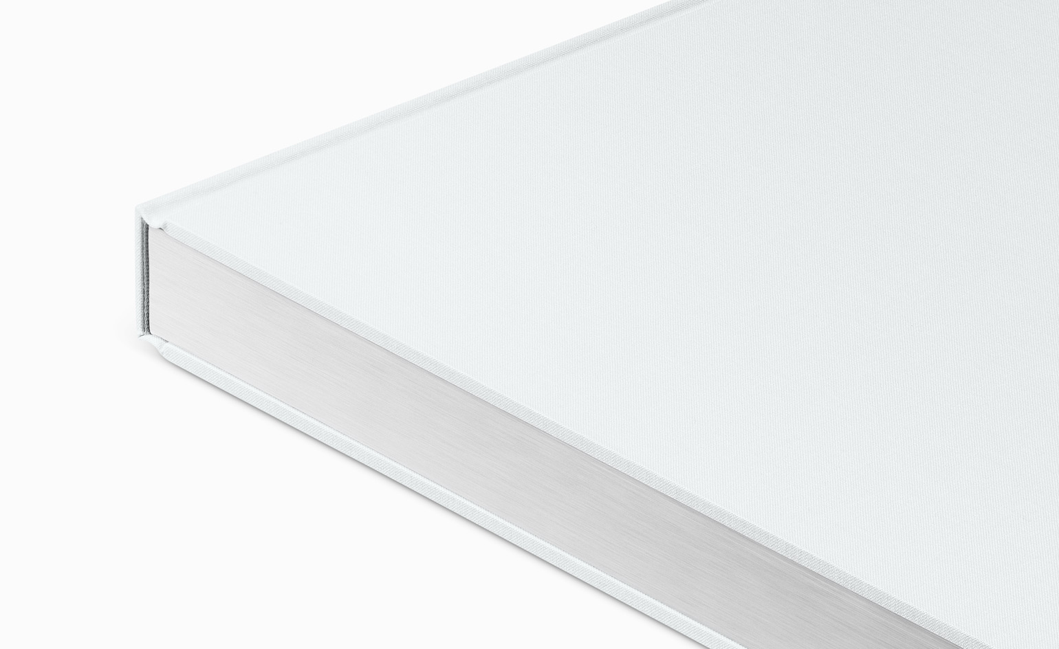
The linen-bound, hardcover volume is printed on specially milled, custom-dyed paper with gilded matte silver edges
This is a comprehensive and objective portrait of Apple products produced over the past 20 years. ‘It is a book with very few words,’ writes Sir Jony Ive in the foreword. ‘It is about our products, their physical nature and how they were made.’ The pages that follow trace two stratospheric decades of product design with the effortlessness that’s become synonymous with the company.
It is a quiet and elegant work, a high-quality piece of book design, typography and production. It is far from a show-off vanity project. Great care, time – and money – has been spent on making it a paean to good, useful design and manufacturing. It is also of course a paean to Steve Jobs. In the five years since his death, Apple has forged on without him. Designed by Apple in California is a tribute both to him, and to the products that have shaped our future.
The tome is Apple at its purest: the products. We caught up with Ive to find out more...
Wallpaper*: The new book, quite unusually for Apple, is a look back.
Jony Ive: The biggest challenge for us was the fact that our focus and preoccupation is always on the future. So that tends to exclude much time to look back at the work we have previously done. Sometimes if we are struggling with a particular issue then that gives us reason to go back and look at the way we have solved problems in the past. But because we've been so consumed by our current and future work we came to realise we didn't have a catalogue of the physical products. So about eight years ago we felt an obligation to address this and build an objective archive. Many of the products that you see, we actually had to go out and purchase [laughs]. It's a rather shameful admission, but it's just not an area that we really invested much time or energy in, so we started to build an archive of the physical products.
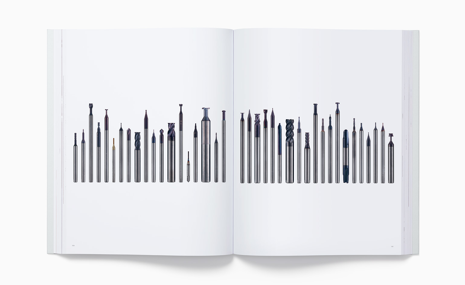
These custom-designed, high-performance tungsten carbide cutting tools were use to manufacture the iPhone 4 bezel
W*: Objectivity seems to be the key goal?
JI: We were intrigued how we could objectively describe, define and catalogue the objects and try to give people a sense of how they were made. Not how they were designed, but how they came to be. How they were manufactured and how you can transform these often-anonymous materials into something that is valuable and useful.
W*: By looking back, did it trigger memories?
JI: You know, I've spent half my life at Apple – so many of us associate different projects with different parts of our lives. It was curious and interesting. For each project there are multiple stories.
Interestingly, the only way we realised we would finish the project was to treat it like one of the projects in the studio. There were a few things we needed to do to accurately and objectively portray these products. Of course, many of these products are white, so the off-the-shelf printing processes really didn't do an adequate job in describing the colour and surface of those products. So, unsurprisingly we ended up developing custom forms of paper [from British papermaker James Cropper] and custom inks.
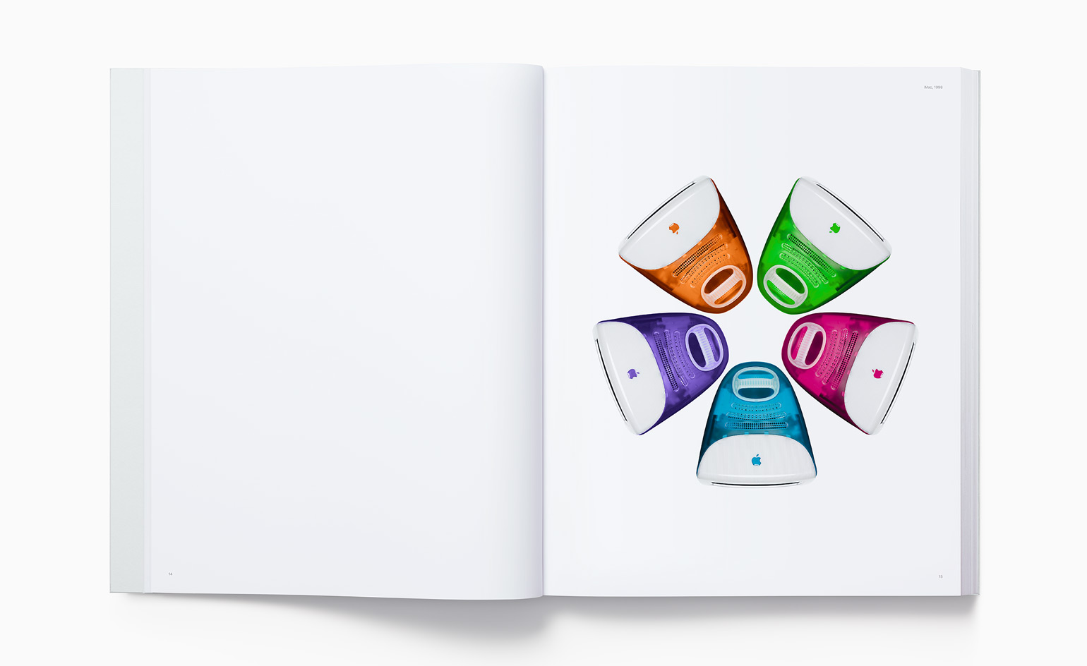
The composition from the launch of the very first iMacs, unveiled in 1998, was replicated exactly for the book
W*: Did you and the team in turn learn anything from the process of making the book?
JI: The products we're working on at the moment, and have been for a while, are the beneficiaries of all the learning we gained from the book – so of course to us they are the very best things we have ever done. Therefore the frustration, the absolute frustration, of not being able to include that work was sometimes enough to make us think this is something we're not going to be able to finish. It's around 20 years of work and it certainly isn't everything we've done – it's the things that we think were salient in our learning or that we just had an affection for. That part [the selection process] wasn't too hard or challenging – we generally all felt the same way about the same products. But certainly to draw a line and say this will be the end of this first catalogue, first book, that was exquisitely painful.
W*: Quite typically for Apple, the book comes beautifully packaged.
JI: We're so used to packaging 3D objects, so that was part of the project we really enjoyed – trying to create a very simple way of protecting the book and not having to force people to deal with a myriad of sticky labels – hopefully it helped the unwrapping and made it enjoyable. So often you can put all of your energy into the primary product that you forget that your actual experience is an aggregation of the product plus all of these peripheral objects like the packaging and shipping box. We really wanted to treat each of them with the care they deserve, or rather, the care that people [the customer] deserves, such as with the draw tab on the cardboard box and the simple tuck on the envelope.
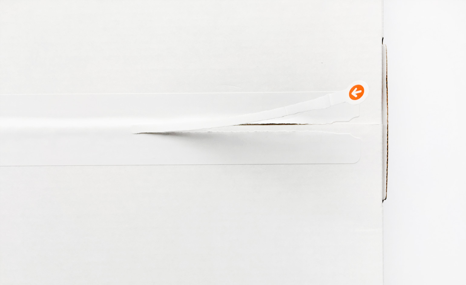
Detail of the draw tab of the shipping box, which is pulled open to reveal the book inside.
W*: What were your key objectives for the book?
JI: We asked ourselves, 'What is the value of a book like this, when most people know these objects so intimately already?' First, to see the objects out of their functional context. Next, to see them in a context of the subsequent products and hopefully how we have learned as a team how technology shifts, moves and evolves. And the other reason was to do with the fact that many people don't really have much of a sense of how their manufactured environment came to be. Most people wouldn't understand how the chair they are sat on is made. One of the things we wanted to do was try and explain as clearly as we can – through photography – how you transform a raw material into a product that you recognise and hopefully use as a daily tool.
We decided to be fairly explicit about some of the processes we used. I guess we feel a strong sense of ownership of these processes because they really do aid our understanding and learning and transfer from one product to the next. We feel that more than ever there has been a disconnect between designing and making and really, you can't disconnect them. In the 90s, as manufacturing was outsourced, this chasm developed between where something was made and where it was designed. But designing and making are inseparable if you want the ultimate product to have integrity. Another key point is that the book is being sent to all the major design colleges in the world. We are keen to get it into the hands of young people who are studying design disciplines. It's very important that it’s an educational resource as well.
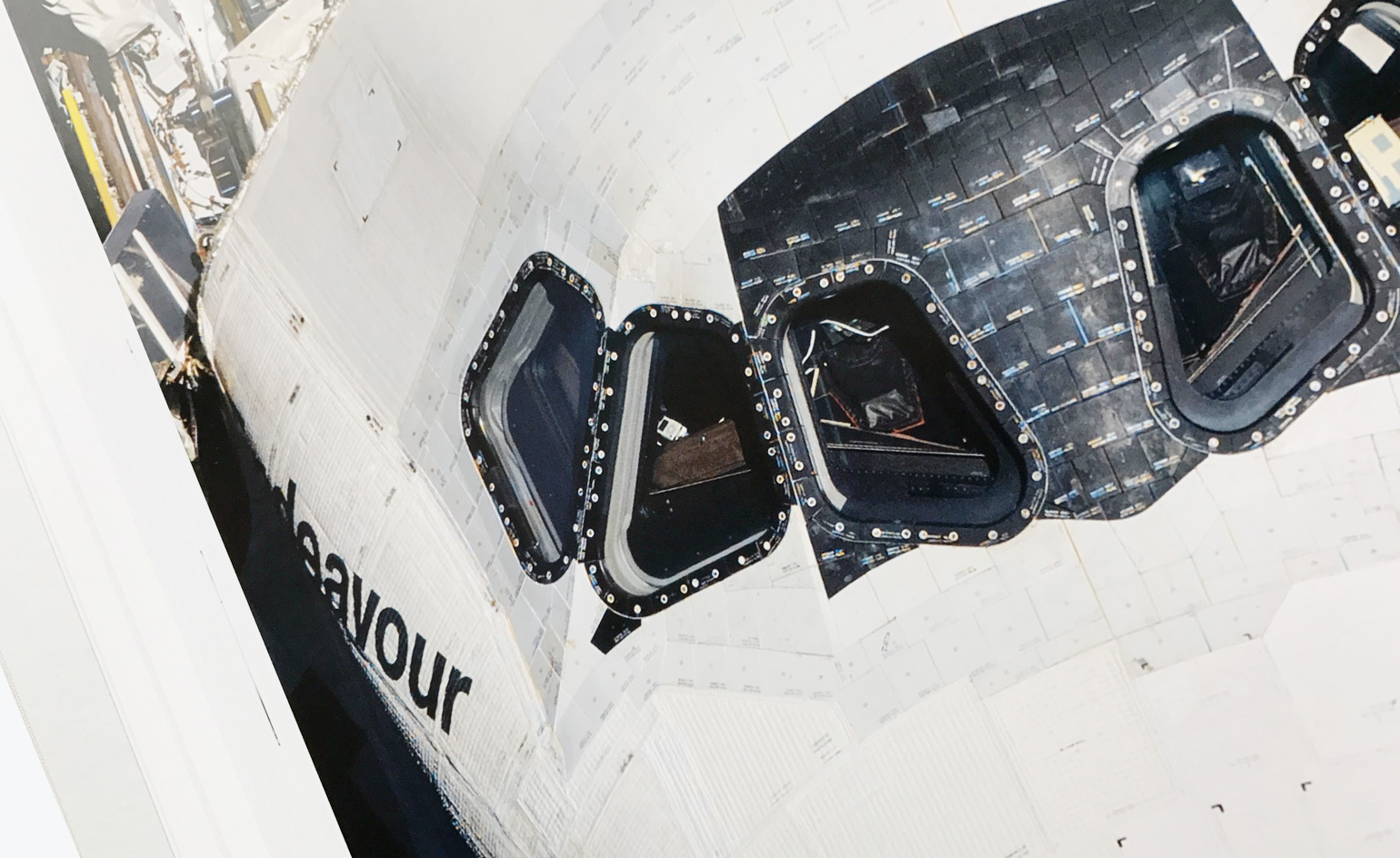
iPod aboard Space Shuttle Endeavour
W*: I presume all the photographs (by Andrew Zuckerman) were shot specifically for the book. But there's one incredible image of a Nasa space shuttle?
JI: Yes, they were – with the exception of that Space Shuttle image (above). The first image in the book is of the very first iMac. We used the same composition as the launch shot in the 1990s. But we reshot every single product [for the book]. As the project has taken so long we actually had to go back and re-photograph some of earlier products because of how photographic technology had changed and improved. The images of the later products were superior to the earlier ones, so we had to go back to the beginning to keep that perfect consistency throughout the book. Nasa images are quite extraordinary. We were poring over these one day and noticed an iPod on the dashboard, resting up there. I thought that was so funny – it was both humbling and humorous.
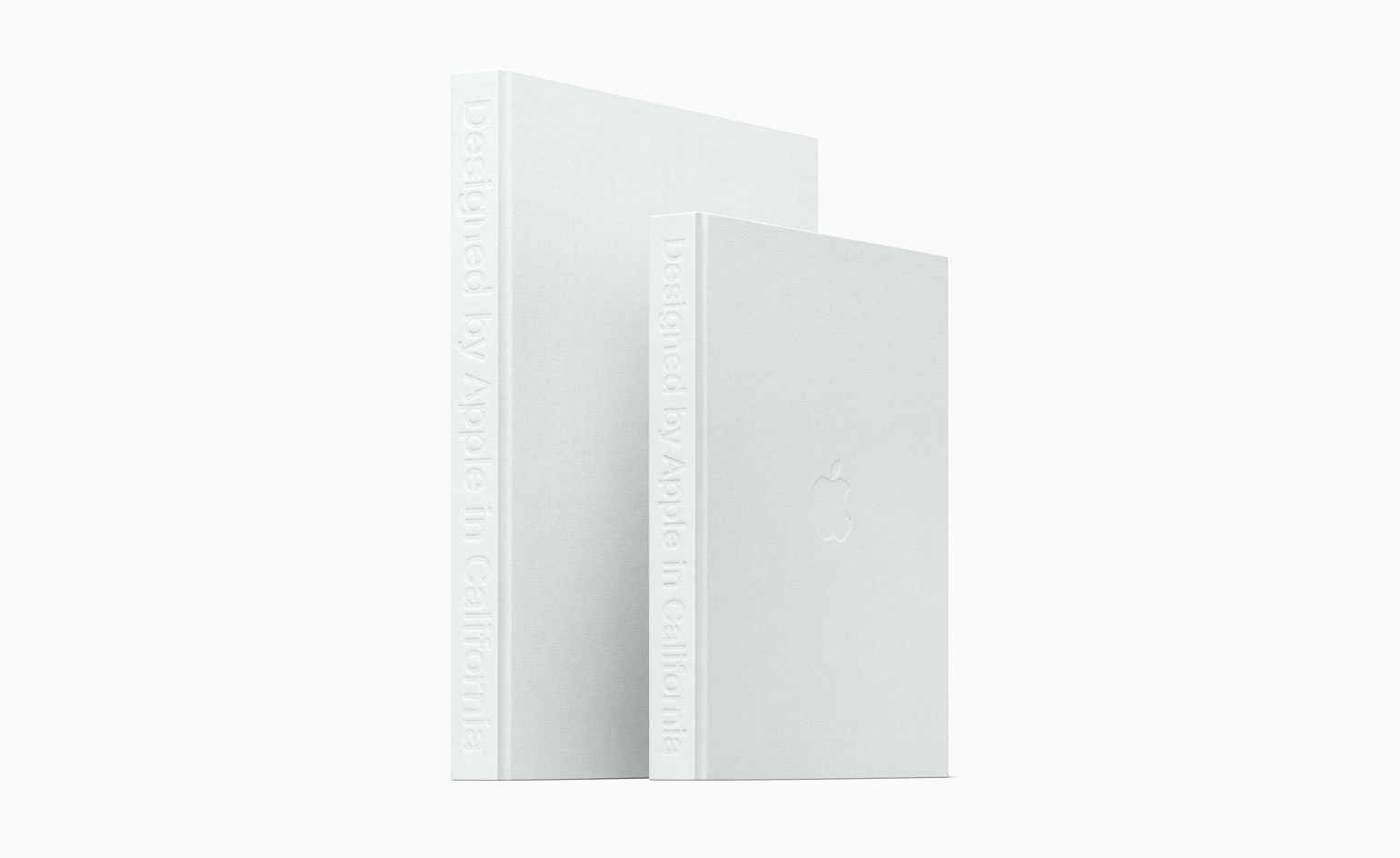
Developed over an eight-year period, Apple’s self-published Designed by Apple in California is available in two sizes and printed on specially milled, custom-dyed paper
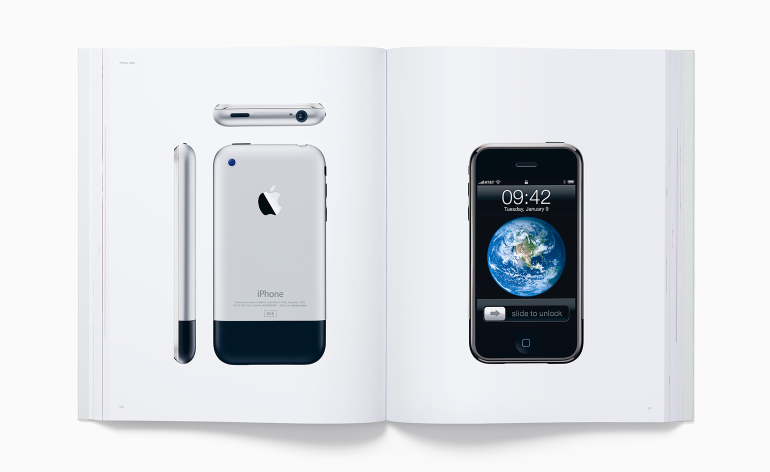
iPhone, 2007. The spline on the 5052 aluminium alloy housing for every iPhone was custom fit to the unique shape of each 304 stainless steel bezel
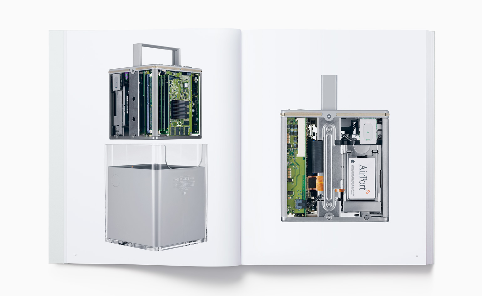
A rare look inside the Power Mac G4 Cube, 2000. The entire computer is suspended within a clear acrylic enclosure to enable a quiet, convection-cooled architecture
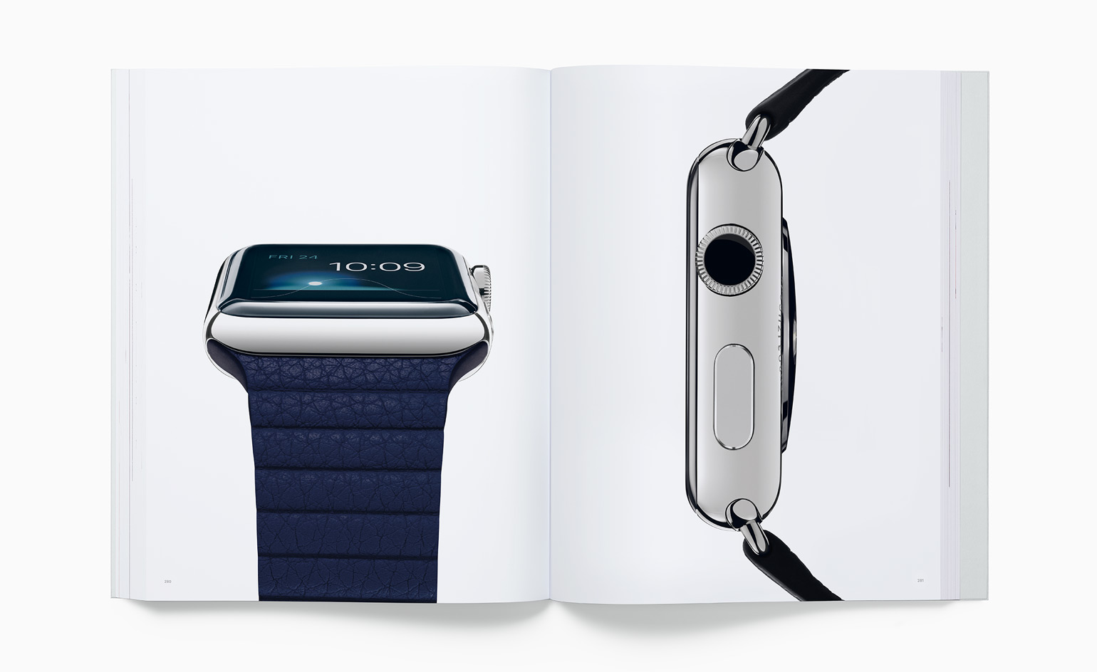
Apple Watch, 2015. The Force Touch sensor (left) is made from several layers of polyimide, copper electrodes, silicone, and adhesive molded into ultra-thin sheets that serve as a capacitator. The Digital Crown (right) has an 8-pixel optical sensor that provides 200 discrete positions per rotation
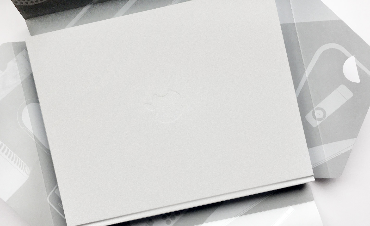
The book comes slipped in a specially designed envelope
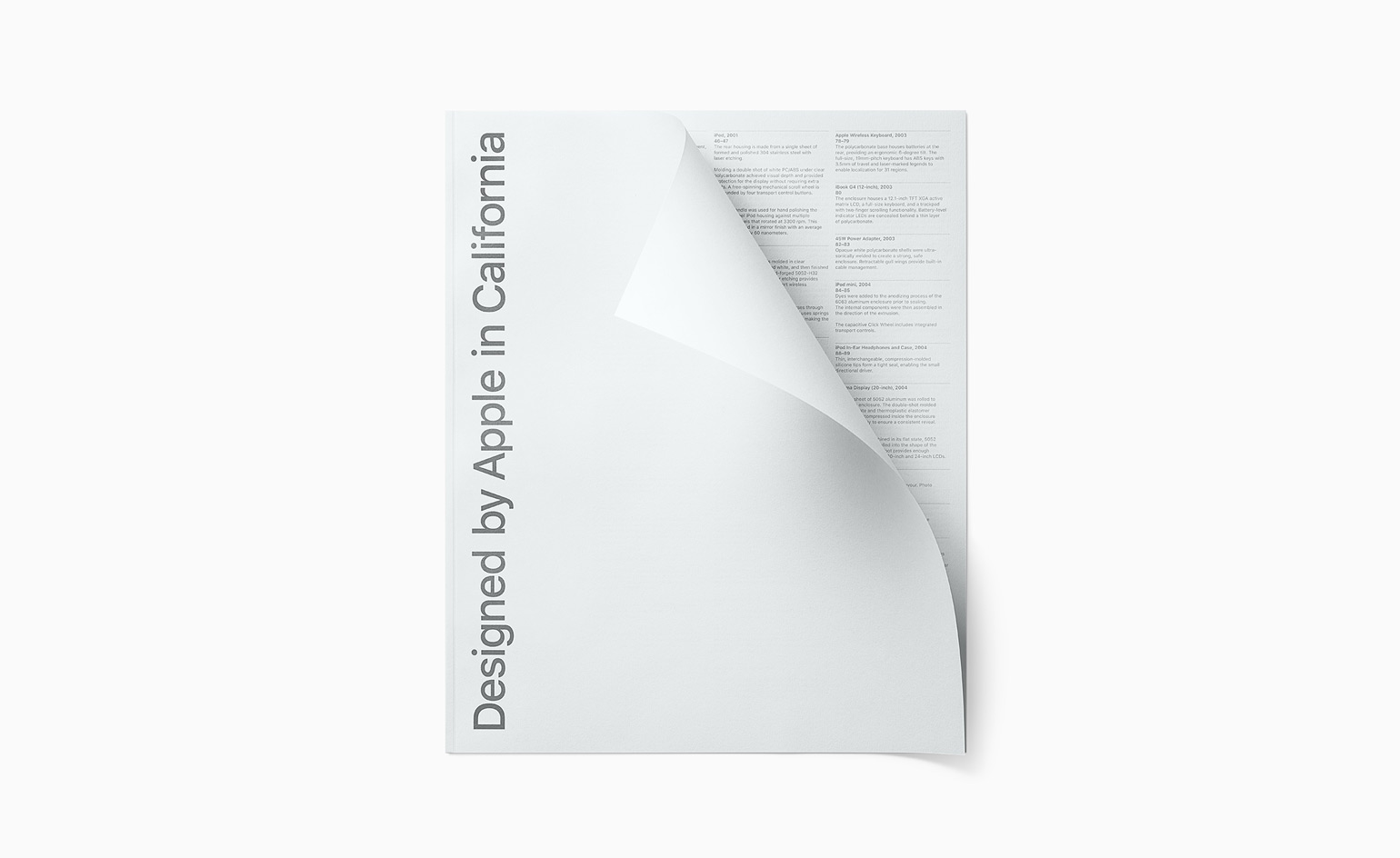
A slip-in portfolio outlines the technical details of Apple’s archive
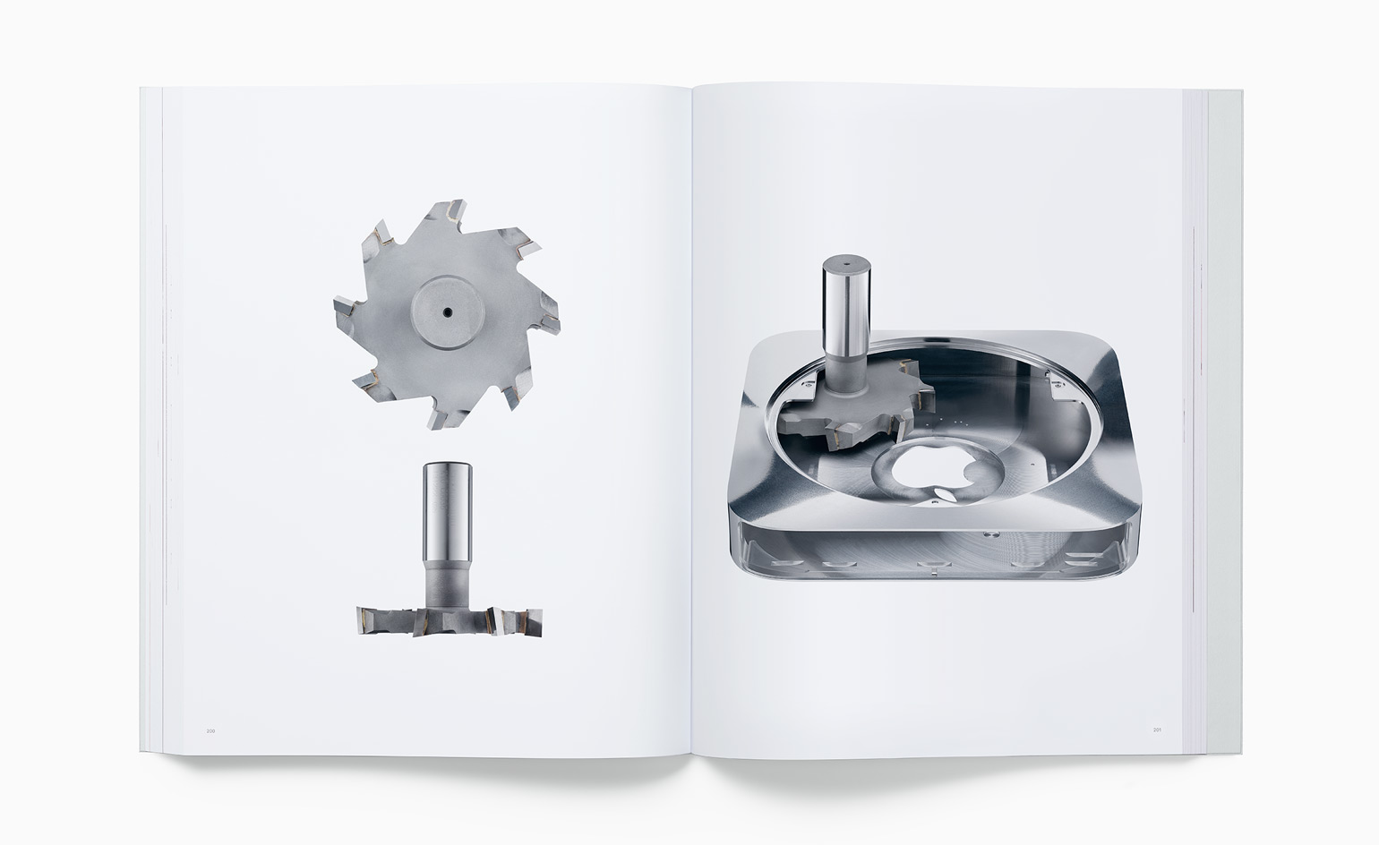
Mac mini, 2010. A custom-designed T-cutter enabled the removal of the maximum amount of material to ensure that all internal components could fit inside a single unibody enclosure
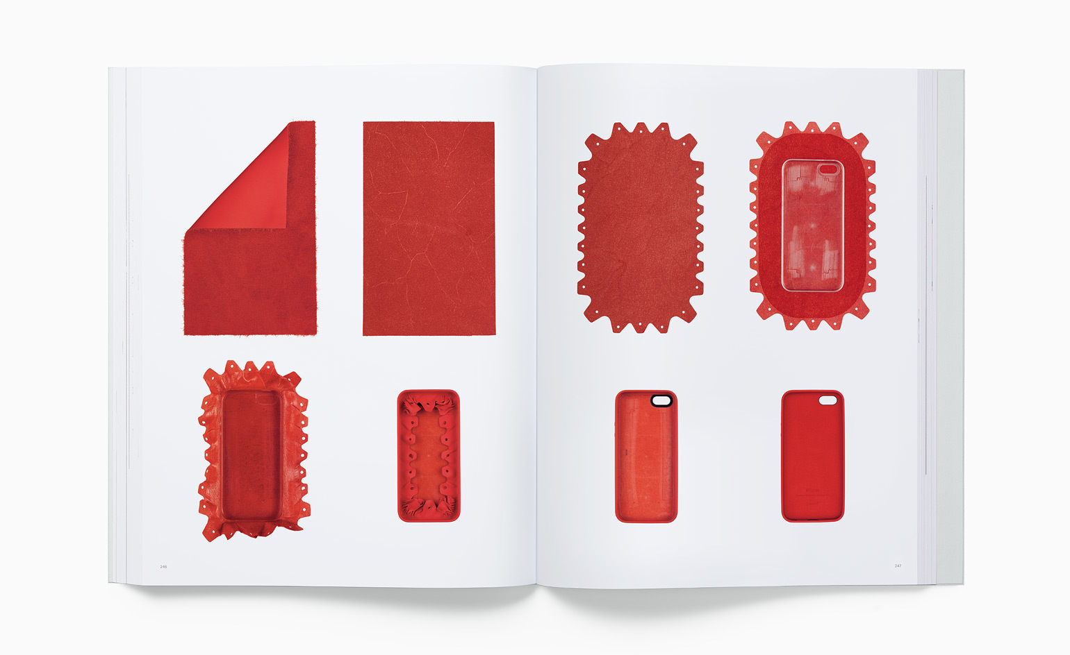
iPhone 5s Leather Case, 2013. Eight steps in the process to form the iPhone 5s Leather Case, including skiving the leather to a thinness of 0.4mm, die-cutting the leather, wrapping the leather around the polycarbonate shell, and inlaying the microfibre lining
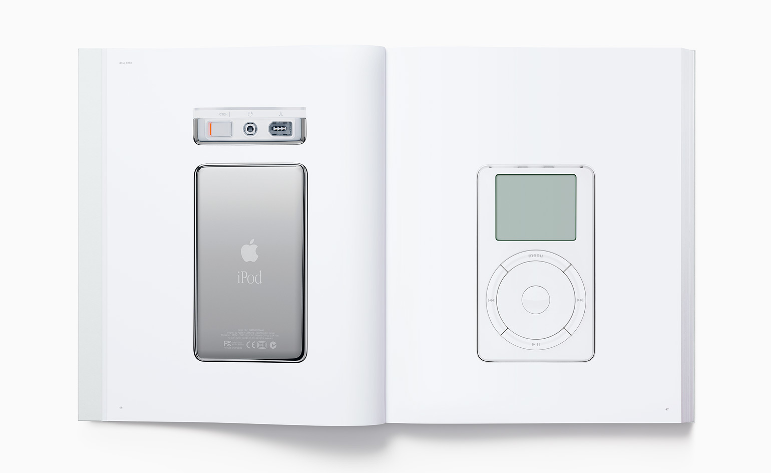
The inaugural iPod model in 2001 had a combined exterior; a single sheet of formed and polished 304 stainless steel with laser-etched graphics for the back, and a double protection of PC/ABS and clear polycarbonate for the face
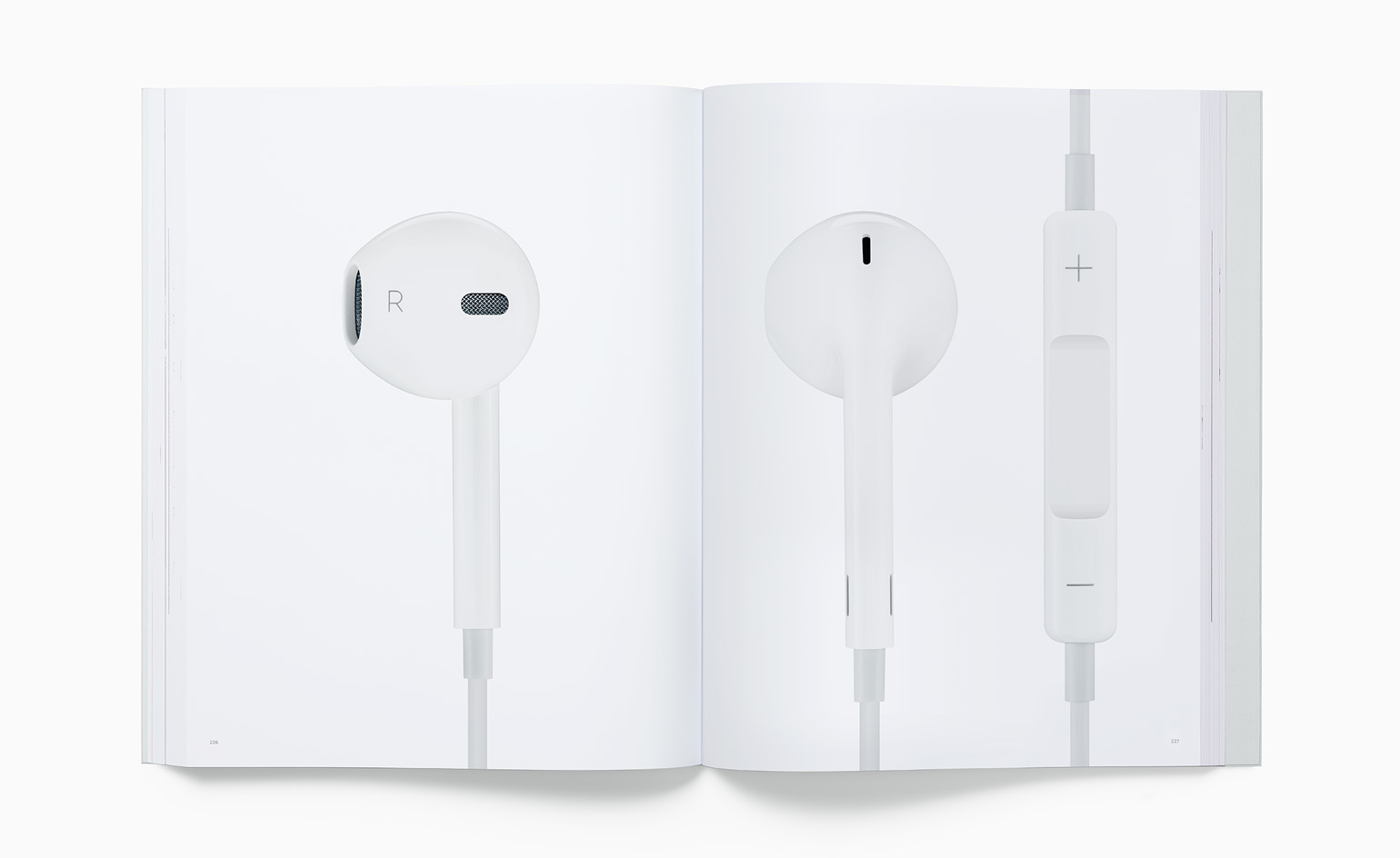
Apple EarPods, 2012. Hundreds of prototype models were tested on more than 600 people to obtain more than 500 measurements. This, combined with additional ergonomic data from more than 10,000 people, contributed to the design of an earpiece defined by the geometry of the ear itself
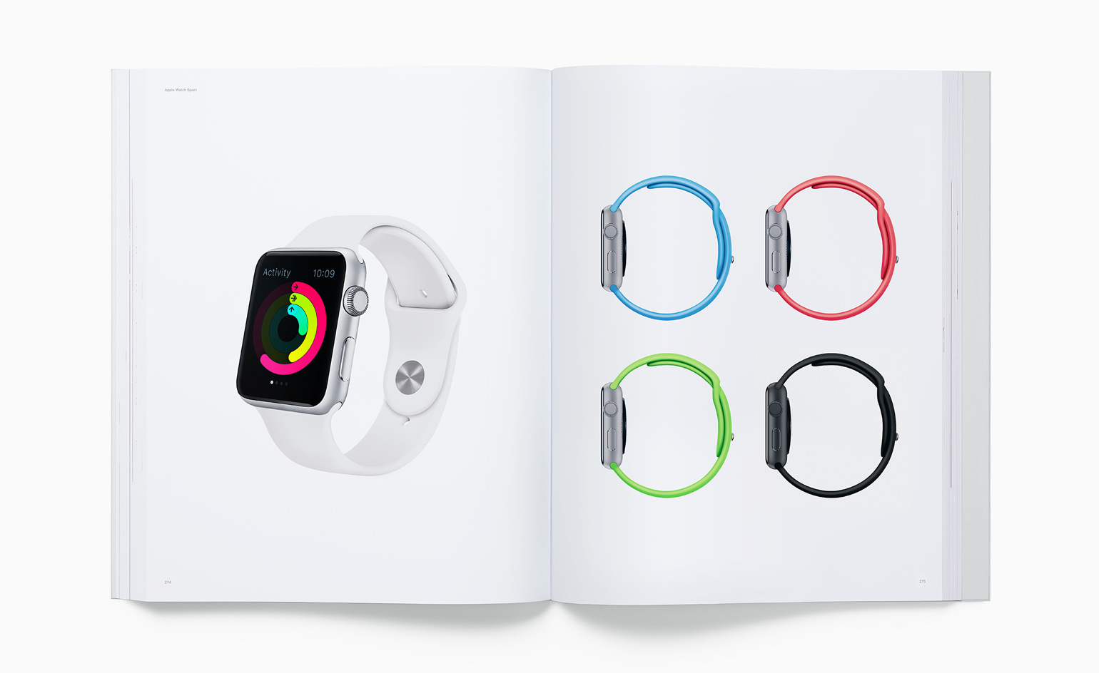
Apple Watch Sport, 2015. The 7000 Series aluminium is polished to a mirror finish using a four-axis force-feedback wheel, then blasted with zirconia media to create a consistent, satin texture
INFORMATION
Designed by Apple in California, from $199. For more information, visit the Apple website
Receive our daily digest of inspiration, escapism and design stories from around the world direct to your inbox.