Inside Apple Park: first look at the design team shaping the future of tech
Global exclusive! Led by Evans Hankey and Alan Dye, the Apple Design Team holds enormous sway over our evolving relationship with technology. Opening the doors to their studio at Apple Park in Cupertino for the first time, they offered us a deep dive into the working processes behind their latest creations
Jason Schmidt - Photography
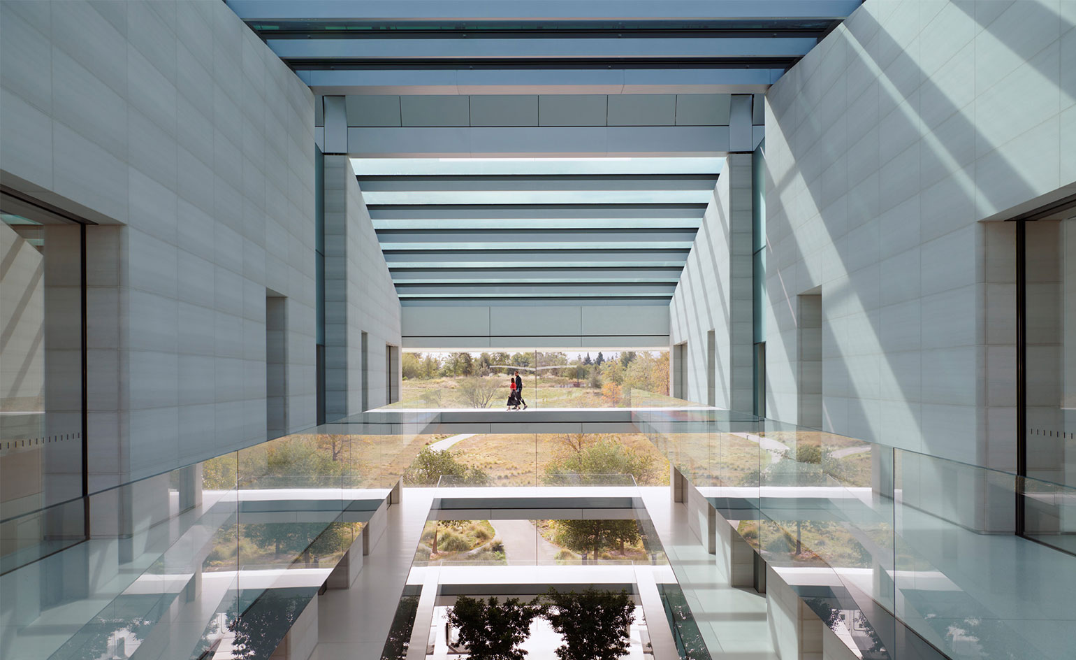
In the distance is a rectangular frame of foliage. In the foreground, a conference table, placed with architectural rigour so that the focal point is dead centre of the screen. The scene is a tiny cross section through Apple Park, the tech giant’s mighty circular HQ in Cupertino, by Foster + Partners. There are 12,000 employees on site here, including the Apple Design Team. This agile but hugely significant department thinks in terms of scope, not scale.
Working side by side to guide this division are Evans Hankey, Apple’s VP of industrial design, and Alan Dye, VP of human interface design. Both close colleagues, confidants and friends of Jony Ive, they effectively took the helm of the Design Team after his departure from the chief design officer role in 2019.
Today they’re both here to talk Wallpaper* through the past few years at Apple, a time of consistent growth, both in terms of products shipped and revenue earned. Apple is a behemoth in every sense of the word, generating $366bn in revenue in 2020, over half of which came from the iPhone, the world’s best-selling handset every year since 2016 (it’s estimated that over a billion iPhones have been sold to date). From television to headphones to watches, growth was experienced right across the company.
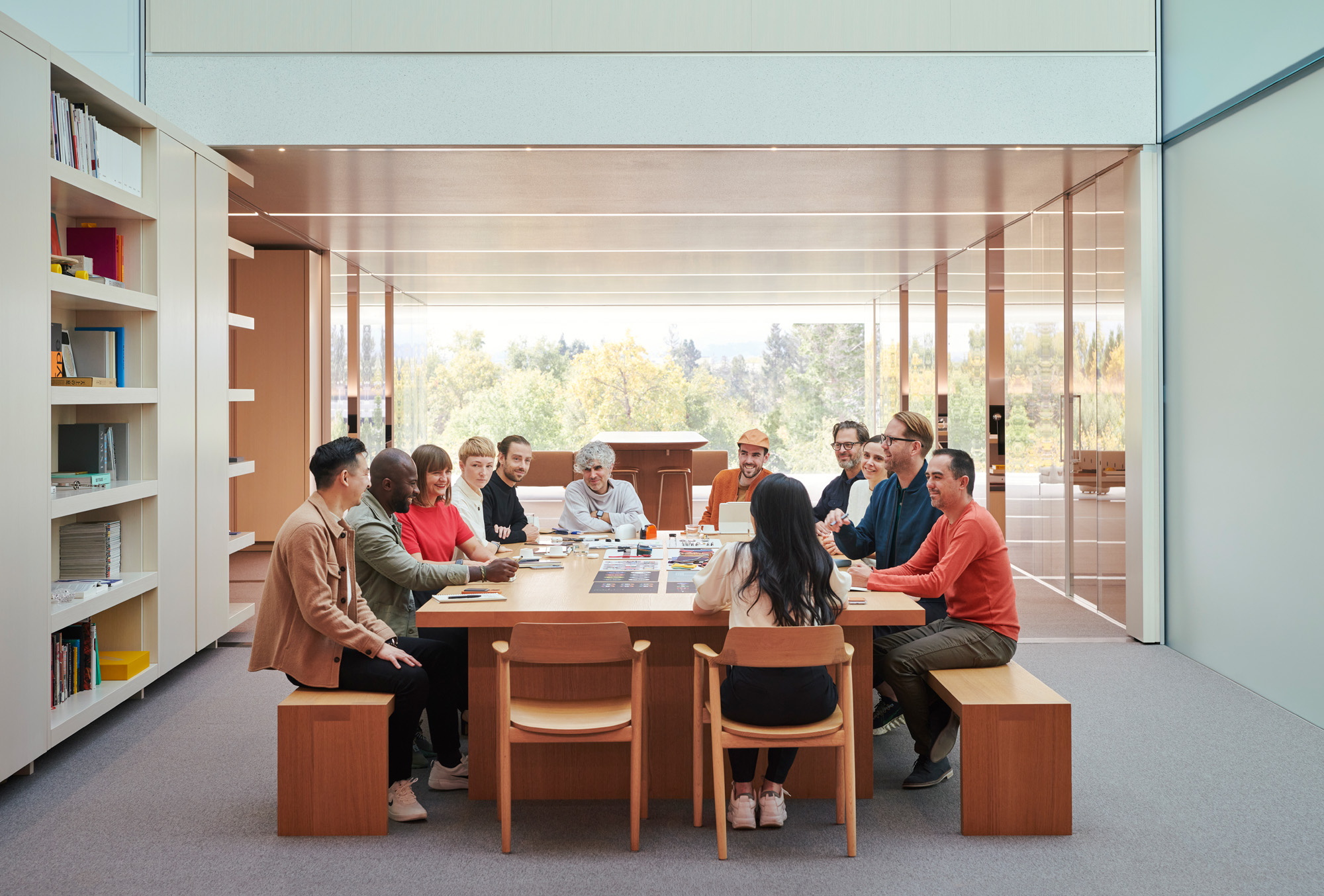
Members of the Design Team gather near the central library to discuss the Apple Watch
Yet despite the millions and billions, there is still a strong sense of the personal touch about Apple’s products, a design ethos that can be traced back to the company’s earliest days. For designers such as Hankey and Dye, the challenge is to parlay the colossal responsibilities of such a footprint into a mutually beneficial future that serves customers and shareholders without depleting resources and hastening climate change.
Power brings responsibility, but also the ability to instigate change. In summer 2020, Apple promised to become fully carbon neutral by 2030, decarbonising its supply chain, seeking out sub-contractors that rely on renewable energy and recyclable materials, and finding the right balance between product longevity and component circularity.
It’s been three years since the Apple Design Team moved into its new premises. Located just over a mile from the company’s previous HQ down the road at Infinite Loop, the awe-inspiring circular campus is a fine analogy for the dizzying complexity of modern electronic devices.
Inside Apple Park with Apple Design Team
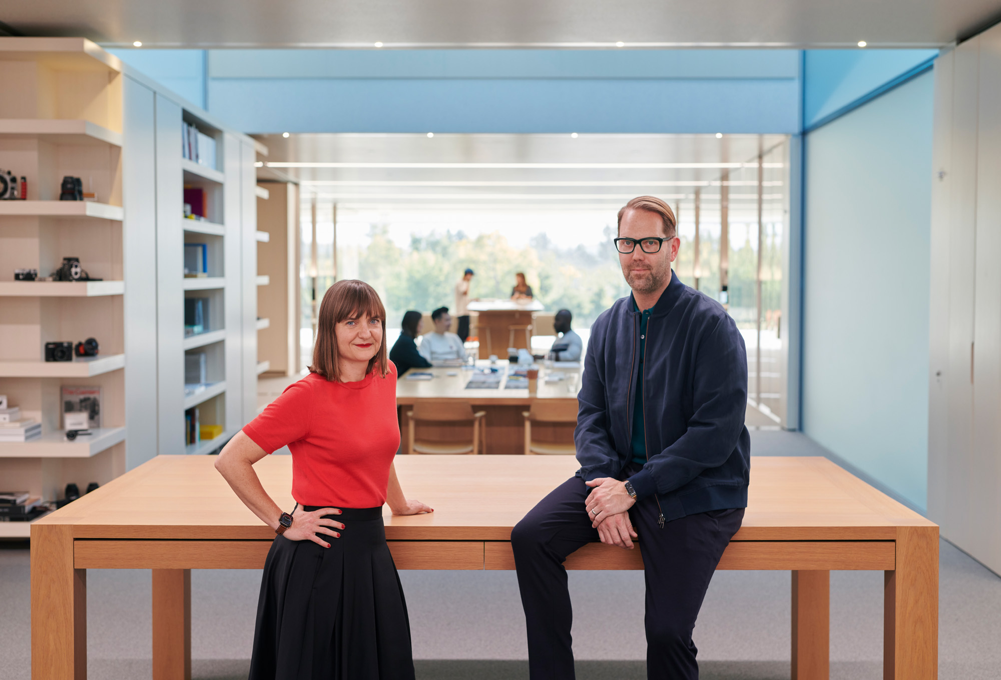
Evans Hankey, VP of industrial design, and Alan Dye, VP of human interface design, in the Design Studio
From a distance, all is sleek and seamless, with barely a hint of what lies beneath the quarter-kilometre-long façade. However, it is a 260,000 sq m machine of massive complexity. From the natural ventilation systems to the multilayered glazing, from the bespoke door handles to the 9,000 carefully specified trees, every single facet of this multibillion-dollar structure has been subjected to the kind of scrutiny most designers can only dream of.
Wallpaper* Newsletter
Receive our daily digest of inspiration, escapism and design stories from around the world direct to your inbox.
It’s the same with the device in your pocket. Seventeen years after Ive created the first iPhone prototype, the latest generation iPhone 13 hasn’t lost any of the magical tactility and sensory delight of its forebears. Outwardly, the iPhone embodies meticulous minimalism: tap the surface and myriad worlds are revealed, just like at Apple Park.
Ive was intensely involved with the building’s design (as was Steve Jobs during the project’s early stages). The team before us now very much reflect the realisation of the two men’s aspirations for a bespoke Apple building. ‘[The Apple Design Team] can share the same studio,’ Ive told Wallpaper* in 2017. ‘We can have industrial designers sat next to a font designer, sat next to a sound designer, who is sat next to a motion graphics expert, who is sat next to a colour designer, who is sat next to somebody who is developing objects in soft materials.’
All this has come to pass and more. Yet Hankey stresses that it didn’t happen overnight. ‘We knew very much that this was a massive opportunity, but we also knew that it also had to be more than just adjacencies,’ she says of their new-found centralisation. ‘We got to where we were as a team because of our cultures and our processes. It was a challenge, not an automatic win. It really took a lot of time to try new things out and be a little bit outside our comfort zones.’
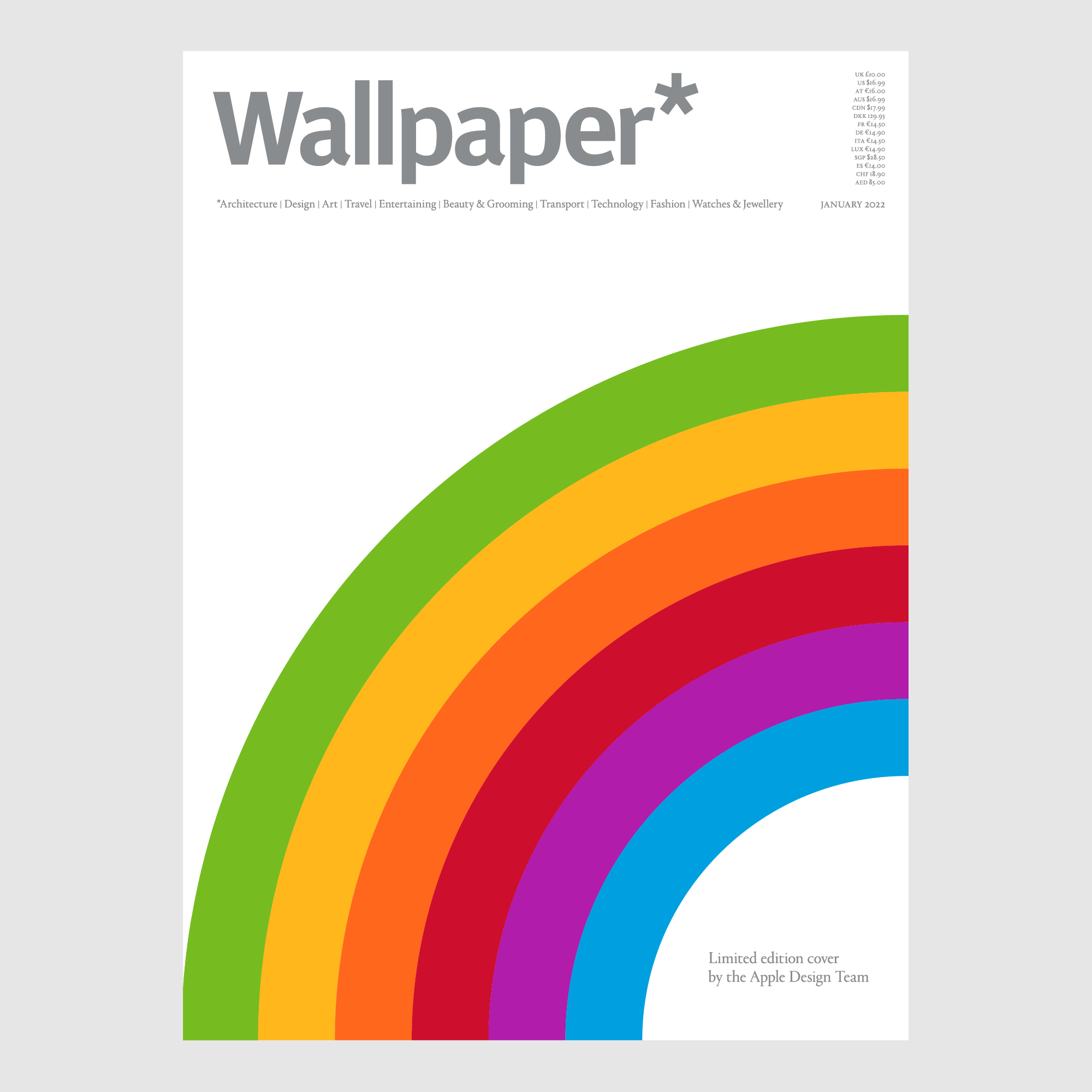
The limited-edition cover created by the Apple Design Team for the January 2022 issue of Wallpaper* (W*273), where a version of this story appears. Buy this issue, and subscribe to receive limited-edition covers every month
Hankey and Dye are adamant that the team wouldn’t be what it was without the deep-rooted cultural bias towards design in Apple. ‘We care about making great products, but we’ve worked equally hard at making a great team and culture. A lot of that came from the beginning. Steve defined Apple by its design,’ says Dye. ‘We always remember him saying that design is not just a veneer. It’s not just how things look, it’s about how things work. After three years [at Apple Park], we couldn’t believe more in the vision of having one central Design Team across all Apple products.’
From the outset, Apple’s aesthetic ethos set it apart. Arguably, the company has done more to democratise the understanding and perception of design, both in its physical manifestation and as a way of guiding and shaping behaviours. Apple designs are globally ubiquitous, yet at no point has the quality of execution ever dropped. Instead, the rest of the world has had to raise its game to catch up. Sure, there have been the occasional rare missteps, and while these might have triggered some internal soul-searching, Apple is not a company for public mea culpas. Learn, improve and move on.
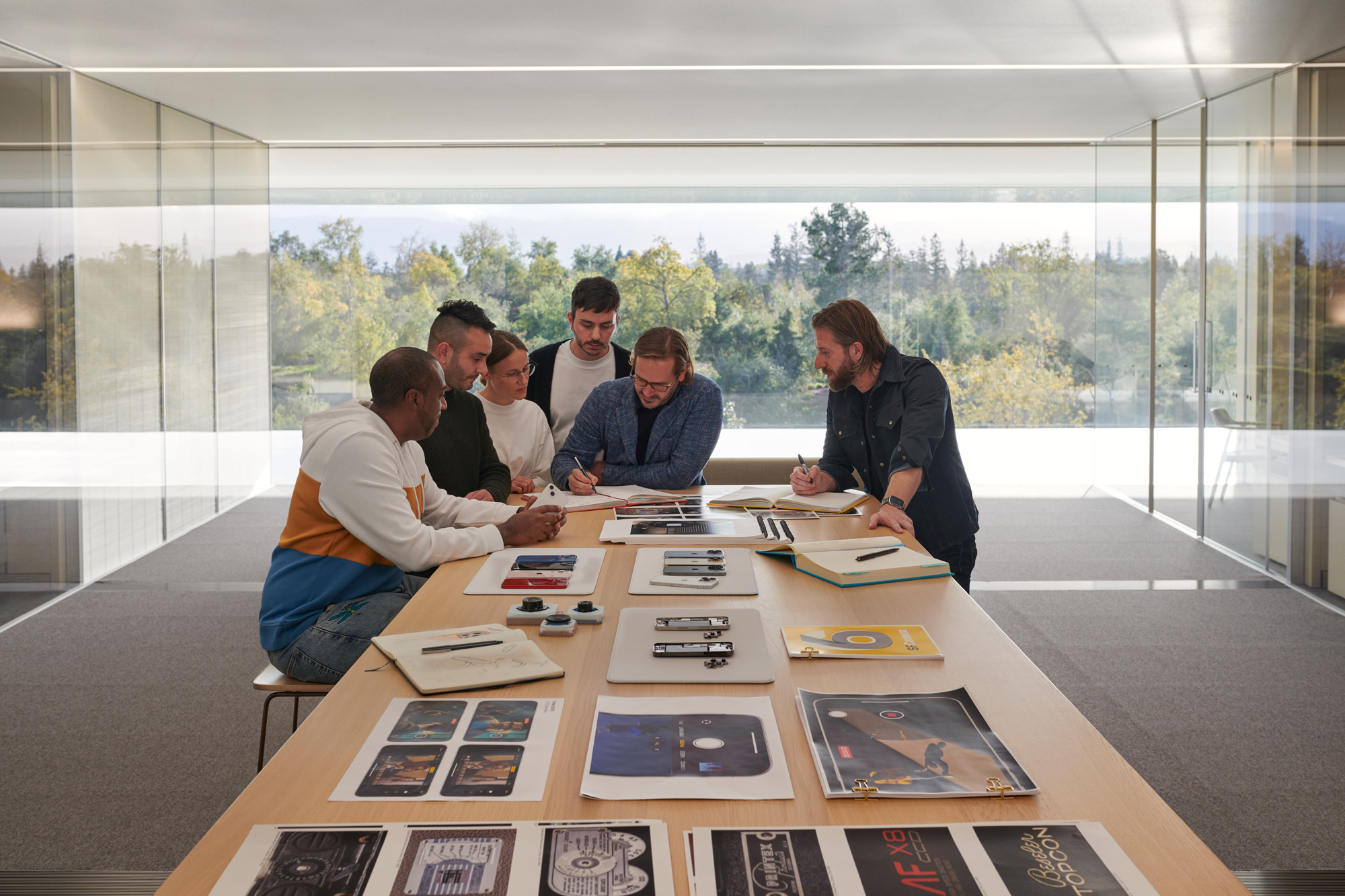
A host of central tables in Apple Park enables impromptu gatherings
Dye and Hankey frequently use the word ‘humility’, especially when Apple is entering new market spaces. While new category killers such as Apple Watch and AirPods might appear effortless and fully formed from the outset, the work behind the scenes was staggering. Take the Human Factors Team, which blends experts in ergonomics, cognition and behavioural psychology. When AirPods’ development began a decade or so ago, human factors researcher Kristi Bauerly found herself researching the ‘crazily complex’ human ear.
‘We moulded and scanned ears, worked with nearby academics, focusing on outer ears for the earbud design and inner ears for the acoustics,’ she says. Thousands of ears were scanned, and only by bringing them all together did the company find the ‘design space’ to work within. ‘I think we’ve assembled one of the largest ear libraries anywhere,’ Hankey says. ‘The database is where the design starts,’ Bauerly continues, ‘and then we iterate and reiterate.’
New products have led to new specialisms and Apple Park was designed to accommodate this growth and cross-pollination. The ability to sketch, model and prototype in-house creates a fluid workflow that is integral to product evolution. Prototyping is hugely important, covering everything from scale and interaction down to materials, colours, textures, and surfaces.
Processes behind the products
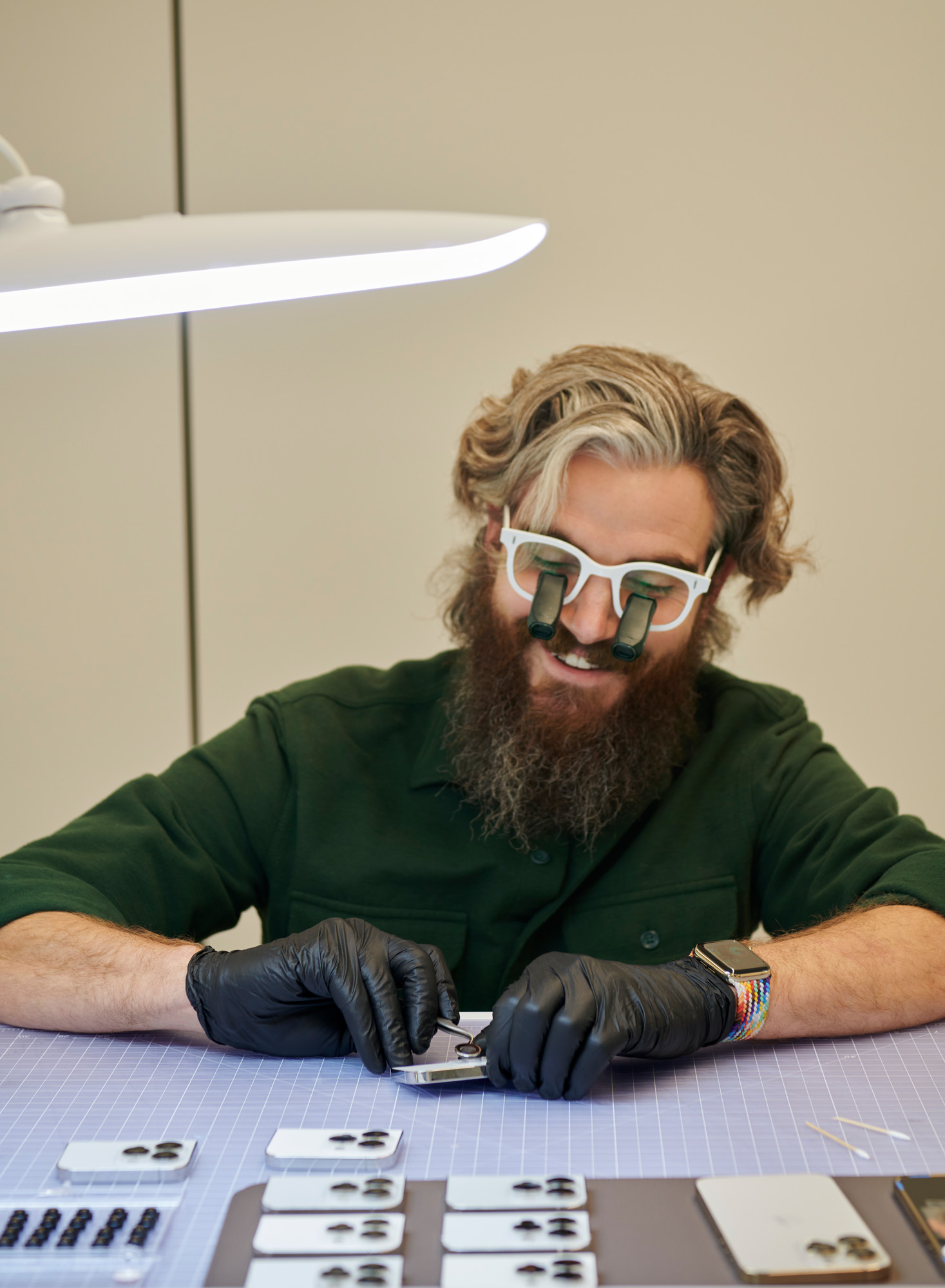
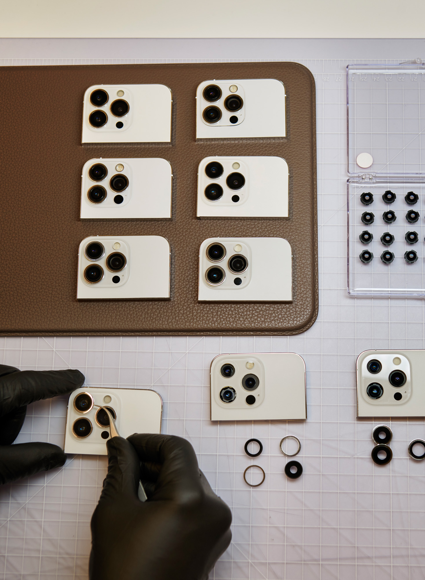
Top and above, a model maker assembles camera modules for iPhone 13 Pro camera lenses into cosmetic models. Multiple section models of iPhone cameras are created to study each detail
For the Apple Watch, the team had to design, build, and implement a physical notification system. How strong? How long? What felt natural? ‘We knew that the Watch was going to be the most intimate, the most personal product that we’ve ever made,’ says Hankey. ‘We also knew it needed to get your attention at some point.’ It was Duncan Kerr, a long-standing member of the Design Team, who suggested the idea of the ‘tap’. ‘It’s such a lovely simple thing, but we had no idea how to bring that to life,’ Hankey says. Through a series of clunky prototypes and the work of haptics expert Camille Moussette, the ‘tap’ was refined and perfected.
Industrial design is by its nature multidisciplinary, although individual expertise is obviously hugely valuable. There are team members who are as adept at coding as they are at three-dimensional design, but in general, the most useful quality – beyond skill and aptitude – is a sense of curiosity. ‘We have this tradition of making things for one another at Christmas,’ says Hankey. ‘It’s about that joy of making and joy of giving. It’s something that’s come from the culture of the team.’
An awareness of craft and construction is essential, for there is an acute responsibility that comes with shaping objects that will be made in the hundreds of millions. The economies of scale and the power of the brand give Apple a powerful platform from which to implement change.
Yet even something as superficially simple but environmentally beneficial as removing the plastic shrink-wrap from an iPhone box induces a paroxysm of self-examination within the team. How can the unboxing experience be maintained? Can it be made more accessible? The problem was mulled over, pulled apart and ultimately solved with an elegant paper tab mechanism. The change will save around 600 metric tonnes of plastic over the life of the product.
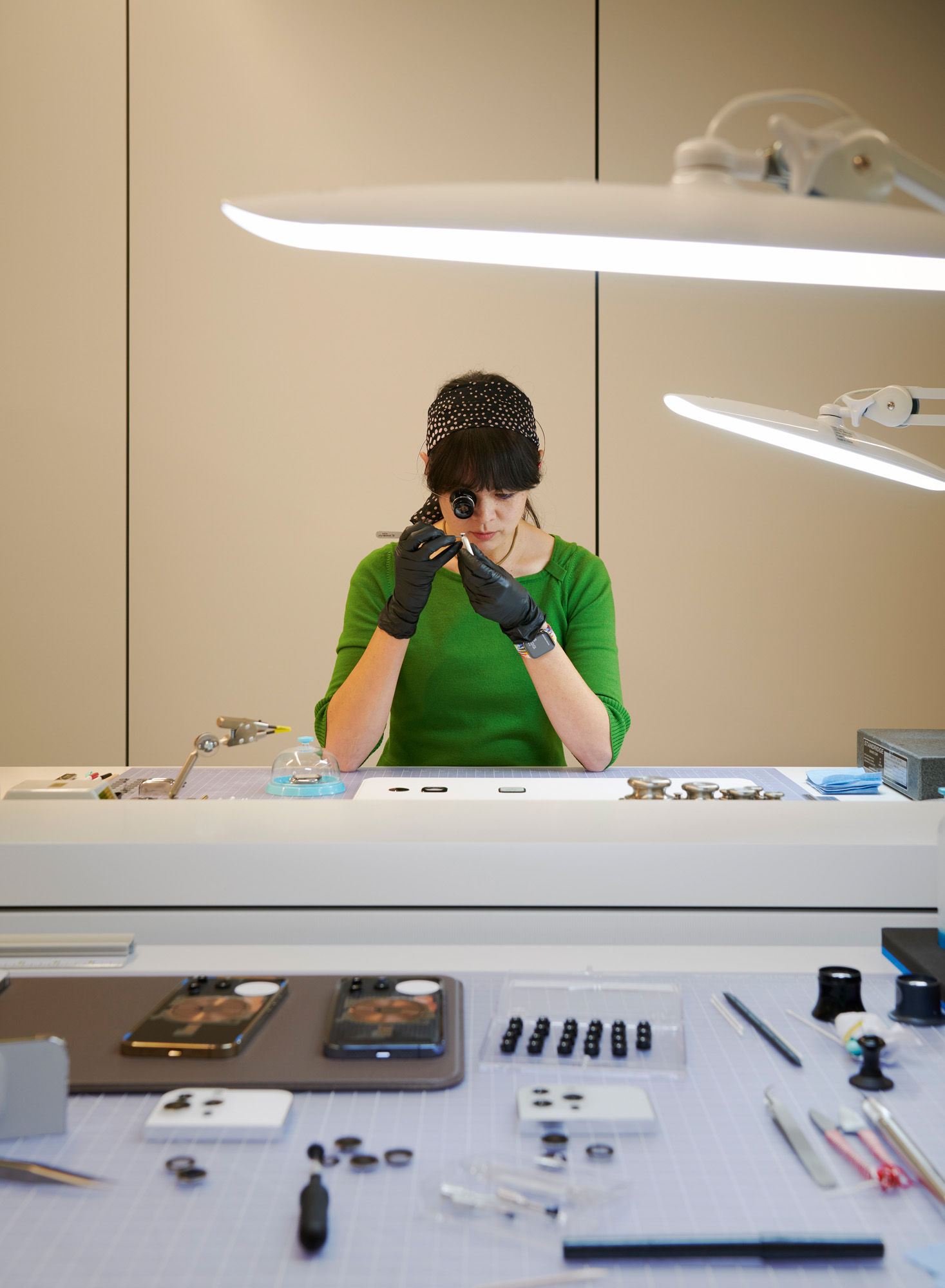
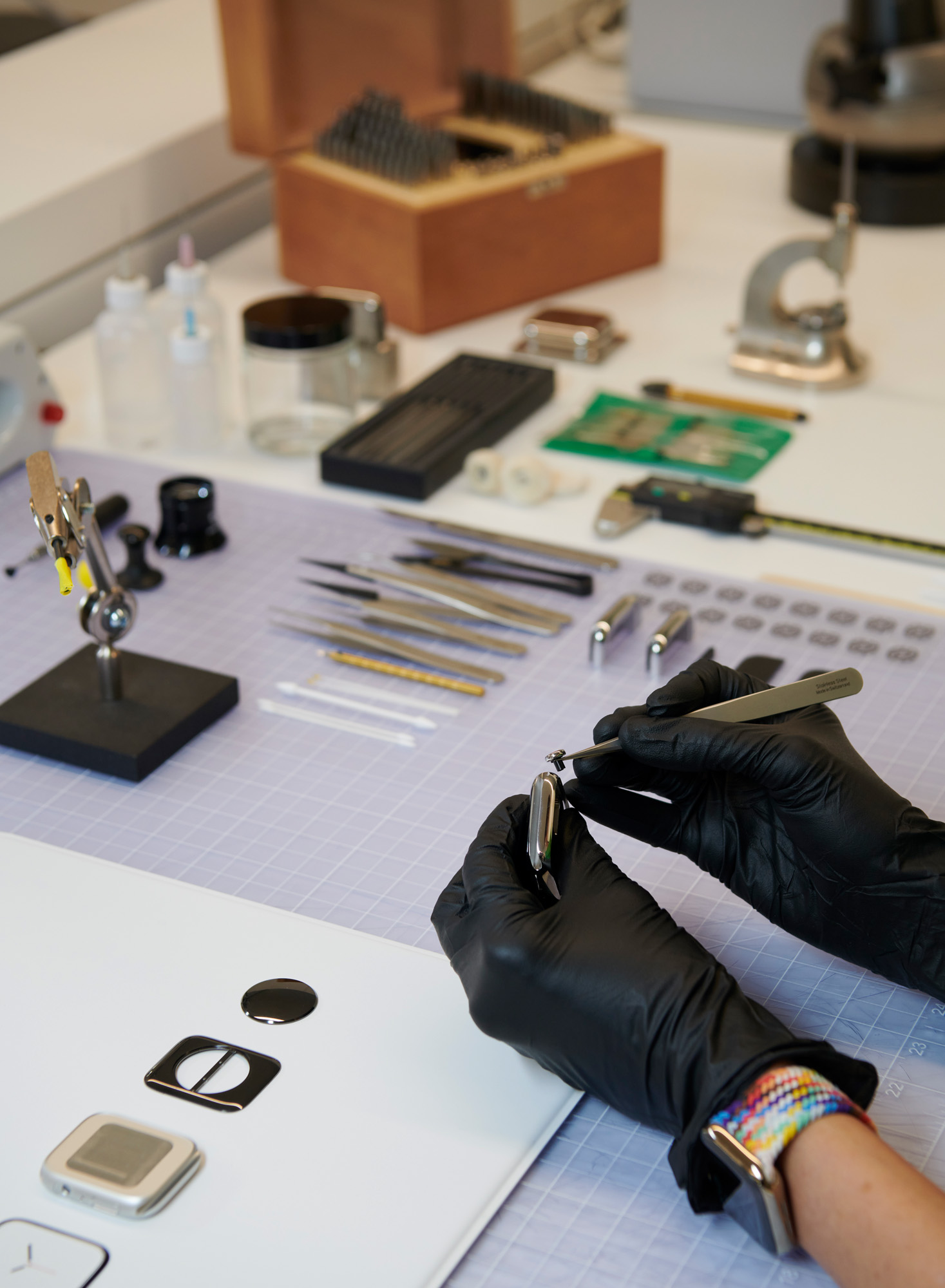
A model maker assembling a digital crown onto an Apple Watch Series 7
Other disciplines have more tangible compulsions. Take typography, something deemed inconsequential and quaint to most early computer pioneers. Not Steve Jobs. Recognising the personal computer’s rapidly advancing ability to display graphics and text to the same visual standards as print, Jobs insisted that the Macintosh debuted with familiar fonts, notably Helvetica and Times New Roman. It also included Apple-specific fonts such as Chicago, Toronto and Geneva. Eventually, Apple developed the TrueType font standard that still prevails today.
‘Apple has had a very special relationship with typography for a long time,’ Dye acknowledges. Lance Wilson, one of the Design Team’s typographic specialists, was one of the people behind San Francisco, the neo-grotesque typeface that shipped with the first Apple Watch in 2014 and was eventually rolled out with iOS 9 and OS X. The first bespoke Apple font in a quarter of a century, San Francisco has to do a lot, especially on the small-screen real estate of the Apple Watch. Owing a stylistic debt to Helvetica, San Francisco goes further, working across 150 languages and evolving into variants, including SF Rounded, SF Mono and a 3D version used for Apple Pay.
Apple and typography
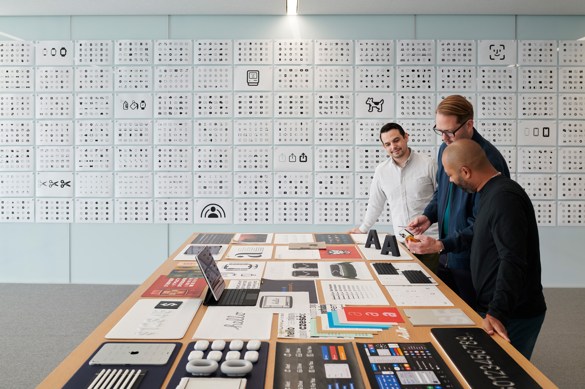
Dye and two graphic designers discuss the development of the SF and SF Symbols typefaces
‘One of the benefits of designing both the typeface and the platforms it’s displayed on is that we can define how the two work together,’ says Wilson. The result is a scalable font capable of accommodating different weights and spacing depending on the point size. San Francisco also set in motion the wholesale redesign of Apple’s symbol set. The SF Symbols app offers developers over 100,000 symbol combinations, with dynamic resizing, multiple weights, and orientations, all intended to ‘create continuity between hardware and software’, in Wilson’s words.
New York, the system serif font, was introduced in 2019, and displays similar capabilities. Both are available to Apple’s 30 million-strong developer community, with their in-built typographic rulebook helping preserve the visual consistency that defines the brand. Wilson and his team also worked on the upgraded fonts for Apple’s ongoing partnership with Hermès, digitally remastered from the French maison’s original horological lettering.
‘It was a lovely collaboration because they have the same appreciation and care and interest in things like typography,’ he explains. Susan Kare’s cursive ‘hello’ graphic, one of the iconic images of the first Macintosh, was the inspiration behind the cursive font created for the spring 2021 launch of the new iMac. The spline-based font has integral connectivity, with each letterform perfectly aligning with the next, just like real handwriting.
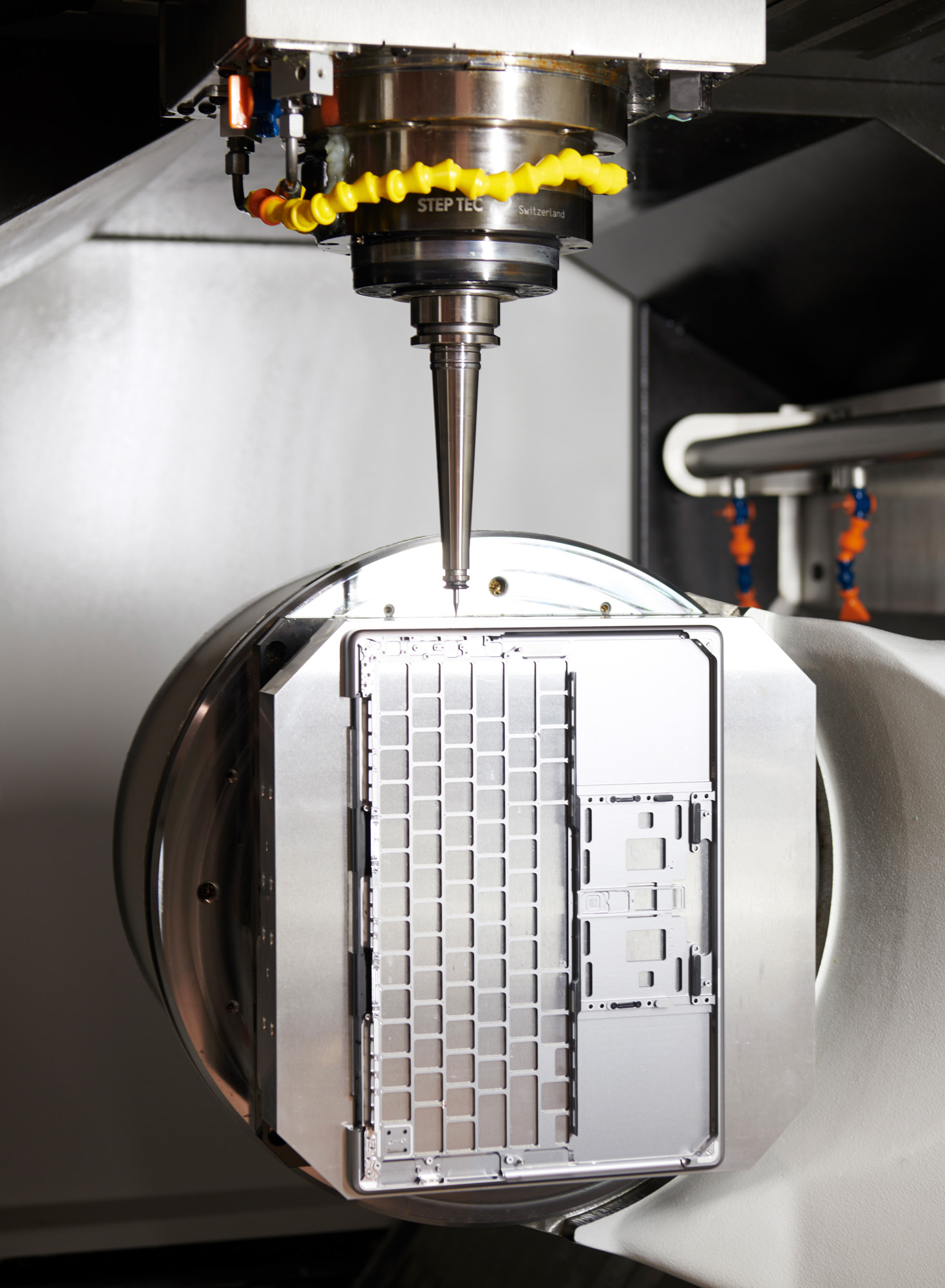
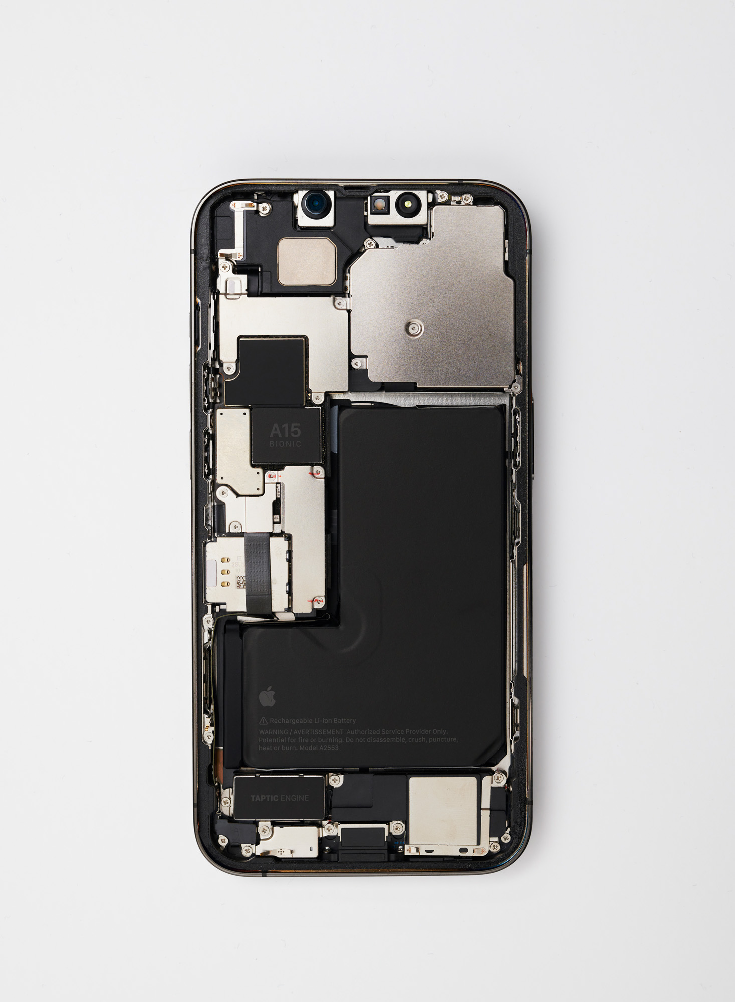
Top, machining the IO on the aluminium unibody enclosure of the new Macbook Pro. Above, interior view of an iPhone 13 Pro prototype
Just as the implementation of typography is embedded into the wider Apple ecosystem, so the company’s approach to photography illustrates the in-house attitude towards building a better tool – only here it’s a far larger canvas. As Dye points out, the iPhone is the most popular camera in the world. ‘That’s a pretty heavy thing to process,’ he admits. Used by everyone from working professionals to complete amateurs, the latest iteration of the iPhone camera and software exemplifies the cross-disciplinary approach. The iPhone 13’s camera represents a substantial upgrade, with Pro models getting a triple-lens system with a macro mode and 6x optical zoom.
Reimagining photography
As UI designer Johnnie Manzari explains, the camera now has a new portraiture mode for photos and a cinematic mode for movies. Both exploit the emotional aesthetics of shifting depth perception. ‘It feels much more human and there’s more of a connection to it, even though it’s an artefact of analogue photography,’ says Dye. ‘We did a lot of research into the history of portraiture as an art form and a craft, going back to oil painting and how they informed photographic traditions,’ Manzari says. ‘The insights we got were about the importance of the focus on the eyes, the treatment of the background and lighting. These led to the features we’ve added to the iPhone over the years, which balance these timeless principles in a way that’s accessible and more intuitive.’
The focus on photography obviously had an impact on hardware design, both in terms of how the lenses are grouped and delineated, but also the way in which the camera software evokes the incremental dials of traditional analogue equipment. All this required an immense amount of research, studying, and photographing vintage cameras, from their materials down to the typefaces and layouts on the cases. A new font, SF Camera, was created, complete with a ‘boxy’, analogue feel. The Photos app not only serves as a one-stop post-production facility but has become more sophisticated in its ability to curate and serve up specific memories, ‘a magical way to rediscover and relive’, according to human interface designer Nicole Racquel Ryan. ‘Memories can identify people and places, and package them up into this beautiful cinematic movie to play back.’ It’s immersive nostalgia, one more way in which our devices can insinuate themselves into every nook and cranny of our lives.
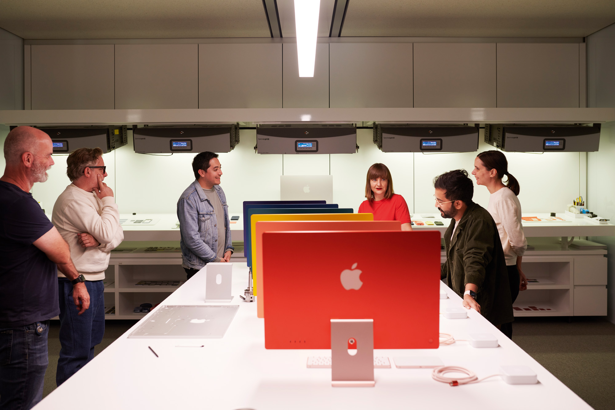
Industrial Design Team members discussing colour, alongside the new iMac
Accessibility and inclusiveness are vital components of the Design Team’s work. ‘I think the team really does understand that we can make our work so much better by partnering with and learning from experts. We’re very willing to learn, whether it’s from photographers or cinematographers, or in many other areas,’ says Dye. From working with disability groups to ensure an iPhone can be used by the visually or hearing impaired, to developing a system of emojis to accommodate all forms of representation and self-identification, the team must engage to evolve.
As the processing capability of devices increases, so does the scope of the designer. The research behind the spatial awareness system that powers the Apple AirTag involved a suite of motion capture cameras, tracking devices through space and honing the way they interacted with each. This also led to the seamless virtual ‘handshake’ between the iPhone and HomePod Mini, as the latter takes over streaming duties as you approach it.
Evolving the Apple Watch
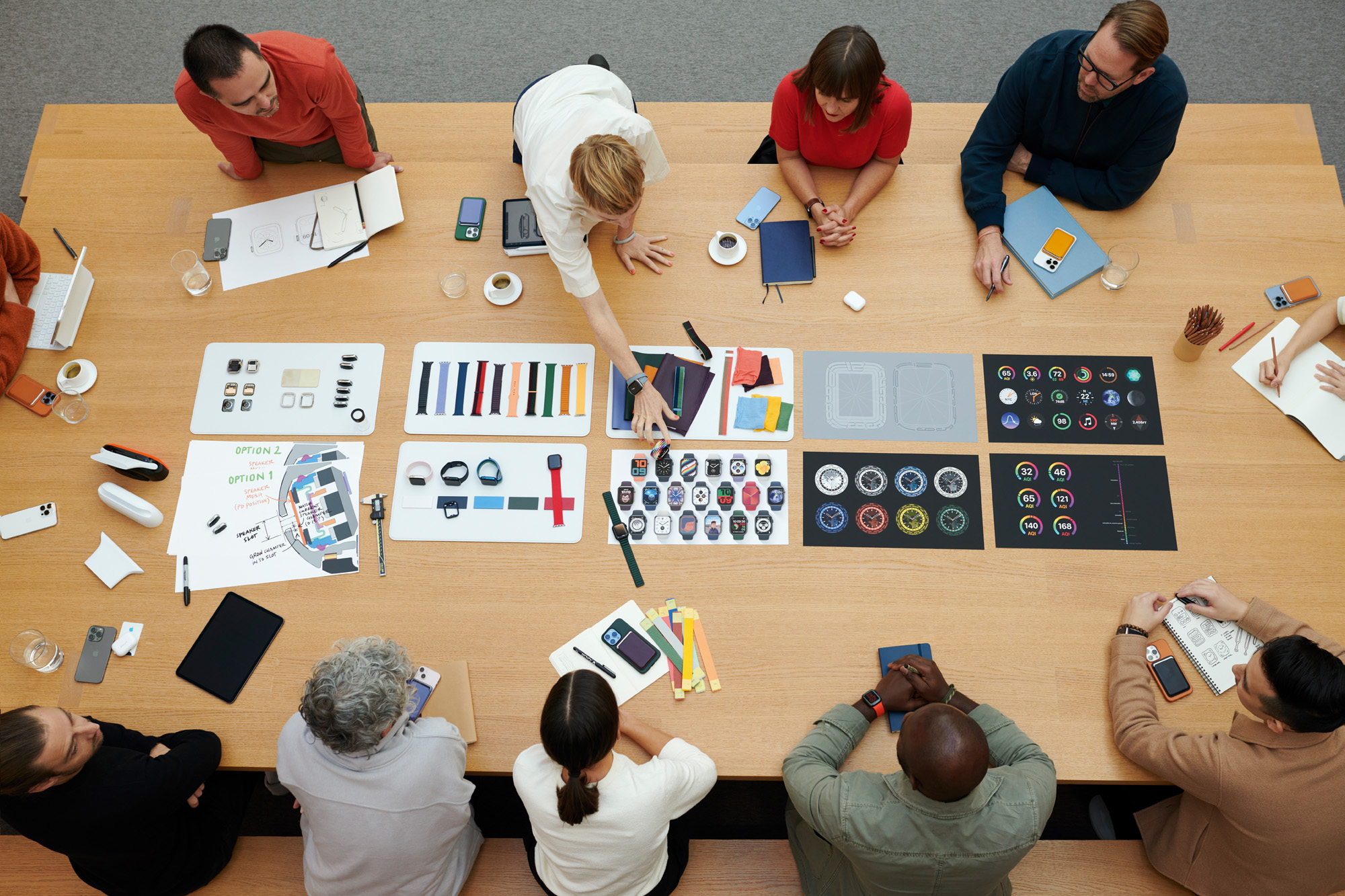
Central to the Design Studio are picnic tables where collaborative discussions take place
Technology is becoming more intimate. The infinite variety of emojis is one thing, but giving the customer choice and personality within the context of a mass-produced industrial object is quite another. This was the challenge of the Watch. ‘Apple Watch is such a great example of the work that we do collectively in the studio,’ says Hankey. The Apple Watch Series 7 increases screen size by 20 per cent to cover practically the entire face of the watch. This was clearly a design goal from the outset, but could only be achieved through iterative, incremental evolution of the product, as well as a close relationship with the engineering team. The Apple Watch also has its unique input device, the Digital Crown. ‘We wanted to merge software and hardware,’ says designer Molly Anderson. ‘The crown came from referencing the history of watches and realising we needed to have physical mechanisms and tactile inputs to make Apple Watch feel really different from the idea of an iPhone on the wrist.’
The range of faces are tailored to personal requirements, with the caveat that it is a watch, first and foremost, so the time is always visible. Likewise, the ability to swap Apple Watch bands of different materials and colours is facilitated by a consistent connecting mechanism. The Solo Loop bands are sized like shoes to ensure a comfortable, personal fit. Not only were materials specialists brought onto the team, but the company’s health and fitness division had to be established as it became clear that the device could do so much more. ‘We realised you would interact with it very differently from anything else we’ve done,’ says Hankey. ‘We knew health was always going to be one of many components of the Apple Watch ecosystem, but we had no idea how important it would become.’
Apple Park: the ultimate tool
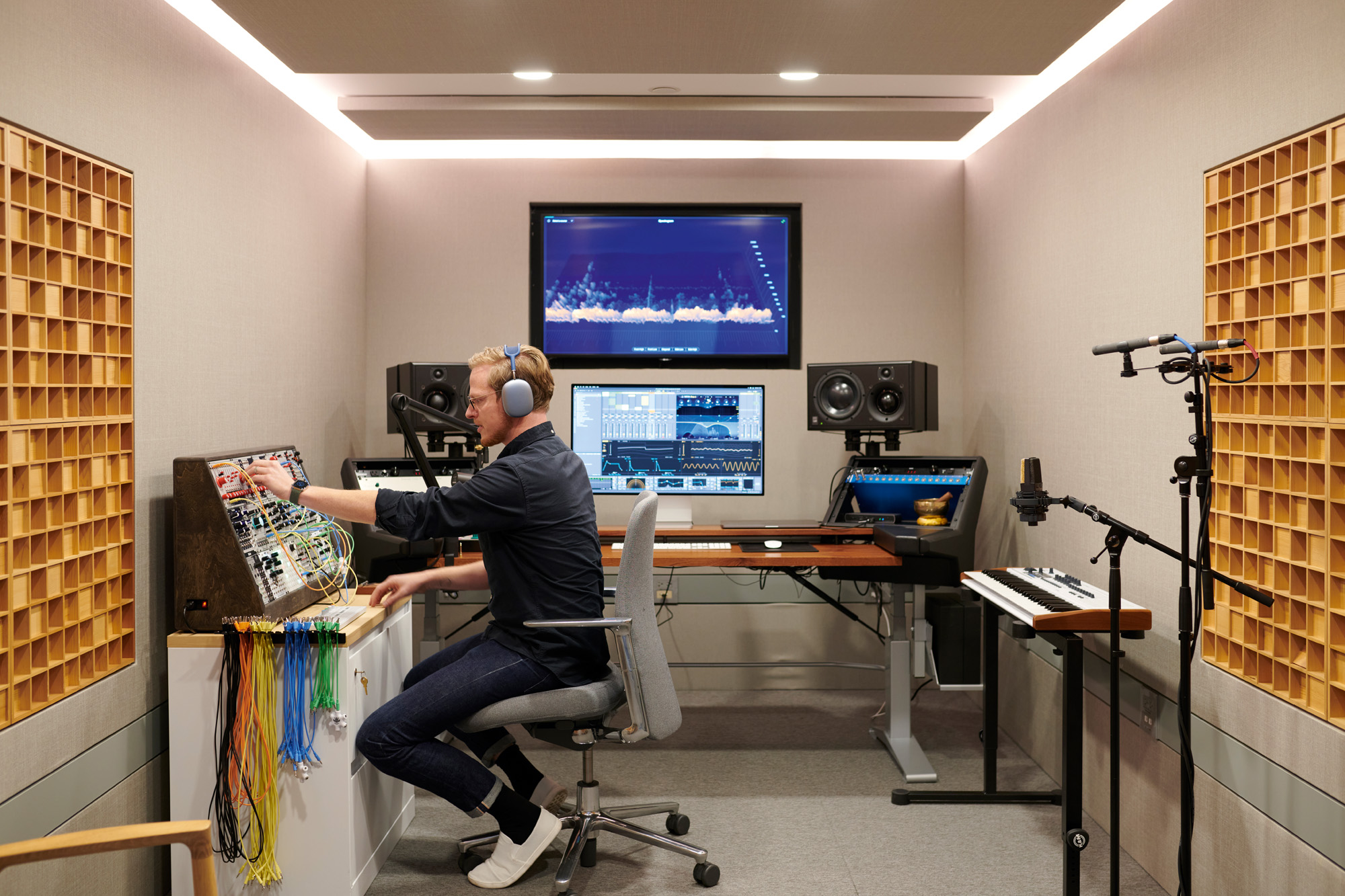
An audio designer creates custom sounds in the Design Studio sound lab
Arguably Apple put the ‘personal’ into personal computer, transforming the PC market with objects that gave back a sense of interaction with their user. Decades before we started talking to our devices, the Macintosh booted up with a happy, smiling face. This, it said, was going to be OK. For consumers, this might feel like ancient history, but for the Design Team, it was where the seeds of innovation, collaboration, and disruption were sown. ‘So much of what we value for the team and for the company, really started in the early days of design at Apple,’ says Hankey. ‘We cannot overstate how lucky we are to be at a company with such a rich and deep foundation. From the very early “think different” mantra to Steve and Jony’s collective focus on craft, care and making tools, to their reverence for the creative process, this is what still drives us.’
At the heart of it all is Apple Park. Hankey and Dye enthuse about the qualities of the space. ‘It’s been designed for serendipitous meetings as well as collaboration,’ Hankey says. ‘It’s just so quiet and calming. We never really understood what that would mean for us until we’d been here for a while.’ In Apple Park, the Apple Design Team has found the ultimate tool, a place where technology’s ever-evolving role in society is researched, dissected, developed, and designed before being transformed into physical reality.
INFORMATION
A version of this article appears in the January 2022 issue of Wallpaper* (W*273). Buy the issue now, and subscribe today
Jonathan Bell has written for Wallpaper* magazine since 1999, covering everything from architecture and transport design to books, tech and graphic design. He is now the magazine’s Transport and Technology Editor. Jonathan has written and edited 15 books, including Concept Car Design, 21st Century House, and The New Modern House. He is also the host of Wallpaper’s first podcast.
-
 The gayest love story ever told: Jeremy Atherton Lin's memoir is a tribute to home
In 'Deep House: The Gayest Love Story Ever Told', Jeremy Atherton Lin mixes memoir with a historical deep-dive into marriage equlaity
-
 This monumental Valentino book is a true Italian fashion epic
Spanning oral testimony, sketches and magazine spreads, ‘Valentino: A Grand Italian Epic’ (published by Taschen) charts the career of Valentino Garavani, whose mononymous Roman house would define a vision of Italian glamour
-
 At the Royal Academy summer show, architecture and art combine as never before
The Royal Academy summer show is about to open in London; we toured the iconic annual exhibition and spoke to its curator for architecture, Farshid Moussavi
-
 Liquid Glass, subtle AI and cross-device continuity define Apple’s new 26-branded OS
At WWDC25, Apple announced a raft of design changes, rolling out iOS 26, iPadOS 26, macOS Tahoe 26, watchOS 26, and tvOS 26 to the delight of attending developers
-
 Dyson’s new Cool CF1 fan brings quiet, compact cooling into the home
An evolution of Dyson’s quest to reinvent the humble desk fan, the Cool CF1 is enhanced and updated for a new, smarter generation
-
 The new Polaroid Flip unfolds to bring you pin-sharp instant photography
Polaroid announces the Flip, an instant camera that blends its evergreen film technology with better results and more control
-
 Could putting pen to reMarkable’s Paper Pro tablet make you more creative and less stressed?
Design Museum director Tim Marlow extols the power of ‘scribbling’, and is backed up by new research from reMarkable on the benefits of its paper tablet
-
 Clicks creates keyboard cases for iPhones – now they're also available for three Android flagships
Smartphones get a new lease of life with Clicks, which brings a Blackberry-style keyboard to today’s cutting-edge Apple and Android devices
-
 The OM System OM-3 camera blends heritage design with cutting-edge technology
The OM-3 from OM System is the newest must-have mirrorless camera design, classically styled and comprehensively equipped to create the ultimate contemporary digital camera
-
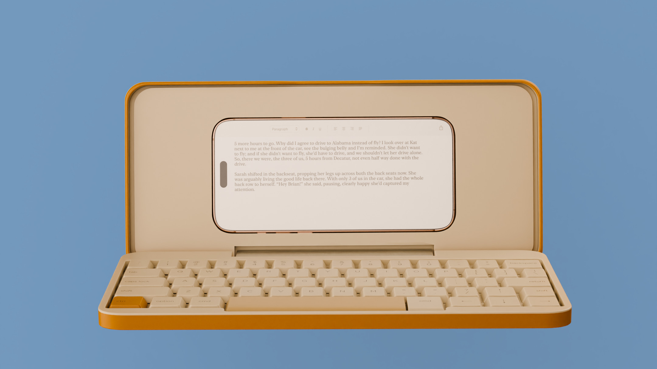 Type without the tyranny of distractions: eight new ways to get the words out
Looking for a way to divert you from doom-scrolling? This selection of eight distraction-free typing devices will keep you offline and away from the socials to help you meet that deadline
-
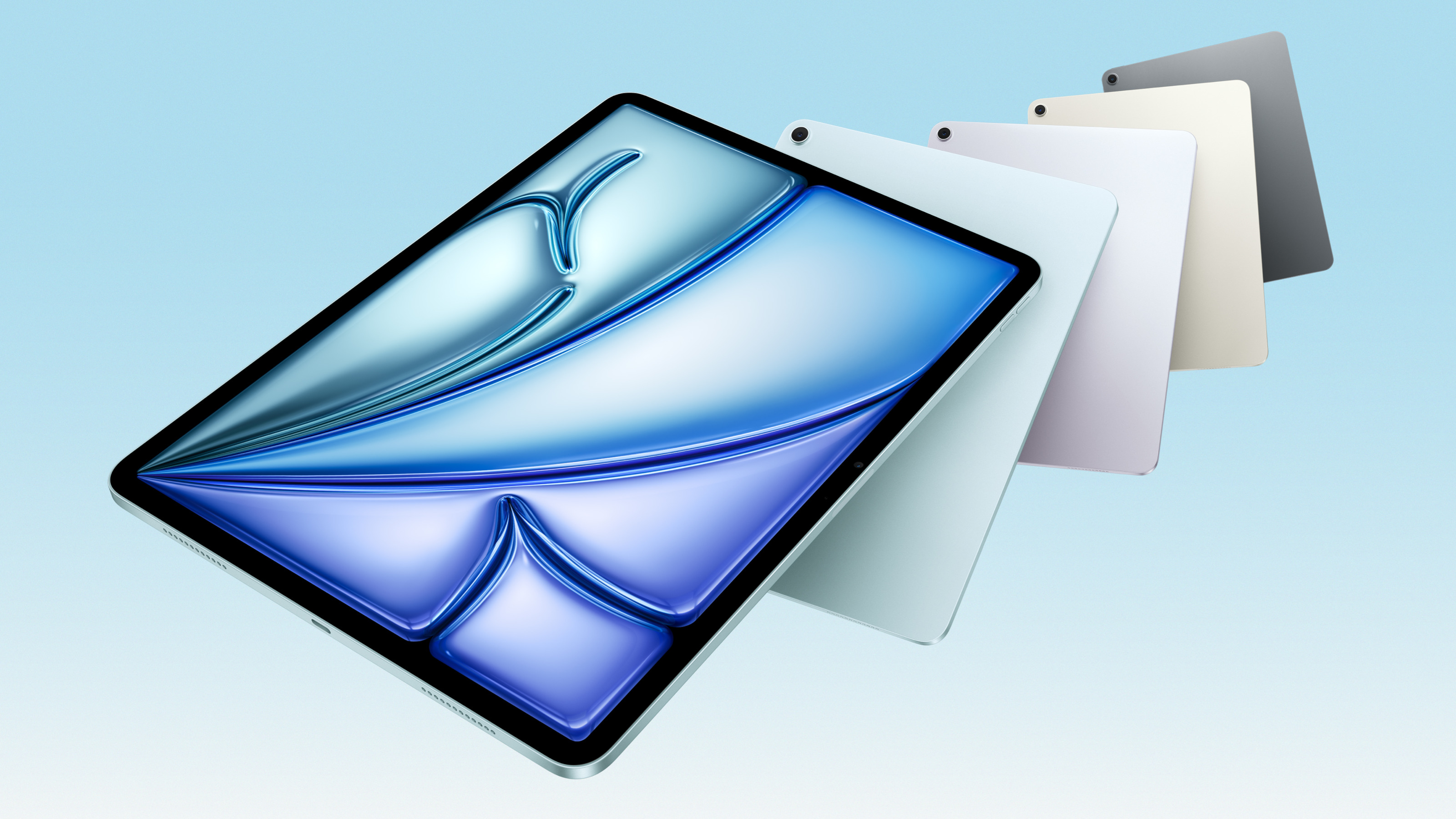 Apple updates the iPad Air with new silicon, new intelligence and new colours
Meet the new M3-powered Apple iPad Air, a compact multimedia tablet built for graphics and AI and capable of outclassing many laptops