Apple reinvents the pencil: in conversation with Sir Jony Ive
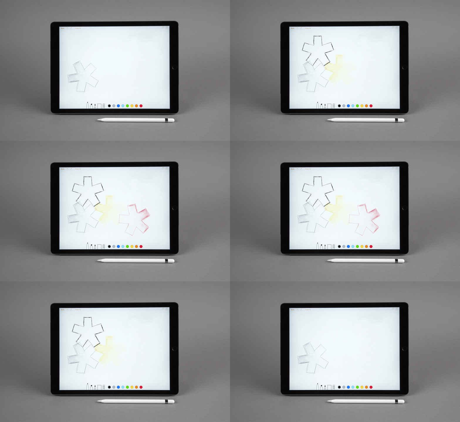
Sir Jony Ive was in London last week and was keen to catch up. There was something he wanted to show me, as he was pretty sure it was right up my street. The Apple Pencil. Yes – a pencil. Could we meet at a favourite haunt – Claridge’s, Mayfair? It sounded perfect. But as fate would have it, I was in San Francisco – an Uber ride away from Ive and Apple’s HQ in Cupertino, California while he was a mere black taxi fare away from Wallpaper* HQ on the River Thames. We had to settle for a trans-Atlantic chat, via iPhone 6s, on Monday 4:30pm GMT, 8:30am… Apple time.
Tony Chambers: I had a great demonstration this morning of the iPad Pro, and more importantly for me, the Pencil. It’s the thing that I do miss when working with screens. Is this something that’s been on your mind for some time, that perhaps we still need this funny little oblong to make things complete?
Sir Jony Ive: It’s a curious thing. It was fundamentally important originally not to develop a user interface that required another instrument. It was important that we develop the UI based upon multi-touch, based on our fingers. The reasons are obvious. I think it is equally obvious that you’re just not as dexterous as you are with a pen or a pencil for certain things.
What we found is that there’s clearly a group of people that would value an instrument that would enable them to paint or draw in ways that you just can’t with your finger. And I suspect that this isn’t a small group of people. I don’t think it’s confined to those of us who went to art school.
Often, when we develop a product in the hope of solving a specific problem, we end up having to try to solve multiple problems not confined to a single area. This is a classic case. This was a problem that wouldn’t be solved by just developing the very sophisticated technology that eventually became the Apple Pencil. We had to develop new technologies for the actual iPad Pro too.
You saw just how low the latency was, how quickly we can draw and how quickly we can render video. There was some substantial, deep technology to develop to make the pencil work as intuitively and naturally as hopefully you saw.
That was the thing that really, genuinely impressed and warmed me the most. It felt so close to the experience of using a traditional pencil. Is that why you used the word ‘Pencil’ rather than ‘Pen’ or stylus? Is it because the sensation is more HB than ballpoint?
I like the name Pencil much more than stylus because stylus seems a product that’s about technology. Pencil, to me, seems very analogue in its association. But what is challenging is that it will become many things. There’s an incredible painting app and very powerful drawing apps. For some people it will be a graphic instrument and to others it will be a fountain pen. One of the technologies within the Pencil means that as well as detecting pressure, we are also detecting the angle of the pencil. All of which is particularly relevant for being able to create a very natural experience. As an object it needed to be relatively neutral as it can take on the identity of a pencil or ink pen or paintbrush or charcoal...
A pencil drawing suggests sketching as well, which is something that’s important. You use a pencil when you are sketching ideas, when you are thinking. There is an impermanence too, which I suppose relates to the advantages of this – that you can erase. It’s also an emotive thing. I always feel that the marriage of technology and the hand is the future, and this is the closest I’ve come to experiencing it. It’s an authentic and honest marrying of the two worlds. Would you agree with that?
Yes, and not surprisingly we had a great deal of analysis to do of our traditional experience of the analogue world to begin to understand the problem. Before we even got into thinking about how we could create a natural experience, it took a long time to really understand the fundamentals that were at play, that ultimately define your experience of writing or drawing naturally with a pencil. And I think that process feels to me like a very good discipline for technology groups to understand, because that process leads you to observe the tiniest details in terms of what we do and how we do it, and why we do it.
I think this is certainly one of those occasions where at the end of this design and product development exercise, it really did yield two things. One was the Apple Pencil. But the other was a more significant understanding of how we do everyday things. We’ve learned a lot, which is actually useful beyond this project.
Yes, learning, relearning how you do everyday things, is a good discipline sometimes – or just thinking about it.
I think it really is. We do this a lot when we are working on things like the trackpad or new keyboard on the MacBook. To develop those sorts of devices requires an incredible amount of observation and measurement and it means that you need to ask the right questions and know what to focus on. This is part of the value of being a design team that’s been together for many years. We’ve been working on these problems for 20-plus years, so it’s an interesting area. And I think we are gaining experience, we are learning.
- Inside Apple Park: first look at the design team shaping the future of tech
The ability to continually evolve is something that the company is renowned for, but this is quite a big step – and it’s a brave step. To have the confidence to do something that is perhaps not what one would expect. Having the confidence to say, 'hang on a minute, maybe we do need this extra tool'. Perhaps this seemingly ancient tool will be, with the right skill and technology behind it – and the right designers using it –a positive addition. Because there’s bound to be some criticism that it’s anachronistic, or it’s something that Apple said they’d never do. I think a ‘stylus’ does seem wrong, yet the Apple Pencil seems so right.
I think there’s a potential to confuse the role of the Pencil with the role of your finger in iOS, and I actually think it’s very clear the Pencil is for making marks, and the finger is a fundamental point of interface for everything within the operating system. And those are two very different activities with two very different goals.
So we are very clear in our own minds that this will absolutely not replace the finger as a point of interface. But it is, and I don’t think anybody would argue, a far better tool than your finger when your focus becomes exclusively making marks. The traditional pencil could have been replaced by a dish of powdered charcoal, which you dipped your finger into to make marks with. And that didn’t happen.
This is core to good design. It’s adding or changing something to make it better, so it’s not just a thing that does another job in a different way. It’s actually adding something to the whole repertoire of what you have. It’s mark making, whether that be a drawing or painting or making notes. I think it will be a great addition to proofreading, for our kind of business, for instance – just scribbling over things.
I was excited that you got to see it, and I thought you would like it.
You have young children. Did their pen-to-paper, finger-to-screen interaction prove useful during the development of the Apple Pencil?
So far, anecdotally – you know we don’t do focus groups – but anecdotally, certainly from what I’ve seen, with my children and friends’ children, they are captivated. And they don’t for one second see them (multi-touch and Pencil) as mutually exclusive directions of technologies. It’s quite refreshing actually.
They embrace both. It is extraordinary. Children will just pick up an iPhone or iPad, and they know what to do. Flick flick flick. But likewise, they are still using pens and pencils and they love reading books. There’s no problem, they don’t see any kind of dichotomy there, they just get on with stuff…
I really like that. I really like how simple that is. I think a lot of these objects live very happily together and are very complimentary alongside each other.
And it’s $99! A beautiful piece of Jony Ive Apple kit in your pocket for less than a hundred dollars. Is that something that was in your mind? Or is it a more a natural consequence of Apple’s ‘do things well and people will like it’ policy?
I think you’re right. It was a consequence of trying to make the very best thing we can. And I think it is surprising how sophisticated the technology and the sensors in the Pencil actually needed to be. When we started, we didn’t think that it would need to be quite so powerful and sophisticated as a product. Certainly that’s not something that’s communicated in its design.
No, it looks the simplest and most basic, primitive oblong. But there is a lot going on inside there, I presume, to make it work as well as it does.
There certainly is. And one thing that I was excited about is the ease of charging. If you are in the middle of drawing something, you can easily just plug it into the iPad Pro and it recharges extremely fast. Just that alone, having the very fast recharge, was an important attribute so that you could work with confidence and not feel that you would have to manage a number of battery lives. I think you relax knowing whatever happens, you can very quickly recharge it.
Fifteen seconds for 30 minutes, I think? Which is fantastic. Then again the charger on the Apple Watch is beautiful. It’s a pleasure to charge the watch at night – that gorgeous sculptural disc with the satisfying magnetic connection.
It is an area we are working really hard on.
Was there a particular pencil in the back of your mind that you had? To me it feels a little like a chinagraph – used for marking up transparencies – just in terms of the width and it being white. Did you use a chinagraph?
I have done but we didn’t want to be overly specific because it will assume the identity of so many different instruments. So I think one of the challenges we often have – and is actually one of the powers of the products we make – is that they have multiple functions. If you’re too specific in your references, I think you can do a disservice to the breadth of capability that the product has, if that makes sense. We wanted it to be developed as very much an analogue tool, but not so specific that it couldn’t comfortably represent a metallic ink pen or a paintbrush.
And at college were you a Caran d’Ache man, or Faber-Castell, or Rotring? Do you have any favourites?
I used to use Rotring for drafting. It’s so long ago I can’t remember what pencils I used – I would guess whatever was handy.
And when you draw now, are you a 4H, or a 4B, or an HB in the middle?
Actually, you know I have been drawing a lot recently with the Hermès pen, the ink pen that Marc (Newson) designed. I really enjoy drawing with that and it comes with a range of different nib thicknesses. I am drawing with just the finest nib.
And you still start a design with a sketch or a scribble?
Yes, we all do. The whole team use sketchbooks. I think it’s a mixture of drawing either by yourself or when you’re with people flitting between conversation and drawing.
Sometimes scribbling things out and sketching is part of communicating isn’t it? It helps the conversation and aids the thought process. I find that I need to have a pen in my hand if I’m even reading, certainly when reading a proof. There’s something about the finger, to pen/pencil, to the brain, that feels inherent. It seems very natural.
I completely agree. I don’t see it as being a disconnected part of the design process, but I think in communicating ideas you’re moving very seamlessly, between words and drawing. And I think often, marks would be fairly abstract if you didn’t have the words that accompanied them. So I think sometimes, when we look in our sketchbooks, there are literal drawings of what we are working on, and there can be pages and pages of what are quite abstract details, or marks that are augmented by conversation. I think it’s all part of the process.
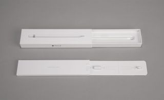
Highly responsive sensors in the Pencil’s tip allow for perfect precision when used in conjunction with the iPad Pro – Apple even provides a spare nib, for endless creativity.
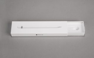
The sleek design of the Pencil veers away from the usual ’office stationary’ appearance of digital drawing tools – imbuing a banal object with Apple’s trademark intuitive design and elegant aesthetic, which is also seen in their emblematic packaging.
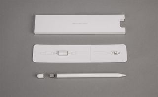
Removing the Pencil’s cap reveals the Lightning connector charging mechanism. Fifteen seconds of charge equates to 30 minutes of battery life – while a full charge equates to 12 hours’ worth of use.
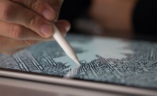
A seemingly simple case holds an intricate and accurate set of pressure sensors within, capable of measuring a range of forces and allowing users to draw lines of any weight by a simple application of pressure. Two tilt sensors built into the tip of the Pencil calculate the orientation and angle of your hand, making shading effects – like you would expect from charcoal or a conventional pencil – possible
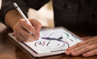
The Pencil is designed to replicate the tactile experience of using a drawing implement as accurately as possible. True to its digital core – and as you’d expect from Apple – the tool can replicate anything from a pen, pencil or paintbrush, to a fountain pen or felt tip
The London-based illustrator Patrick Vale – known for kinetic, intricate drawings of social and urban scenes – was drafted in by Apple to demonstrate the raw creative potential of the Apple Pencil, as seen in the video above
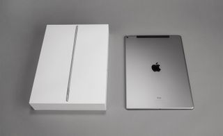
The Pencil is Apple’s first tablet tool of this kind – the perfect companion accessory to the supersized iPad Pro, pictured.
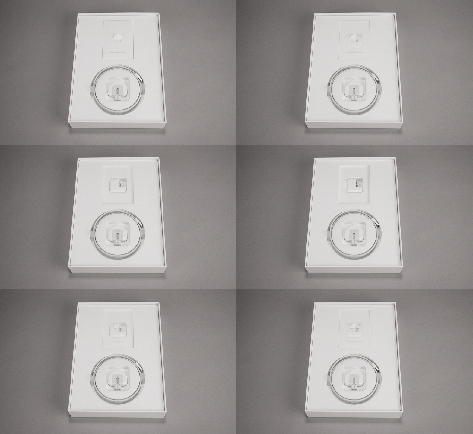
As with all Apple products, the packaging stands leagues ahead of the competition in its spare, sophisticated design.
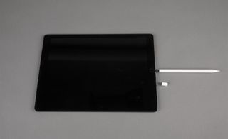
The Apple Pencil is specifically designed to work with the iPad Pro – itself a superlative piece of design technology that pushes the creative possibilities of the iPad series even further. Pictured: the Pencil’s simple charging mechanism.
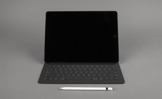
Another first for Apple is the introduction of the iPad Pro’s Smart Keyboard. An ultra-thin and refined keypad has allowed the Keyboard’s creators to seamlessly integrate it into a conventional iPad cover and stand. Connected through a single magnetic strip and powered by a unique conductive material, the keyboard remarkably eschews USB or Bluetooth for immediate functionality – further streamlining an already minimalist design.
INFORMATION
Apple Pencil for iPad Pro, £79. For more information, visit Apple's website
Wallpaper* Newsletter
Receive our daily digest of inspiration, escapism and design stories from around the world direct to your inbox.
-
 This nostalgic exhibition dives into a century of British surfing
Cornwall's National Maritime Museum charts the history of waveriding on England's south coast
By Tianna Williams Published
-
 Waiheke Island is a must-visit for oenophiles and aesthetes alike
Discover what to do during this New Zealand destination's annual Walking Festival and beyond
By Jessica-Belle Greer Published
-
 Bold colours and tactile textures: inside Bottega Veneta's second fine jewellery drop
The collection is composed of two parts: Enlaced and Alchemy
By Hannah Silver Published
-
 Apple updates the iPad Air with new silicon, new intelligence and new colours
Meet the new M3-powered Apple iPad Air, a compact multimedia tablet built for graphics and AI and capable of outclassing many laptops
By Jonathan Bell Published
-
 Apple is rumoured to be releasing a foldable iPhone. How should it stand out from the crowd?
The new model is forecast for 2026, but Apple’s competitors have already entered the foldable phone market. Is the tech megabrand late to the party, or can we expect something special from its contribution?
By Anna Solomon Published
-
 Year in review: top 10 gadgets and tech of 2024, as chosen by technology editor Jonathan Bell
The very best of 2024’s gadget and technology launches and stories, from emerging AI to retro gaming, laser projectors and musician’s side projects
By Jonathan Bell Published
-
 Apple’s new Mac mini is a pocket-sized powerhouse thanks to the M4 processor
With the new Mac mini, Apple has squeezed its M4 and M4 Pro processors into the smallest conceivable footprint, physically and environmentally. Apple insiders tell us how
By Jonathan Bell Published
-
 Apple’s Alan Dye and Molly Anderson discuss the design of Apple Watch Series 10
In addition to the Apple Watch Series 10, Apple has also introduced a new black titanium finish for the premium Apple Watch Ultra 2; here’s what’s new
By Nick Compton Published
-
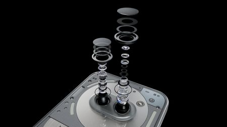 Nothing explodes its mid-range masterpiece to create the Nothing Phone (2a) Plus
We get our hands on the new Nothing Phone (2a) Plus, an upgraded and enhanced smartphone that promises a better photographic experience, smarter software and more
By Jonathan Bell Published
-
 Watch Steve Jobs give a keynote at the 1983 International Design Conference in Aspen
The latest publication from The Steve Jobs Archive captures Apple’s co-founder giving a typically iconoclastic performance to a 1980s audience of design
By Jonathan Bell Published
-
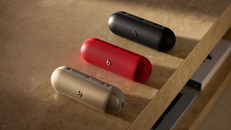 The new Beats Pill: exclusive interview with Apple’s Oliver Schusser
Oliver Schusser, an Apple Vice-President, is in town to talk Pills, thrills and heartaches. We sat down to explore the Beats portable music strategy
By Craig McLean Published