Artist David Shrigley turns Sketch's Gallery restaurant into a work of art
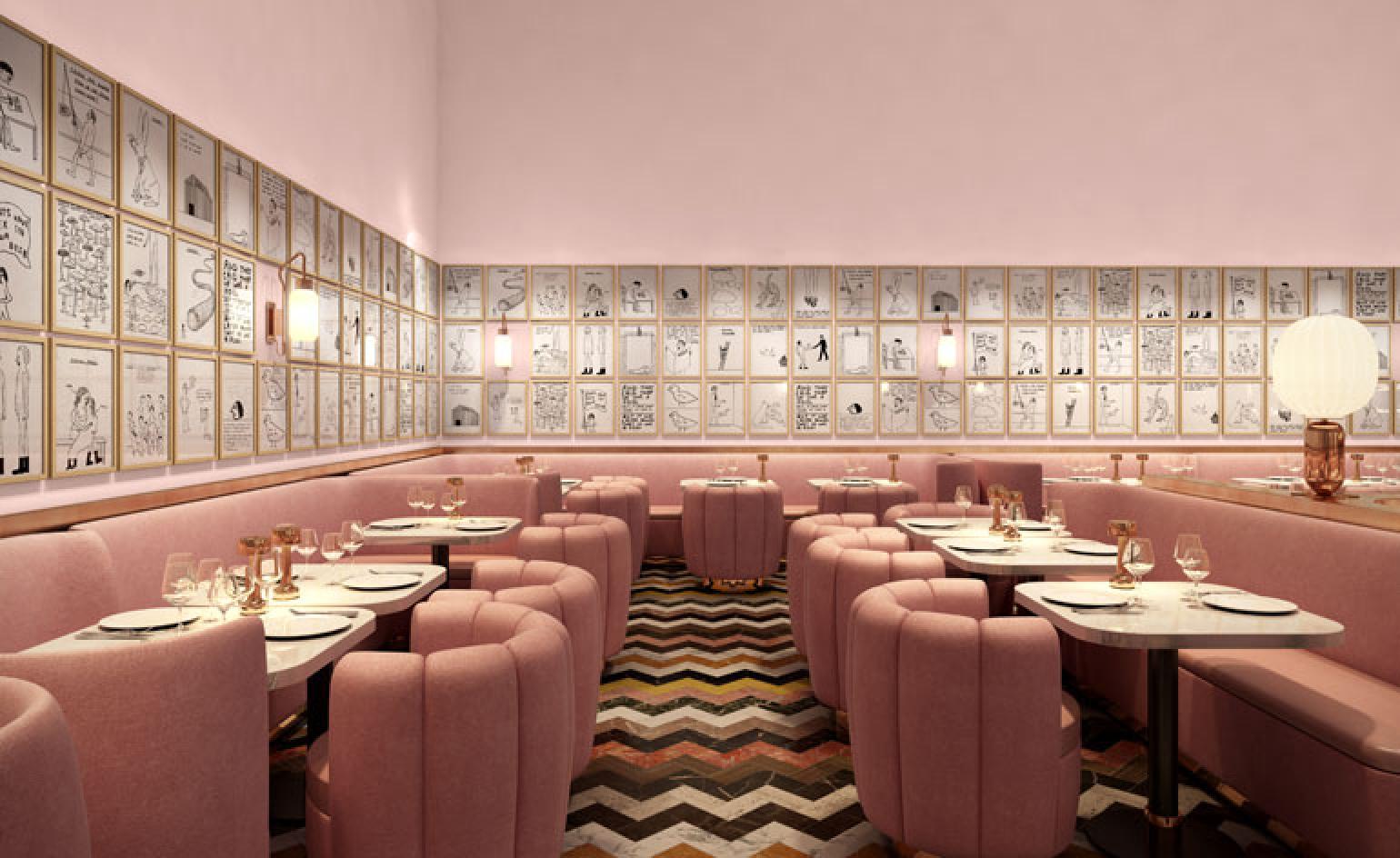
For the last two years, diners at the Gallery restaurant at Mourad Mazouz's London favourite Sketch have enjoyed the Martin Creed experience; the artist was given creative rule of the dining rooms, bar the menu. The room opens to the public today, though transformed and densely decorated with 245 drawings by David Shrigley, known for his darkly comic and absurd 'cartoons'. It's the largest presentation of new works by the Glasgow-based artist to date.
Shrigley, working with Stoke-on-Trent based ceramicists Caverswall, has also created a 22-piece tableware set. Available to buy, the set is based on Shrigley's wobbly pinched clay models and features drawings, doodles and sometimes disorienting tags. A condiment set is marked 'Dust' and 'Dirt' for example with a surprise third piece labeled 'Nothing' and entirely empty.
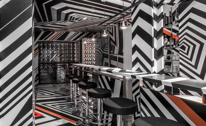
See other spaces conceived by artists as Gusamtkunstwerke (total works of art)
The interior of the Gallery restaurant meanwhile has been conceived by India Mahdavi, with Shrigley largely leaving the designer to her own devices. 'It wasn't a collaborative process,' says Mahdavi. 'David showed me some of the ceramics and all he really said was that he wanted to the tables to be white as a canvas for the tableware.' The pair also decided they wanted to re-establish some order in the dining room. 'Sketch has a lot of rooms and they are all quite busy,' says Mahdavi. 'And the previous installation in the room was quite chaotic. I wanted to create something that was more ordered but was also a very happy, bourgeois Hollywood environment.'
To that end Mahdavi has created copper gilded banquettes and splashed the walls with pink. 'I was talking to Andre Balazs about it and he described it as very Beverly Hills, a bit of Beverly Hills in Mayfair. But I think of it as a feminine brasserie, a contemporary take on the brasserie.'
Chef Pierre Gagnaire has created a new menu to complement the new interior and there are also new uniforms for the staff designed by Richard Nicoll; T-shirt dresses for the girls and grey boiler-suits for the boys.
We chat with David Shrigley about Sketch and his 'oblique mordant' humour...
W*: You haven't just drawn on the wall of the restaurant then?
David Shrigley: No, they are just framed drawings because that was easier. And they are all A3.
And there are 245 drawings?
Yeah, it was supposed to be 239 but we had to add six. We needed to fill a gap basically.
Are drawings all based around single ideas or are you constantly reworking the same idea?
I tend not to try the same idea twice. And I don't redraw anything. But I do visit the same idea over time. That is partly because I have a bad memory I think. And then I think, ooh, am I copying something from someone else and then I realize that I am actually copying myself.
I made these drawings over a really condensed period of time and there is definitely a sort of uniformity to them. There are a few about food and belching and things like that. There is not really a uniform message though, apart from my usual oblique mordant humour. People go to a gallery and are willing and perhaps expecting to be upset or challenged or disturbed. But they don't go to a restaurant for that. No and this is definitely an intervention in a restaurant rather than a restaurant in a gallery.
How does that affect the way that you work then, how you think about the work?
I guess its just responding to the context. And thinking about how people are going to respond to it. Take the milk jug on the table. The milk jug has a message on it. But if the milk jug is the wrong way round, you don't see it.
You don't want to drag people into this totally immersive experience?
It's sort of ambient. It's avoidable. I mean the plate has a design around it but even that I designed after talking to the chef. And he said he didn't want anything in the middle of the plate because that would negate any food design. I was keen that it wasn't fighting against other aspects of the dining experience. It's just adding something else. And it's a collaborative thing. I mean with the plates, my work only really makes sense with the chef's work. Without the food, my plate doesn't really make sense.
Had you been to Sketch much before the commission?
Well, I live in Glasgow so not really. But I know Martin Creed pretty well and I knew what he had done here. And apparently, I can come here as often as I want now, I have a free tab. I might avail myself of that.
So you didn't work with India Mahdavi on the furniture. But was that ever an option?
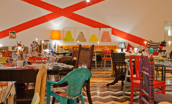
We had a meeting or two. And she basically said 'what do you want?'. I said I wanted something that was quite comfortable and clean and I wanted a white tabletop to show off the ceramics. The last incarnation of the restaurant, Martin Creed's design, was deliberately difficult to be in. It was a great piece but every table was different, every chair was different. It was supposed to be that every plate was different but they couldn't quite do that.
I wanted something that was really comfortable and uniform this time. The only brief for the project was that it functions as a restaurant. And you don't necessarily have to acknowledge the artwork; it doesn't get in the way. And to be honest, this project could have taken years and I could have got involved with all the different aspects of what goes on in the space. As it is I have just added the graphic elements. And it is probably better for that.
But you did want to work on the ceramics?
Yeah, I have made ceramics before, even a couple of things that were functional. The interesting thing for me was to make an actual dinner service that's functional, that will be used. And will have food on it.
The plate has a map and I was interested in how the food is a representation of the place in which it is served. But there are lots of graphic things like that. I made an extra piece for the condiment set with 'Nothing' on it so you are putting nothing on your food. The others are marked 'Dust' and 'Dirt'.
You went down to Caverswall in Stoke-on-Trent a few times?
Yeah, I know a lot more about how to produce a tableware set now.
And what was the process, in terms of them producing your designs?
I made a model in clay for all the pieces - there are 22 of them - and they were cast from that. We did have a lot of trouble getting one of the milk jugs to pour. But they add all the things that make them work properly.
Were they quite up for the challenge of the project?
Well, like most people these days, they will do anything if you pay them. But you learn pretty quickly that it's probably wise not to talk too much about conceptual art with them. You just say 'I want it like this'. Why you want it like this is neither here nor there. But they were really nice and they were really up for it.
It's such a long process and it's so tedious that I'm absolutely sick of the tableware now to be honest. There were just so many elements to get right. But I am pleased with them. And the original idea was a good one.
And the tableware sets are for sale?
Yeah, and the proceeds go to charity. But it is really about encouraging people not to steal them from the restaurants. This definitely isn't product design for me though. This is an artwork for a very specific context. It is a sort of public artwork for me. It is really about objects and how we use them, it's not good design. So it's a milk jug but it's also my idea of what a milk jug is. This is sort of pretend design.
You didn't have anything to do with the menu?
No, but apparently Pierre, the head chef had made a dish in my honour. He did ask me what I liked.
Do you eat out a lot?
Yeah, I like eating out but I'm not a massive foodie sort of dude. I do go to Copenhagen a lot and I have done a lot of work with (Noma founder) René Redzepi. I make a print for his more treasured of his staff when they leave. And I've been in San Francisco quite a lot over the last couple of years and they are all foodies there.
Is it important for you to show work outside of the gallery space, to make work to be shown outside of the gallery space?
Well, if you don't you might run out of things to make art about. And it really makes you think about where your art ends and the world begins.
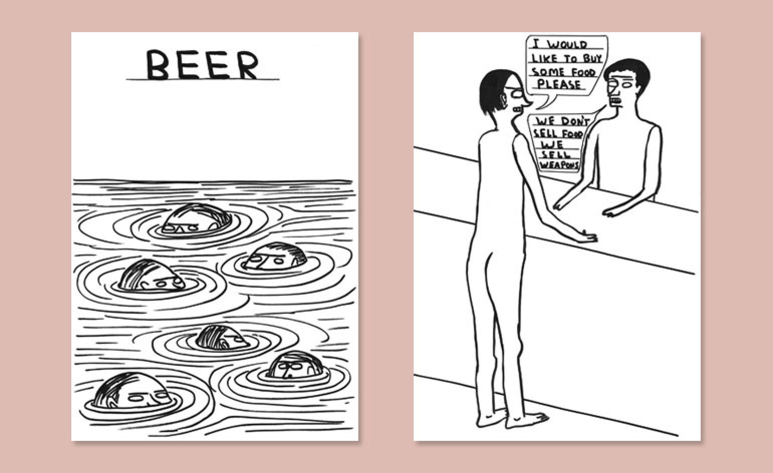
'I made these drawings over a really condensed period of time and there is definitely a sort of uniformity to them,' says the Glasgow-based artist. 'There are a few about food and belching and things like that. There is not really a uniform message though, apart from my usual oblique mordant humour'
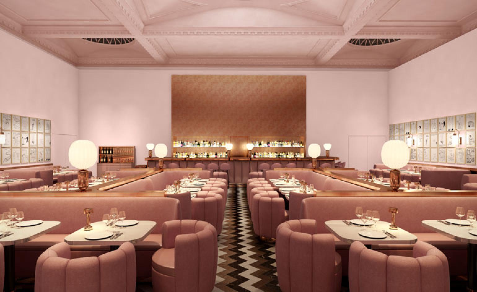
Shrigley enlisted India Mahdavi to redesign the interiors of the restaurant. The pair decided they wanted to re-establish some order in the dining room. 'Sketch has a lot of rooms and they are all quite busy,' says Mahdavi. 'And the previous installation in the room was quite chaotic. I wanted to create something that was more ordered but was also a very happy, bourgeois Hollywood environment'
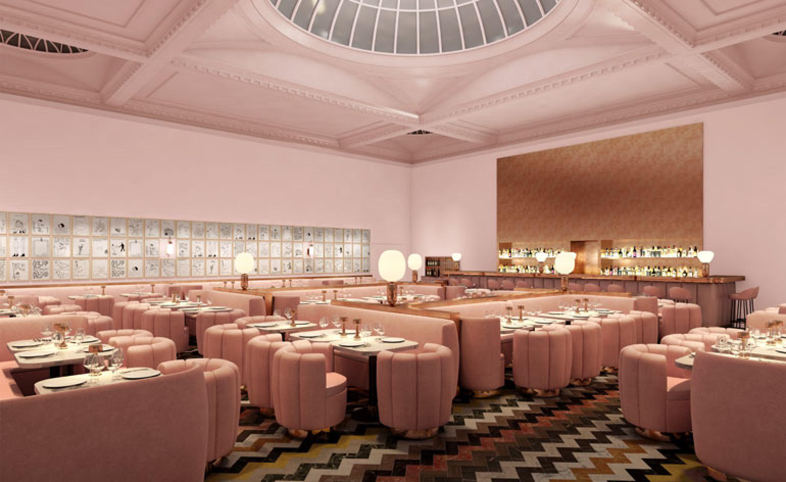
To that end Mahdavi has splashed the walls with pink and brought in pink banquettes, as well as copper lighting and surfaces. The marble flooring is left over from the restaurant's previous redesign by artist Martin Creed
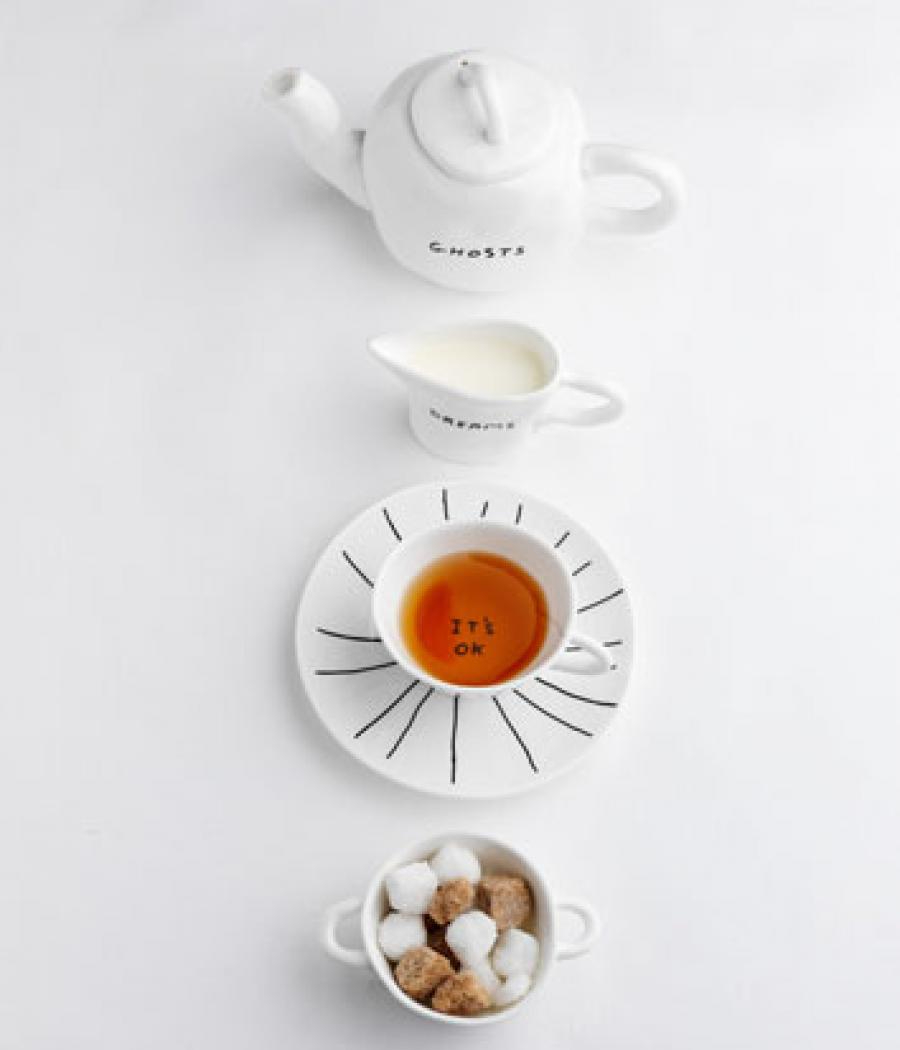
Shrigley worked with Stoke-on-Trent based ceramicists Caverswall to create a 22-piece tableware set for the restaurant, which is available to buy. It is based on Shrigley's wobbly pinched clay models and features drawings, doodles and sometimes disorienting tags
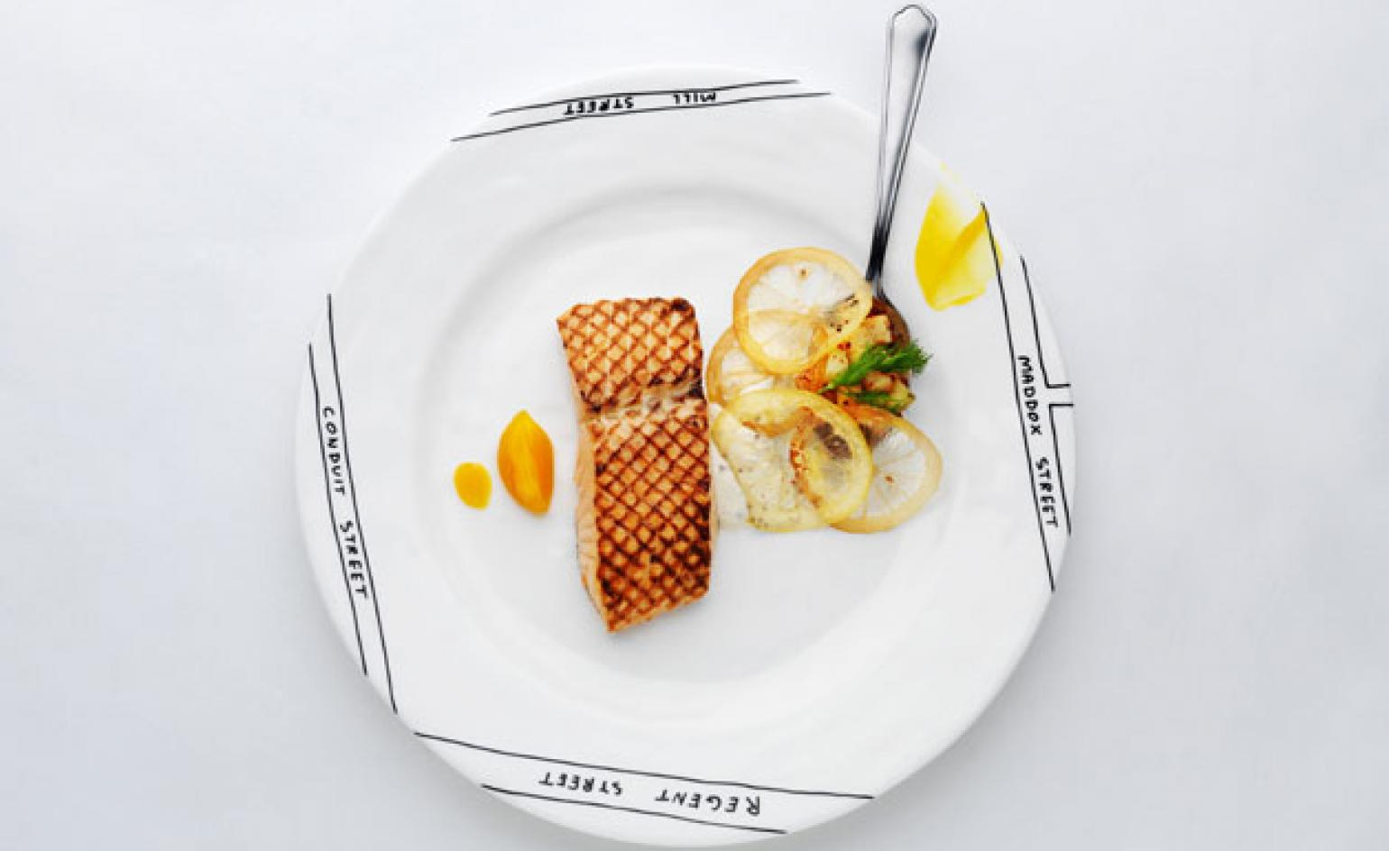
Chef Pierre Gagnaire has created a new menu to complement the new interior. One of the main courses includes grilled organic salmon, perfumed with pink berries, bouquet of leek, shrimp and smoked salmon, and Chablis Dijon-mustard coated new potatoes with dill
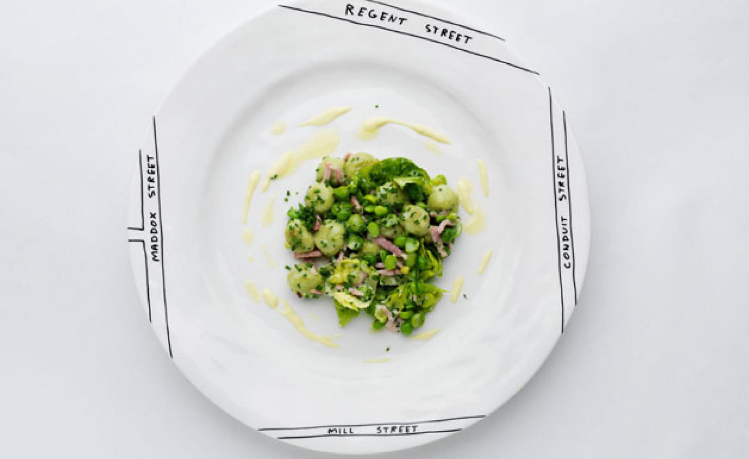
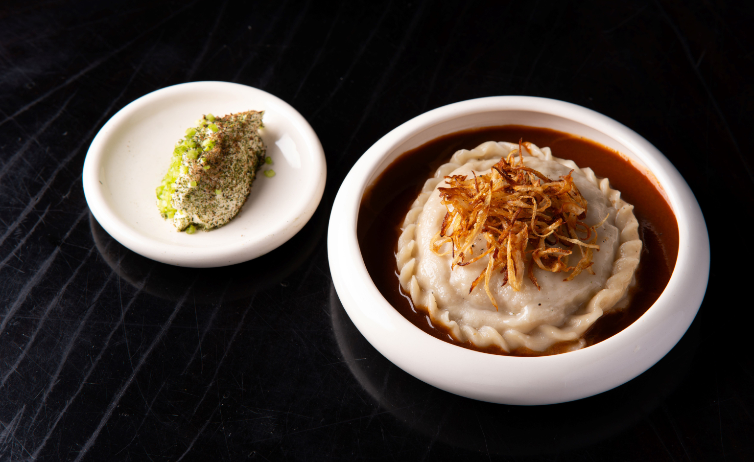
A side order of garden pea gnocchi
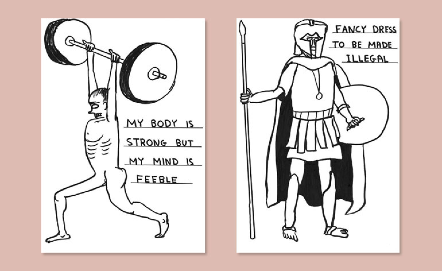
The Gallery restaurant offers the largest presentation of new works by the Glasgow-based artist to date
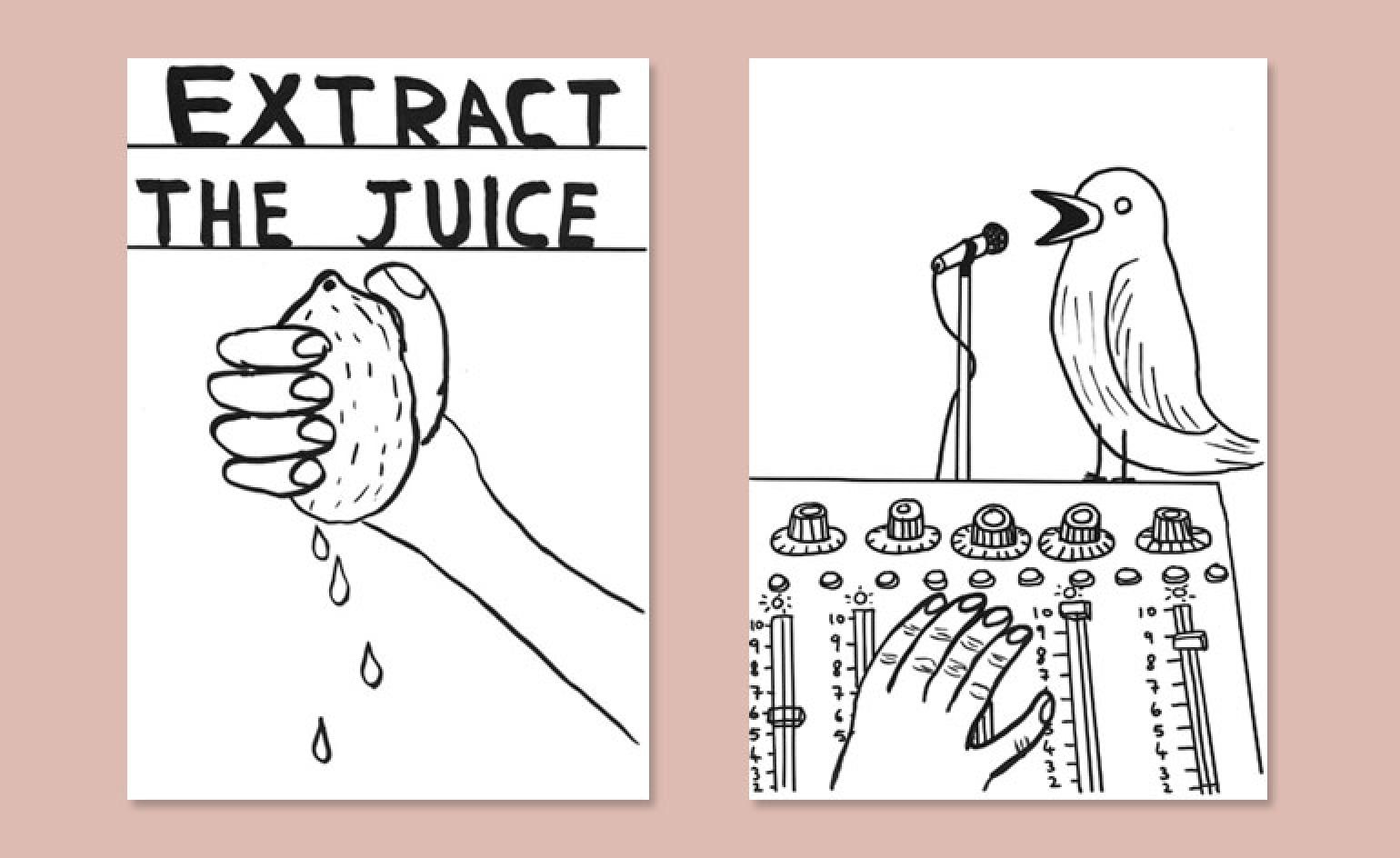
Asked about showing his work in a restaurant context, Shrigley says: 'It really makes you think about where your art ends and the world begins'
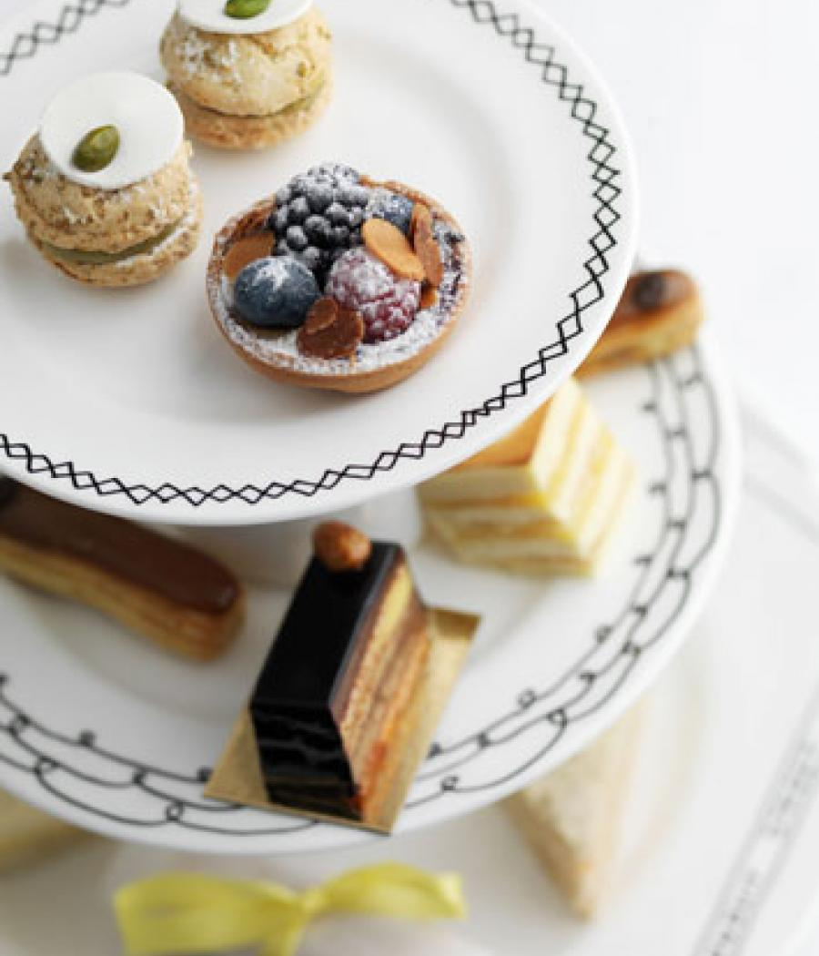
Proceeds from the tableware will go to charity
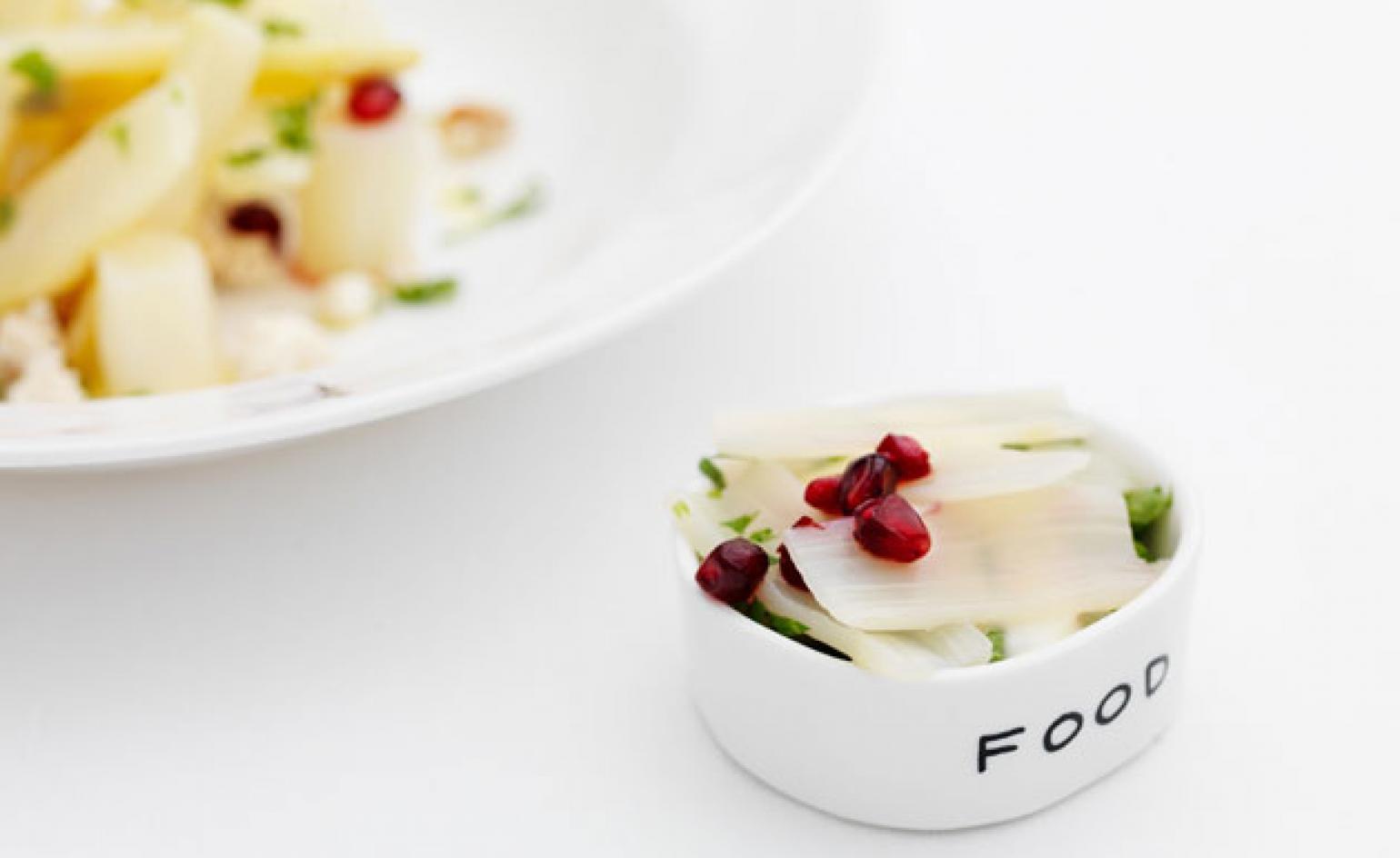
'The interesting thing for me was to make an actual dinner service that's functional, that will be used. And will have food on it,' says the artist
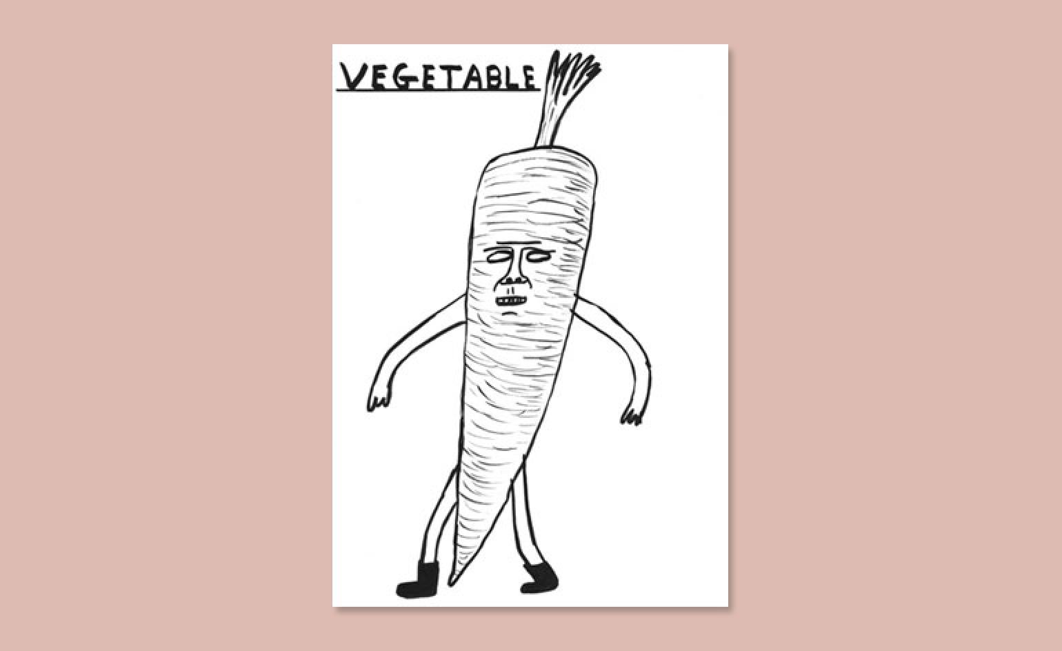
A vegetable gets the Shrigley treatment
ADDRESS
Sketch
9 Conduit Street
London
Wallpaper* Newsletter
Receive our daily digest of inspiration, escapism and design stories from around the world direct to your inbox.
-
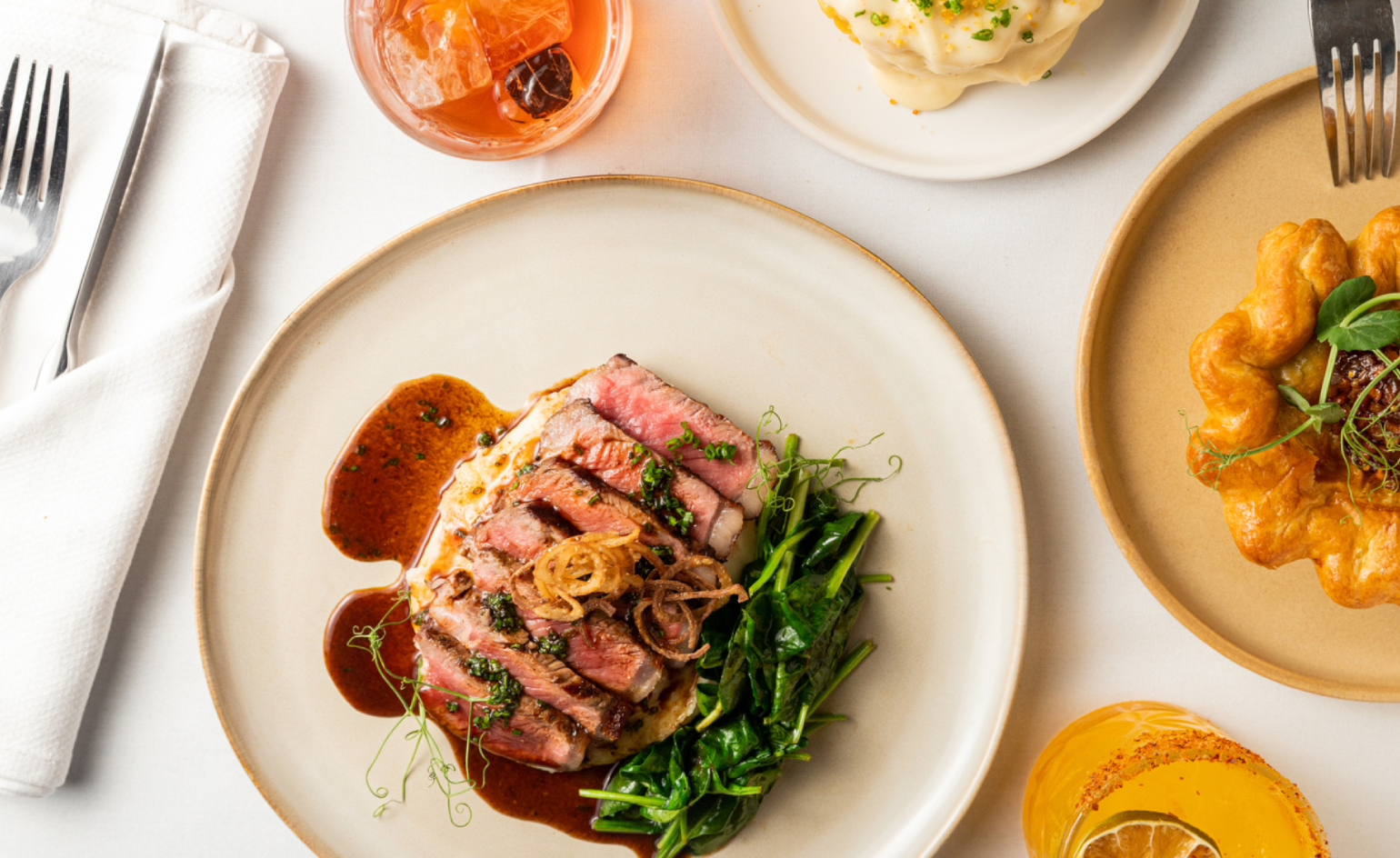 At Linden Los Angeles, classic New York comfort food gets its due
The restaurant, inspired by a stretch of boulevard bridging Brooklyn and Queens, honors legacy, community and pleasure
By Carole Dixon Published
-
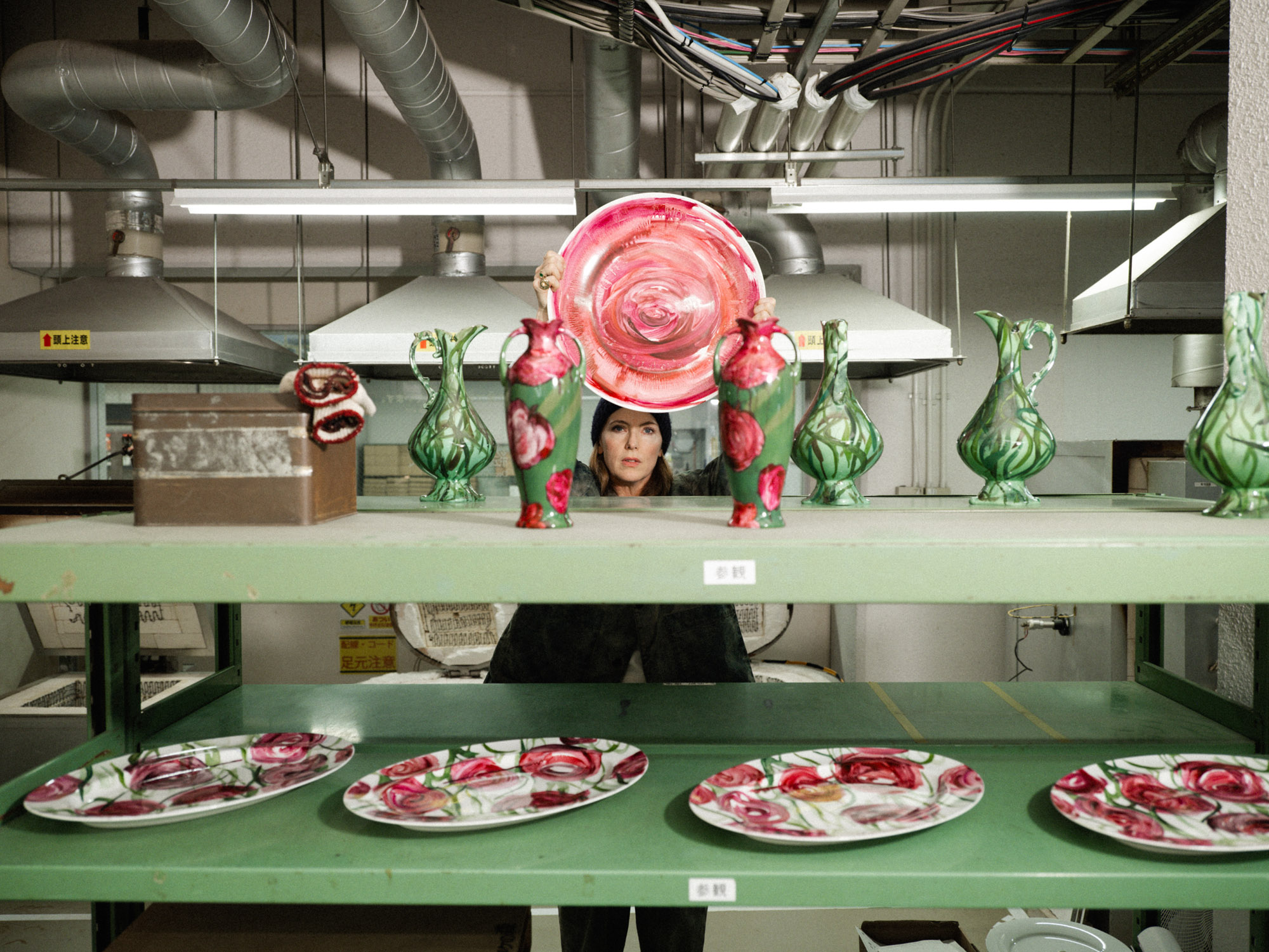 Faye Toogood comes up roses at Milan Design Week 2025
Japanese ceramics specialist Noritake’s design collection blossoms with a bold floral series by Faye Toogood
By Danielle Demetriou Published
-
 Tatar Bunar puts Ukrainian heritage front and centre
Family recipes and contemporary design merge at this new east London restaurant by Ukrainian restaurateurs Anna Andriienko and Alex Cooper
By Ben McCormack Published
