
In partnership with Axor
For decades, bathroom furniture design offered little in the way of choice; taps and mixers were prescriptively binary – metallics or black. Axor, manufacturer of luxurious taps and showers of unparalleled design, technology and manufacturing quality, sets a new standard for bathroom innovation and individualisation, empowering architects, interior decorators and discerning customers to realise their creative visions via unlimited choice and bespoke design options.
Axor design objects are already available in up to 16 exclusive Axor FinishPlus surfaces, from Polished Brass to Brushed Bronze, Polished Gold Optic to Brushed Black Chrome. Upon request, almost any Axor product can be further personalised, resized, customised and adapted via Axor Signature services.

Now, working in collaboration with British designers Edward Barber and Jay Osgerby, Axor brings a splash of colour to its offering, extending the Axor One bathroom collection with a selected palette of coloured taps. Inspired by a specific set of naturally occurring interactions between light, colour, and water, the extended range comprises six tonal variants, specially curated for Axor by Barber Osgerby to evoke specific aspects of water in relation to the earth and the sky.
The palette draws on the designers’ observation that colour often increases in vibrancy and intensity when seen through water, a process that reflects Axor’s elemental connection to nature through water. Aquamarine is a blue-green that captures the chromatic character of a calm sea. Coral is a warm, red-orange tone. Ice is a light, muted blue, seen in the layered blues of glaciers and sea ice. Stone is a strong grey, referenced from the intersection of land and sea. Shell is a cool greyish pink. Sand is the colour of the shore, wet from the ebbing tide.

‘We chose the colours to complement the widest range of bathroom finishes, from enamel and concrete, to marble and wood,’ explain Barber and Osgerby. ‘Each colour balances the ability to become part of a calm visual field with limitless scope for self-expression and individuality, reflecting the way in which bathrooms and small cloakrooms are increasingly becoming places that are less about neutral utility and more about original and impactful design.’
The bathroom now comes with added colour, depth and vibrancy.
INFORMATION
-
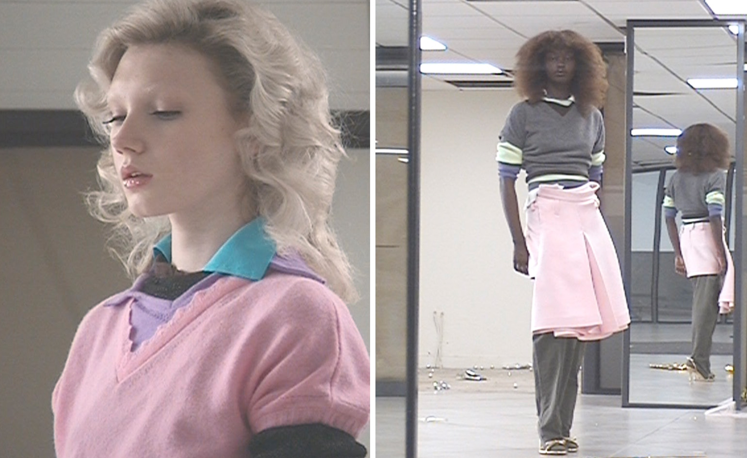 All-In is the Paris-based label making full-force fashion for main character dressing
Part of our monthly Uprising series, Wallpaper* meets Benjamin Barron and Bror August Vestbø of All-In, the LVMH Prize-nominated label which bases its collections on a riotous cast of characters – real and imagined
-
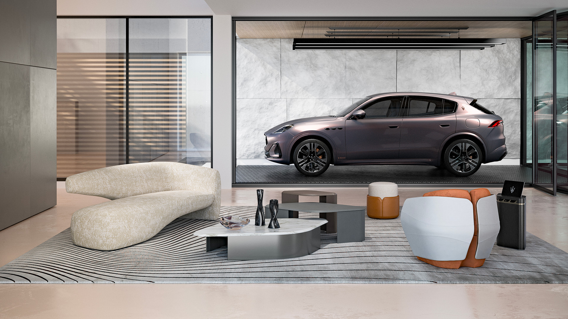 Maserati joins forces with Giorgetti for a turbo-charged relationship
Announcing their marriage during Milan Design Week, the brands unveiled a collection, a car and a long term commitment
-
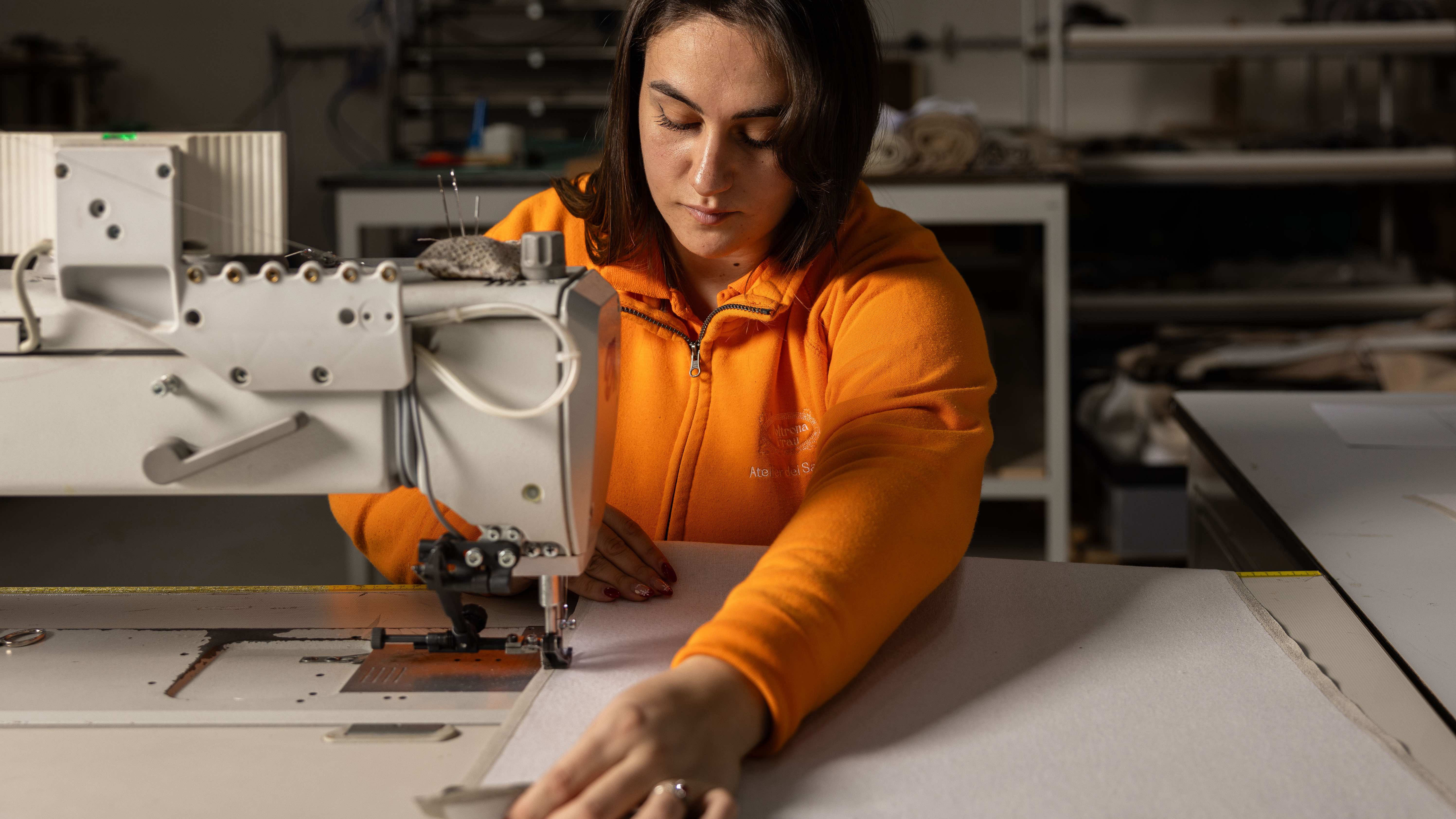 Through an innovative new training program, Poltrona Frau aims to safeguard Italian craft
The heritage furniture manufacturer is training a new generation of leather artisans


