Fix up look sharp: Balmond Studio launches new brand identity
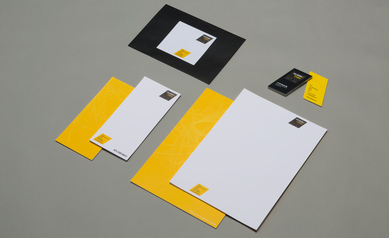
It’s been six years since the renowned structural engineer Cecil Balmond left Arup to set up his own eponymous London studio – and business is booming. Offering its clients architectural and consulting services as well as interior design, public and fine art pieces, Balmond Studio has been busy expanding into the Middle East and the United States with heavyweight projects including an ambitious 4.2 million sq m waterfront development in Colombo, Sri Lanka and a vast stainless steel public sculpture for the Santa Monica Boulevard and Century Park East in Los Angeles, USA.
‘It was about creating a strong, consistent identity within our ever-growing network of staff, partners and collaborators from across the globe. Different people. Different markets. Same message,’ says James Balmond, who has been propelling the brand forward since 2014 in his role as creative director. ‘Re-affirming our brand means that we fly the flag with clarity. Everyone is on the same page knowing who we are, how we do things and what we expect from our employees and affiliates.’
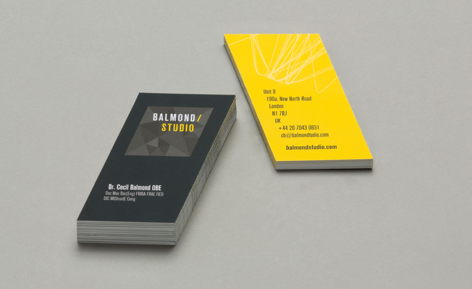
The new identity, which has been designed in-house, seeks to reflect the studio’s architectural and artistic approach. It’s built around a punchy palette of black, yellow and white, and is stamped with a new rhombus-shaped logo. Coupled with Ammann tiling, the studio says that these new angular forms are designed ‘to evoke the geometric investigation that drives Balmond’s design approach’. Interwoven with these bold blocks of colour are the studio’s sketches, renders, fractals and patterns that become branded layers.
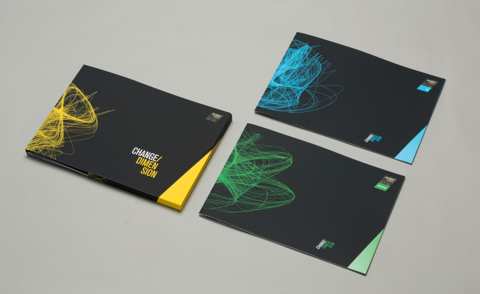
Softening the hard edges, swirling algorithm motifs grace the studio’s brochure covers – a reference to Balmond’s propensity for using generative algorithms to create structure, as well as its continuing research into non-linear organisational systems.
‘Our new branding is all about synergy,’ says Balmond. ‘So we have placed the Balmond Studio design methodology at the heart of the brand itself.’
Soon to be rolled out internationally across all of the studio’s platforms and offices, the rebrand is the first installment of a two-phase project – the second, Balmond promises, ‘will ‘push visual boundaries and production techniques to an entirely new level. It is a real game changer.’ Watch this space.
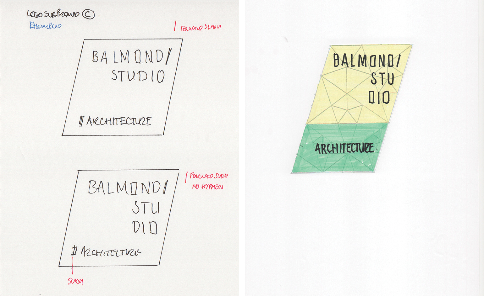
The new look is an extension and reflection of the Studio’s architectural and art practices, which shape and form the brand’s mechanics and aesthetic
Algorithms are feature in the new design, mirroring Balmond’s use of ’geometric investigation’ as a creative structure
Sketches, renders, fractals and patterns become branded layers – another characteristic of the studio’s identity
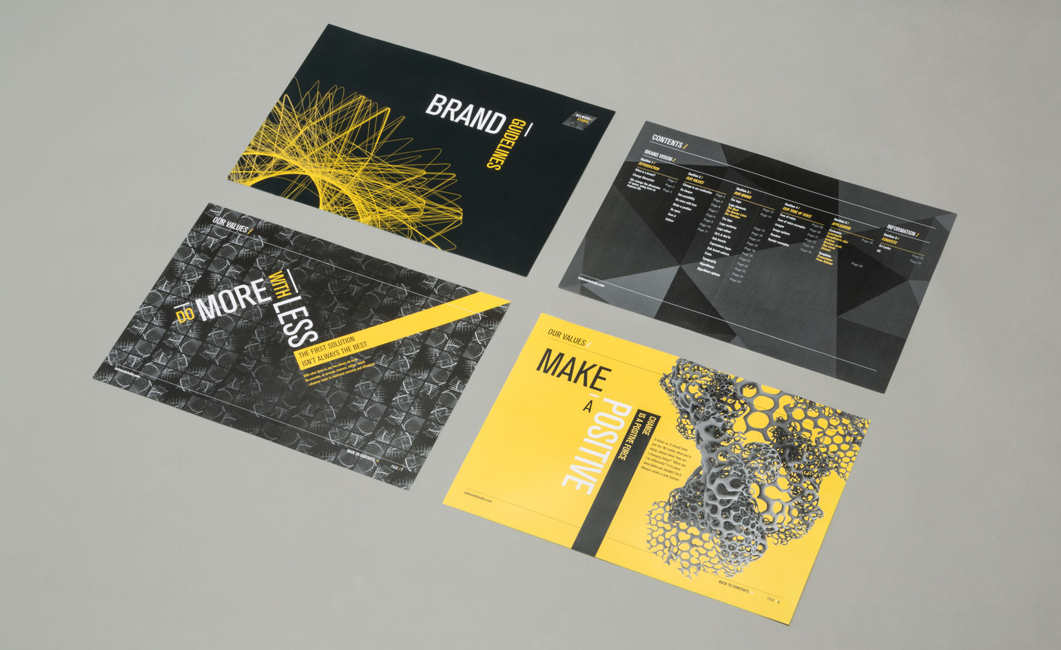
The new branding is all about synergy and will be rolled out in the next few months, across all offices and platforms
INFORMATION
For more information, visit Balmond Studio's website
Wallpaper* Newsletter
Receive our daily digest of inspiration, escapism and design stories from around the world direct to your inbox.
Ali Morris is a UK-based editor, writer and creative consultant specialising in design, interiors and architecture. In her 16 years as a design writer, Ali has travelled the world, crafting articles about creative projects, products, places and people for titles such as Dezeen, Wallpaper* and Kinfolk.
-
 This new Vondom outdoor furniture is a breath of fresh air
Designed by architect Jean-Marie Massaud, the ‘Pasadena’ collection takes elegance and comfort outdoors
By Simon Mills
-
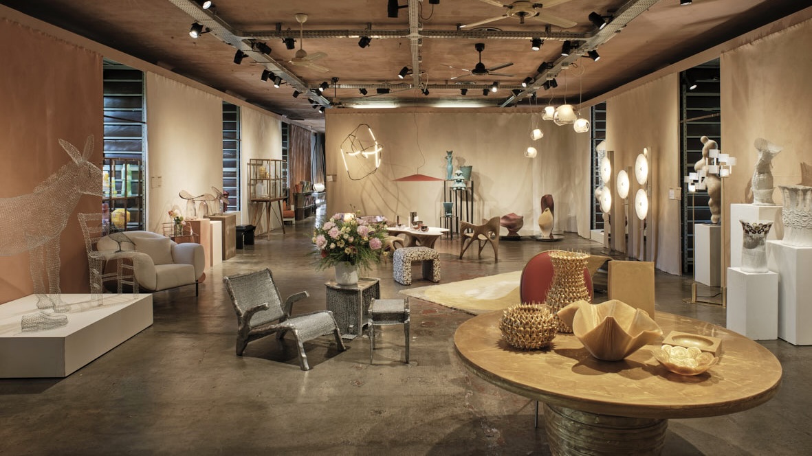 Eight designers to know from Rossana Orlandi Gallery’s Milan Design Week 2025 exhibition
Wallpaper’s highlights from the mega-exhibition at Rossana Orlandi Gallery include some of the most compelling names in design today
By Anna Solomon
-
 Nikos Koulis brings a cool wearability to high jewellery
Nikos Koulis experiments with unusual diamond cuts and modern materials in a new collection, ‘Wish’
By Hannah Silver
-
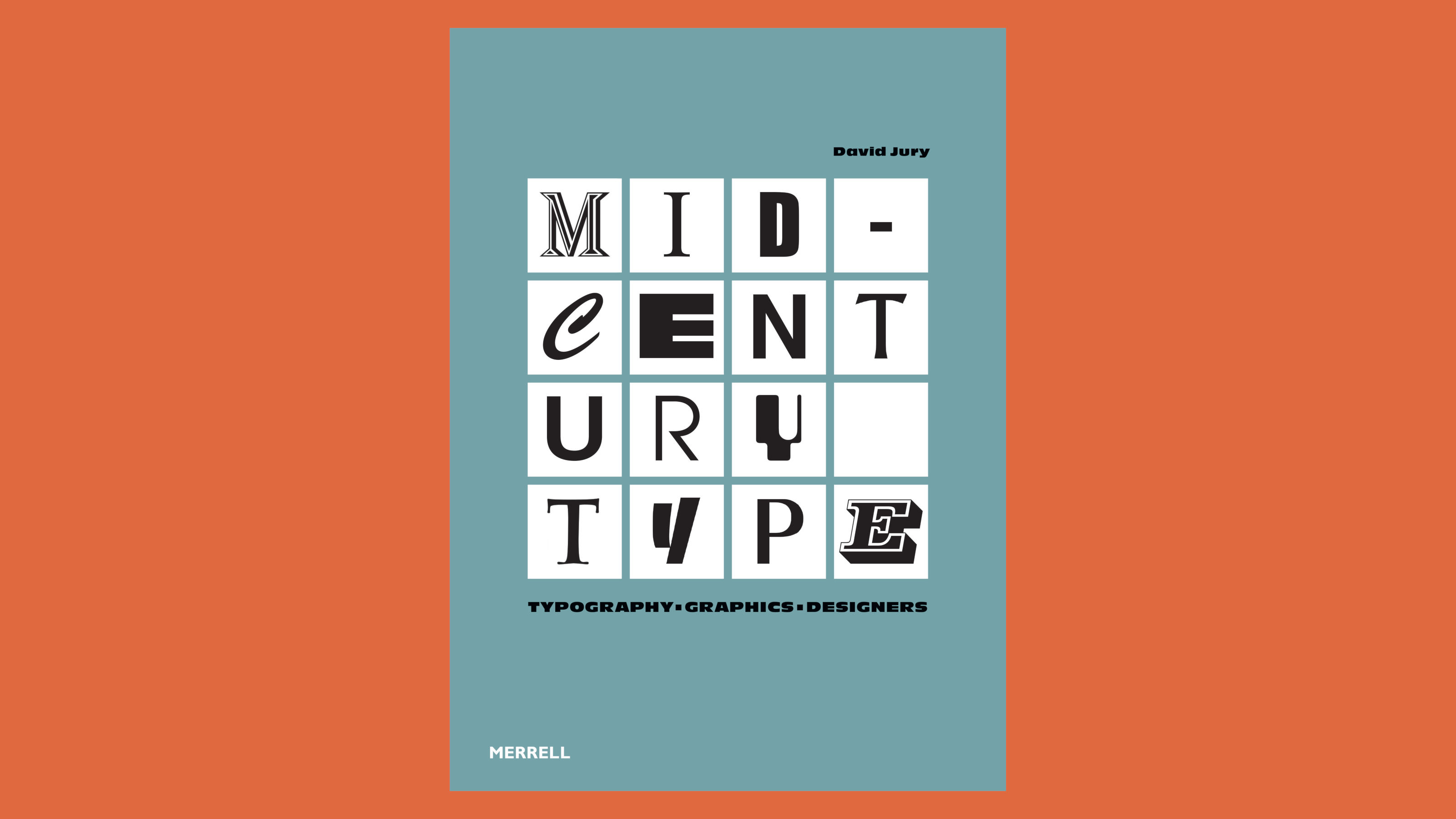 ‘Mid-Century Type’ surveys the best graphic design from 1945 to 1965
This must-have manual of post-war graphic design tracks the evolution of midcentury visual culture and the people and studios that shaped it
By Jonathan Bell
-
 LoveFrom, Serif: a modern interpretation of Baskerville created by Jony Ive’s LoveFrom
Jony Ive, Marc Newson and Peter Saville discuss LoveFrom, Serif, their elegant modernisation of one of the most influential and enduring of all early typefaces
By Jonathan Bell
-
 A century of all-American toy advertising in pictures
A new Taschen book chronicles the 20th-century toy advertising boom in America, recounting how compelling visual storytelling sparked a consumer revolution
By Harriet Lloyd-Smith
-
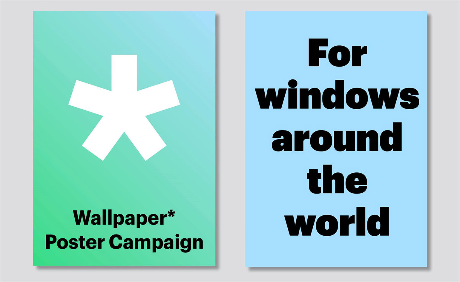 How to contribute to the Wallpaper* Poster Campaign
Due to high demand, we have extended the deadline to 1 May 2020!
By Rosa Bertoli
-
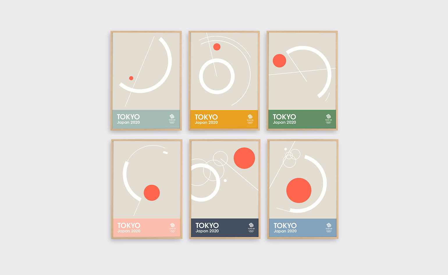 Tom Pigeon creates prints for Team GB ahead of 2020 Olympics
Ahead of the 2020 Tokyo Summer Olympic Games, Tom Pigeon has designed prints for the Great Britain and Northern Ireland Olympic Team, inspired by classic posters from the 1960s and 1970s and Russian constructivist art
By Alyn Griffiths
-
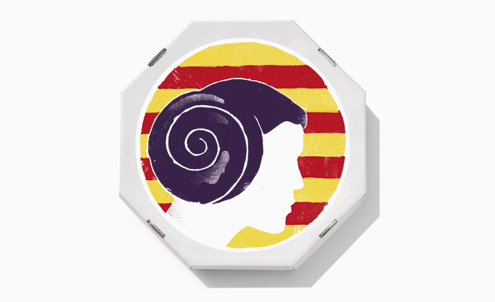 Leading creatives design pastry box stickers for EnsaimadArt
By Damon Syson