In the frame: standout designs from around the globe
All year round, we journey through design weeks, fairs and galleries scouring for the most refined, innovative and spectacular designs from across the globe. From sublime exhibition sets and nifty product launches to compelling collaborations and sophisticated new brands, we bring you our guide of the best in design for 2018...
Bec Brittain installation at Want Les Essentiels
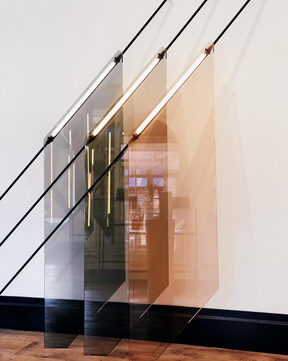
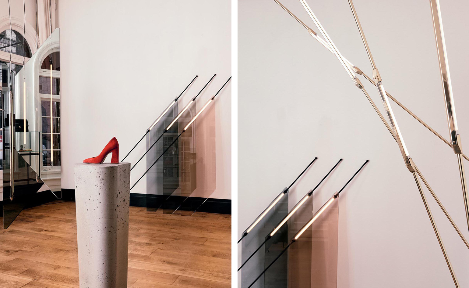
For over a decade, the Canadian label Want Les Essentiels has defined what travelling in style can be. To coincide with the appointment of a new creative director Christine Charlebois at the helm, the label will host a series of designer showcases at its West Village boutique in Manhattan, devoted to the furniture, lighting, sculpture and visual arts worlds. Its inaugural presentation kicks off with a custom-designed lighting installation from the designer Bec Brittain. The installation riffs on Brittain’s Shy Beam design; ‘Climbing Beams’ that connect the wall to the ceiling, while ‘Flags’, which pair the brass tube lighting with sheets of smoked and coloured glass, appear to creep up the walls. Writer: Pei-Ru Keh
Want Les Essentiels, 301 West 4th Street, New York, NY 10014, USA
Warby Parker hand mirrors collection
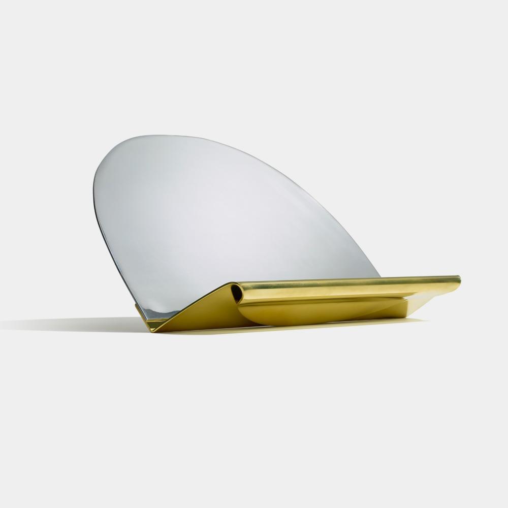
The handheld mirror has always been a component of the Warby Parker experience. In all of the eyewear label’s stores, portable mirrors that resemble ping pong paddles have long been kept at the ready for customers’ use. In fact, the mirrors have become such a presence that Warby Parker approached eight designers from New York and Los Angeles to reimagine the staple accessory. Ranging from Brendan Ravenhill’s elegantly angled brass and aluminium piece (pictured) to Egg Collective’s playful, kinetic sculptures and Chen Chen and Kai Williams’ archaeological dripped cement versions, each of the eight lighthearted renditions are being displayed in Warby Parker’s Greene Street (New York) and Abbot Kinney (Los Angeles) stores for the next two weeks. They will are also up for sale during this time on Paddle 8, with all proceeds benefitting Free Arts – an organisation that empowers undeserved youth through arts and mentoring programs that help develop their skills, confidence and creativity. Writer: Pei-Ru Keh
Zero Space at Musashino Art University, by Igarashi Design Studio
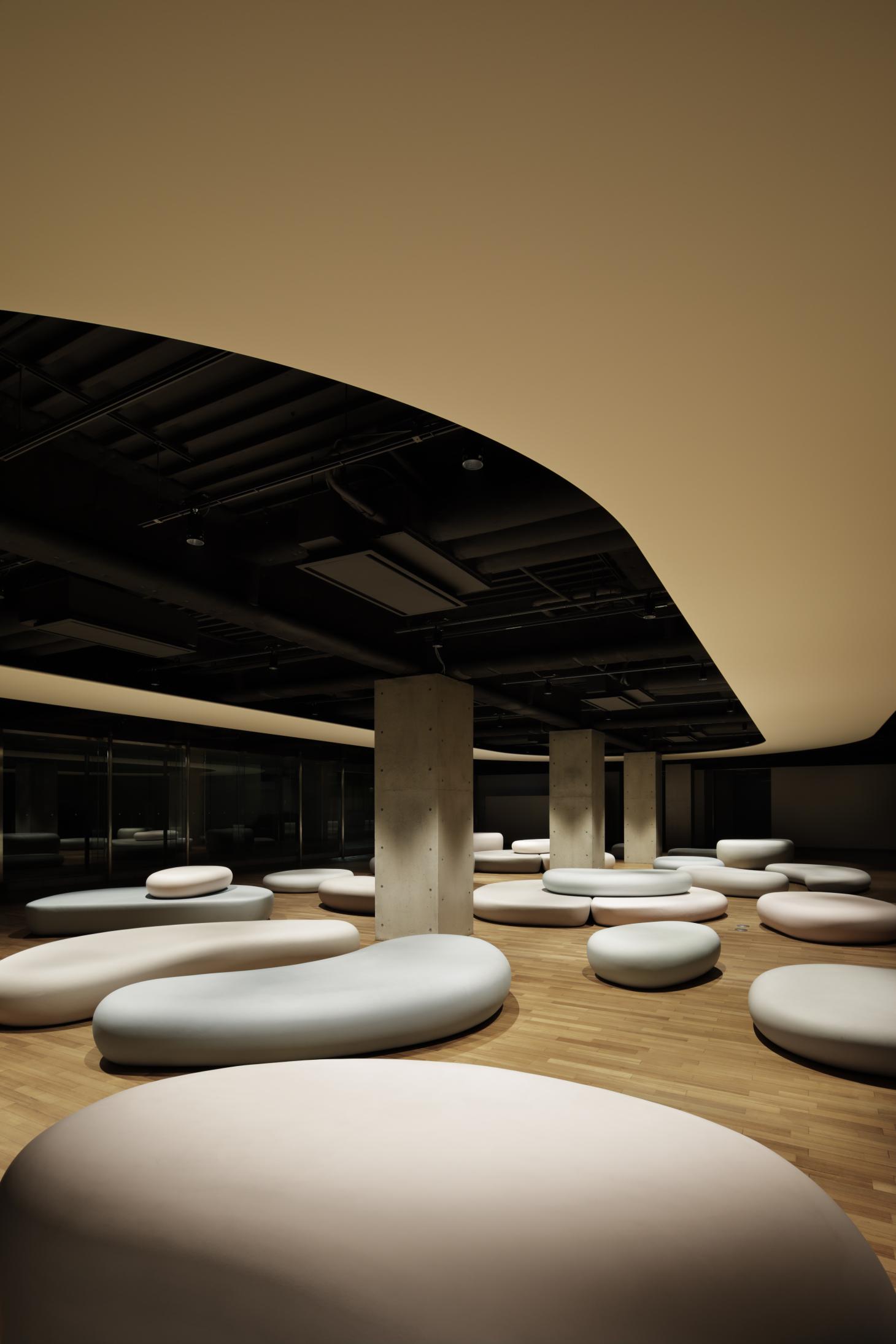
Igarashi Design Studio has revealed the Zero Space at Musashino Art University in Tokyo. A moment of calm amidst the busyness of university life, the space is dedicated to both independent and group study, and geared to accommodate its students’ dynamic working habits. The core design motif is inspired by a river: soft, rounded pebble benches direct the flow of visitors meandering through the space. Highly flexible, the benches can be freely rearranged and stacked at will to help stimulate ticking minds at work. Meanwhile, the internal lighting (designed in collaboration with Yuko Yamashita) is carefully controlled to get the best out of the space. During the day, natural light is sourced from a pair of sprawling 35 m tall windows. At night, hidden overhead lighting bounces off the wooden floor giving the zero-shaped panel at the room’s heart a gentle glow. Photography: Nacasa & Partners Inc. Writer: Luke Halls
Musashino Art University, 1 Chome-736 Ogawacho, Kodaira, Tokyo 187-0032, Japan
‘Lane’ and ‘Primavera’ tiles, by Barber & Osgerby, for Mutina
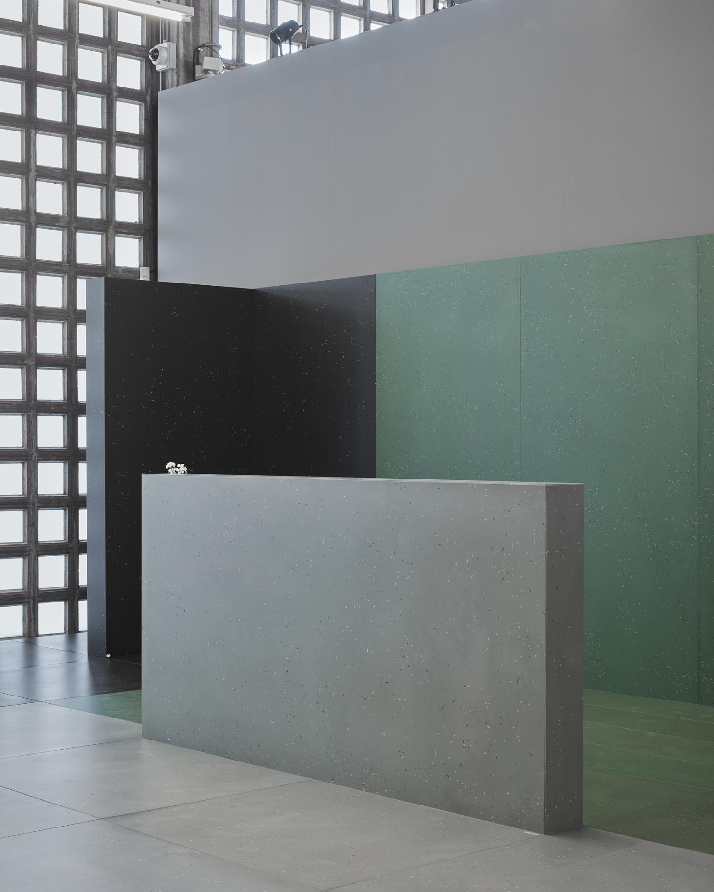
Design duo Barber & Osgerby are no stranger to tile design. Once more teaming up with Italian brand Mutina, the London-based studio have revealed a pair of new releases at Cersaie ceramic tile and bathroom furnishings fair in Bologna: ‘Lane’ and ‘Primavera’. The former is inspired by an abstract exploration of colour, informed by a detailed study of London’s architecture and neighbourhoods, and is available in 12 variants of white, black, grey, aubergine and terracotta. Meanwhile, ‘Primavera’ visually emulates the natural environment through randomly enclosed coloured ceramic inserts that highlight the imperfections of nature. ‘Primavera’ comes in white, grey, blue, green and black hues, and 22 per cent of each tile is made from recycled raw materials, highlighting the duo’s reverence for nature. Writer: Luke Halls
(Montblanc M) RED, by Montblanc and Marc Newson

Montblanc has rekindled its design love affair with Marc Newson on (Montblanc M) RED, a new writing instrument raising funds in the fight against AIDS. Available as a ballpoint, fountain pen and roller ball pen, it combines precious red resin with Newson’s smooth, geometric aesthetic, evoking classic Montblanc fluidity and seamlessness. ‘For over 110 years, Montblanc has built a heritage of creating fine writing instruments that have a special meanings to its owners,’ explains Montblanc CEO Nicolas Baretzki. ‘Through our partnership with (RED) we continue this long tradition, creating a special lifetime companion that makes a real impact by supporting the goal towards an HIV-free society.’ (Montblanc M) RED is also accompanied by a selection of new accessories, including a red Italian calfskin sketch book; a bracelet in woven red leather, with a decorated stainless steel closing; and a pair of stainless steel cufflinks. For every piece from the collection purchased, €5 goes to the Global Fund to support HIV/AIDS programmes. Writer: Luke Halls
Staatliche Kunstsammlungen Dresden museum shop, by Studio Chmara.Rosinke
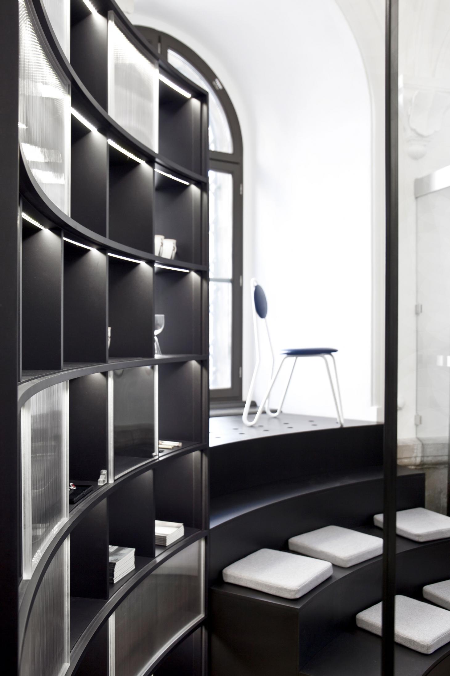
Dresden’s cultural institution Staatliche Kunstsammlungen has recently had its museum shop overhauled by Studio Chmara.Rosinke. Going against the grain of the typical museum shop layout, the listed 16th-century corner tower has been updated to reduce visitor congestion. Monochrome fixtures and furnishings match the circular floorplan, and are suitably shaped to streamline visitor flow, orbiting around a central hanging black chandelier. In addition, the Vienna-based studio looked to present the shop as ‘an alternative to the normal cash desk’, formatting the room more as an information hub. Visitors can now discover more about each featured exhibition prior to entry, and learn more about the institution’s various historic museums and buildings. Photography: courtesy Studio Chmara.Rosinke. Writer: Luke Halls
Staatliche Kunstsammlungen Dresden, Residenzschloss, Taschenberg 2, 01067 Dresden, Germany
Edelman's Dubai office, by Pallavi Dean Interiors
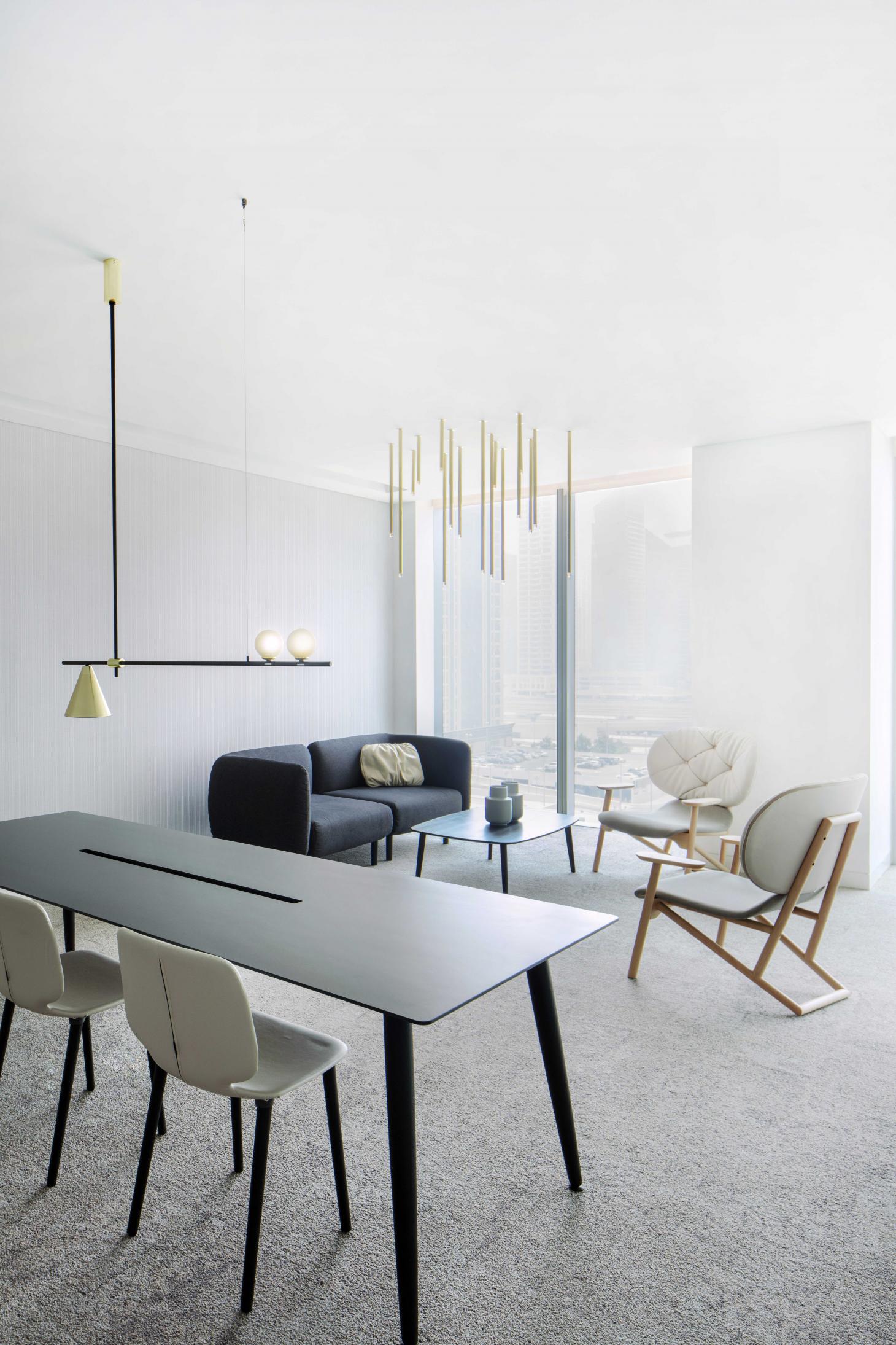
Emirates-based design firm Pallavi Dean Interiors has delivered the glossy new Dubai office for global communications firm Edelman. Building on the success of its Abu Dhabi outpost, the design was elevated to sky-high premiums with its 1000 sq m kaleidoscopic interior, comprising a network of ‘cultural villages’. From Civic Square, the main reception area, to a lunch hub called Urban Park to a Go Bananas creative lounge, the vibrant interiors strike the balance between playful and sophisticated, appealing to seasoned experts and modern millennials alike. While each ‘village’ features a variety of bold colour palettes and workstations complete with pieces by Lignet Roset and La Palma (among others), national talents are also celebrated. Emirati designer Khalid Shafar produced a custom-made wall installation for the reception, using the Iqal worn by local men, while artist Zeinab Al Hashemi displays satellite images of Dubai’s dazzling desert playground. By creating a connection to the firm’s Abu Dhabi space, but still retaining its own identity, Edelman’s Dubai den takes office design to daring new heights.
Photography: Pankaj Anand. Writer: Jessica-Christin Hametner
Tomorrow’s Tigers at Sotheby’s
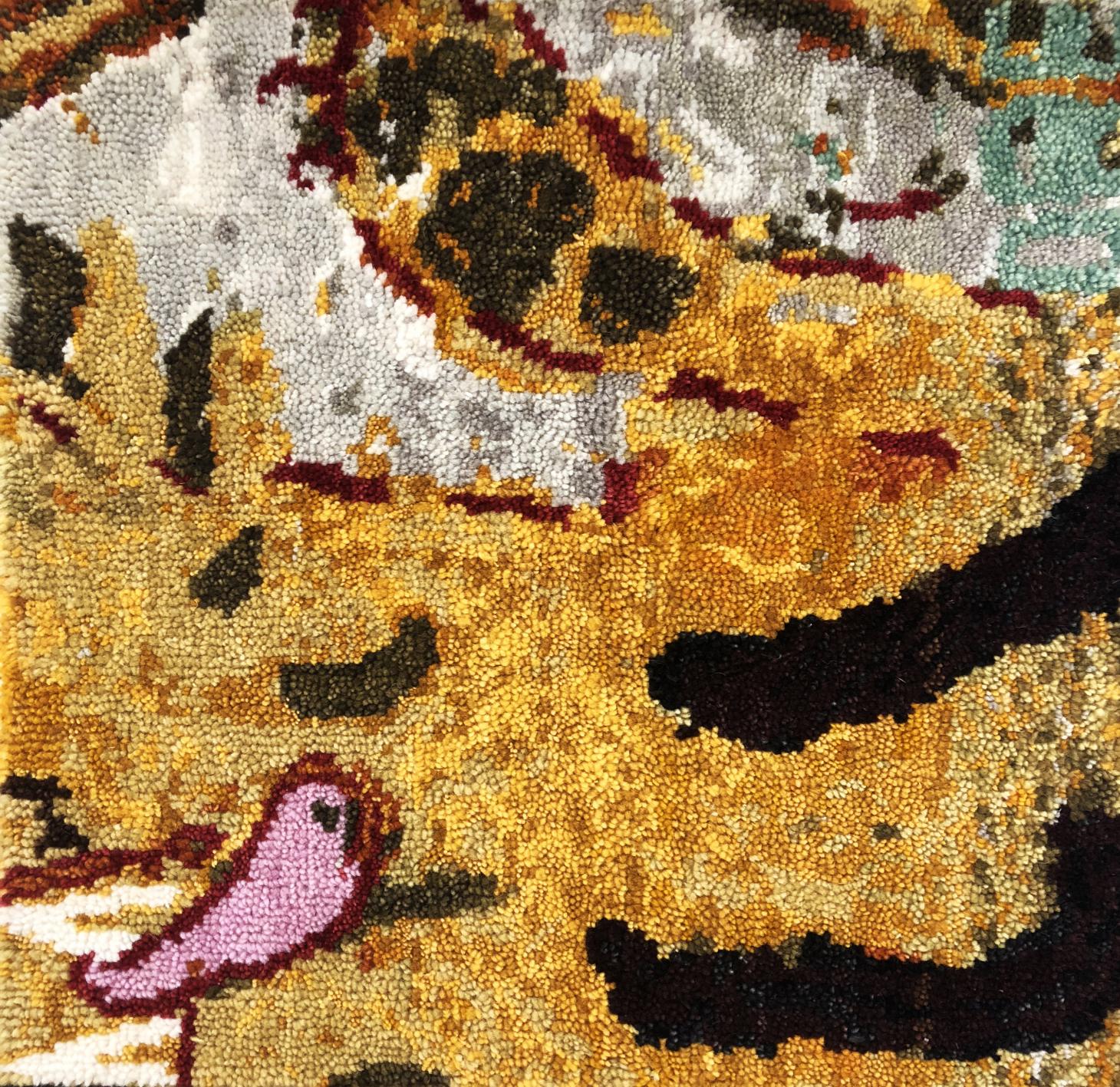
Auction house Sotheby’s is set to open an exhibition of bespoke rug designs by 11 renowned artists including Anish Kapoor, Maya Lin and Reena Saini Kallat who have been appointed by WWF for its Tomorrow’s Tigers fundraising project. Taking cues from the Tibetan tiger rug, each artist has been commissioned to realise a design that rug specialists Christopher Farr will bring to life via unique weaving and hand dying techniques. The initiative has been curated by Artwise and the artist rugs will go on view alongside rare 19th century woven antique tiger versions in January 2019. The limited edition rugs will start at £10,000 and funds raised go towards WWF’s aim to double the number of endangered tigers in the wild by 2022, the next Chinese year of the tiger. Pictured, detail of Rose Wylie’s design. © Christopher Farr
11-17 January 2019, Sotheby’s London, 34-35 New Bond Street, London W1S 2RT UK
Carl Hansen & Son, Osaka
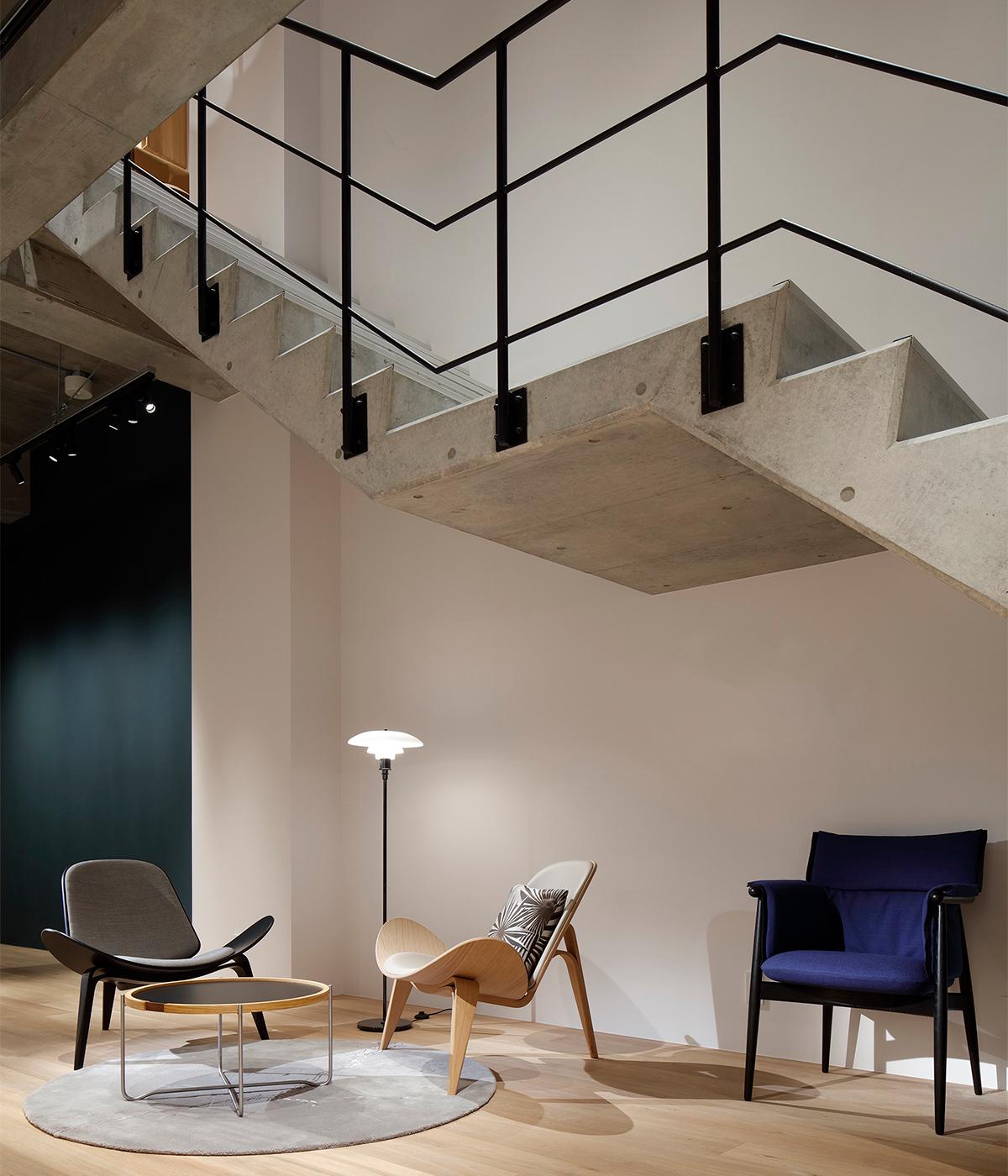
Danish design stalwarts Carl Hansen & Son open up its second Japan flagship, this time in Osaka’s hip Minami-Horie district. Classics by the likes of Arne Jacobsen, Poul Kjærholm and Hans J. Wegner stand alongside contemporary designs by Tadao Ando and Naja Utzon in an industrial-style space that is doused in concrete and subtle tones of wood. The aesthetic provides a different experience to its Tokyo sister, but still offers the Danish design package is sought after by the Japanese market. ‘Japan and Denmark share a design tradition that values minimalism, functionalism, and outstanding craftsmanship,’ says Knud Erik Hansen, CEO of Carl Hansen & Son. ‘We look forward to showcasing our exceptional furniture and welcoming all design enthusiasts.’
1-15-22, Minami-Horie, Nishi-Ku, Osaka City, 550-0015 Osaka-fu, Japan
Mater Earth Gallery
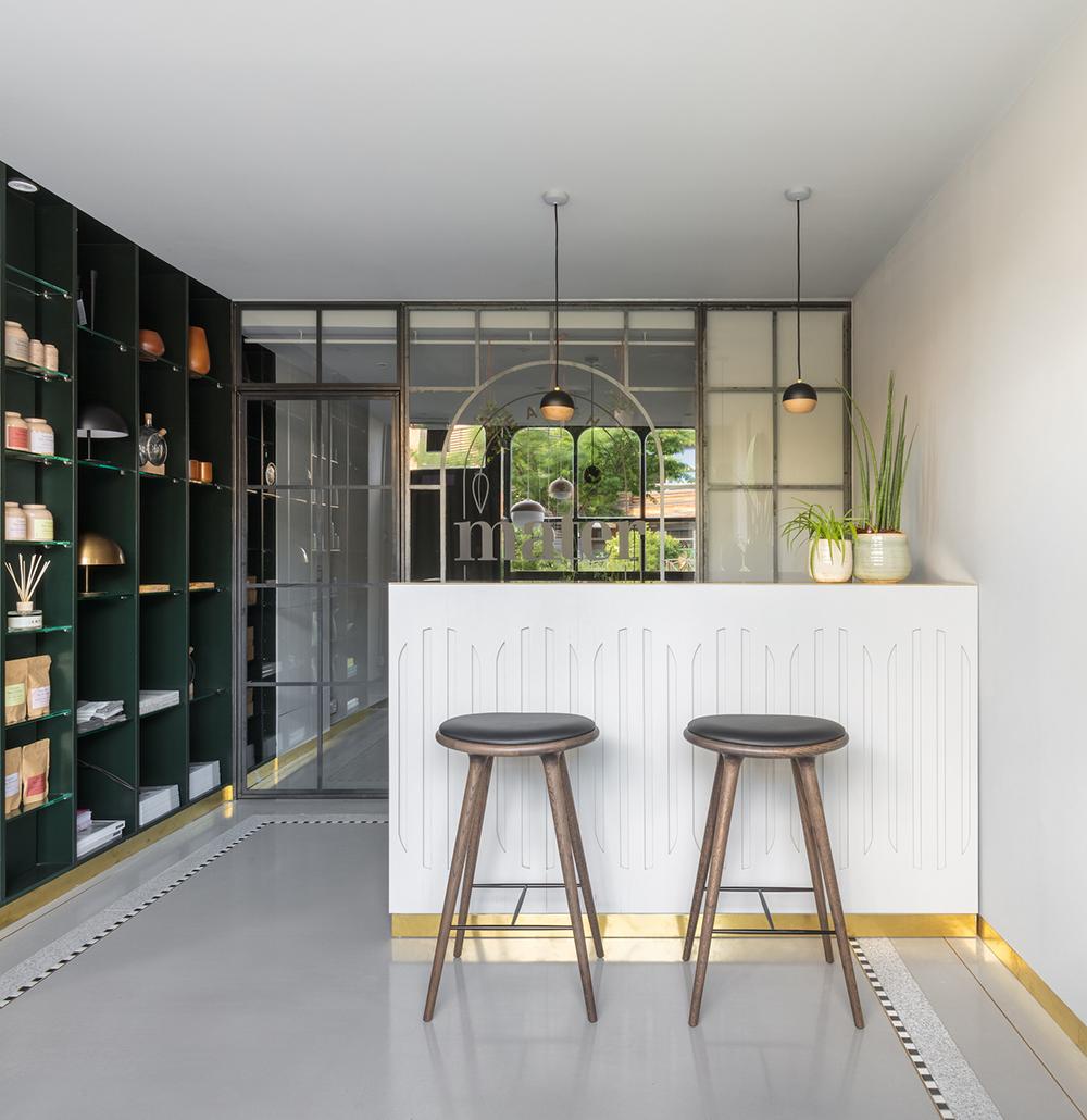
Set on the outskirts of Clerkenwell and its flurry of design showrooms is Danish brand Mater‘s Earth Gallery. Opened inside a residential building, the naturally lit space houses the Copenhagen-based design brand’s collection that takes a step in a sustainable and ethical direction. At the front of the showroom, a materials lab-style set up demonstrates the brand’s use of recycling, presenting the raw material of aluminium and natural cane against the end product. The showroom also includes the newest collection from international talents including Mexican designer José de la O’s LED pendant, in addition to staples in the collection like the Double Bottle vase by Eva Harlou, designer of the concept store itself, and its Copenhagen version too.
Mater‘s Earth Gallery 36A Myddelton St, Clerkenwell, London EC1R 1UA
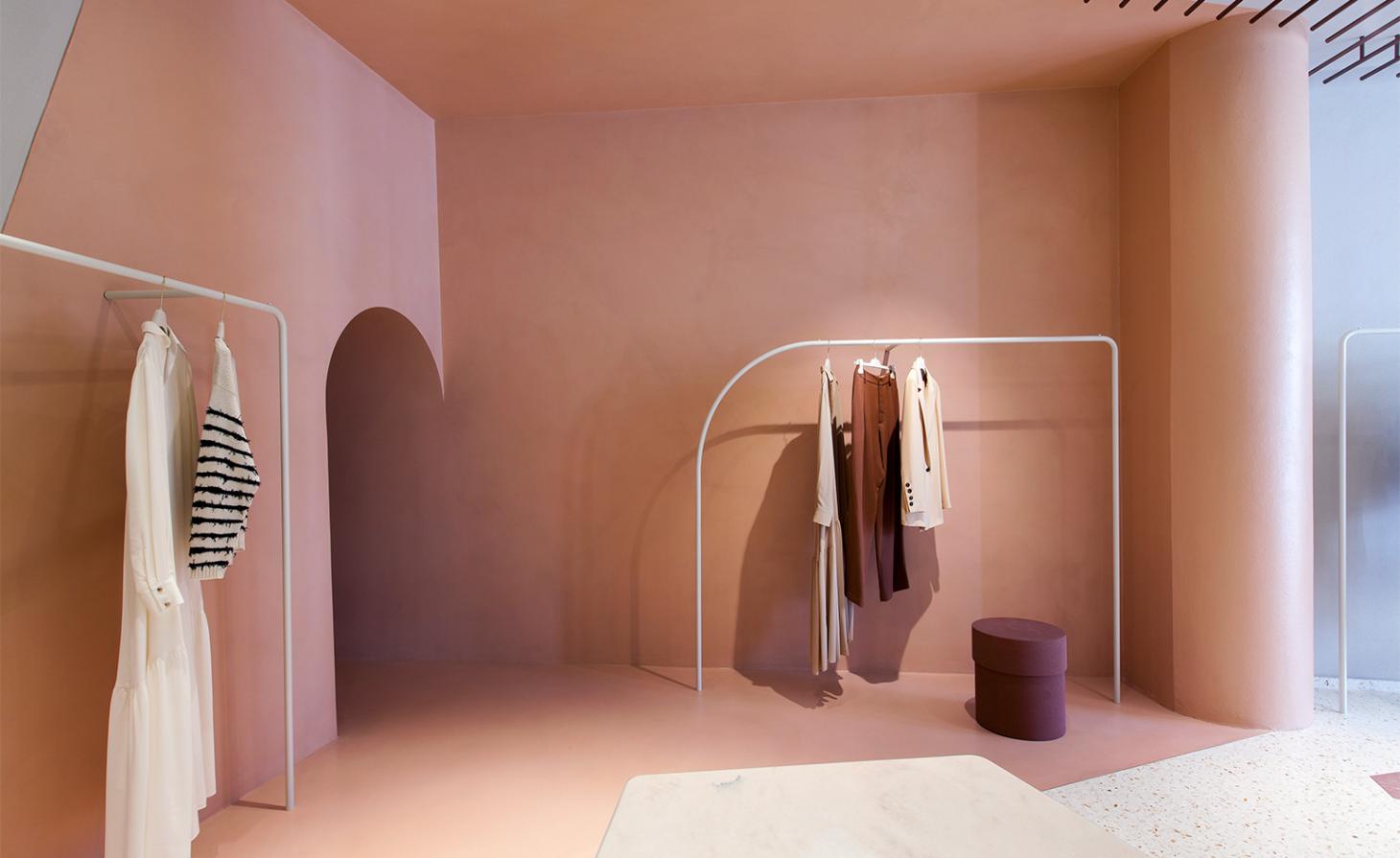
oused within a building from the 1600s in Brera, Milan is a new boutique for Italian fashion brand Alysi, designed by Studiopepe. The contemporary interior uses a muted palette and an architectural arch motif to shape a feminine salon space, something that the design duo are experts in following their private members’ club installation at Salone del Mobile this year. Almost an installation itself, the boutique is divided into three sections, connected by an archway tunnel joining the shopping areas, together with a mixture of copper, plaster and marble. At the end of the boutique, a dressing room appears as a futuristic silver lounge with linear textures in the curtain, ceiling and mirrors, providing a holistic shopping environment.
Alysi, Via Ponte Vetero 6, Milano
Danish Design Centre at BLOX
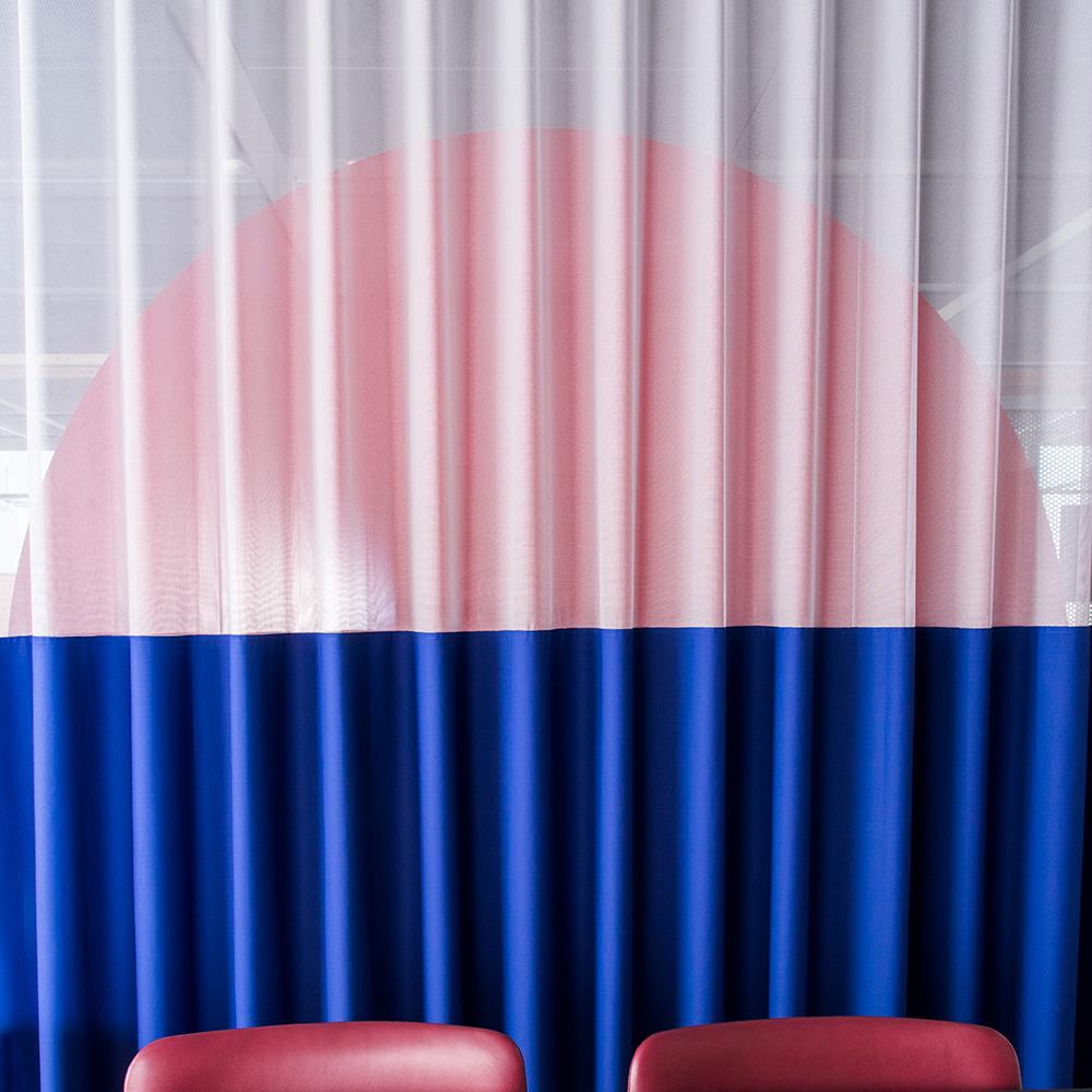
Multi-disciplinary practice Spacon & X have realised a dynamic interior space for the Danish Design Centre’s new home at BLOX, Copenhagen’s latest design and architecture hub. The bright space, designed with sustainability and flexibility in mind, focuses on open source design as a key part of its architectural blueprint. Design classics like PH lamps and Fredericia Furniture pieces are paired with custom-made items crafted from materials including plexiglass and recycled plastic, which fulfil the changing needs, behaviour and circumstances of the creative office. The bold interior creates an ideal environment for the fast-paced digital working world. Writer: Jessica-Christin Hametner. Photography: Julie Due
BLOX, Bryghuspladsen 8, 1473 København K
Voting inventions
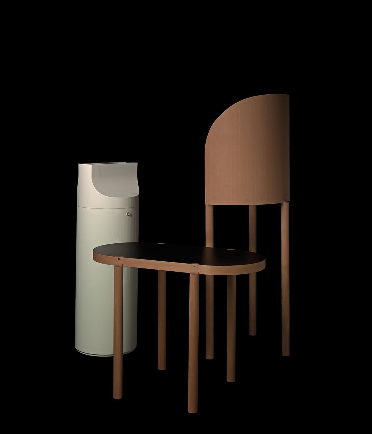
With his Objects for Voters project, Frieder Bohaumilitzky has created a still life of the democratic process. Inspired by last September’s ultimately indecisive federal election, Bohaumilitzky decided to redesign the required voting items for the elections of the German parliament. ‘Political communication has changed, but the procedure of voting itself is still remarkably undesigned,’ he says. The ballot box, polling booth and supervisor’s table are all reinvented with style and seriousness, as sober, neutral objects with a friendly curve and a colour scheme that’s studiously neutral. ‘I used only black, white and the natural colour of wood,’ the designer notes. The bent wood is also meant to evoke the interiors and facilities in German public buildings. Bohaumilitzky combined his design studies with a course in political science, and the objects for Voters take a welcome cross-disciplinary approach. Available from Objects for Voters. Photography: Niklas Taleb. Writer: Jonathan Bell
Utah and Taro by East Fork
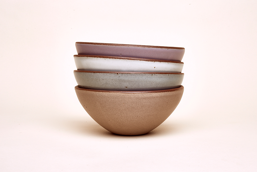
Timeless, usable dinnerware is the calling card of East Fork, a ceramics company based in Asheville, North Carolina. Founded by Alex and Connie Matisse (Henri Matisse is Alex’s great-grandfather), East Fork has been using artisanal pottery methods to make functional objects for daily use since 2009. Coinciding with the move from using a wood kiln to gas firing, the studio has added two new glazes to its existing palette of neutral tones – a peach-toned terracotta called Utah, and an earthy lilac called Taro. Conceived by creative director Connie and then brought to life by the team’s glaze chemist, these new matte glazes have been specifically developed and tested rigorously as they are rarely seen in traditional stoneware. Available in all of East Fork’s weighty, sculptural designs, the new hues are perfect for mixing and matching.
Writer: Pei-Ru Keh
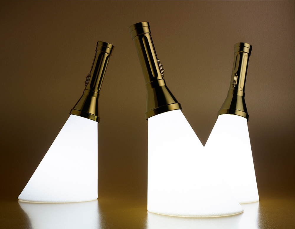
Designer Stefano Giovannoni launched his online furniture brand Qeeboo back in 2015 with a collection of colourful plastic furniture. He is now reissuing the designs with a chrome finish created using nanotechnology. In a first for furniture and design objects, atomised particles are removed from a piece of brass, aluminium or copper in a high-vacuum atmosphere, and coated on the plastic product. One of the designs being treated with this technique is Studio Job’s ‘Flash’ lamp, which gives corporeal form to the rays of a torch. For the studio’s Job Smeets, the torch has a personal significance, as well as a practical one. ‘I once had my power turned off because I forgot to pay the bill, so here I am lighting the whole place with “Flash”. It’s the saviour of the universe.’
The Qeeboo shop is open 17 – 22 April, at Fiera Porta Sud, Palazzo Visconti and Hotel NHow, Milan, at Salone del Mobile. Photography: Rebecca Scheinberg. Interiors: Maria Sobrino. Writer: Rosa Bertoli
As originally featured in the May 2018 issue of Wallpaper* (W*230)
The secrets of St James’s
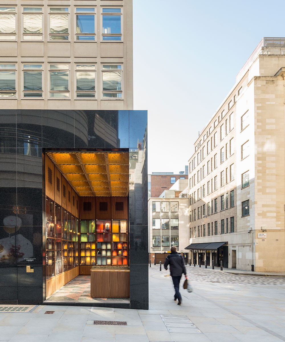
Architectural practice Squire & Partners are offering up a bird’s eye view of St James’s with an interactive map display as part of the market’s new exhibition. Traveling around the key locations, the map produces a narrative of the historic area revealing cultural secrets like where did John meet Yoko? Or where did Jimi Hendrix play his first UK gig? The experience has been elevated with a theme tune too, a curated soundtrack of Frederic Chopin’s Nocturne In E Flat Major, Op.9 No.2.
St James’s Market, SW1Y 4AH, Regent St, London
Gum flagship Milan
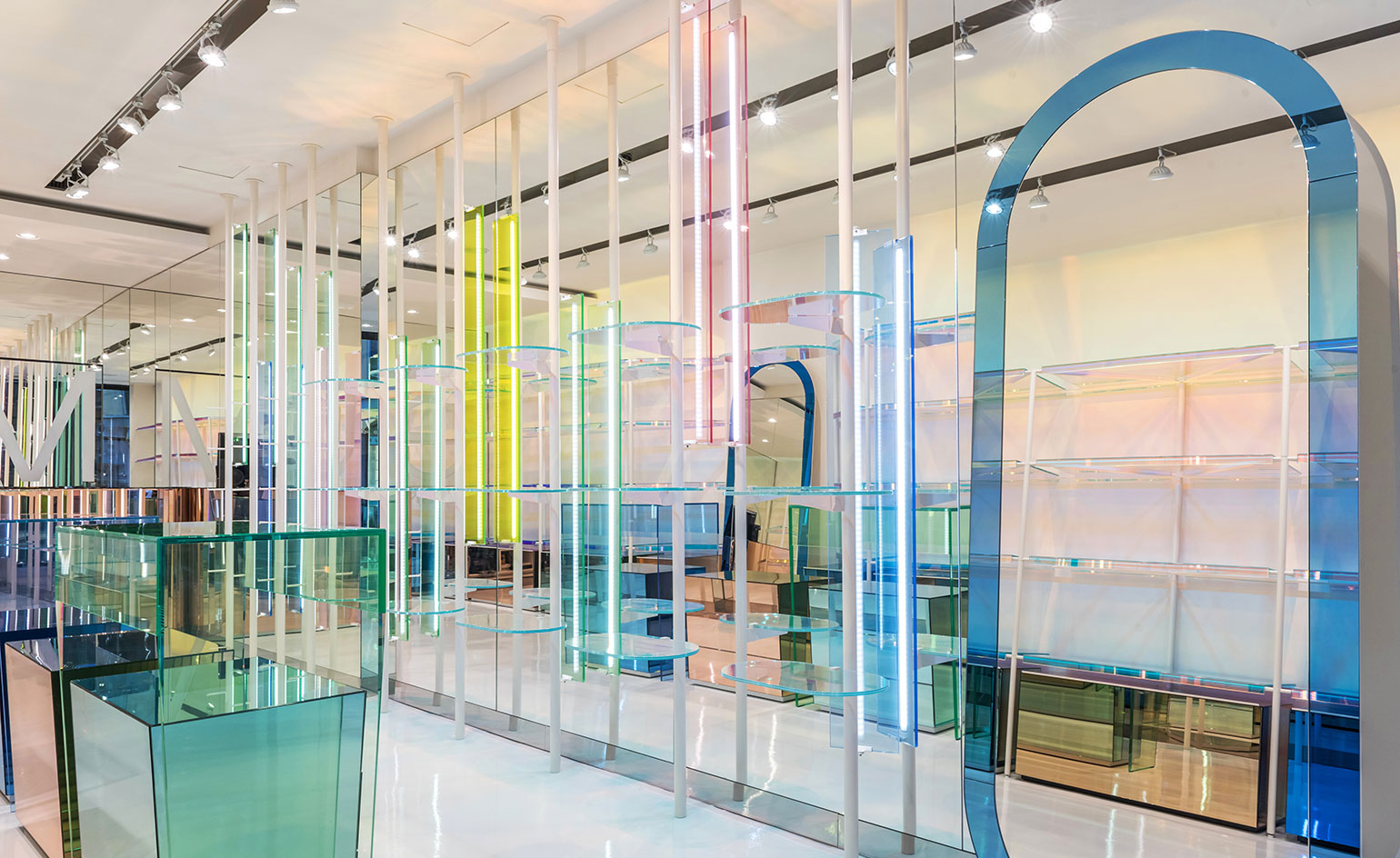
Italian architect Antonio Barbieri was commissioned to create a new look for Milan’s Gum flagship store. Barbieri created a multicoloured space designed to bring to life the bright leathers of the Florentine accessories brand; painting walls and ceilings an unassuming neutral tone, he added layers of glass and mirror in jewel hues, creating an impactful effect of lights, shadows and reflections. Since 1999, the architect has worked with fashion brands such as Gucci, Emilio Pucci and Max Mara, and designed independent boutiques all over Italy and abroad. This latest project lets the architect’s more playful side, mixing colour and material to create ‘a space where light goes through and bounces’.
Gum Milan, Corso Garibaldi, 34, Milan. Writer: Rosa Bertoli
A/D/O Water Futures Research Program
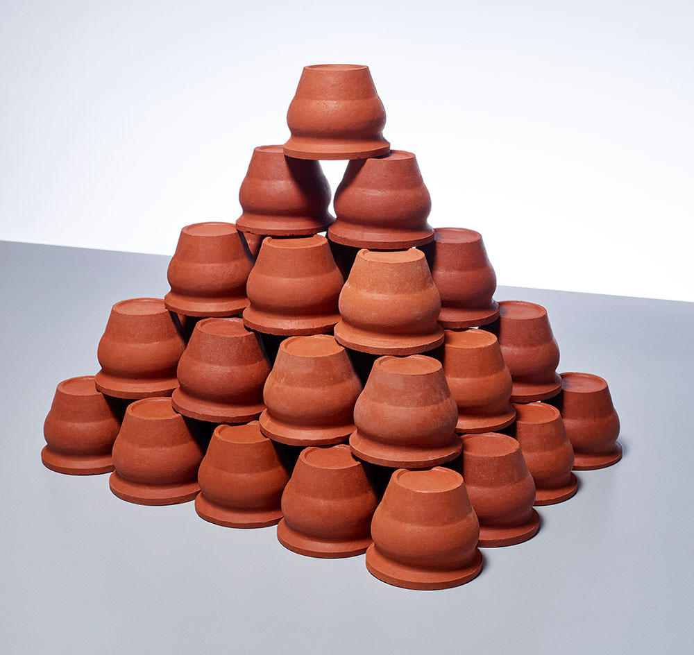
With the world’s water crisis feeling increasingly real these days, curator and water conservationist Jane Withers has launched a new multi-pronged research program together with A/D/O, the Brooklyn-based research centre dedicated to pushing the boundaries and future of design. During the kick off event last week, which featured a water tasting designed by Arabeschi di Latte, Withers and A/D/O unveiled the year-long program that will focus on three themes: harvesting the sky, pollution and purification and drinking local. Each theme will also be accompanied by a dedicated installation, exhibition and series of events and workshops. What’s more, the program has also issued a call for entries for new design ideas to tackle the harmful drinking water culture today. With competition categories ranging from future objects and materials to future information design, the open call will culminate in a final exhibition in early 2019. Pictured: unglazed clay cups from India are used for drinking water and tea and, once discarded, dissolve back into the earth. Writer: Pei-Ru Keh
849 Alexander Girard pen
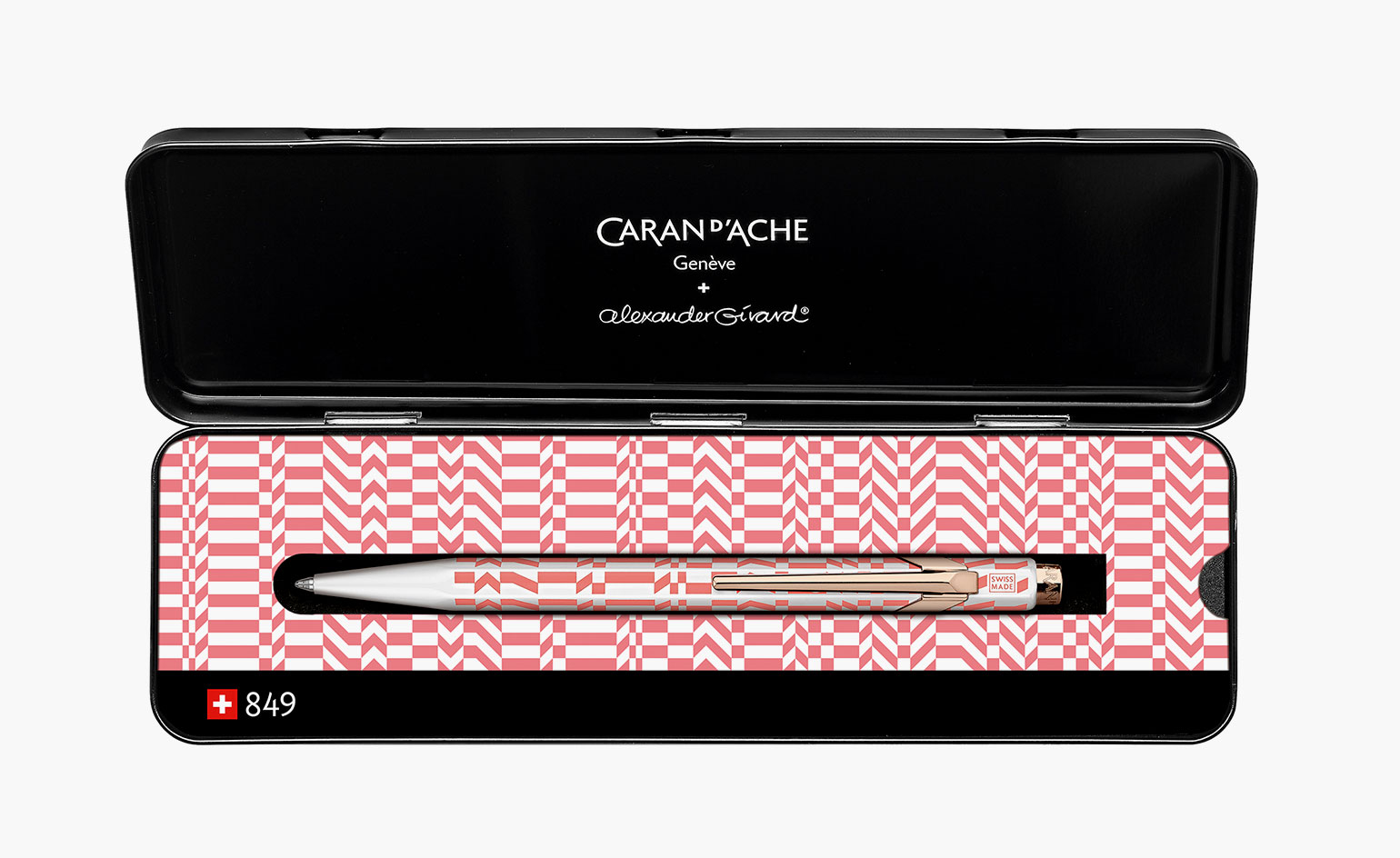
Three iconic creative forces come together for a playful collaboration. The Swiss mastery of Maison Caran d’Ache meets Alexander Girard’s graphic prints and Vitra’s creative ingenuity for a charming new pen design. The 849 Alexander Girard is a decorative piece with the Double Triangle and Check Stripes patterns taking up the body of the sleek 849 hexagonal model, that is a part of Vitra’s spring accessories collection.
Writer: Sujata Burman
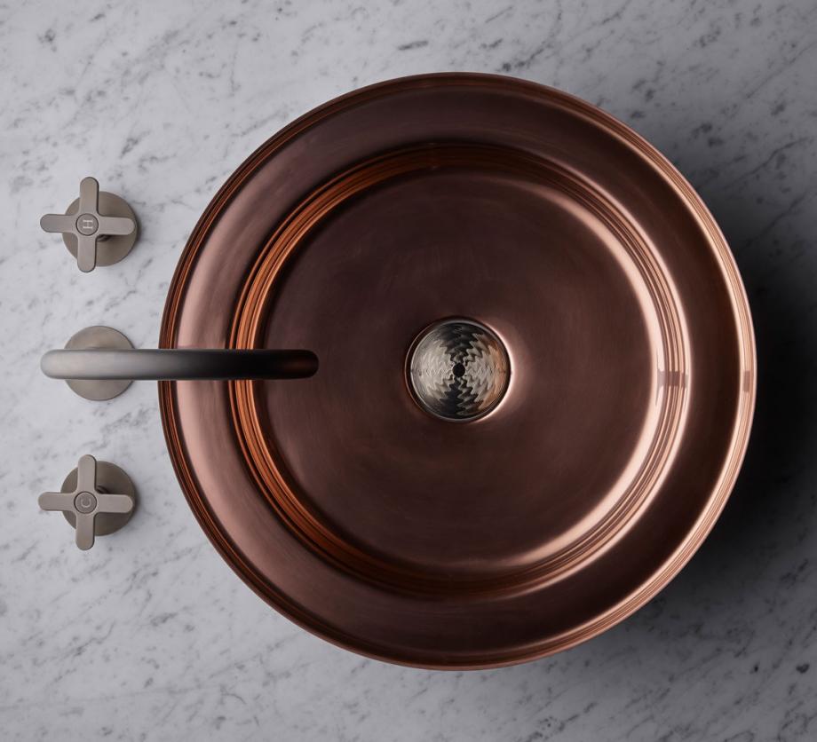
Following the success of his luxury kitchen brand, La Cornue, French visionary Xavier Dupuy launches a venture that takes him into new territory: bathrooms design. In an attempt to revive the art of metalwork, and in particular French copperware, he has released a range of contemporary sinks. Titled Bassines, Dupuy creates the brand with long-time partner, designer Laurent Besseas with sleek modern basins in stainless steel, gold, copper and black.
Available from Bassines. Writer: Sujata Burman
Globe-Trotter x Paul Smith
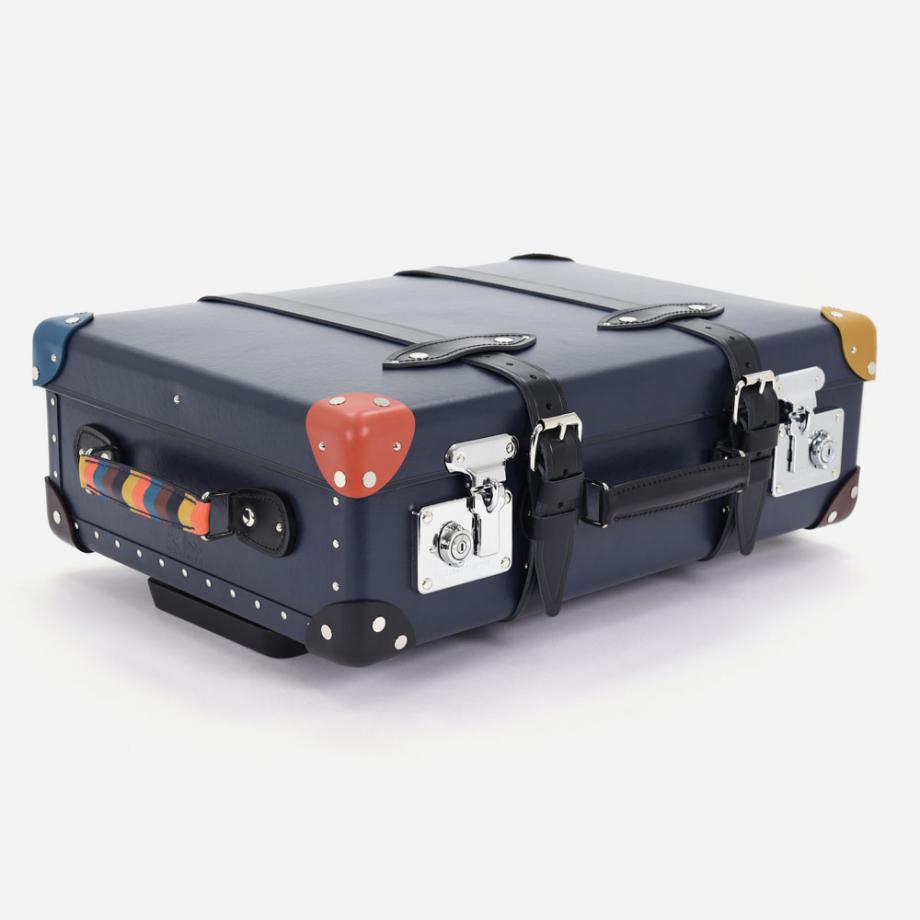
Globe-Trotter’s 20” classic navy trolley case is getting a Paul Smith makeover. The luxury travel brand has tapped the British fashion designer for a limited edition collection which sees Smith add a splash of colour to the carry-on with his ‘Artist Stripe’ pattern on the handle and corners of the trolley. Available in a range of hues, the playful pieces merge art and fashion to make a unique travel companion. The range will be presented at the Paul Smith boutique in Milan during Salone del Mobile (18 – 22 April 2018).
20” Trolley Case (Paul Smith) [Signed by Paul Smith], £1,700, available from Globe-Trotter. Writer: Sujata Burman
Cannes Précieux
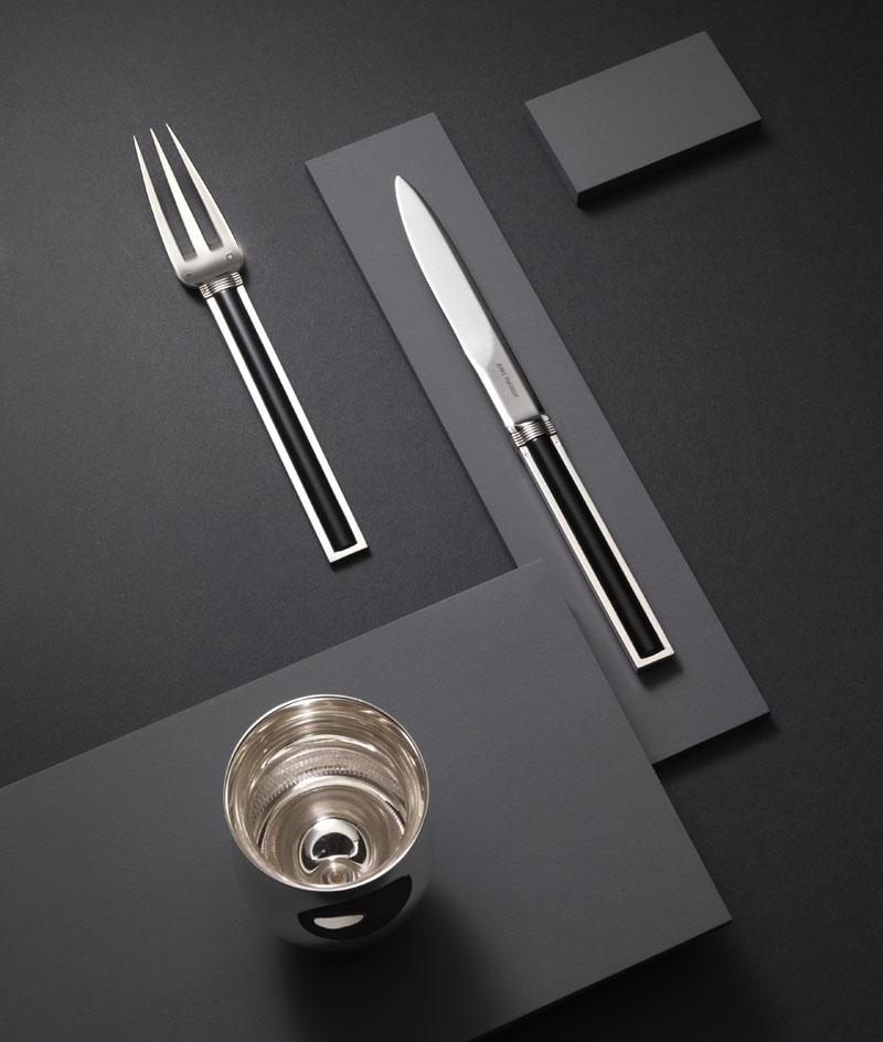
Back in 1928, Jean Puiforcat set the bar for dinner opulence with the Cannes pattern in flatware. The iconic design was inspired by the architectural façade of Hôtel Martinez in Cannes, and served many of the elite at sophisticated dinner soirées. The French brand is now giving the range an elegant resurgence by adding a hint of onyx, lapis-lazuli, jade and jasper to the handle of the sterling silver pieces. Cannes’s semi precious addition takes the designs up a notch from cutlery to haute couture table jewels.
Cannes Précieux is available by special order from Puiforcat. Writer: Sujata Burman
‘Poli-Piel’ by Jorge Penadés
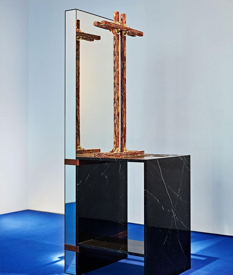
Jorge Penadés has been giving leather scraps the luxury treatment since his acclaimed graduation project ‘Structural Skin’ (2014). The Spanish designer compresses and glues dyed leather offcuts into long profiles with a grain like marble or wood. ‘Poli-Piel’, a solo show at Madrid gallery Machado-Muñoz, shows him taking his invention in a bold direction. Leather is the common element across eight distinctive pieces of furniture and lighting; buckles and leather straps combine his own material with planes of glass, aluminium and mirror in daring compositions. Marking Penadés' first solo exhibition, ‘Poli-Piel’ also showcases a new technique he has found for coaxing the natural material into structural form. Two conical table lamps have bases of stacked coils, each layer made of rolled and glued leather. The show’s title plays on the Spanish word for ‘Leatherette’ as well as describing many ways to use leather. Until 10 March
Machado-Muñoz, Calle José Marañón, 4, 28010 Madrid, Spain. Writer: Riya Patel
This X That pop-up
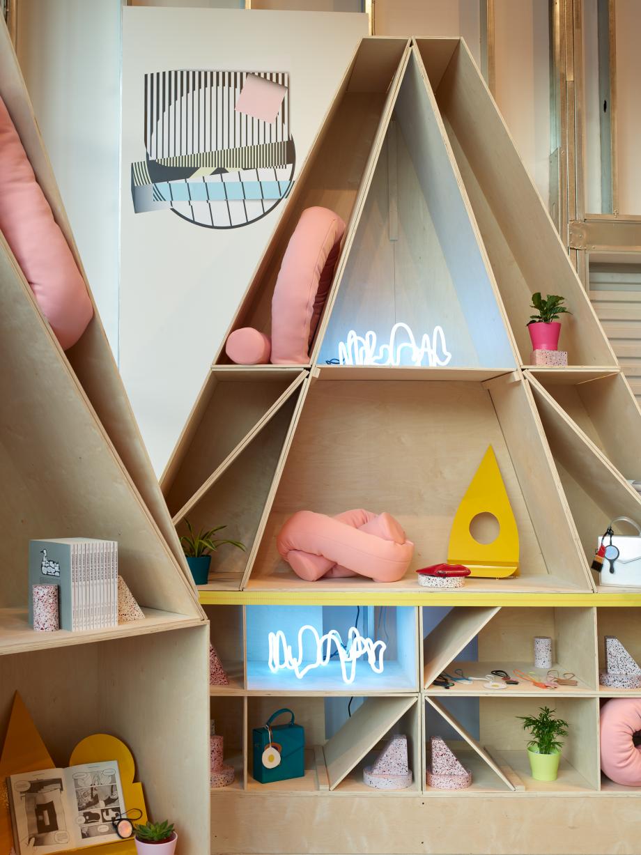
Design consultancy This X That fuses architecture and design at its new pop-up store at MOCA’s Geffen Contemporary. The LA-based company invited a selection of emerging architecture practices to contribute limited-edition pieces for the home and garden, including Architecture Office, Besler & Sons, New Affiliates and Welcomecompanions. Our favourite piece has been designed by Jimenez Lai, founder of Bureau Spectacular, who contributed the neon Scribble lamp. Lai translated his passion for architecture into a cartoon-ish design. The lamp supports itself by its own flowing curvature, and can be installed on the floor, tabletop, or on the ceiling. Until 19 March.
Geffen Contemporary at MOCA, 152 North Central Avenue, Los Angeles, CA 90012. Writer Luke Halls. Photography: Injinash Unshin
Kartell pop-up
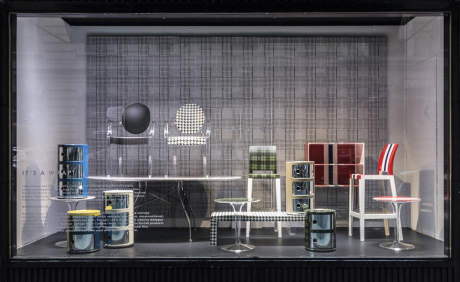
In a fitting union of Italian prowess, the eye-catching collaboration between Kartell and entrepreneur Lapo Elkann has arrived on American shores via a pop-up space at Barneys New York. Using the innovative wrap technology that fuels his automotive customisation brand, Garage Italia, Elkann has covered a selection of Kartell icons in a series of vibrant patterns and graphics, inspired by both fashion and classic cars. Forty of Kartell’s timeless pieces, including Philippe Starck’s 'Ghost' chair and Antonio Citterio’s 'Glossy' table have been enveloped in energetic racing stripes, shiny chrome and sartorially-inspired plaids. Originally unveiled during Milan Design Week in 2016, the collection is on view and available for purchase at Barneys’ Madison Avenue location until the end of March.
Barneys New York, Madison, 660 Madison Ave, New York, NY 10065. Writer: Pei-ru Keh. Photography: Rick Barroso
Sister City hotel concept
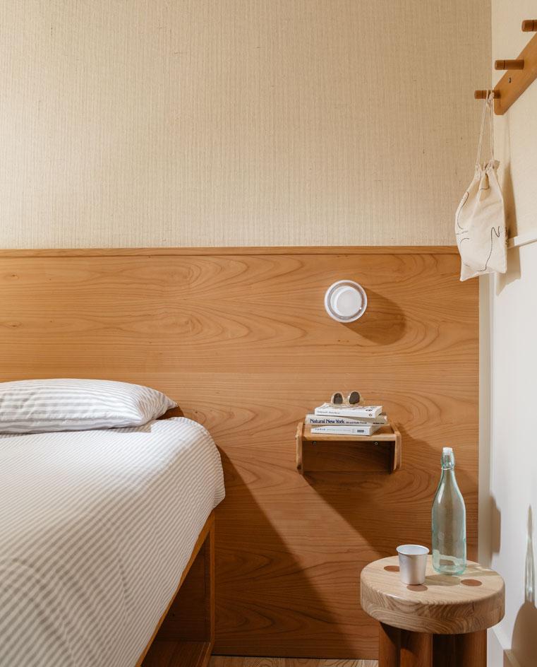
Ace Hotel broke the hospitality mould when it unleashed its irreverent, carefully curated ethos on the world almost two decades ago. This week, its creative arm Atelier Ace announced a new arrival, Sister City, which will be revealed in New York City this autumn. Located off Bowery, one of Manhattan’s most historic thoroughfares, and accessed through a garden on Freeman’s Alley, the new hotel concept promises to use empathy and an aesthetic union of both function and beauty to cater to the modern traveller’s needs. Armed with a rooftop bar, a ground floor restaurant and 200 rooms, this highly anticipated launch is sure to overturn the applecart.
Writer: Pei-Ru Keh
'Apollo' by Achille Salvagni
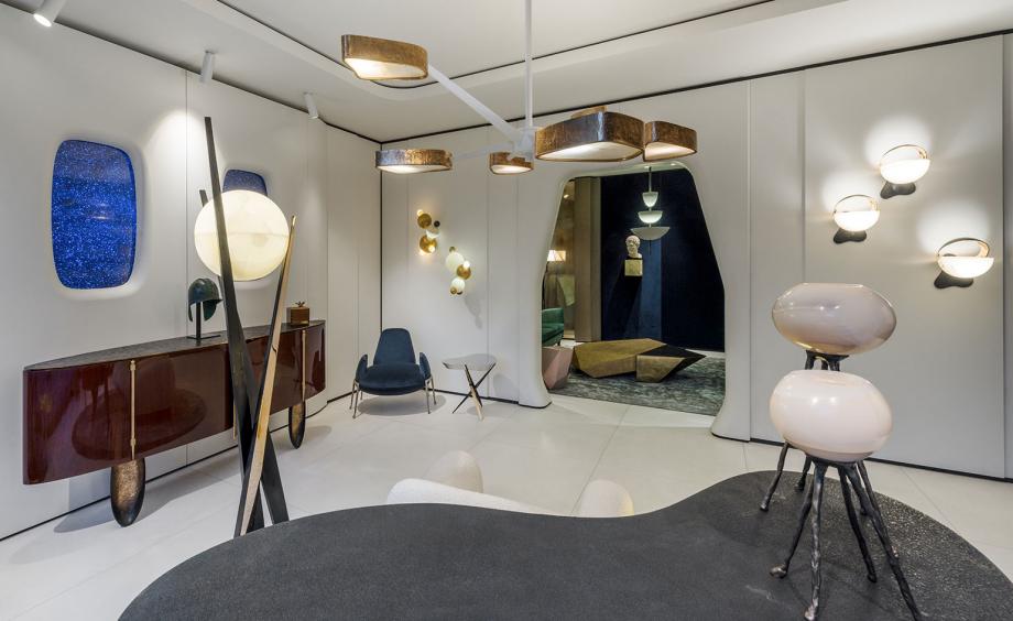
Achille Salvagni is inspired by 1960s science fiction set designs for the Spring transformation of his showroom. He turned to Stanley Kubrick’s 2001: A Space Odyssey when building his own space capsule right inside the Mayfair atelier. The Roman designer uses some of his classics alongside new product to realise the retro-futuristic set; white washed panelled walls and ceilings are accompanied by portholes to metaphorically look out into the galaxy. The product lends itself to the fantasy too; new circular wall sconces sit in twos and threes to look particularly celestial while chairs and stools appear as extraterrestrial friends. ‘As commercial space tourism takes shape, I created my own interpretation of a space capsule.’ says Salvagni, ‘I wanted to imagine a futuristic yet opulent interior with highly crafted pieces, design a personal response to the imminent exploration of this unchartered territory, another marvel soon to be revealed.’
15 March - 7 September; 12 Grafton St, Mayfair, London W1S 4ER. Photography: Paolo Petrignani. Courtesy of Achille Salvagni Atelier. Writer: Sujata Burman
Wonmin Park at Carpenter’s Workshop Gallery
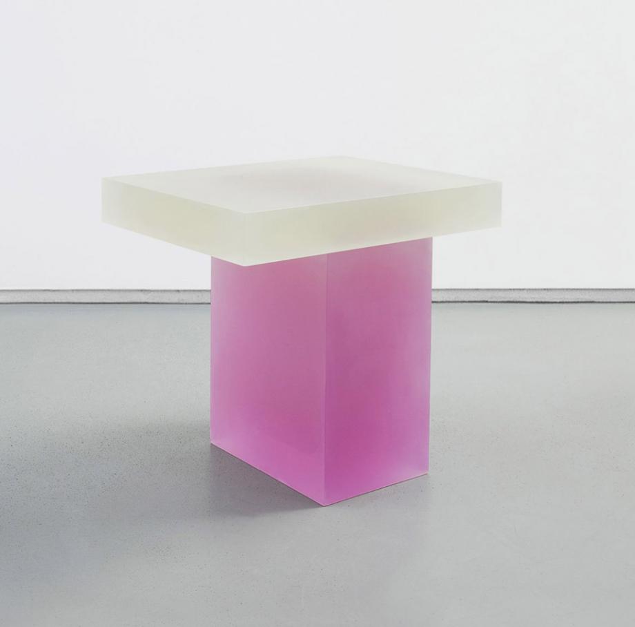
Wonmin Park’s restrained, yet elegant aesthetic is a long-time favourite of ours, and we were particularly excited when he unveiled his latest venture ‘Plain Cuts’ – an experimental collection of aluminium tables at PAD in London last year. The Paris-based designer is now making his US debut this week at Carpenter’s Workshop Gallery in New York. In addition to showcasing ‘Plain Cuts’, Park’s contemplative pieces are joined by new, unseen additions to his signature ‘Haze’ series of resin works (pictured). Until 14 April.
Carpenter’s Workshop Gallery, 693 5th Avenue, New York, NY 1002. Writer: Pei-Ru Keh
Epic React Flyknit
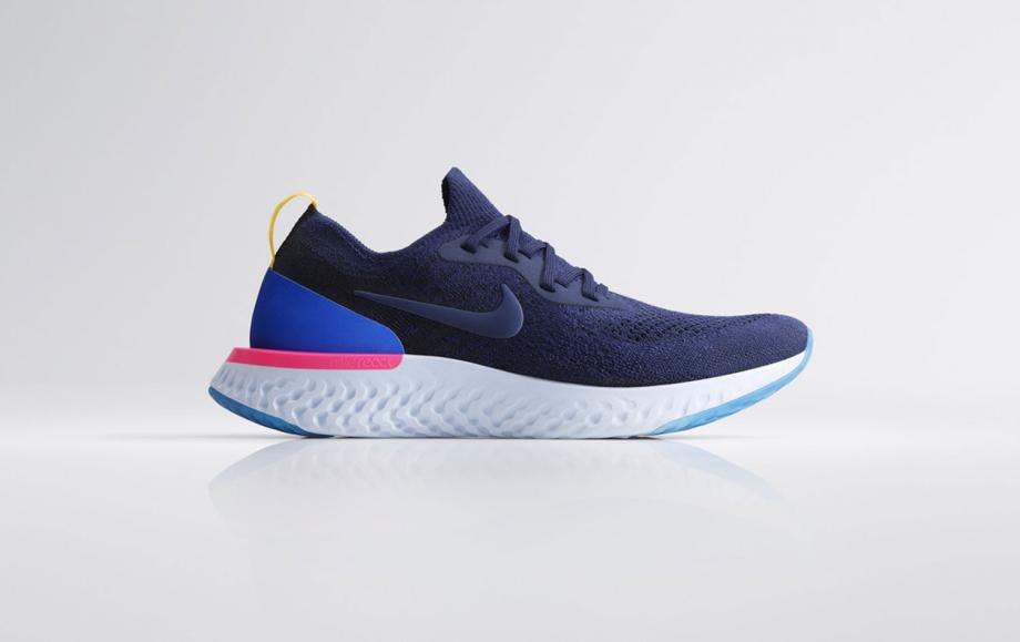
High design meets lightweight technology in the newest Nike running shoe – Nike Epic React Flyknit. Its minimalist focus reflects its functions, using a lightweight cushioning foam with maximum energy return. ‘That unique React Foam pattern was created after thousands of iterations, which were made possible because we’ve used computational design,’ says Nike’s senior director for global running footwear, Bret Schoolmeester. ‘The final design makes the midsole softer in areas where runners exert higher pressure and more stable near the edges and sidewall where runners need increased stability’. And it’s a treat for the eyes too – the rippling pattern together with the stokes of blue and neon pink at the rear of the model (available in a white version too) adds a certain playful energy, while maintaining its three goals – flexibility, breathability and support.
The Nike Epic React Flyknit will be available 22 February from Nike. Writer: Sujata Burman
Norm Architects
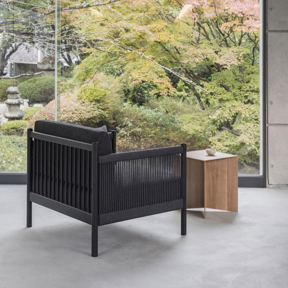
Design brand Ariake launched last year with a unique concept of connecting two Japanese furniture manufacturers – Legnatec and Hirata Chair – with an international roster of design talent (Anderssen & Voll and Gabriel Tan to name a few). Next up is Norm Architects, who have launched a chair and sofa that are set to show at Stockholm Furniture Fair next month. For Ariake, the Danish firm joined forces with Brazil-based architect Marcio Kogan (StudioMK27) to realise the ‘Braid’ armchair (pictured). The cultural merging is evident from its design – the modernist structure is inspired by Danish cabinetmakers’ furniture, while the intricate details, like the bamboo construction and tatami mats, echo Eastern influences.
Writer: Sujata Burman
Studio Furthermore at Aram Gallery
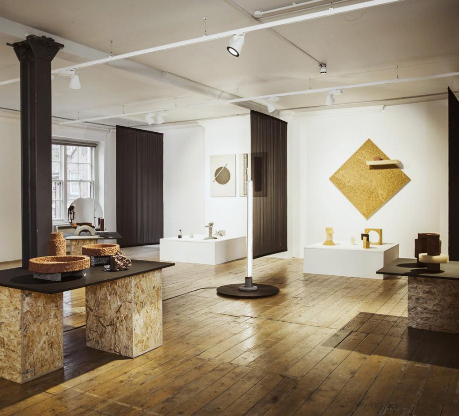
East London-based Studio Furthermore was inspired by the rocks, earth and mineral ores of Iceland for its ‘Replica’ series. The ceramics and aluminium alloy collection – currently on show at London’s Aram Gallery – is reminiscent of foamy lava rocks, created through scientific experimentation whereby a copy of the original product is the end-product we see. The range of standing lights, mirrors, pots and tables is coupled with examples of the studio’s tests and a film that takes individuals through the process at the Drury Lane space.
‘Replica’ is on view until 20 January. The Aram Gallery, 110 Drury Lane, WC2B 5SG. Photography: Amandine Alessandra. Writer: Sujata Burman
Primitives
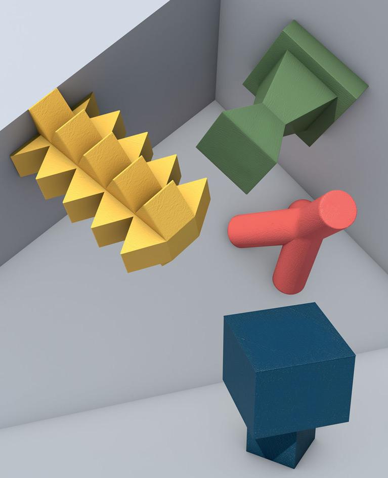
These striking podiums form part of a set of nine. The collection, entitled ‘Primitives’, was designed by Sicilian studio Moncada Rangel and draws inspiration from the abstract shapes of Brancusi. Their simple geometric forms and bold colours create a unique stage upon which even the simplest objects become showstoppers. Each was handmade by graduates of the Made programme at the Academy of Fine Arts in Syracuse. Using plywood and papier-mâché, the students, led by Moncada Rangel, crafted sculptural pieces in keeping with the studio’s aesthetic. This collection certainly turns the tables by upgrading the pedestal from supporting role to star of the show.
Pictured: four pieces from the ‘Primitives’ collection, which was recently acquired by a Sicilian cosmetics brand and is currently being shown in a small gallery and retail space on the island of Ortygia. Illustrator: Julien Savioz. Writer: Mary Cleary
Woody-Zoody
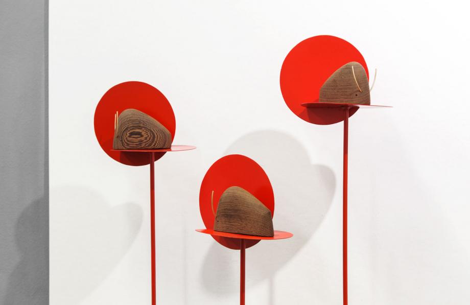
Design duo Formafantasma have created the newest member of the Woody-Zoody family of wooden animals. ‘Toro’ (the Italian word for bull) is a playful wenge wood and brass figurine of a bull, a minimalist interpretation of the animal which features the signature elegance of the pair’s work. ‘We both share a passion for toys, we collect vernacular wooden toys from all over the world,’ say Simone Farresin and Andrea Trimarchi. ‘Children can imagine animals from any shape, and our object for Woody-Zoody starts with an abstract form which becomes a bull with two small brass tubes.’ ‘Toro’ is part of a growing collection of wooden animals, joining the likes of Giacomo Moor’s ‘Toucan’ and Giulio Iacchetti’s ‘Whale’.
Writer: Rosa Bertoli
Rising Talents Awards at Maison et Objet
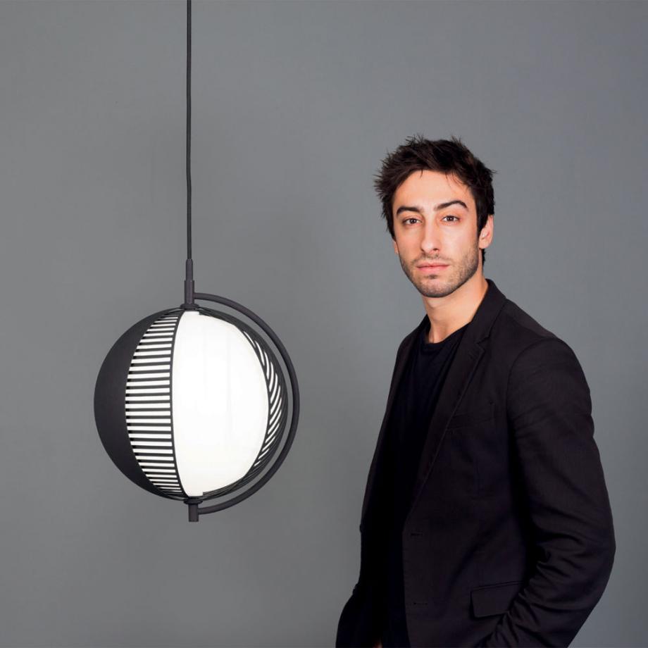
Each year, Maison & Objet invites six legendary creatives to nominate an upcoming designer for the Paris design fair’s Rising Talents series. This January’s selection includes Federica Biasi, chosen by Andrea Branzi; Guglielmo Poletti, chosen by Rossana Orlandi; and Antonio Facco, chosen by Giulio Cappellini. Says Cappellini, ‘Facco’s projects are largely inspired by his observations of the younger generations.’ With a keen interest in industrial and artisanal techniques, Facco’s portfolio includes works for Cappellini, Antolini and Bolon. In Paris, Facco is presenting a new light for Swedish brand Oblure. ‘Mondo’ (pictured with Facco) features a sphere partially obscured by two shades that can be rotated to create different pattern compositions, transforming its aesthetic while controlling the intensity of the light.
Maison & Objet runs from 19-23 January. Photography: Felicity McCabe. Writer: Rosa Bertoli
Wallpaper* Newsletter
Receive our daily digest of inspiration, escapism and design stories from around the world direct to your inbox.
Rosa Bertoli was born in Udine, Italy, and now lives in London. Since 2014, she has been the Design Editor of Wallpaper*, where she oversees design content for the print and online editions, as well as special editorial projects. Through her role at Wallpaper*, she has written extensively about all areas of design. Rosa has been speaker and moderator for various design talks and conferences including London Craft Week, Maison & Objet, The Italian Cultural Institute (London), Clippings, Zaha Hadid Design, Kartell and Frieze Art Fair. Rosa has been on judging panels for the Chart Architecture Award, the Dutch Design Awards and the DesignGuild Marks. She has written for numerous English and Italian language publications, and worked as a content and communication consultant for fashion and design brands.
-
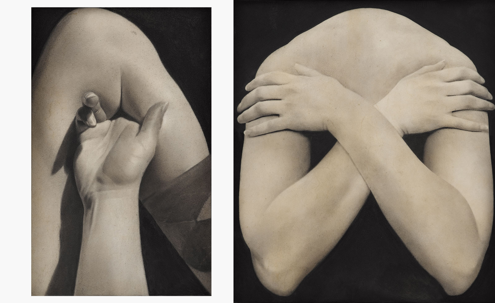 Put these emerging artists on your radar
This crop of six new talents is poised to shake up the art world. Get to know them now
By Tianna Williams
-
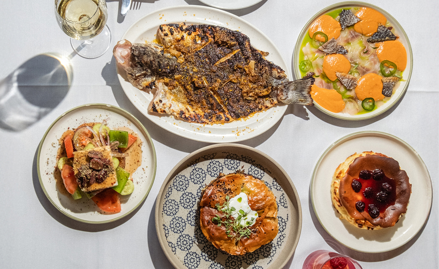 Dining at Pyrá feels like a Mediterranean kiss on both cheeks
Designed by House of Dré, this Lonsdale Road addition dishes up an enticing fusion of Greek and Spanish cooking
By Sofia de la Cruz
-
 Creased, crumpled: S/S 2025 menswear is about clothes that have ‘lived a life’
The S/S 2025 menswear collections see designers embrace the creased and the crumpled, conjuring a mood of laidback languor that ran through the season – captured here by photographer Steve Harnacke and stylist Nicola Neri for Wallpaper*
By Jack Moss
-
 Salone Del Mobile 2025: Paolo Sorrentino, Robert Wilson, Sou Fujimoto and Pierre-Yves Rochon amongst this year's contributors
The countdown to Salone Del Mobile 2025 has begun. President, Maria Porro, announced first plans for the fair including some key names
By Cristina Kiran Piotti
-
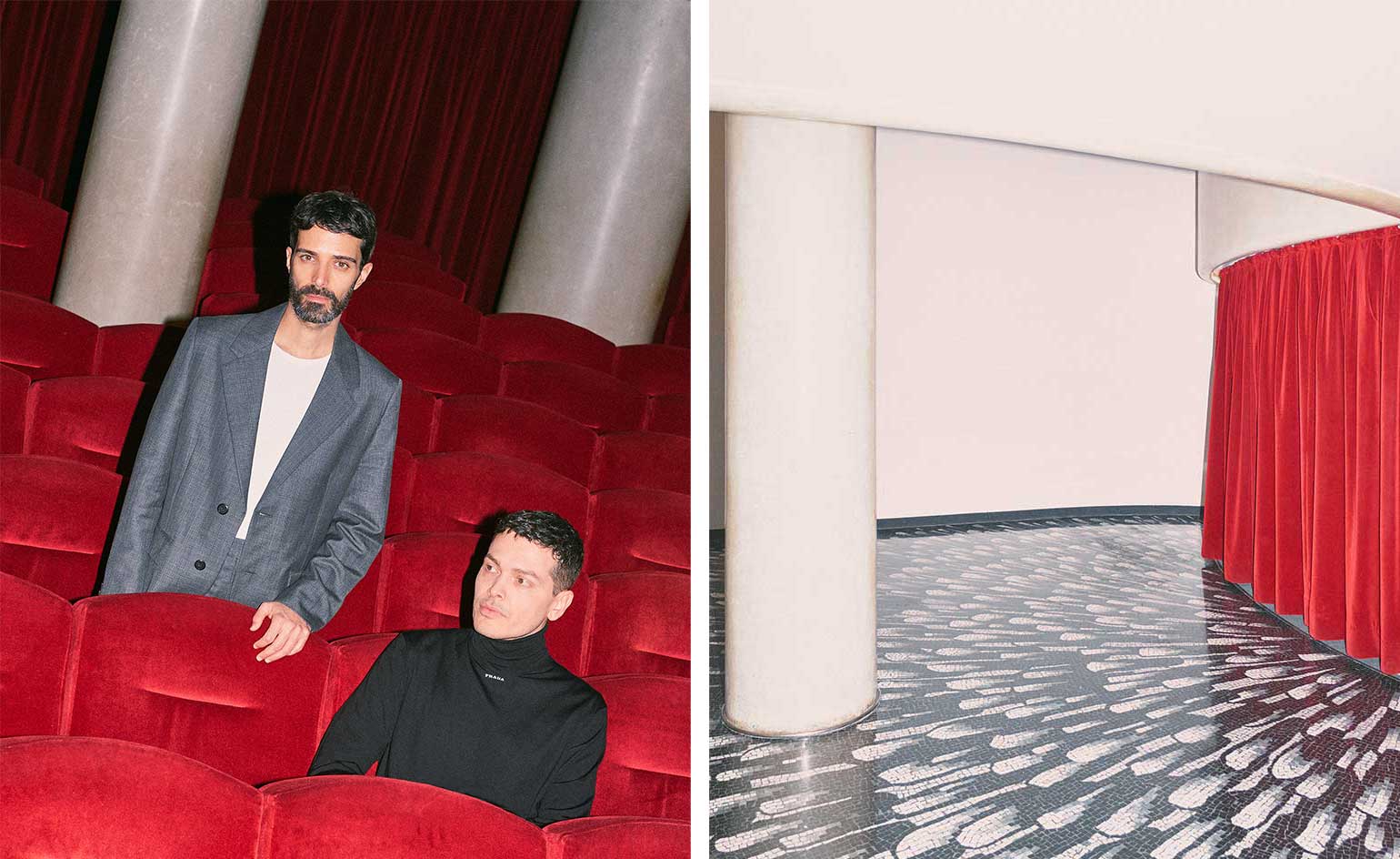 Prada Frames 2023: Milan programme announced
Programme announced for Prada Frames 2023 at Milan Design Week, the annual symposium curated by Formafantasma at Luigi Caccia Dominioni's Teatro Filodrammatici from 17 to 19 April
By Rosa Bertoli
-
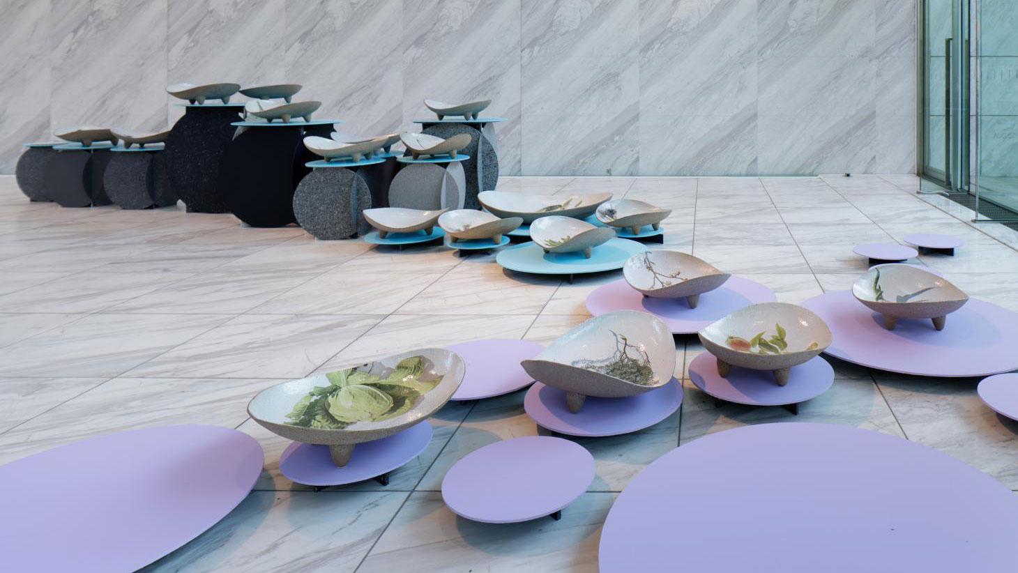 Designart Tokyo transforms the city into a museum of creativity
Designart Tokyo presents global design highlights through a series of exhibitions involving global creative talent and traditional Japanese craft
By Danielle Demetriou
-
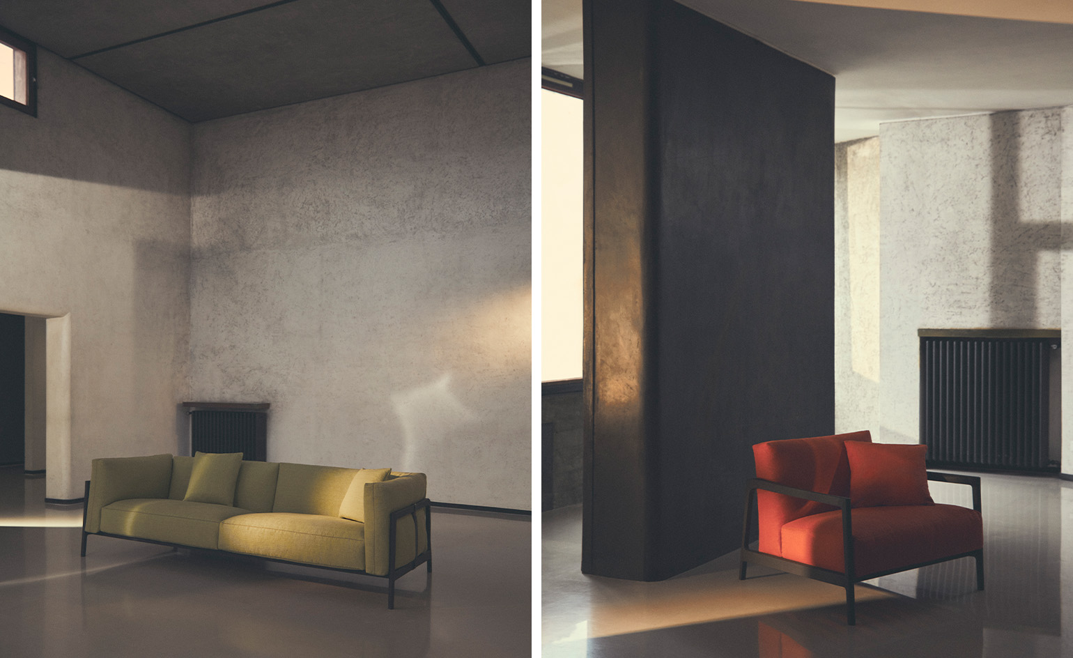 Paul Smith partners with Boffi | DePadova on a colour-soaked collection
The design signatures of Paul Smith and Boffi | DePadova unite in ‘Everyday Life’, a wide-ranging ‘homage to craftmanship’ that comprises colourful sofas, armchairs, coffee tables and more
By Jack Moss
-
 Matisse cut-outs inspire this lighting collection by Formafantasma
At Milan Design Week 2022, Maison Matisse celebrates the French artist’s paper cut-outs through contemporary design collections
By Rosa Bertoli
-
 Prada and Formafantasma announce Milan Design Week symposium
Curated by Formafantasma and at Milan’s National Braidense Library from 6 – 8 June 2022, Prada Frames is a free event exploring the relationship between the natural environment and design
By Rosa Bertoli
-
 Formafantasma goes bananas for Johanna Seelemann
Known for projects such as exposing the journey of a banana, German designer Johanna Seelemann brings a fresh perspective to mundane objects, and is tipped by Formafantasma as one of 25 creative leaders of the future in Wallpaper’s 25th Anniversary Issue ‘5x5’ project
By Pei-Ru Keh
-
 Natuzzi’s new furniture exudes Mediterranean attitude
Part of Natuzzi’s ‘Circle of Harmony’ creative series, its new furniture collections feature pieces by Sabine Marcelis, Formafantasma, Marcel Wanders Studio, Patrick Norguet and more
By Rosa Bertoli