Brent Dzekciorius: Best British Designers
Sometimes, it takes an outsider to provide a fresh perspective or even to cast a critical, unbiased eye over the familiar. No surprises then that auction house Phillips de Pury recently lured Brent Dzekciorius – the ex-director of Johnson Trading Gallery and Moss Gallery, and the founder of his own art and design production company DZEK – away from New York to head its primary market programme in London.
Profiled in the Great Britain section of our current November ‘Territories’ issue, Dzekciorius has tremendous admiration for London’s design scene. ‘There is a design culture here that is storied,’ he says. 'It is an embraced and critical component of the overall arts culture, an equal rather than a second tier, and because of this people come from all over the world to be a part of it. There is an incredible balance of ambition, competition, and support within the design community here and this balance feels respected.’
For Dzekciorius, what distinguishes London from the other design capitals of the world is that it so unabashedly embraces every single component of design, including the commercial aspect. ‘There are other towns with strong design communities, but I don't think any has the combination of working talent, cultural credibility, and commerce that is present in London. We don’t, for instance, see Sotheby’s presenting Design Academy Eindhoven’s graduate show in New York or Eindhoven.’
His enthusiasm for his new stomping grounds has shown through in the brief interval that he’s been with Phillips. His shows so far, including Connectors at the Saatchi Gallery, reflect his conviction that good design starts with craftsmanship. ‘We surround ourselves with objects of utility, art, that can be highly personal and I think it’s important to know something beyond what caused that stain on the arm of the chair. This is about saying goodbye to disposability, and becoming more informed, responsible consumers.’
With such rigourous standards in mind, we asked Dzekciorius for his pick of British designers worth watching, following which we tracked each down for some quality one-on-one time.
Glass Hill
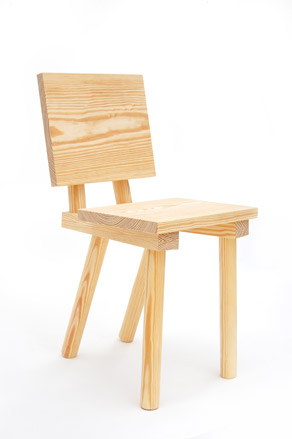
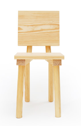
Glass Hill is duo Markus Bergström and Joe Nunn. Says Dzekciorius, ‘I can’t say enough about these guys. They did the exhibition design for Connectors, and gave us our first Phillips de Pury edition chair. They are artisan craftsmen at heart with a great aesthetic.’
W*: What are you working on at the moment?
A river boat/art club for gallerist, Man Somerlinck.
W*:What is your dream project or commission?
An inter-continental railway link between Europe and Asia.
W*: What object do you most wish you had designed?
The BMW e36 (Nunn) and the Mercedes Benz w124 (Bergström).
W*:What do you think will be the next big trend in design?
Buy One Get One Free (Nunn) and global maximalism (Bergström).
W*: Who would you most like to collaborate with and why?
Someone with a creative output in a different field from ours and whose work we admire: Raf Simons (Nunn) and Peter Märkli (Bergström).
W*:What is your favourite thing about the UK?
Its steadfast provincialism (Nunn). London, a thriving quarantine that’s like a state within the state (Bergström).
W*:In what way does life in the UK inform or inspire your work?
A lack of preciousness.
Raw Edges
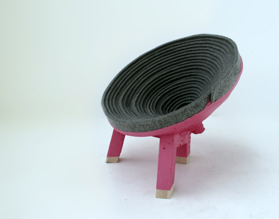
Yael Mer and Shay Alkalay as Raw Edges are one of the most interesting young partnerships in design today. Dzekciorius hails their ‘playful, original approach to their work. In ‘Coiling’, they use felted wool as both upholstery and structure by rolling strips of felt into coils and dipping them into beautiful acrylic resins.’
W*:What are you working on at the moment?
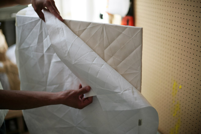
We have just launched ‘Folded’ a new ceramic tile collection for Italian manufacturer Mutina that was inspired by folded and then unfolded paper. We played with the idea of taking shower in a paper room. In November, we have a solo show at Fat Gallery in Paris. We are also in a short Sotheby exhibition ‘Small Show Huge Talent’ where we created drawers that are pulled out of the floor. We’re also doing an exciting completely new project to be presented early next year with Novalis Gallery in Turin.
W*What is your dream project or commission?
It would be probably something to do with contemporary dancing; something that’s between costumes and furniture design (Mer). Any kind of collaboration with Michel Gundry would be blissful (Alkalay).
W* What object in the world do you most wish you had designed?
Let’s just focus on things we saw last week. Shay would have been happy to design Stuart Haygarth’s ‘ Framed’ Stairs for the V&A, and Yael would have been delighted to come up with similar concept to Tomas Heatherwick’s Spun Seat.
What do you think will be the next big trend in design? Well, we tend very much to focus on what interests us and we try to avoid looking at current trends, even though it is probably inevitable. So we are the wrong people to ask about coming trends.
W* Who would you most like to collaborate with and why?
Michel Gundry because his down-to-earth surrealism, his amazing rough aesthetics and sense of humour, his original usage of camera angles and his editing. Inbal Pinto and Avshalom Pollak Dance Company because of their out of place and out of time scenarios, and their combinations of objects and the human body. And if we could design something for or with Japanese manga artist and director Hayao Miyazaki, it would have been amazing!
W* What is your favourite thing about the UK?
It doesn’t feel strange to be a stranger here, and no one asks where we are from when hearing our strange accents.
W* In what way does life in the UK inform or inspire your work?
Everything feels quite accessible here. This where Mark Holmes (ex-Established & Sons) saw the first prototype of Starck. It allowed leading figures like Giulio Cappellini or Ambra Medda to visit us in our small north London Studio. If we lived in our native Tel-Aviv, it wouldn’t have been as simple. There are fantastic galleries and design shops that we are always happy to collaborate with such as Arts-Co, Phillips de Pury, Fumi, Mint Shop, Established & Sons and The Lollipop Shoppe.
Max Lamb
Dzekciorius says Lamb ‘has such respect for craftsmanship and the industrial process, which is why I think his collaboration with Lobmeyr is so fitting. He is one of the few designers I am aware of who is so comfortable working in both traditional and unconventional materials, expertly employing the hi- and low-tech with processes ranging from electroforming to sand-casting and whittling.’ Lamb’s second collaboration with Lobmeyr, ‘Quarz’, is a collection of tumblers representing mathematical quartz prisms inspired by the Giant’s Causeway in Northern Island.
W*: What are you working on at the moment?
In eight hours, I fly to Hong Kong to make a new series of stone furniture for a private apartment block on Hollywood Road. It’s a commission through Studio Ilse. I will be in Xiamen in Fujian Province working with a stone yard and granite quarry to make a concierge desk, coffee tables for the lobby, and a series of side tables and stools for the apartments and roof terrace.
What is your dream project or commission? Hopefully, one day I will be able to commission myself to build my own home.
W*: What object in the world do you most wish you had designed?
To be honest, I don't. But I am very grateful for all the incredible objects I use on a daily basis that have been designed by others: pen-knife, cutlery, paperclip, pencil, claw-hammer, calculator, tape-measure and so on.
W*:What do you think will be the next big trend in design?
Goodness knows. I try not to take any notice. But hopefully more people will begin to make things for themselves and thus slow down consumption. We are so lazy these days and have so many expectations.
W*:Who would you most like to collaborate with and why?
Nobody in particular. At present I am quite content working on projects by myself and occasionally collaborating with local industries and fabricators when necessary. I just designed a set of steel tables that I had welded by a guy called The Welder who runs a company called ‘One Small Girl and a Bottle of Gas’. The steel, the laser cutting, the welding and the galvanising were all done in London which is a really satisfying way to work.
W*: What is your favourite thing about the UK?
We are a tiny island with proud people, incredible hills in the Lake District, Snowdonia and Scotland as well as beautiful beaches in Cornwall, Devon and Northumberland.
In what way does life in the UK inform or inspire your work? It’s the diversity of the landscape and its natural resources.
Seongyong Lee
A recent graduate of the Royal College of Art, Lee’s final year project ‘Plytube’ was inspired by standard cardboard tubing and their construction principles. Dzekciorius says the project ‘is an incredible innovation in both architectural material and furniture design, defining an entirely new language of joinery. The pieces are incredibly lightweight, but sacrifice nothing in strength. A fully functional stool from the series weighs a mere 820g. We are working closely with Seongyong on the development of Plytube as both material and furniture series.’
W*: What are you working on at the moment?
I am still working on the ‘Plytube’. I am also working on a chair and light.
W*: What is your dream project or commission?
I would like to design a bench for a public space.
W*: What object do you most wish you had designed?
A very reliable and good looking ruler.
W*: What do you think will be the next big trend in design?
The simplification of manufacturing techniques combined with efficiencies of production that improve the quality of mass products. We’ve already seen some of this potential from Apple.
W*: Who would you most like to collaborate with and why?
I have a very high respect for master artisans and would love to work with them so that I can learn the history and craft, and add my own spin to the process.
W*: What is your favourite thing about the UK?
Watching children play or seriously absorb art pieces at a gallery.
W*: In what way does life in the UK inform or inspire your work?
Lots of students and young designers regard the UK as the land of opportunity. The people here seem to be always on the lookout for new or good works. There’s a culture here that nurtures artists and designers. This kind of open possibilities inspires me and lets me concentrate more creatively on my works.
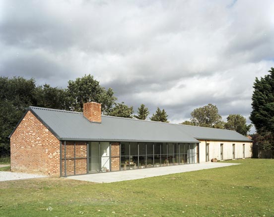
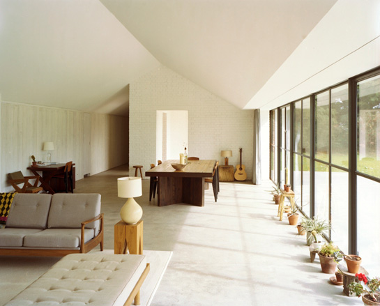
Interactive floor plan: Stable Acre House, Norfolk, by Architect David Kohn

Interactive floor plan: Stable Acre House, Norfolk, by Architect David Kohn
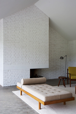
Interactive floor plan: Stable Acre House, Norfolk, by Architect David Kohn
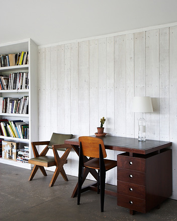
Interactive floor plan: Stable Acre House, Norfolk, by Architect David Kohn
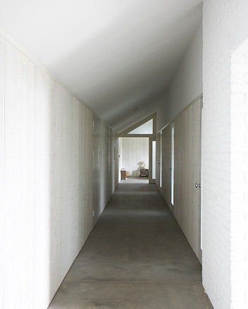
Interactive floor plan: Stable Acre Barn, Norfolk, by Architect David Kohn
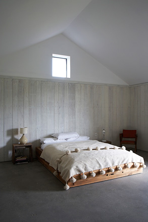
Interactive floor plan: Stable Acre House, Norfolk, by Architect David Kohn
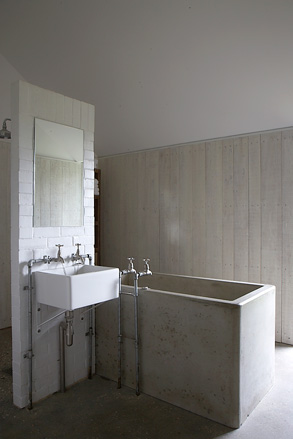
Interactive floor plan: Stable Acre House, Norfolk, by Architect David Kohn

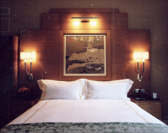
The Savoy, London:
After an extensive three year, £200m renovation, London’s Savoy has finally reopened
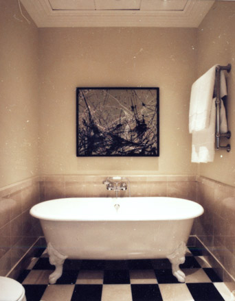
The Savoy, London:
’It wasn’t about changing the hotel. It was about restoring it’
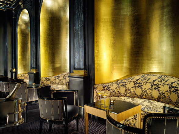
The Savoy, London:
The Beaufort Bar offers an impressive range of vintage champagnes available by the glass
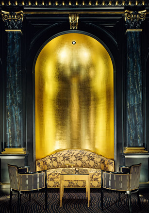
The Savoy, London:
The new Beaufort Bar, complete with velvet chairs and gold-leaf walls
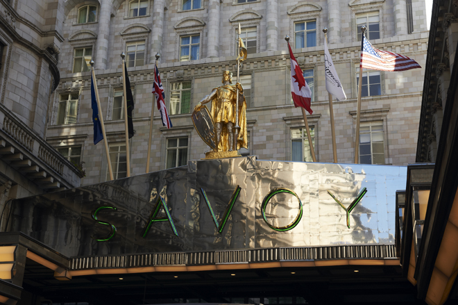
The Savoy, London:
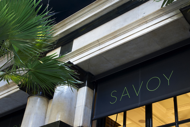
Pentagram’s John Rushworth took inspiration from the 40ft neon lettering on the hotel’s canopy for the new logo...
The Savoy, London:
...reinterpreting it in a fresh, restrained yet elegant manner

Brent Dzekciorius: Best British Designers:
Glass Hill: Phillips de Pury’s first edition chair
Brent Dzekciorius: Best British Designers:
Glass Hill: Phillips de Pury’s first edition chair
Brent Dzekciorius: Best British Designers:
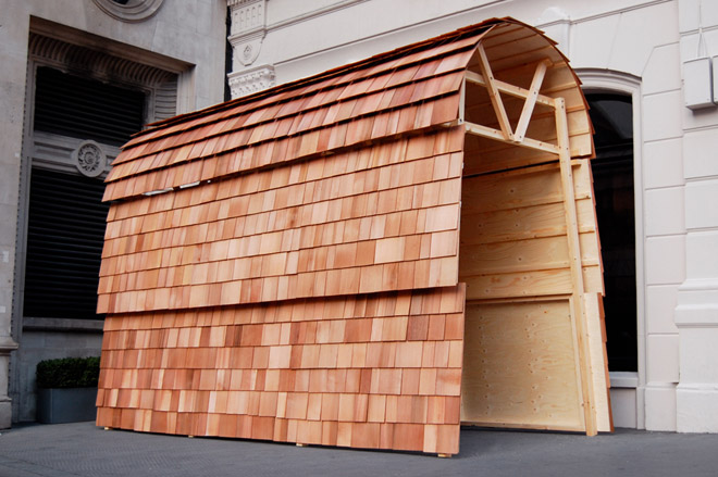
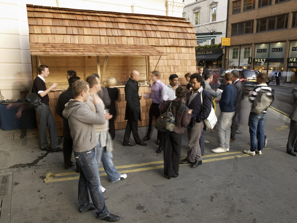
Glass Hill: ’L Bar at Andaz’ a pop-up bar to quench the thirsts of the local commuter and design community alike during the London Design Festival 2010
Brent Dzekciorius: Best British Designers:
Glass Hill: ’L Bar at Andaz’ a pop-up bar to quench the thirsts of the local commuter and design community alike during the London Design Festival 2010
Brent Dzekciorius: Best British Designers:
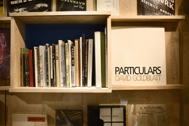
Glass Hill: Installation for Wood Finch Rare Book’s together with architect Simon Jones.
Brent Dzekciorius: Best British Designers:
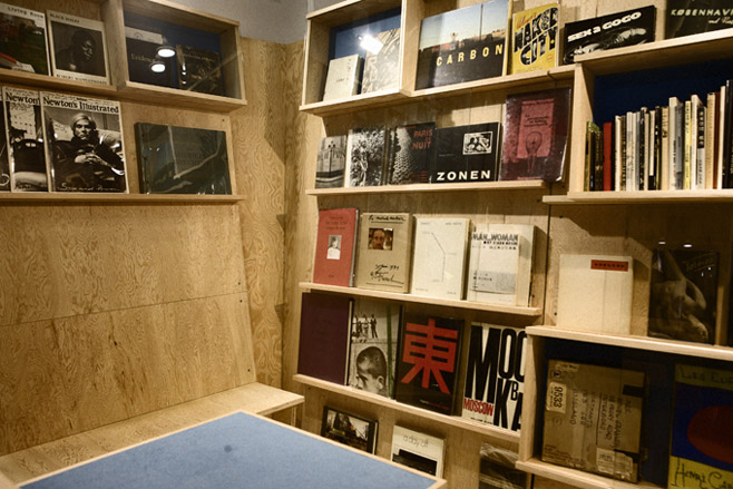
Glass Hill: Installation for Wood Finch Rare Book’s together with architect Simon Jones
Brent Dzekciorius: Best British Designers:
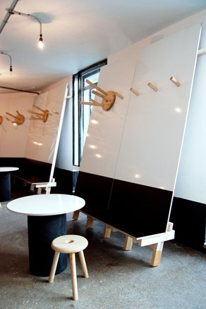
Glass Hill: The Artbar, the Royal College of Art
Brent Dzekciorius: Best British Designers:
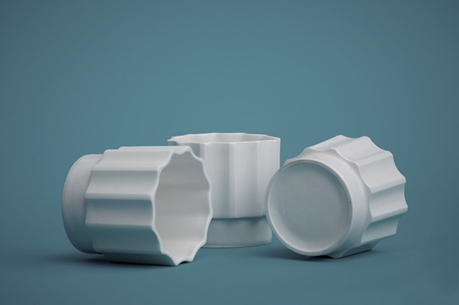
Glass Hill: The limited edition mug for the ICA
Brent Dzekciorius: Best British Designers:
Raw Edges: ’Folded’ tiles for Mutina, presented at Cersaie, Bologna, 2010
Brent Dzekciorius: Best British Designers:
Raw Edges: Coiling- Experiments in coiled felt and acrylic resin for the exhibition ’Ten Small Processes Behind Ten Objects,’ at the Salone 2010
Brent Dzekciorius: Best British Designers:
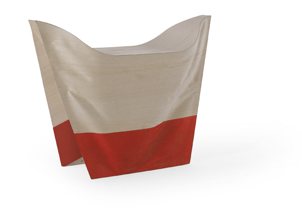
Raw Edges: Tailored Wood Bench for Cappellini 2010
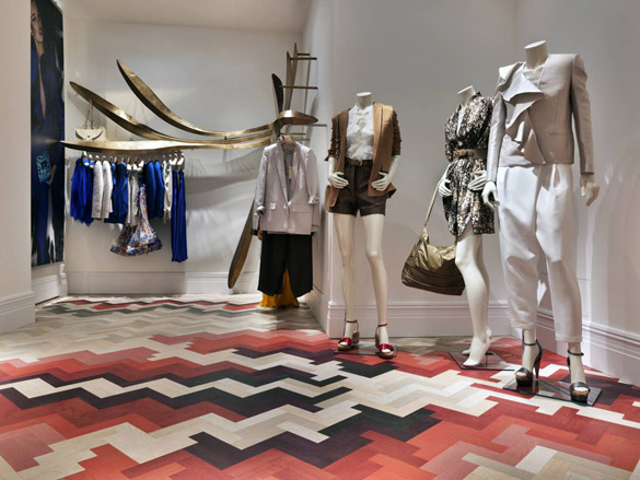
Brent Dzekciorius: Best British Designers:
Raw Edges: Stella McCartney store Milan - Floor installation, 2010
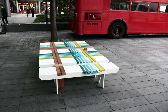
Brent Dzekciorius: Best British Designers:
Raw Edges: Bench10, outside the Lollipop Shoppe, London Design Festival 2010
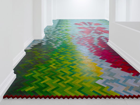
Brent Dzekciorius: Best British Designers:
Raw Edges: Wall to Wall at Established & Sons Limited Gallery, London, October 2009
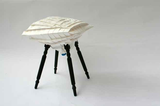
Brent Dzekciorius: Best British Designers:
Raw Edges: Pleated Pleat Stool for Mint, presented at LDF 2009
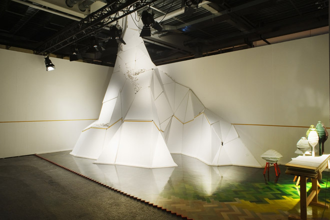
Brent Dzekciorius: Best British Designers:
Raw Edges: Design Miami/Basel, Designers of the Future Award, 2009
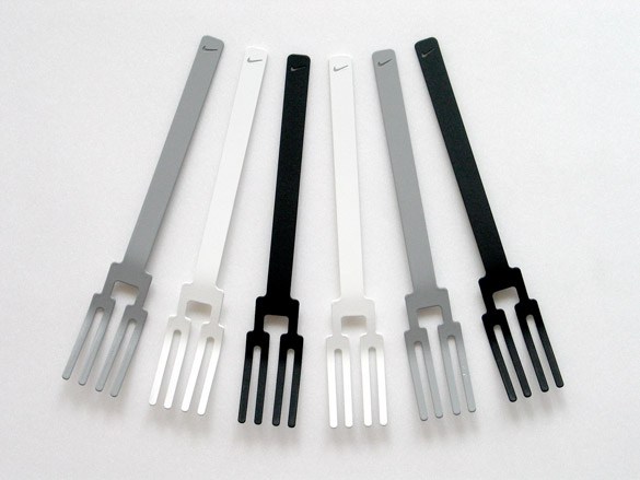
Brent Dzekciorius: Best British Designers:
Seongyong Lee: ’Tournament’ cutlery
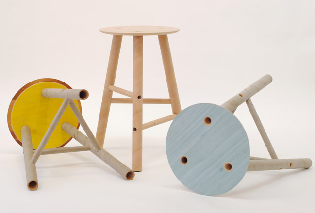
Brent Dzekciorius: Best British Designers:
Seongyong Lee: ’Plytube’ stools, 2010
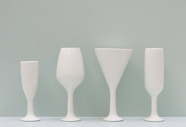
Brent Dzekciorius: Best British Designers:
Seongyong Lee: ONIV, ceramic Candlestand, Vase, Oil Lamp, 2008
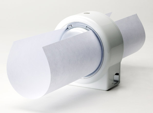
Brent Dzekciorius: Best British Designers:
Seongyong Lee: Circular printer, 2003
New printing system based on the circulating movement of the ink head
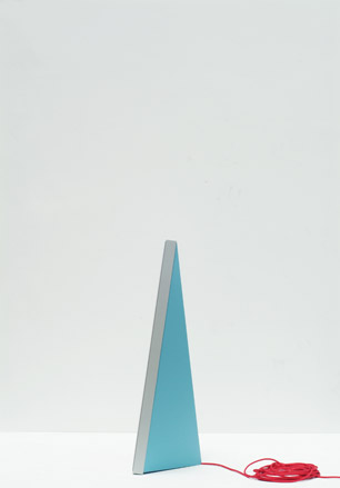
Brent Dzekciorius: Best British Designers:
Seongyong Lee: Light and Sound, lighting and speaker, 2008
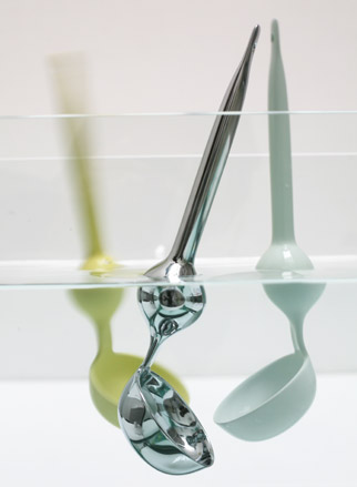
Brent Dzekciorius: Best British Designers:
Seongyong Lee: Floater cutlery, 2004
This product started from two main purposes. First, whenever you wash your dishes, you might have difficulties to find spoon as cutlery sinks deep down into water. Second, it is based on the idea of easy holding. Through making inside empty, it becomes rising to the surface of water like a float. Meanwhile, the spherical shape in the center acts as a supporter to help you when you cut and chop food with less effort.

Wallpaper* Newsletter
Receive our daily digest of inspiration, escapism and design stories from around the world direct to your inbox.
Daven Wu is the Singapore Editor at Wallpaper*. A former corporate lawyer, he has been covering Singapore and the neighbouring South-East Asian region since 1999, writing extensively about architecture, design, and travel for both the magazine and website. He is also the City Editor for the Phaidon Wallpaper* City Guide to Singapore.
-
 The Subaru Forester is the definition of unpretentious automotive design
It’s not exactly king of the crossovers, but the Subaru Forester e-Boxer is reliable, practical and great for keeping a low profile
By Jonathan Bell
-
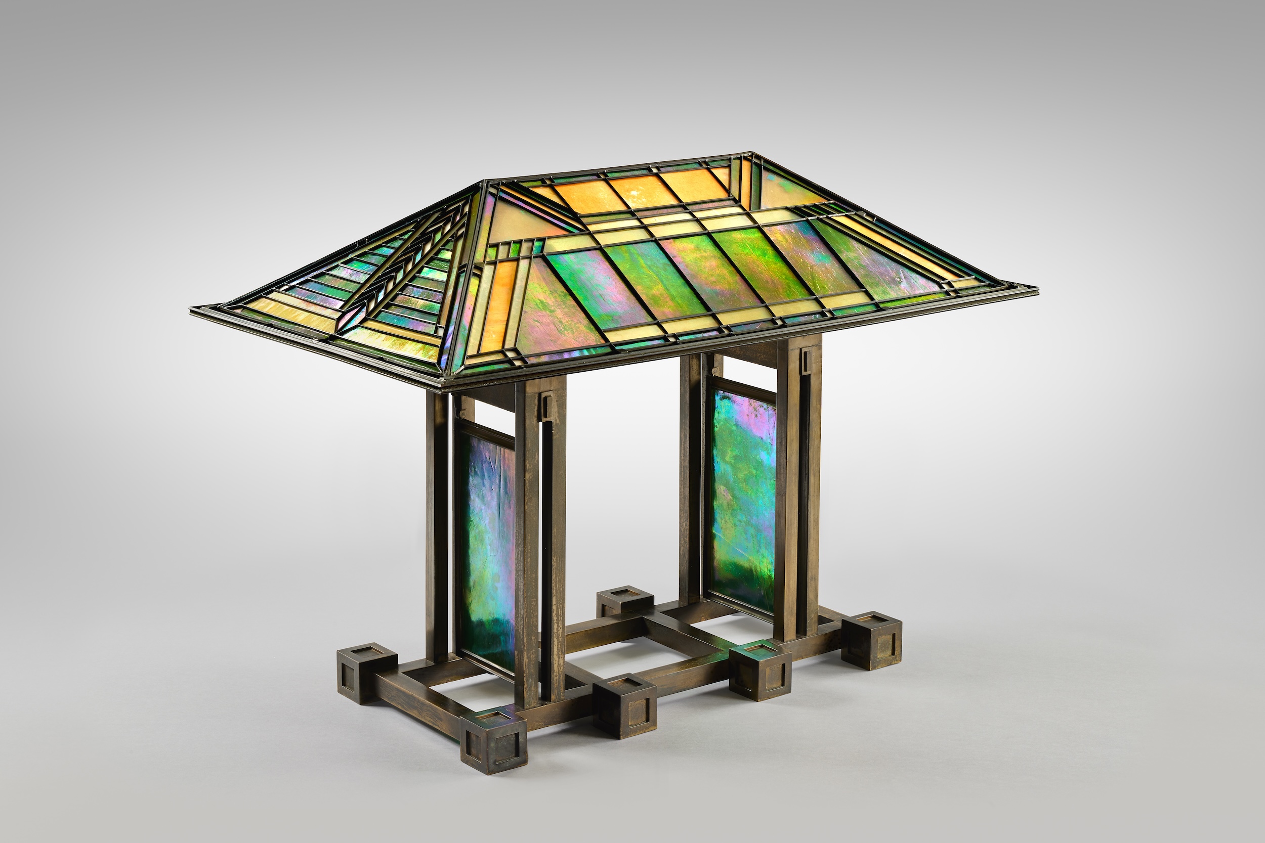 Sotheby’s is auctioning a rare Frank Lloyd Wright lamp – and it could fetch $5 million
The architect's ‘Double-Pedestal’ lamp, which was designed for the Dana House in 1903, is hitting the auction block 13 May at Sotheby's.
By Anna Solomon
-
 Naoto Fukasawa sparks children’s imaginations with play sculptures
The Japanese designer creates an intuitive series of bold play sculptures, designed to spark children’s desire to play without thinking
By Danielle Demetriou