Brick by brick: Why Not Associates build deSingel a new visual identity
Receive our daily digest of inspiration, escapism and design stories from around the world direct to your inbox.
You are now subscribed
Your newsletter sign-up was successful
Want to add more newsletters?
Antwerp's deSingel Arts Campus reveals their new architecturally-inspired graphics, designed by Why Not Associates
Last year, pioneering Belgian Arts Institution deSingel commissioned graphic design agency Why Not Associates to overhaul their campus’ visual identity, integrating its striking architecture into the new identity.
Creating branding based on a building is far from a new concept, but DeSingel’s Antwerp campus comprises a range of architectural styles, motifs and personalities, which complicates things somewhat. The original campus was designed by modernist architect Léon Stynen in the 60s and 70s, and a new, idiosyncratic building by Stéphane Beel was added in 2010. The branding would also need to unify the campus' diverse range of events. DeSingel is renowned for it's avante-garde programming, as well as being home to a music and drama college, the Flemish Architecture Institute and Radio 2 Antwerp.
Why Not tackled the brief by ‘sending photographer Robbie Depuydt around the campus, asking him to find the most interesting angles and shapes,’ explains Why Not’s Andy Altmann. Depuydt returned with snapshots of the signature areas: the ‘blob’ shaped windows and the iconic Beel roofing. But he also returned with pictures of less recognisable spaces – the staircase in the atrium, for example, which turned out to be ‘just as interesting’, graphically.
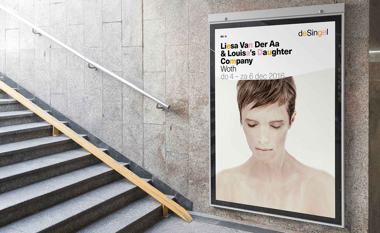
By utilising the campus' hallmark features, alongside the less pronounced ones, the final concept was born. For the posters and advertising materials, outlines of these archictural details are used to crop press images, providing a distinct, vibrant border.
If the colour scheme looks random, that’s because it is. Altmann notes that finding a colour that would work alongside an ‘image of a solo violinist, as well as a performance-art troupe who dance around naked’ – is a bit of a challenge. Flexibly, DeSingel’s internal design team, have free-reign to pick whichever border colour fits with the individual artist being advertised.
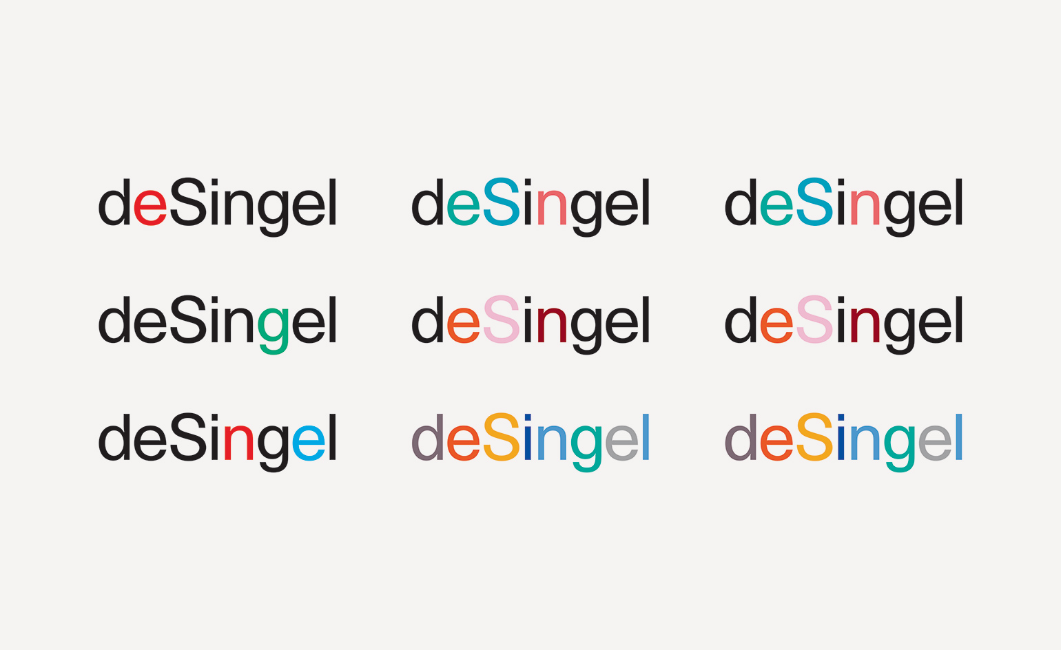
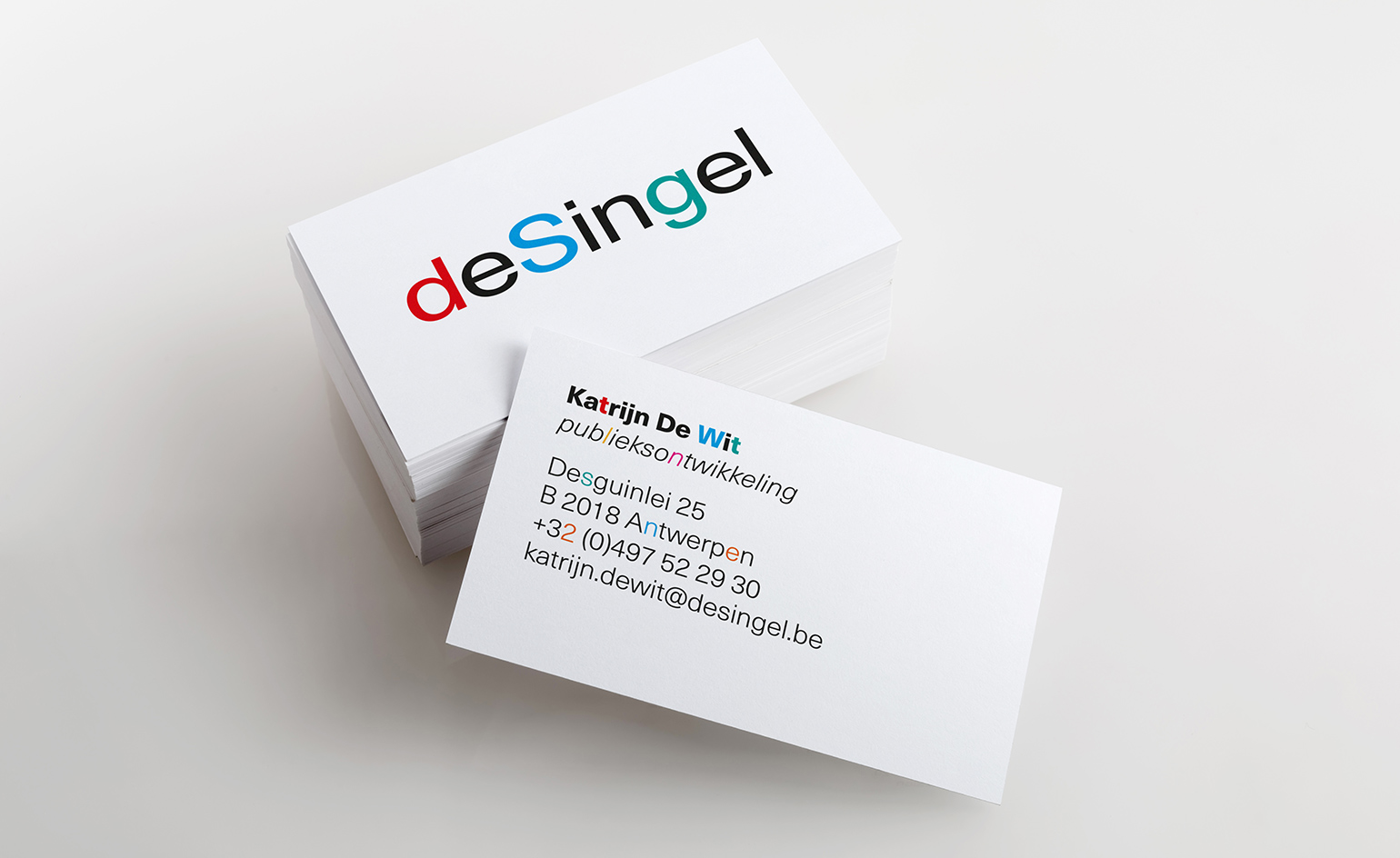
The result is contemporary and forward-thinking, so it might come as a surprise that the new logo’s typeface was created by Herbert Binneweg back in 1979. It is the same typography seen to this day on the enormous signage pinned to Stynen’s building. Altmann notes that returning to the original lettering was ‘a bit of a brave move’. Indeed, there were initially ‘raised eyebrows’ from deSingel, who were attached to their interim logo. But, with the boundary-testing Why Not attitude firmly in place, Altmann won them round to the idea, stating, ‘It’s really quite nice, why not make use of it?’

The original campus in Antwerp was designed by architect Léon Stynen in the 60s and 70s, and a new, idiosyncratic building by Stéphane Beel was added in 2010

Andy Altmann of Why Not tackled the brief by ‘sending photographer Robbie Depuydt around the campus, asking him to find the most interesting angles and shapes'

The visual branding needed to unify the campus' diverse range of uses, including a music and drama college, the Flemish Architecture Institute and Radio 2 Antwerp

For the posters and advertising materials, blocked-out outlines of shapes found around campus are used to crop press images, providing a distinct, vibrant border

If the colour scheme looks random, that’s because it is - DeSingel’s internal design team have free-reign to pick whichever colour fits best with the individual artist being advertised

The result is contemporary and forward-thinking, so it might come as a surprise that the new logo’s typeface was created by Herbert Binneweg in 1979
INFORMATION
For more information, visit deSingel’s wesbite
Photography courtesy of Why Not Associates
ADDRESS
Desguinlei 25, 2018 Antwerpen, Belgium
Receive our daily digest of inspiration, escapism and design stories from around the world direct to your inbox.
Elly Parsons is the Digital Editor of Wallpaper*, where she oversees Wallpaper.com and its social platforms. She has been with the brand since 2015 in various roles, spending time as digital writer – specialising in art, technology and contemporary culture – and as deputy digital editor. She was shortlisted for a PPA Award in 2017, has written extensively for many publications, and has contributed to three books. She is a guest lecturer in digital journalism at Goldsmiths University, London, where she also holds a masters degree in creative writing. Now, her main areas of expertise include content strategy, audience engagement, and social media.