Danish Design - I like it! exhibition, Copenhagen
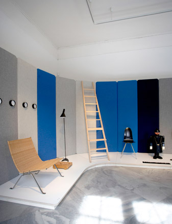
His work has often been described as more Scandinavian than British in spirit, so its no surprise to hear that Jasper Morrison has answered a call to curate and stage an exhibition on Danish design in Copenhagen's Design Museum Denmark. Conceived to mark the museum's recent name change ('Kunstindustrimuseet' being a mouthful, even for Danes themselves) the exhibition is a hand-picked bonanza of all-star Danish furniture classics that belong to the museum's extensive collection.
Morrison's viewpoint has culminated in a selection of pieces that work to embody the classic and humane qualities that make up Danish design - a process he reveals to be more complex than initially anticipated. 'It is a very condensed selection - you've probably notice how jammed everything is', he explains, 'On the first day when we started, I was a bit worried we wouldn't have enough stuff, but by the end, we were just pushing things in and just moving things around, trying to squeeze them all in'.
The exhibition has been set up in collaboration with Danish textile heavyweight Kvadrat, and Morrison has lined the panels of the exhibition's walls with Hallingdal, a textile designed in 1965 by Danish designer Nanna Ditzel, and one that has adorned countless design classics - from pieces by the likes of Fritz Hansen to Morrison himself. A section of the exhibition has also been dedicated to showcase the creation and production process of the textile, which is now considered in itself a Danish design icon. Lesser known, is the fact that Hallingdal was used for a long time on the national railway seats - which pretty much means that every Dane has touched it, but only few know what it actually is.
This everyday aspect echoes what Morrison - a designer who doesn't believe in designing for sensation - is trying to embody in the exhibition. It's easy to see why he was chosen as the man for the job, despite, in his words, not being an experienced exhibition designer. Morrison's work is essentially about new rationalism, and Danish design, in an extreme sense, is based on industrial types. There is a definite connection - both rather sober, discreet, and completely un-showy, but above all, created with the intention to improve the quality everyday life.
The resulting exhibition has a very human, almost poetic, sense to it all, and Morrison's eye for putting pieces together and making them work alongside each other, despite some of them being from different eras, is instantly apparent.
Wallpaper* caught up with Morrison to discover his vision behind the project:
Are some of the pieces you've chosen very personal to you?
Receive our daily digest of inspiration, escapism and design stories from around the world direct to your inbox.
Yeah, you could say so. I mean the first piece, the PK 22 stool by Poul Kj ærholm, was, very early on, a favourite before I studied design - I was very drawn to it.
What have been your intentions and vision for the show?
I'm not an experienced exhibition designer, but it began a bit with just the idea of the colour of Hallingdal and to have some sort of a background for the pieces, which would be sympathetic and develop later in into these four colour zones really. The blue one is the more cooler, rational example of Danish design - pieces that are more precise or strict. That's why the policeman (Kay Bojesen's 1930s Policeman toy) is there. The green zone is a little bit softer, more outdoorsy, and then later on it warms up into the red and the pink zones. So it was just a way of using the colours of Hallingdall to set a sort of structure to the exhibition.
So you mentioned that you couldn't fit all the pieces you wanted in. Presumably they're not being shown then?
I don't know how many there are, but there are probably 50, or maybe more. So we've started to call this exhibition 'Part One'.
You once said that the design world has drifted away from normality and forgotten its roots. Do you see a connection between Danish design and your own minimalist-functionalist approach?
I think it's a good reminder to the design world in general, to look at all this stuff. I mean, most of us only know these pieces from books, or the occasional encounter with the more famous pieces like the wishbone chair. But to see it all up-close, is a really good reminder that they're still selling and making this stuff. I've just come back from a workshop Christian Olesen (Design Museum curator) took me to, where they're still making this stuff to order. It's a fantastic place. So that's pretty impressive really, that these designs were made 50 years ago, and 50 years on, they're still working.
Do you think we need something like that in Britain?
I think that's a real testimony to how good design is, if it lasts that long. I think designers should be designing with that in mind, pieces that will be good in 20 to 30 years.
So which one of your pieces do you think will stand the test of time?
Well that's difficult to say, but I'd say the newer ones are designed more with that in mind. I try and design things now that have a built-in longevity.
What one product in the history of design do you wish had your name on it?
That's a difficult one. Well I guess the easy way would be to choose from here (the exhibition). There is a real masterpiece in the next room, which is this 1955 drawing cabinet by Poul Kjærholm.
Where can you see Danish design going from here? Do you notice and particular new scenes, a new movement of any kind?
I'm sure it's coming. There's Cecilie Manz - I think she's really good, and she's very much in the tradition on Danish design. I'm sure that the new generation will pick up on this stuff soon.
You've mentioned that Danish design had a part in inspiring you to become a designer. Was there a piece or designer in particular that did it?
My grandfather worked for a company called Danish Bacon (when it was first introduced to Britain), so he came to Copenhagen every month. And I think he just picked up on this Danish style. So most of the rooms in his house were done in the normal English style - a bit antique-y with curtains and carpets and things - but one room in was done in a very modern way, with Danish furniture, white carpets and bare wood floors. I just remember, when I was about four or five years old, how good I felt in that room - how different it was to other people's houses, or the other rooms. And looking back, I feel it had a big impact on me. The fact that just a room could have such a strong effect on how I felt, drew me maybe to design. I'm not sure, but I think so.
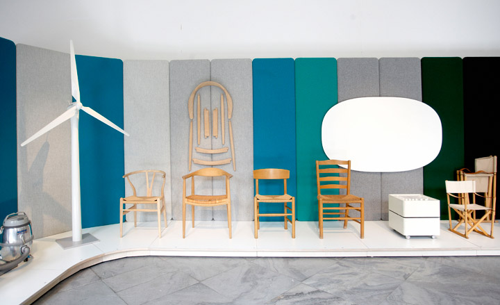
Conceived to mark the museum's recent name change ('Kunstindustrimuseet' being a mouthful, even for Danes themselves)...
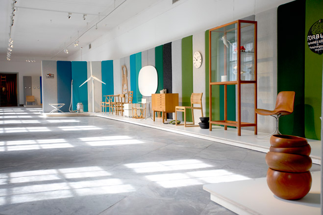
... the exhibition is a handpicked bonanza of all-star Danish furniture classics that belong to the museum's extensive collection.
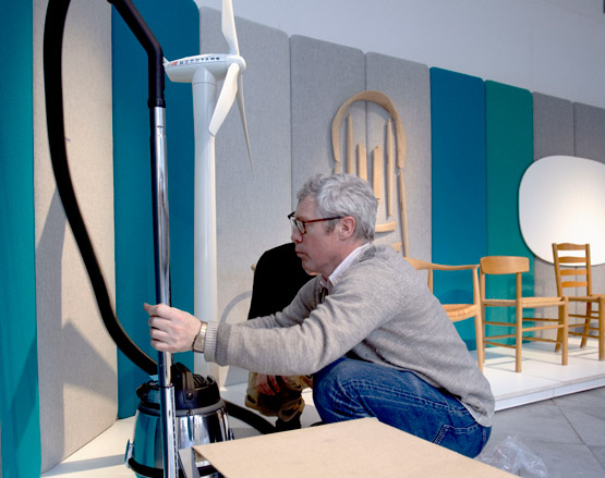
Jasper Morrison in production on the exhibition, seen here with Nilfisk's 2000 version of the GM80 vacuum cleaner.
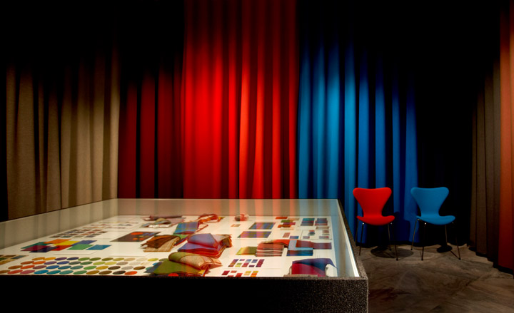
A section of the exhibition has also been dedicated to showcase the creation and production process of Hallingdal, which most know now as a Danish design icon.
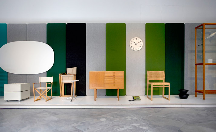
The exhibition has been set up in collaboration with Danish textile heavyweight Kvadrat, and Morrison has lined the panels of the exhibition's walls with the Hallingdal textile...
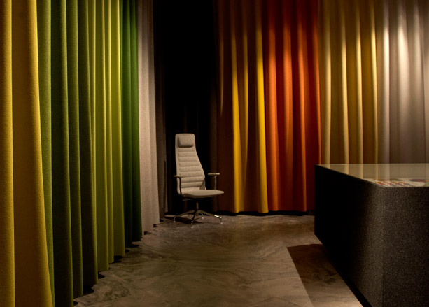
.. Designed in 1965 by Danish designer Nanna Ditzel, Hallingdal is still produced to this day by Kvadrat.
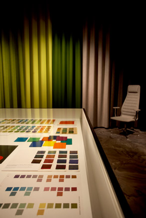
The colours featured on the wall are the relaunched shades that Nanna Ditzel's grandchildren have brought out, and feature in the new Kvadrat collection.
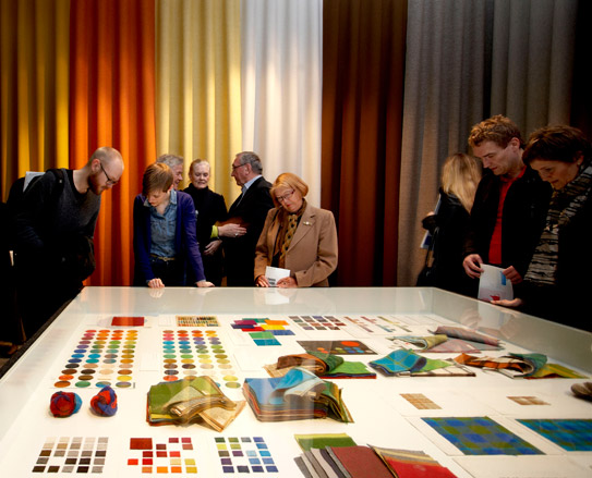
The textile has been used on many furniture classics, and Ditzel herself worked with a lot of the designers involved in the mid-century modern movement of that time. Lesser known, is the fact that the textile was also used for a long time on the Danish national railway seats.
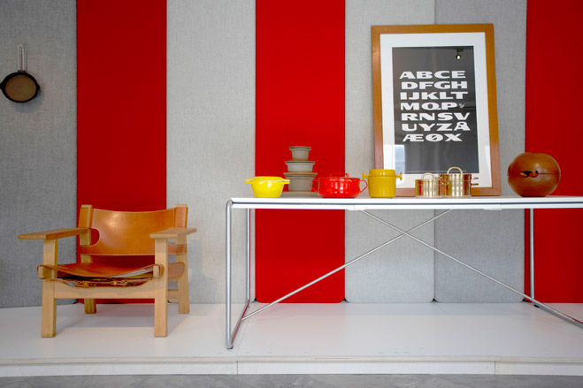
This everyday aspect echoes what Morrison - a designer who doesn't believe in designing for sensation - is trying to embody in the exhibition.
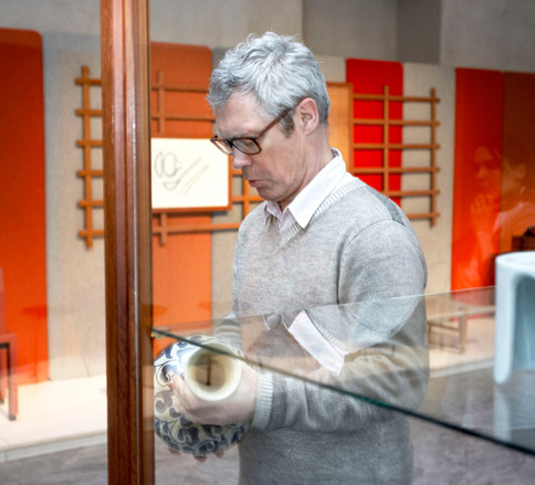
Morrison's work is essentially about new rationalism, and Danish design, in an extreme sense, is based on industrial types...
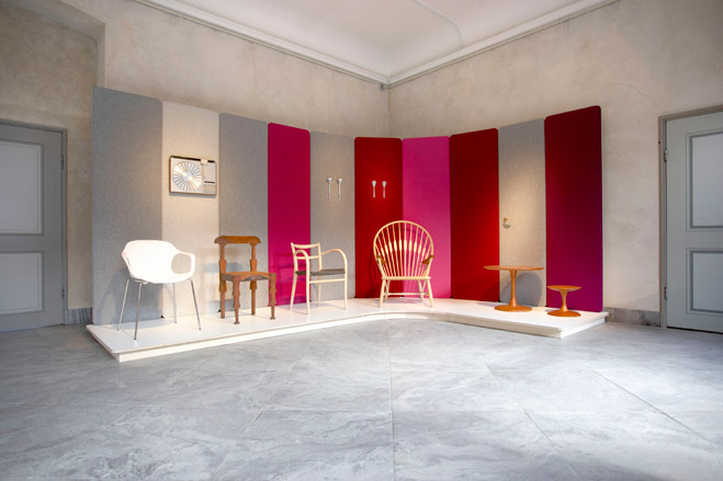
... so there is a definite connection - both rather sober, discreet, and completely un-showy, but above all, created with the intention to improve the quality everyday life.
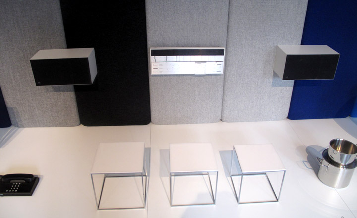
A detailed shot of the Jasper Morrison's installation set-up for the main exhibition. On the panel sits Jacob Jensen's Beomaster 1200, circa 1969, for Bang & Olufsen.
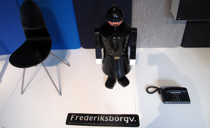
Kay Bojesen's 1930s large 'Policeman' toy.
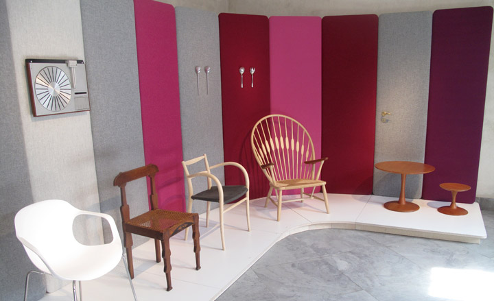
Morrison's conception for the exhibition space began with the idea of the colours of Hallingdal...
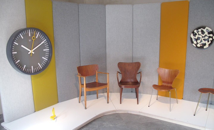
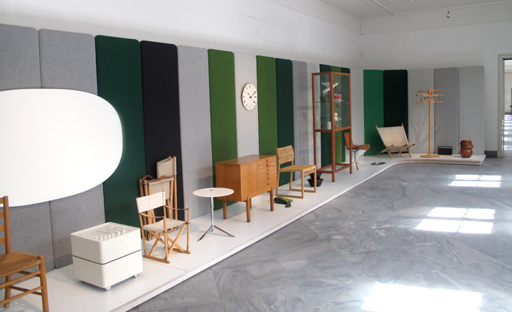
The initial blue zone typifies the cooler, more rational examples of Danish design, while the green zone is softer and more outdoorsy.
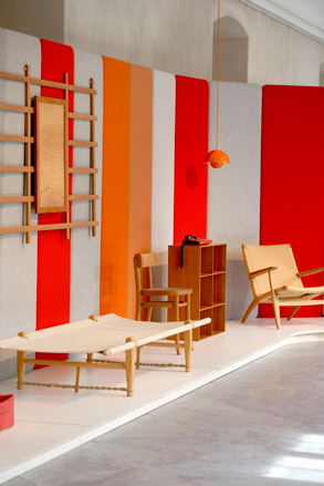
... which later on it warms up into the red and the pink zones.
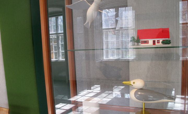
A cabinet featuring the 'Seeguls' toys, from the 1930s, by Kay Bojensen.
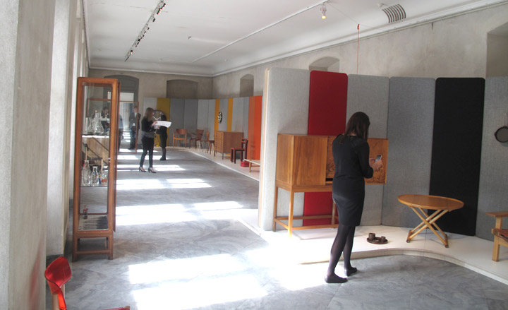
Morrison's viewpoint has culminated in a selection of pieces that work to embody the classic and humane qualities that make up Danish design.
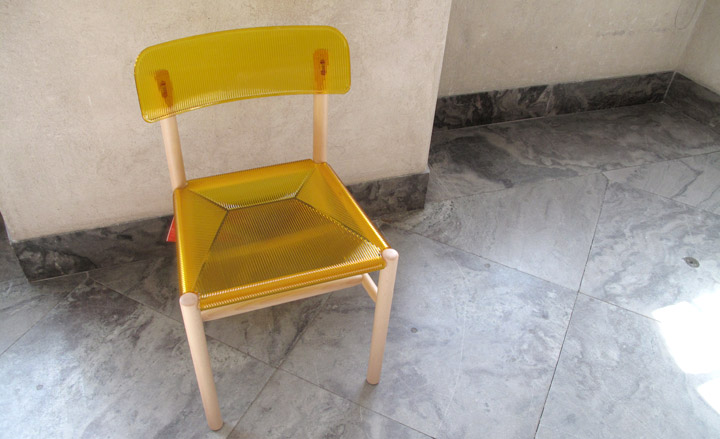
Morrison's 'Trattoria Sedia' chair, 2009, for Magis...
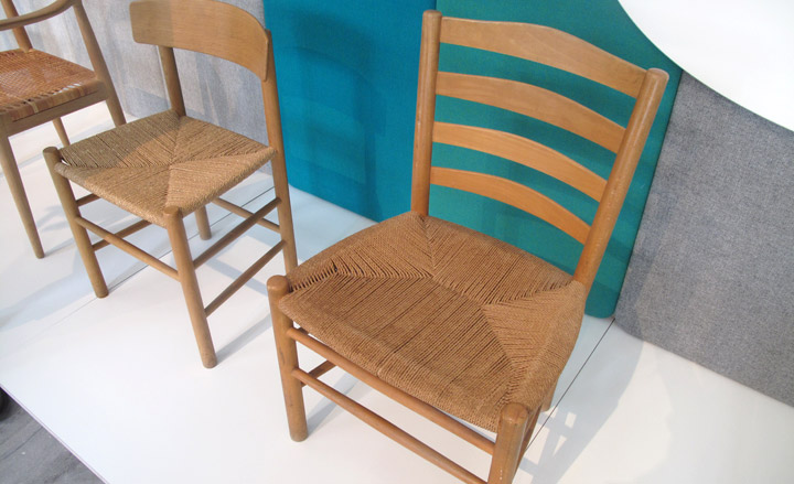
... and the classic Danish chairs - spanning more than a few decades - that inspired it.
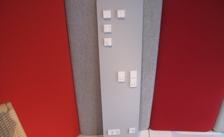
A selection of LK FUGA sockets, by Jørgen Juhl Schneider, 1981 - an example of how even the most everyday Danish household items have become an iconic design classics.
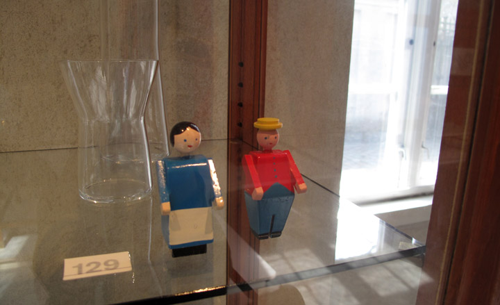
The resulting exhibition has a very human, almost poetic, sense to it all...
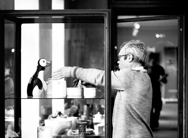
... and Morrison's eye for putting pieces together and making them work alongside each other, despite some of them being from different eras, is instantly apparent.
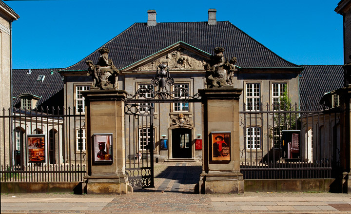
Exterior view of Design Museum Denmark in the Bergdade area.
ADDRESS
Design Museum Denmark
Bredgade 68
1260 Copenhagen K