Alissa Eckert on designing the ‘spiky blob’ Covid-19 medical illustration
Design Emergency began as an Instagram Live series during the Covid-19 pandemic and is now becoming a wake-up call to the world, and compelling evidence of the power of design to effect radical and far-reaching change. Co-founders Paola Antonelli and Alice Rawsthorn took over the October 2020 issue of Wallpaper* – available to download free here – to present stories of design’s new purpose and promise. Here, Alice Rawsthorn talks to Alissa Eckert, the medical illustrator of the spiky blob recognised worldwide as Covid-19
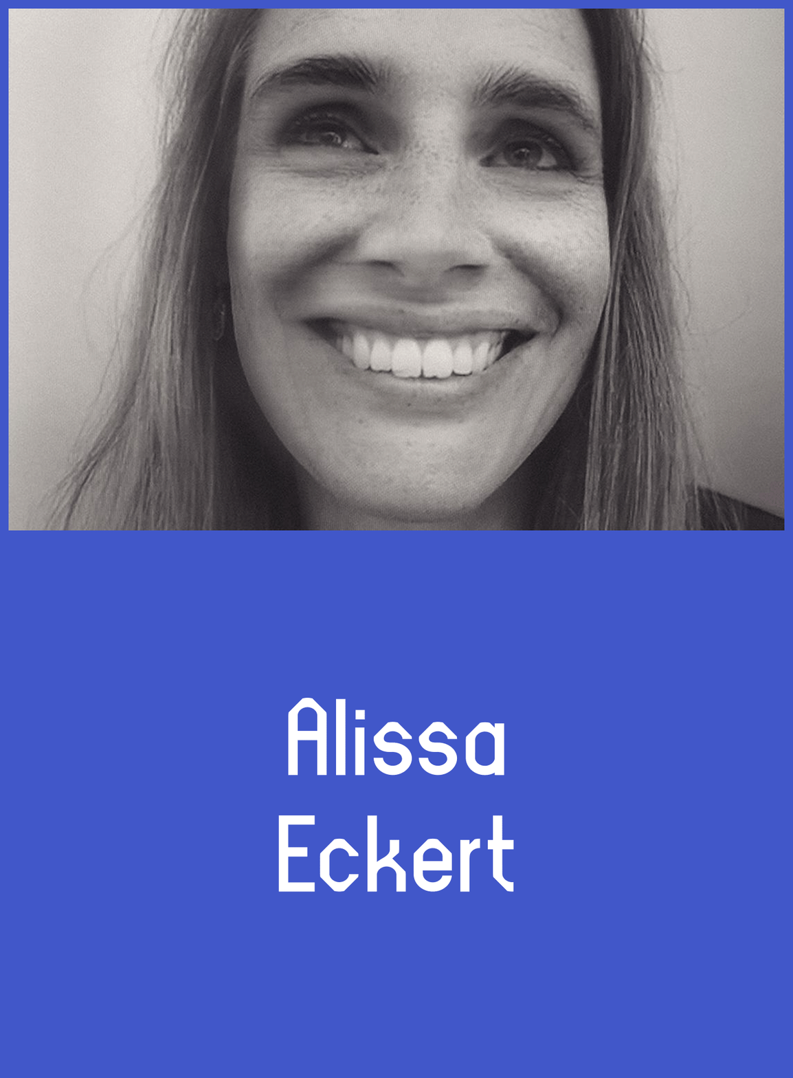
One image defines Covid-19 more than any other. It is, of course, the ‘spiky blob’, which was designed in late January by Alissa Eckert and Dan Higgins, two medical illustrators at the Centers for Disease Control and Prevention (CDC) in Atlanta, as a visualisation of the coronavirus that causes Covid-19. Eckert, who has worked on a succession of important health information, education and emergency response projects (including cholera and Ebola) since joining the CDC in 2006, spoke to Alice Rawsthorn about what undoubtedly is the world’s most famous medical illustration.
Alice Rawsthorn: How did you come to be involved with the project?
AE: The day after the CDC opened its Emergency Operations Center for Covid-19 on 20 January 2020, Dan and I were asked to create an identity for the virus. Maybe you can think of it as a mugshot, something that represents what this enemy is.
AR: What was your brief?
AE: Because of our experience in the past, they left a lot of it up to us, but they requested something up close, with a bit of drama, something bold that was going to catch the public’s attention. It’s a public health emergency alert essentially. We were trying to make something that was going to draw people in and bring them back to the CDC website to learn more about the evolving situation. Not many people knew about Covid-19 at the time.
AR: Can you deconstruct the end result for us and describe how the design process and its outcome fulfil those objectives?
AE: We wanted it to be really bold and attractive. First of all, we wouldn’t have wanted it to be too playful. People just wouldn’t take it seriously if we did that, right? We needed something that felt serious. So, we played upon the realism a little bit, using it to help people understand that this thing actually exists. That was my main goal, to make it pop out of the page. A little bit of drama and dramatic lighting to play with the emotions. That’s what I had in my head as I was designing.
Wallpaper* Newsletter
Receive our daily digest of inspiration, escapism and design stories from around the world direct to your inbox.
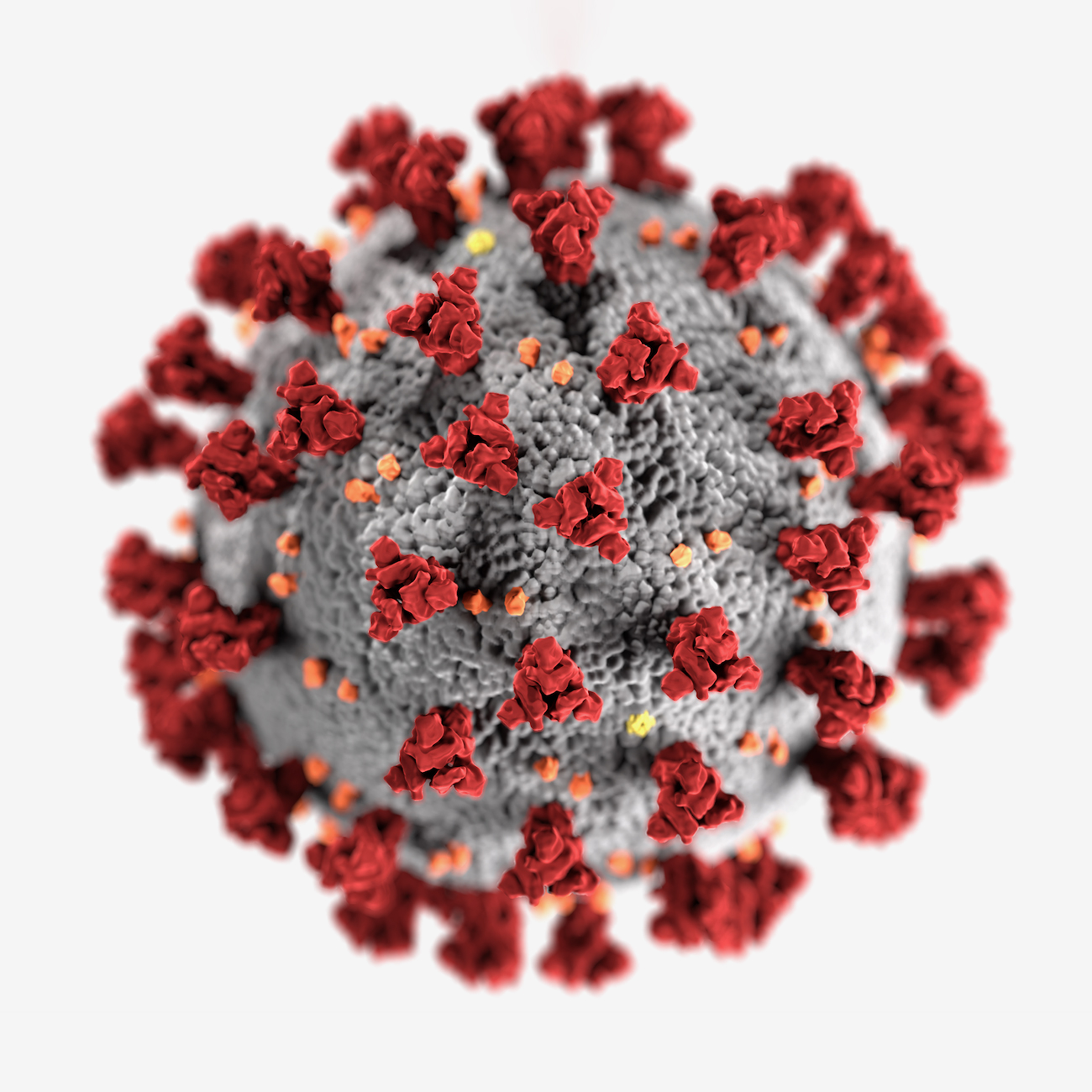
The ‘spiky blob’ visualisation of the coronavirus that causes Covid-19, designed by Alissa Eckert and Dan Higgins, two medical illustrators at the Centers for Disease Control and Prevention (CDC) in Atlanta.
AR: How do its aesthetic qualities, such as the textures and colours, contribute to its impact?
AE: I was thinking about making a velvety texture on the proteins, and something that looked like you could touch it and feel it. And I also wanted it to be solid, a bit rocky, something found in nature. Because if you relate it to something that exists, it’s going to be more believable. The colours relate to the public health warning aspect, and the dramatic lighting, of course, the stark shadows.
AR: What was the process and which tools did you use?
AE: It’s a long process of different steps. First, we have a Q&A with the scientists and then we get our data together, what we need to input, what proteins to include. Then we go to the Protein Data Bank, which is a repository of data on proteins and their coordinates, uploaded by scientists. We download that information into visualisation software and get a 3D rendering of our proteins. We extract that data and optimise it down to what we can pull into our 3D programme. So, we start with Chimera, the visualisation software, then there’s an optimising programme, ZBrush, and then our 3D programme, 3DS Max. That’s where I put the whole thing together: build the pieces, add the lighting and texturing, and the camerawork. After that, we use Adobe After Effects to do final polishing touches.
AR: How does the approval process work?
AE: Once we’re done, there’s what’s called a quality control or quality assurance check at CDC that goes through the design department and scientific clearance, at the same time. With this project we didn’t have to do many edits, so it went pretty smoothly. Dan and I worked on the project for a week, and then there were two to three days of clearance before it was released on 31 January 2020. That’s not normal. It was very fast paced, because this is an emergency response. An element of your work that fascinates me is the scope for self-expression.
AR: Medical illustration is led by scientific accuracy, but to what degree can you refine the image to fulfil your brief of raising the alarm about a potential pandemic, and the damage it could cause?
AE: When you are creating educational materials like this, it’s important to distil down the information by taking out unnecessary stuff to focus people’s attention on what really matters. For example, with the building of the virus, we really focused on the big red S proteins, the ones that make the coronavirus so contagious by attaching it to human cells. They give it the crown structure and its signature look and feel.
AR: S stands for ‘spike’, doesn’t it? As I understand it, you sort of overplayed them.
AE: Yes, and I downplayed the M proteins, the little orange bits. Technically the Ms are the most numerous proteins on the structure, but I tried doing that just to see, and it was too overwhelming and lost the focus. So, I downplayed the Ms, and focused on the S proteins, because they’re what really matters. The proteins are still accurate, but we’re focusing people’s attention differently.
AR: You and Dan have worked together on many important projects at the CDC, including Ebola. How did you divide your roles and responsibilities in this one?
AE: Before doing medical illustration, Dan was a graphic designer, and my background was more in science and painting. We bring that into our roles when we’re working together. Dan did more of the layout work for the banners and things that came into play after we’d built the virus, and I focused on taking it into the 3D programme and bringing it to life. Also, Dan was the one who went to the Protein Data Bank, pulled down all the proteins and gave them to me. That’s where our roles divided, but then we came back together and worked on choosing the colours. While we were doing this, the graphic designers at CDC were building the branding for the response. We needed to match that, so we pulled from their colour palette. There were so many colours to choose from that we worked together on which would work best. I tried some of the blues and greens, but they didn’t work well. That’s why we focused on the reds and oranges, which gave it a lot more feeling and emotion.
AR: Did you expect the image to have such a huge impact?
AE: No, we always look at our work as an educational opportunity. Sometimes we see our stuff here and there in the news, but this one just kind of exploded. It’s been amazing to see how powerful a medical illustration can be, and how it has inspired people. It has been wonderful to watch it evolve.
AR: It is very rare that an image becomes so ubiquitous at such speed. Do you think it was partly because, above and beyond the quality of your and Dan’s work, the illustration was all we had to tell us at the time about Covid-19, this creeping terror, this terrible threat. Scientists and medical researchers didn’t understand it. The name, Severe Acute Respiratory Syndrome Coronavirus 2, is incomprehensible to non-scientists like me. All we knew about it for sure was the dearth of knowledge, an unpronounceable name, blind terror and then this incredible visualisation.
RELATED STORY
AE: It gave a face to the unknown. That’s how I think of it, because it gave people something substantial that they could hold on to and comprehend. It was so important to have something that people could see and recognise. There wasn’t anything else out there at the time, which is why it was important to do it early and to race to get it done.
AR: How long did it take?
AE: About a week, which is pretty crazy. But that’s why the two of us were working together. We’ve worked together a long time, so we had a lot in place to draw upon to streamline the process and get it done quickly.
AR: There have been so many interpretations of the spiky blob. Do you have any favourites?
AE: A friend of mine gave me one she’d knitted the other day. That’s one of my favourites. And then the cupcakes. Have you seen the cupcakes out there? And the piñatas were really cool, but, honestly, I’m waiting for the Halloween costumes.
AR: Has any other medical illustration ever been so ubiquitous?
AE: No, although there are some renowned illustrators and images out there. There was an Ebola image some years ago from Visual Science that I really like. It’s a really beautiful piece. But in Covid-19 we’ve come across something that we haven’t had to deal with in a hundred years, and scientific imaging and the science itself have evolved a lot in that time. We have a unique situation, which is why we’ve seen this sort of explode.
AR: How did you become involved with medical illustration, which for most of us is a highly specialised, esoteric field?
AE: It’s definitely something that requires a very specific type of person, because it takes in both science and art. Not everybody has both of those going on. I didn’t know about it until I was in my fourth year of college as a biology major working at a veterinary hospital and planning on going to veterinary school. I’d taken art classes on the side as electives since middle school and I was always drawing. But I’d never intended on doing it professionally, until I found out about medical illustration. Someone was like: ‘You need to look into this.’ In a nearby school, the University of Georgia, they had a programme for scientific illustration, one of the only ones in the country. So, I changed my major in the fourth year of school and moved an hour and a half away, then went to grad school and ended up at the CDC.
AR: Which of the past projects you’ve done at the CDC informed your work on this one?
AE: We’d just come off a year-long project that helped the most, an antibiotic resistance threats report that came out in November last year. It uses a lot of the design principles we pulled into this. That project was about showing off the most deadly bacteria in the same way with beauty shots. These bacteria are a little bit different than viruses in the way they’re structured. They’re a little more simplistic, so we focused more on their behaviours with one another, rather than on the up-close front structure. But the design principles were the same. I created a theme in my head as something I could use to bring them to life. I knew that I wanted the concept to be beautiful and eye-catching, in the same way as the Covid piece. I thought about it as being ‘beautiful but deadly’, because these bacteria are dangerous, and I wanted to get that across, but I wanted it to be attractive too. So, I went to Pinterest and created a page that worked as a mood board and started gathering pictures of underwater jellyfish and other brightly coloured creatures to use as inspiration. I find that using something that exists in nature, and sort of emulating it, is the best way to get a piece that looks real and believable. We didn’t have time to do that with Covid, because there was only a week, right? We had almost a year for the other set of 20-something images. Anyway, I kept that idea in the back of my mind about nature and bringing things to life. It was perfect timing, having just come off that project and starting this one, with everything fresh in my head. It helped with building up the aesthetics.
AR: What are you working on now? More Covid-19 illustrations?
AE: I’ve got a queue full of Covid images right now. I’m working on symptoms, tracking and that kind of stuff. Since I’ve been working at CDC, I’ve also been working on illustrating birth defects – that’s best done by hand, not 3D for the most part. But the priority right now is anything Covid-related.
AR: What lessons have you learned as a medical illustrator from this project, that will feed into your work in the future?
AE: We’ve been perfecting a lot of visualisation and communication techniques, by building things for the mass media, that will work on broadcast or on news websites, and making things work quickly. When you’re scrolling on Facebook, you need to be able to catch somebody’s attention within one to three seconds, so the images need to be striking, colourful and bold, to capture your audience. That’s mostly been my take-home from the things I’ve worked on recently.
AR: What were the most challenging aspects of the project for you?
AE: Just getting in there, getting dirty and figuring out what was going to work best colour-wise. We had to try a lot of different versions to get it right. It wasn’t instant. There’s always a lot of trial and error. Building is the easy part, it is what it is, but the communication part determines whether or not it’s going to work. We’ve got to get all those colours to work correctly, and to work cohesively with the textures, the lighting and everything else. When you have lots of experience, you can do some of that work intuitively, but some of it really has to be thought about.
AR: What are the main challenges for medical illustration?
AE: We’re working hard at being recognised. A lot of people don’t know what medical illustration is and why it’s important. There’s a whole network of medical illustrators out there working night and day on the Covid response and sharing materials to help each other out. Everybody’s hard at work.
INFORMATION
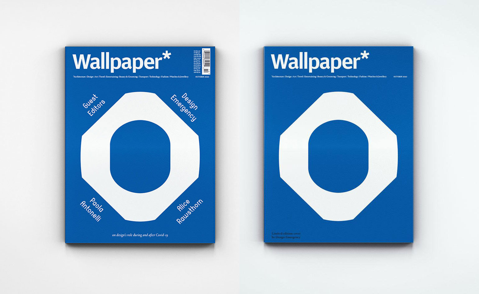
A version of this story appeared in the October 2020 issue of Wallpaper*, guest edited by Design Emergency. A free PDF download of the issue is available here.
-
 Sotheby’s is auctioning a rare Frank Lloyd Wright lamp – and it could fetch $5 million
The architect's ‘Double-Pedestal’ lamp, which was designed for the Dana House in 1903, is hitting the auction block 13 May at Sotheby's.
By Anna Solomon
-
 Naoto Fukasawa sparks children’s imaginations with play sculptures
The Japanese designer creates an intuitive series of bold play sculptures, designed to spark children’s desire to play without thinking
By Danielle Demetriou
-
 Japan in Milan! See the highlights of Japanese design at Milan Design Week 2025
At Milan Design Week 2025 Japanese craftsmanship was a front runner with an array of projects in the spotlight. Here are some of our highlights
By Danielle Demetriou
-
 Amelia Stevens' playful, minimalist design 'is geared towards beauty as a function of longevity'
In a rapidly changing world, the route designers take to discover their calling is increasingly circuitous. Here we speak to Amelia Stevens about the multi-disciplinary joy of design
By Hugo Macdonald
-
 For Agnes Studio 'what matters is the emotional part: how you connect with design and designed objects'
In a rapidly changing world, the route designers take to discover their calling is increasingly circuitous. Here we speak to Agnes Studio about revitalising local traditions
By Hugo Macdonald
-
 At home with designer Sebastian Herkner
Sebastian Herkner finds inspiration in his extensive travels around the globe and the spirit of optimism of his adopted hometown of Offenbach
By Rosa Bertoli
-
 At home with Kelly Wearstler
American designer Kelly Wearstler talks about her approach to interiors, her California homes, favourite LA spots, creative inspiration and more
By Rosa Bertoli
-
 Ritesh Gupta’s Useful School: ‘Creative education needs to centre on people of colour’
Creative industry veteran Ritesh Gupta on launching Useful School, a new virtual learning platform that puts people of colour front and centre
By Pei-Ru Keh
-
 Ilse Crawford judges Wallpaper* Design Awards 2022
London Design Medal laureate Ilse Crawford – part of the six-strong jury for the Judges’ Awards, the Wallpaper* Design Awards’ highest honours – on design for a better reality, and our worthy winners
By Rosa Bertoli
-
 Luca Guadagnino judges Wallpaper* Design Awards 2022
Italian film director Luca Guadagnino, who recently expanded his work into design and interiors, talks about his projects and judging the Wallpaper* Design Awards 2022
By Laura Rysman
-
 Nendo’s Oki Sato on challenges, new talent, and ‘taking the difficult way’
Oki Sato, founder of prolific Japanese studio Nendo, reflects on past and present challenges – including designing Tokyo’s Olympic cauldron – and, for Wallpaper’s 25th Anniversary Issue ‘5x5’ project, selects five young talents ready to pick up the torch
By Danielle Demetriou