Simon Mills in conversation with designer Marc Newson and Montblanc creative director Zaim Kamal
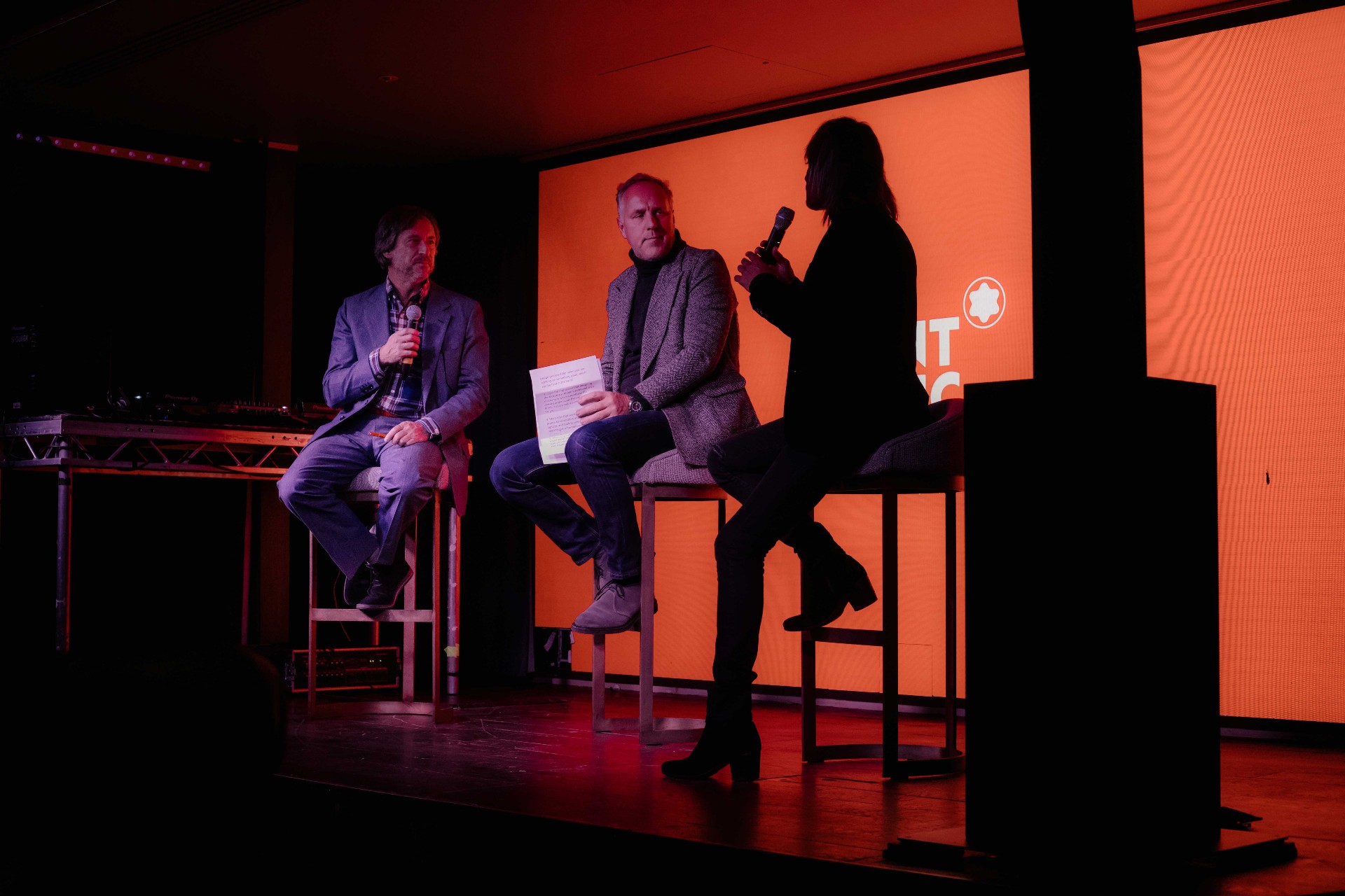
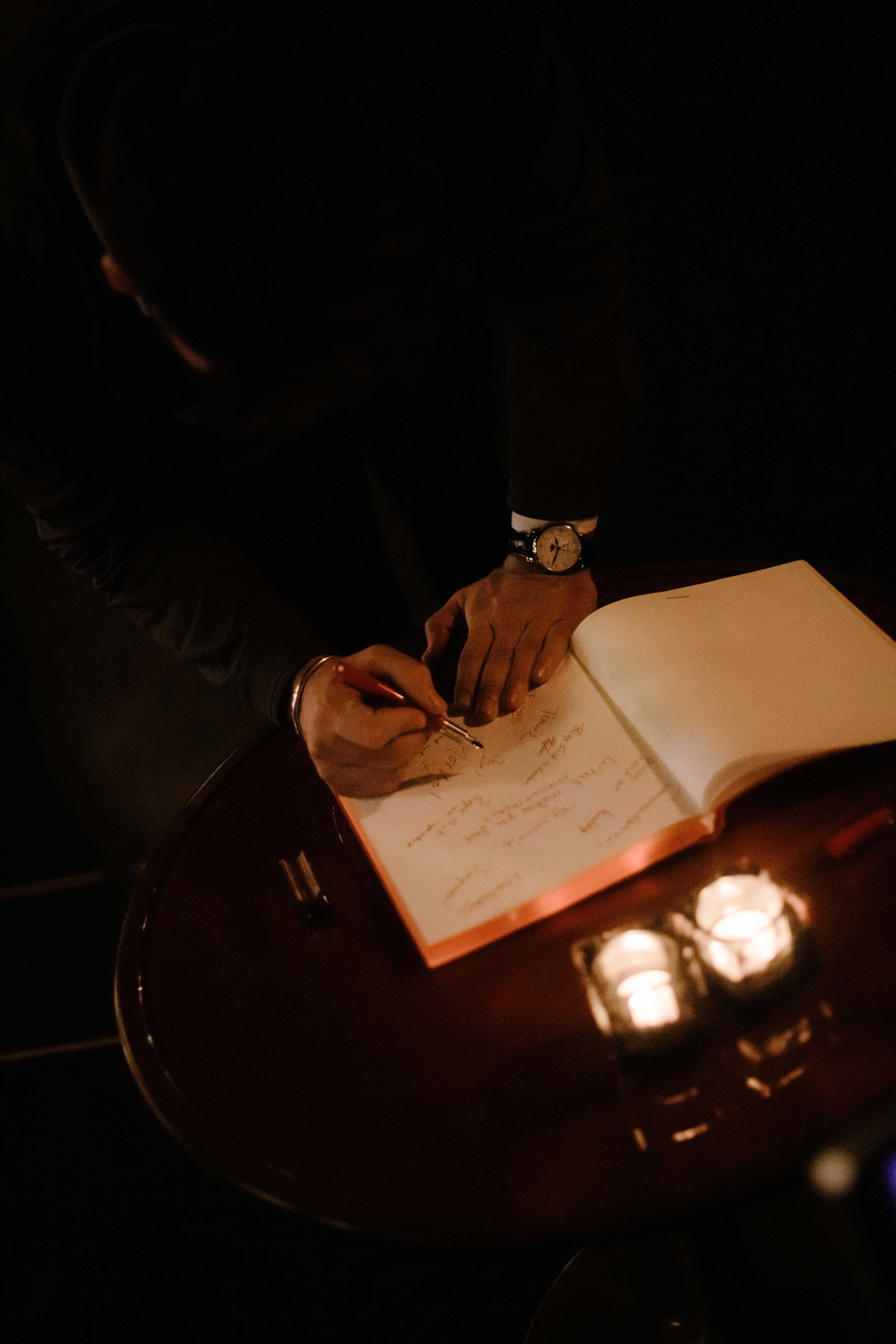
Wallpaper* recently hosted an evening with Montblanc to commemorate the launch of the (Montblanc M) RED, a new writing instrument designed by globally renowned designer Marc Newson to raise funds in the fight against AIDS.
Since launching in 2006 the RED charity, founded by U2 frontman Bono, has generated over $.5bn for the Global Fund by partnering with creative brands such as Montblanc to create extraordinary products and experiences. The aim of RED is to raise awareness and funds to help eliminate HIV/AIDS.
‘Twenty-seven million of the 36m people living with HIV today live in Sub-Saharan Africa, and that’s where the majority of RED funds go towards treatment programmes,’ explained Meaghan Condon, director of partnerships for RED, as she introduced the conversation between Marc Newson and Montblanc’s creative director Zaim Kamal. ‘We have impacted over a 110m lives, but there’s still a lot more work to be done’, she added, ‘so we are incredibly proud to be working with Marc and Montblanc on this incredible collaboration.’
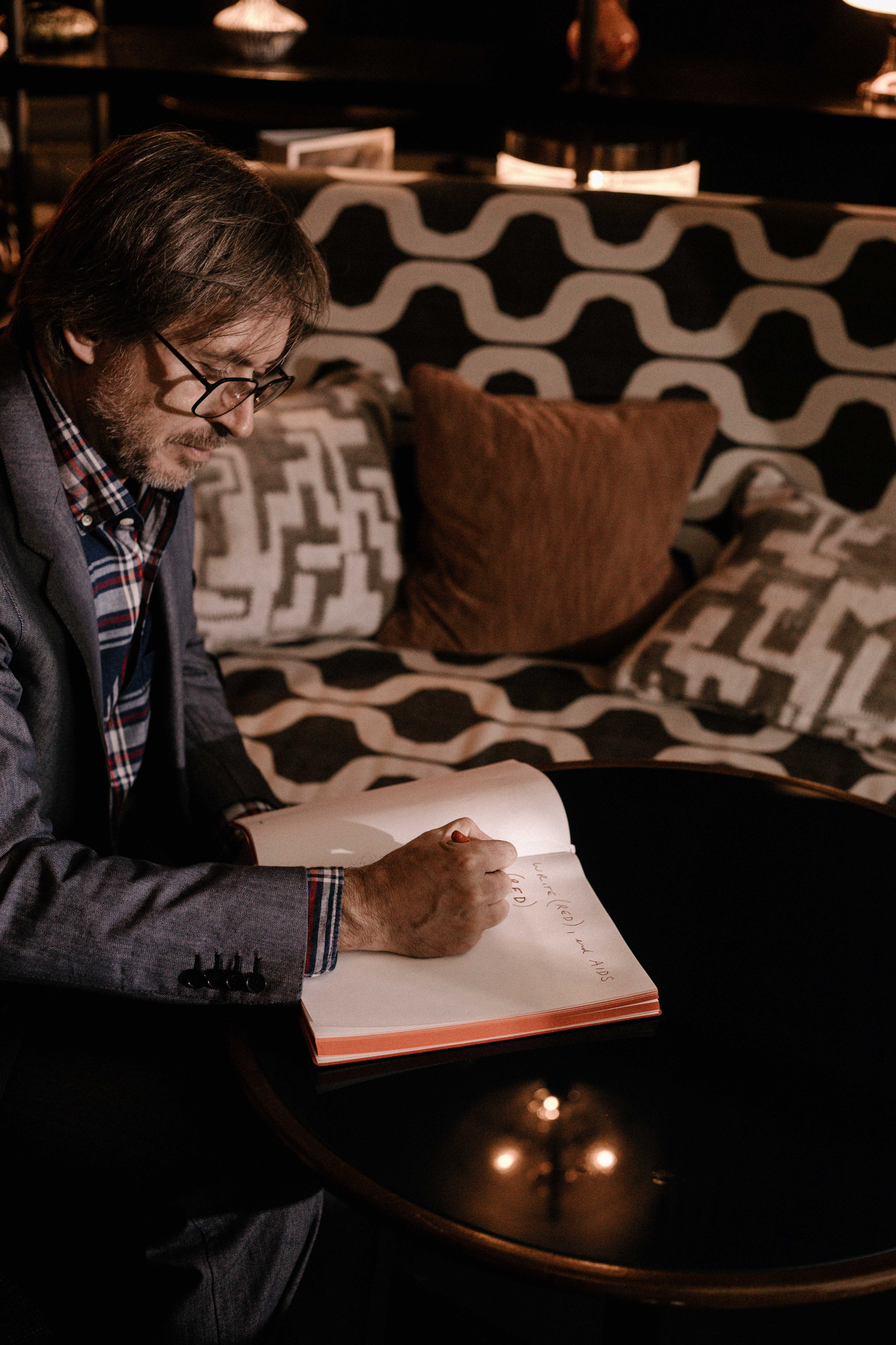
Marc Newson pictured with his new writing instrument for Montblanc
Wallpaper*: Marc, please tell us how you got involved with RED?
Marc Newson: Bono asked Jony Ive and me to curate an auction back in 2013. There had already been one auction before that, in 2008, curated by Damien Hirst, which raised a phenomenal amount of money – $21m or something. So, while Jony and I were obviously proud to be associated with the cause we were also slightly overwhelmed by the fact that Damien had raised so much money.
In the end we managed to raise $44m in a single night. The format was simple: to curate an auction of things that we liked. So, it was a question of identifying the things and approaching the people that manufactured those things, or who were responsible for them, and convincing them that this was a worthwhile cause.
W*: Can you describe some of the objects you chose?
MN: It was a very broad and eclectic. Jony and I wanted to champion certain things that we’d loved throughout our lives. We wanted to curate, customise… and in some cases, even design them from scratch.
Wallpaper* Newsletter
Receive our daily digest of inspiration, escapism and design stories from around the world direct to your inbox.
We designed a Leica camera for example – and, turned this into a way of generating revenue for RED. [The auction also included a Dieter Rams for Braun hi-fi system, a thermal window from the US space shuttle, a vintage Fiat 500 Jolly in red, a pair of Apple earbuds in rose gold and a Zvedea cosmonaut suit from a 1990 Soviet space agency mission].
I’m not sure we could have raised that much money without Bono who was also the auctioneer, but there were a number of people like him involved – you know, very, very persuasive people. The RED charity has ways and means of exploiting – in the nicest sense of the word – all of the avenues that are available to them.
W*: During your career you have designed many things from a plane and a car to watches and several pairs of sneakers. When you are creating something on the scale of the (Montblanc M)RED fountain pen, how does the design and engineering process differ from a larger project?
MN: There’s really no difference between engineering a pen, or parts of an aeroplane. I did a lot of work on the Qantas A380 aircraft programme and I’m also designing some very, very large yachts at the moment. At the end of the day, it’s just a question of scale. You apply the same logic, methodology, and philosophy to designing a pen as you would anything else.
The wonderful thing about the pen is that, unlike a lot of those things, it is something that I’ve used since the get-go. The pen is the way I transmit my ideas from my head to reality. So when Montblanc gave me the opportunity to design a pen in struck a deep chord. Just the idea of designing a pen for Montblanc, who are arguably the most well-known and brilliant manufacturer of pens in the world – gave me a thrill. If you’re going to design pens for anyone, it really should be with them!
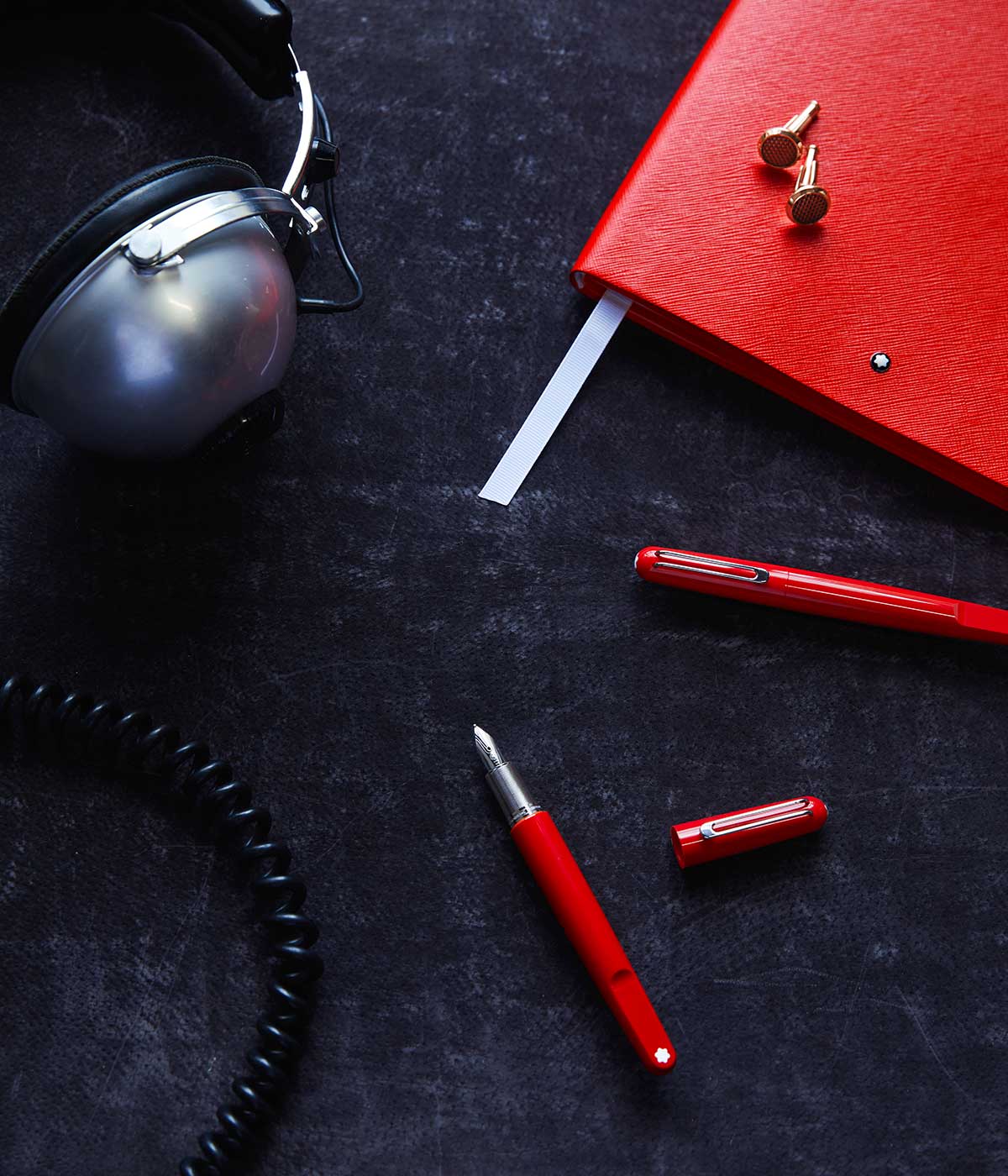
W* Marc talks about the sensory experience of using a pen; Zaim, do you get that same sensation when using a Montblanc?
Zaim Kamal: Using a fountain pen – we call it a ‘writing instrument’ at Montblanc – is a way of making a mark in terms of what you say. It’s basically the touch and feel; it’s something that you don’t think about, but it’s there when you need it. So, the sensory experience is how you hold it, how you touch it, and what it actually communicates.
Wallpaper*: We have instant access to computers and tablets. We can send texts on our smartphones. We can email on our laptops. So, why do we still need a pen?
MN: People always ask me, what’s my gauge of what’s relevant or not, and ultimately I’m my own yardstick. I design things for myself. I’m a consumer, I spend money on things. So what would I want to spend the money in my pocket on? One of those things happens to be a pen.
I feel – and I know I’m not the only one amongst designers of my generation who feel the same – that there is a growing need to have analogue objects. A need to be able to use, relate and have a connection with essential tools in our lives. Things that stand the test of time in a way that technology simply – I don’t say can’t – but probably won’t.
W*: During your own personal creative processes, do you always start with pen to paper?
MN: I do, because that’s how I grew up. It’s really hard to beat the spontaneity of the gesture of what an object like a writing instrument gives you. I think for the foreseeable future, the pen is, gesturally, just the most fantastically immediate way of doing something.
ZK: I completely agree with that. I draw everything, and I travel a lot so I communicate with the design team at Montblanc by sketching in my sketchbook. I take a photos and send them off; they rework the ideas in the studio and send them back. If you start with a hand sketch it gives them the tactility and the understanding of the volumes they’re working on, and this is very, very important, to have the tactility, because otherwise it becomes too flat and technical.
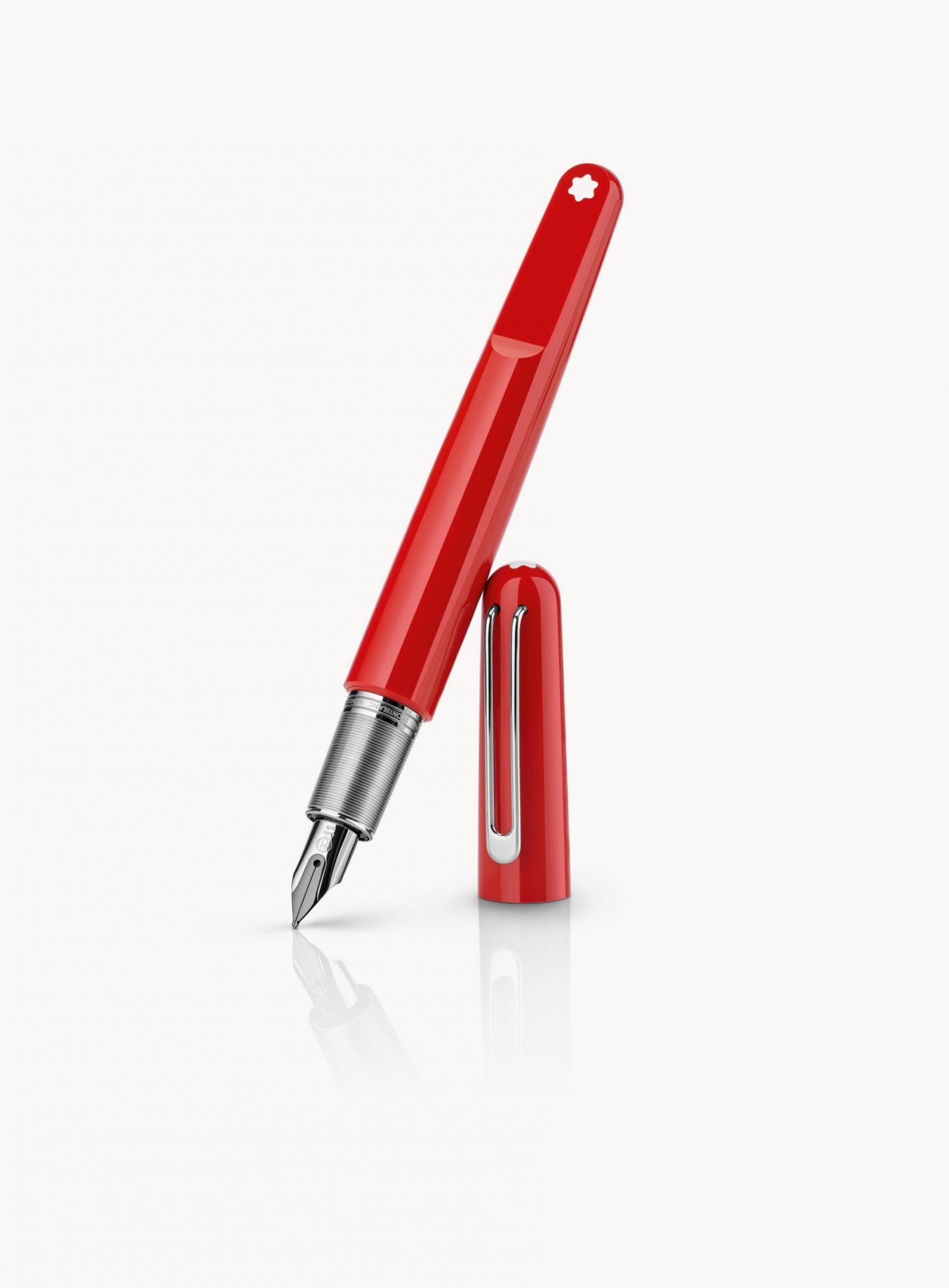
W* So there’s a more organic, tactile feel to designing with a pen you mean…
ZK: it’s the way you communicate fastest, quickest, and the most directly. It’s also the way of interacting with each other. Have you seen the Yohji Yamamoto documentary Notebook of Cities and Clothes by Wim Wenders? In the last scene the pattern cutters are on the floor and there’s one pen, one pair of scissors and five people. One by one they pick up the pen, they draw something, somebody cuts and then somebody else picks up the pen… This interaction is actually what design is about – it’s not just one idea, it’s many, many ideas overlaying to create the final product.
MN: I just love the fact that when you use a fountain pen the ink visibly dries in front of you. It’s a wonderfully tactile, real-time experience.
W*: Zaim; why was Marc Newson the prefect collaborator for Montblanc?
ZK: This is the first time in the history of Montblanc that a fountain pen was designed by somebody external. We chose Marc because we share similar values; the importance of tactility, form, volume etc. so we wanted to see what it was like for Marc Newson to create a new icon of Montblanc.
I think we managed that really well, because not only did he respect what we were about, but he also disrupted and challenged us. The ‘second plateau’ on the pen, for instance, was a technically one of the most difficult things we have done…
W*: Yes.. talk us through the pen’s ‘Second Plateau’.
ZK: The design of a fountain pen normally is a consistent clean line. Marc did this cut. It looks simple, but technically to do this perfectly flat and create the perfect angle or radius that Marc wanted, was one of the most challenging things that our team had to do. I remember the first time that we presented the drawings, the team looked at me and said ‘can you not convince him to change it?’
I said not only can I not convince him, he’s put the Montblanc motif on it. I remember their sense of pride when they showed us they'd found the perfect angle. I think that finding the solution to this kind of challenge is why Montblanc is cherished and loved.
INFORMATION
For more information visit the Montblanc website
-
 Put these emerging artists on your radar
This crop of six new talents is poised to shake up the art world. Get to know them now
By Tianna Williams
-
 Dining at Pyrá feels like a Mediterranean kiss on both cheeks
Designed by House of Dré, this Lonsdale Road addition dishes up an enticing fusion of Greek and Spanish cooking
By Sofia de la Cruz
-
 Creased, crumpled: S/S 2025 menswear is about clothes that have ‘lived a life’
The S/S 2025 menswear collections see designers embrace the creased and the crumpled, conjuring a mood of laidback languor that ran through the season – captured here by photographer Steve Harnacke and stylist Nicola Neri for Wallpaper*
By Jack Moss
-
 Bold and futuristic: new book explores the work of creative polymath Marc Newson
A weighty new tome celebrates the genius of creative polymath Marc Newson, chronicling evolution, experimentation and innovation in a career spanning four decades
By Jonathan Bell
-
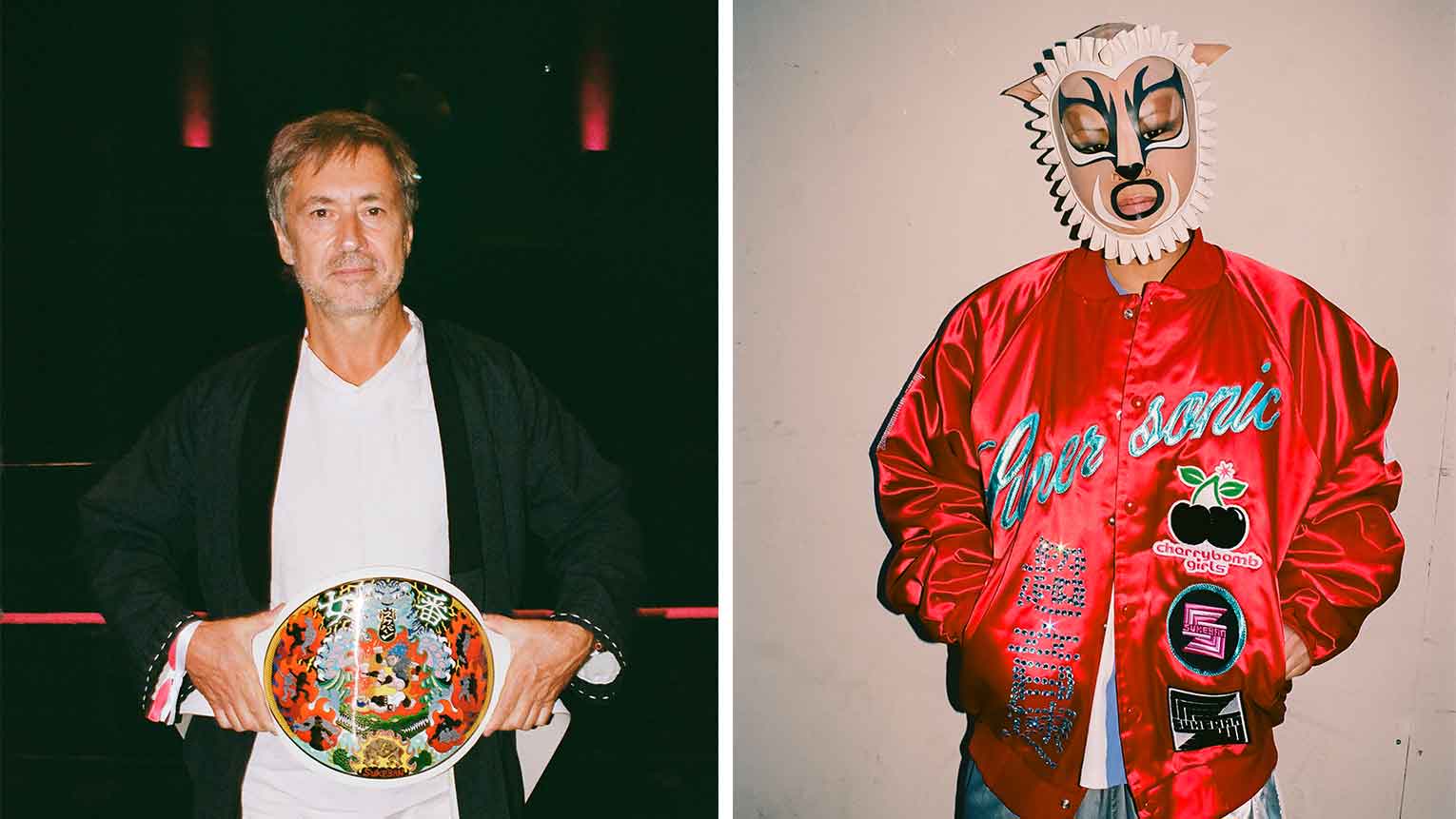 Best Body Slammers: Japanese female wrestling meets design
The Sukeban female wrestling league made its Miami debut in December, with a championship belt by Marc Newson, hats by Stephen Jones, creative direction by Olympia Le Tan – and a win in the Wallpaper* Design Awards 2024
By Maria Sobrino
-
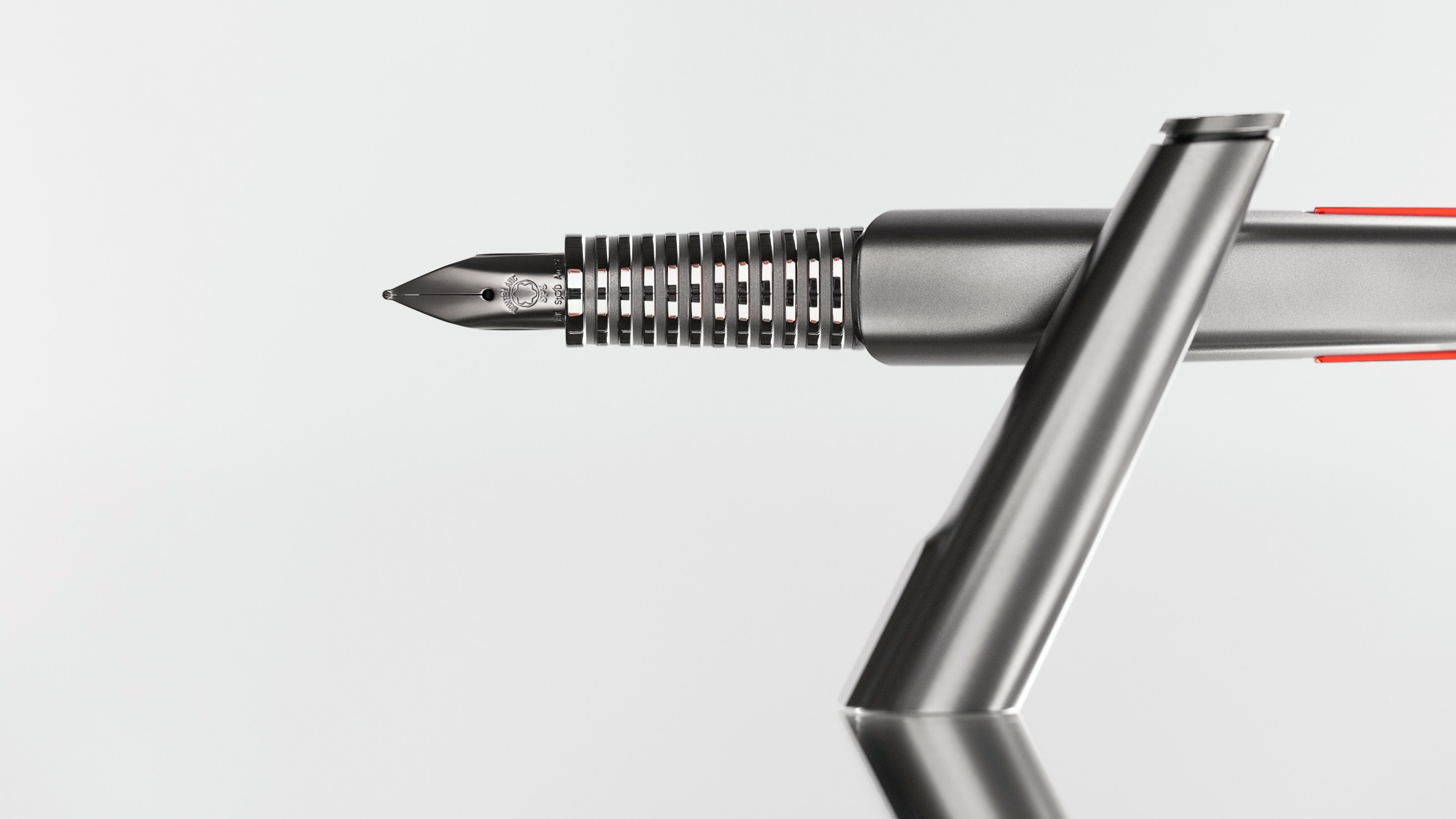 Ferrari teams up with Montblanc for a high-performance fountain pen
The Montblanc Ferrari Stilema SP3 is as sleek and rarefied as the company’s legendary sports cars. We spoke to Ferrari's Flavio Manzoni about the collaboration
By Jonathan Bell
-
 Jony Ive’s LoveFrom unveils official website
Launched today, 11 October 2021, LoveFrom.com reveals the creative collective’s visual identity, anchored in a Baskerville-inspired typeface called LoveFrom Serif, provides a statement of purpose, and pays gentle homage to Apple’s Steve Jobs
By Sarah Douglas
-
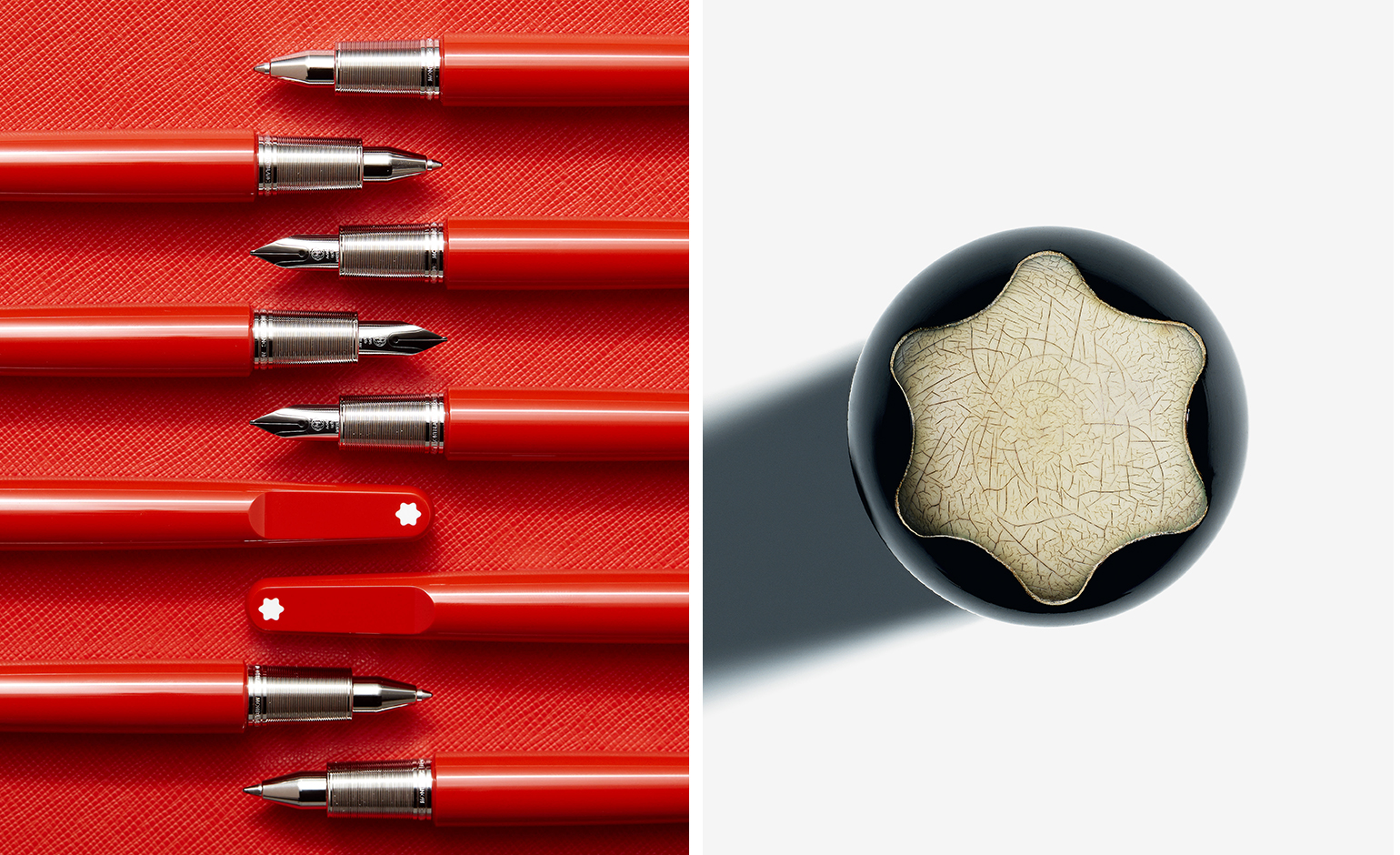 Explore the rich archives of Montblanc
Montblanc’s new book – Montblanc: Inspire Writing – takes readers on a journey into the archives of the German luxury house
By Simon Mills
-
 Montblanc’s commitment to international arts runs deep
By Elly Parsons
-
 Rolling out: Marc Newson reinvents Louis Vuitton’s trunks for the 21st century
By Nick Vinson - Art Direction
-
 Snake eyes: Montblanc celebrates 110 years with a seductive serpent motif
By Pei-Ru Keh