Project unfinished: flick through Dimore Studio’s anthology-cum-catalogue
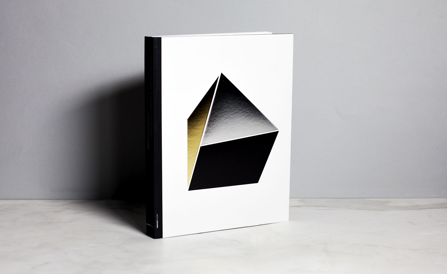
Trust Dimore Studio's Emiliano Salci and Britt Moran to take the simple catalogue and transform it into a veritable work of art. Eschewing the simply printed, the easy to post or the heavy on information (and light on inspiration) commonly employed by other furniture or textile brands, the Italian duo have applied their spellbinding approach to create Progetto Non Finito: A catalogue raisonné of unique pieces designed by Dimore Studio.
The exquisite tome reads more like an anthology than a catalogue, gathering the studio's many projects throughout the years (from storage units to seating options, tables, lamps, rugs and more), all captured by photographer Andrea Ferrari in the characteristic Dimore way; part haunted elegance, part decadent antique, wholly modern and refined.
A foreword by Paola Moretti introduces the contents, explaining the roots and essence of Progetto Non Finito: 'Sculptures that become living objects, inspired by modern art and references from the past, single pieces suitable to juxtapose alongside empty spaces with a sense of history.'
Four chapters follow. 'The Silent House' is peppered with quotes from Giò Ponti, Le Corbusier and Amélie Nothomb; 'Pregotto Tessuti' summarises the textile works created to celebrate the studio's 10th anniversary; 'Progetto Palmador' gathers its prolific furniture designs; and a product index, which is made captivating by using white type on black paper, employs simple sketches to show dimensions.
Beyond serving as an archive of its previous work, the compilation goes some way into unravelling Dimore's ideology. 'A modern piece of furniture can fit in well in a historical palace and face a piece of art. It is not a simple matter of matching old and new, but visualising the space in its entirety,' the designers offer up humbly – as if it were quite that simple.
Like the furniture and interiors they create, every last detail has been carefully considered. The cover, for example, is understated yet polished; a heavy, pale grey mount board adorned with three debossed geometric shapes in a medley of foils (metallic gold and silver, and a matte black).
Playful inserts of different sizes and alignment create divisions within the book itself. In 'The Silent House', for example, the smaller sheets present totemic quotes from designers who have inspired and influenced the Milanese duo, while in 'Pregotto Tessuti' the inserts create a page-turning game of contrasting patterns, die-cut shapes providing windows into other designs. Different paper types – including Artic Paper Munken Lynx, Fedrigoni Sirio Ultra Black and GMund Cotton New Grey – add pace and tactility, two principles that are key to the duo's work. As they so succinctly put it: 'What is the point of surfaces that don't thrill your fingers?'
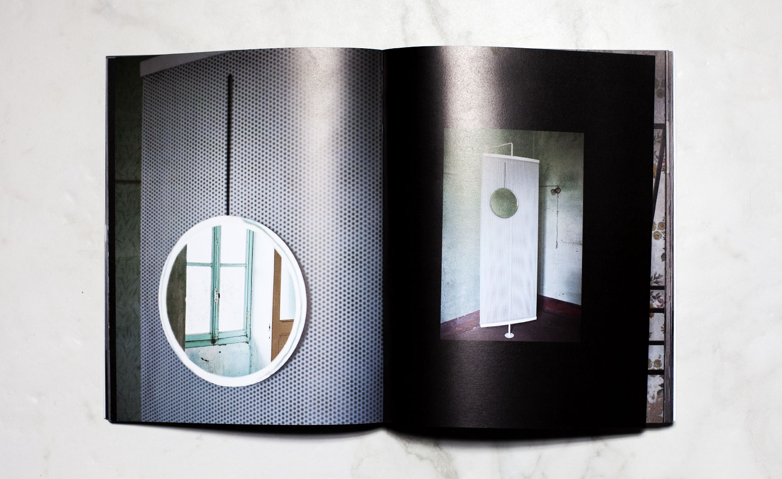
Separated into four chapters – ’The Silent House’, a collection of textile and then furniture works and, finally, the product index – all use different types of paper, affording a unique pace and tactility
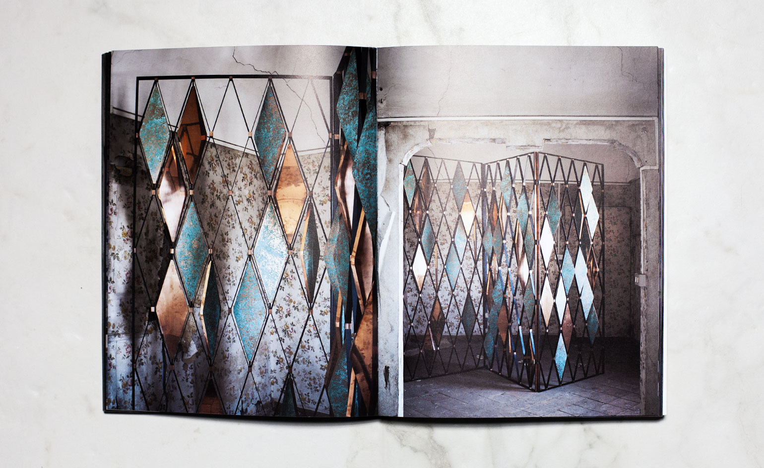
One of the quotes within reads: ’Enjoying ambiguities and contradictions. The collision of old and new creates a vibration, an electricity between opposites. Vitality lies in combinations and accidental juxtapositions’
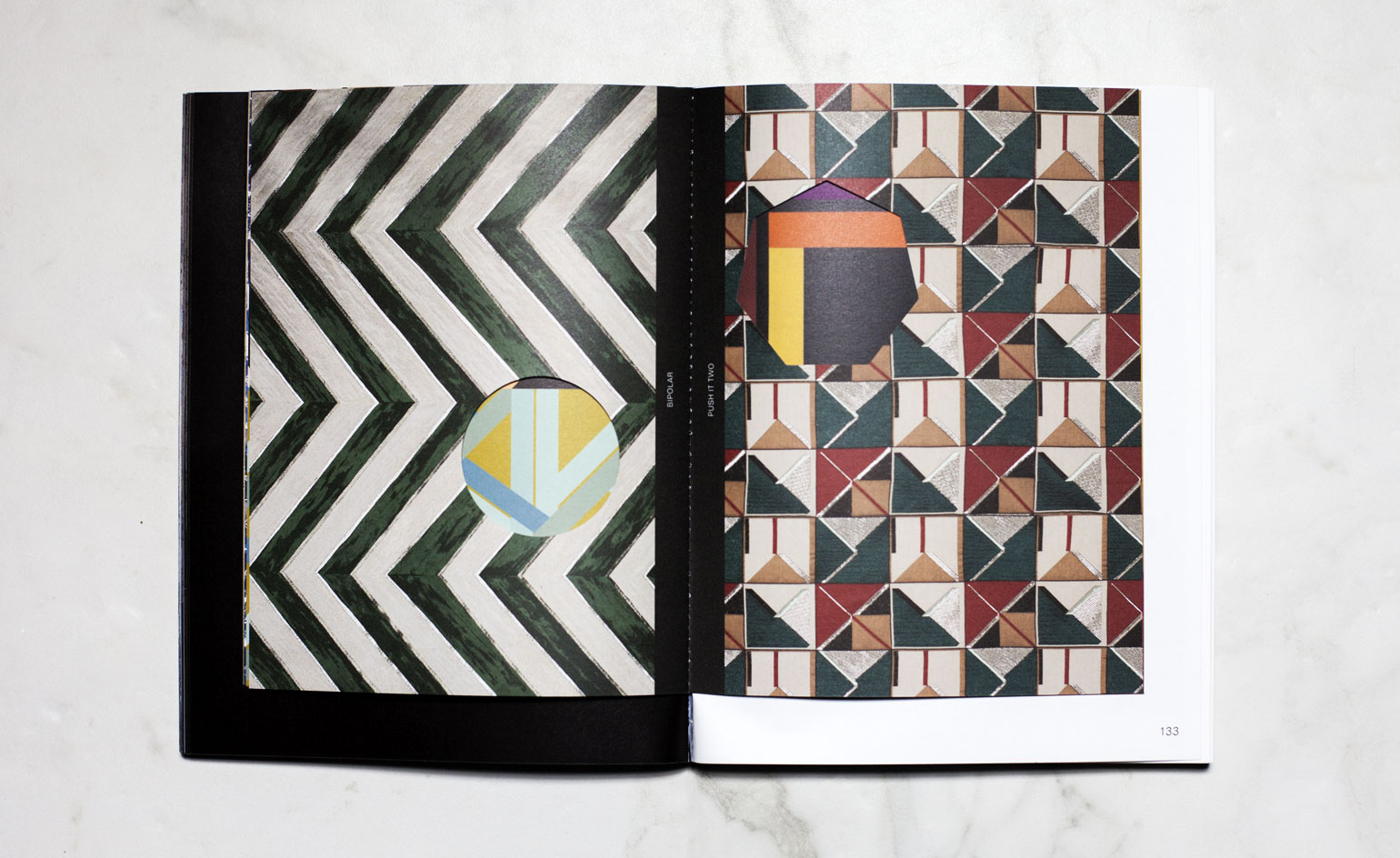
Dimore’s masterful designs have a habit of ’Feeding the senses and framing the spirit’. Pictured left: ’Bipolar’ textile with a flash of ’The Blue Click’ beneath. Right: ’Push It Two’, over ’True Colours’
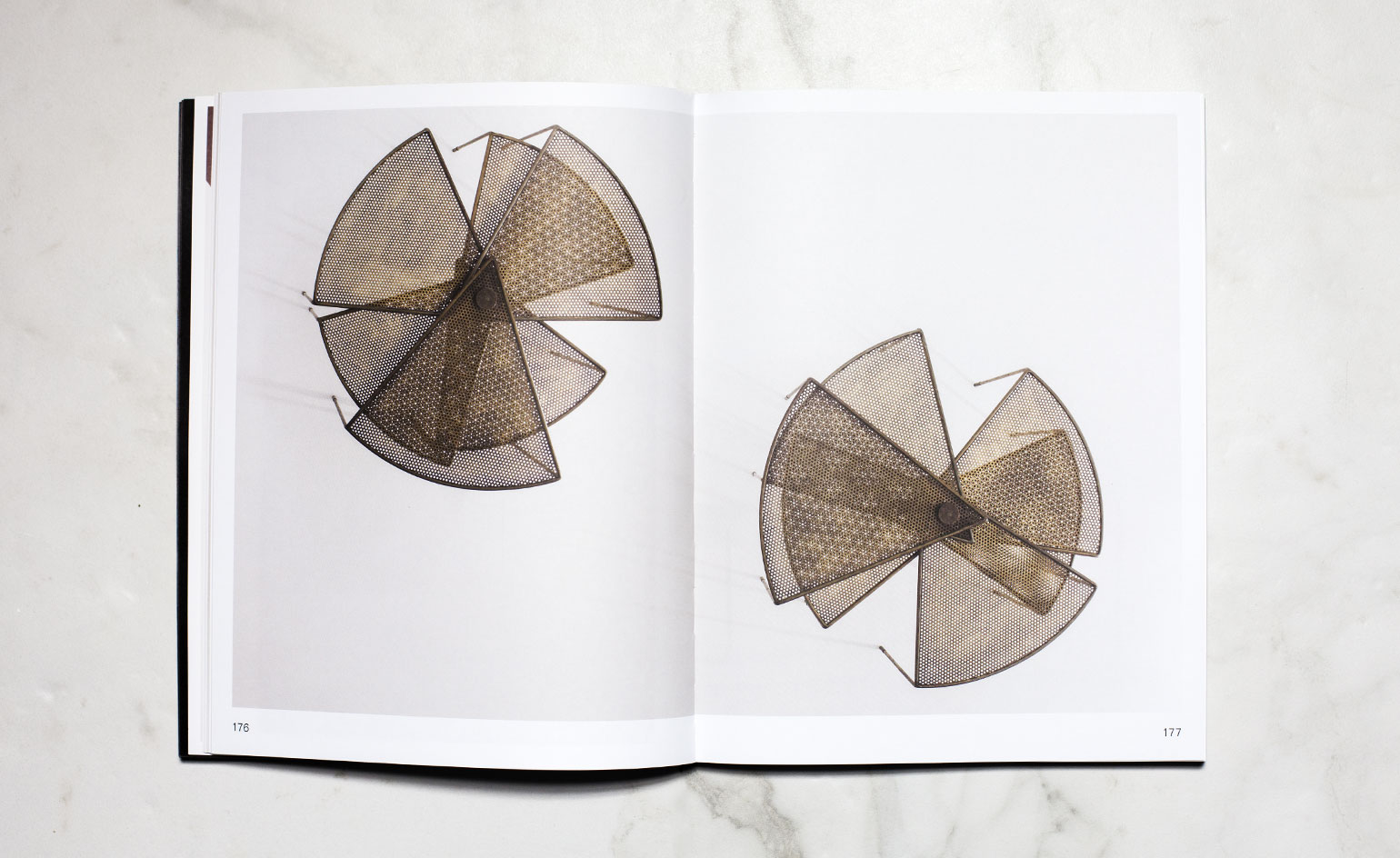
Pictured: ’Tavolo Basso’, a series of low fan structured tables painted in metal with feet in oxidised brass
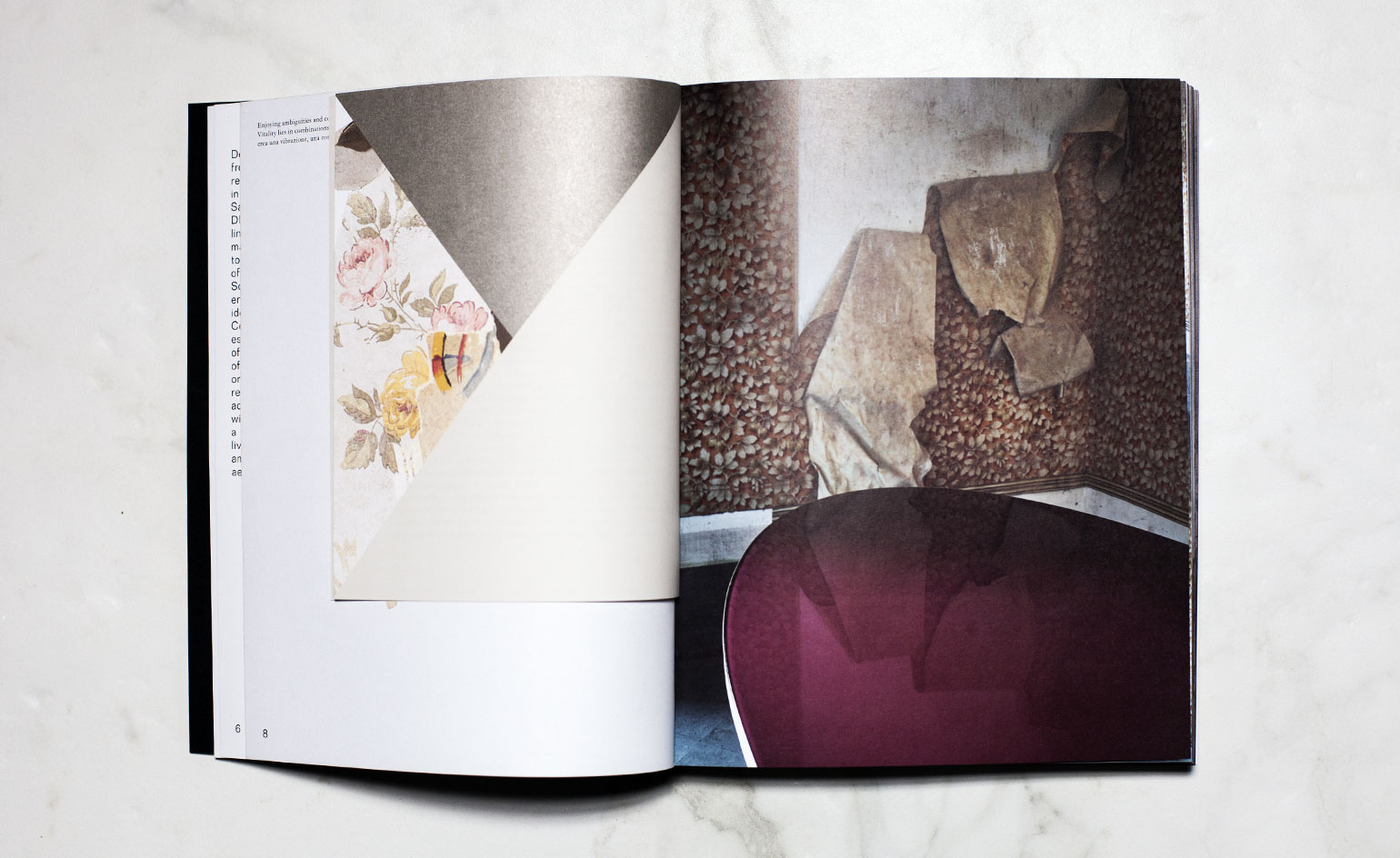
’What is the point of surfaces that don’t thrill your fingers?’ ask the Milanese designers
INFORMATION
Photography: Michael Ainscough
Wallpaper* Newsletter
Receive our daily digest of inspiration, escapism and design stories from around the world direct to your inbox.
-
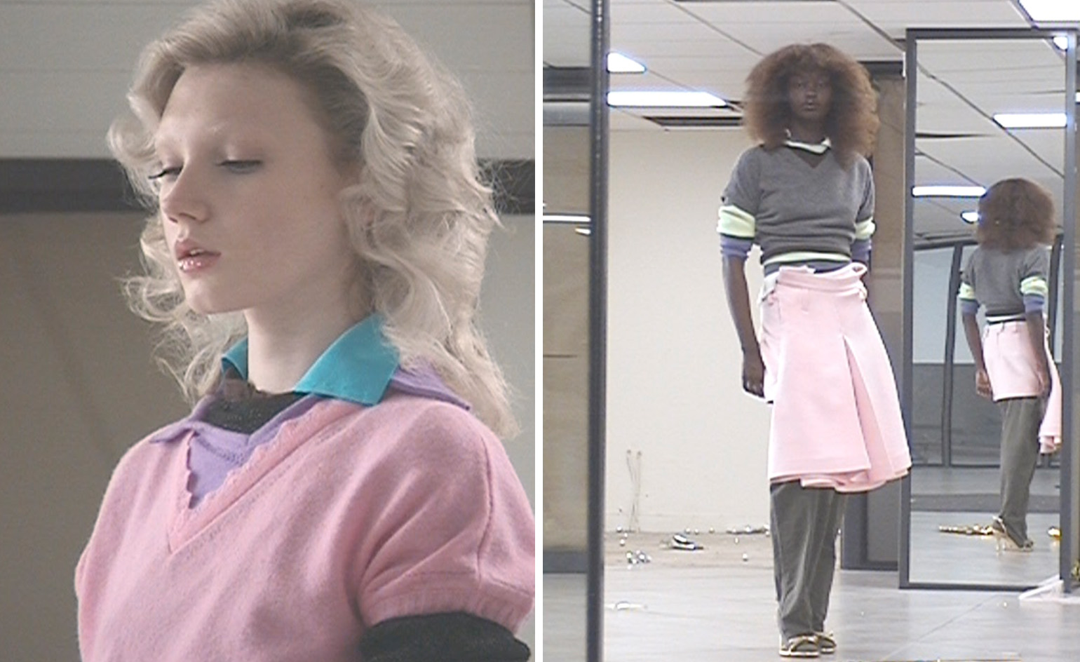 All-In is the Paris-based label making full-force fashion for main character dressing
Part of our monthly Uprising series, Wallpaper* meets Benjamin Barron and Bror August Vestbø of All-In, the LVMH Prize-nominated label which bases its collections on a riotous cast of characters – real and imagined
By Orla Brennan
-
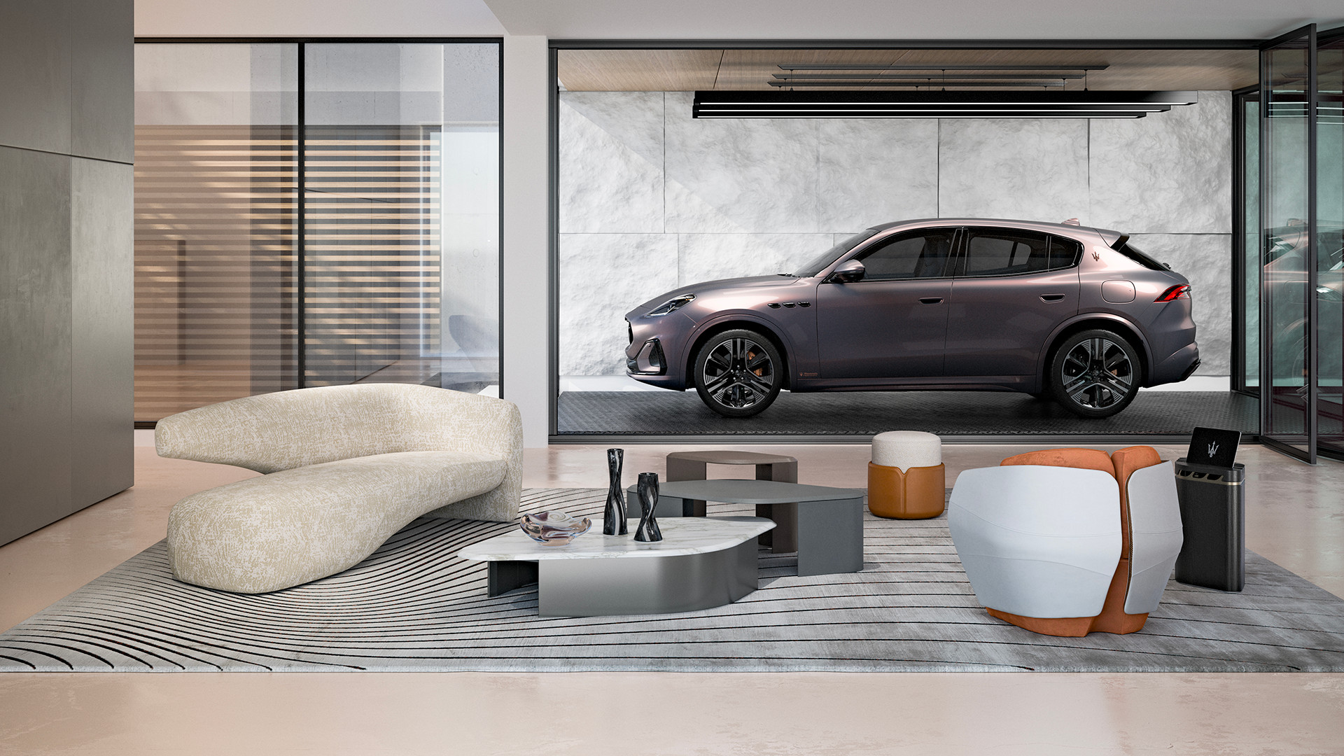 Maserati joins forces with Giorgetti for a turbo-charged relationship
Announcing their marriage during Milan Design Week, the brands unveiled a collection, a car and a long term commitment
By Hugo Macdonald
-
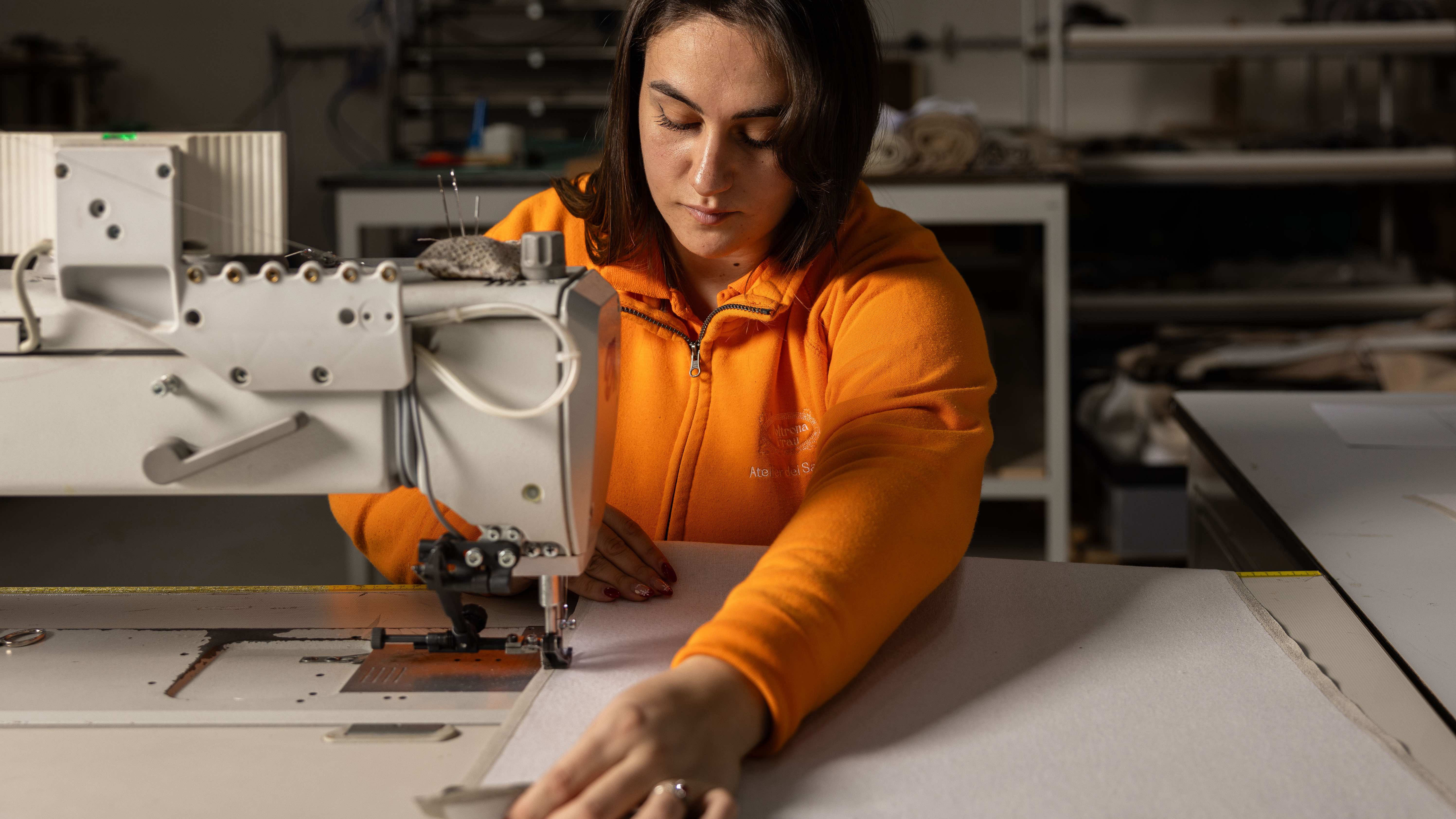 Through an innovative new training program, Poltrona Frau aims to safeguard Italian craft
The heritage furniture manufacturer is training a new generation of leather artisans
By Cristina Kiran Piotti
-
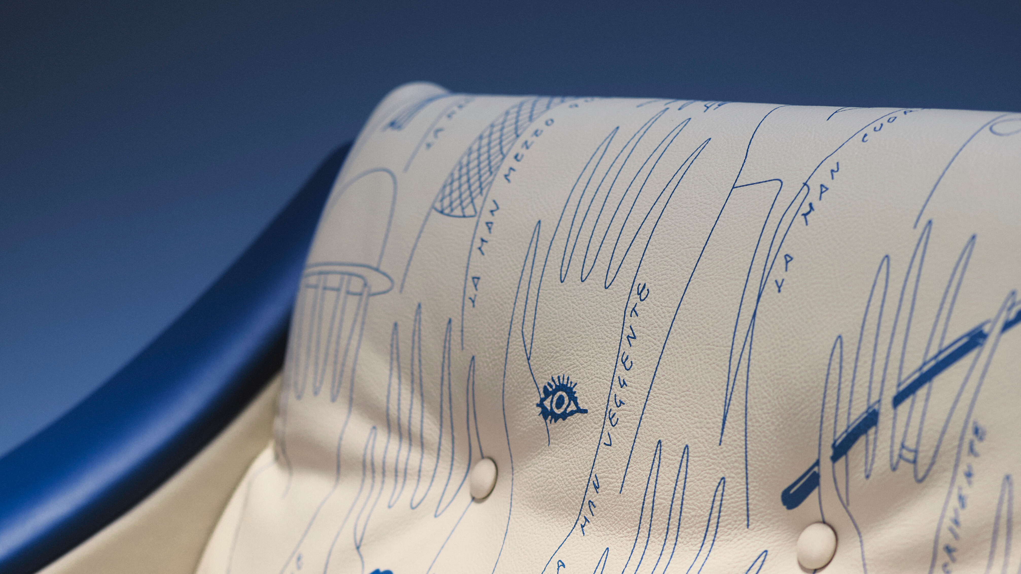 A hidden Gio Ponti illustration comes to light for ‘Dezza’ armchair’s 60th
Poltrona Frau brings a lost Gio Ponti illustration to life in leather for the designer’s ‘Dezza’ armchair’s anniversary celebration
By Ali Morris
-
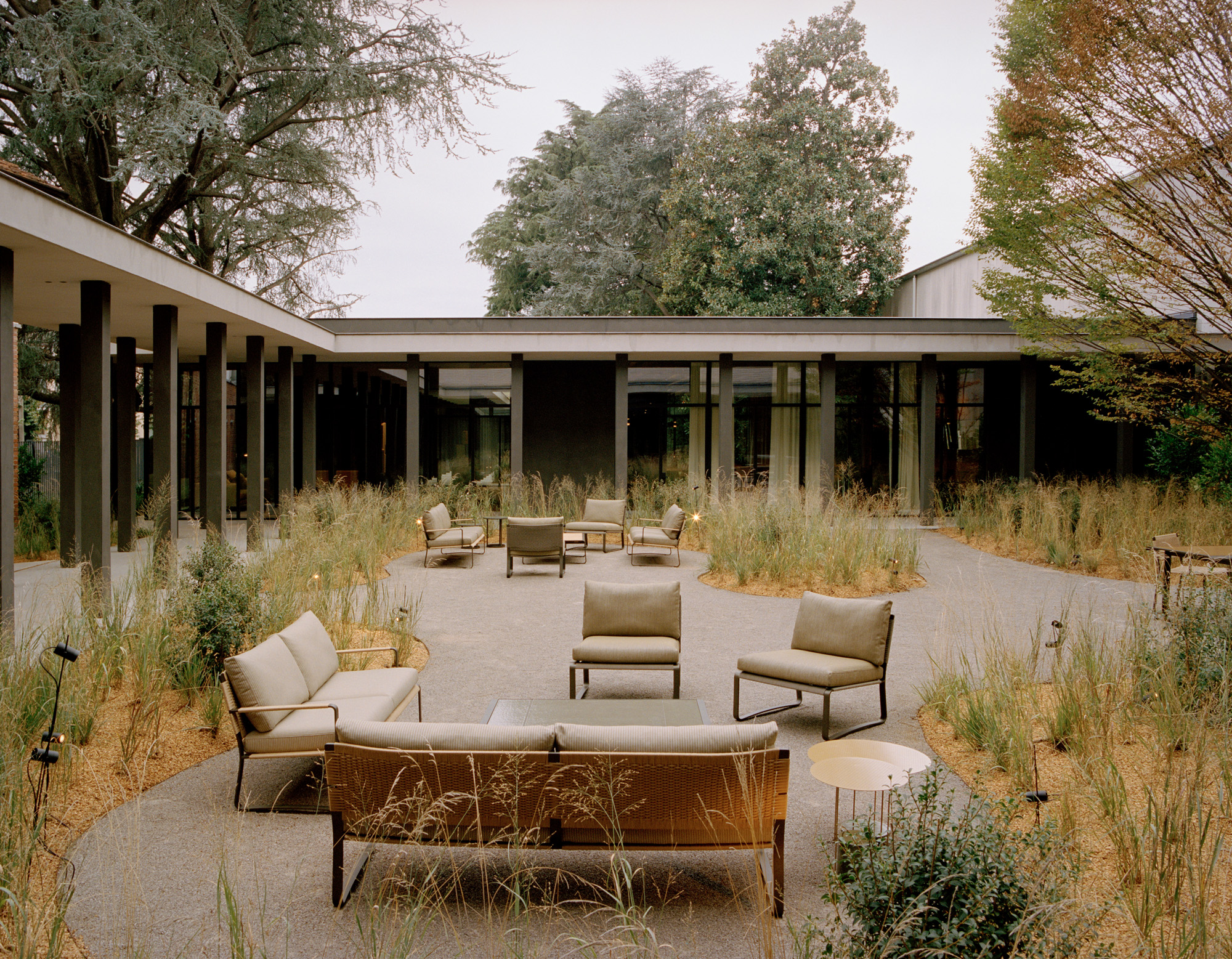 Vincent Van Duysen ‘inspired by modernism’ for Molteni & C’s outdoor furniture debut
Molteni & C goes alfresco with two new collections and reissued classics, bringing its signature elegance to the great outdoors
By Rosa Bertoli
-
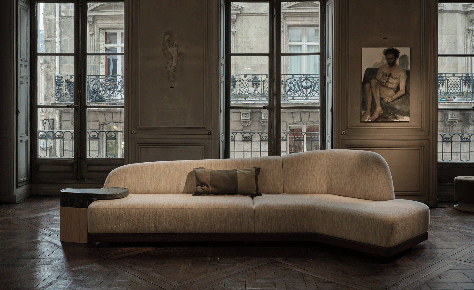 Charles Zana unveils his first design collection
Charles Zana’s 60-piece furniture and lighting collection encapsulates simple design codes and is revealed here ahead of an official brand launch in 2022
By Hannah Silver
-
 Il Sereno and Patricia Urquiola launch penthouse that celebrates Italian design
The Lake Como Hotel, designed by Patricia Urquiola in 2016, opens its latest penthouse dedicated to modernist design and a new e-commerce to shop furniture, accessories and textiles from the hotel
By Rosa Bertoli
-
 Antonio Citterio reflects on his work with Flexform, and conceiving a sofa as the heart of the home
Antonio Citterio designed the Groundpiece sofa for Flexform in 2001: twenty years on, we chart the architect's history of collaboration with the Italian furniture company, and discover his view on redefining domestic interiors
By Deyan Sudjic
-
 Retro revival: Dimore Studio unleashes 70s style at Fendi’s Sloane Street boutique
By Ali Morris
-
 Cassina marks 90 years with a revamped HQ, a new gallery space and a fresh look at its classics
By Ellen Himelfarb
-
 Bow belles: stay ahead of the curve with sensual velvets and geometric arcs
By Rosa Bertoli