Eclectic spaces: Danish design studio Frama starts interior architecture division
Receive our daily digest of inspiration, escapism and design stories from around the world direct to your inbox.
You are now subscribed
Your newsletter sign-up was successful
Want to add more newsletters?
The ideas pouring out of the grand 1800s building that design studio Frama inhabits are fully eclectic. The Copenhagen-based collective has a working space that is ever changing and experimental, and it is with this aesthetic they have started a new venture – Frama Interior Architecture, transforming the interiors of two stores in their city.
Located in Nyboder, their impressive St Pauls Apotek studio space retains its original apothecary architecture of embellished glass ceilings, medical drawers and weathered, oil treated floorboards. Frama have used an assortment of raw materials with their own products to conceive different spaces that are constantly ‘work in progress’ within their studio. From an industrial kitchen that mixes anthracite, steel and wood against the original walls; to the ‘St Pauls Blue Room’ where the walls are washed with a bespoke blue pigment made in collaboration with manufacturer Jotun, their inspirational interiors allow for a substantial degree of alteration and flexibility.
Frama have taken this uniquely free level of creativity to their redesigns of two Copenhagen boutiques: a women’s clothes store called Stig P and a concept store called Packyard, both possessing distinctly individual styles. As with their studio, they have made use of the original 1980s marble tiles that adorn the walls in the Stig P showroom. Building on this, they decided to expose the walls that were previously hidden, using a dark palette alongside natural woods, minimalist metal railing and Kvadrat fabrics to compliment the veined marble-work.
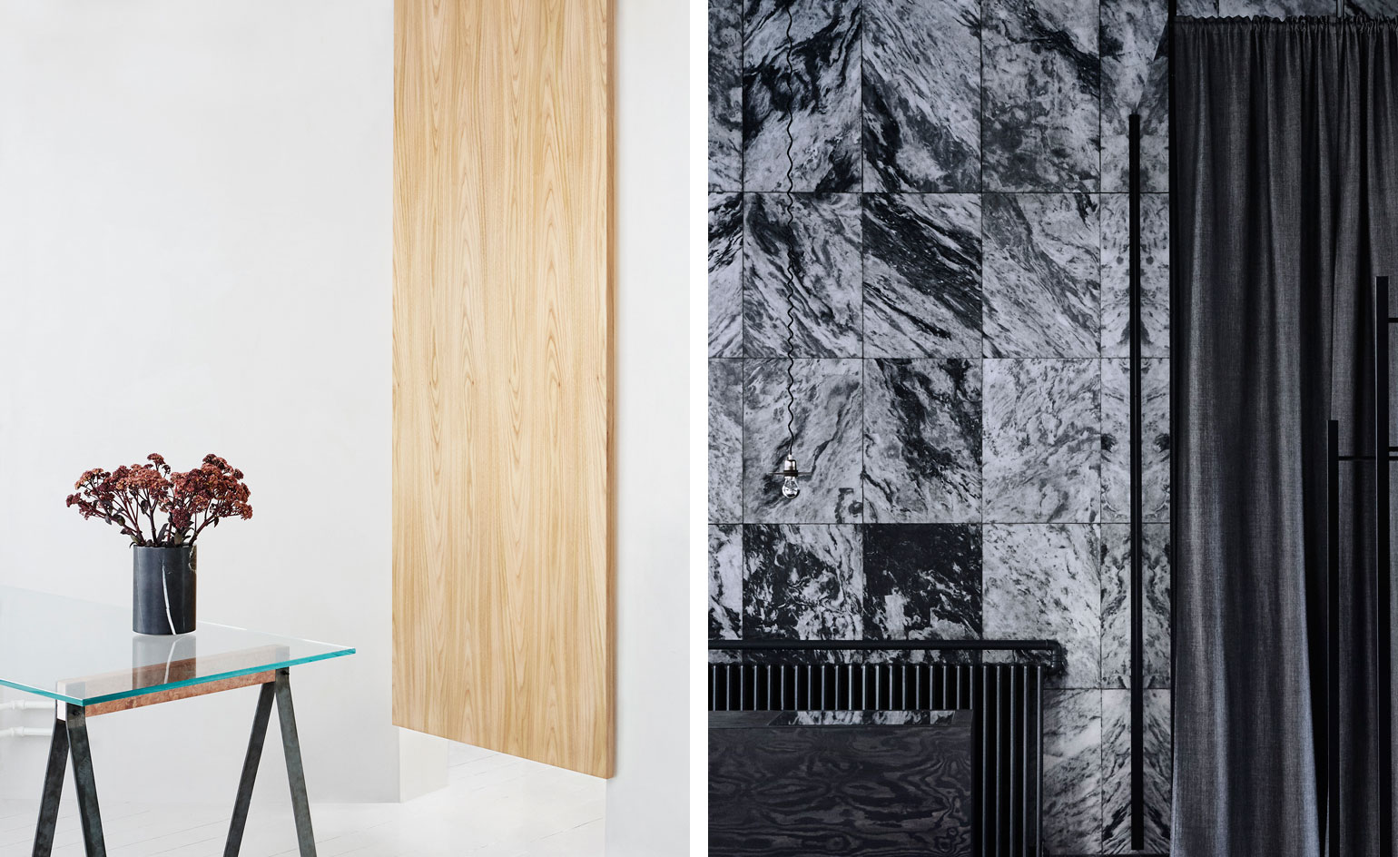
The Packyard store transformation presents an opposite world – light, fresh hues in a spacious and simple set, appearing more like a gallery. Here, they bought an experimental flair to the space, with moveable floating walls. Flat pieces of elmwood (a play on the name of the street the shop lives on – 'Elmegade') hang from the ceiling, and can be used as mirrors, glass, display walls or dividers, to customise the store's layout.
‘Our interior architecture section is challenging the company and making sure we are constantly out of our comfort zone with new ideas,’ says Niels Strøyer Christophersen, Frama's founder. Next up for the team is the remodel of a classic bistro, set to open in November.
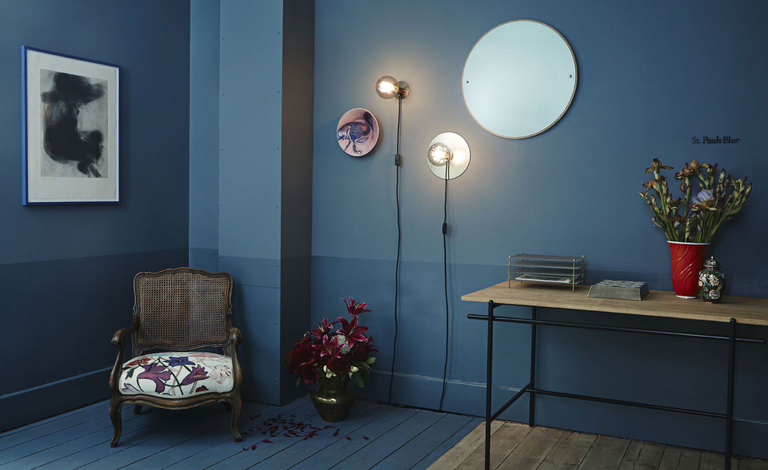
The transformation of these two spaces reflects the highly eclectic design style of Frama’s St Pauls Apotek studio. Pictured: The Frama studio’s ’St Pauls Blue Room’, painted using a bespoke pigment
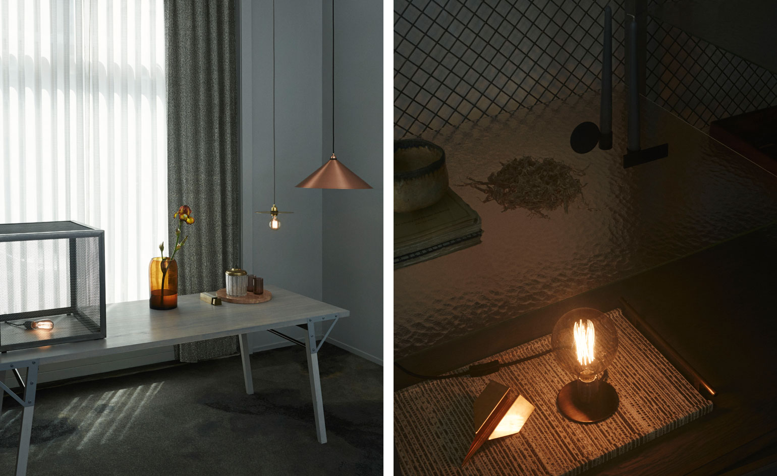
Incorporating myriad raw materials into their designs, Frama’s studio space is a constant ’work in progress’
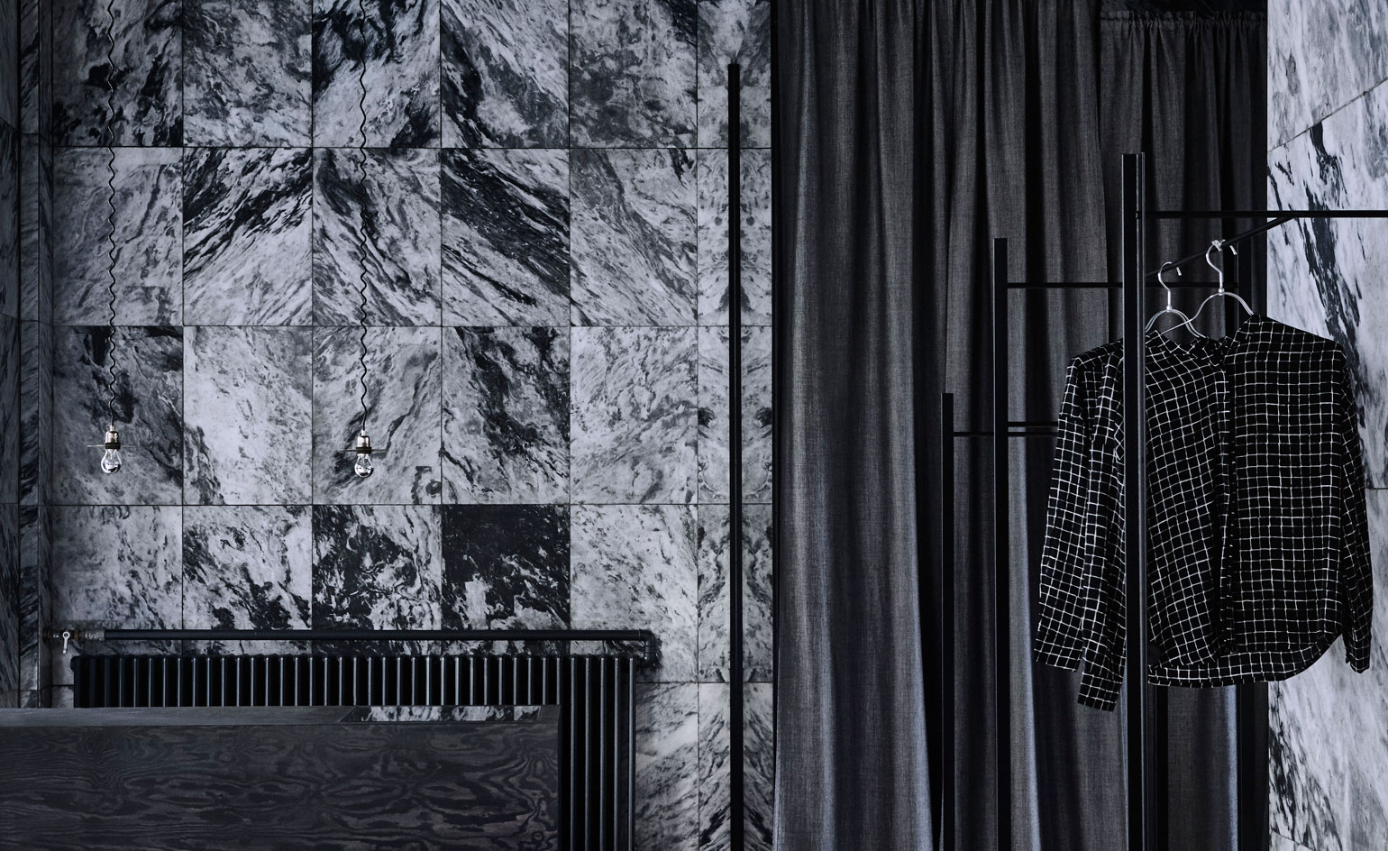
For the Stig P redesign, the brand made use of the original 1980s marble titles that adorn the walls, exposing them while utilising a dark palette to match the veins in the tiles
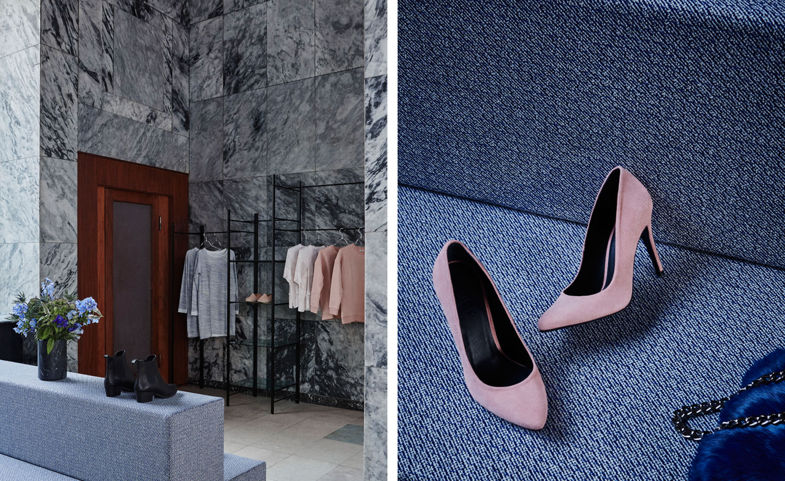
Minimalist railing and Kvadrat fabrics complement the marble
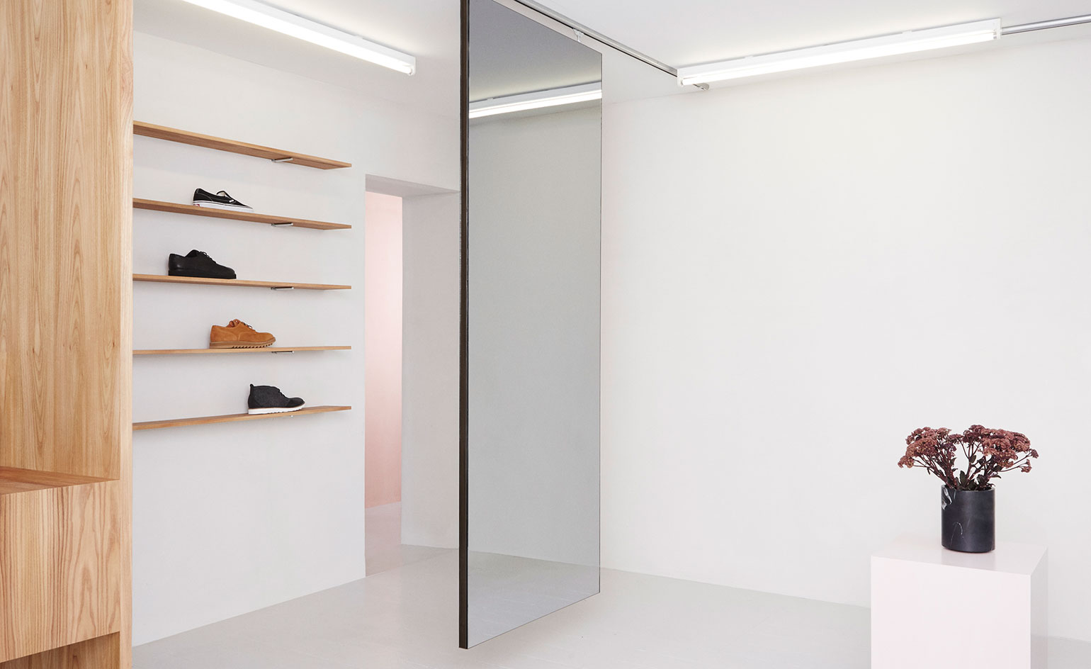
In contrast to Stig P, the Packyard store was given fresh and light hues, subsequently resembling a gallery as much as a retail space
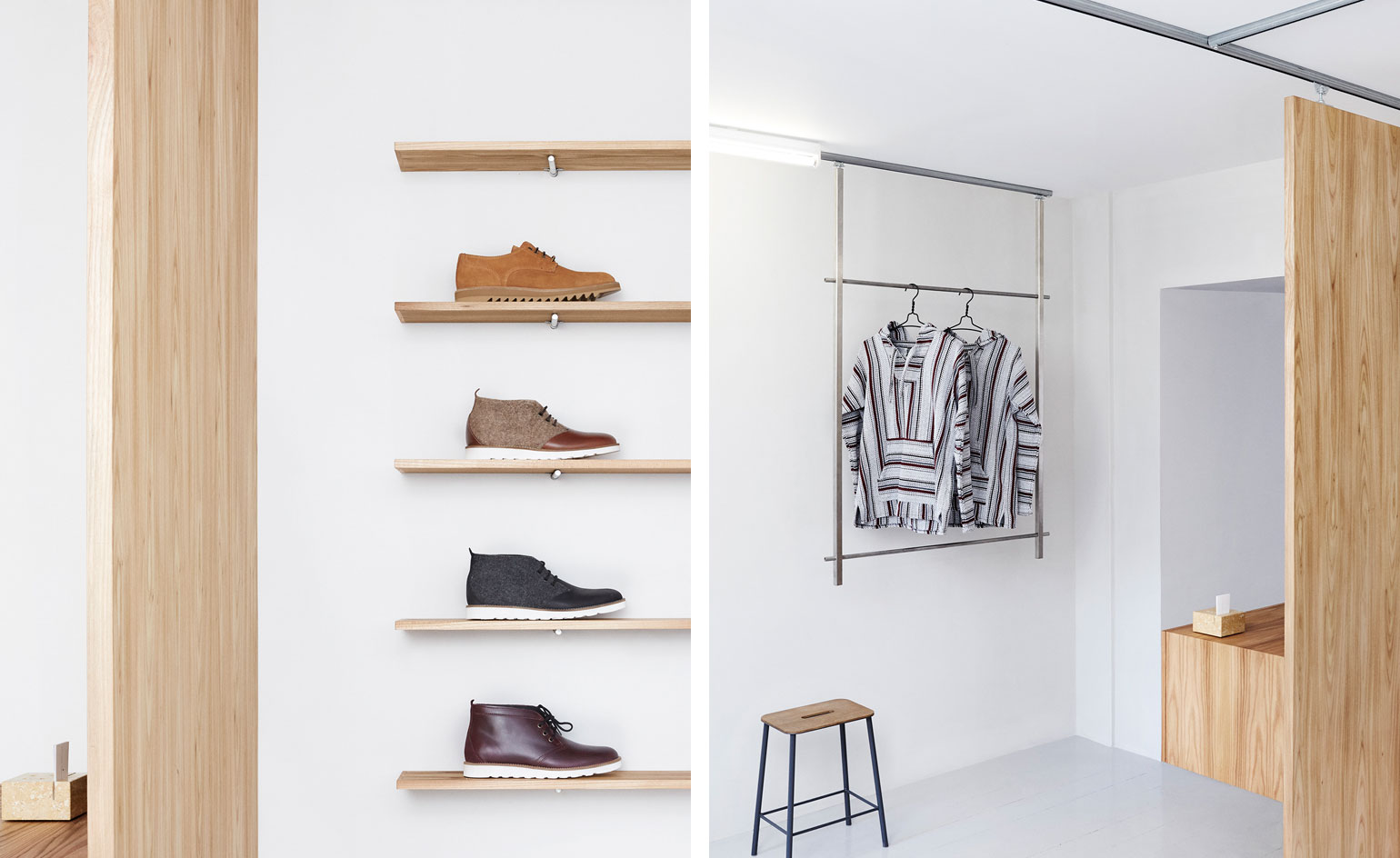
Here, they bought an experimental flair to the space, with moveable floating walls
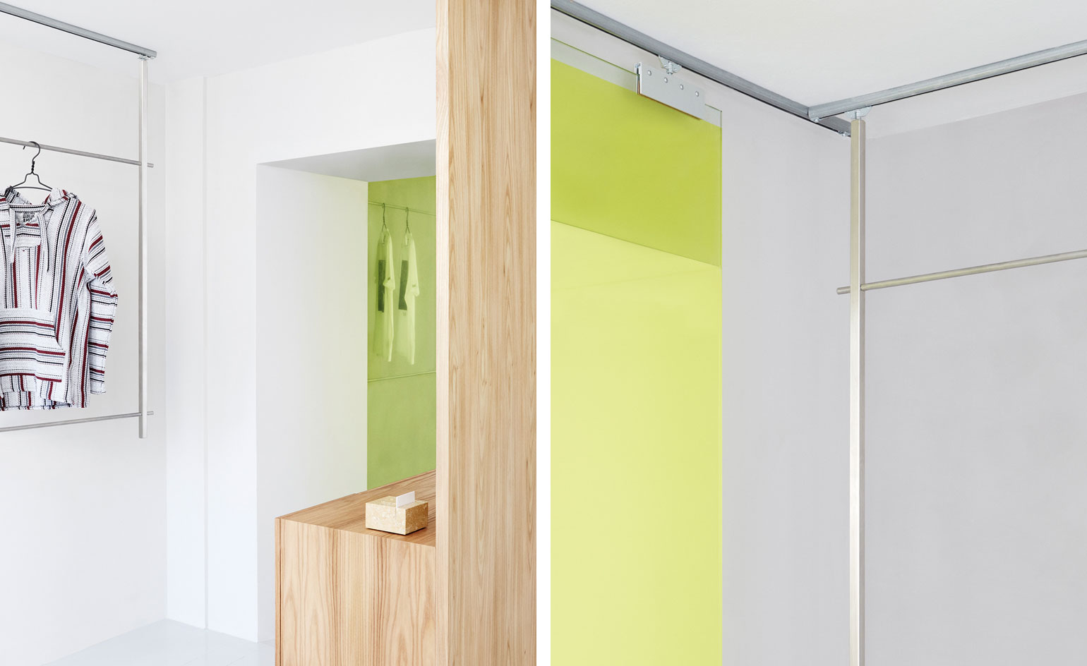
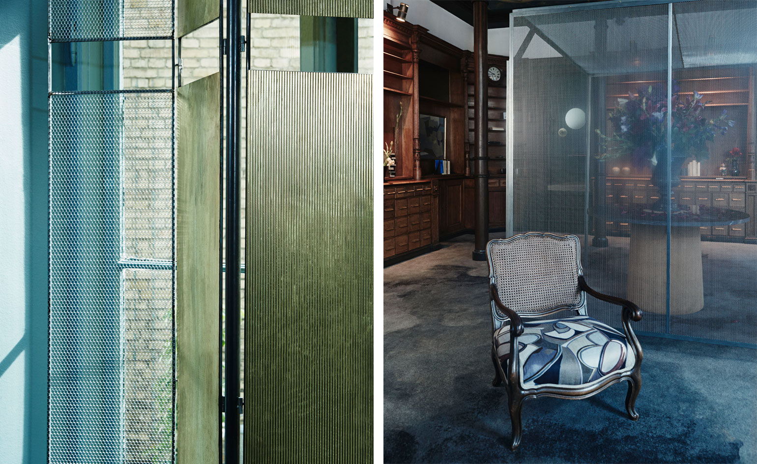
Next up for the team is a remodel of a classic bistro, set to open in November. Pictured: Frama’s St Pauls Apotek studio
INFORMATION
For more information, visit Frama CPH
ADDRESS
Packyard
Elmegade 22
2200, Copenhagen
Stig P
Kronprinsensgade 14
1114, Copenhagen
Receive our daily digest of inspiration, escapism and design stories from around the world direct to your inbox.
Sujata Burman is a writer and editor based in London, specialising in design and culture. She was Digital Design Editor at Wallpaper* before moving to her current role of Head of Content at London Design Festival and London Design Biennale where she is expanding the content offering of the showcases. Over the past decade, Sujata has written for global design and culture publications, and has been a speaker, moderator and judge for institutions and brands including RIBA, D&AD, Design Museum and Design Miami/. In 2019, she co-authored her first book, An Opinionated Guide to London Architecture, published by Hoxton Mini Press, which was driven by her aim to make the fields of design and architecture accessible to wider audiences.