Game on: Studio Frith on creating the Frieze Art Fair campaigns
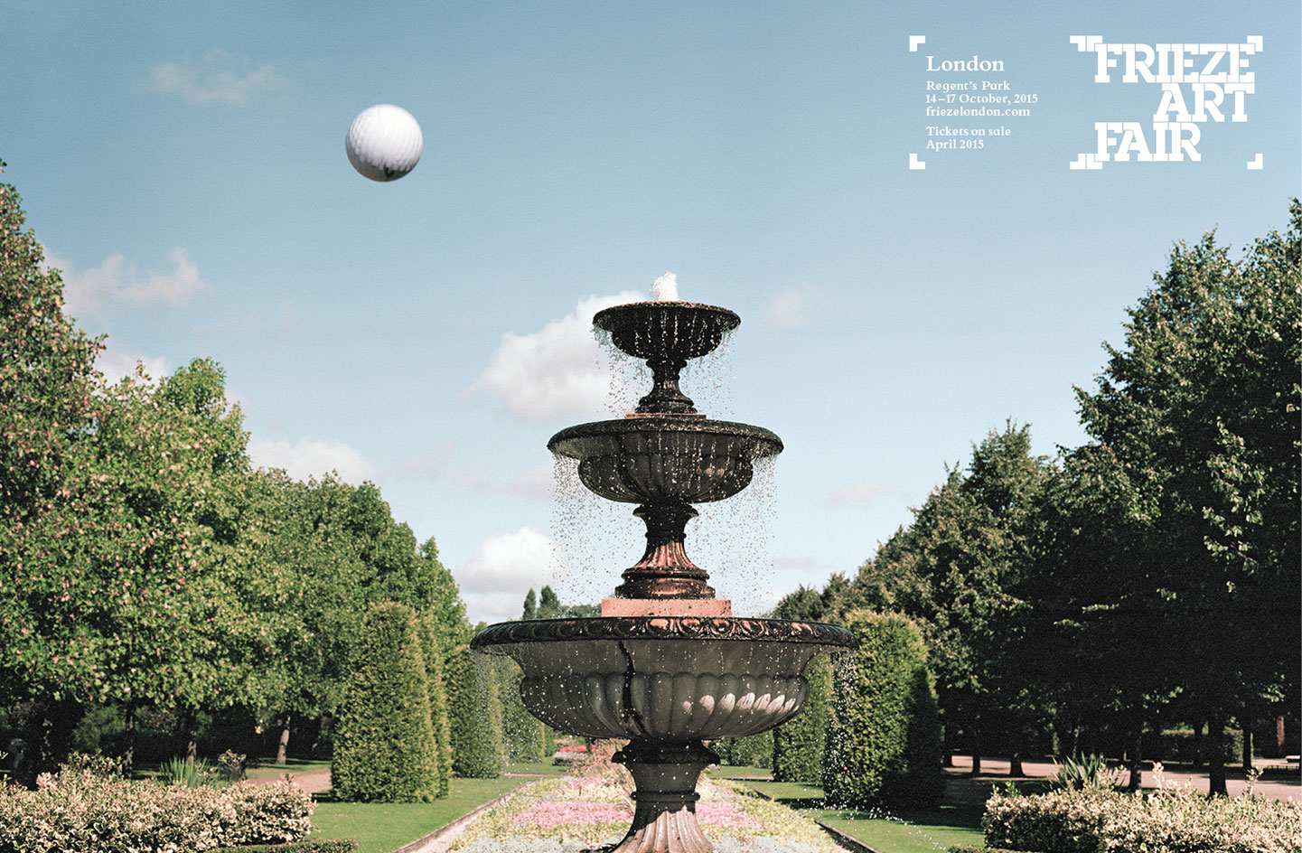
Creating the visual identity of the largest and most renowned contemporary art fairs in the world is no mean feat, but Studio Frith make it look easy. For the second year running, the maverick London consultancy founded and led by Frith Kerr has taken on Frieze Art Fair's campaign head on and won. We speak to Kerr about the fun and games behind creating the identity of Frieze...
What is the idea behind the campaigns for this year's fairs?
We used ball games that take place in Regent's Park London and Randall’s Island New York as our starting point and analogy for Frieze. The essence of a ball game is to put circular objects into a negative space – although football fans might have a more emotional view! But all ball games need space; parks, sports fields, a space where this energy can be exerted. Similarly, the energy of the art world inhabits Frieze. This open, neutral, clean and beautiful space is filled with the energy of the international art.
How do the new campaigns relate to your work with last year's images?
Location was key last year too. Instead of balls that 'land' in Randall's Island and Regent's Park we used birds that migrate through the two locations. We saw the art world as 'international nomads' descending, landing in Regent's and Randall’s before they flew off again.
What do you aim to achieve or communicate with these visuals?
Being creative and artful is just the process to making work that is interesting and engaging. We commissioned the photographer Polly Brown who shot on film stock in London and New York. She has a real tenacity to her vision. We liked that these campaigns were rooted in the physical, the places where the actual fairs take place. If you walk from Frieze London to Masters this week you walk through an aisle of trees that are an incredible yellow colour; likewise in New York in May the blossom is out. We wanted to communicate something of these spaces, the vibrant colour, the open air and energy that is unique to Frieze.
What makes Frieze so special for you?
Frieze is like something out of Close Encounters, where the entire art world lands from outer space, then is off again and leaves without a trace. We think of Matthew [Slotover, Frieze founder] as something of a Spielberg.
What are the challenges of working on something so epic?
It is a challenge! We are trying to make advertising that stands out in a magazine full of art, that works on a bus going down Oxford Street and simultaneously works on a mantelpiece in a collectors home. We are talking to an incredible visually literate audience and at the same time we are not trying to make art. Our approach to advertising and design is always to root it in something that is real. We work like a team of librarians and we do a huge amount of research to make our concept presentations as detailed as possible. Our approach is always based on research so that the idea always has a concrete thread of truth and logic that can work can across any medium. Sometimes the end product is fairly simple, like a day-glo colour ball against a line, but it can remind us of a Peter Halley painting without trying to be one.
With so many spectators and participants, sponsors and gallerists at Frieze, how do you satisfy them all?
Well… you can't argue with a golf ball, it would be too dull.
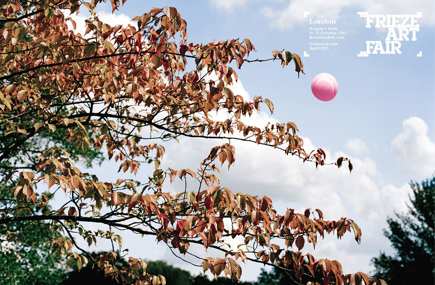
This year’s campaign leads on from last year’s idea which linked the two locations – London’s Regent’s Park and Randall’s Island, New York – through the common theme of ball games
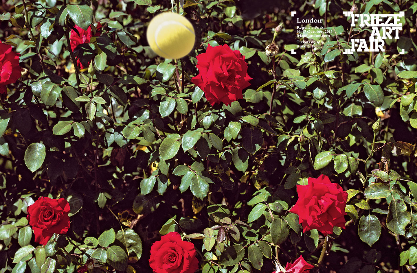
’All ball games need space; parks, sports fields, a space where this energy can be exerted. Similarly, the energy of the art world inhabits Frieze,’ explains studio founder Frith Kerr
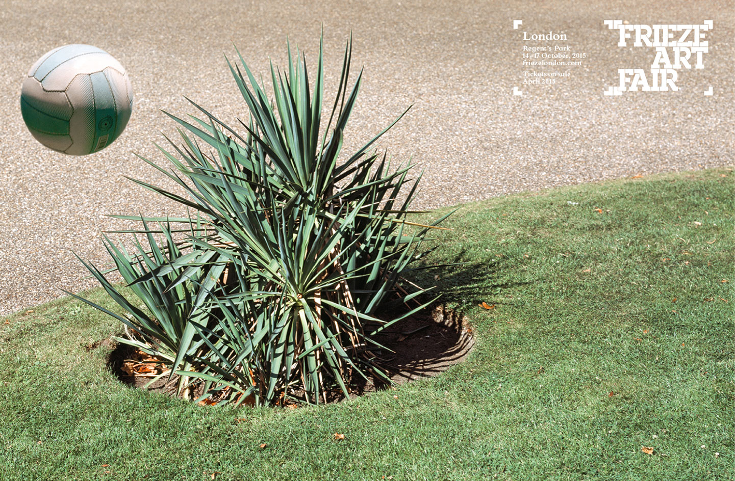
Last year’s campaign saw the art world as ’international nomads’ descending, landing in Regent’s and Randall’s before flying off again
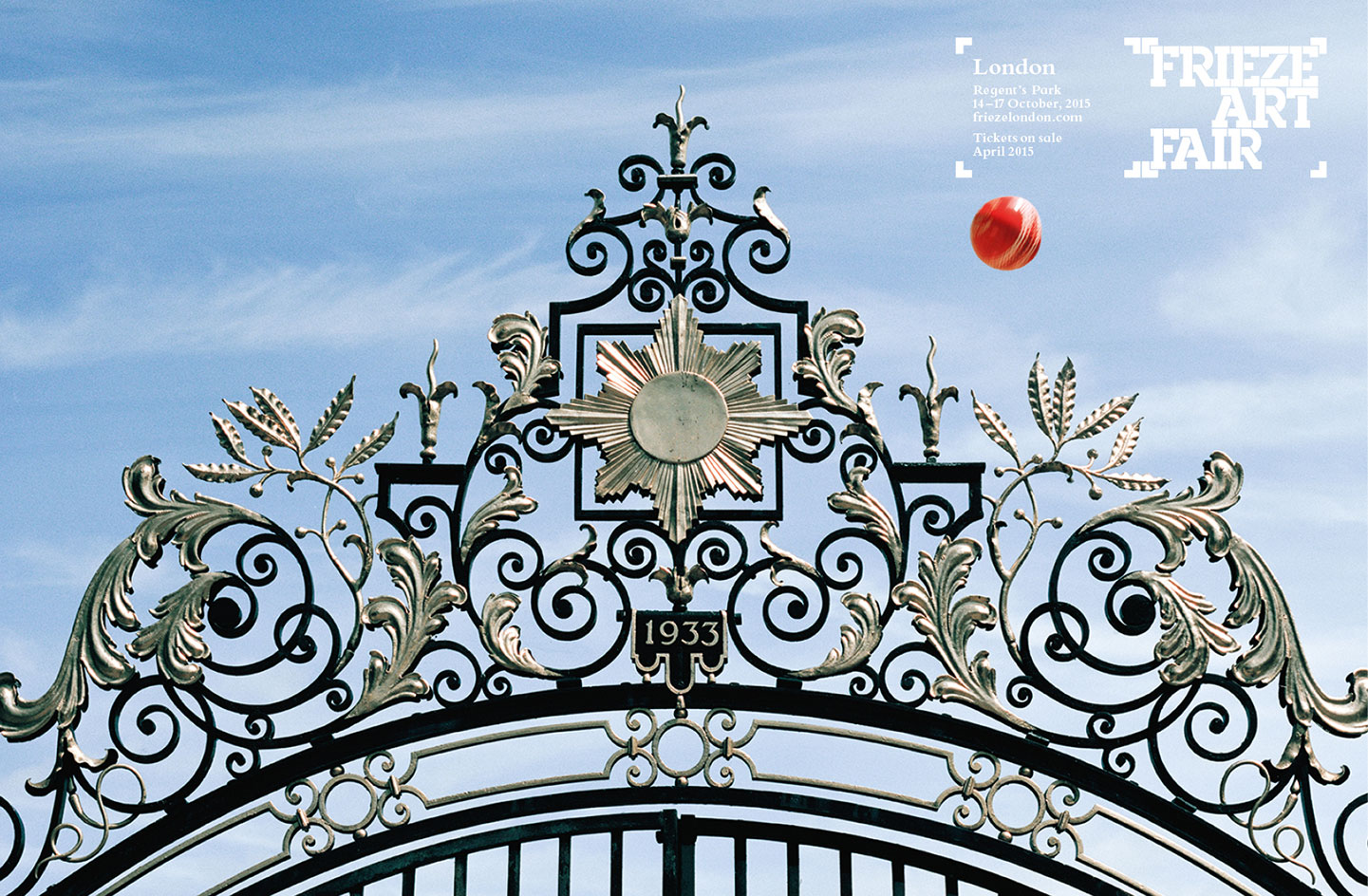
’Being creative and artful is just the process to making work that is interesting and engaging,’ explains Kerr
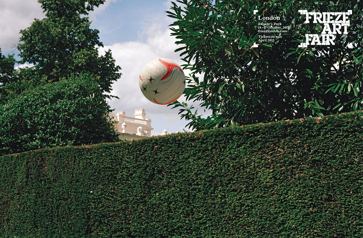
Photographer Polly Brown was commissioned to capture the ball games in action in London and New York. ’She has a real tenacity to her vision,’ says Kerr
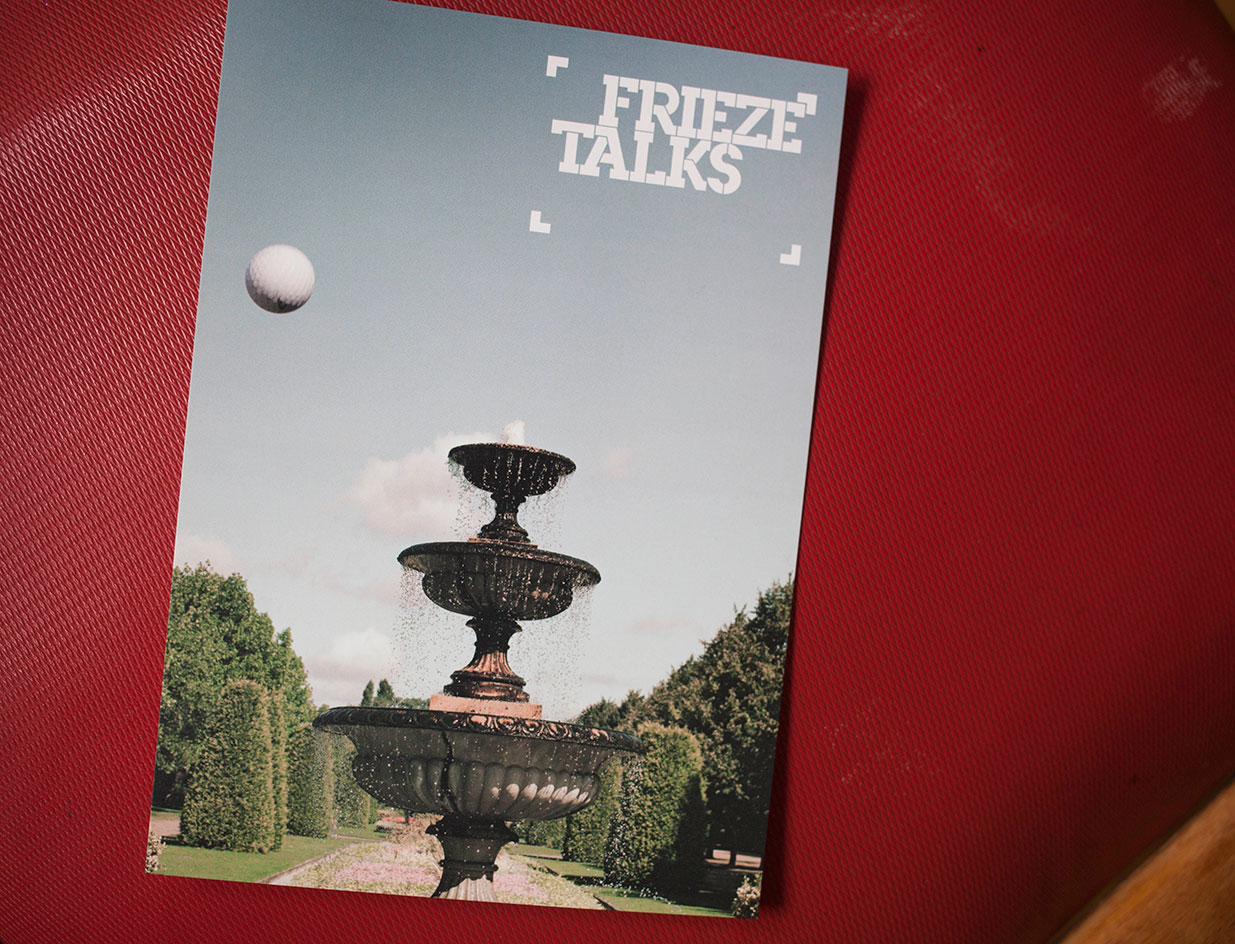
’We liked that these campaigns were rooted in the physical, the places where the actual fairs take place’
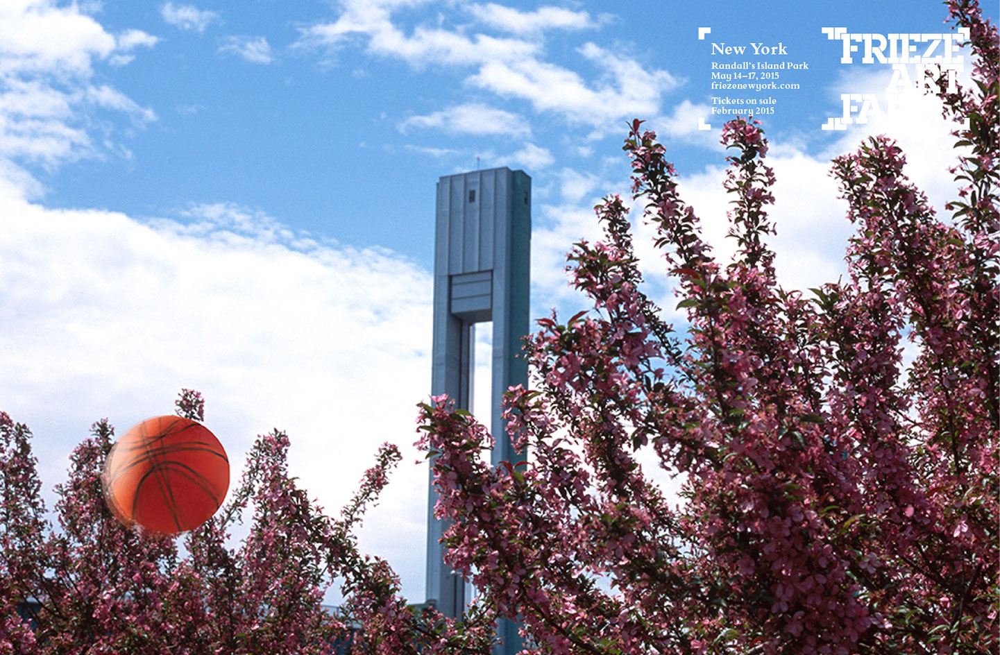
’If you walk from Frieze London to Masters this week you walk through an aisle of trees that are an incredible yellow colour; likewise in New York in May the blossom is out. We wanted to communicate something of these spaces, the vibrant colour, the open air and energy that is unique to Frieze’
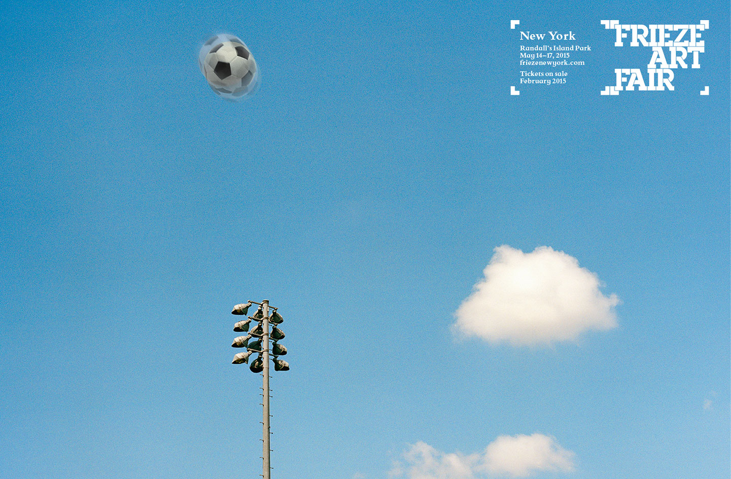
’We are trying to make advertising that stands out in a magazine full of art, that works on a bus going down Oxford Street and simultaneously works on a mantelpiece in a collector’s home...’
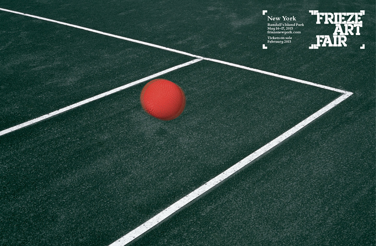
’... we are talking to an incredible visually literate audience and at the same time we are not trying to make art’
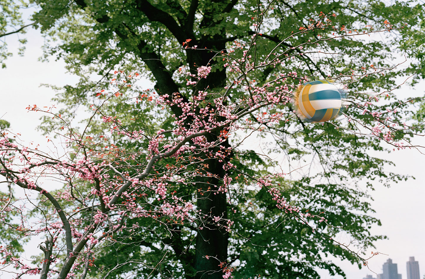
’Our approach to advertising and design is always to root it in something that is real’
INFORMATION
Visuals courtesy of Studio Frith; www.studiofrith.com
Photography: Polly Brown
Receive our daily digest of inspiration, escapism and design stories from around the world direct to your inbox.