Glenmorangie 18: A new Wallpaper* design collaboration
Glenmorangie’s 18 Years Old is a premium single-malt Scotch whisky of serious distinction. Wallpaper* worked with the venerable Highlands-based brand on last year’s 'Modern Gentleman' by Glenmorangie and Wallpaper* project, an ambitious collaborative effort that saw us commissioning a collection of one-off whisky-inspired furniture, lighting and accessories from a handpicked selection of designers and craftspeople.
For this year’s challenge, we’ve teamed up with Glenmorangie again and selected six more designers from Wallpaper’s extended global talent network.
We’ve provided each one with a simple brief: use your craft, creativity and technique to create a bar-room glory with a bottle display – what’s known in the drinks trade as a ‘bottle glorifier’.
Our six designers’ role is to enhance the visibility and desirability of a bottle of the Glenmorangie 18 Years Old or Signet 'expressions' (varieties of whiskey), either on or behind the bar, or on a table. The glorifier must work for both expressions (both bottles having the same footprint and diameter).
For the first stage of the project we’ve asked each designer to submit three initial glorifier designs in the form of sketches, providing 18 in total (one for each year Glenmorangie 18 Years Old is aged). Then it’s up to you.
From these three preliminary sketches Glenmorangie is asking Wallpaper.com readers and Glenmorangie Facebook friends to choose one concept from each designer, to go into production. We need six sketches in total, with each winning design coming to life for a special Wallpaper* feature early next year.
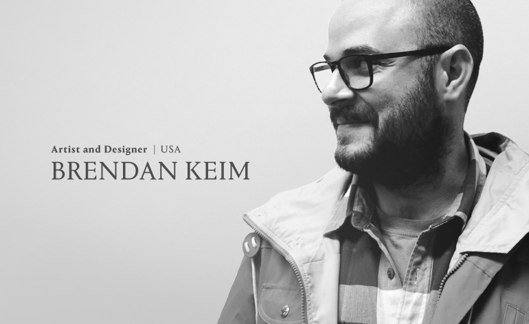
Brendan Keim is a Brooklyn-based artist and designer. After graduating from NYC’s Pratt Institute in 2005, he gained a bachelor’s degree in industrial design and a masters in fine arts at Rhode Island School of Design's furniture programme. Today, Keim combines his love of woodworking and craft with interactive electronics
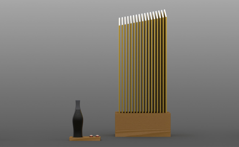
Remote serving tray and floor lamp by Keim
A thin slice of American White Oak doubles as a serving tray and wireless dimmer controller for the 170-LED floor lamp. Two custom-machined copper knobs adjust both the intensity and quality of the LEDs. Each LED signifies one year since the distillery’s founding.
Vote for this design
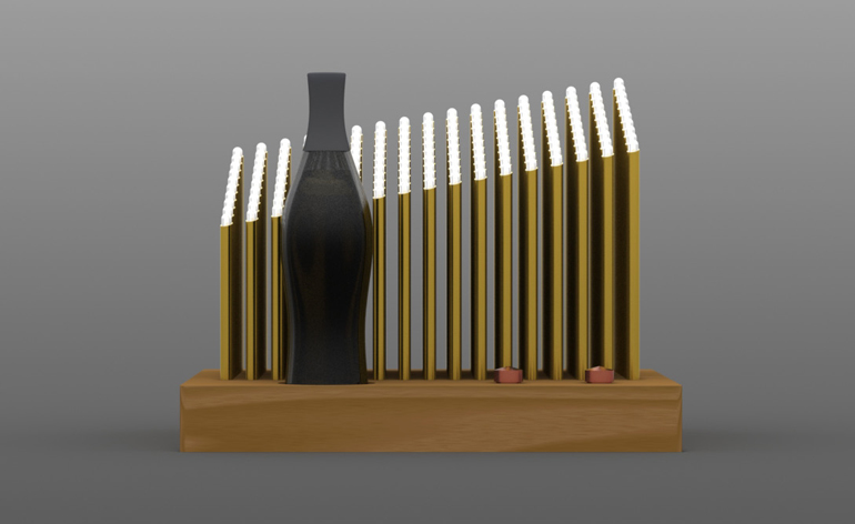
Distillery by Keim
Illuminating the bottle are 170 LEDs (echoing the number of years of the whisky distillery’s existence), which have been sliced to mimic the rooftops of the distillery. Again, two custom-machined copper knobs adjust both the intensity and quality of the LEDs.
Vote for this design
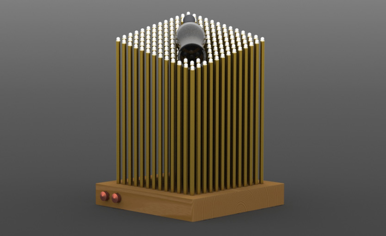
Cradle by Keim
For this design, the 13 x 13 grid of LEDs and the bottle each signify a year of the distillery's history. Once again, two custom-machined copper knobs adjust both the intensity and quality of the each LED.
Vote for this design

An award-winning designer of furniture and lifestyle products, British-born John Green’s approach is simple – to create innovative and functional designs that people can’t resist. As well as developing products for his own brand, he also works as a freelance designer, collaborating with other designers and manufacturers. He currently works from The Studio in York, alongside other young British designers and brands
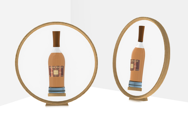
Back-lit whisky glorifier by Green
A combination of American oak and opal LED back-lit glass gives a blend of tradition and innovation to this bottle glorifier.
Vote for this design
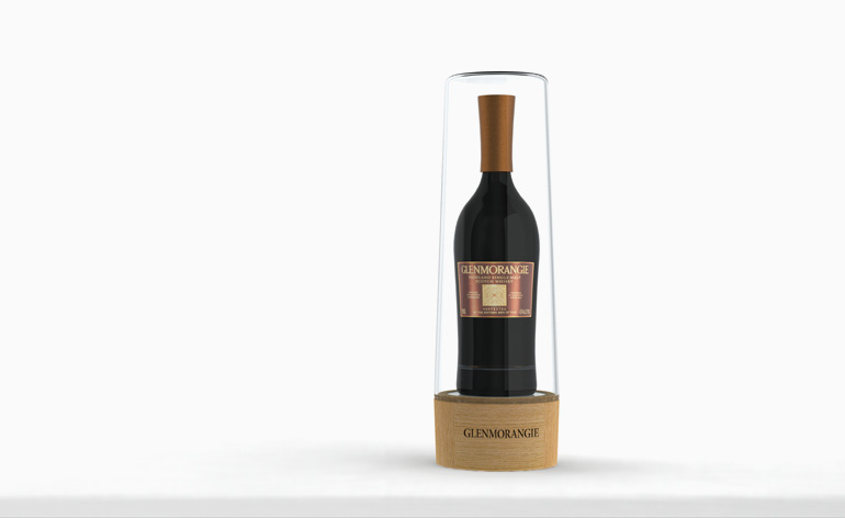
Base light whisky glorifier by Green
The tapered glass dome takes inspiration from the stills that Glenmorangie are so proud of. The base is made of American White Oak from the Glenmorangie forest and houses a light that will shine up into the whisky bottle.
Vote for this design
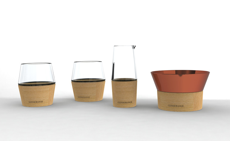
Glasses and ice bucket by Green
The tapered glass, coupled with the American White Oak bases, together represent the heritage of the Glenmorangie whisky and the traditional craftsmanship used in its making.
Vote for this design

Born in 1983, Kenyon Yeh received a masters in product design from Kingston University in London and is now based in Taipei, where his Kenyon Yeh Studio focuses on furniture, lighting and product design. His work is characterised by a unique approach, creativity, form and practice. His designs have been manufactured by international companies such as Seletti, Menu As and Esaila and he has collaborated with Topman UK. Yeh also produces his own handmade furniture collection, Unikea. ‘Design is a process and tool for communication,’ he says
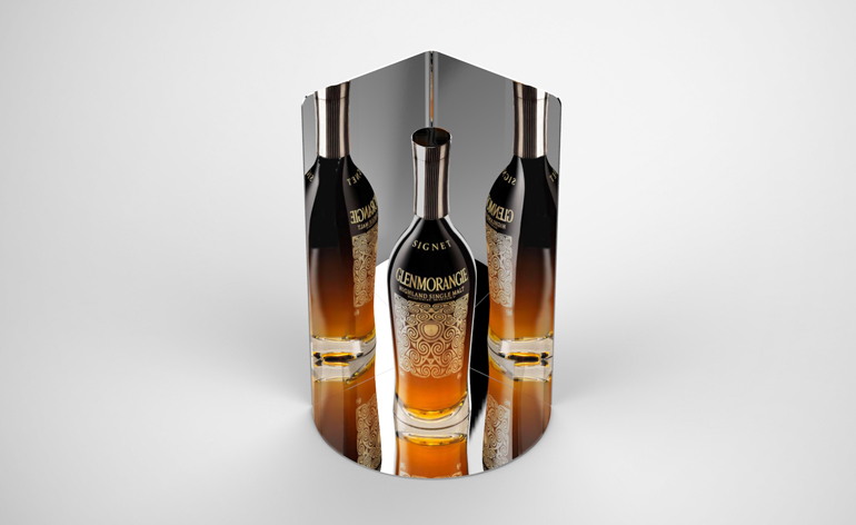
Signet glorifier by Keh
A polished aluminium sheet forms a mirror that surrounds the bottle and shows the Glenmorangie Signet from every side.
Vote for this design
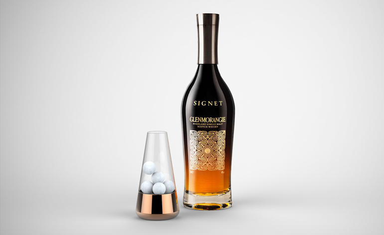
Ice bucket by Keh
This design is made from glass with a copper base. The glass contains ice cubes with small holes at the bottom to bring the melting ice water down to the base
Vote for this design
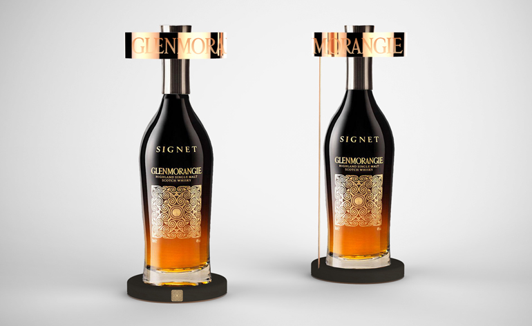
Dark oak glorifier by Keh
A dark oak wood base is connected to the copper crown with a simple copper tube. The elegant display highlights Glenmorangie's signature orange hue
Vote for this design

Mexican Rolando Rodriguez-Leal is part of design partnership Aidia Studio, along with Polish designer Natalia Wrzask. Rodriguez-Leal’s experience includes a stint at Foster + Partners in London before joining Zaha Hadid Architects as lead architect, where he worked on projects as varied as the Dubai Opera House and the People’s Conference Hall in Lybia. In 2011, he founded Aidia Studio with Wrzask, who has also worked at these two prestigious architecture firms
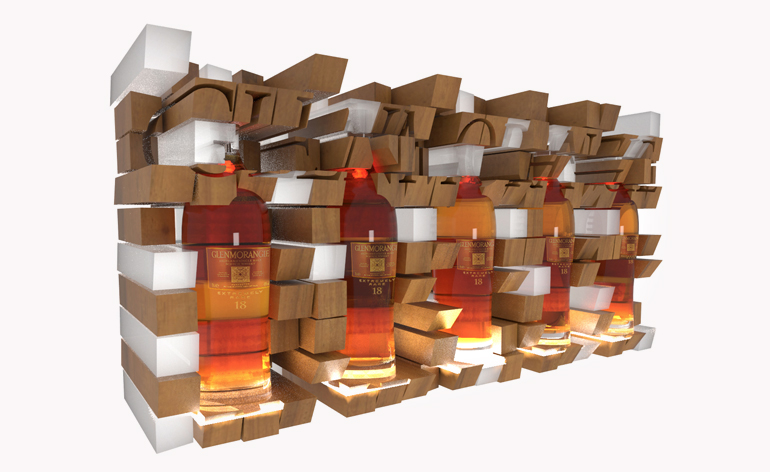
Glorifier one by Rodriguez-Leal
Rodriguez-Leal's designs represent the complexity of flavours and aromas of the Glenmorangie 18 Years Old whisky, as well as the tradition of craftsmanship, attention to detail and sophistication. This modular design makes a sculpture out of the bottles and the display system itself.
Vote for this design
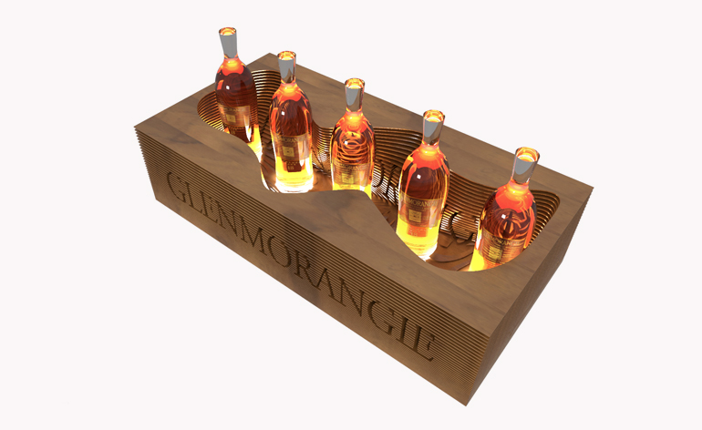
Glorifier two by Rodriguez-Leal
The bottles are once again lit from below in this countoured design. The Glenmorangie name is carved out of the layers of wood that make up the casing.
Vote for this design
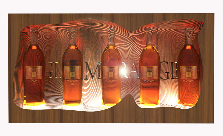
Glorifier three by Rodriguez-Leal
This design plays with the grain of the wood, which is magnified by the bottles themselves. The hues of the wood and whiskey become one.
Vote for this design
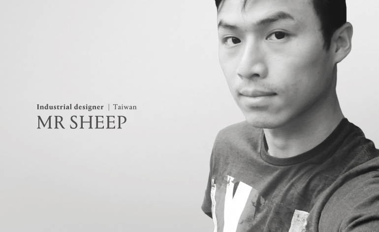
Also known as John Yide Yang, Mr Sheep is a Taipei-based industrial designer who has studied in the UK and Taiwan and worked for Asus computers. He recently created an ice-humidifier installation for Tokyo Design Week. ‘Designers,’ he says, ‘should make the world a better place.’
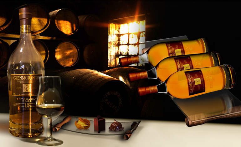
Lasting Flavour by Mr Sheep
Laying out the bottles like barrels of whisky, this design echoes Glenmorangie’s process of maturing and then extra-maturing its whisky to draw out the lasting flavours and layers of taste.
Vote for this design
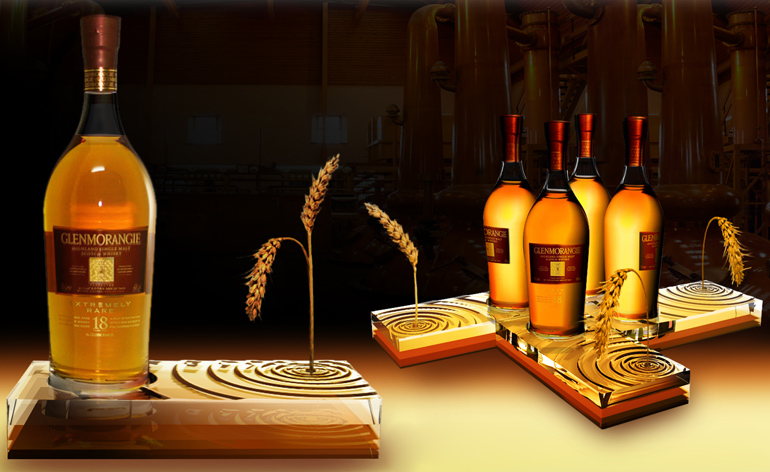
Process by Mr Sheep
This design is inspired by the process through which Glenmorangie 18 Years Old whisky is made; malting, fermenting, distilling, maturing and extra maturing. The different processes give it its rich taste.
Vote for this design
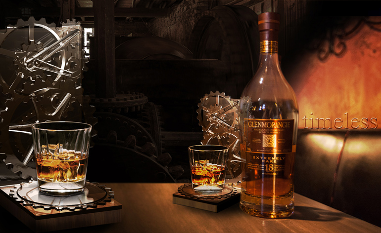
Timeless by Mr Sheep
This design draws on the history of whisky-making. Like a constantly turning mill, malting the whisky, this design continually rotates the glass. The rotation emphasises the light honey-like colour of the whisky.
Vote for this design
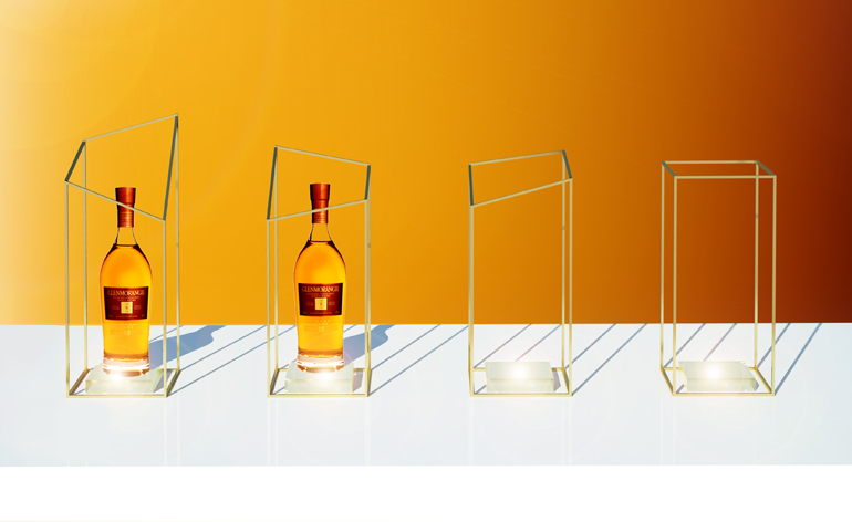
Glorifier one by Bernadi
The bottle glorifier is conceived as a simple and pure brass frame, which highlights the precious bottle as it stands on a backlit, frosted glass base. The bottle’s frames are designed in four geometries to be used singularly or all together, side-by-side. The geometric transition is a metaphor of the long and distinctive process through which Glemorangie 18 Years Old whisky is made.
Vote for this design
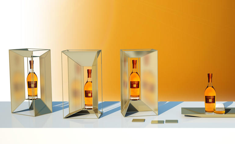
Glorifier two by Bernadi
This modular system can be a single- or multiple-bottle glorifier. By displaying the bottle in different positions, the brass sheet’s varied angles create multiple reflections of the Glenmorangie bottle
Vote for this design
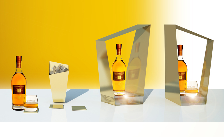
Glorifier three by Bernadi
Conceived as a single piece, the design can also be used to showcase multiple bottles if the glorifiers are placed side-by-side. It comprises a folded brass sheet and a backlit frosted glass base. The complex and asymmetric geometry reflects the sophisticated and distinctive taste of the 18 years old Glenmorangie whisky.
Vote for this design
Wallpaper* Newsletter
Receive our daily digest of inspiration, escapism and design stories from around the world direct to your inbox.
Rosa Bertoli was born in Udine, Italy, and now lives in London. Since 2014, she has been the Design Editor of Wallpaper*, where she oversees design content for the print and online editions, as well as special editorial projects. Through her role at Wallpaper*, she has written extensively about all areas of design. Rosa has been speaker and moderator for various design talks and conferences including London Craft Week, Maison & Objet, The Italian Cultural Institute (London), Clippings, Zaha Hadid Design, Kartell and Frieze Art Fair. Rosa has been on judging panels for the Chart Architecture Award, the Dutch Design Awards and the DesignGuild Marks. She has written for numerous English and Italian language publications, and worked as a content and communication consultant for fashion and design brands.
-
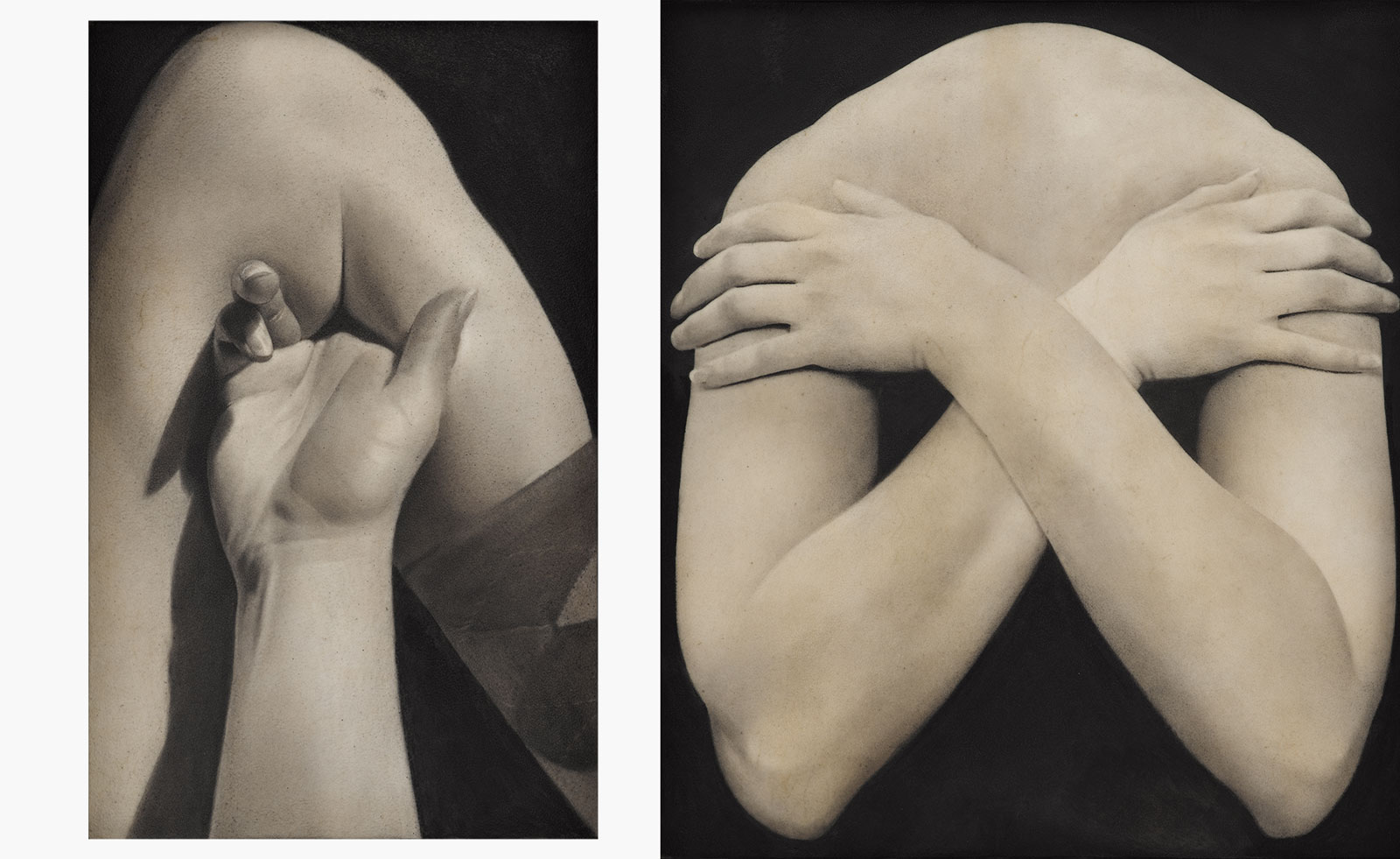 Put these emerging artists on your radar
This crop of six new talents is poised to shake up the art world. Get to know them now
By Tianna Williams
-
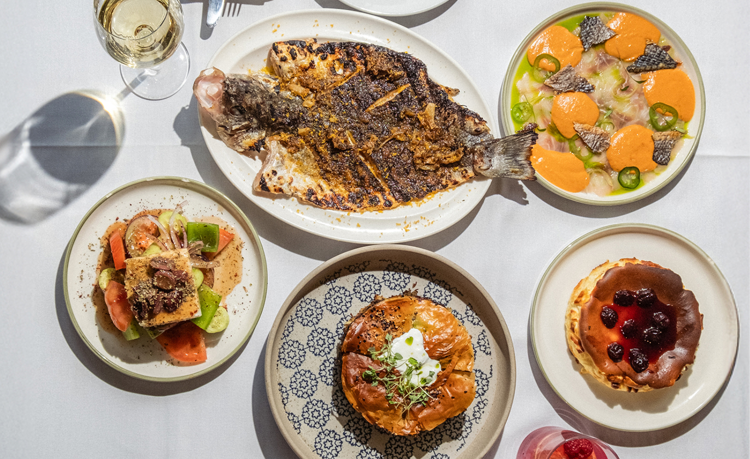 Dining at Pyrá feels like a Mediterranean kiss on both cheeks
Designed by House of Dré, this Lonsdale Road addition dishes up an enticing fusion of Greek and Spanish cooking
By Sofia de la Cruz
-
 Creased, crumpled: S/S 2025 menswear is about clothes that have ‘lived a life’
The S/S 2025 menswear collections see designers embrace the creased and the crumpled, conjuring a mood of laidback languor that ran through the season – captured here by photographer Steve Harnacke and stylist Nicola Neri for Wallpaper*
By Jack Moss