Global roaming: the secret behind Aesop's international success
In a design-led response to the threat of online retail, luxury fashion houses are riding the new wave of bold minimalistic store fit-outs. They have invested in expensive and weighty materials including marble, steel, bronze and brass, perhaps to convey a sense of strength and permanence.
On the flipside, Aesop – the cult Australian skin, hair and body care company distinguished by its use of both plant-based and laboratory made ingredients – continues to build its empire with approximately 112 uniquely different stores operating across the world. Many are positioned outside retail hubs and incorporate fit-outs using utilitarian, natural, and in some cases, discarded materials.
'The majority of our designs are with local architects who understand the environment in which a store will trade and therefore will be sympathetic to the light, climate and streetscape, but also how customers shop and use retail spaces,' affirms Michael O’Keefe, Aesop’s CEO.
Designed under the leadership of Shinichiro Ogata, the serene Kyoto store eloquently demonstrates the site-specific nature each store possesses. The stark black and white space draws inspiration from the simplistic design of 'Machiya' townhouses and the vertical alignment of Japanese text. A black mesh curtain hangs in the entrance with rows of floating brown Aesop bottles turned on their sides like calligraphic scrolls.
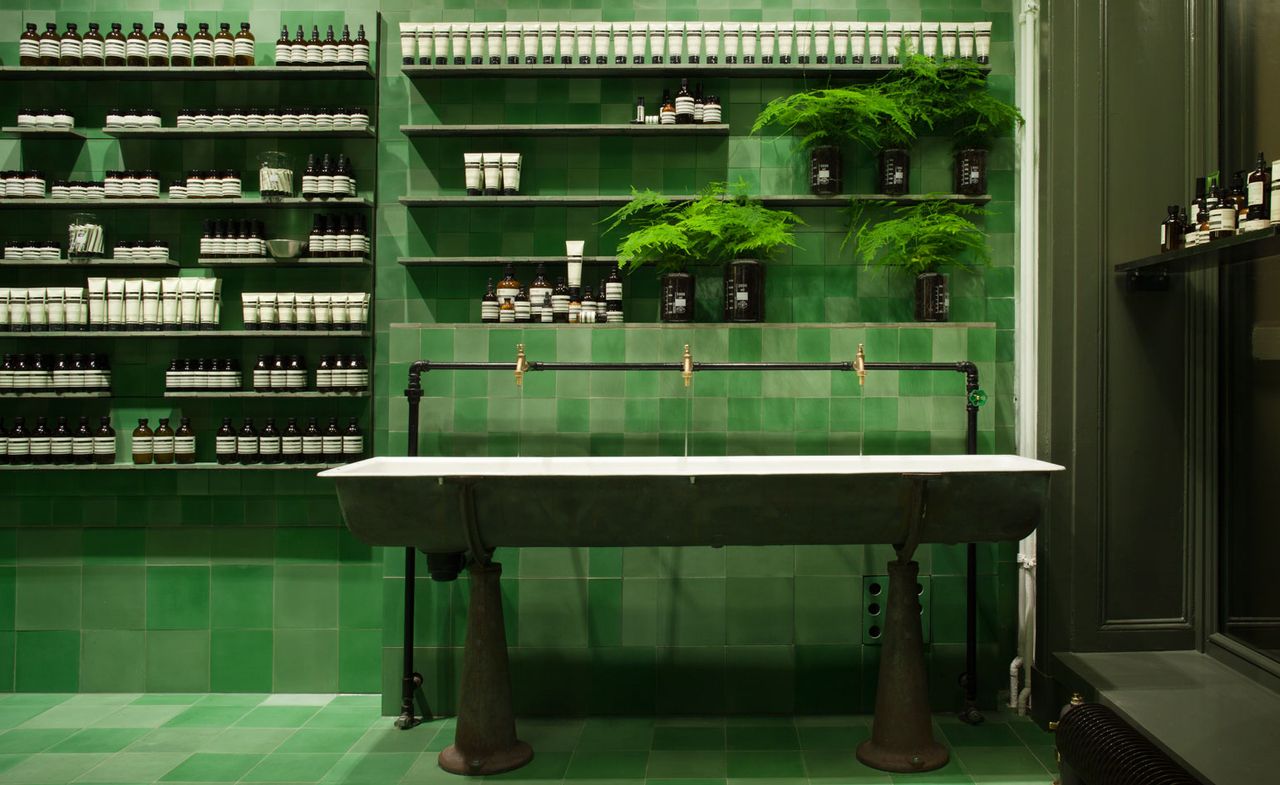
In contrast, vibrant mint and emerald tiles line the walls and floors of the clinical Mitte store in Berlin. Weiss-Heiten Design pays homage to the city's Bauhaus ties with feature lighting, and its tiled U-Bahn stations. Yet entering the green-dappled space also evokes the feeling of stepping into a forest clearing.
'Our desire to create uncluttered, harmonious environments is driven from architectural sensibilities, and a notion that rejects the sameness of globalisation and retail norms. This work speaks for us, and perhaps could be considered a form of advertising. Our clients respect us for rejecting more commercial avenues,' explains Aesop’s creative director, Marsha Meredith. Notably, the cult beauty brand doesn’t use the promotional mechanisms that the beauty industry is renowned for: celebrity endorsements, product sampling, or gift with purchase.
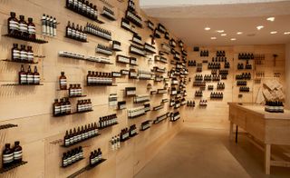
Architects and designers are granted a high level of creative freedom, yet the common denominator amongst their brief is finding novel ways of displaying products. Examples include: thousands of timber planks jutting out from walls; hammered rows of nail shelves; and a multitude of drawers in an antique archival desk pulled open to reveal bottles, jars and clusters of coloured tubes. Most ingenious is the Nolita, New York, store that utilises 2,800 copies of the New York Times cut into strips then stacked and bound for wall cladding. The notion of layered history is incorporated in the feature wall of oak shelves densely stocked with products in serial order.
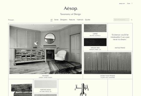
In response to customers requesting a book chronicling their shops and their design details, Aesop launched a digital archive called the 'Taxonomy of Design' in October of this year. It features a selection of its stores worldwide, profiling their designers, and includes filmed interviews. Materials and furnishings used are also credited as inspiration for home decoration.
An appreciation for the arts is emphasised in every part of the business – from literary and philosophical quotes on packaging to a series of online city guides that celebrate rare and offbeat discoveries. Aēsop’s monthly EDM’s and website strive to nourish the intellect and sensibilities of their customer with book reviews and eclectic cultural event listings. Adding an online store seems more like an afterthought. Yet, ingeniously, Aesop builds strong brand loyalty through shared values.
The Rue Saint Honore store, France. Designed by Rodney Eggleston of Melbourne’s March Studio with Dennis Paphitis, located in an original 18th century townhouse
The Nolita store, New York. This pint-sized space is designed by New York-based architect Jeremy Barbour, who also created Aesop's Grand Central Terminal kiosk

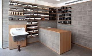
The AU store, Melbourne. A venetian theme unifies Aesop's North Melbourne offering, helped along by these three elegant Venetian fountains with brass garden taps, an ideal space for product demonstrations. The shop also boasts an archiving drawer for a grand counter, originally the property of the Gallery of New South Wales

The Kawaramachi store, Kyoto. This store is the result of a new collaboration with Torafu Architects. The history of the Kawaramchi neighbourhood stretches back to the 16th century. Aesop' store respects this heritage while also aligning comfortably with contemporary Kyoto
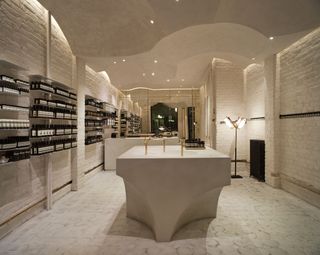
The Prinsensgate store, Norway. This larger, 66 m sq store was Aesop's first in Norway, and was designed in collaboration with local architecture firm Snøhetta
INFORMATION
For more information, see the Aesop wesbite
Wallpaper* Newsletter
Receive our daily digest of inspiration, escapism and design stories from around the world direct to your inbox.
-
 Fluid workspaces: is the era of prescriptive office design over?
We discuss evolving workspaces and track the shape-shifting interiors of the 21st century. If options are what we’re after in office design, it looks like we’ve got them
By Ellie Stathaki Published
-
 This collection of slow furniture is a powerful ode to time
A serene exhibition of David Dolcini's 'Time-made' collection has fast-tracked its place into our hearts and homes
By Ifeoluwa Adedeji Published
-
 Is the Pragma P1 the most sustainable watch yet?
Geneva-based brand Pragma combines industrial design with real sustainable credentials
By Hannah Silver Published
