‘Meditation chambers' at Google HQ offer a blueprint for office wellbeing
Designed by Office of Things for Google's Bay Area headquarters, the bunker-inspired meditation chambers combine technology, light and sound to create a meditative effect
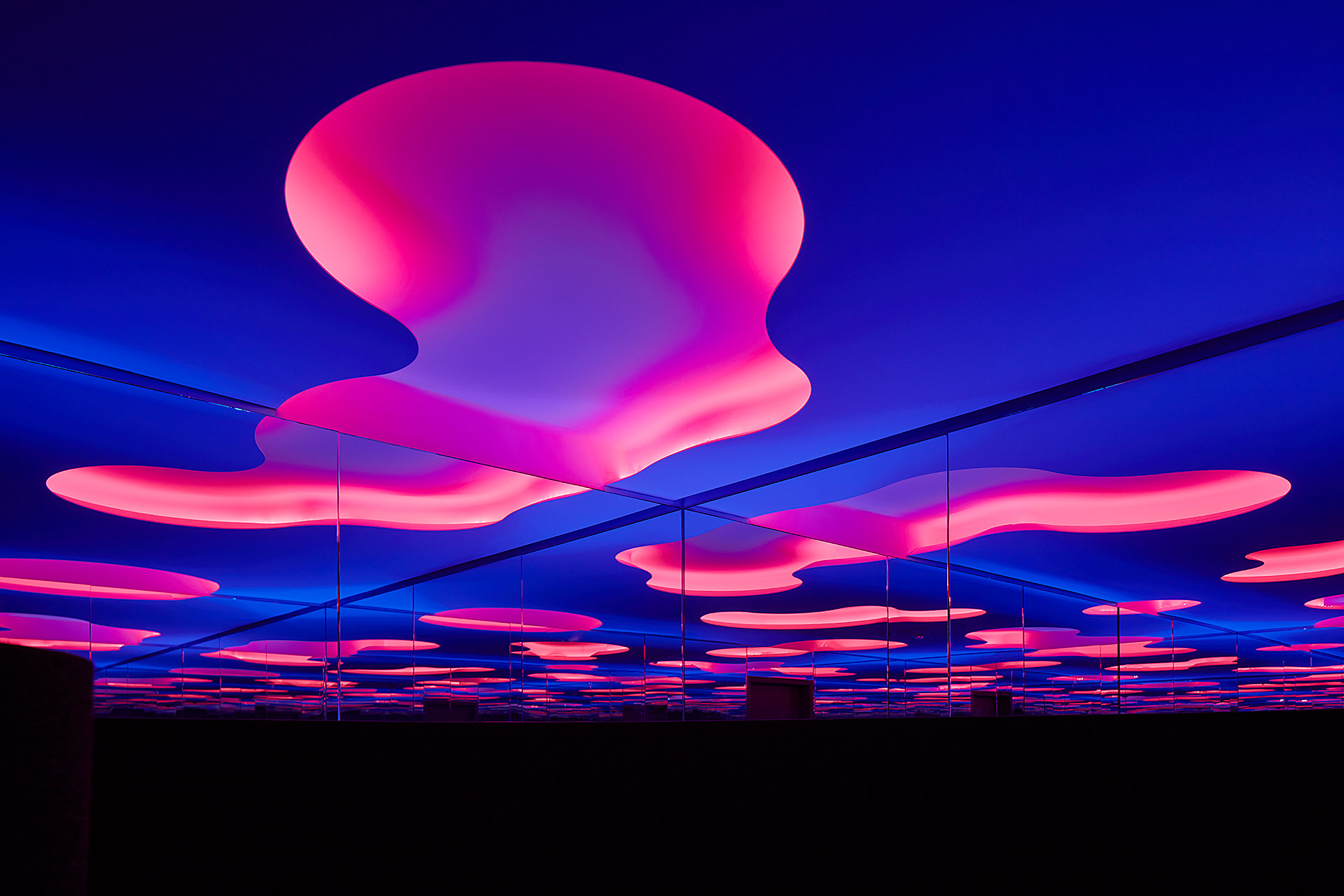
Although returning to the office may still be varying widely across the board, a newly unveiled internal project at Google, known as the Immersive Spaces Series, is offering a roadmap on how to create restorative spaces in the workplace when the time does come. A work in progress since 2017, Google has been working with the American design practice, Office of Things, to design and construct five meditation chambers in the Youtube and Google offices in the Bay Area, adapted from an area of research which the practice has been investigating on its own. Conceived and designed pre-pandemic, the rooms’ philosophy of offering employees a place to acknowledge and restore their mental health could not come at a more relevant time.
The Immersive Spaces Series
Each room in the Immersive Spaces Series has been designed to be used by a single occupant at a time. Inspired by the architecture and protective aspects of bunkers, the experience within each chamber is enhanced by augmented light and sound sequences which create a meditative effect that both grounds and cleanses on the haptic and psychic fronts. Each room is divided into three components: an entry, which focuses on helping the occupant leave behind the literal and figurative noise of the office and the outside world, the Ground; a spacious landscape of rounded edges, dark colours and soft textures, where occupants are invited to rest on the floor, against a wall or on a reclining bench, and finally the Sky, an ephemeral space that hovers above that allows the mind to relax and wander.
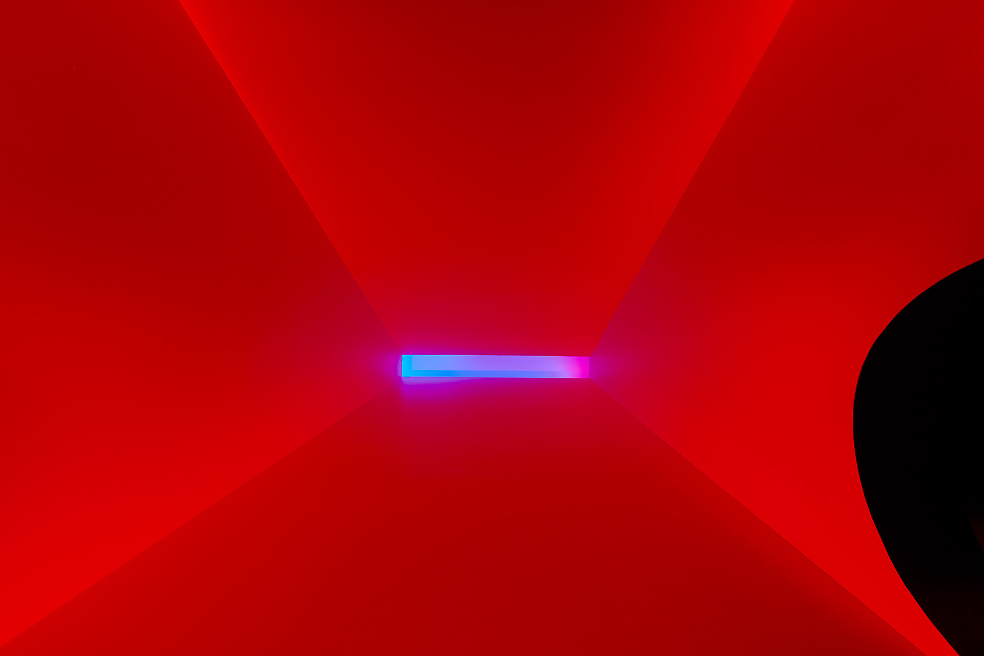
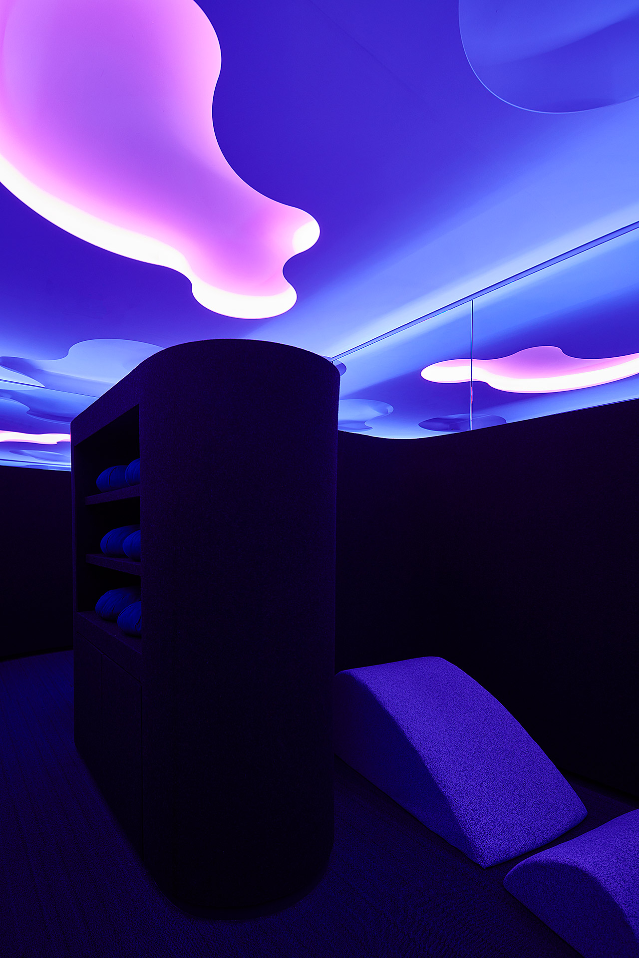
Looking up to the ceiling in one of Google's meditation rooms.
‘The first version of this room was for a temporary art gallery in Toronto that we built ourselves. It was a thoughtful learning experiment to help us understand how materials can come together, and what experience is created. Since then, as the spaces become more complex and refined, we’ve tried to evolve the designs accordingly,’ says Lane Rick, a principal at Office of Things, who led the project design. ‘These spaces are a crystallization of [our] exploration of the intersection of material tactility and the volumetric, ephemeral parts of placemaking; a grounded, soft texture to sit in, and an airy ceiling to look at. As the series evolved into an ensemble of spaces for meditation, the relationship between the elements has become more apparent to us.’
A ‘User First’ Approach
It was through seeing this early version of the meditation chamber that prompted Ryan Trinidade, a project executive at Google’s San Francisco office, to pursue a collaboration with Office of Things.
‘Wellness and inclusivity has been a priority for the company since its founding; it's one of the reasons we serve food. We've had meditation and prayer spaces well before I joined, but about five or six years ago I started a discussion with Office of Things about rethinking our meditation spaces,’ he shares. ‘Taking a "User First" approach, there were several pain points we sought to fix; acoustics, lack of ritual, privacy, and joy. The goal of the original meditation spaces and our current iteration, remains the same; to provide a break from meetings and screens, to take a moment for yourself.’
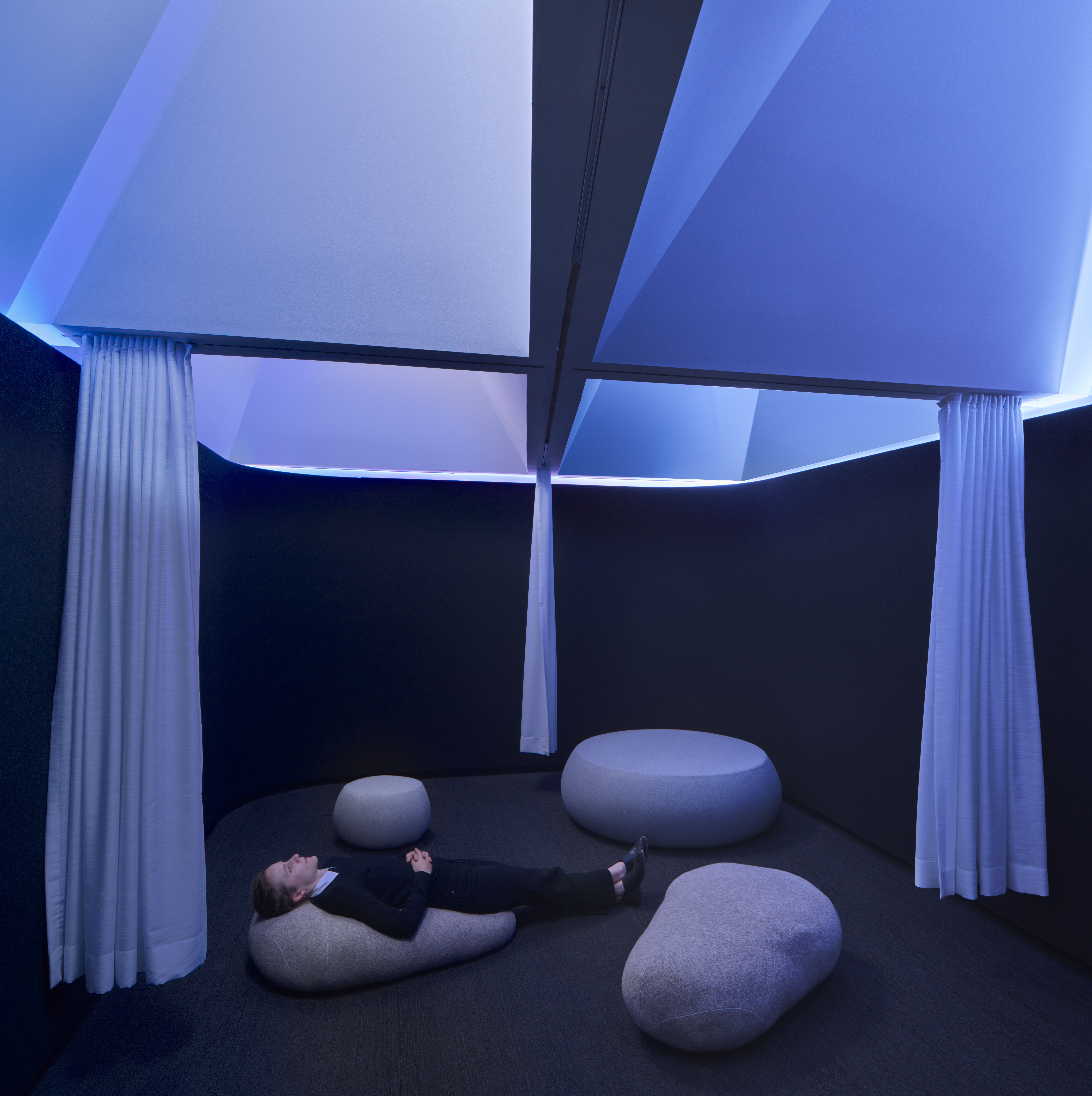
One of the relaxation spaces designed by Office of Things for Google.
For the Youtube and Google offices, the studio studied the design and material qualities of anechoic chambers and sensory deprivation rooms. ‘We also adapted aspects of mindfulness meditation techniques to the experience of sitting and laying in the rooms, especially through the careful composition of the experiences for body and mind,’ adds Rick.
From the compressed entryway, which Rick says ‘resets the sensorial reverberations in the body’, to the way the ceiling has been designed ‘to maximize the effects according to the dimensions of the space [so] it is focused on creating a space of transformation and escape’, the rooms couldn’t be more conducive for getting away from the hubbub and reality of life. Acoustically padded walls, subtle changes in the lighting sequence and sounds emanating from the floor wash over the senses in a way that makes time feel slower.
‘At its core, the Immersive Spaces are physical environments that are augmented with technology,’ she concludes. ‘ The technology is hidden from eyesight, but introduces an element of change over time. For us, this experience is transformative and sublime; the small room gives way to a perceived immensity.’
Wallpaper* Newsletter
Receive our daily digest of inspiration, escapism and design stories from around the world direct to your inbox.
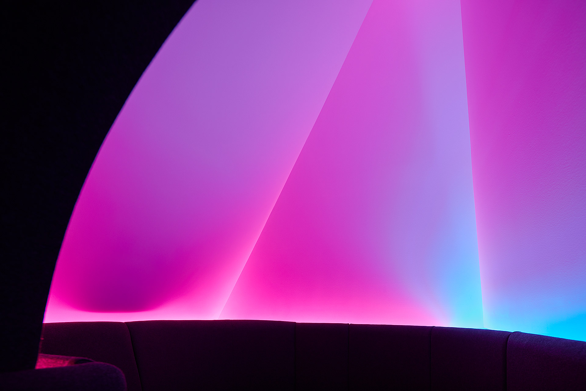
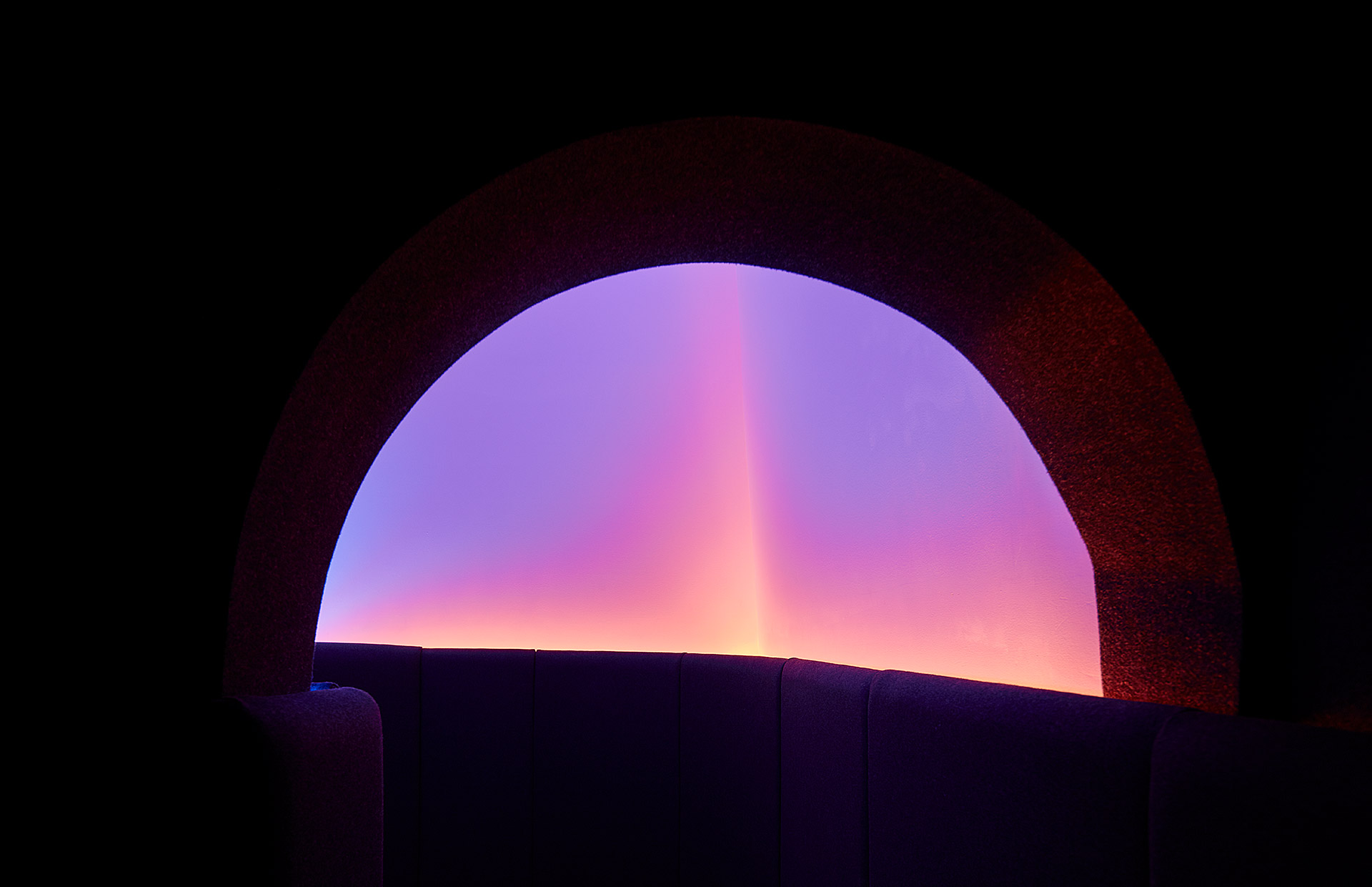
The entrance to the Horizon room, one of five spaces created by Office of Things for Google's Bay Area offices.
Also in the Horizon room, a play of pink-hued lights.
A niche featuring soft-cushioned seating.
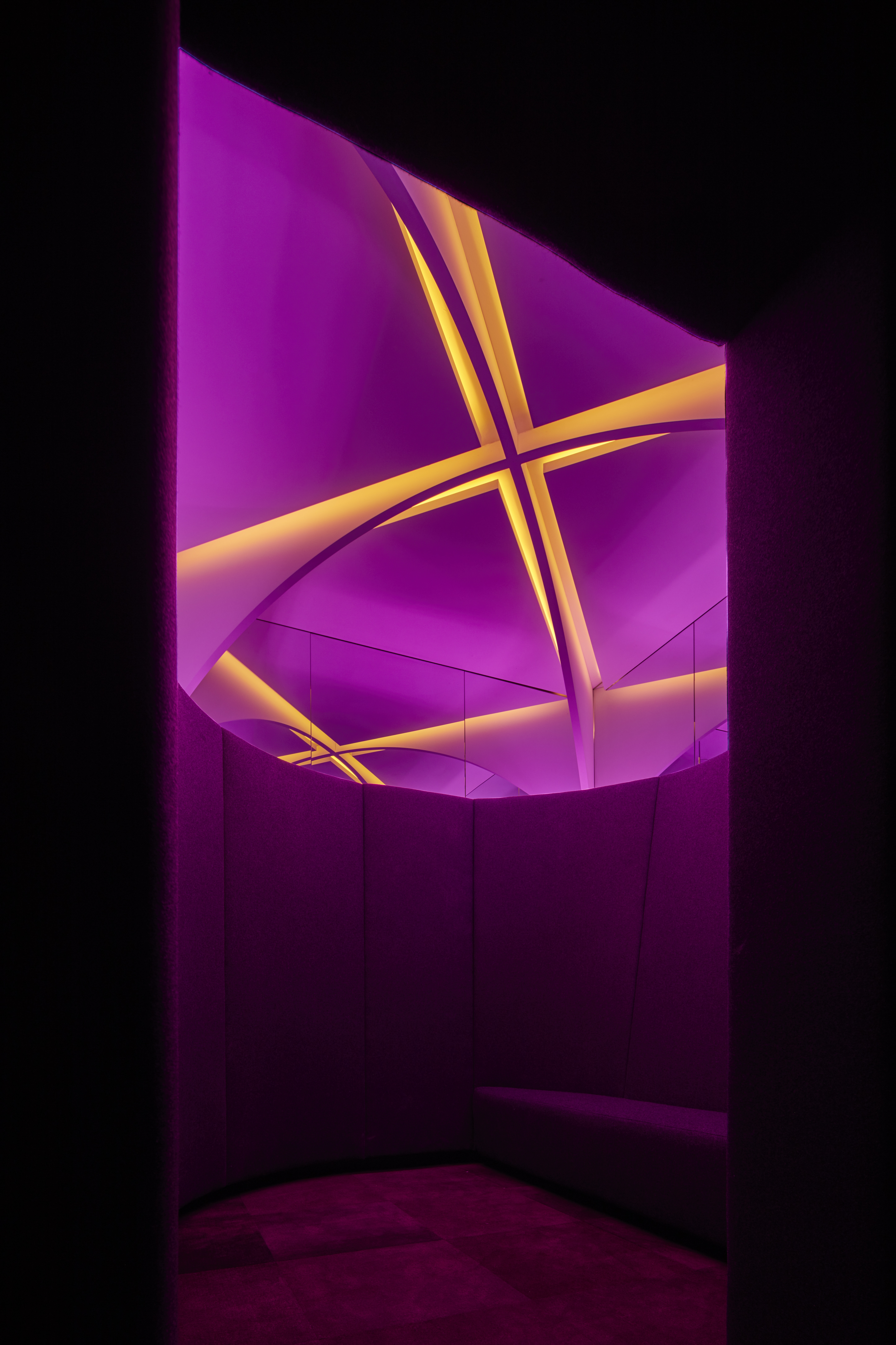
The entrance to the Arches room, featuring a curved ceiling motif enhanced by dramatic lighting.
INFORMATION
oo-t.co
Pei-Ru Keh is a former US Editor at Wallpaper*. Born and raised in Singapore, she has been a New Yorker since 2013. Pei-Ru held various titles at Wallpaper* between 2007 and 2023. She reports on design, tech, art, architecture, fashion, beauty and lifestyle happenings in the United States, both in print and digitally. Pei-Ru took a key role in championing diversity and representation within Wallpaper's content pillars, actively seeking out stories that reflect a wide range of perspectives. She lives in Brooklyn with her husband and two children, and is currently learning how to drive.
-
 Marylebone restaurant Nina turns up the volume on Italian dining
At Nina, don’t expect a view of the Amalfi Coast. Do expect pasta, leopard print and industrial chic
By Sofia de la Cruz
-
 Tour the wonderful homes of ‘Casa Mexicana’, an ode to residential architecture in Mexico
‘Casa Mexicana’ is a new book celebrating the country’s residential architecture, highlighting its influence across the world
By Ellie Stathaki
-
 Jonathan Anderson is heading to Dior Men
After months of speculation, it has been confirmed this morning that Jonathan Anderson, who left Loewe earlier this year, is the successor to Kim Jones at Dior Men
By Jack Moss
-
 Google installation 'The Orb' offers space to contemplate and communicate
Google's mesmerising installation 'The Orb' encourages engagement for both the public and employees, offering a welcomed moment of distraction
By Ellie Stathaki
-
 Google Bay View Campus by BIG and Heatherwick Studio reimagines workspace
Google has worked with architects BIG and Heatherwick Studio on the new Bay View Campus in Silicon Valley
By Hannah Silver
-
 CAW Architects designs colourful Google office near Palo Alto
This colourful Google office designed by California-based CAW Architects is a bold, playful and nature-filled new home for the tech giant’s family in Mountain View, CA
By Ellie Stathaki
-
 Need-to-know technology news from Salone del Mobile 2018
By Elly Parsons
-
 Letter from Silicon Valley: inside the finest tech workspaces
By Jessica Klingelfuss