Gov.uk wins Design of the Year 2013

Happy faces might be rare at London's Number Ten these days, but there will be smiles all round at the news that Gov.uk has won the Design Museum's Designs of the Year Award 2013. In fact, no matter what your politics, this groundbreaking website designed by the Government Digital Service is truly worth celebrating. Already being held up as a benchmark alongside such other British graphic icons as Margaret Calvert’s road signs, and Harry Beck’s tube map, the new Gov.uk has achieved the seemingly impossible: making interacting with government straightforward.
An exercise in sophisticated simplification, Gov.uk combines all of the UK government’s websites into a single domain. Where most websites look to keep visitors reading as long as possible, design director Ben Terrett explains that here, the opposite is true. 'We want the experience to be fast and easy, so if people are spending ages on one page, it’s not working,' he says.
Among a host of initiatives to make politics more transparent, the website adheres to a strict style guide. Visitors will no longer be baffled by words such as ‘tackling’ (unless the context is about rugby), ‘deliver’ (unless it’s about pizza or post, not policies), and ‘disincentivise’. The winning design was chosen from 98 entries to claim the overall prize, and the award was collected by Terret and Mike Bracken, executive director of Government Digital Service.
The Rt Hon David Cameron MP, Prime Minister and Conservative Party Leader said: 'For the first time, people can find out what's happening inside government, all in one place, and in a clear and consistent format. It is just another example of Britain's world class design talent standing out on the global stage.'
Six other projects were also awarded as category winners, including the Tour Bois-Le-Prêtre in Paris, designed by Frédéric Druot, Anne Lacaton and Jean-Philippe Vassal for the architecture category; and Lisa Immordino Vreeland’s 'Diana Vreeland: The Eye Has To Travel', for fashion. Konstantin Grcic picked up the award in the furniture category for his Medici Chair for Mattiazzi, the Venice Architecture Biennale identity by John Morgan Studio won best graphics, and Kit Yamoyo by ColaLife and PI Global won best product. Finally in the transport category, Vitamins won with the Morph Folding Wheel. They have reinvented the wheel, and in doing so – like the Government Digital Service – they’ve proved that going back to basics is the key to great design.

Overall and digital winner: Gov.UK Website, by Government Digital Service

Overall and digital winner: Gov.UK Website, by Government Digital Service

Overall and digital winner: Gov.UK Website, by Government Digital Service
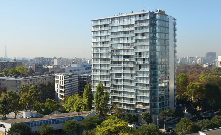
Architecture winner: La Tour-Bois-Le-Prêtre, Paris, by Frédéric Druot, Anne Lacaton and Jean-Philippe Vassal

Architecture winner: La Tour-Bois-Le-Prêtre, Paris, by Frédéric Druot, Anne Lacaton and Jean-Philippe Vassal

Fashion winner: 'Diana Vreeland: The Eye Has To Travel', by Lisa Immordino Vreeland
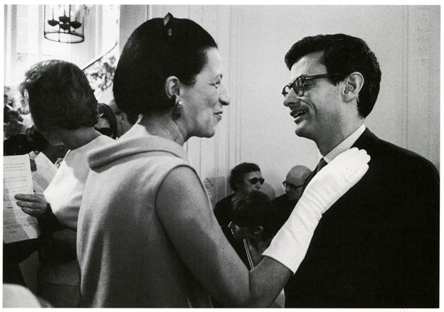
Fashion winner: 'Diana Vreeland: The Eye Has To Travel', by Lisa Immordino Vreeland
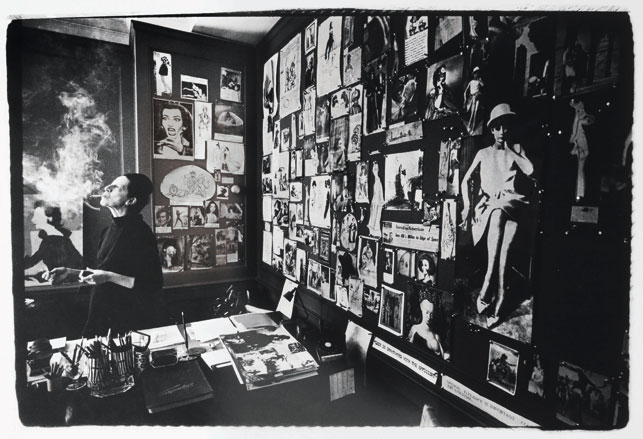
Fashion winner: 'Diana Vreeland: The Eye Has To Travel', by Lisa Immordino Vreeland
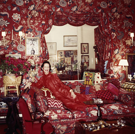
Fashion winner: 'Diana Vreeland: The Eye Has To Travel', by Lisa Immordino Vreeland
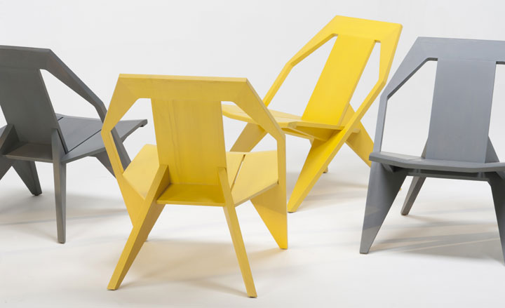
Furniture winner: Medici Chair, by Konstantin Grcic, for Mattiazzi
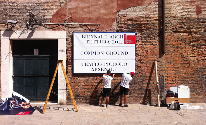
Graphics winner: Venice Architecture Biennale Identity, by John Morgan Studio
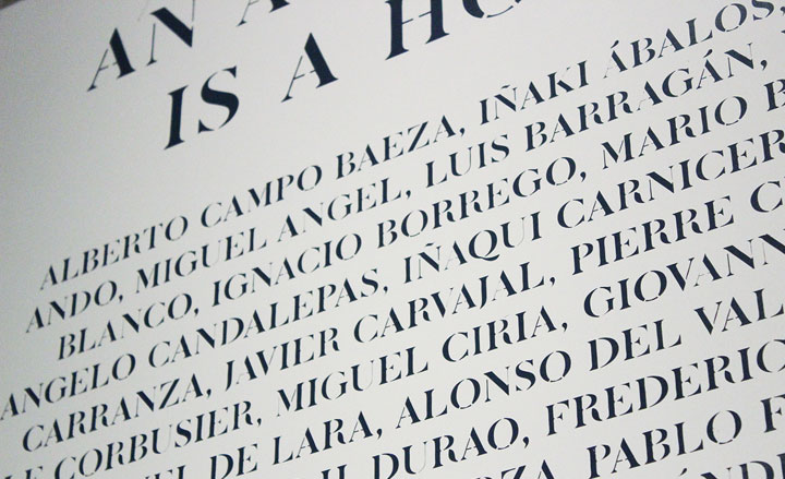
Graphics winner: Venice Architecture Biennale Identity, by John Morgan Studio
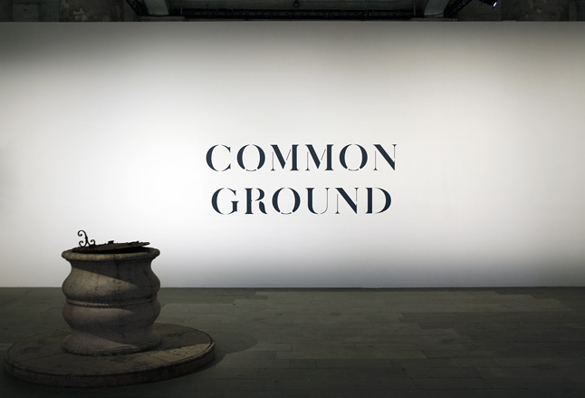
Graphics winner: Venice Architecture Biennale Identity, by John Morgan Studio
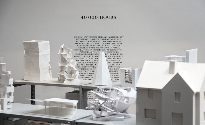
Graphics winner: Venice Architecture Biennale Identity, by John Morgan Studio
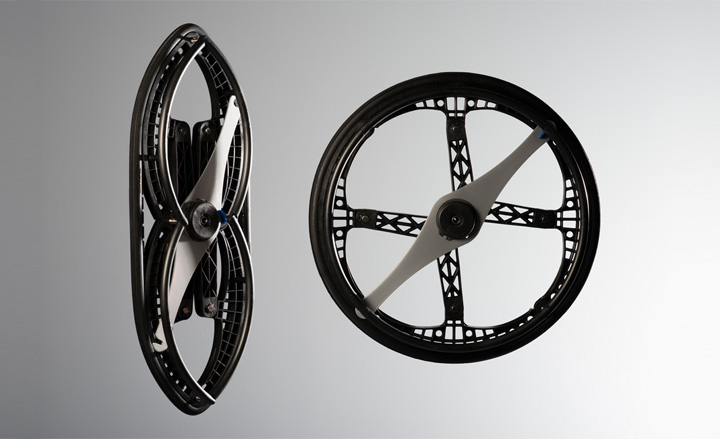
Transport winner: Morph Folding Wheel , by Vitamins, for Maddak Inc. Our eagle eyes first spotted a prototype of this design back in 2010 - then titled the 'Crossbred Folding Wheel' by designer and Vitamin co-founder Duncan Fitzsimons. It featured in our Next Generation Issue (W*130)
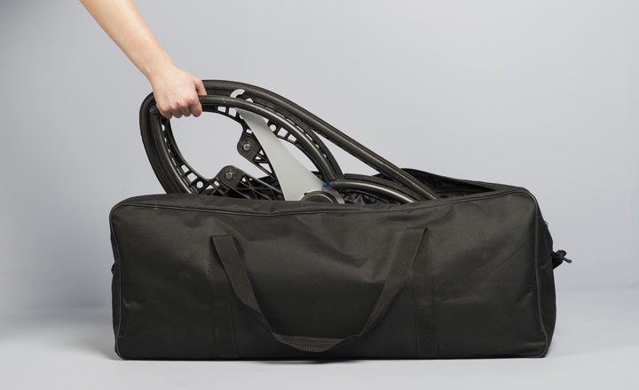
Transport winner: Morph Folding Wheel , by Vitamins, for Maddak Inc
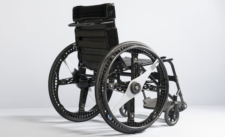
Transport winner: Morph Folding Wheel , by Vitamins, for Maddak Inc
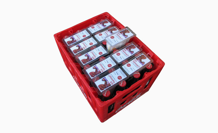
Product winner: Kit Yamoyo, by Colalife and PI Global

Product winner: Kit Yamoyo, by Colalife and PI Global
ADDRESS
Design Museum London
28 Shad Thames
London SE1 2YD
Wallpaper* Newsletter
Receive our daily digest of inspiration, escapism and design stories from around the world direct to your inbox.
Henrietta Thompson is a London-based writer, curator, and consultant specialising in design, art and interiors. A longstanding contributor and editor at Wallpaper*, she has spent over 20 years exploring the transformative power of creativity and design on the way we live. She is the author of several books including The Art of Timeless Spaces, and has worked with some of the world’s leading luxury brands, as well as curating major cultural initiatives and design showcases around the world.
-
 Extreme Cashmere reimagines retail with its new Amsterdam store: ‘You want to take your shoes off and stay’
Wallpaper* takes a tour of Extreme Cashmere’s new Amsterdam store, a space which reflects the label’s famed hospitality and unconventional approach to knitwear
By Jack Moss
-
 Titanium watches are strong, light and enduring: here are some of the best
Brands including Bremont, Christopher Ward and Grand Seiko are exploring the possibilities of titanium watches
By Chris Hall
-
 Warp Records announces its first event in over a decade at the Barbican
‘A Warp Happening,' landing 14 June, is guaranteed to be an epic day out
By Tianna Williams
-
 Saul Steinberg: behind the scenes at Triennale Design Museum
Triennale Design Museum and publishing house Electa present ‘Saul Steinberg Milano New York’, a new exhibition (until 13 March 2022) that pays homage to the American artist through 350 works. Join us for a behind-the-scenes peek at it's installation
By Rosa Bertoli
-
 Ten years of Muller Van Severen, at Design Museum Ghent
A new exhibition by Belgian design duo Muller Van Severen (until 6 March 2022) features a retrospective of the studio’s ten years as well as a curation of pieces from the Design Museum Ghent collections
By Rosa Bertoli
-
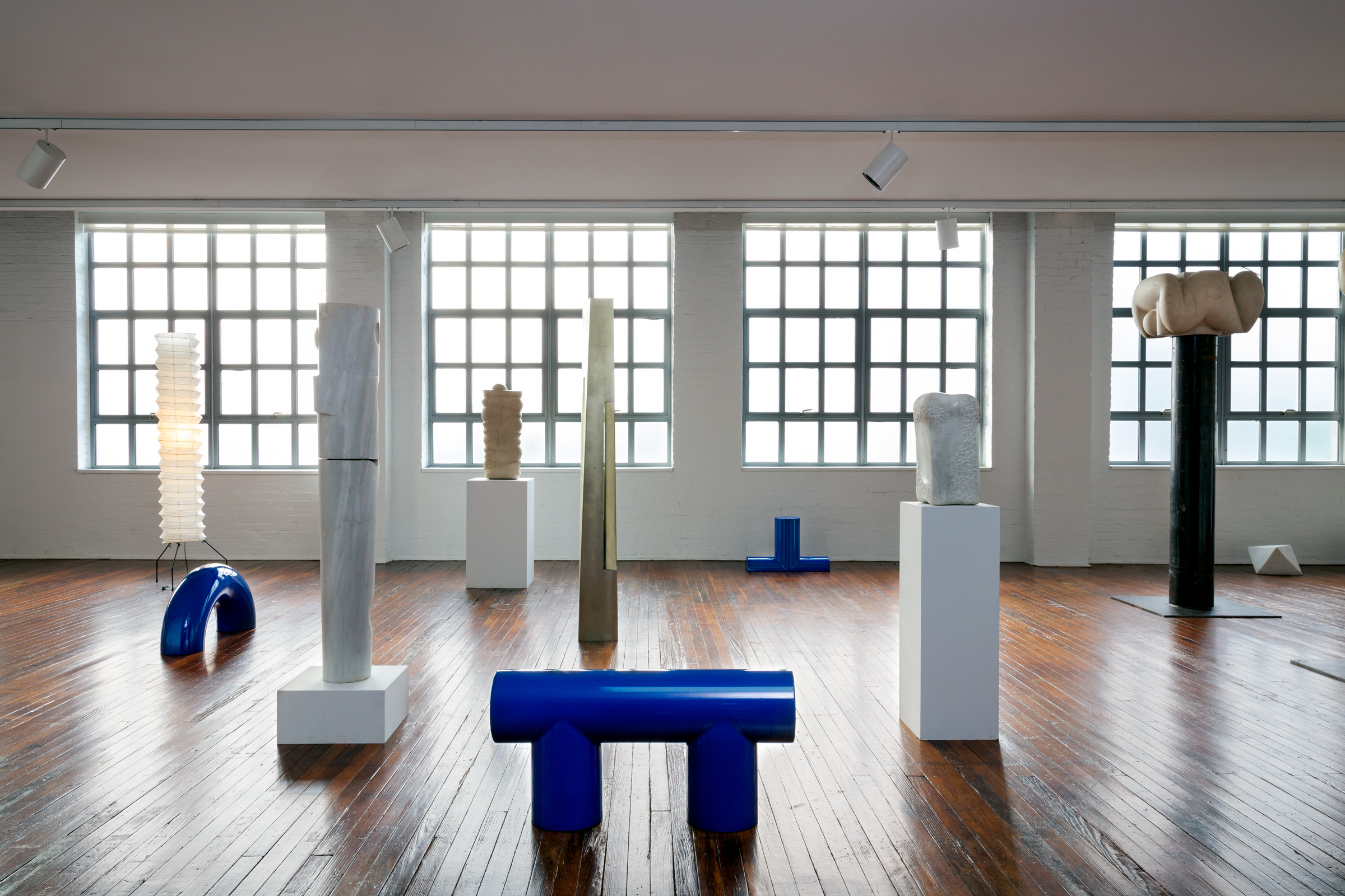 Noguchi show celebrates his reverence for Greece
Design show ‘Objects of Common Interest: Hard, Soft, and All Lit Up with Nowhere to Go’ opens in collaboration with Wallpaper* Designers of the Year, Objects of Common Interest, at the Noguchi Museum in Queens, New York (until 13 February 2022)
By Tilly Macalister-Smith
-
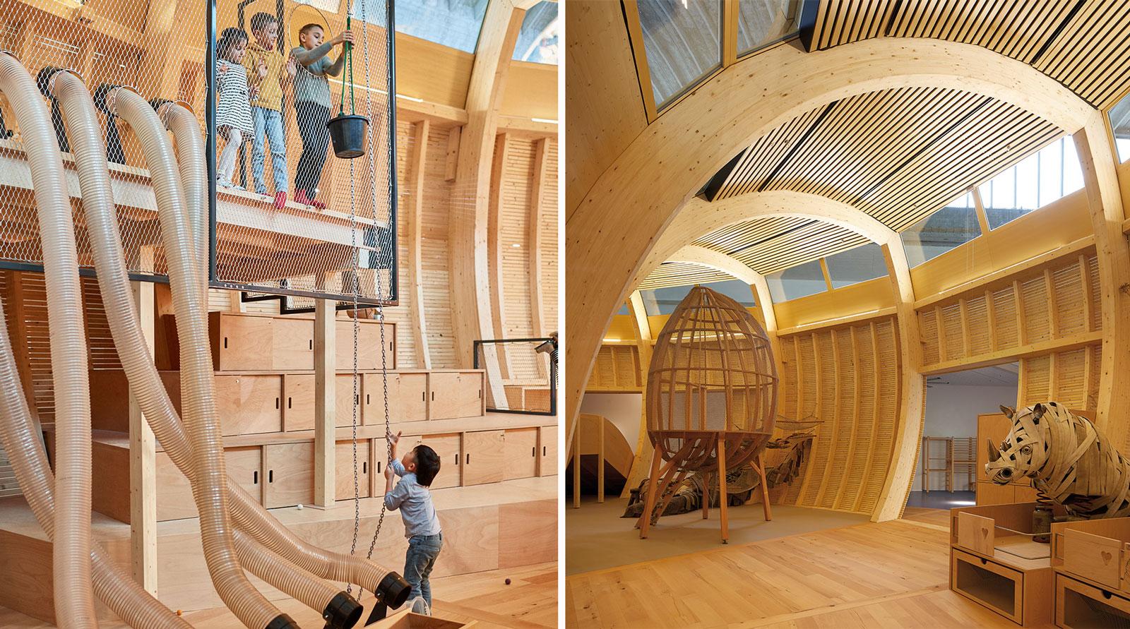 ‘Design not for children, but for everyone’: Jewish Museum Berlin’s new play space
Olson Kundig architecture and design practice brings kids’ play space ANOHA Children’s World to life inside a vast former wholesale flower market, at the Jewish Museum Berlin
By Hannah Silver
-
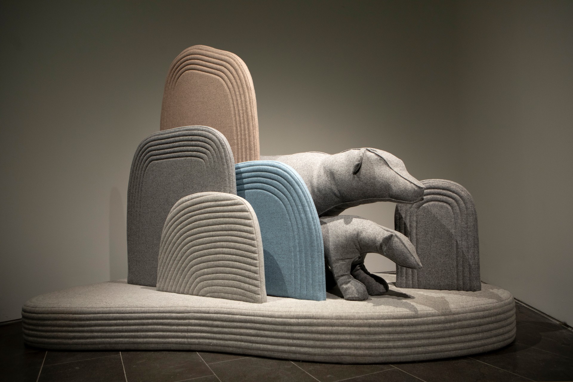 A landscape of playful animals pops up at Design Museum Holon
Child-centric designer Sarit Shani Hay presents an imaginary natural landscape that references Ron Arad's Design Museum Holon architecture and is inhabited by soft, cushioned sea lions, seals and bears
By Rosa Bertoli
-
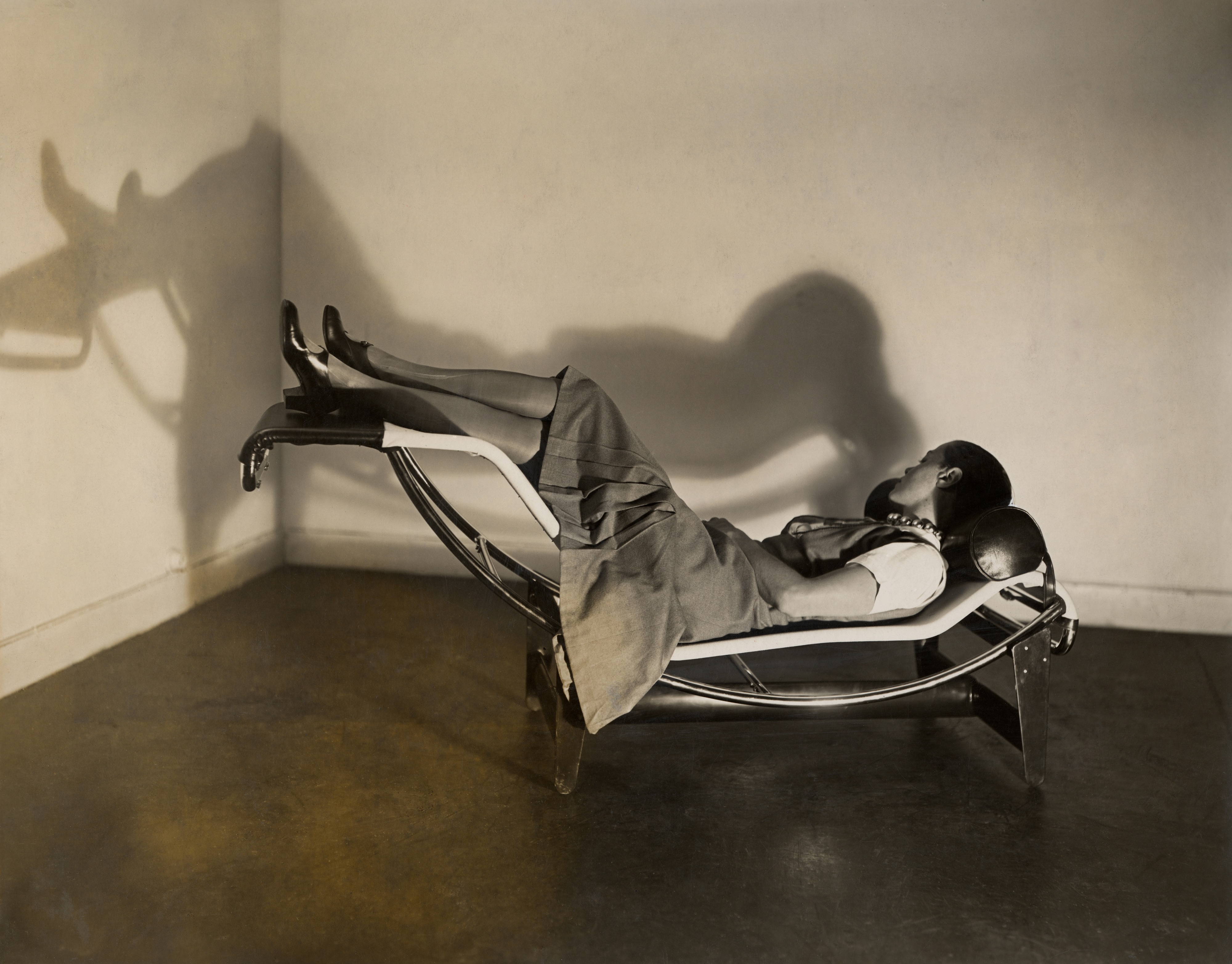 Charlotte Perriand’s life and work explored at London’s Design Museum
London’s Design Museum presents ‘Charlotte Perriand: The Modern Life’, an exhibition turned the spotlight on one of the most iconic creators of the 20th century
By Rosa Bertoli
-
 Meet the Design Museum’s all-female Designers in Residence
The multidisciplinary cohort includes Enni-Kukka Tuomala, Abiola Onabule, Cynthia Voza Lusilu and Ioana Man, who developed a series of multidisciplinary projects with the Design Museum, responding to the theme of ‘Care'
By Rosa Bertoli
-
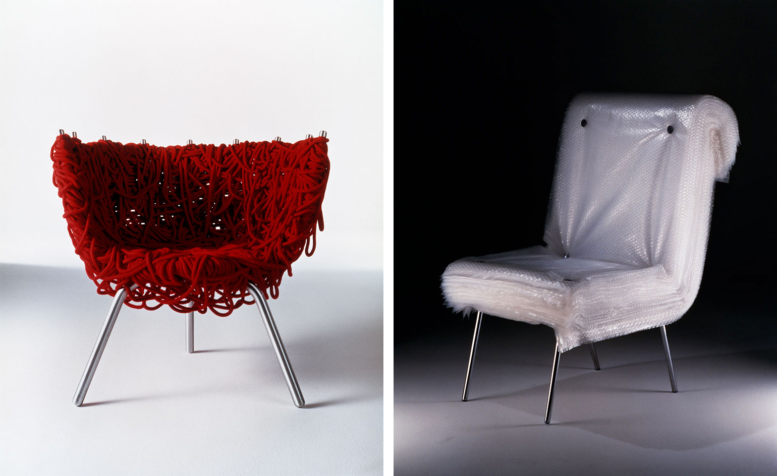 Campana Brothers look back on 35 years of revolutionary design
On view at modernist Museum of Modern Art in Rio de Janeiro, ‘Campana Brothers – 35 Revolutions’ is a retrospective of the Brazilian designers’ impactful oeuvre
By Rosa Bertoli