Farshid Moussavi’s new Harrods Toy Department is a joyful exercise in colour theory
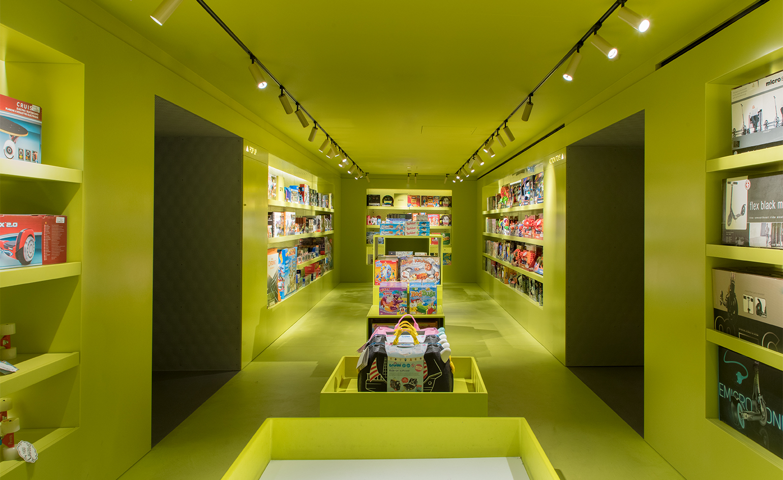
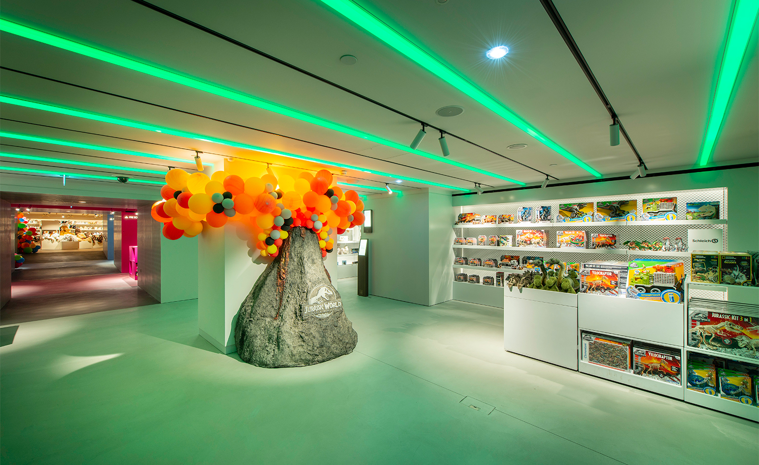
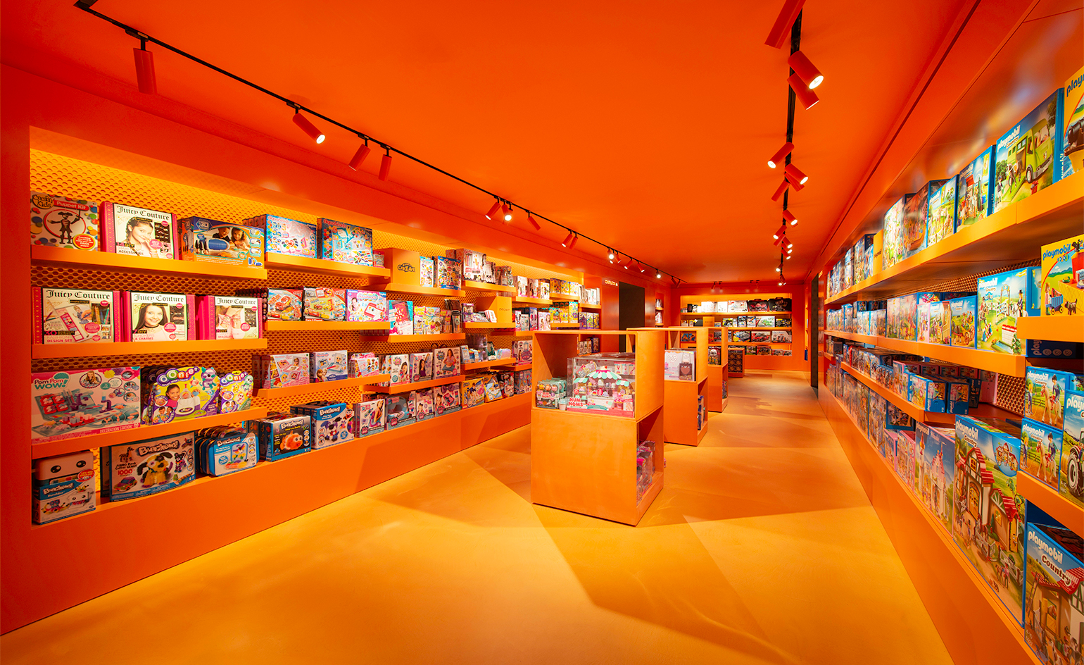
Freshly reinvented by London-based Farshid Moussavi Architecture, the Harrods Toy Department has reopened its doors on the fourth floor of the storied department store. It comprises a suite of eight individual boutiques, each dedicated to a specific toy category, distinctive in colour and theme.
This toy department boasts a heritage richer than most, dating back to the 1880s, an era when hand-carved rocking horses, wind-up animals and fully functioning miniature steam trains topped Christmas lists. ‘It’s lovely that Harrods is so deeply rooted in history,’ says Moussavi, ‘but the design has always evolved over time; it’s not static. [Harrods] has remained as a key player because it’s committed to innovation.’
One source of inspiration for Moussavi was ‘tunnel books’, 3D pop-up dioramas popular during the Victorian era. With these in mind, a ‘tapered tunnel’ runs down the centre of the toy department, with ‘transitional moments’ occurring as visitors move between each coloured room; an optical play on perspective, colour and material. ‘I’m still quite amazed they went for this because it is pretty radical,’ she says.
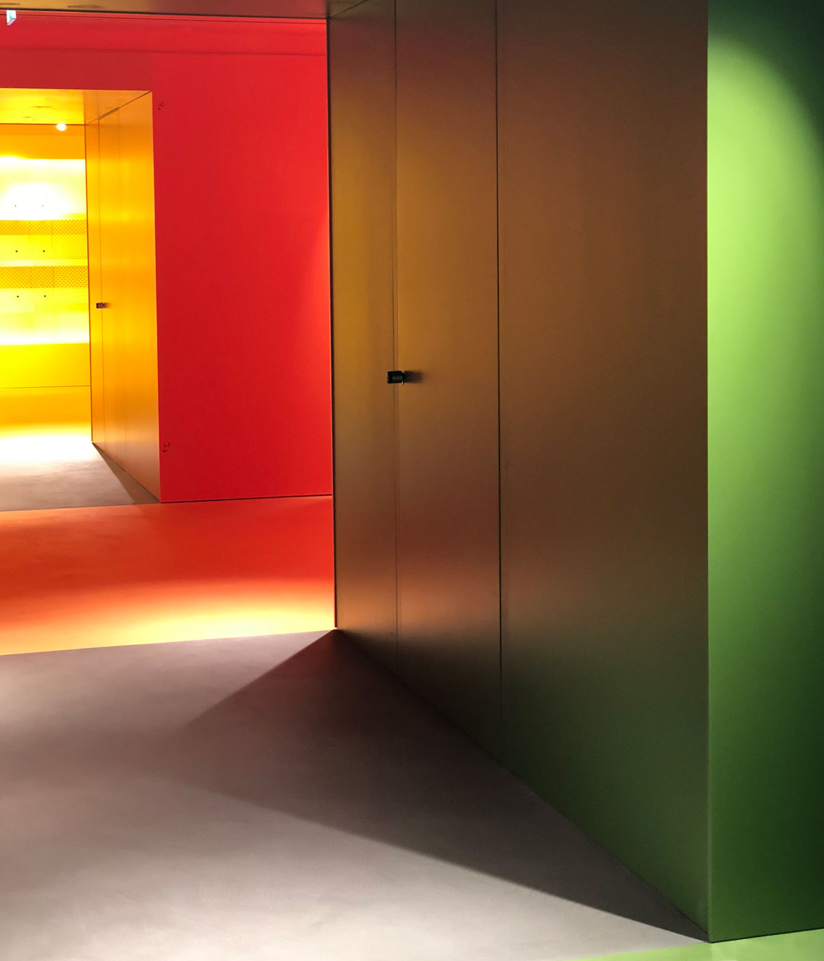
The design eschews conventional wisdom on department store layouts, which dictates a large open space with a stockroom at one end. Instead, each colour-coded room is divided by cleverly integrated ‘mini stockrooms’. ‘When a store is large, it needs to break down into different kinds of experiences, otherwise it becomes monotonous,’ says Moussavi.
Another convention the team has deliberately defied is gender division. ‘Normally you go to a toy department and see pink and blue,’ explains Moussavi, but here colour is presented as a spectrum, rather than a duality, prompting shoppers to subconsciously open their minds.
Farshid Moussavi Architects are no strangers to retail design, with a portfolio including Istanbul’s Meydan Retail Complex, the John Lewis shopping complex in Leicester and Victoria Beckham’s flagship store in London, but tackling the Harrods Toy Department was a first for the firm, both in terms of target market and spatial limitations. ‘The constraints were not from the client, but from the existing building,’ recalls Moussavi. The Harrods store is Victorian, Grade I listed and not easily meddled with, ‘you have to work with what needs to stay.’

Moussavi has consciously operated with a limited material palette to avoid the risk of over-complication. The flooring consists of a poured ‘chalky’ material, channeling schoolroom chalkboards and embracing blemishes. Walls are constructed using layered perforated panels, creating a unique moiré effect enhanced by intelligent lighting. ‘The idea is to make it as simple as possible, but of course simple doesn’t mean boring,’ Moussavi contends. Visual noise is a trait so often synonymous with toy retail, but the new store prioritises minimalism in order to encourage a ‘sharper detection of space’.
There’s no doubt that brick-and-mortar stores must engage consumers in new and exciting ways to resist the encroachment of online retail. ‘Our discerning customers expect a retail environment that not only sells the latest product, but also combines experience and education,’ says Annalise Fard, Harrods’ Home Director.
‘Educate, Entertain and Engage’ are the three pillars at Harrods’ core. Moussavi’s new design exemplifies this ethos with a fresh injection of charm and innovation, constructing a contemporary childhood haven in the centre of an adult world.
Wallpaper* Newsletter
Receive our daily digest of inspiration, escapism and design stories from around the world direct to your inbox.
INFORMATION
For more information, visit the Harrods website
ADDRESS
87-135 Brompton Road
Knightsbridge
London
SW1X 7XL
Harriet Lloyd-Smith was the Arts Editor of Wallpaper*, responsible for the art pages across digital and print, including profiles, exhibition reviews, and contemporary art collaborations. She started at Wallpaper* in 2017 and has written for leading contemporary art publications, auction houses and arts charities, and lectured on review writing and art journalism. When she’s not writing about art, she’s making her own.
-
 Put these emerging artists on your radar
This crop of six new talents is poised to shake up the art world. Get to know them now
By Tianna Williams
-
 Dining at Pyrá feels like a Mediterranean kiss on both cheeks
Designed by House of Dré, this Lonsdale Road addition dishes up an enticing fusion of Greek and Spanish cooking
By Sofia de la Cruz
-
 Creased, crumpled: S/S 2025 menswear is about clothes that have ‘lived a life’
The S/S 2025 menswear collections see designers embrace the creased and the crumpled, conjuring a mood of laidback languor that ran through the season – captured here by photographer Steve Harnacke and stylist Nicola Neri for Wallpaper*
By Jack Moss
-
 Afternoon Light is a new online destination for design discovery
Afternoon Light online shop launches with an eclectic selection of design brands big and small
By Pei-Ru Keh
-
 Discover the brands redefining the marijuana experience
Contemporary brands have made efforts to redesign the experience of marijuana: these the names to look out for, from community-centered dispensaries to elegant objects
By Rosa Bertoli
-
 CJ Shops retail project in São Paulo fuses the physical and digital experience
São Paulo’s new CJ Shops is just what we're into. A highly innovative, exquisitely designed retail project that matches top domestic and international luxury brands with the finest local restaurateurs
By Scott Mitchem
-
 Shop Gio Ponti furniture from home
Molteni&C prepares for the US launch of its new e-commerce platform, offering the company’s refined collections alongside a uniquely curated selection of contemporary artworks
By Rosa Bertoli
-
 Ivystudio’s clean design for White’s laundry in Montreal
By Harriet Thorpe
-
 Farshid Moussavi reveals what inspired her picks for the Wallpaper* Design Awards 2018
By Nick Compton
-
 Row DTLA emerges as a fully-fledged destination for design, fashion, food and more
By Carole Dixon
-
 Grey scale: Johannesburg’s latest design atelier is an industrial revelation
By Ali Morris