Jamie Fobert Architects breathe new life into the Burlington Arcade with a new, old-fashioned, floor
Receive our daily digest of inspiration, escapism and design stories from around the world direct to your inbox.
You are now subscribed
Your newsletter sign-up was successful
Want to add more newsletters?
Tucked between New Bond Street and the Royal Academy, running from Piccadilly through to Burlington Gardens, London’s Burlington Arcade is an ornate slice of retail history.
The covered gallery, designed by Samuel Ware and built in 1819, has been rebuilt and updated many times over the course of its 196-year existence but despite this, its appearance has remained largely unchanged; intricately-detailed arches span its entire length (it’s over two football pitches-long) separating each of its 17 bays, while light floods in through a vaulted glass ceiling. Beautiful as it is, the Regency arcade is a small-scale shopping concept that has become increasingly outdated - two similar arcades recently closed their doors for good in Knightsbridge - unable to compete with the flagships and shopping centres that surround it.
Determined to save Burlington from the same fate, its owner Meyer Bergman has been busy attracting a smart new team of tenants - Chanel Beaute, Eres, Maison Michel, Barrie and Frederic Malle have all set up shop - and have also been working with London architect Jamie Fobert, on a spectacular new floor.
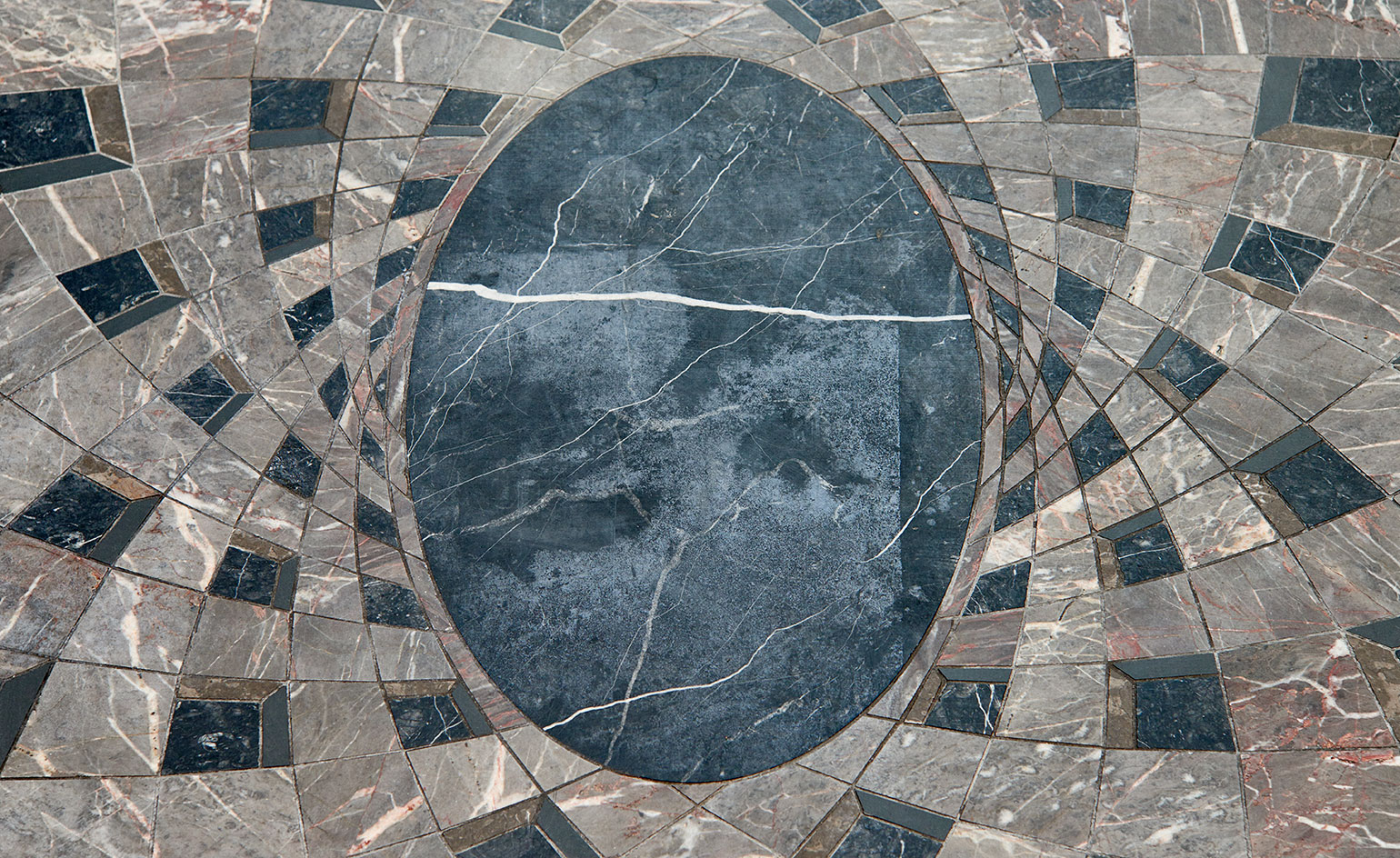
Originally paved with thick austere slabs of York stone, the arcade’s floor was replaced in the 1960s and then the 1990s with a somewhat jarring terrazzo tile. Then in 2011, a glossy, but doomed proposal by Peter Marino provoked an outpouring of protest from retailers and customers. ‘Our goal was to design a floor that was contemporary on one hand but also grew out of the history of the place,’ says Fobert of his spiraling new design. Made from thousands of intricately cut pieces of dark British stone - comprising Burlington Slate Cumbria, Moorcroft Somerset, Ashburton Devon and Mendip Marble Somerset - the floor takes its design cues from the geometry of the arcade’s architecture and various 19th century British floor patterns. ‘It’s such a bizarre proposition for an architect to be asked to work with a space that’s 4 x 220 metres, and to do just a floor,’ says Fobert. ‘It was a great opportunity.’
After months of detailed research and experimentation, Fobert settled on a rhythmic, interlocking, three dimensional design that reflects the variety of the arcade’s curvilinear forms found on the arches and grill work. The stone was cut and dry laid in Italy - the only country with the expertise and laser technology required - before being shipped to London and laid by Tudor Stonework. A complex but subtle design, the dark stonework manages to flatter all of the existing shopfronts, appearing blue, green, brown and red all at once.
‘What I really like in our work is ambiguity. If we did something really modern it would be in sharp contrast to its surroundings. What’s great about this, is that most people will come in and think it’s from 1820,’ enthuses Fobert. ‘If people walk in and they don’t even notice it, that would be perfect for me. The floor shouldn’t compete with the arcade, it’s there to make it feel just that bit more luxurious.’
As well as an advanced non-slip coating, another practical benefit of the new floor is the abolishment of the stepped entrance, which has been replaced by a gently sloping ramp - a small change but one that has proved to be life-changing for one of the Burlington’s most loyal customers, who can now, every day, manoeuvre her wheelchair into the arcade completely unaided.
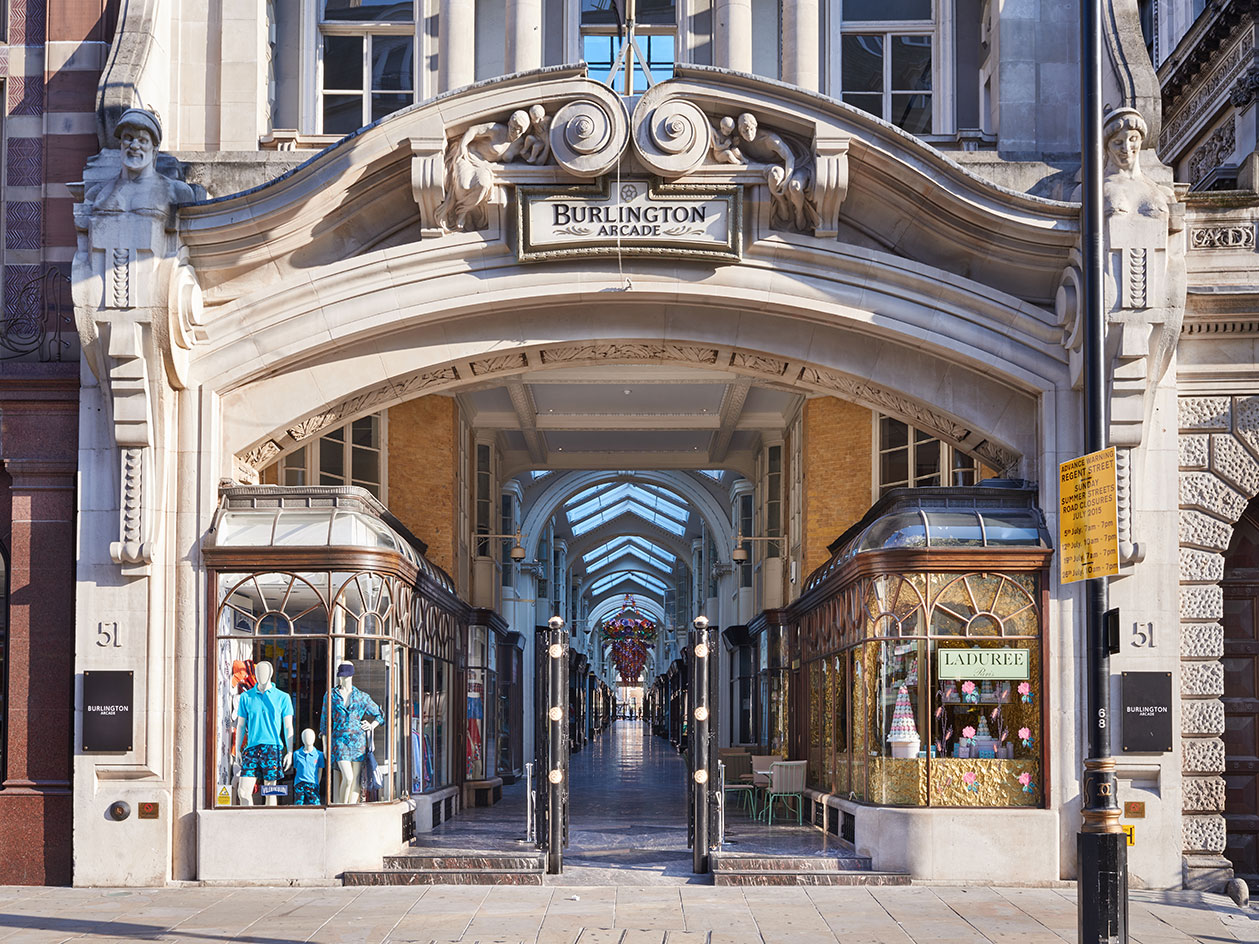
Tucked between New Bond Street and the Royal Academy, running from Piccadilly through to Burlington Gardens, London’s Burlington Arcade is an ornate slice of retail history

The covered gallery, designed by Samuel Ware and built in 1819, has been rebuilt and updated many times over the course of its 196-year existence but despite this, its appearance has remained largely unchanged; intricately-detailed arches span its entire length separating each of its 17 bays, while light floods in through a vaulted glass ceiling

Originally paved with thick austere slabs of York stone, the arcade’s floor was replaced in the 1960s and then the 1990s with a somewhat jarring terrazzo tile. Then in 2011, a glossy, but doomed proposal by Peter Marino provoked an outpouring of protest from retailers and customers
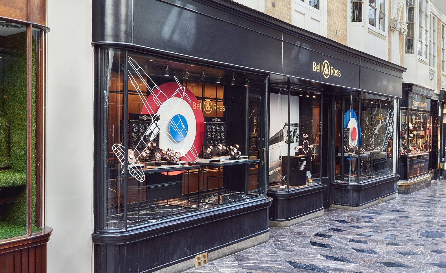
‘Our goal was to design a floor that was contemporary on one hand but also grew out of the history of the place,’ says Fobert of his spiraling new design

Paper artist Zoe Bradley has created two floral chandelier installations handcrafted from paper that are currently on display in the Arcade
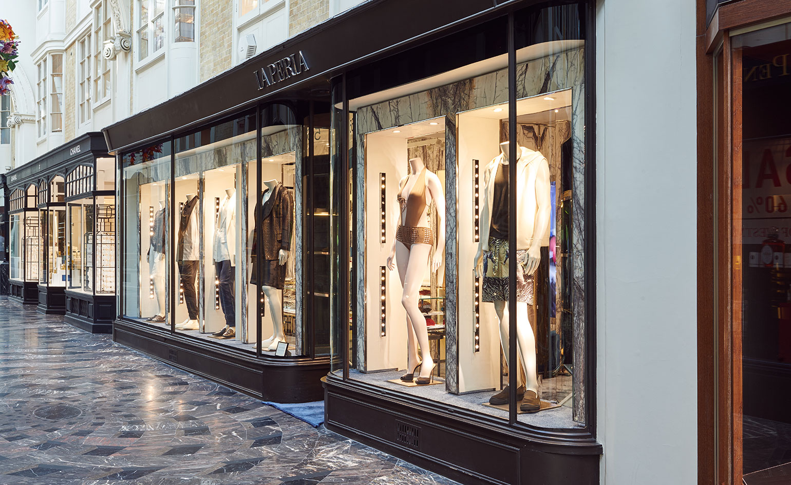
Made from thousands of intricately cut pieces of dark British stone - comprising Burlington Slate Cumbria, Moorcroft Somerset, Ashburton Devon and Mendip Marble Somerset - the floor takes its design cues from the geometry of the arcade’s architecture and various 19th century British floor patterns
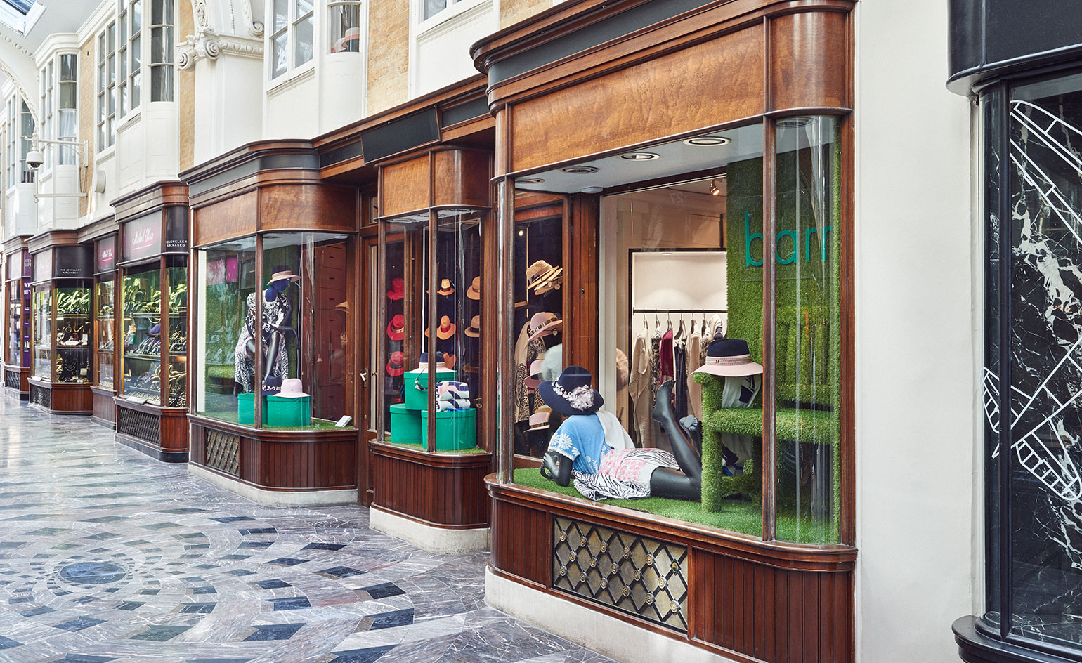
‘It’s such a bizarre proposition for an architect to be asked to work with a space that’s 4 x 220 metres, and to do just a floor,’ says Fobert. ‘It was a great opportunity'
ADDRESS
Burlington Arcade
51 Piccadilly
London W1J 0QJ
Receive our daily digest of inspiration, escapism and design stories from around the world direct to your inbox.
Ali Morris is a UK-based editor, writer and creative consultant specialising in design, interiors and architecture. In her 16 years as a design writer, Ali has travelled the world, crafting articles about creative projects, products, places and people for titles such as Dezeen, Wallpaper* and Kinfolk.