Neu look: KMS Team redesign Staatsgalerie’s visual identity
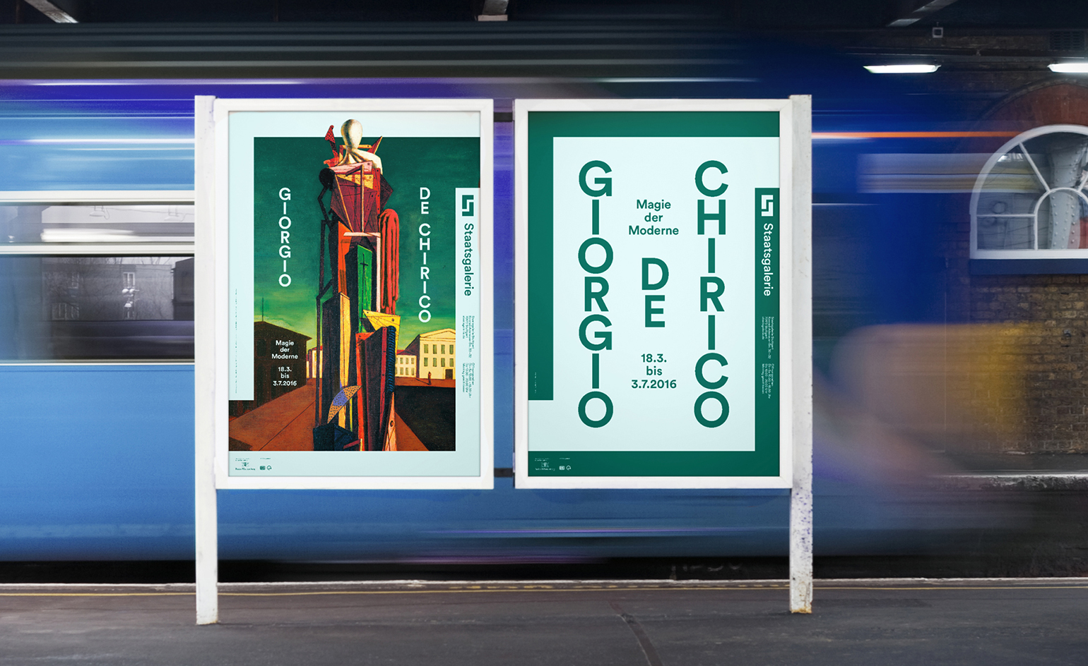
Stuttgart's Staatsgalerie is renowned for being innovative: from the exhibitions it stages to its colourful, James Stirling-designed architecture. Last week, they launched a new visual identity to match.
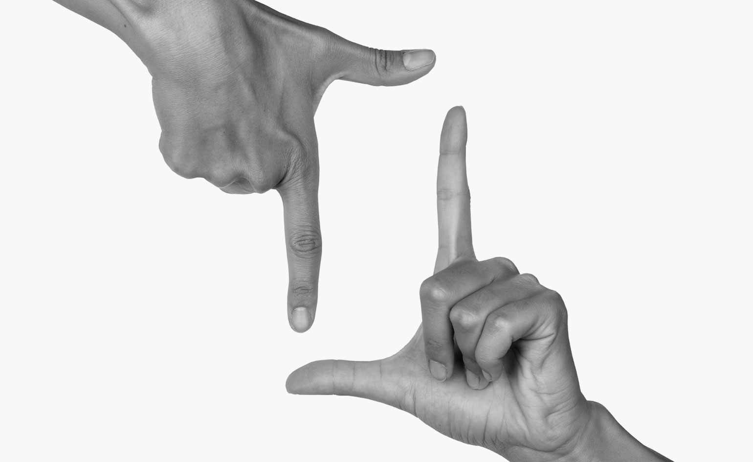
The museum has a diverse, 800-strong permanent collection spanning eight centuries. This presented a challenge for Munich-based design firm KMS Team, who were commissioned for the project. Lead designer Aurelian Hallhuber was keen to ensure that the new identity would complement any of the museum's featured works, while reflecting Staatsgalerie's commitment to innovation. To do this, he designed a colourful poster border and logo inspired by the universally recognisable symbol of the ‘hand-frame’. This border functions as a ‘consistent, highly recognisable element to the visual identity but its colour and content may vary’, notes Hallhuber. Like any good frame, it aims to draw focus on the artwork, rather than distracting from it.
KMS and Staatsgalerie decided to launch the design in collaboration with one of the museum's prominent new exhibitions, ‘Giorgio de Chirico: Magic of Modernism’, which runs until 3 June this year. ‘The de Chirico exhibition was the obvious choice,’ Hallhuber comments. ‘De Chirico often painted images inside the image. He put a frame inside the frame’. Using this meta, modernist master as a jumping-off point, a tongue-in-cheek sense of fun is added to the identity.
With such a minimal concept, an equally clean typeface needed to be sourced. KMS opted for the modern, unfussy, ‘Circular’ type, from the Swiss foundry Lineto. Hallhuber notes, ‘It is a very classic Sans Serif font but with a timeless feel. It has a clear and geometric look, but also some round details that contrast the linear logo.’ This soft-edged lettering prevents the overall design from becoming too faddy or cold.
KMS were excited to work in such a dynamic environment, noting the valued input they received from the ‘open’ and ‘courageous’ Staatsgalerie team, but Hallhuber acknowledges that the budget was a little more limited than the 'corporate commissions' he's used to. The upside to this was the 'sense of freedom' surrounding the project. With a blank canvas as a brief, all Hallhuber had to do (with daring simplicity), was add the frame.
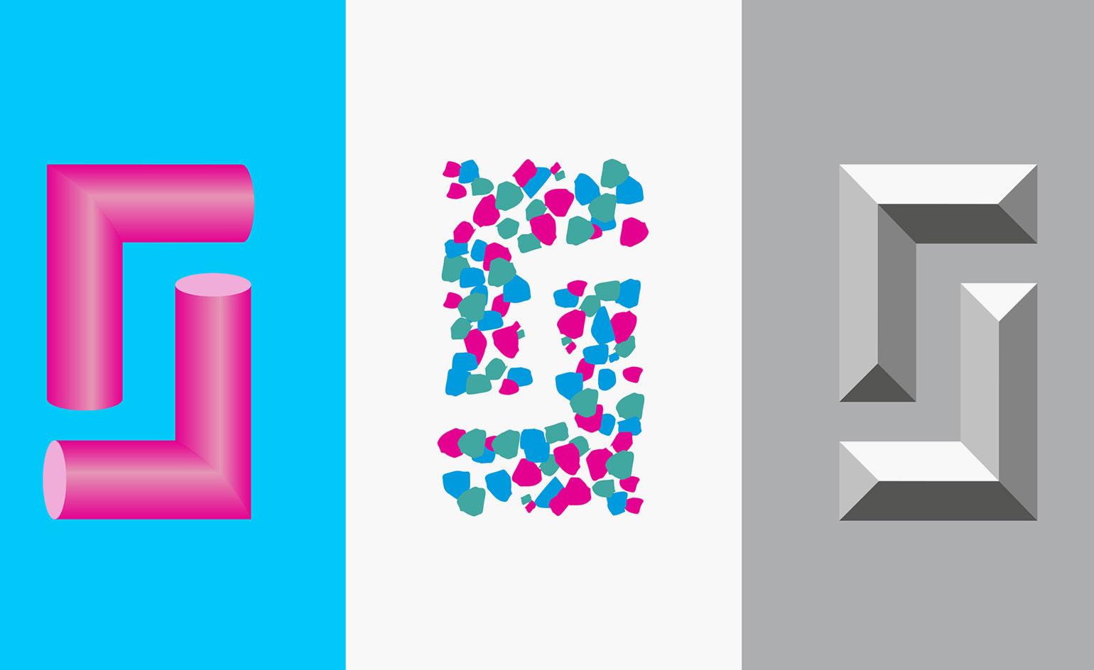
The design uses a colourful, blocked-in version of the universally recognisable symbol of the 'hand-frame'
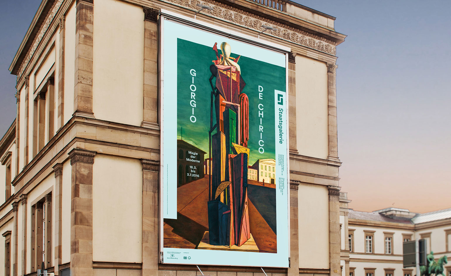
Because the museum's collection includes a diverse range of artwork dating from the 14th century to the present day, the challenge for KMS was to create a unifying, cohesive identity
Lead designer Aurelian Hallhuber was keen to ensure that the new identity would complement the museum's featured works, while reflecting Staatsgalerie's commitment to innovation
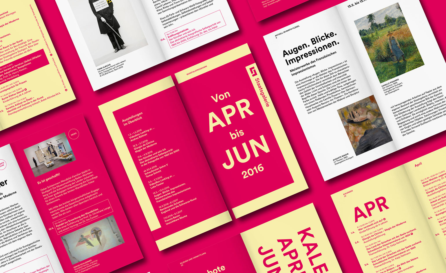
Hallhuber explains, 'This border functions as a consistent, highly recognisable element to the visual identity but its colour and content may vary’
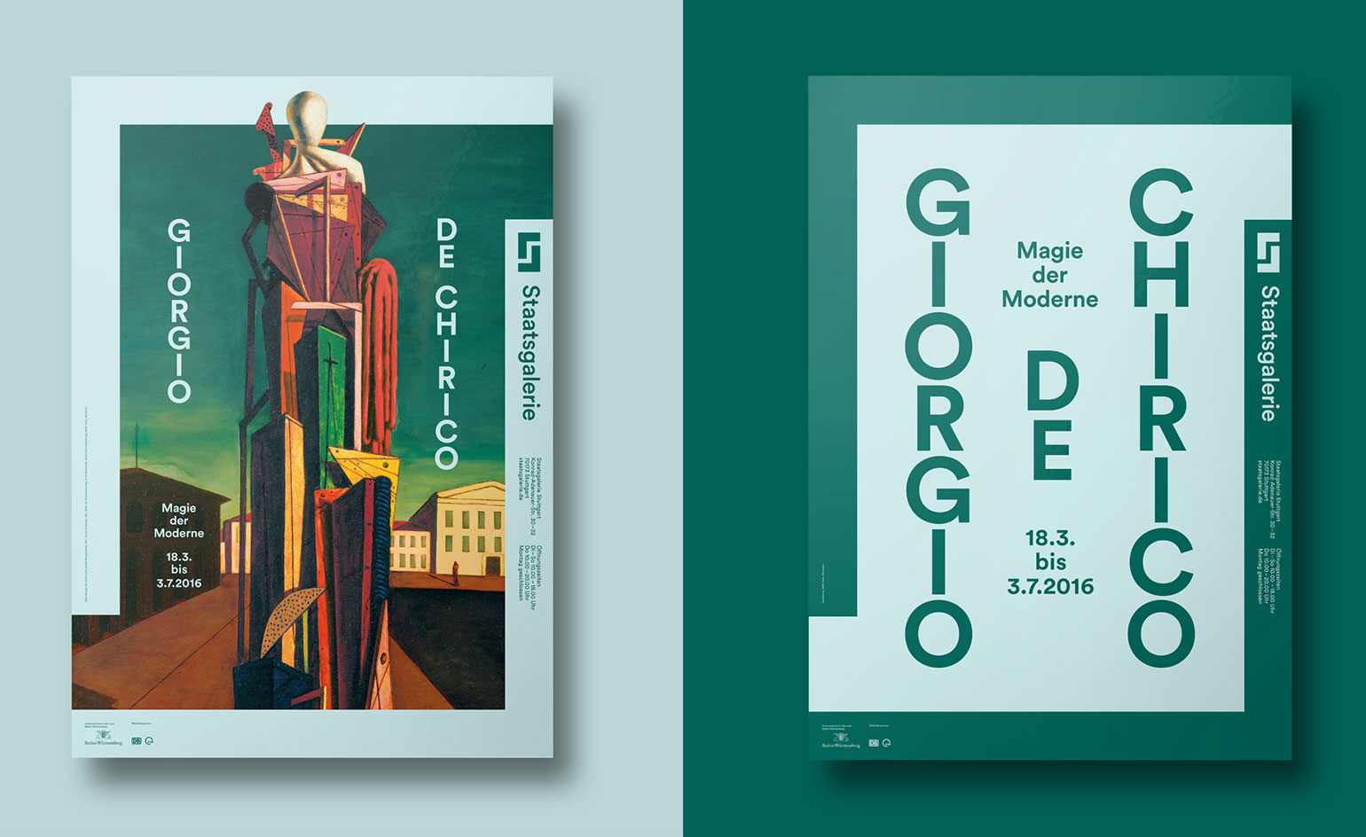
KMS and Staasgallerie decided to launch the design in collaboration with one of the institution's most prominent new exhibitions – ‘Giorgio de Chirico: Magic of Modernsim’, which runs until 3 June this year
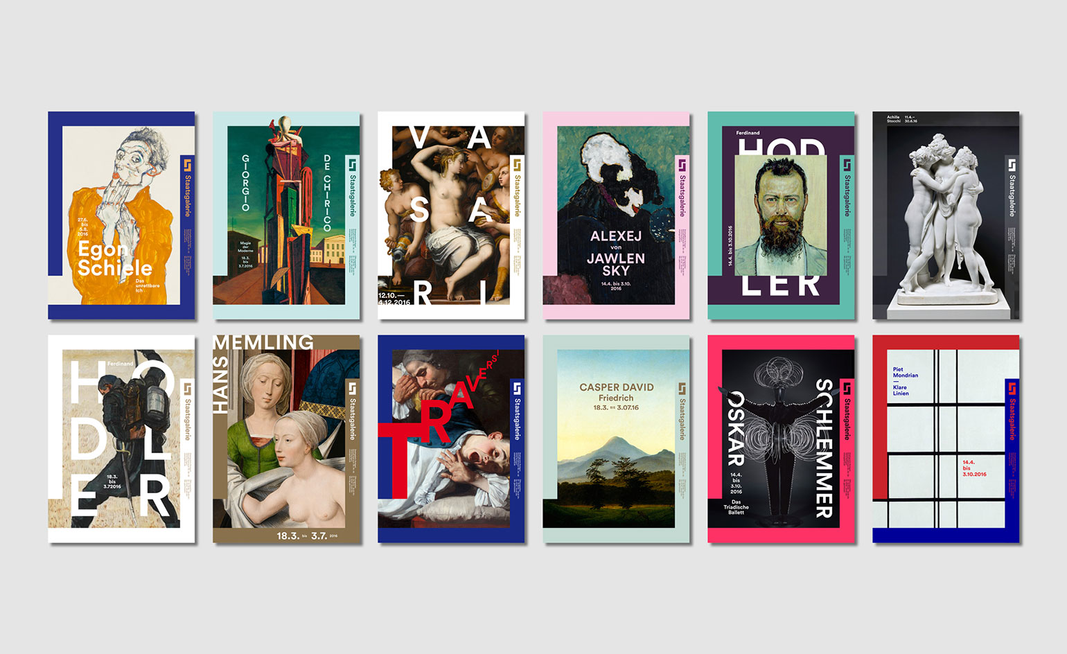
Using this meta, modernist master as a jumping-off point, a tongue-in-cheek sense of fun is added to the already youthful identity
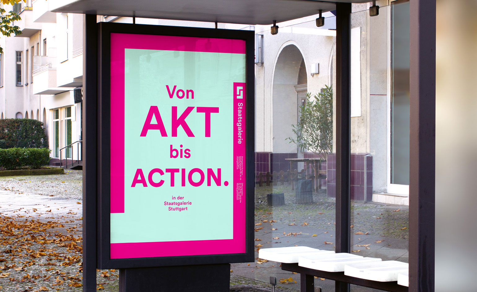
With such a simple concept, an equally clean typeface needed to be sourced. KMS opted for the modern, unfussy, ‘Circular’ type, from the Swiss type foundry Lineto
INFORMATION
For more information, visit the KMS Team website
Photography courtesy KMS Team
Wallpaper* Newsletter
Receive our daily digest of inspiration, escapism and design stories from around the world direct to your inbox.
Elly Parsons is the Digital Editor of Wallpaper*, where she oversees Wallpaper.com and its social platforms. She has been with the brand since 2015 in various roles, spending time as digital writer – specialising in art, technology and contemporary culture – and as deputy digital editor. She was shortlisted for a PPA Award in 2017, has written extensively for many publications, and has contributed to three books. She is a guest lecturer in digital journalism at Goldsmiths University, London, where she also holds a masters degree in creative writing. Now, her main areas of expertise include content strategy, audience engagement, and social media.
-
 Kapwani Kiwanga transforms Kvadrat’s Milan showroom with a prismatic textile made from ocean waste
The Canada-born artist draws on iridescence in nature to create a dual-toned textile made from ocean-bound plastic
By Ali Morris
-
 This new Vondom outdoor furniture is a breath of fresh air
Designed by architect Jean-Marie Massaud, the ‘Pasadena’ collection takes elegance and comfort outdoors
By Simon Mills
-
 Eight designers to know from Rossana Orlandi Gallery’s Milan Design Week 2025 exhibition
Wallpaper’s highlights from the mega-exhibition at Rossana Orlandi Gallery include some of the most compelling names in design today
By Anna Solomon
-
 Johanna Seelemann and Robert Damisch use design as a tool to carve a future for the craft community of their homeland
Designers Johanna Seelemann and Robert Damisch tell us about their 'fascination for unravelling the objects that we might take for granted' and finding an answer to unite both craft and design
By Hugo Macdonald
-
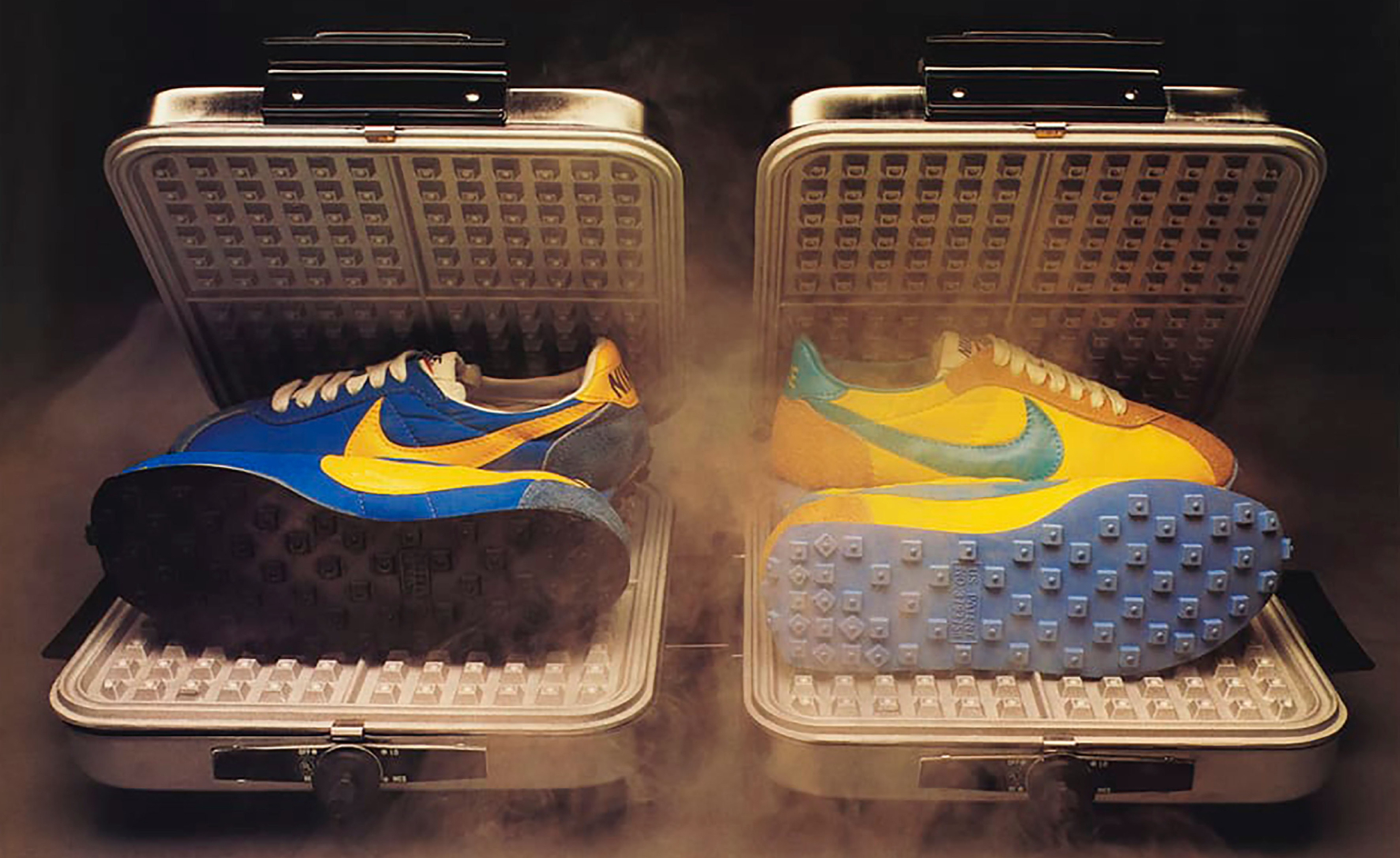 ‘Nike: Form Follows Motion’ surveys 50 years of the Swoosh’s era-defining design
‘Nike: Form Follows Motion’ at the Vitra Design Museum in Germany, curated by Glenn Adamson, is the first-ever museum exhibition dedicated to the sportswear giant
By Sofia de la Cruz
-
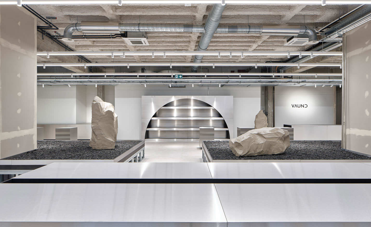 The brutalist designs of Berlin-based studio Vaust
Multidisciplinary Berlin studio Vaust digs deep into the German capital’s weighty brutalist legacy to create impactful designs and interiors
By Mary Cleary
-
 Mac Collins honoured with Design Museum’s inaugural emerging designer prize
The Design Museum announces British designer Mac Collins as the recipient of the Ralph Saltzman Prize, a new annual accolade to celebrate and support emerging designers
By Rosa Bertoli
-
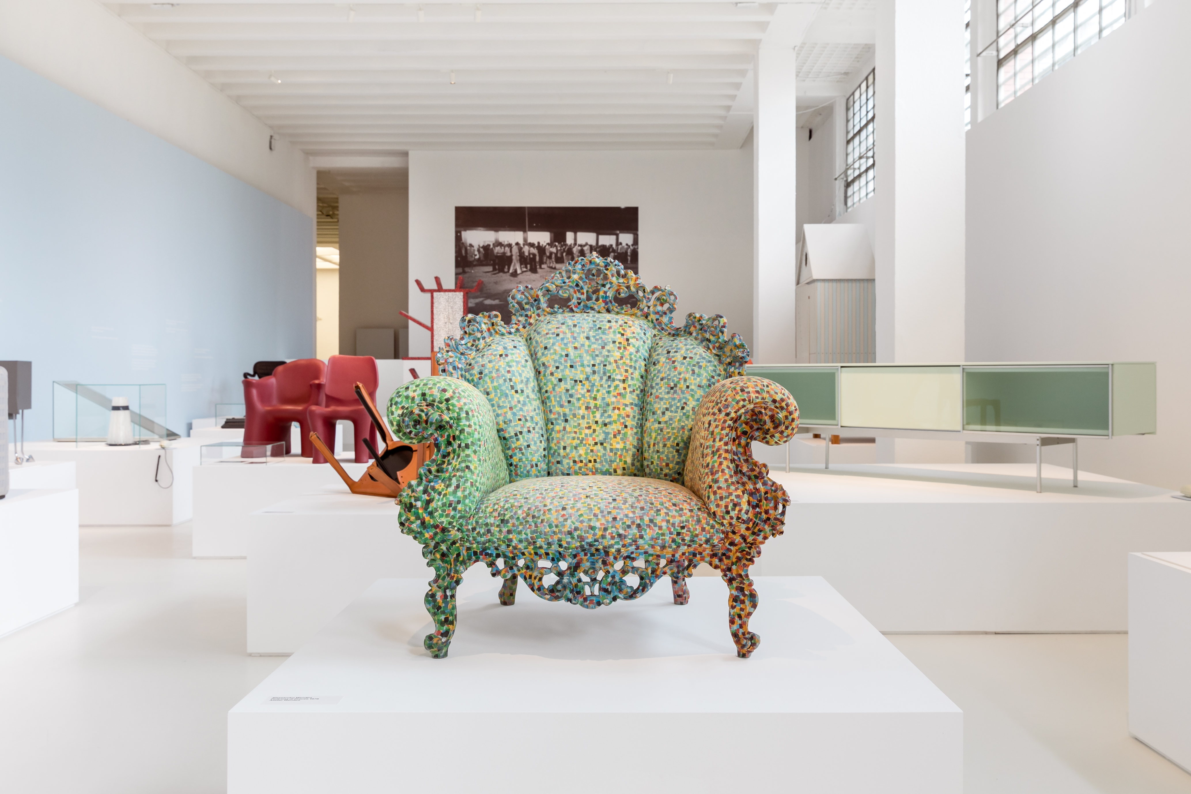 Wallpaper’s Marco Sammicheli appointed Triennale Design Museum Director
The design critic and curator has been at Wallpaper* since 2017, and part of the Triennale team during this time. He will now oversee and grow the Italian institution’s design collections
By Rosa Bertoli
-
 World View: Letter from Germany
Our World View series shines light on the creativity and resilience of designers around the world as they confront the challenges wrought by the Covid-19 pandemic. Working with our international contributors, we reach out to creative talents to ponder the power of design in difficult times and share messages of hope. In Berlin, designers have embraced the slower pace of life and developed a stronger appreciation for community and environment, writes Emily McDermott MORE FROM WALLPAPER* WORLD VIEW
By Emily McDermott
-
 Stefano Boeri on his plans for the Triennale Design Museum and transforming the institution into a ‘major cultural hub’
We talk to Triennale president Stefano Boeri on his plans for the Milanese institution, including the Triennale Design Museum and the development of a new cultural hub
By Emma O'Kelly
-
 Miami by Design: PAMM
By Rosa Bertoli