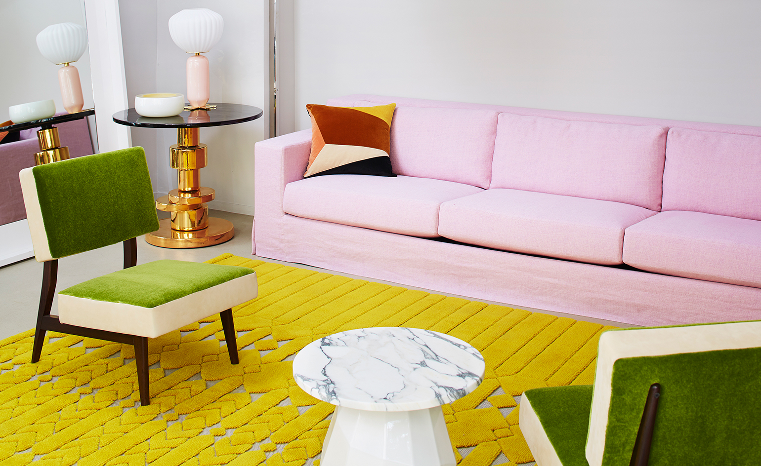
Sander Lak brings his intuitive colour approach to new Maharam collaboration
Maharam enlisted fashion designer Sander Lak to create a collection of woollen upholstery textiles, for which the designer drew inspiration from nature and American pop culture corporate graphics
Pia Riverola - Photography
Textile house Maharam presents a new collection of upholstery fabrics in collaboration with New York designer Sander Lak. Lak set up Sies Marjan six years ago; last June, the label was shuttered, another casualty of the pandemic, but before its untimely demise, it had established a reputation for impeccable tailoring, a colour-focused approach and a feel-good point of view. And it went out on a creative high.
For his final A/W20 collection, Lak, a former design director at Dries Van Noten, took an esoteric deep dive into experimental sustainable practices, sponsoring and creating a capsule collection for the AMO/Rem Koolhaas’ exhibition, ‘Countryside, The Future’, which opened in February last year at the Guggenheim. The collection explored ideas of sustainability and eco-responsibility as Lak experimented with innovative material techniques and fabrications. These included a collaboration with Cornell University on an eco-printing technique where plants and flowers were hammered into silk to create prints, and transforming sustainable wool upholstery, developed from sheep sheddings by Dutch textile artist Claudy Jongstra, into two sleeveless overcoats and a duffle bag.
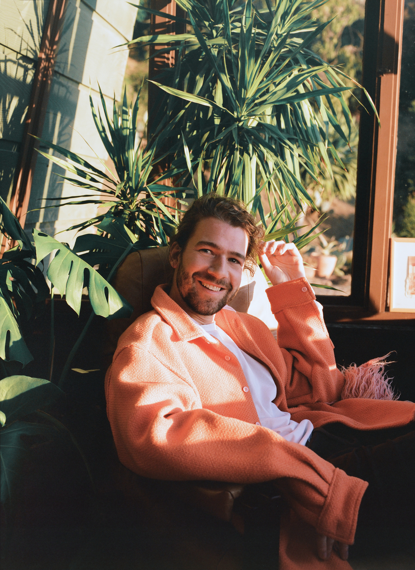
Sander Lak, wearing a custom shirt made from Terra fabric in Tandem, photographed in February at his home in Laurel Canyon, Los Angeles
The Jongstra collaboration introduced Lak to Maharam. Jongstra’s Drenthe Heath fabric, named for the indigenous Drenthe Heath sheep that she rears in northern Netherlands, and exclusive to Maharam, was custom-dyed using walnut husks, onion skins, indigo and madder to create a deep, rich kelp colour for the Sies Marjan collection. The textile was also incorporated into a limited run of Maharam pillows as part of a Sies Marjan x AMO capsule line, sold at the Guggenheim store.
Maharam and Sander Lak: the collaboration
This month, Lak and Maharam reveal a new joint effort – the development of three wool fabrics that join Maharam’s wool initiative, launched at the end of February 2021. Responding to growing interest in renewable natural fabrics for furniture upholstery, while taking a fresh look at classic textiles, the offerings include material made using post-consumer recycled wool, and wool that has been spun, woven and pressed at a single location to reduce the environmental impact of textile transport.
Lak has created a pair of woven felts – Gemma (with a solid and saturated finish) and its mélange sibling Gemma Multi (an intricate duotone that’s also reversible) – along with Terra, a chunky basket-weave wool that nods to his fashion background with its cable knit-like blooms. They reflect extensive colour experimentation, alongside the material depth and nuances in wool. Offering a combined palette of 150 colours, the textiles bring a fresh perspective to what upholstery can be.
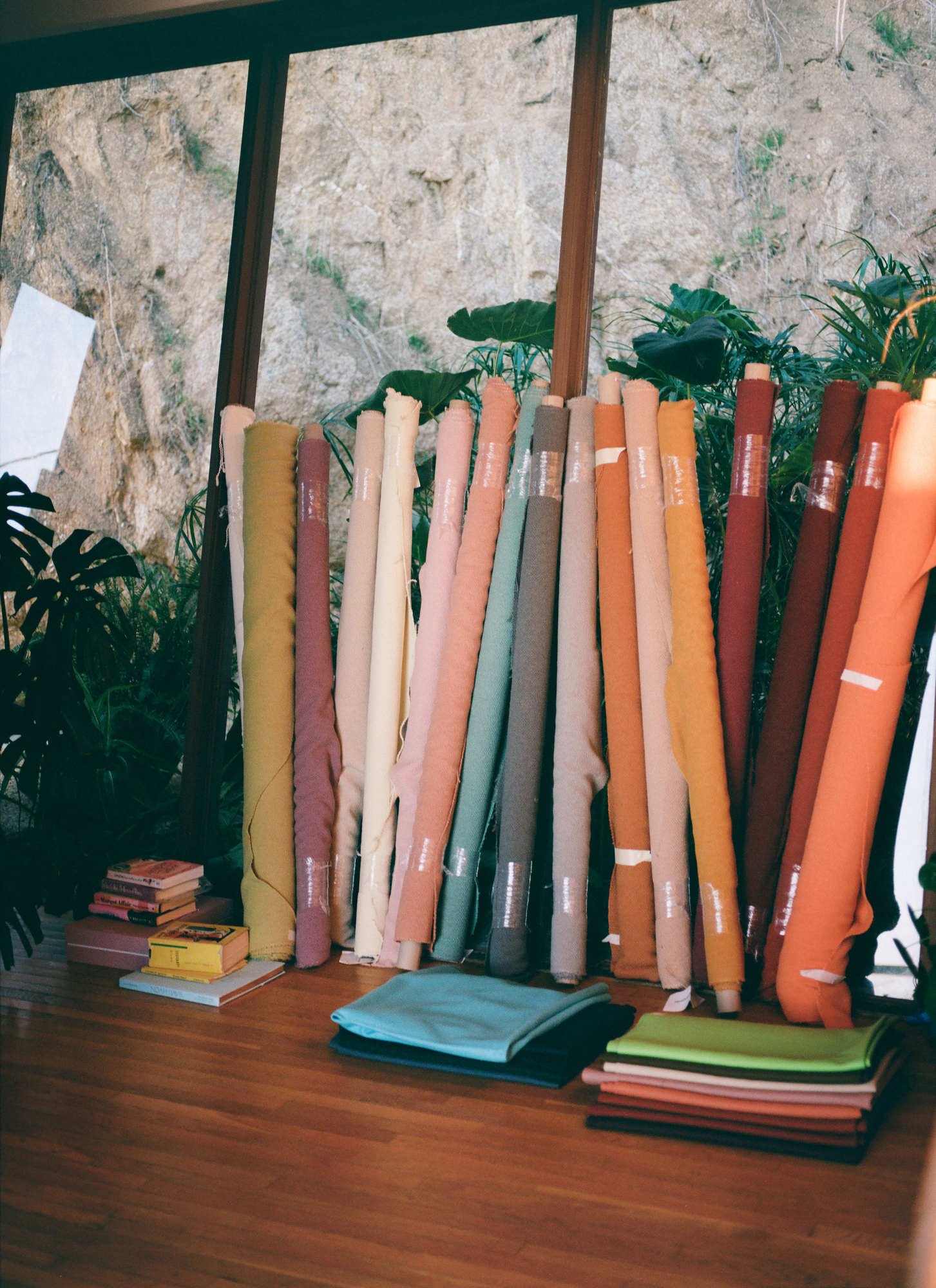
Rolls of Terra fabric and folded stacks of Gemma fabric
‘What was great about this project was that I had this incredible freedom,’ says Lak, who was born in Brunei, and grew up between Malaysia, Gabon, Scotland and the Netherlands. ‘When I’m working on a collection, we normally work with maybe 12 colours, which is already a lot. From a fashion point of view, there are so many things you have to think about for fabrics.’ Designing interiors textiles was a new experience. ‘Instead of me considering where on the body this would go and how I would line it, I really just had to look at the fabric and decide what colour this fabric, this texture and these fibres would take best, without having to worry about skin tones, hair colour, shape or washability. Of course, we have to look at which colours will sell well and which are more editorial, but we needed so many colours that it was the first time I really felt I could let it all come out of me.’
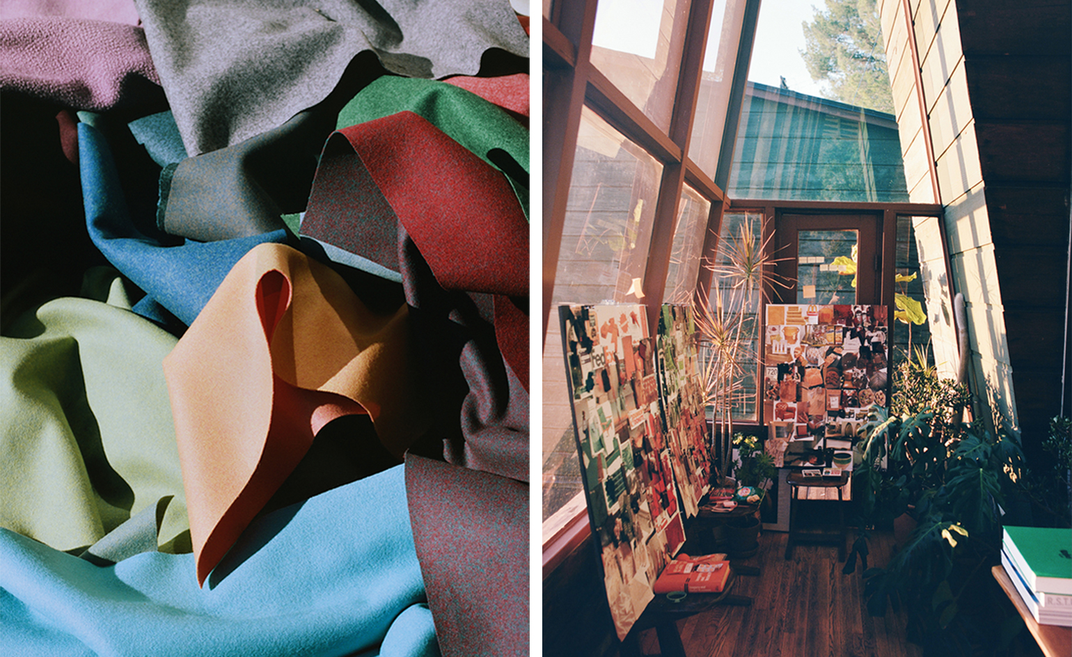
His approach to assembling this extensive array is simple. ‘I pick colours based on imagery that I collect. I don’t go through a Pantone book. I have a huge database of the most random images and I go through them and select by colour what is speaking to me,’ says Lak, who is currently working between LA and New York. ‘Without sounding like a Laurel Canyon hippie, it’s purely instinctual. The way that I worked on this project is similar to how I work in fashion. I make boards of all these different colour samples, and then I just put them next to each other to see what works; I go outside in the afternoon to see what it looks like then, and in the morning, and under artificial light. I’m probably the only nerd in the world who is excited by that, but for me, that is the most exciting thing, to find the shade that clicks.’
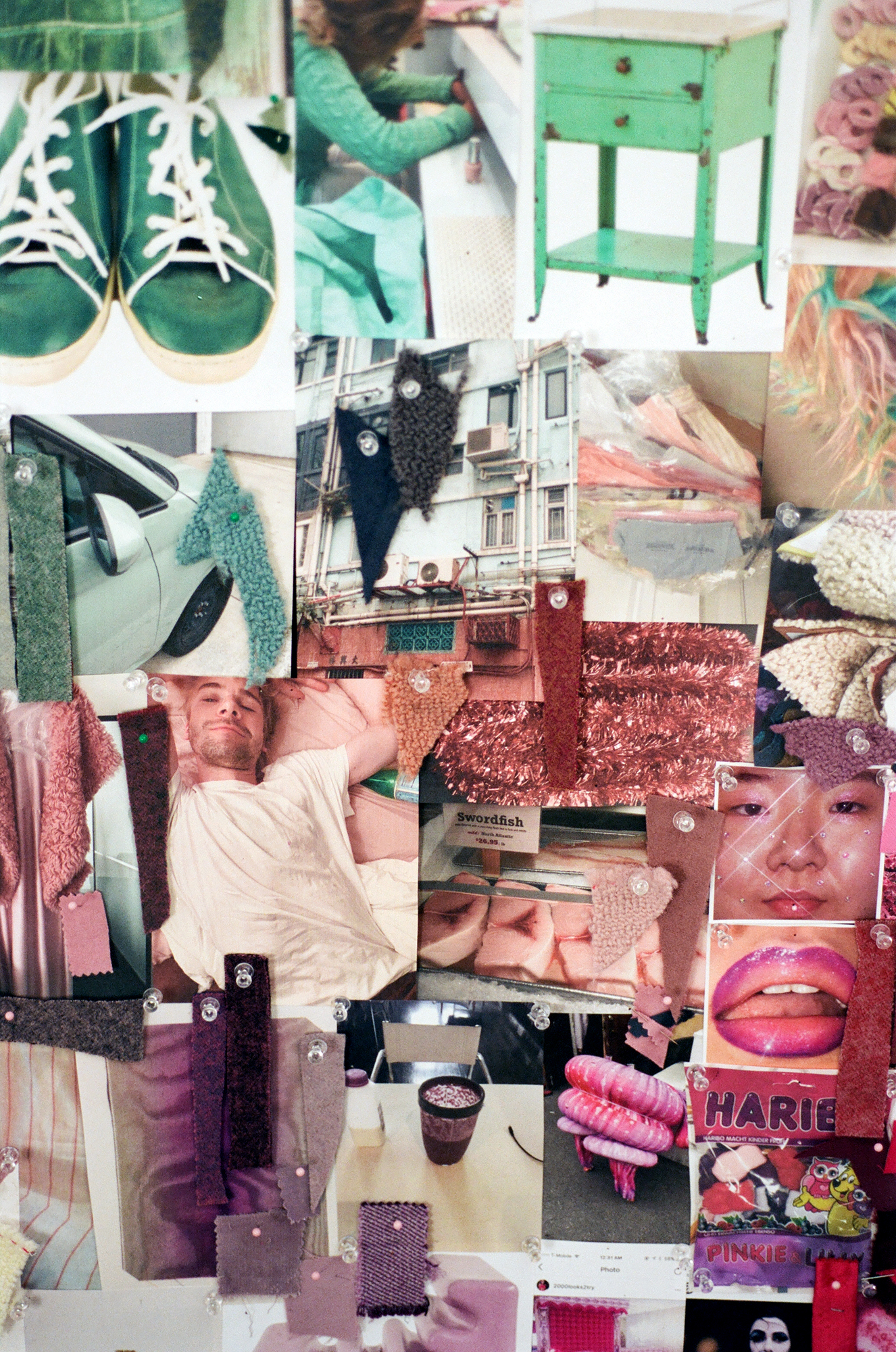
The palette that accompanies the woolly trio has been drawn from the ephemeral and the mundane, be it the buttery shade of cheese and crackers, the muted tones of milkshakes and smoothies, or the bold colour combinations of digital icons. Lak also looked to nature; ‘the subdued shades of plants that are almost dying or completely overwatered or over-thriving, and colours of the sky,’ he recounts. ‘All of these natural components completely overlapped with the reality of the pandemic home life.’
Lak also looked to the corporate colours of American brands like McDonald’s, Dunkin’ Donuts and Baskin-Robbins. ‘I was drawn to using these aggressive, almost unnatural colours and making them feel more natural and subtle on very natural fibres. There was a lot of clashing, which is also reflective of what we are living through – a time of opposing emotions, where we are happy to have some quiet, but we’re also bored of quiet. We’re scared, but we’re also kind of satisfied.’
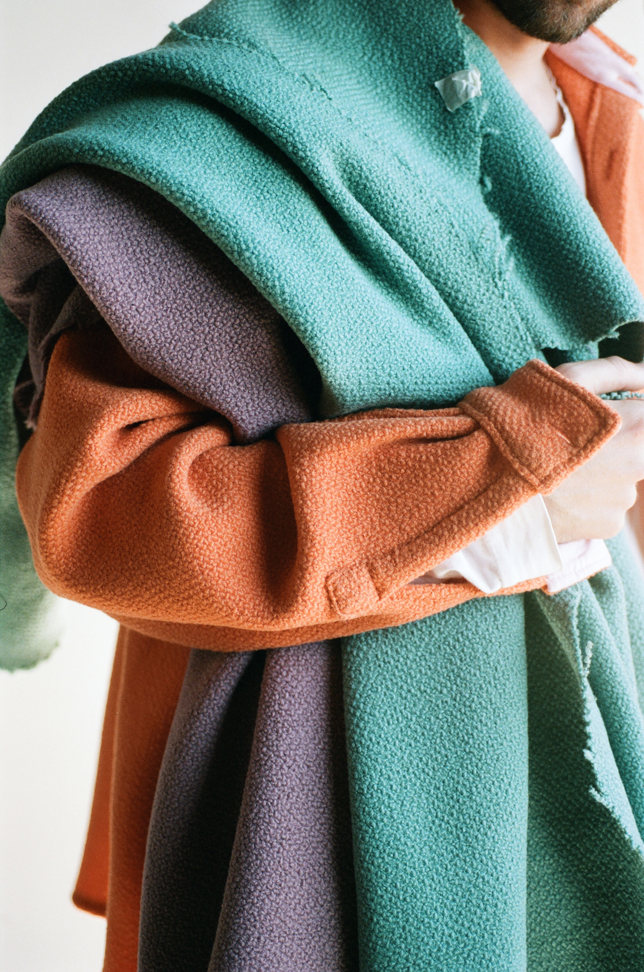
A custom shirt made by Sander Lak using his Terra fabric for Maharam in Tandem
‘Sander has a strong gut instinct about colour,’ says Mary Murphy, Maharam’s senior vice president of design. ‘In addition to arriving at colours that are unusual, Sander also likes mysterious colours, colours we don’t quite know, that change in different light. He likes combining things that are a little bit weird. The two felt wools offered a blank canvas for him to do whatever he wanted. He could go crazy with the solid felt and the dyed fibres in the mélange version. His colour combinations created a lot of surprises. The mélange is my favourite because if you look closely, you can see different things.
‘For Terra, we wanted something that would complement the flat woven felts,’ she adds. ‘It’s the most textured of all the wools that we were working on. It is piece-dyed, so Sander wasn’t limited in any way by yarn colours. We wanted him to have free rein to express his point of view, which is definitely different. That’s why we collaborate and bring that different flavour to our line.’
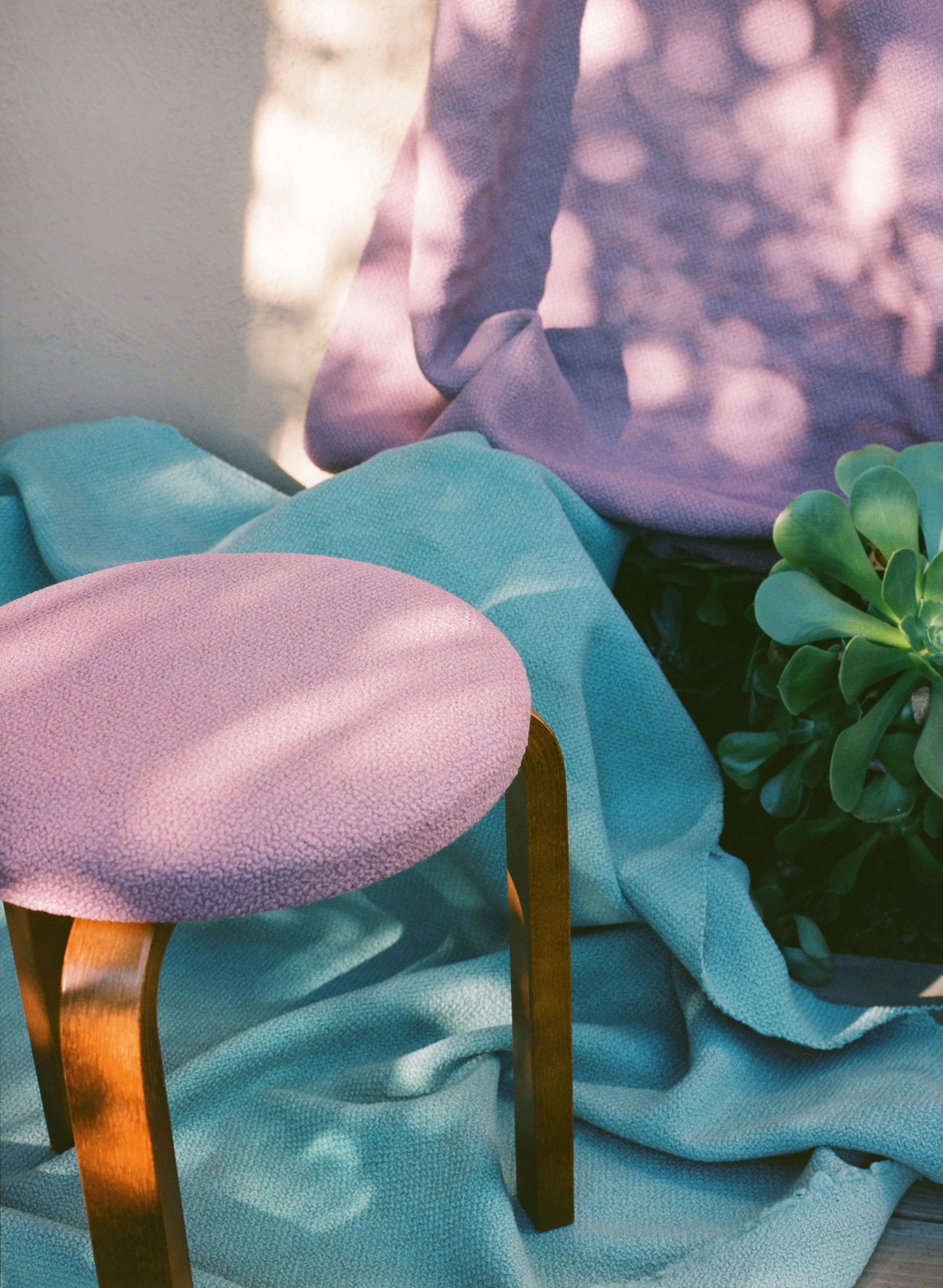
Alvar Aalto’s ‘Stool 60’, upholstered in Terra fabric in Brunnera, with Terra fabric in Callais and Brunnera behind
None of the colourways’ references are explicitly named in the collection, but each of Lak’s textiles possesses a memorable energy that emerges from their idiosyncratic depth and complexity. Enhanced by Maharam’s impeccable dyeing and manufacturing prowess, which adds resiliency to ensure the textiles stand up to both upholstery and vertical applications, the three new fabrics are just the start of more to come.
‘We’ve always said that we don’t want to collaborate with someone we wouldn’t want to have dinner with,’ says Murphy. ‘We want a long-term relationship. Even though it wasn’t quite as much fun because we couldn’t work face-to-face, we were still able to achieve something that we all feel good about. There’s also going to be another and another, so we still have time.’
Wallpaper* Newsletter
Receive our daily digest of inspiration, escapism and design stories from around the world direct to your inbox.
INFORMATION
Pei-Ru Keh is a former US Editor at Wallpaper*. Born and raised in Singapore, she has been a New Yorker since 2013. Pei-Ru held various titles at Wallpaper* between 2007 and 2023. She reports on design, tech, art, architecture, fashion, beauty and lifestyle happenings in the United States, both in print and digitally. Pei-Ru took a key role in championing diversity and representation within Wallpaper's content pillars, actively seeking out stories that reflect a wide range of perspectives. She lives in Brooklyn with her husband and two children, and is currently learning how to drive.
-
 A Xingfa cement factory’s reimagining breathes new life into an abandoned industrial site
We tour the Xingfa cement factory in China, where a redesign by landscape specialist SWA Group completely transforms an old industrial site into a lush park
By Daven Wu
-
 Put these emerging artists on your radar
This crop of six new talents is poised to shake up the art world. Get to know them now
By Tianna Williams
-
 Dining at Pyrá feels like a Mediterranean kiss on both cheeks
Designed by House of Dré, this Lonsdale Road addition dishes up an enticing fusion of Greek and Spanish cooking
By Sofia de la Cruz
