True blue: for textile brand Dedar, a creative duo render master artists’ work in a new hue
Receive our daily digest of inspiration, escapism and design stories from around the world direct to your inbox.
You are now subscribed
Your newsletter sign-up was successful
Want to add more newsletters?
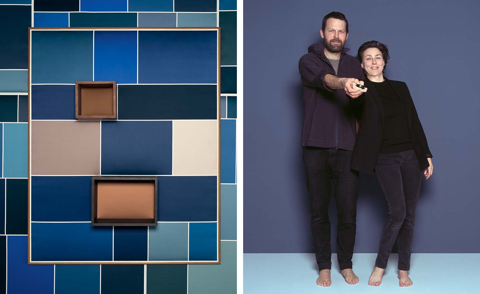
Photographer Brigitte Niedermair and designer Martino Gamper have known each other since childhood. The pair, both regular Wallpaper* collaborators, grew up in Merano, where northern Italy merges into Austria across the Alps. They took different professional routes, yet they each became artisans in creative fields, Niedermair says, mastering their crafts in unique ways.
Two years ago, strategist and creative problem solver Helen Nonini, who had known the pair for some time, decided it was time they collaborated. Nonini – whose experience in brand strategy has included work with Gucci, Gianvito Rossi and Audi – saw an affinity between Gamper, Niedermair and Italian textile brand Dedar, so she suggested a three-way collaboration. The owners of Dedar, Caterina and Raffaele Fabrizio, were looking for a way to celebrate the company’s 40th birthday; Nonini was tasked with finding a way to combine its textiles with the pair’s passion for art and design, to create something special.
‘The project had to represent our identity, which combines an intrinsic quality and ability to provoke with a playful and joyful attitude,’ says Raffaele. ‘The idea was to have a wall piece that mixed textile craft with a graphic expression,’ adds Caterina.
The siblings are now in charge of the company founded by their parents in 1976; Nicola and Elda Fabrizio started out working with the mills around Lake Como to create a diverse and eclectic collection of fabrics that has been growing ever since.
The brief gave Gamper and Niedermair the freedom to explore the possibilities that fine fabrics offer – all the owners asked was that they bring Dedar’s playfulness together with that passion for art, design and craftsmanship and channelling these qualities into a wall piece the company could produce and sell. After a long brainstorming session, Niedermair and Gamper travelled to Lake Garda, almost equidistant between Merano and Dedar’s base in Appiano Gentile, hoping to find inspiration in the area and its architecture, including Gabriele D’Annunzio’s legendary home, Il Vittoriale. Inspiration did indeed strike, just not in the way they expected.
‘One evening, we were driving to dinner through a remote area,’ recalls Niedermair. ‘The phone network wasn’t working and, as we were doing a search on Google Images. We noticed this pattern that appeared when images were slow to load.’ This effect, when a series of placeholder boxes appear as the actual pictures finish loading, is known in the digital community as Dominant Colour Lazy Loading. The Google algorithm arranges the boxes neatly in a grid, picking the dominant colour of each image to fill the boxes for a second or less.
Niedermair and Gamper saw the potential of these ephemeral patterns, and they started searching the names of artists and artworks to explore different effects. The Fabrizios had given them a list of artists they admired, such as Giotto, Pablo Picasso, Vincent Van Gogh, Yves Klein and Henri Matisse, and Niedermair was quick to identify the colour blue as a common theme in these artists’ work.
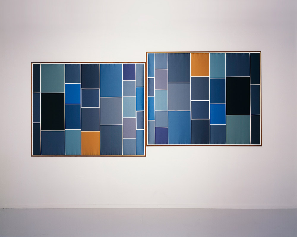
The pair created works inspired by Van Gogh’s ’The Starry Night’
Search terms used by Niedermair and Gamper included ‘Van Gogh notte stellata’ (The Starry Night), ‘Giotto cappella degli Scrovegni cielo stellato’ (the sky that appears in Giotto’s 14th-century fresco cycle in the Scrovegni Chapel, Padua) and ‘Henri Matisse blue collage’. They also looked at Picasso’s Blue Period paintings and Klein’s eponymous shade of blue. For a fraction of a second, these searches would return an asymmetric grid of squares and rectangles in varying shades of blue, punctuated with green, orange or brown depending on the painting represented. And then the pattern would be gone as quickly as it appeared.
‘We felt we had found a synthesis of contemporary art, of our historical memory and of art’s codes, linking the present to the past,’ says Niedermair. Alongside Gamper, she searched for the combinations of colours that best represented each artist’s work, and started refining the searches to achieve the best pattern combinations on the results page. An important element of the project, Niedermair says, was the actual screenshot: a quick reaction was needed to press two buttons on the smartphone before the actual paintings loaded. ‘For me, this was research on what can be a photographic study,’ she says. ‘This work is at once very far from but also very close to photography – it’s an exploration of conceptual photography.’
Once photographed on a phone, each image was printed on Dedar’s ‘Tabularasa’ fabric, a thick cotton satin ideal for printed colours. The Fabrizios used an inkjet printer to achieve the right shades and straight lines. ‘[This fabric] was the perfect support on which to achieve the rigour of a screen,’ says Gamper.
A bonus, he notes, is that the high density of the material renders the panels soundproof, making them ideal for large-scale interiors projects. As composition is key to the project, Niedermair and Gamper created a wood and brass frame for the panels, which allows them to be slotted into each other, in order to create infinite modular arrangements. (The panels come numbered and signed.) The Giotto piece was also adapted into an item of furniture, with two wooden three-dimensional constructions applied to the brown boxes. Each work can be mounted on a rotating support, which offers viewers the effect of a phone screen changing orientation. Niedermair says this element captures the essence of the project, as it references its technological origins.
When asked what was the most important moment of the two-year project, Niedermair and Gamper agree that driving up and down that narrow road at Lake Garda was a pretty special and even absurd experience. ‘Usually, you drive around so that your phone will work,’ says Gamper. ‘We were driving around so that our phones wouldn’t work – it was almost a paradox.’
The process has been a team effort, with Nonini identifying the collaboration, Gamper and Niedermair coming up with the concept and Dedar applying its expertise to the production under the Fabrizios’ guidance. Gamper and Niedermair were also asked to shoot photographs to promote the project and, for Wallpaper*, they took the pictures that appear on these pages. The limited-edition cover they created for this issue nods to this five-way partnership by representing Matisse’s Dance, a 1909 painting that depicts five people holding hands and dancing in a circle.
The pair’s classic but radical approach to art enchanted the Fabrizios. ‘We like that Martino is a craftsman who can combine artisanal tradition with conceptual thinking, and Brigitte’s unique point of view, her unconventional approach to femininity,’ says Raffaele. The two creatives met each other halfway, in a place that is neither photography nor design, but a little of both. ‘Formally, this work is not myself nor Brigitte,’ says Gamper. Niedermair agrees, adding: ‘Yet it might be us at our best.’
As originally featured in the April 2017 issue of Wallpaper* (W*217)
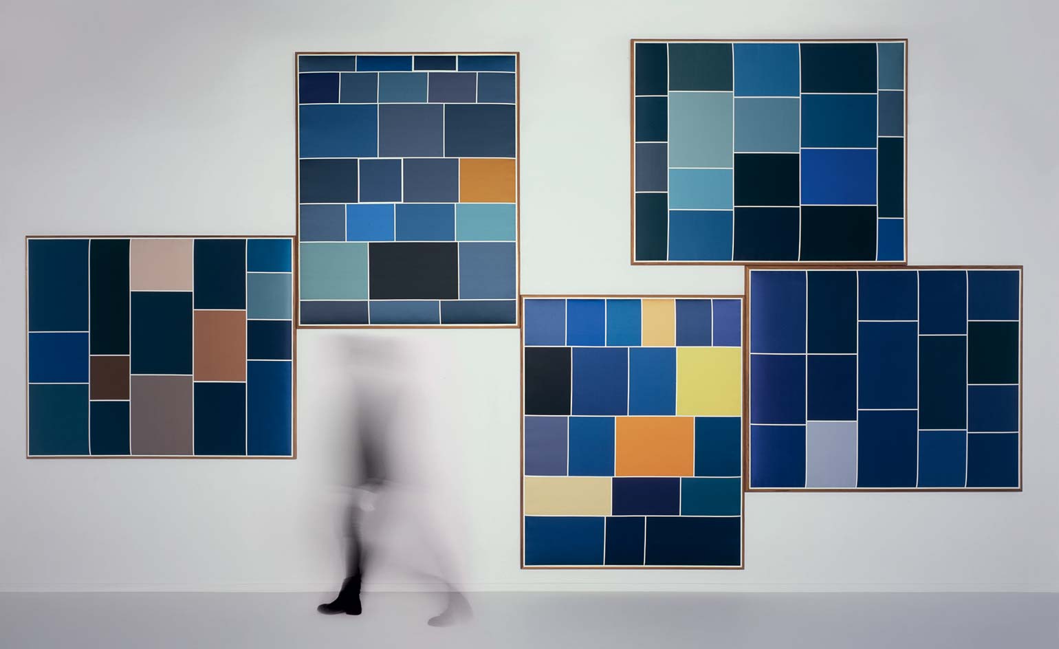
Gamper and Niedermair's panels were each inspired by the work of a different artist. From left to right, Giotto, Vincent Van Gogh, Henri Matisse, Pablo Picasso, and Yves Klein
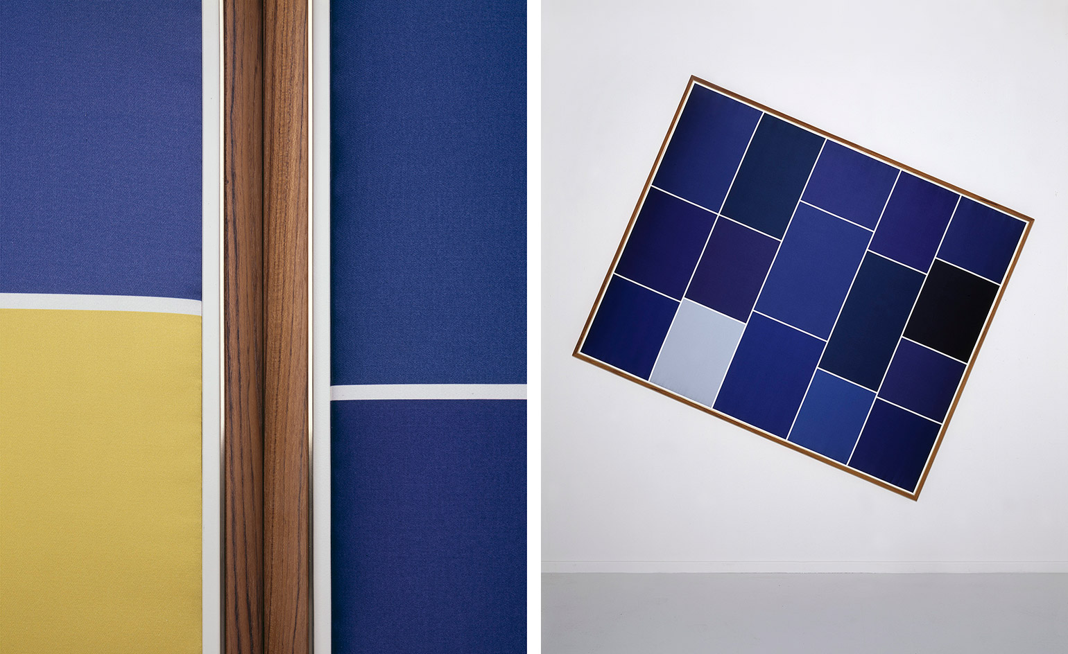
Left, Gamper and Niedermair created a wood and brass frame for the panels that allows them to be slotted together. The density of the fabric means the panels are soundproof. Right, a work inspired by Yves Klein
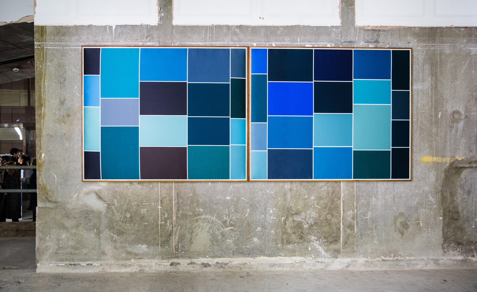
‘Screenshot’, a show of the artworks, is at Wallpaper's exhibition space, One Poultry in London
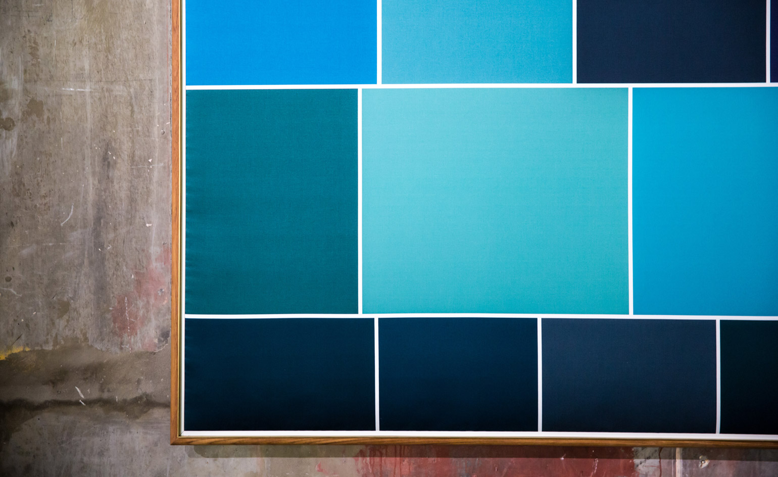
The exhibition continues until 18 March
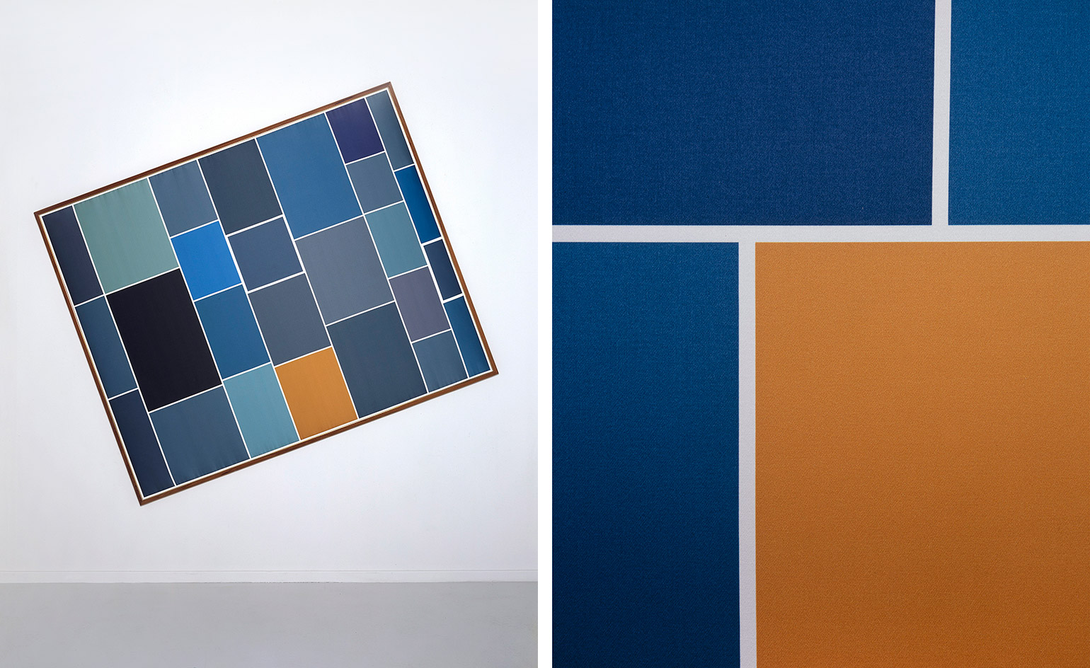
Search terms used by Niedermair and Gamper included ‘Van Gogh notte stellata’ (The Starry Night), which resulted in this piece
INFORMATION
‘Screenshot’, a show of the artworks, is at Wallpaper's exhibition space, One Poultry, between 10 – 18 March, 9am – 5pm. For more information, visit Brigitte Niedermair’s website, Martino Gamper’s website, and the Dedar website
ADDRESS
One Poultry
London EC2R 8EJ
Receive our daily digest of inspiration, escapism and design stories from around the world direct to your inbox.
Rosa Bertoli was born in Udine, Italy, and now lives in London. Since 2014, she has been the Design Editor of Wallpaper*, where she oversees design content for the print and online editions, as well as special editorial projects. Through her role at Wallpaper*, she has written extensively about all areas of design. Rosa has been speaker and moderator for various design talks and conferences including London Craft Week, Maison & Objet, The Italian Cultural Institute (London), Clippings, Zaha Hadid Design, Kartell and Frieze Art Fair. Rosa has been on judging panels for the Chart Architecture Award, the Dutch Design Awards and the DesignGuild Marks. She has written for numerous English and Italian language publications, and worked as a content and communication consultant for fashion and design brands.