Masters of reality: dn&co present skewed urban perspectives in 'Co-Ordinates'
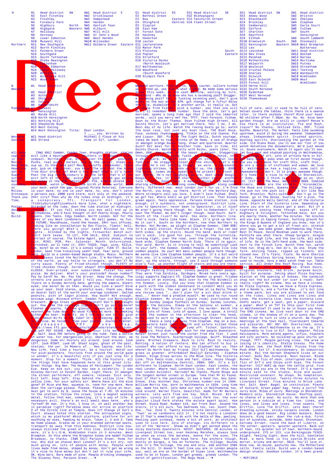
'Perhaps no city has ever been as mapped as London', suggests the brand consultancy firm dn&co as the basis of their 'Co-Ordinates' project. A willingly unverifiable statement perhaps, but certainly one with edifying currency – while far from the globe's oldest city (being founded by the Romans c.43 AD, it's pipped to that accolade by over 1000 years in Europe alone), London is a remarkable centre of historical, cultural and social significance, lauded by many and rarely surpassed.
Appropriate then, that dn&co have invited a host of willing participants to visually reimagine it via the medium of large-scale poster design. 'Whether you’re into complex infrastructure or pub crawls, or see the city as a playground or a battleground,' runs the remit, 'we challenge you to skew perspectives, distort to your reality and map to persuade.'
The project's 24 contributors include Pentagram, Applied Wayfinding, Build, Face37, Melissa Price, Magpie Studio, Studio Thomson and dn&co itself. Each practice was required to create an A1 sized artwork in two colours, to be printed on 270gsm paper (supplied by GF Smith, with no embossing) and verified by Peckham Print Studio. Of the 11 editions printed, each studio will keep a single copy – the remaining ten will be sold, with profits being donated to Streets of London, a charity that raises money for homelessness work in the capital. What's not to like?
The resulting designs are, inevitably, both beguiling and diverse: from the Yorkshire-based Build studio's breathlessly evocative typographical documentation of the city through the eyes (pen?) of a visiting northerner; to Pentagram's blown up reworking of the Geographer's A–Z Map Company insignia; Entente's abstracted explorations of structure and rhythm; Melissa Price's Public Information-chanelling geological exposition; and Studio Thomson's whimsical, irreverent riff on Routemaster signage. We can't wait to see the rest.
All of the designs will be on display as part of 'Co-Ordinates', from 23–27 September at dn&co's new Bermondsey gallery, Ground Floor Space.
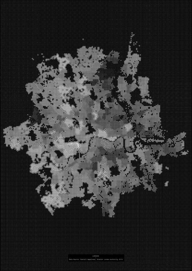
’Whether you’re into complex infrastructure or pub crawls, or see the city as a playground or a battleground,’ runs the remit, ’we challenge you to skew perspectives, distort to your reality and map to persuade.’ Pictured: Face37’s Happiness, London visualises the results of a survey held by the Greater London Authority, in which city residents were asked to assess their overall happiness
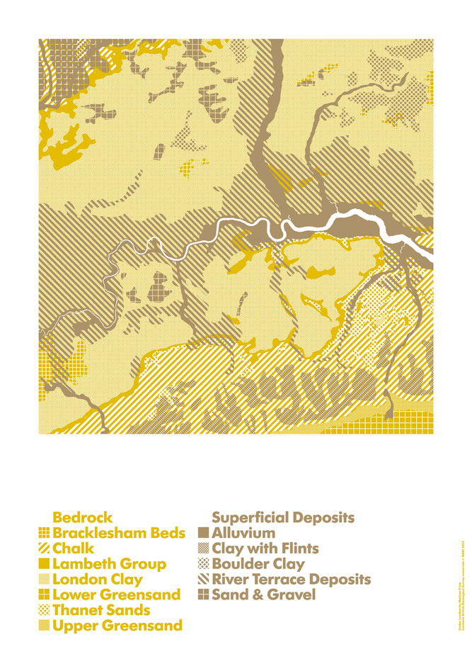
London is far from the globe’s oldest city but it’s a remarkable centre of historical, cultural and social significance feted by many and rarely surpassed – making it ripe for a project like this. Pictured: Melissa Price’s Under London, a Public Information-chanelling exposition of the city’s geological make-up
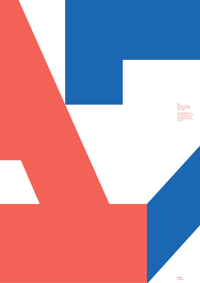
Each practice was required to create a single A1 sized artwork in two colours, to be printed on 270gsm paper (supplied by GF Smith, with no embossing) and verified by Peckham Print Studio. Pictured: Pentagram’s A–Z, a blown up reworking of the Geographer’s A–Z Map Company insignia
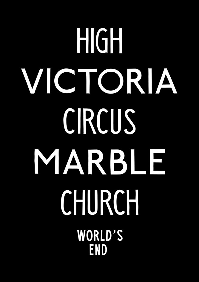
Each practice will keep a single copy, while the remaining ten will be sold, with profits being donated to Streets of London, a charity that raises money for homelessness work in the capital. Pictured: Studio Thomson’s World’s End, for which the practice took inspiration from retro Routemaster signage rolls, evoking emotions of being lost, learning and understanding

The designs will be on display as part of ’Co-Ordinates’, from 23–27 September at dn&co’s new Bermondsey gallery, Ground Floor Space. Pictured: The Entente’s Skewed, a representation ’of how we perceive London, its inhabitants and its patterns... We don’t identify it as a gridded or structured in terms of physicality, but how the city works’
INFORMATION
’Co-Ordinates’ will be on show from 23–27 September at Ground Floor Space. Imagery courtesy dn&co
ADDRESS
Ground Floor Space / dn&co
3 Tyers Gate
London, SE1 3HX
Wallpaper* Newsletter
Receive our daily digest of inspiration, escapism and design stories from around the world direct to your inbox.
Tom Howells is a London-based food journalist and editor. He’s written for Vogue, Waitrose Food, the Financial Times, The Fence, World of Interiors, Time Out and The Guardian, among others. His new book, An Opinionated Guide to London Wine, will be published by Hoxton Mini Press later this year.
-
 The Subaru Forester is the definition of unpretentious automotive design
It’s not exactly king of the crossovers, but the Subaru Forester e-Boxer is reliable, practical and great for keeping a low profile
By Jonathan Bell
-
 Sotheby’s is auctioning a rare Frank Lloyd Wright lamp – and it could fetch $5 million
The architect's ‘Double-Pedestal’ lamp, which was designed for the Dana House in 1903, is hitting the auction block 13 May at Sotheby's.
By Anna Solomon
-
 Naoto Fukasawa sparks children’s imaginations with play sculptures
The Japanese designer creates an intuitive series of bold play sculptures, designed to spark children’s desire to play without thinking
By Danielle Demetriou
-
 On the Isle of Man, the secret history of designer Archibald Knox is revealed
The mysterious life and works of local designer Archibald Knox is celebrated in a retrospective at Manx Museum, spanning silverware, furniture, clocks and more
By Emma O'Kelly
-
 Wedgwood’s AI tool lets the public reimagine Jasperware for its 250th anniversary
To celebrate 250 years of Jasperware, Wedgwood debuts an AI tool that opens up the design process to the public for the first time
By Ali Morris
-
 A new London show explores material magic with medieval melancholy
Inspired by deconsecrated monasteries, interior designer and curator Jermaine Gallacher takes us on a journey through time and mood in a London exhibition at The Ragged School
By Billie Muraben
-
 William Morris mania meets the design industry’s darker side in a new London show
‘Morris Mania’ at the William Morris Gallery explores the British designer’s complicated legacy in an ever-more commodified world
By Tianna Williams
-
 Reimagining remembrance: Urn Studios introduces artistic urns to the UK
Bridging the gap between art and memory, Urn Studios offers contemporary, handcrafted funeral urns designed to be proudly displayed
By Ali Morris
-
 Wallpaper* takes a turn around Somerset House for Collect 2025
Our round-up of the highlights from the 21st edition of the collectible craft and design fair in London
By Malaika Byng
-
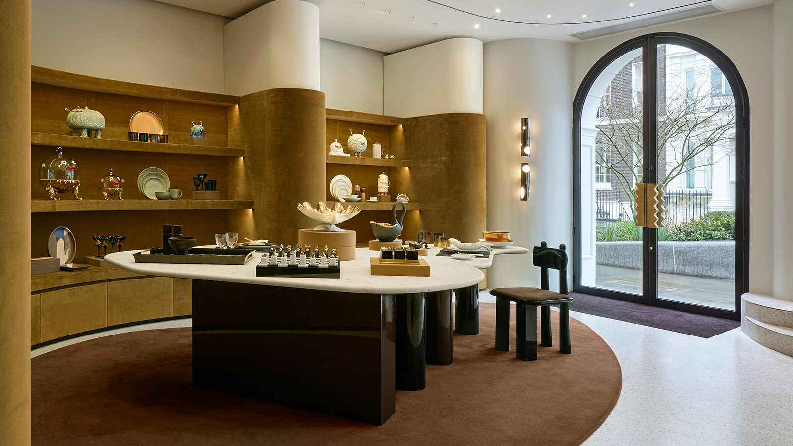 ‘It’s a museum-like jewel box’: L’Objet marks 20 years of elegant design with a new London flagship
Opening on 12 March 2025, L’Objet’s new London boutique is rich in chocolate colours and velvet detailing
By Tianna Williams
-
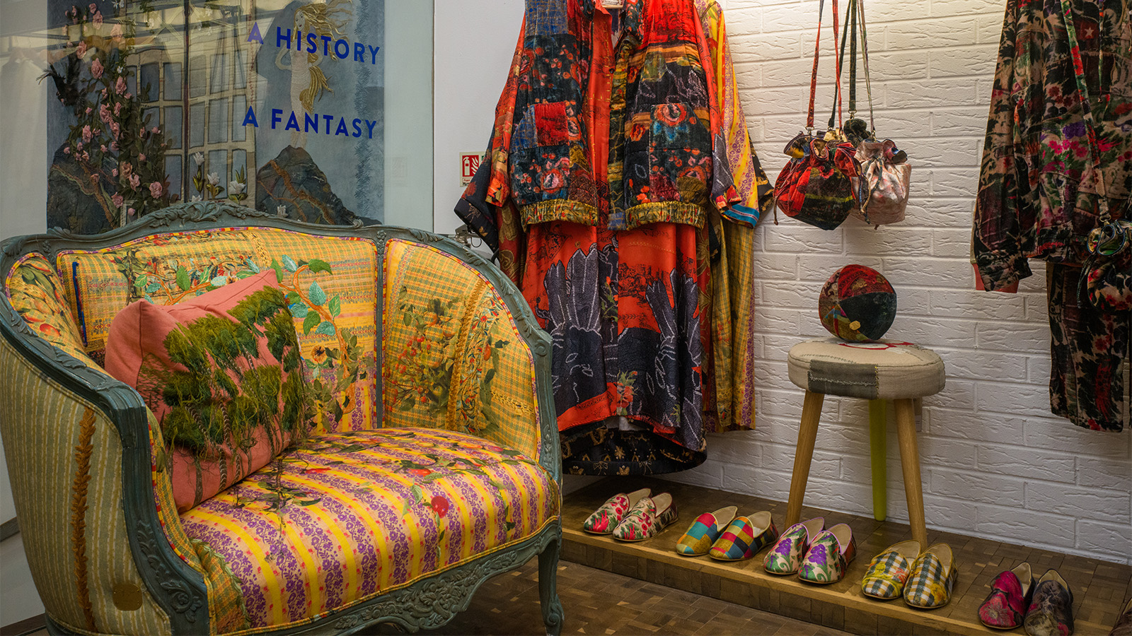 This Beirut design collective threads untold stories into upholstered antique furniture
Beirut-based Bokja opens a Notting Hill pop-up that's a temple to textiles, from upholstered furniture to embroidered cushions crafted by artisans (until 25 March 2025)
By Tianna Williams