Travel the globe through colour with Giulio Ridolfo
In a new tome, Materialising Colour, Journeys with Giulio Ridolfo, join the Italian colourist on his scenic journey through colour, joined by botanical photographer Howard Sooley and curator Jane Withers
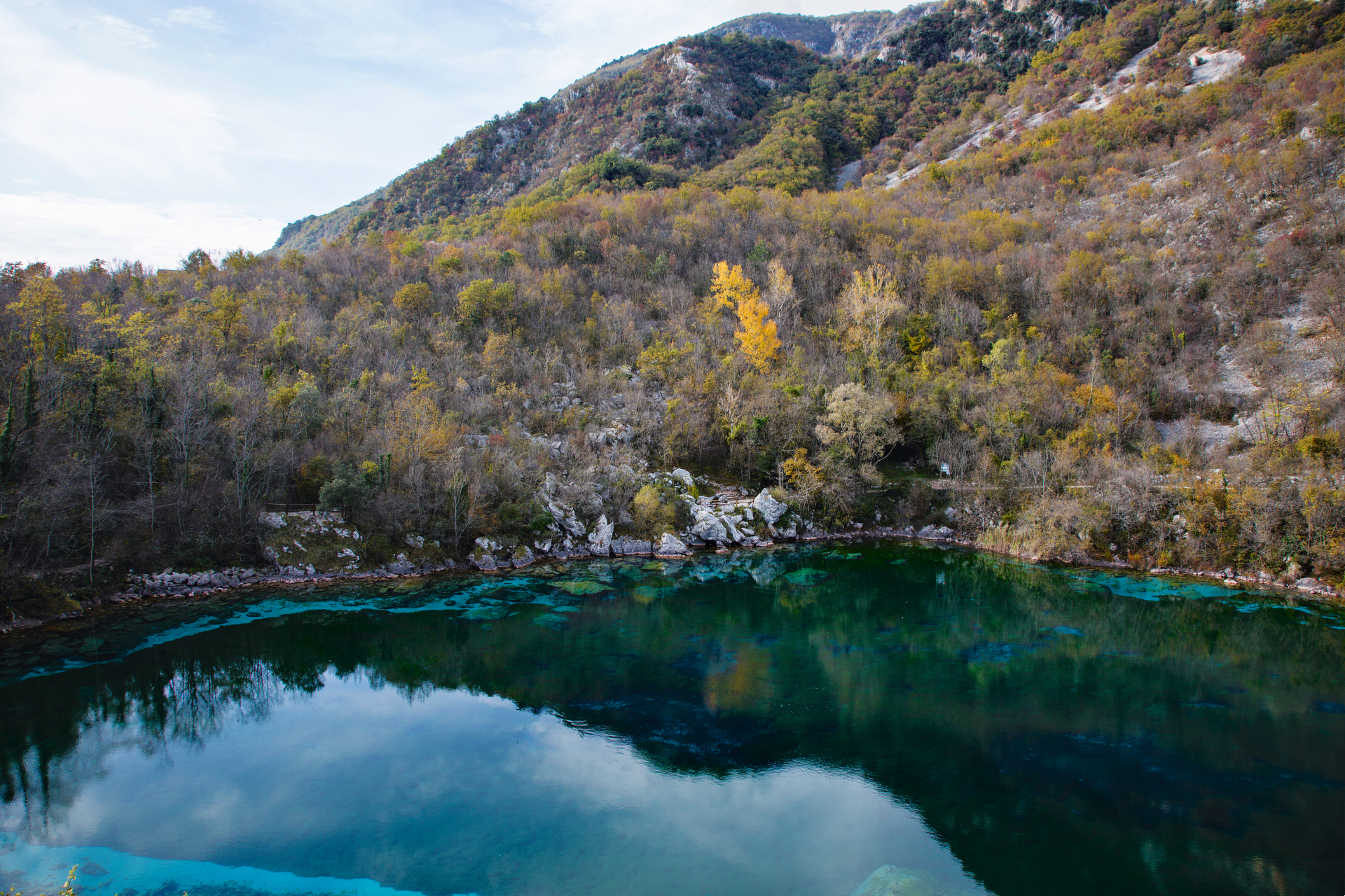
Howard Sooley - Photography
Giulio Ridolfo is the man behind some of the most successful textiles and chromatic palettes in contemporary interior design. The Italian colourist is the ultimate expert when it comes to colour, and his chromatic touch has been applied to furniture by brands such as of Moroso and Vitra, while his work for textile authority Kvadrat is legendary in the design world.
Now the Danish fabric company celebrates this colour legacy with a new design book. Published by Phaidon, Materialising Colour, Journeys with Giulio Ridolfo follows the designer through his travels to unpack his incredible colour sensibility. Botanical photographer Howard Sooley accompanied Ridolfo on his journeys to document the process, while curator Jane Withers wrote the stories behind the trips.
Giulio Ridolfo and Kvadrat
‘I first met Giulio in the early 1990s, in my early days at Kvadrat,’ says the company’s CEO, Anders Byriel. ‘I always looked forward to conversations with him because they were so broad-ranging: art, fashion, design, music, film, food. This expansive cultural perspective is deeply embedded in his work. The journeys recorded here illuminate his curiosity and experimentation with colour, and the search to understand context and give colour meaning. They also reveal the skill behind this singular vision.’
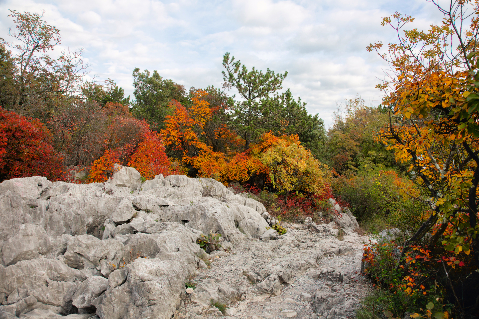
Journeys: Friulian Biotopes – A Journey in ‘a country of storms and primroses’ Day Four: Aurisina, Carso. Courtesy, Howard Sooley
It was Byriel who, several years ago, thought about documenting what he defined as one of design’s most important but undervalued aspects. This exclusive look at Ridolfo’s colour journeys is fascinating as it is intimate, as the designer takes us to in his native Friuli, Northern Italy, to the Danish coastline, and to Gujarat, western India, then back to Kvadrat’s manufacturing facilities to show us the textiles coming to life through colour. A final chapter explores his relationship with designer Patricia Urquiola and their shared views on the application of textiles ‘beyond living spaces’.
Giulio Ridolfo’s creative process
Sooley follows Ridolfo through these journeys, documenting his research into the meaning of colour, which is presented in both a compelling travel diary as well as through a series of compositions made from found objects, both natural and artificial. Four visual essays present an insight into Ridolfo’s approach, from the exploration of his surroundings to the collection of ordinary objects, which he then combines into striking compositions that become the starting point for each hue. These assemblages mark the start of a colour exercise for Ridolfo: multilayered, vibrant and alive, and his imaginative approach is based on observation of nature, experience and subjectivity.
In his work, Ridolfo eschews the more scientific routes of conventional colour theory, dubbing his own approach ‘homeopatic’. ‘Ridolfo uses colour and textiles to stimulate sensibilities and provoke moods, to evoke and celebrate a sense of place. His work is deeply rooted in observation, intuition, materiality, poetics and the mutability of the natural world,’ writes Withers. ‘One of his favourite sayings is ‘You can’t mix colour in theory’.’
Ridolfo studied fashion at Domus Academy in the 1980s, later setting up a fashion showroom in Udine. His fashion background is evident throughout his work, not only for his unique sensibility to colour, but also for his approach, describing the upholstery process as ‘dressing’ a design object to bring his personality to life.
Conversations with product designers usually start early in the creative process. ‘From the first sketches for a project, I analyse what kind of touch to give a chair or sofa. Is it woolly or leathery, soft or sharp or smooth? What textile would suit its shape, suit the body of a chair? A really good work is when you don’t distinguish textile from shape,’ he explains.
Wallpaper* Newsletter
Receive our daily digest of inspiration, escapism and design stories from around the world direct to your inbox.
Friuli-Venezia Giulia, Italy
The first journey, through the Friulian region, offers a glimpse into the influences that have shaped Ridolfo’s approach to colour from early on in his life. The subtle shades of the raw autumnal landscape, the region’s architecture and the local craftsmanship all play a part in this first colour story. ‘The colours are not so strong in Friuli. They are soft and rich,’ he says. ‘It is a region with no thrills or showy off-ness – it is rough and humble. But it has a richness from the land, from alluvial soil, and a balance that comes from doing the same thing for centuries.’
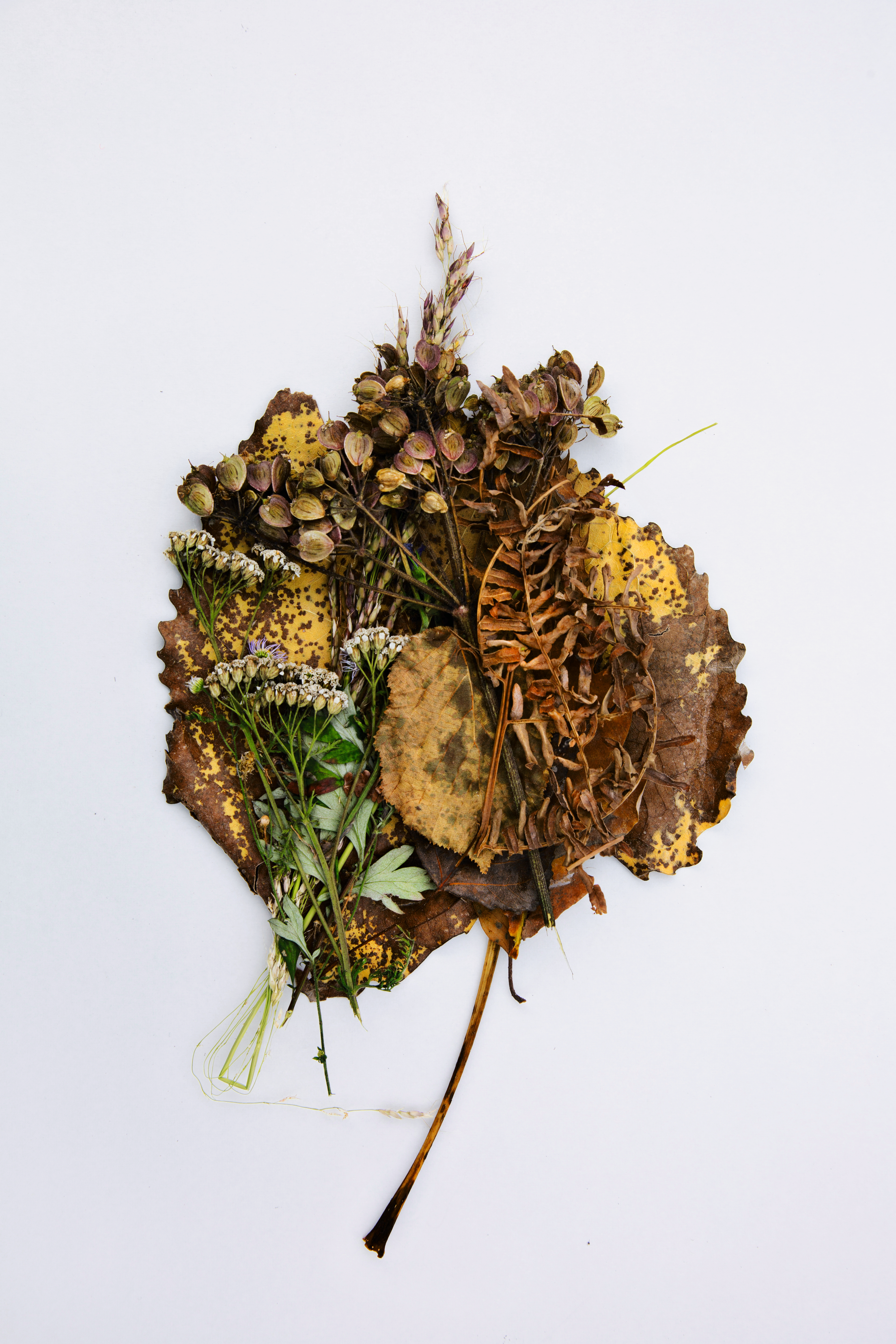
Journeys: Friulian Biotopes – A Journey in ‘a country of storms and primroses’: Day Five: Collio, Aquileia, Torviscosa. Courtesy and copyright Howard Sooley. The Collio carpet of colours includes wild fennel, fern and achillea, laid on a plane tree (Platanus) leaf
They travel through hills, mountains, lakes and rivers, to a disused marble quarry and to Italian writer Pierpaolo Pasolini’s hometown (his descriptions of light and colour have inspired Ridolfo since a young age). ‘On this journey into his origins […] it is as if Ridolfo is signing postcards to send us as gifts, mingling cultural influences with echoes of the past,’ writes Udine-based writer and curator Elena Commessatti.
Jutland, Denmark
The second trip takes Ridolfo and Sooley to Ebeltoft, where the designer is holding a workshop at Kvadrat’s headquarters to work on the Steelcut Trio textile range. Ridolfo chose to visit in the summer when, Withers writes, he finds the light to be the most characteristic of the company’s Nordic design heritage. The designer brings in found objects and inspirations, and mixes them with the grays and blues from the sea and sky into a moodboard that defines his preferred atmosphere: a process that will look fascinating to any colour enthusiast.
While I have some idea of how colours might interact, you can never be sure how the colours will work together until you see them woven
Gujarat, India
When following Ridolfo through his journey into the land of Indigo, the book goes into delightful detail describing different indigo dyeing techniques, with visual reportages of Ridolfo’s visit to specialised workshops. The designer visits the region to explore the blue palette right where it originated. It’s a trip with ultimately a commercial goal in mind: expanding his Remix family of textiles for Kvadrat, starting from the colour blue. But there is nothing commercial about the journey: it is very much Ridolfo’s personal immersion into the colour and its origins, and a fitting demonstration of his unique approach to the craft. In Gujarat, he also experiments with other complementary colours, creating a palette of warm tones drawn from insects, marigold, turmeric, pomegranate and tamarind.
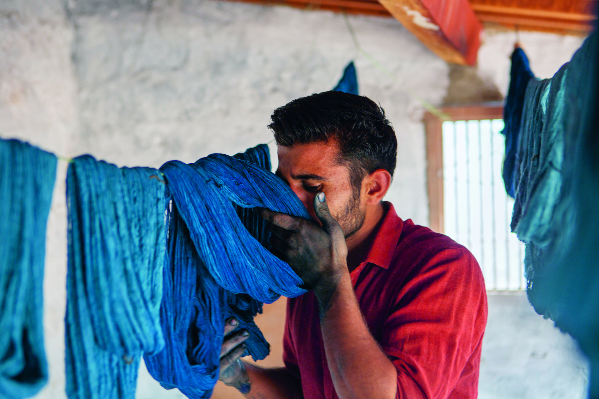
Journeys: India, Indigo – Revisiting the Ancient Art of Indigo: Natural Indigo. Dyeing in Bhujodi: at the workshop of master weaver Shamji Vankar Vishram. Bhujodi, Gujarat. Courtesy, Howard Sooley
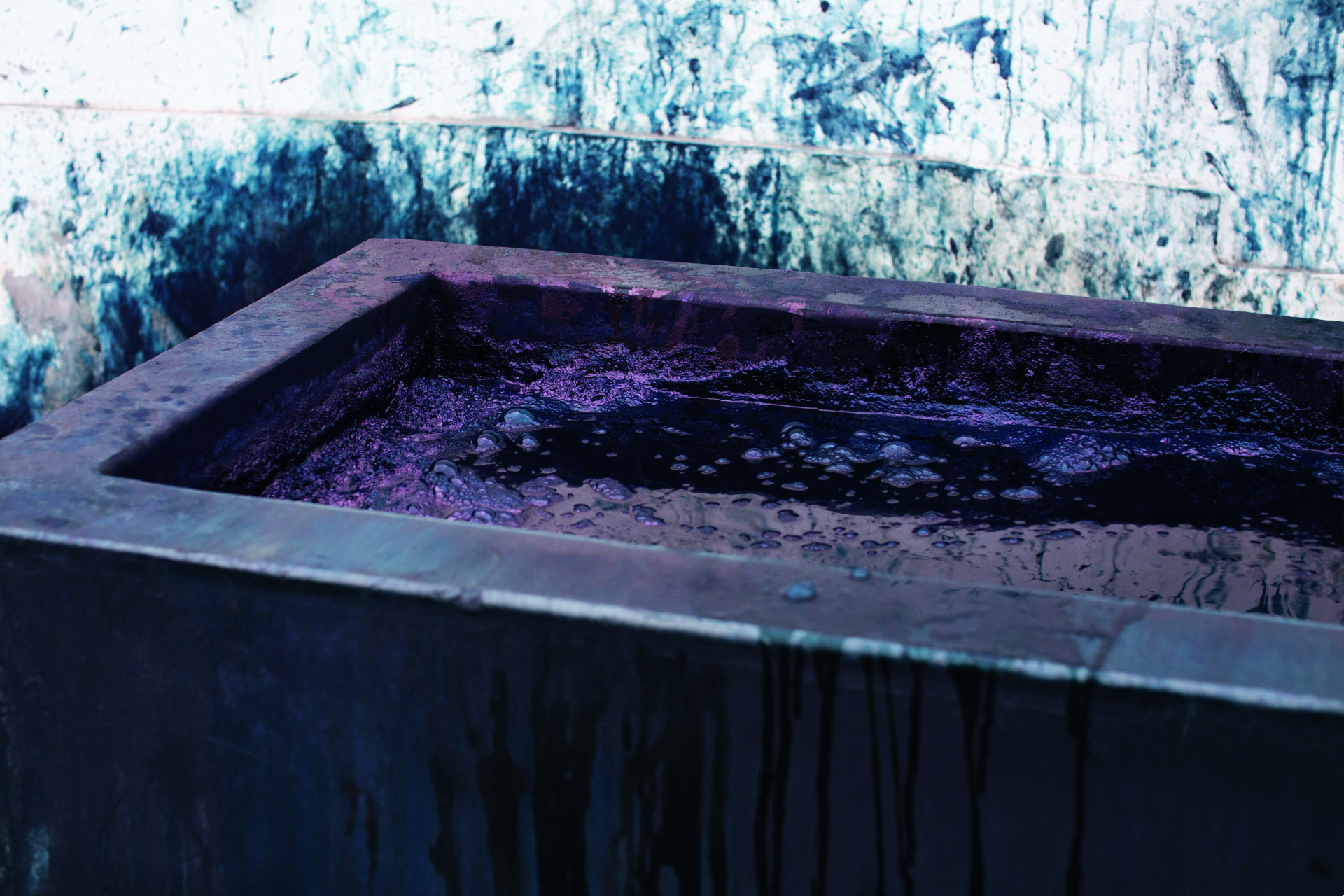
Journeys: India, Indigo – Revisiting the Ancient Art of Indigo: at Dr Khatri’s Workshop in Ajrakhpur.
The indigo journey ends in Huddersfield, West Yorkshire, where Ridolfo visits Kvadrat’s textile mill to work on the colour range for the Remix series. The tome takes us through the more developmental steps of the palette created in collaboration with Kvadrat’s art director, Stine Find Osther, offering a 360 degree view of Ridolfo’s process. It’s a fascinating succession – from the raw energy of the Gujarati workshops and the inspirations found along the way to the precise scientific processes in the labs – a contrast that highlights Ridolfo’s ability to operate between worlds to achieve his palettes.
Pale Shelter – Giulio Ridolfo with Patricia Urquiola and Patrizia Moroso
The final chapter in the book describes an installation staged in the woods close to the home of Patrizia Moroso, made up of insect-like shapes inspired by nomadic settlements and high performance sports equipment. The installation features shapes made from camping structures covered in Kvadrat textiles designed by Ridolfo and Urquiola and assembled in Moroso’s workshop nearby, resulting in an exploration on on nomadic habitation and how colour and textiles can become inhabitable space. As one expects from this creative group, inspirations came from incredibly diverse places, from Alberto Giacometti’s slim figures to butterfly wings.
Appendix
Usually often overlooked section, the appendix here serves as an arbitrary ‘A–Z of Colour’ and features some essential colours explained, as well as the most pivotal moments in colour history according to Ridolfo. The alphabetic index ranges from David Bowie’s Ziggy Stardust (‘a kaleidoscopic cartoon of colour’, wrote a 1971 review), to flags and fluorescence. It is also illustrated with squares of colours re-named by the designer, from ‘The Saddest Maroon’ (his name for a very specific shade of brown) to ‘Dense Non Sense Yellow’ (the colour of kiwifruit). With its gastronomic references (‘Prosciutto Melted Pink’ and ‘Pasta e Piselli Green’, for example), this section is a delight to get lost into.
You can’t mix colour in theory
Ridolfo’s no-rules approach comes through as a perfect combination of informed and impulsive. ‘It’s more interesting to find order in the disorder, spontaneity, the mix of wildness and control, the play of opposites,’ he notes.
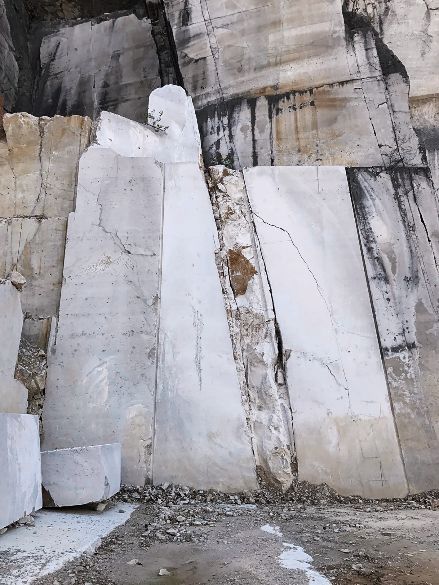
Journeys: Friulian Biotopes – A Journey in ‘a country of storms and primroses.’ Day Four: Aurisina, Carso. Courtesy: Howard Sooley
‘Giulio has been rewriting the alphabet of colours for years, with courageous liberty, and independence,’ adds Commessatti – two characteristics which are well exemplified throughout the pages. ‘Materialising Colour gives an insight into Giulio’s extraordinarily personal colour methodology,’ writes Byriel. ‘But I hope it will also inspire other designers to discover their own colour journey’.
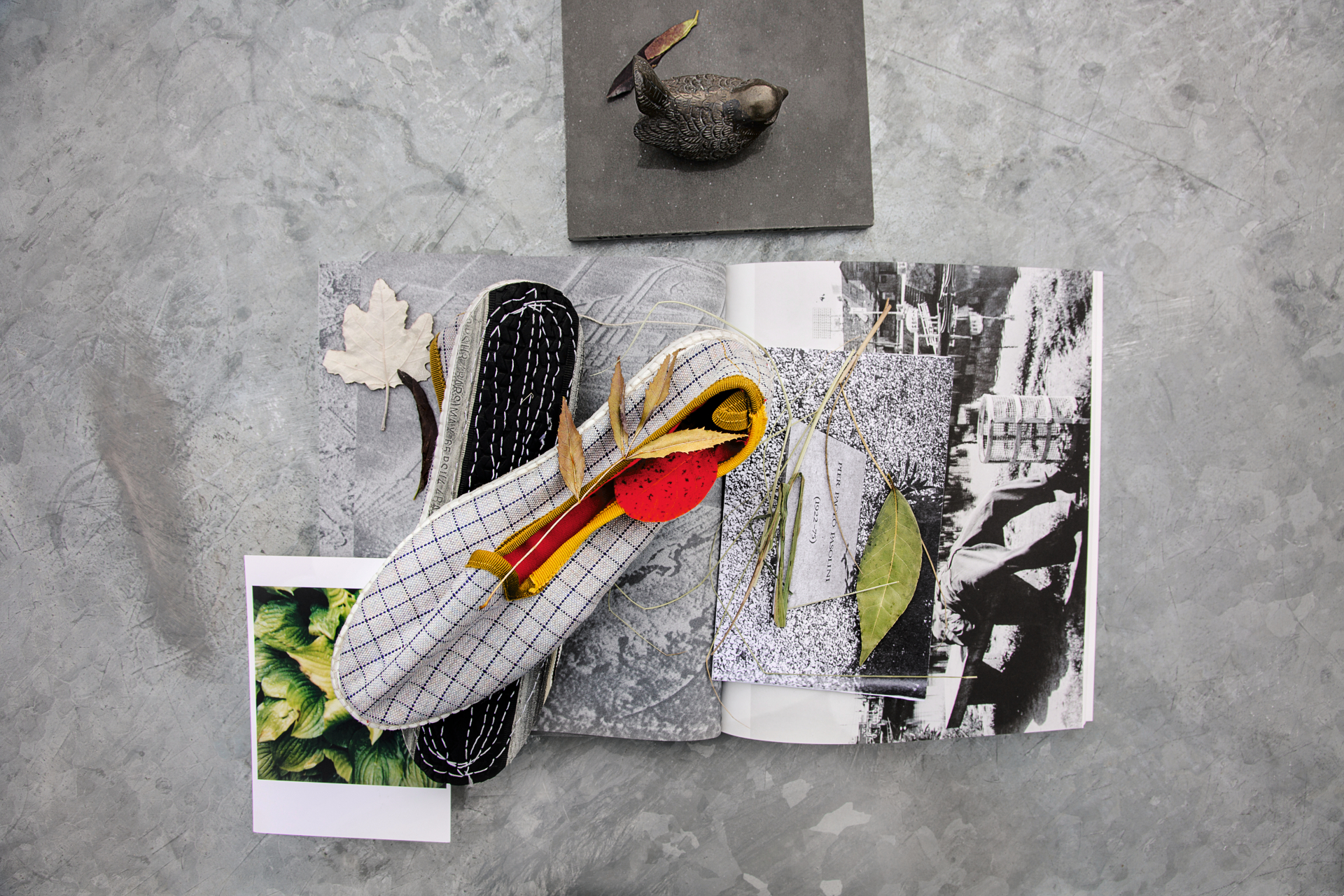
Journeys: Translating Colour – from Craft to Industry: Dyeing in the Lab.

Journeys: Friulian Biotopes – A Journey in ‘a country of storms and primroses’: Day Four: Aurisina, Carso.
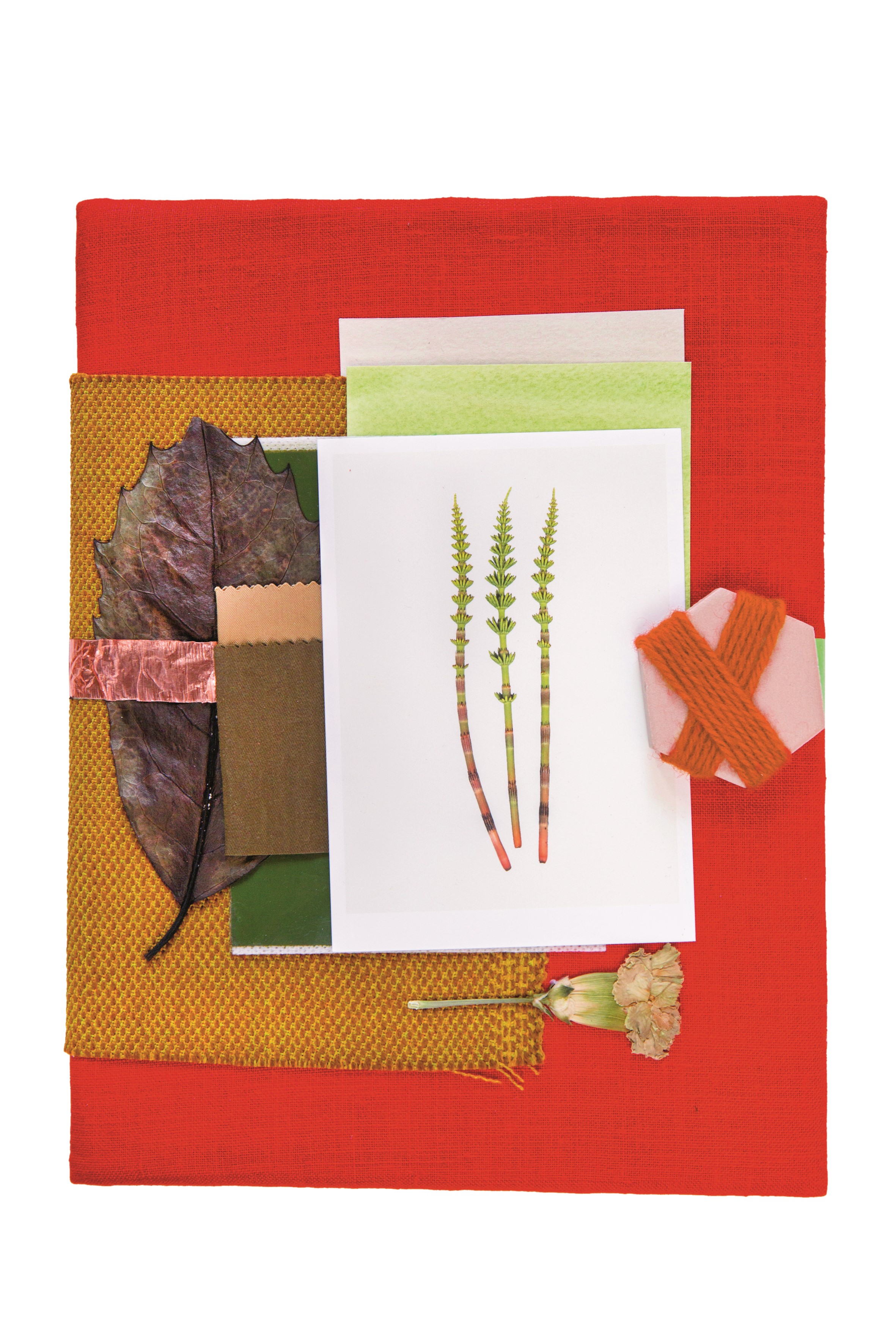
Journeys: Friulian Biotopes – A Journey in ‘a country of storms and primroses’: Day Five: Collio, Aquileia, Torviscosa: mood board by Giulio Ridolfo, for Collio collection of carpets
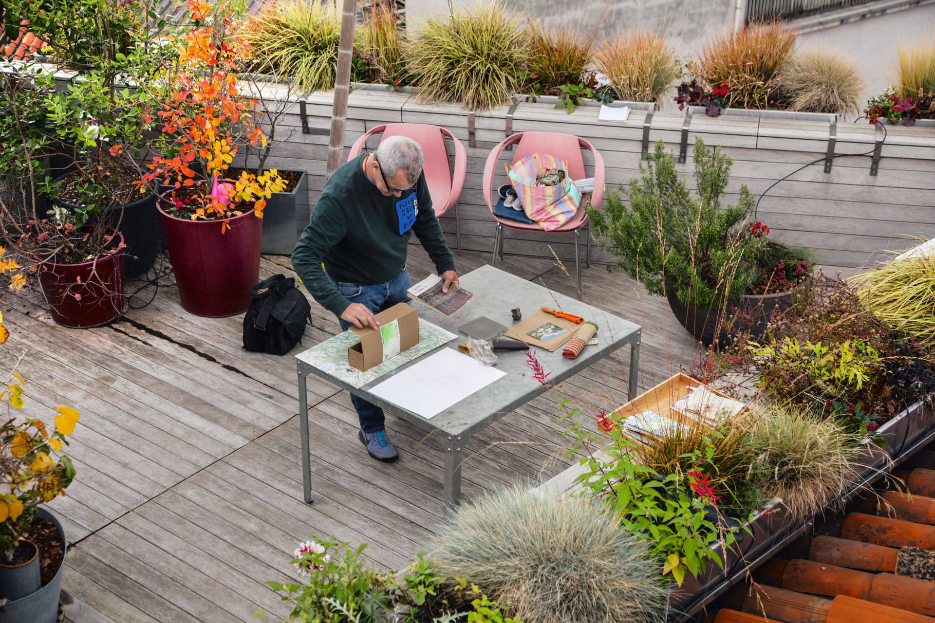
Giulio Ridolfo in Udine
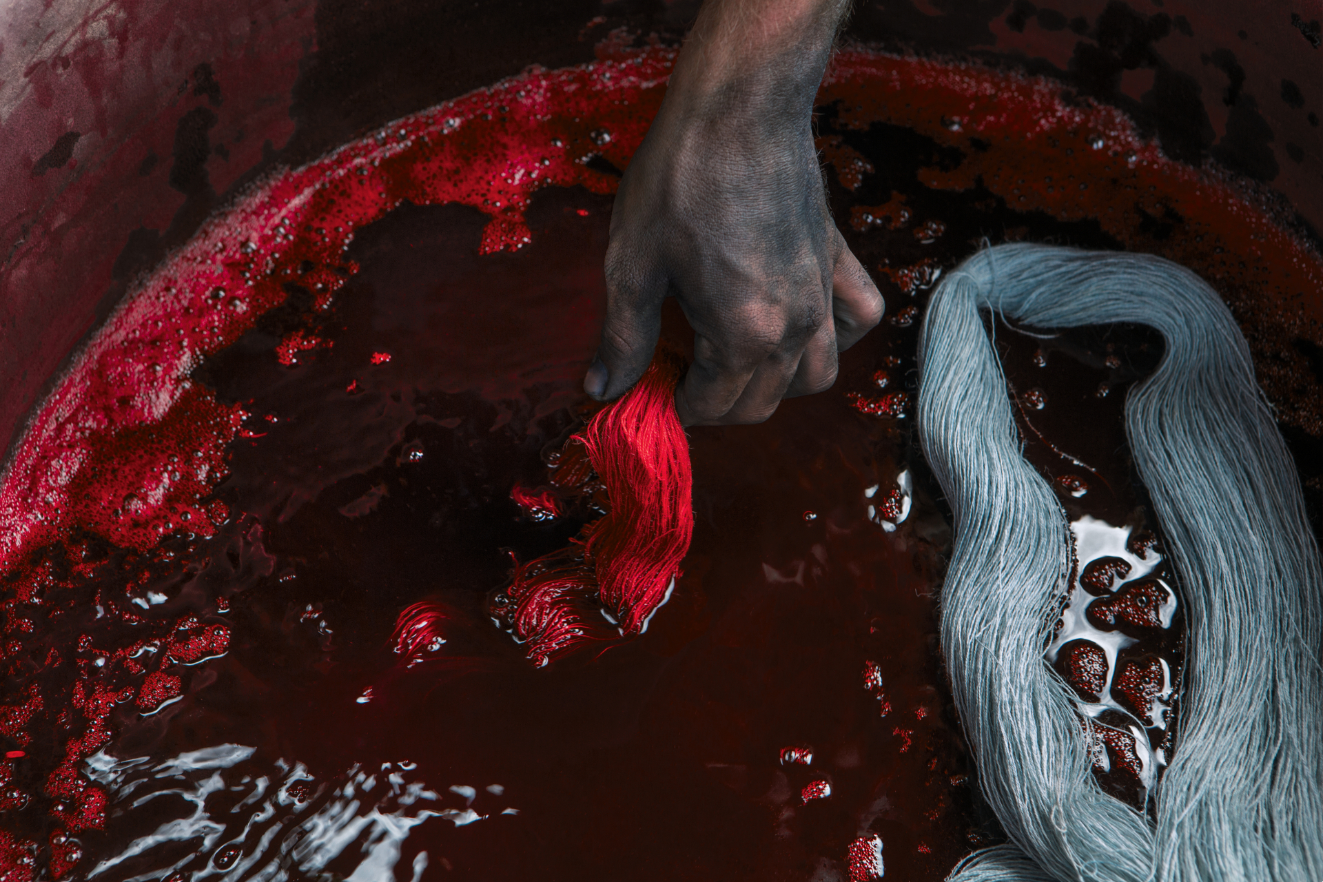
Journeys: India, Indigo – Revisiting the Ancient Art of Indigo: Natural Indigo Dyeing in Bhujodi: at the workshop of master weaver Shamji Vankar Vishram, Bhujodi, Gujarat
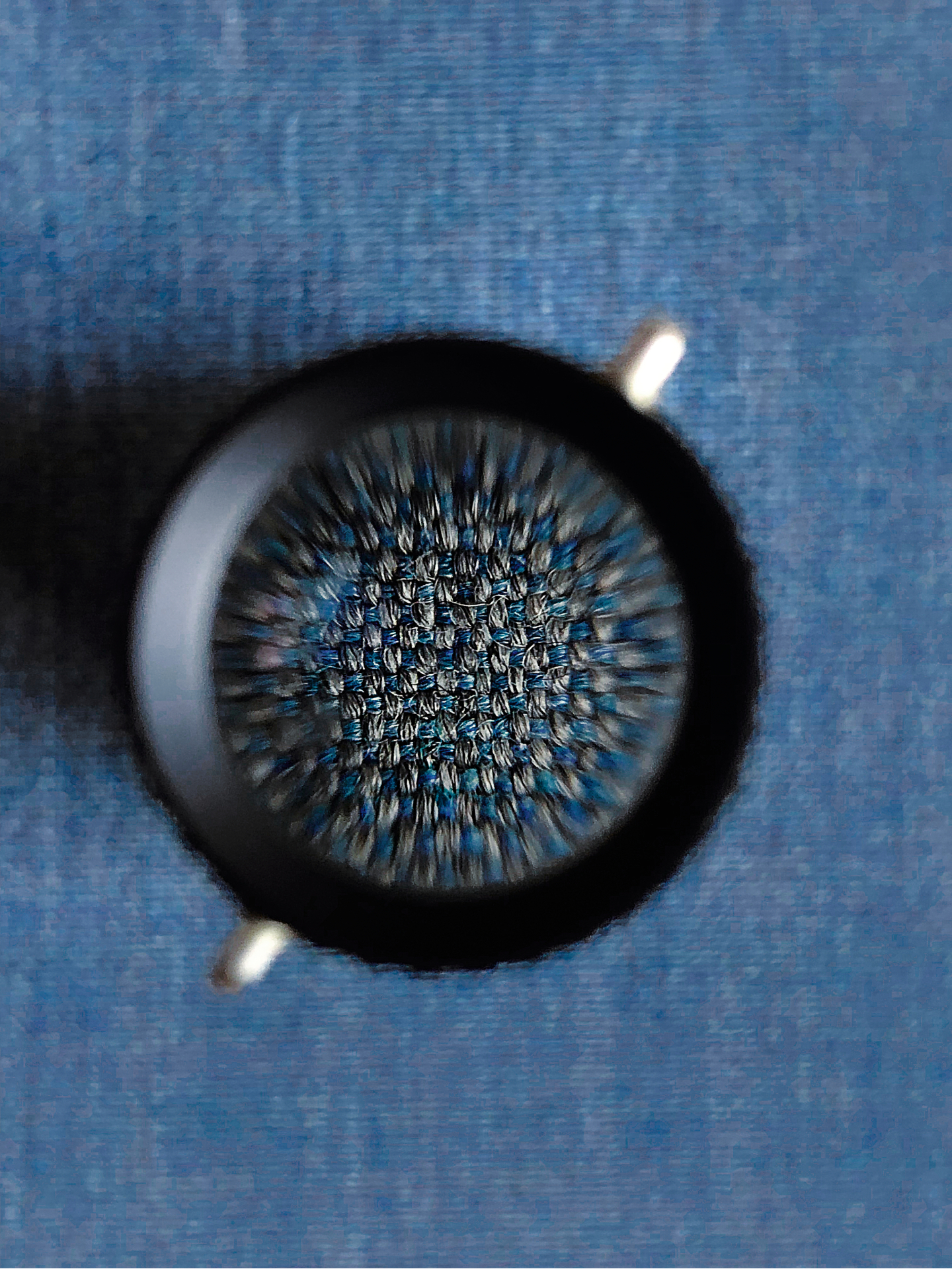
Journeys: Translating Colour – from Craft to Industry: Remix Refreshed: detail, showing subtly irregular shading
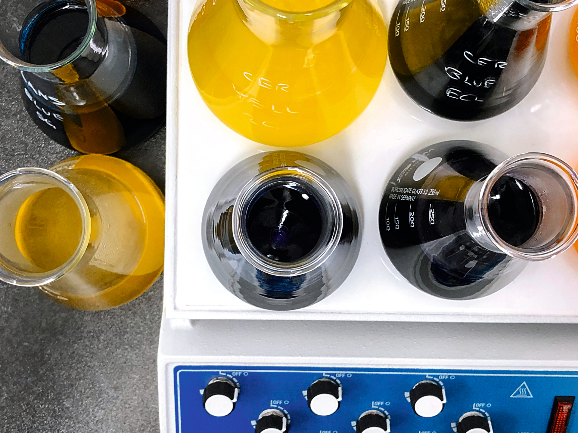
Journeys: Translating Colour – from Craft to Industry: Dyeing in the Lab
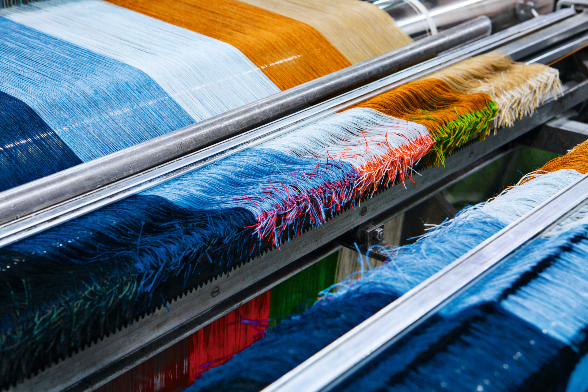
Journeys: Translating Colour – from Craft to Industry: Indigo Remixed: test yarns
INFORMATION
Materialising Colour: Journeys with Giulio Ridolfo, £59.95, published by Phaidon
phaidon.com
Rosa Bertoli was born in Udine, Italy, and now lives in London. Since 2014, she has been the Design Editor of Wallpaper*, where she oversees design content for the print and online editions, as well as special editorial projects. Through her role at Wallpaper*, she has written extensively about all areas of design. Rosa has been speaker and moderator for various design talks and conferences including London Craft Week, Maison & Objet, The Italian Cultural Institute (London), Clippings, Zaha Hadid Design, Kartell and Frieze Art Fair. Rosa has been on judging panels for the Chart Architecture Award, the Dutch Design Awards and the DesignGuild Marks. She has written for numerous English and Italian language publications, and worked as a content and communication consultant for fashion and design brands.
-
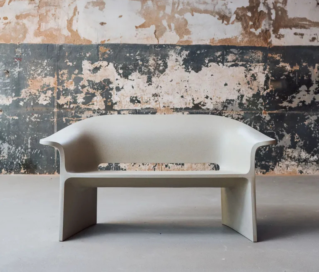 This bench was designed to live forever
Designer Tomek Rygalik launches Loope, a furniture company with radical circularity at its heart.
By Ifeoluwa Adedeji Published
-
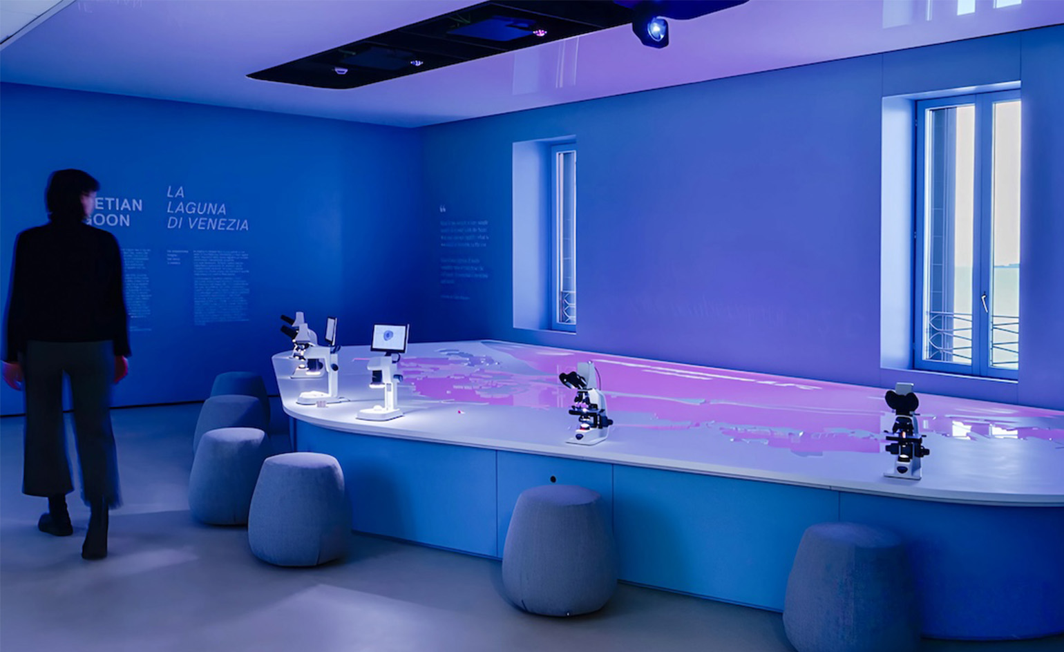 Prada opens Sea Beyond, a new centre for ocean education in the Venetian Lagoon
Created in partnership with UNESCO-IOC and designed by Carlo Ratti, the centre marks the first educational space of its kind in Italy
By Laura May Todd Published
-
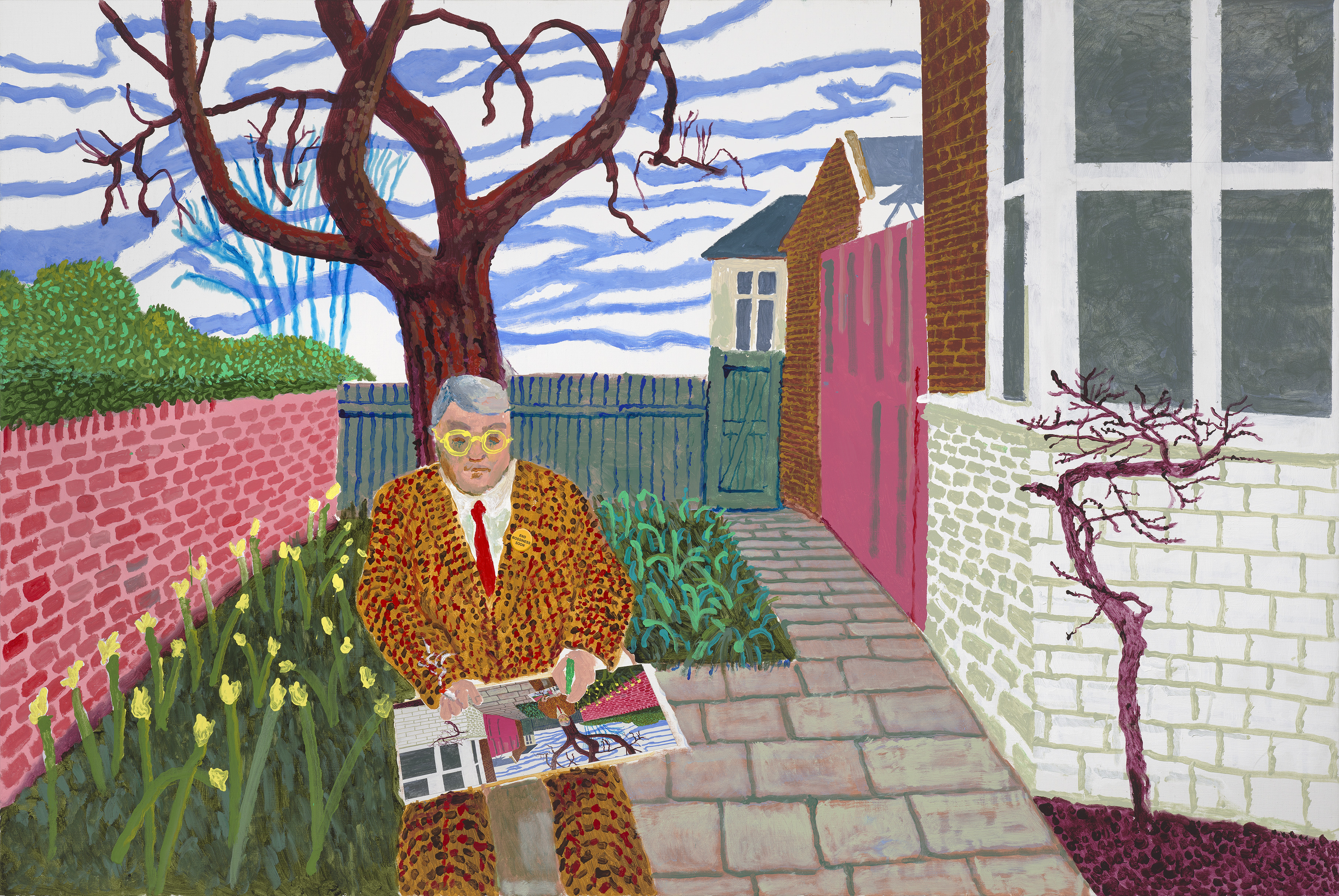 ‘David Hockney 25’: inside the artist’s blockbuster Paris show
‘David Hockney 25’ opens 9 April at Fondation Louis Vuitton in Paris. Wallpaper’s Hannah Silver soaked up the resolute, colourful homage to the brilliant relentlessness of life
By Hannah Silver Published
-
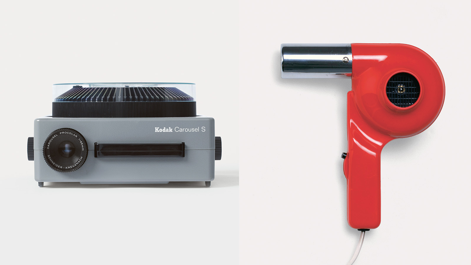 Masters of midcentury modern design and their creations spotlighted in new book
‘Mid-Century Modern Designers’ is a new book from Phaidon celebrating those who shaped the period and their notable creations, from furniture to objects
By Tianna Williams Published
-
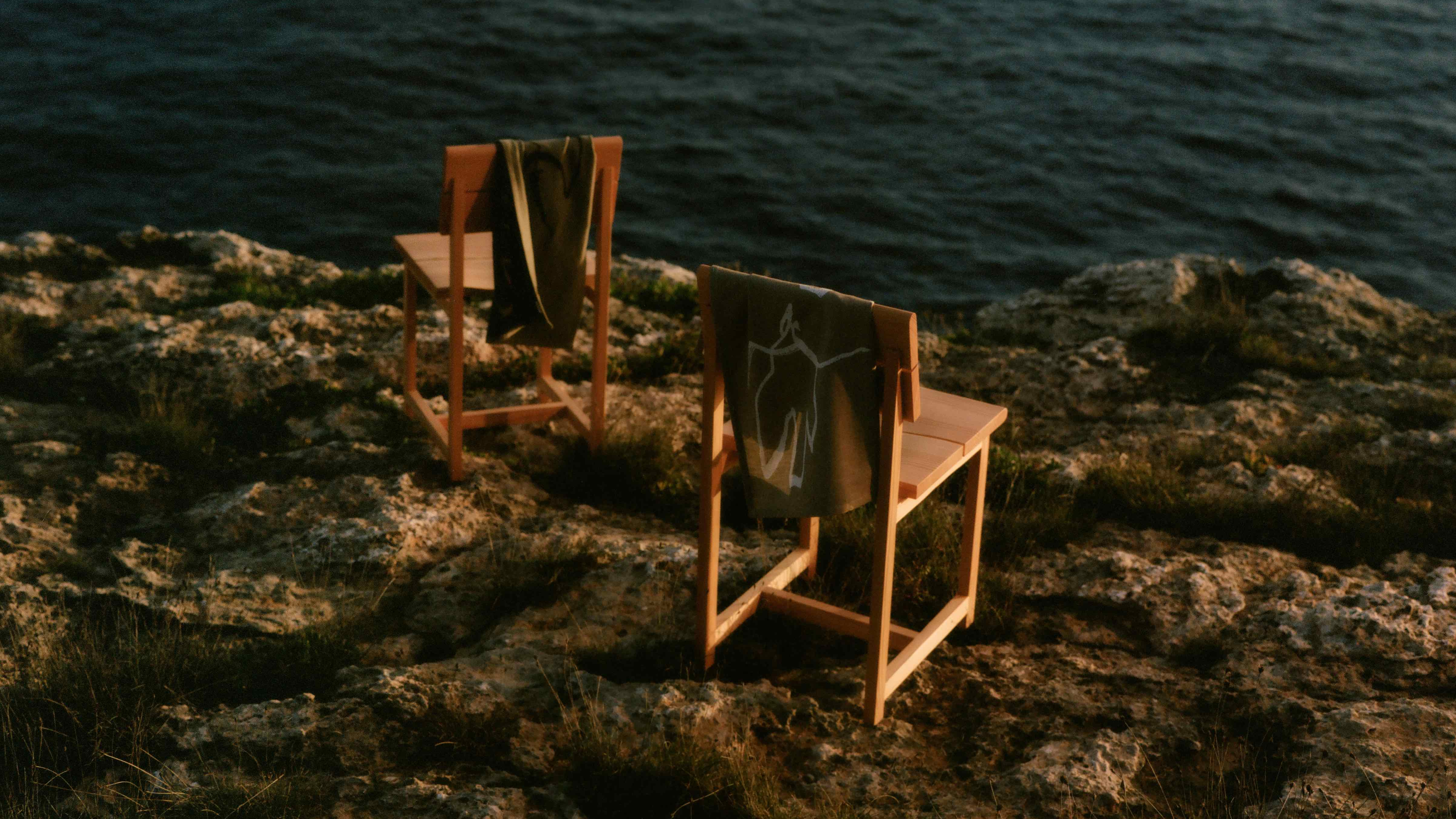 Meditations on Can Lis: Ferm Living unveils designs inspired by Jørn Utzon’s Mallorcan home
Ferm Living’s S/S 2025 collection of furniture and home accessories balances Danish rationality with the elemental textures of Mallorcan craft
By Ali Morris Published
-
 Rooms with a view: a new book celebrates the Italian approach to interior design
Laura May Todd's survey of Italian interiors is the perfect antidote to January gloom, taking a look inside 50 distinctive Italian homes
By Ali Morris Published
-
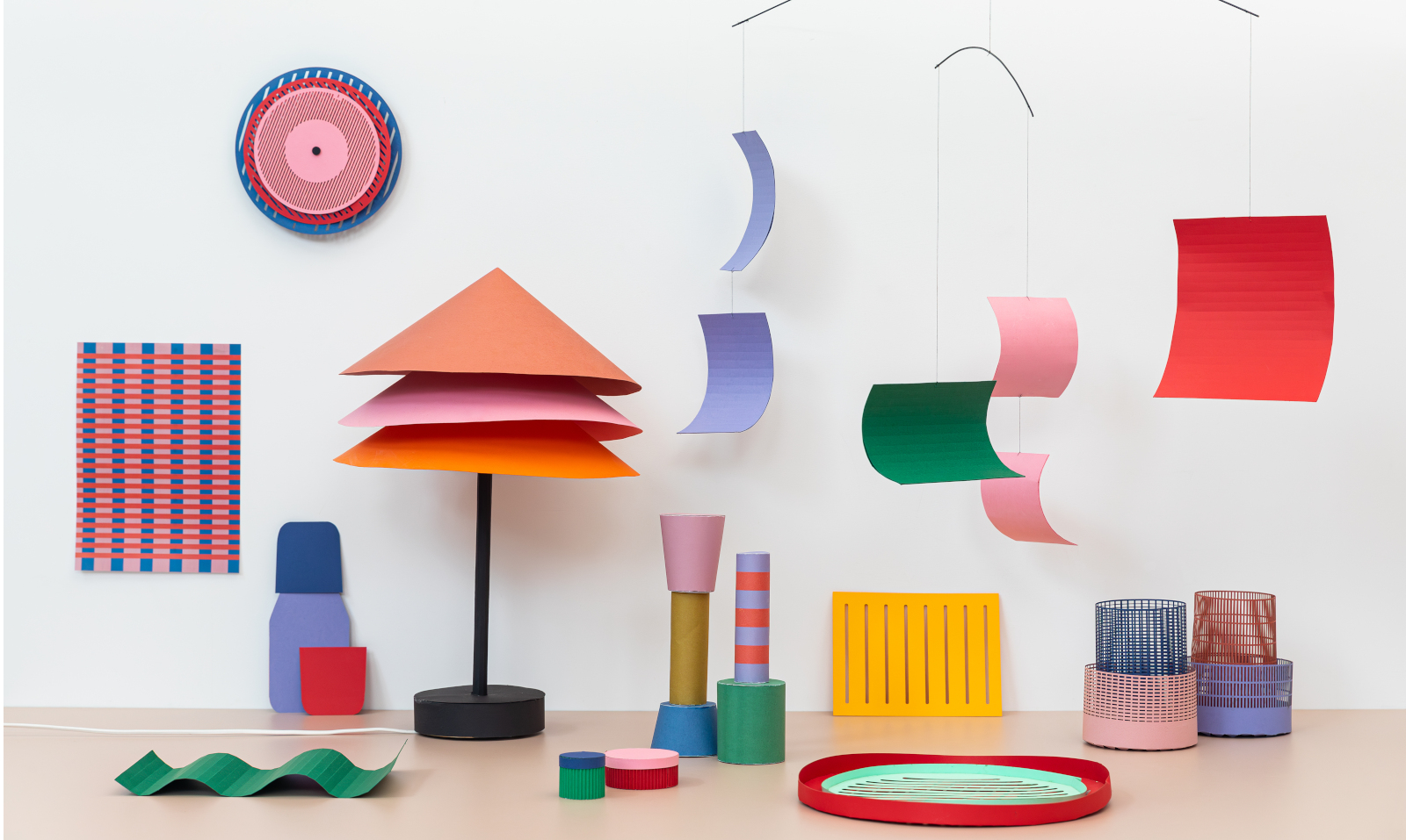 Year in review: top 10 design stories of 2024
Wallpaper* magazine's 10 most-read design stories of 2024 whisk us from fun Ikea pieces to the man who designed the Paris Olympics, and 50 years of the Rubik's Cube
By Tianna Williams Published
-
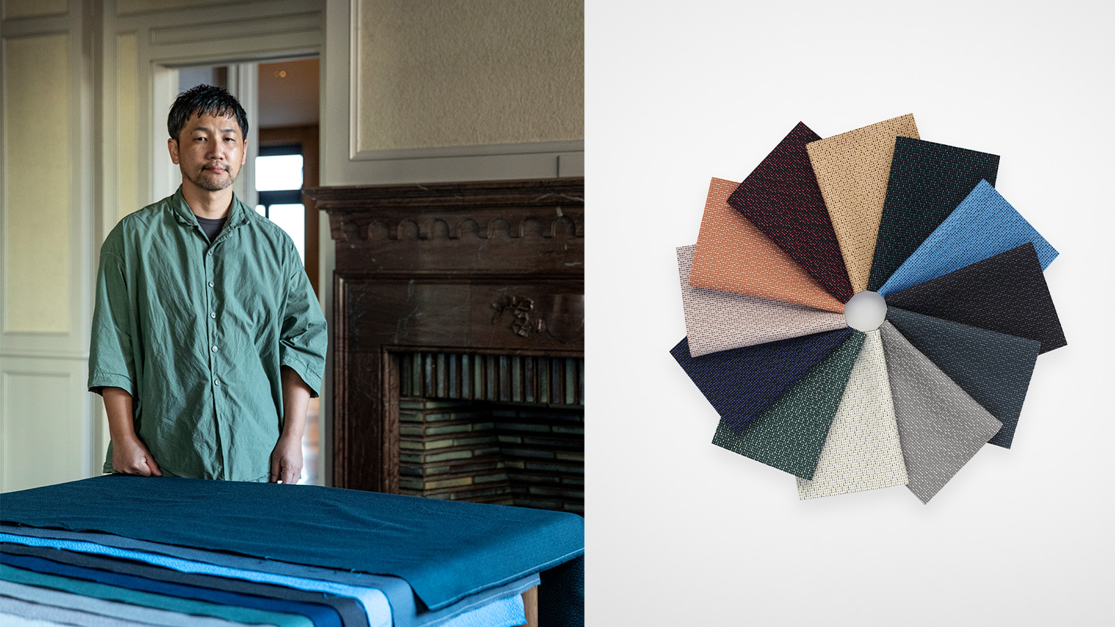 Teruhiro Yanagihara's new textile for Kvadrat boasts a rhythmic design reimagining Japanese handsewing techniques
‘Ame’ designed by Teruhiro Yanagihara for Danish brand Kvadrat is its first ‘textile-to-textile’ product, made entirely of polyester recycled from fabric waste. The Japanese designer tells us more
By Danielle Demetriou Published
-
 Discover the alchemy of American artists Philip and Kelvin LaVerne
The work of Philip and Kelvin LaVerne, prized by collectors of 20th-century American art, is the subject of a new book by gallerist Evan Lobel; he tells us more
By Léa Teuscher Published
-
 20 pairs of bookends celebrate contemporary Scottish design and Dundee’s literary heritage
As Dundee Design Week gets ready for its fifth edition, a bookish commission shines a light on two pioneering female journalists from the city’s storied past
By Alyn Griffiths Published
-
 ‘You’ve got to hang out with Judd furniture… you learn something’: Rainer Judd
As new book ‘Donald Judd Furniture’ lands, the artist’s children Rainer and Flavin discuss their father’s legacy
By Diana Budds Published