Doctor’s orders: graphic design is good for you, reflects a new London show
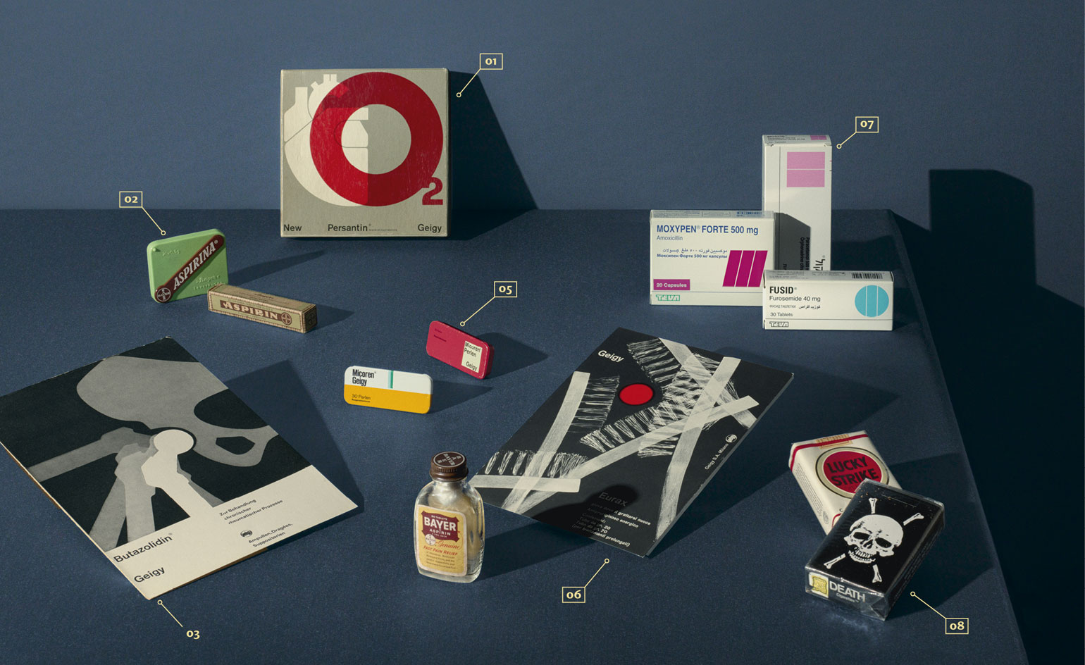
There isn’t a catch-all response to the question posed by the Wellcome Collection’s new exhibition, ‘Can Graphic Design Save Your Life?’ The answer, as curator Lucienne Roberts has discovered after several years of sifting through the archives, is contradictory to say the least. As co-founder, with Rebecca Wright, of GraphicDesign&, a publishing house that explores graphic design’s social role, Roberts has long been interested in ‘demonstrating the value’ of the discipline. ‘There are very few subjects that are as essential as health,’ she says. ‘We knew the pharmaceutical industry was a really rich area to explore. It lends itself to quite a minimal, abstract approach.’
Drawing on Wellcome’s own massive collection, as well as loans from companies and individuals, Roberts worked with Jason Holley and Satoshi Isono of Universal Design Studio to shape the exhibition. ‘We looked at it as a graphic space,’ says Holley, ‘using composition, architecture, colour and iconography.’ From the (freshly fashionable) hospital pastel colour scheme to a sprinkling of supergraphics and a clutch of totemic forms (cigarette, cross, warning triangle and question mark), the stage is set for hundreds of items that chart our relationship with the desires, demands and dictates of buying, selling and applying healthcare.
The exhibition begins with the cross, crescent and crystal, the three symbols of the International Red Cross movement. ‘These are powerful emblems,’ says Roberts, ‘so it’s a good way of introducing graphic design to a non-graphic audience.’ The juxtaposition with Raymond Loewy’s Lucky Strike cigarette packaging is stark; the show’s ‘Persuasion’ section lays bare the creative battles that still rage between pro- and anti-smoking lobbies. The undeniable bursts of creativity and visual allure of the former (think Saatchi & Saatchi’s Silk Cut) have given health campaigners an unenviable uphill task. Ironically, in recent years designers have also explored the simplicity and discipline of ‘unbranded’ cigarette packaging.

Universal Design Studio’s model for the exhibition, with graphic symbols as sets for themed sections
- Education: modernism deployed to inform consumers and promote health
- Hospitalisation: the art and design of treatment and recuperation
- Medication: the role of design in building brands and selling drugs
- Contagion: a warning triangle to explore safety and security
- Provocation: design with a conscience, aiming to reshape attitudes
- Persuasion: a cigarette shaped display infers the power of design
Drug packaging has long provided artistic inspiration. Bayer, the German chemical multinational, pioneered stamping its logo on the pills themselves at the turn of the century, giving Aspirin, its new miracle drug, a distinct, inimitable style. From the 1920s and 1930s onwards, the psychology of health and healing and the vast amount of new drugs on the market transformed packaging design. The show’s ‘Medication’ section revels in these crisply medicinal corporate identities, annual reports, packets and posters from companies including Bayer, Geigy, Teva and more.
Other key pieces include a classic French pharmacy sign, with its flashing green patterns reprogrammed to display the name of the exhibition, and the ‘Battenberg’ markings from the side of a British ambulance, which form a ghostly imprint of the vehicle on the gallery wall. The signage throughout is set in New Rail Alphabet, the Margaret Calvert-designed typeface that was the default option for the NHS for many years.
Designing for healthcare ticks all the boxes for the socially conscious designer – it seeks to arrest, inform and ultimately change behaviour. Roberts cites Ken Garland’s 1964 ‘First Things First’ manifesto, an influential attempt to create a moral framework for graphic design’s ample powers of persuasion. The show’s ‘Contagion’ and ‘Provocation’ displays demonstrate how vital visual communication is and how impactful health propaganda can be (the 1980s Aids ‘gravestone’ advert, included in the exhibition, is a totemic and ominous item for those who recall it).
The exhibition name is repeated, plastered across the gallery walls. ‘It is a provocative title and we wanted to maximise it,’ Roberts says. As with all the best medical messaging, it lingers in the mind long after the last pill has been popped.
As originally featured in the October 2017 issue of Wallpaper* (W*223) – on newsstands 15 September
INFORMATION
‘Can Graphic Design Save Your Life?’ is on view until 14 January 2018. For more information, visit the Wellcome Collection website
ADDRESS
Wellcome Collection
183 Euston Road
London NW1 2BE
Wallpaper* Newsletter
Receive our daily digest of inspiration, escapism and design stories from around the world direct to your inbox.
Jonathan Bell has written for Wallpaper* magazine since 1999, covering everything from architecture and transport design to books, tech and graphic design. He is now the magazine’s Transport and Technology Editor. Jonathan has written and edited 15 books, including Concept Car Design, 21st Century House, and The New Modern House. He is also the host of Wallpaper’s first podcast.
-
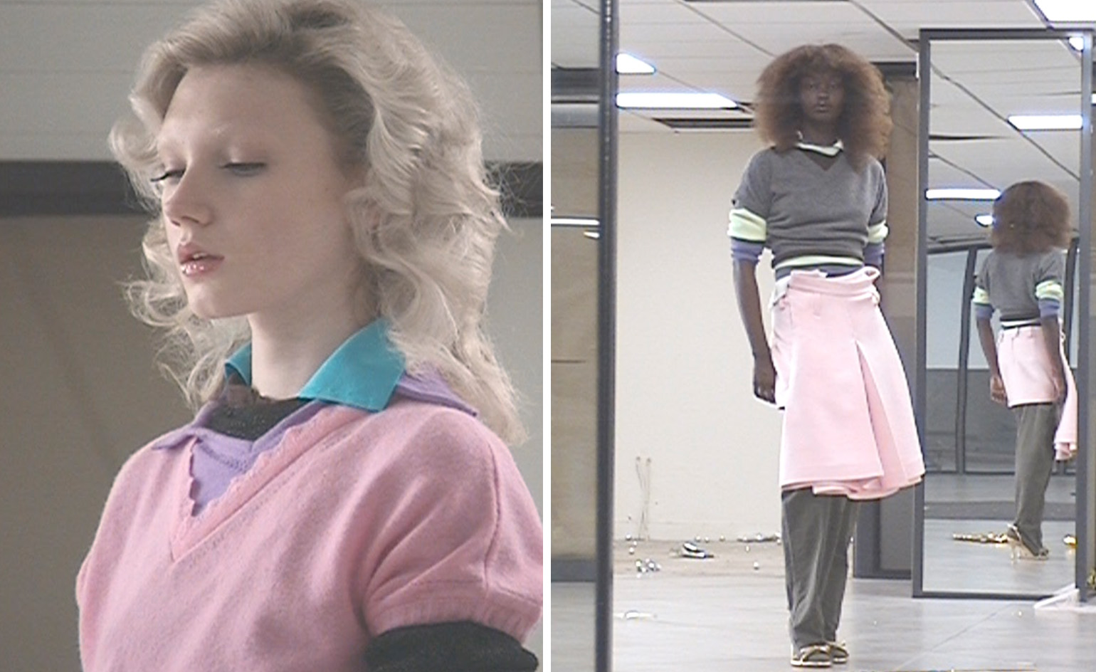 All-In is the Paris-based label making full-force fashion for main character dressing
Part of our monthly Uprising series, Wallpaper* meets Benjamin Barron and Bror August Vestbø of All-In, the LVMH Prize-nominated label which bases its collections on a riotous cast of characters – real and imagined
By Orla Brennan
-
 Maserati joins forces with Giorgetti for a turbo-charged relationship
Announcing their marriage during Milan Design Week, the brands unveiled a collection, a car and a long term commitment
By Hugo Macdonald
-
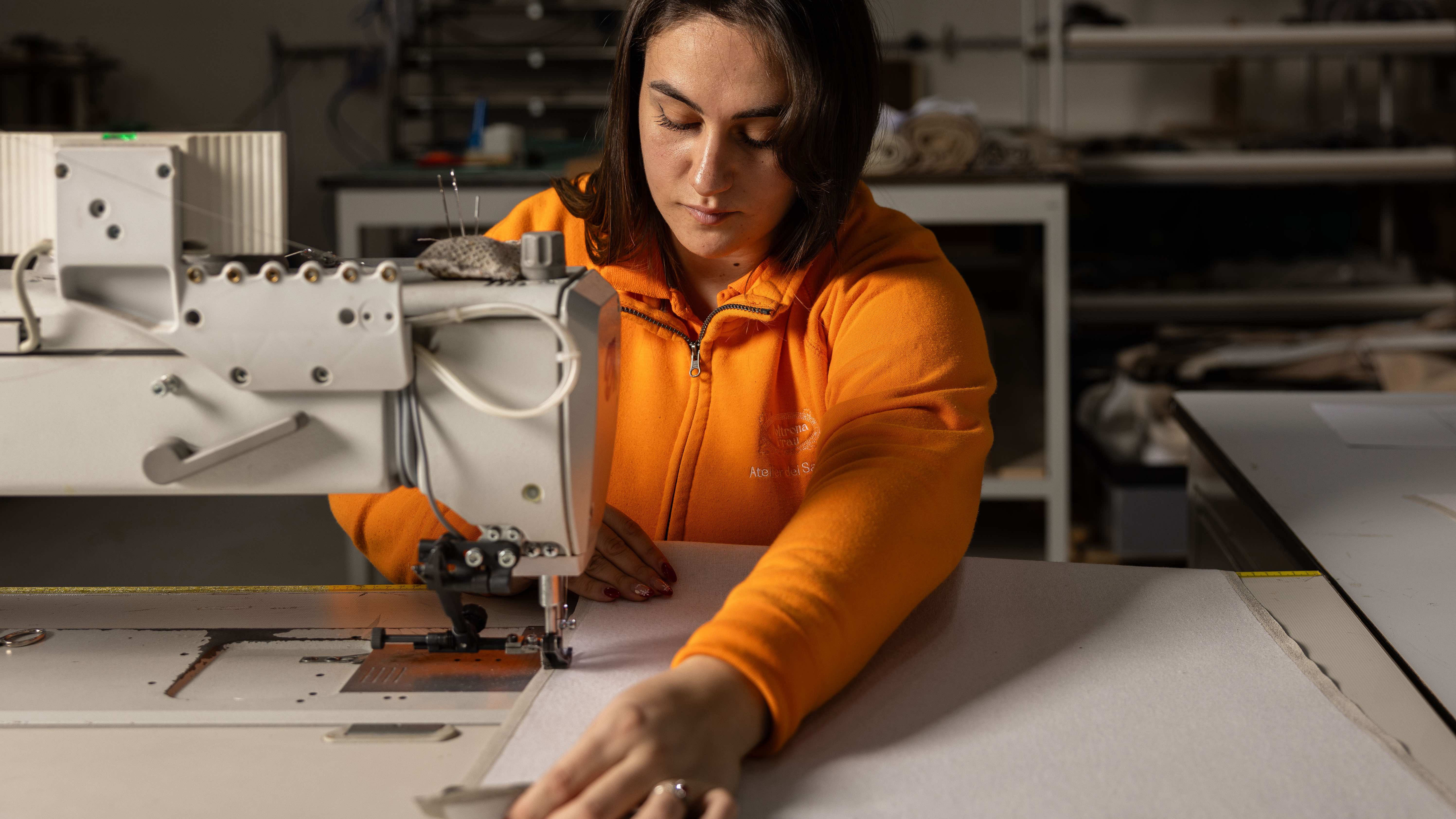 Through an innovative new training program, Poltrona Frau aims to safeguard Italian craft
The heritage furniture manufacturer is training a new generation of leather artisans
By Cristina Kiran Piotti
-
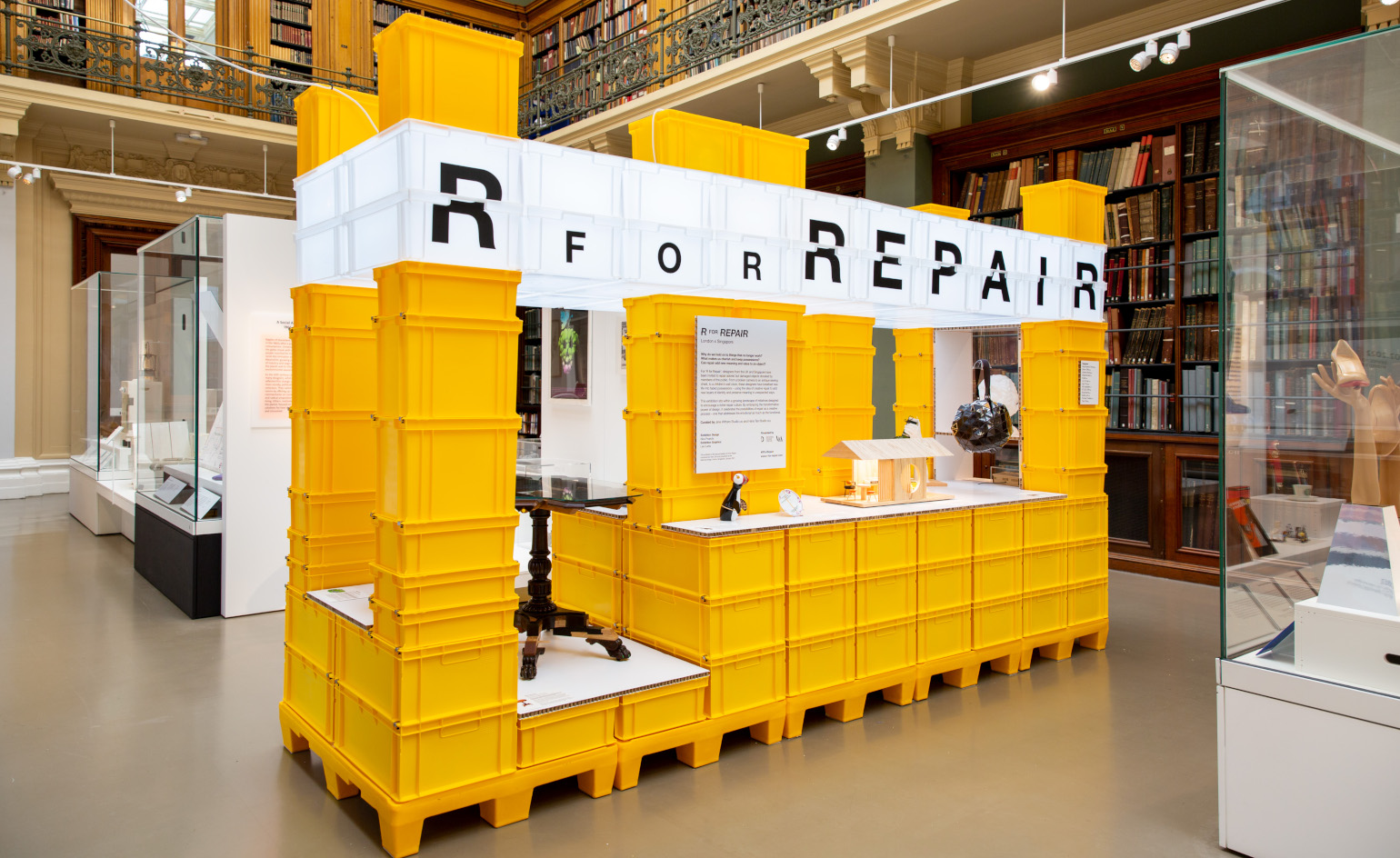 ‘R for Repair’ at London Design Festival displays broken objects, re-formed
In the second half of a two-part exhibition and as part of London Design Festival 2022, ‘R for Repair’ at the V&A displays broken objects, re-formed
By Martha Elliott
-
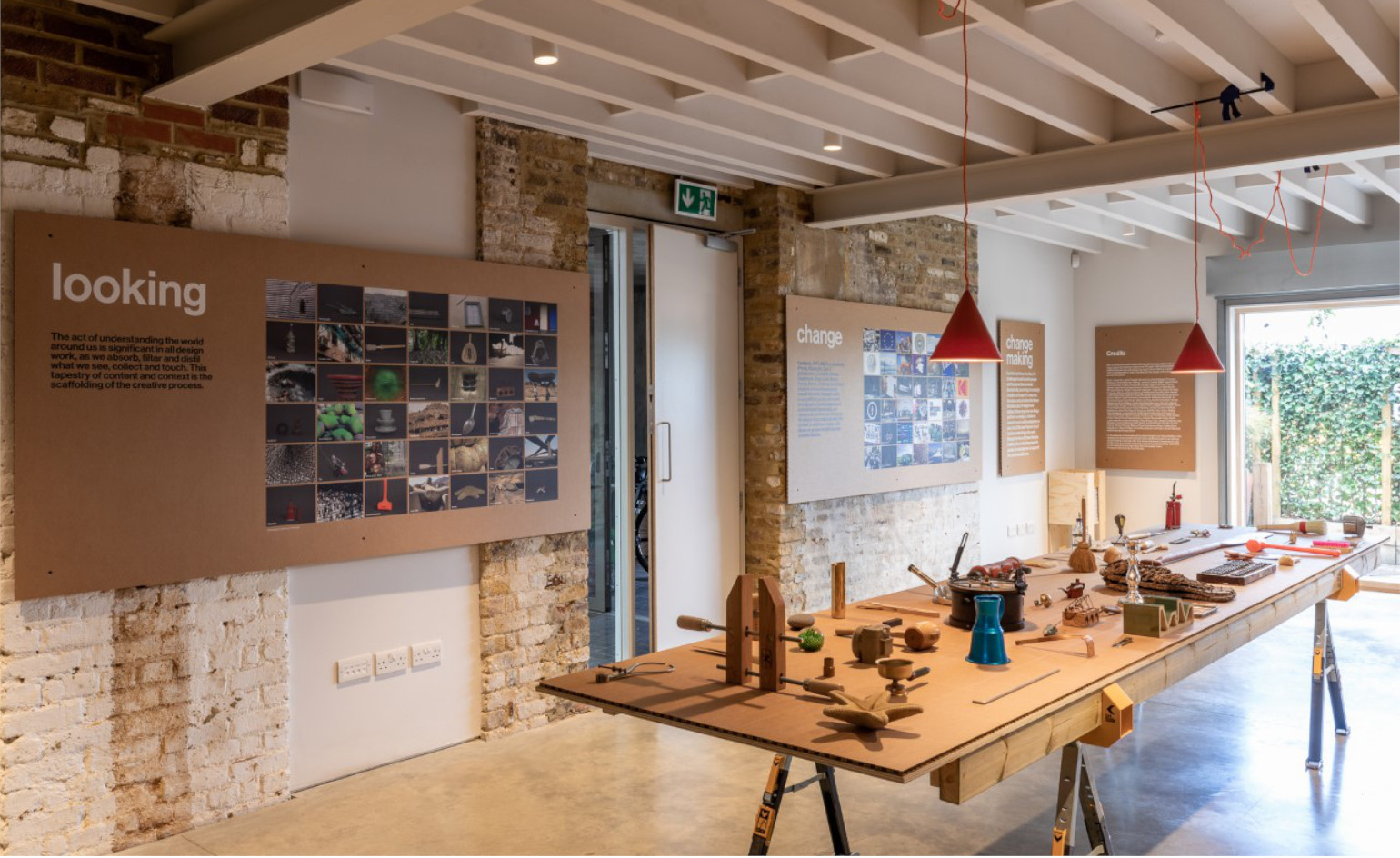 ‘Finding quality through the act of making’: Pearson Lloyd celebrates 25 years of design
Pearson Lloyd’s show ‘Change Making’ reflects on past designs from its archives, showcasing the influences on and evolution of the studio, from furniture design to the NHS
By Martha Elliott
-
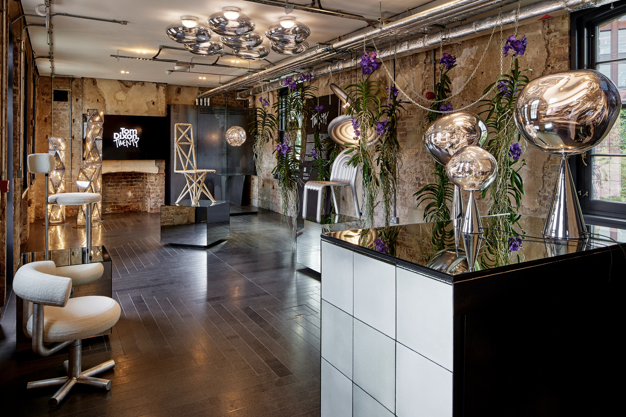 Tom Dixon marks his studio's 20 years with a show of design experiments
Mushroom, cork, steel coral and more: Tom Dixon showcases an overview of his design experiments as he celebrates his practice's 20 years
By Rosa Bertoli
-
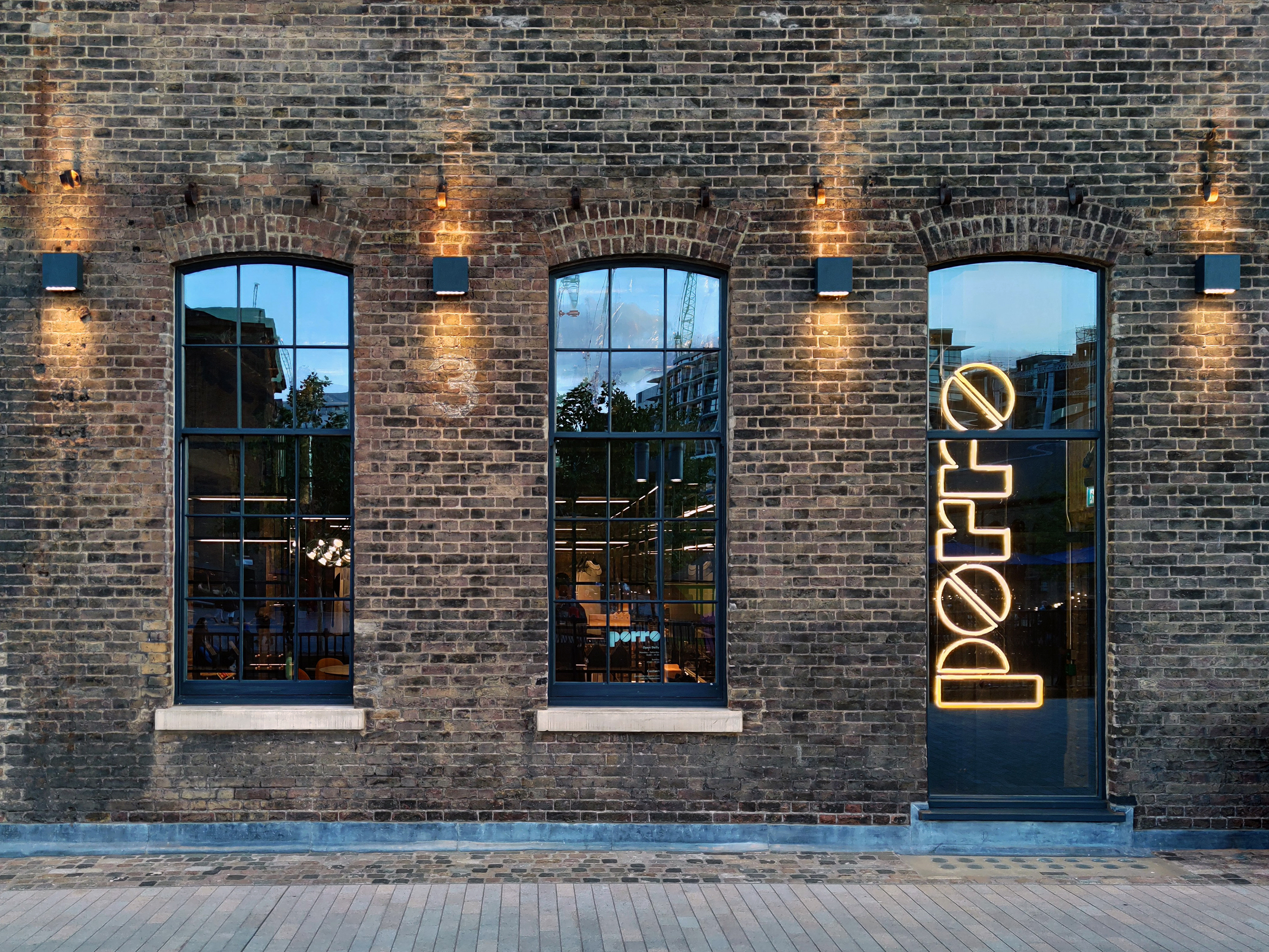 Porro unveils new London showroom at Coal Office
London Design Festival 2022: industrial architecture meets pure geometries in the new Porro showroom, taking over a space within Tom Dixon’s Coal Office to showcase the brand’s systems and furniture
By Rosa Bertoli
-
 Vitra unveils new London home in the Tramshed, Shoreditch
London Design Festival 2022: after a year-long renovation, Vitra opens the door to its new showroom in the heart of Shoreditch
By Rosa Bertoli
-
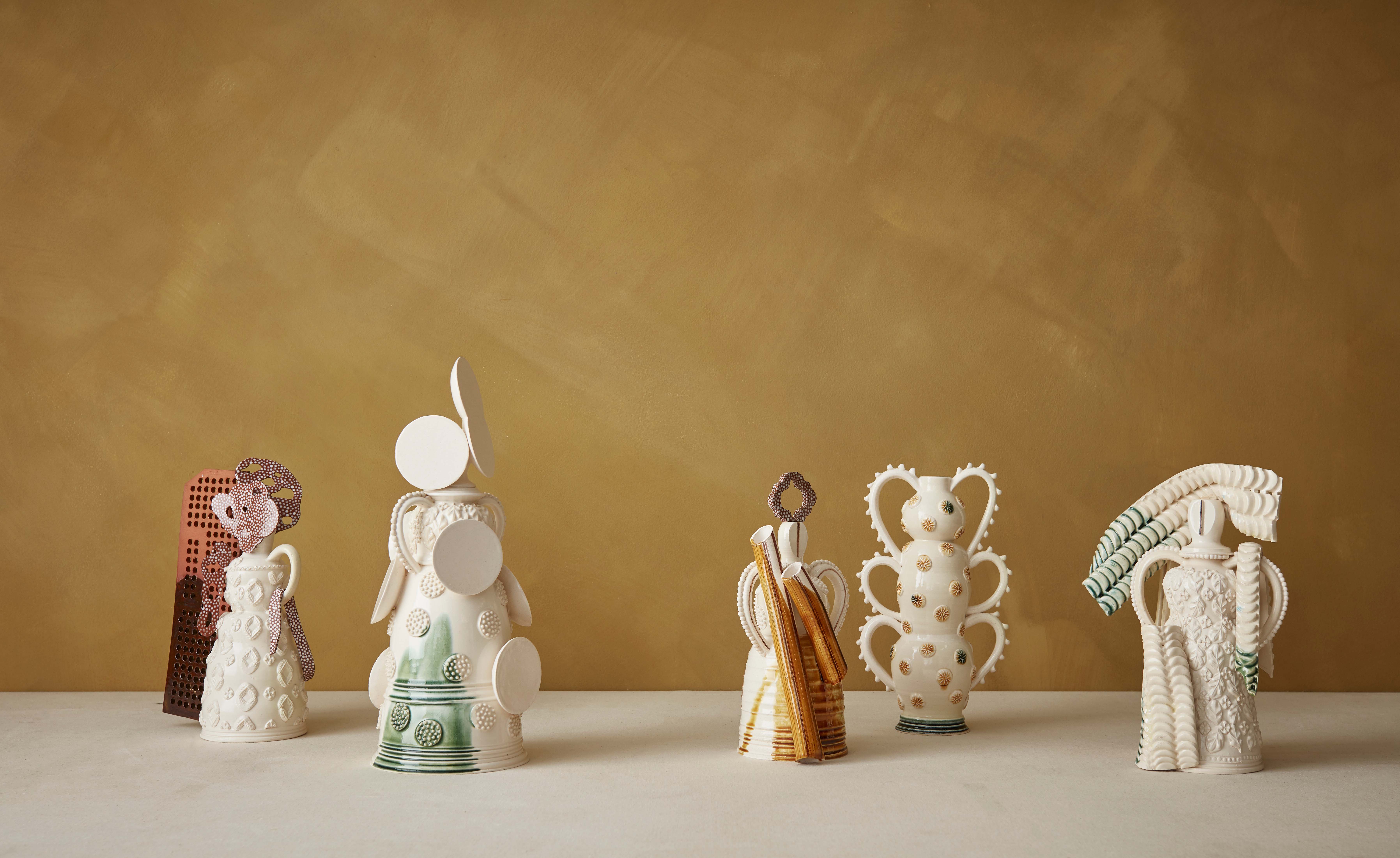 Mudlarking beside the River Thames inspires The New Craftsmen’s makers
London Design Festival 2022: The New Craftsmen’s new collection, ‘Claylarks’, features work from a group of creatives inspired by a River Thames mudlarking expedition
By Mary Cleary
-
 One tree, ten designers: SCP presents The One Tree Project at London Design Festival
London Design Festival 2022: SCP enlisted ten British designers to create furniture and objects from a felled ash tree from founder Sheridan Coakley's Hampshire garden
By Francesca Perry
-
 London Design Medals 2022
London Design Medals 2022 are awarded to costume designer Sandy Powell, architect Indy Johar, researcher Joycelyn Longdon and photographer Sir Don McCullin
By Rosa Bertoli