New Fornasetti vases by Bitossi Ceramiche
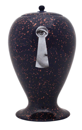
Fresh characters have been added to the family of Fornasetti vases by Bitossi Ceramiche this month. As always, the designs give a witty twist to Piero Fornasetti's iconic prints, such as the face of his muse Lina Cavilieri. Each of the designs is produced in limited edition and once sold out, will be replaced by a new personality.
All are offspring of the same original – a chalk mould of a vase designed by Piero Fornasetti in the 1950s that never made it into production and was later found in the cellar by his son Barnaba. The ceramics mix Bitossi Ceramiche's craftsmanship with Barnaba's design flair.
The collection will be on show from 26th February to 3rd April at Spazio Fornasetti in Milan, and some of the vases will form part of an installation with surrealist dresses designed by Liborio Capizzi, using classic Fornasetti wallpapers, fabrics and ties.
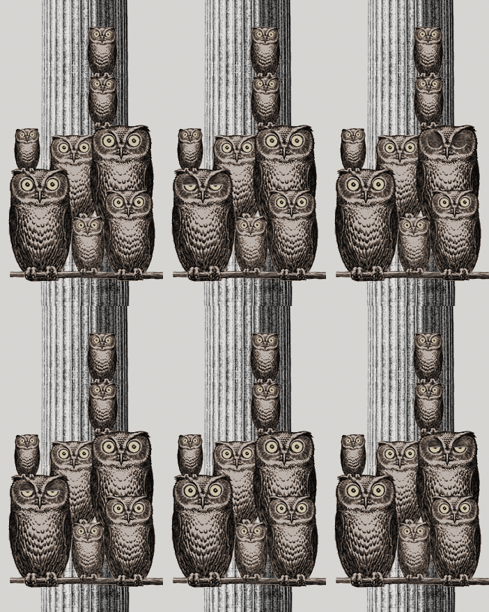
Alongside the new vases, Fornasetti has recently unveiled a brand new website, designed by Micha Weidmann. We took time out to quiz Weidmann (below) about the new design, and how he went about transforming a brand with such a strong heritage onto a digital platform.
Where are you based?
Spitalfields, London
Where did you train?
Wallpaper* Newsletter
Receive our daily digest of inspiration, escapism and design stories from around the world direct to your inbox.
How long have you been working as a digital creative director?
For about six years. It started through a series of collaborations with Chanuki Seresinhe, our online consultant, who also worked with us on the Fornasetti website.
What projects are you most proud of?
The Louise Bourgeois book accompanying the touring exhibition at Tate Modern, Centre Georges Pompidou, MOCA LA and the Guggenheim. There are 80,000 words spread over 320 pages with around 350 pictures, and it's a cross between a biography in glossary form and an art catalogue.
I also like the more experimental catalogue designs I did for Prada, as well as a personal project, '84 Airmiles' - 84 pairs of photographs from the air and ground, taken at every mile point on the flightpath from Santa Catalina Island to Los Angeles to Palmdale in the Mojave desert.
How long has the Fornasetti site redesign been in the making?
Six months.
How did you approach it?
A close collaboration with Barnaba Fornasetti was key. We spent many days working in the stunningly designed Fornasetti house in Milan, in order to immerse ourselves and truly understand the extraordinary world of Fornasetti. Working with a creative visionary takes an entirely different approach, as it is important to create a design that functions more like a framework and lets the original creative vision of the designer take centre stage.
How have you translated the historic, traditional brand onto a digital platform?
This is an area I am fascinated by - how to retain the values of a historic, traditional brand that was never created to go digital. In the process, one needs to evaluate what the digital application of the brand should be, in a way that the company originally communicated its brand in the conventional platforms.
Offline or online, the brand should appear seamless. I often find that many businesses try to make their online presence overly digitalised, and thereby, forget the essence of the original brand.
In the case of Fornasetti, traditional high-end typography meets the magical Fornasetti graphics, applied onto the online world, with the same craft that it takes to design a Fornasetti interior.
As far as publishing is concerned, have print and web reached a comfortable mutual relationship yet do you think?
Not at all. Many people still make the fundamental mistake of playing off print against web, claiming 'print is dead'. A truly successful brand recognises the value of both print and web and how to intertwine the two experiences to create an immersive brand experience.
Publishing is a true example - magazines don't yet understand how to intertwine the two experiences, and almost always create two distinct interactions. There have been some experiments like Mine magazine, where a digital publication is created by combining a mix of the various print articles based on your preferences. Although, I rarely see a magazine that cleverly makes sense of the users' needs, either offline and online. As a simple example, the same feature article can have large photo spreads on its print counterpart, and smaller updates on its digital area. In this way, the benefits of both offline and online are used to tell the same story.
What are you working on at the moment?
An e-commerce website for the luxury childrenswear brand, Caramel Baby&Child. This is a collaboration with the e-commerce experts, Brilliant, the offshoot of Pod1. I am also working on the brand identity and packaging for a completely new high end beauty brand due to launch this Autumn.
What's your favourite website?
The Miu Miu website offers a great online experience which, I believe, truly reflects Miuccia's vision for Mui Miu. It's easy to use and very fast, whilst retaining a dynamic design. Another is the Maison Martin Margiela website. It's very clever and makes a statement that fits the Margiela identity.
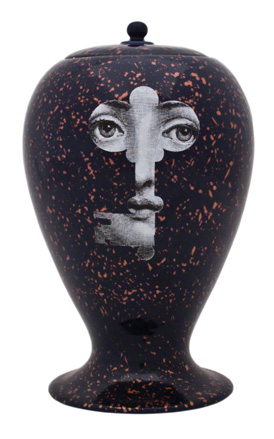
Front view of the Cobalto vase
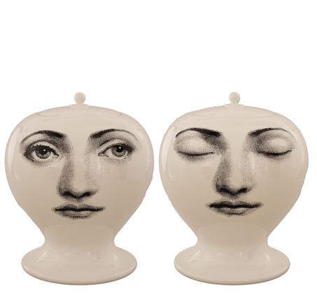
Front and back view of the Ciccio vase
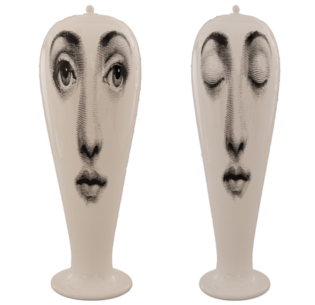
Front and back view of the Smilzo vase
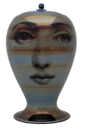
Front view of the Lustro Buongiorno vase
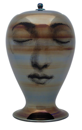
Back view of the Lustro Buongiorno vase
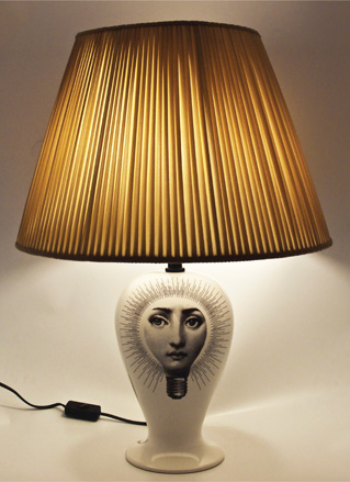
The Lampadina vase
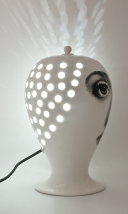
The Lanterna vase
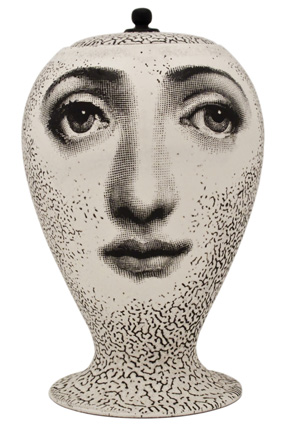
Front view of the Organico Buongiorno vase
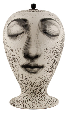
Back view of the Organico Buongiorno vase
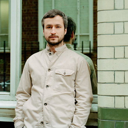
Micha Weidmann, the designer behind Fornasetti’s new website
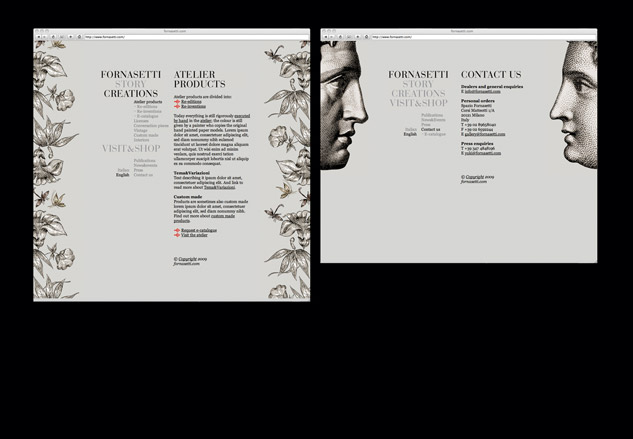
Weidmann attempted to marry traditional, high end typography with Fornasetti’s distinctive graphics for the new website
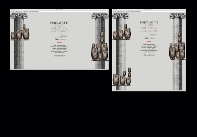
He approached the project with the same level of craft that it takes to design a Fornasetti interior
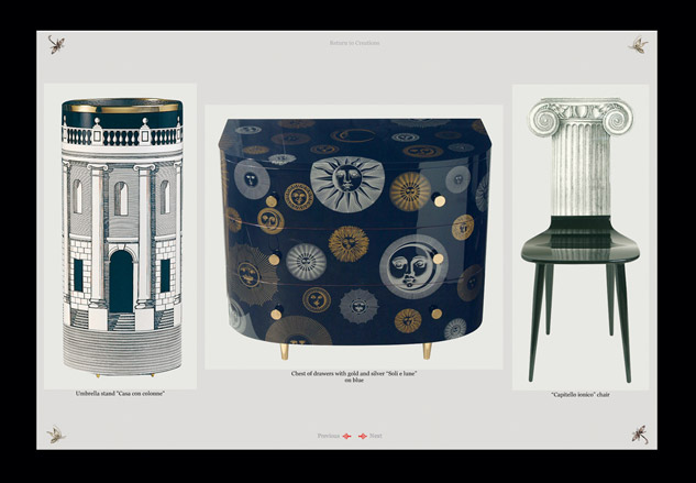
The new website showcases the entire Fornasetti range - including vintage and atelier pieces alongside interiors
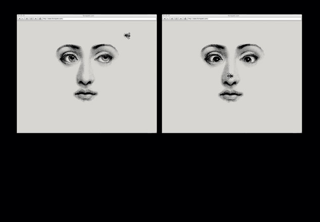
Animated and charmingly interactive, Weidmann’s website is a timely move into the 21st century for the Italian company
ADDRESS
Spazio Fornasetti
Corso G. Matteotti, 1/A
I-20121 Milan
Italy
Malaika Byng is an editor, writer and consultant covering everything from architecture, design and ecology to art and craft. She was online editor for Wallpaper* magazine for three years and more recently editor of Crafts magazine, until she decided to go freelance in 2022. Based in London, she now writes for the Financial Times, Metropolis, Kinfolk and The Plant, among others.
-
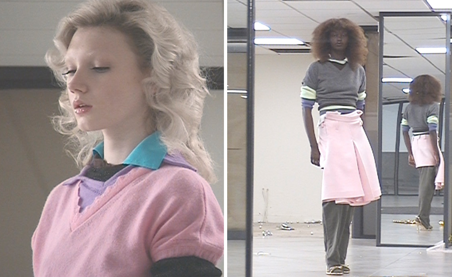 All-In is the Paris-based label making full-force fashion for main character dressing
Part of our monthly Uprising series, Wallpaper* meets Benjamin Barron and Bror August Vestbø of All-In, the LVMH Prize-nominated label which bases its collections on a riotous cast of characters – real and imagined
By Orla Brennan
-
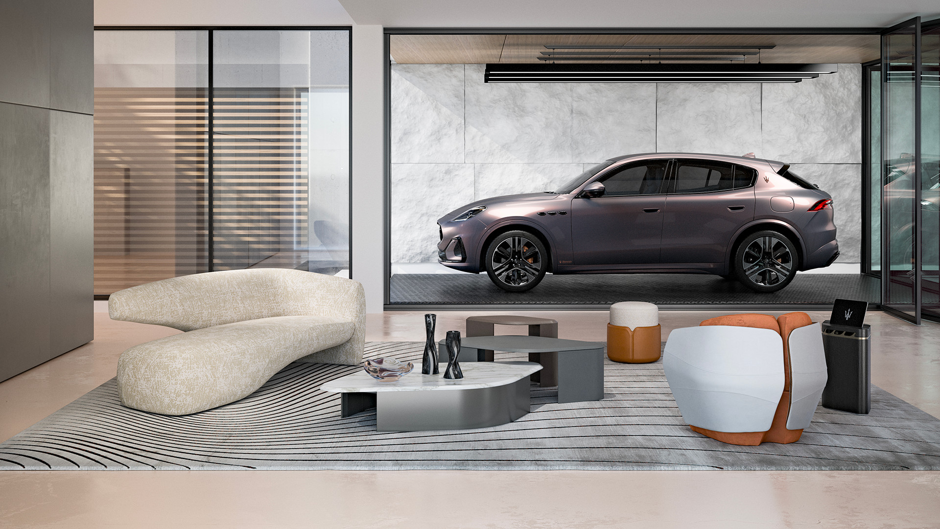 Maserati joins forces with Giorgetti for a turbo-charged relationship
Announcing their marriage during Milan Design Week, the brands unveiled a collection, a car and a long term commitment
By Hugo Macdonald
-
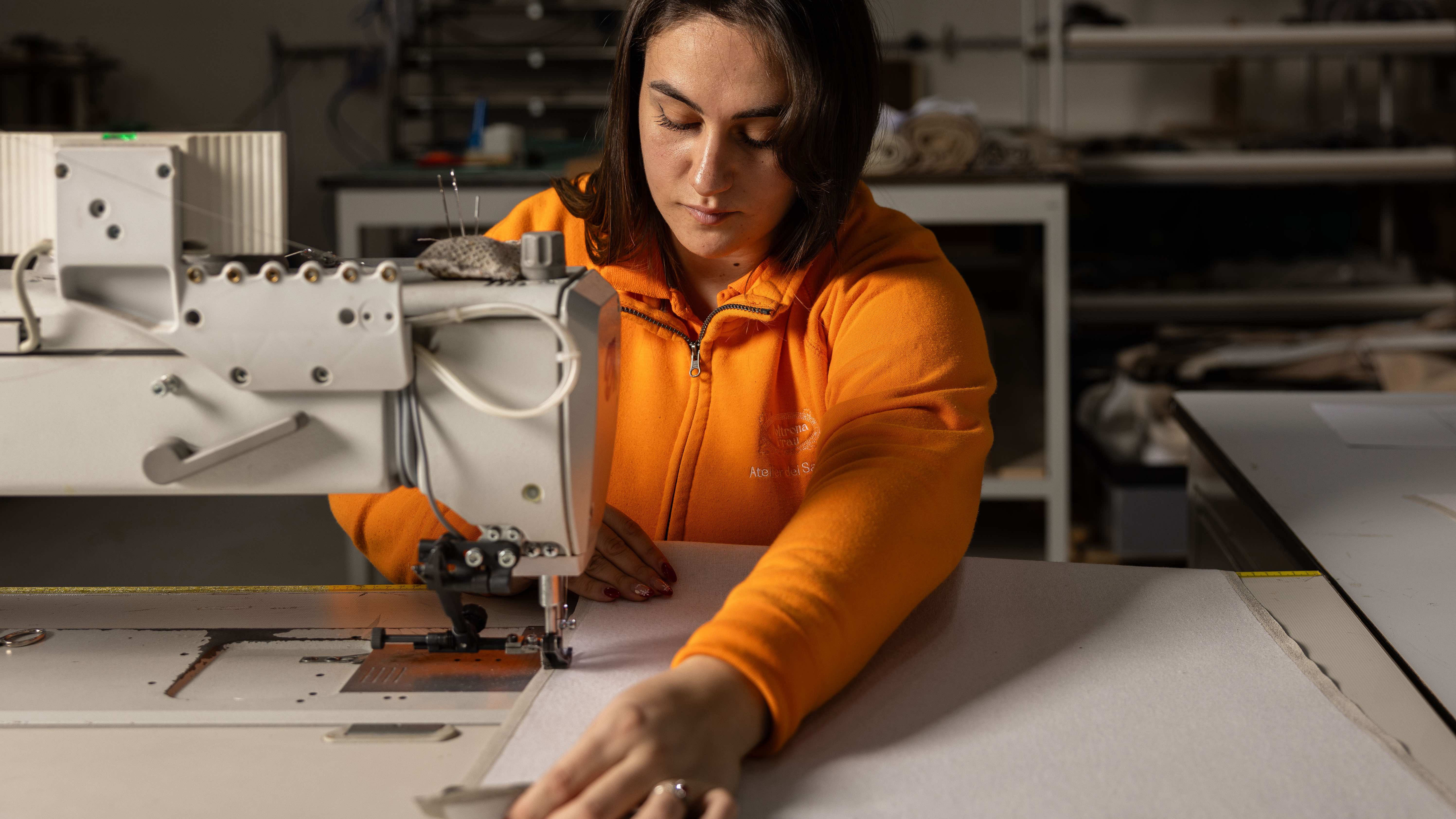 Through an innovative new training program, Poltrona Frau aims to safeguard Italian craft
The heritage furniture manufacturer is training a new generation of leather artisans
By Cristina Kiran Piotti