French graphic designer Philippe Apeloig created a brand-new typeface just for us, along with a celebratory animation. Watch it here in full
When it came to creating the cover for our 200th issue, we of course wanted something special; celebratory but not self-indulgent, a design that looked forward as much as back. It was the perfect excuse for a crème-de-la-crème collaboration. And in design terms, they don’t get much creamier than Philippe Apeloig.
Known chiefly for his poster work for French theatres and galleries using custom fonts and dramatic, even explosive composition, Apeloig’s designs combine impossible elegance with a kind of internal combustion. He is a committed educator, teaching at Rhode Island School of Design, the Cooper Union School of Art in New York and elsewhere. He also recently designed hour markers for the quite lovely Slim d’Hermes watch.
For the cover, Apeloig devised another custom font to create a spinning, disintegrating '200' and added die-cut holes to reveal a second cover underneath, a simple block of colour (available in three options). He then animated it, adding actual movement to implied movement (resulting in a piece of work so effective that it now comprises part of 'Using Type', Apeloig's forthcoming show at Amsterdam's Stedelijk Museum). Frankly, we couldn’t be happier. We spoke to him about creating this landmark design.
Wallpaper*: For the cover of our 200th issue, you have created type that seems to be in motion in some way. Is that what you were trying to achieve?
PA: Yes of course. In most of my work I try to create a sort of frozen motion in a two-dimensional design. I want to imagine that the design moves on the surface. It could be seen as a piece of performance art.
You have created a cover and an animation. How hard is it to create a type design that can work for both? And which comes first?
Both of them came at the same time. I abstracted the shapes of the numbers '2' and '0'. I observed traditional shapes of those two signs and looked for what part they have in common. Then I realised that a half circle could be used in different scales within the two numbers. I like to set constraints when I work, such as the thickness of the line, which is maintained as a constant. The asterisk appears as a symbol of ornamentation.
More generally, as the world moves steadily away from print towards digital – or rather, we hope, there are more and more digital and moving versions of things – is this something you have to think about more and more? Creating things that can move?
Since the beginning of my professional life I have been interested in playing with the idea of visual illusion and motion. Movement is a central theme in the design of the typography in the poster for the ‘Chicago’ exhibition, one of my very early works that I did for the Musée d’Orsay in 1987 and later in 2003 for another poster titled 'Barges on water, river and canals', which was for an exhibition of antique barge models. In this last one, I elongated the segments between the letterforms to reproduce the slow motion of a boat gliding and reflecting on the surface of the water. This visual effect of reflection in the water is also seen in the identity I have done for the French navigable waterways. I consider myself lucky to be able to enjoy a time where technology allows us to use typography across different medias. We can use type elements in different spaces and bring motion with animation.
Because I pay a lot of attention to music, it influences every step of the creation. Rhythm has a great impact on my approach to typography. I watch a lot of art performances that inspire me.
You have pushed the cover design near to the point of abstraction. Do you enjoy having the freedom to do that? And is it harder to do than when you are required to be absolutely legible?
I feel comfortable with abstraction. It’s interesting to explore the limit of readability. I like to go beyond traditional expectations. I think we live in a world that is abstract. Look at nature for instance. The artists are the people who are able to translate these abstract shapes into human gesture.
What is the first duty of the designer, then: impact or legibility?
In typography of course both are linked. Finding a balance between the two is the challenge.

Three of the six celebratory die-cut Wallpaper* 200 covers; two styles (one with word, one without), and three colourways.

’This visual effect of reflection in the water is also seen in the identity I have done for the French navigable waterways,’ he says. Pictured left: Bateaux sur l’eau, rivières et canaux, Armada de Rouen, voies navigables de France, screen print by Dubois Imagerie, 2003; right, Ameublement Francais

’Since the beginning of my professional life I have been interested in playing with the idea of visual illusion and motion,’ explains the designer. ’Movement is a central theme in the design of the typography in the poster for the ‘Chicago’ exhibition.’ Pictured left: Chicago. Naissance d’une métropole 1872–1922, Musée d’Orsay, Paris, offset print by Jacques London/Bedos, 1987. Right: L’identifiant, voies navigables de France, screen print by Lézard Graphique

Slim d’Hermès, Watch designed by Philippe Delhotal, creative director of La Montre Hermès, Original font of the numbers designed by Philippe Apeloig, 2015

Carré Hermès Roland Barthes, Hermès, Silk and cashmere, 2015

Pictured left: Typo Apeloig, Cité du livre et ville d’Aix-en-Provence, Screen print by Lézard Graphique, 2014. Right: Using Type, Stedelijk Museum of Amsterdam, Screen print by Lézard Graphique, 2015

Pictured left: Street Scene, Châtelet, théâtre musical de Paris, Screen print by Lézard Graphique, 2013. Right: An American in Paris, Châtelet, théâtre musical de Paris, Screen print by Lézard Graphique, 2014

Pictured left: Baltique Méditerranée. Itinéraires de nos mémoires, Fête du livre d’Aix-en-Provence (Foreign Literature Festival), Screen print by Lézard Graphique, 2013. Right: De la neige au sable. Henning Mankell, Fête du livre d’Aix-en-Provence (Foreign Literature Festival), Screen print by Lézard Graphique, 2015

Pictured left: Saison 2015-16, Théâtre national de Toulouse Midi-Pyrénées, Screen print by Lézard Graphique, 2015. Right: Le Saut Hermès (Horse Jumping Competition), Hermès, Screen print by Lézard Graphique, 2013

Pictured left: 101 Robes, Éditions Flammarion, 2015. Right: Art et Industrie, Magen H Gallery, Cover design by Philippe Apeloig, 2015
INFORMATION
’Using Type’ is on view from 31 October 2015 – 31 January 2016 at Amsterdam’s Stedelijk Museum
-
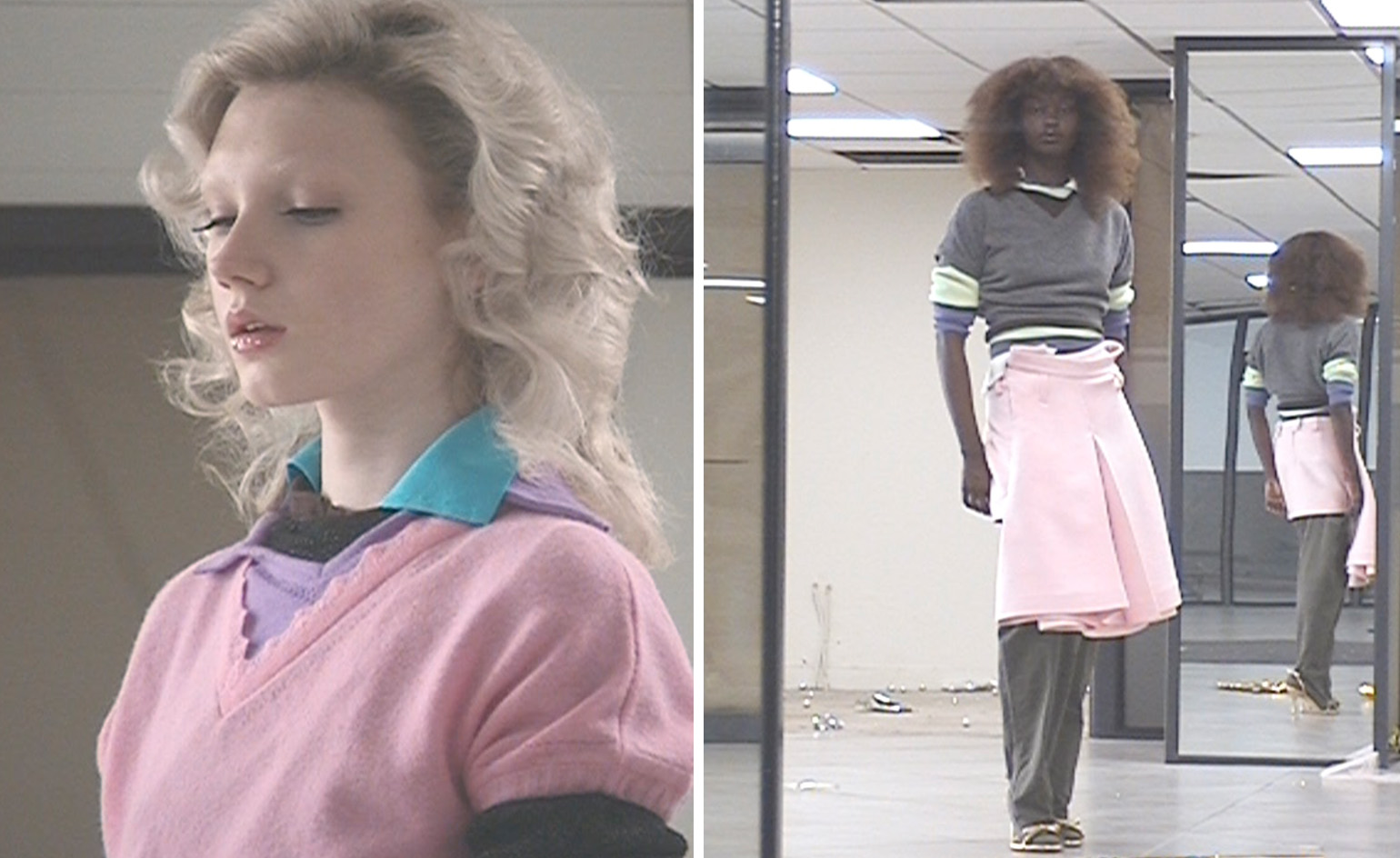 All-In is the Paris-based label making full-force fashion for main character dressing
Part of our monthly Uprising series, Wallpaper* meets Benjamin Barron and Bror August Vestbø of All-In, the LVMH Prize-nominated label which bases its collections on a riotous cast of characters – real and imagined
-
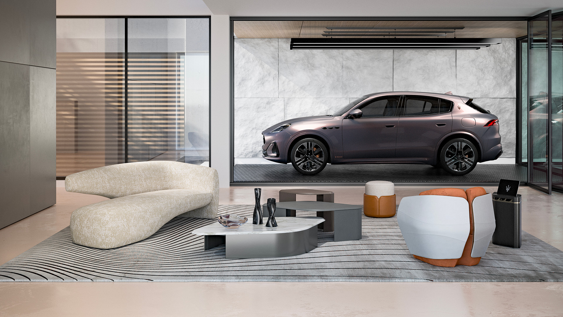 Maserati joins forces with Giorgetti for a turbo-charged relationship
Announcing their marriage during Milan Design Week, the brands unveiled a collection, a car and a long term commitment
-
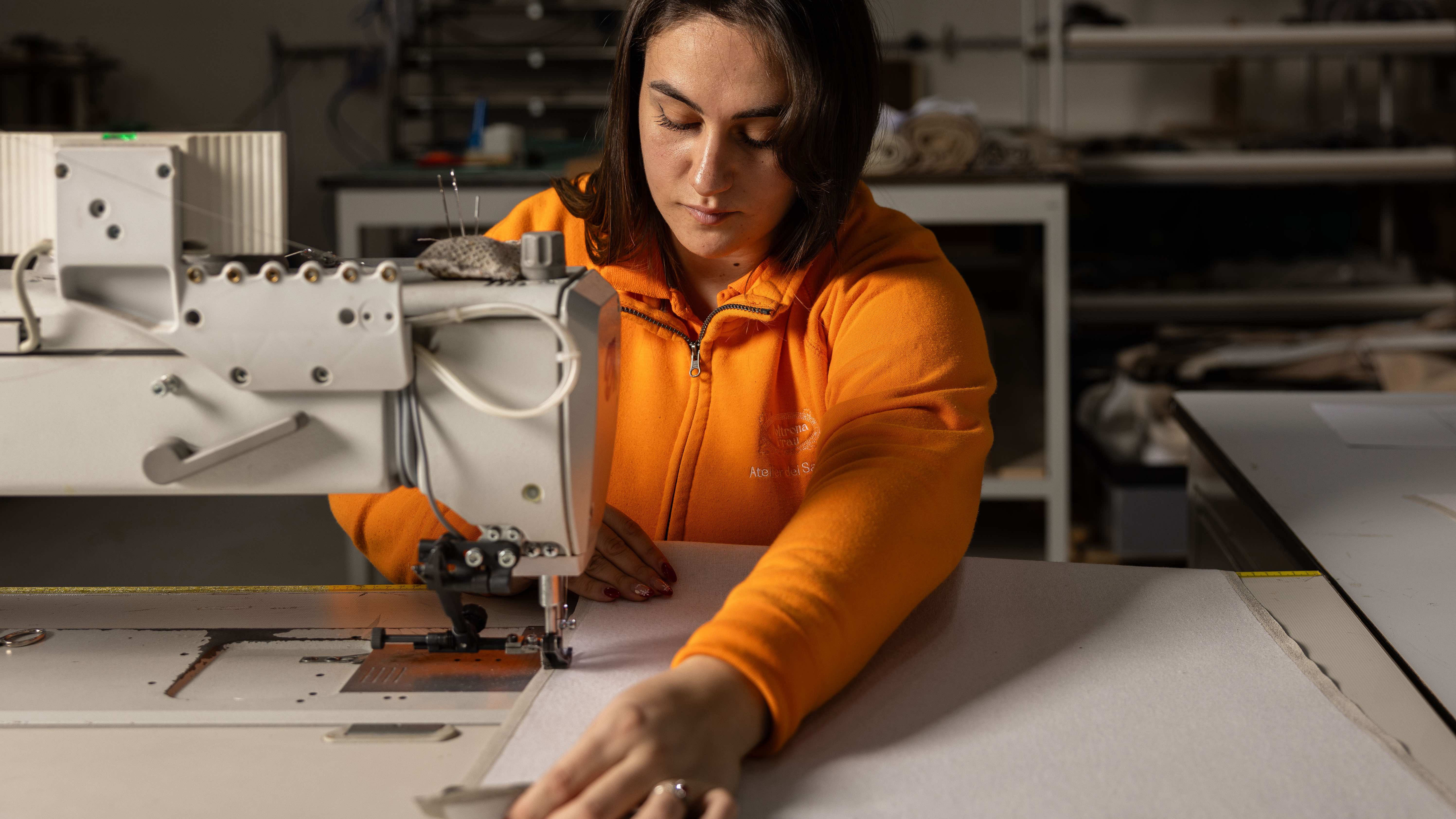 Through an innovative new training program, Poltrona Frau aims to safeguard Italian craft
The heritage furniture manufacturer is training a new generation of leather artisans


