
Anyone familiar with the dynamic posters and typography conceived over decades by Philippe Apeloig might be surprised to discover that his designs for La Manufacture de Sèvres are absent of lettering. Instead, he’s used the slashes and punctuation marks that frequently feature in the composition of his typefaces to produce three rhythmic motifs that speak to the fluidity of his work. Unlike the prescribed right-side up format of a page or sign, the porcelain maker’s classic ‘Diane’ service plates encouraged Apeloig to consider how the circular shape would dictate the placement of his patterns.
In this way, ‘Tourbillon’ consists of gold slashes that diffuse outward and curve like a cresting wave; the pointillist array that glows from the Sèvres blue surface of ‘Galaxie’ demonstrates how grammatical dots can be arranged as cosmic scenery; while elongated hyphens that make up ‘Paille’ (straw) appear as a fine sprinkle of sprigs.
As the Paris-based graphic designer tells Wallpaper*, parameters such as kerning – or spacing – became integral to achieving a kinetic impression with each creation. ‘It’s like frozen motion,’ he says from the Galerie de Sèvres, where the plates have been mounted as an exhibition alongside limited-edition prints of the motifs on traditional washi paper from the Awagami Factory in Japan. ‘It’s interesting to limit yourself to one element and see all that you can do,’ he adds. 'This is typography as well; I just didn’t want to write something in words.’

‘Tourbillon’ by Philippe Apeloig
The invitation was extended to Apeloig by Romane Sarfati, general director of the Cité de la céramique Sèvres et Limoges after she saw his drawings and watercolours in a show at the Galerie de Multiples in Paris last spring. Yves Mirande, the manufacturer’s director of culture and communication, suggests that she recognised ‘the balance’ inherent to Apeloig’s work, noting that he is the first graphic designer to contribute a series.
Apeloig, who devised a scarf for Hermès in 2014 by using the page layout of Roland Barthes’ Fragments d'un discours amoureux (A Lover’s Discourse: Fragments) to arrive at a genius geometrical pattern, is no stranger to abstracting and reimagining references both ordinary and esoteric. With the plates, a nod to Japanese artist Hokusai comes through – not just in the wave but also in the broader arrangement of the minimalist patterns. However, his talent for coaxing such beauty from prosaic punctuation is what makes these works unique.
Worth noting, too, are the precise production aspects: for ‘Tourbillon’, the result of photosensitive printing, the gold slashes continue around the downward edge of the plates; whereas ‘Galaxie’ and ‘Paille’ were engraved to enhance the depth of the gold detailing. High-gloss and slightly concave in all five sizes, the plates ultimately absorb Apeloig’s serene markings into their self-contained volumes.
This does not preclude them from being used, especially when the food is up to a similar standard. He notes how he intentionally avoided concentrating the pattern activity at the centre, for instance. ‘The plates play with emptiness – they’re not over-designed,’ he says. Even if the focus becomes a stack of asparagus stalks, his effort would not go unnoticed. ‘It’s a real motivation to reinvent yourself. I’m not bringing recipes,’ he says, gliding over the double entendre.
His reproduced signature – his truest typography of all – happens to be on the reverse side, adding to the Sèvres branding. But of course, it’s poor form to look.

Elongated hyphens that make up ‘Paille’ (straw) appear as a fine sprinkle of sprigs

‘Galaxie’ demonstrates how grammatical dots can be arranged as cosmic scenery

‘Tourbillon’ consists of gold slashes that diffuse outward and curve like a cresting wave

‘Galaxie’ was engraved to enhance the depth of the gold detailing

For ‘Tourbillon’, the result of photosensitive printing, the gold slashes continue around the downward edge of the plates

‘The plates play with emptiness; they’re not over-designed,’ Apeloig says
INFORMATION
‘Typography: Apeloig à Sèvres’ is on view until 29 July. For more information, visit the Galerie de Sèvres website
ADDRESS
Galerie de Sèvres
4 Place André Malraux
75001 Paris
-
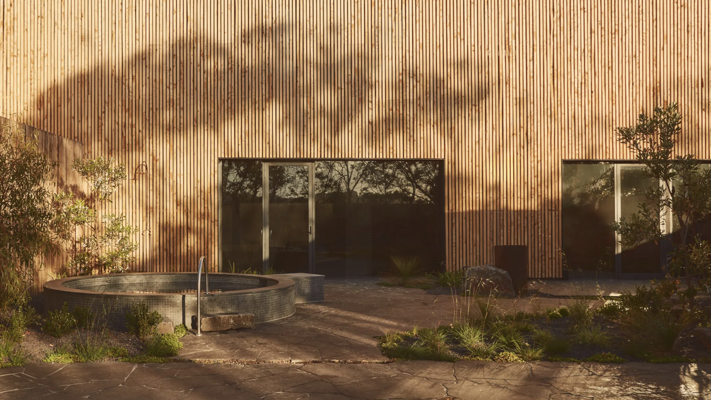 Australian bathhouse ‘About Time’ bridges softness and brutalism
‘About Time’, an Australian bathhouse designed by Goss Studio, balances brutalist architecture and the softness of natural patina in a Japanese-inspired wellness hub
-
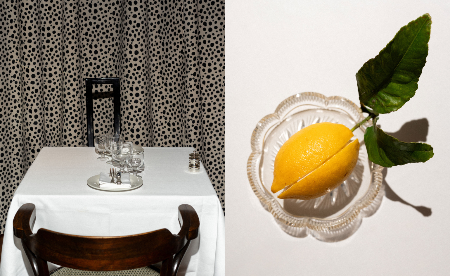 Marylebone restaurant Nina turns up the volume on Italian dining
At Nina, don’t expect a view of the Amalfi Coast. Do expect pasta, leopard print and industrial chic
-
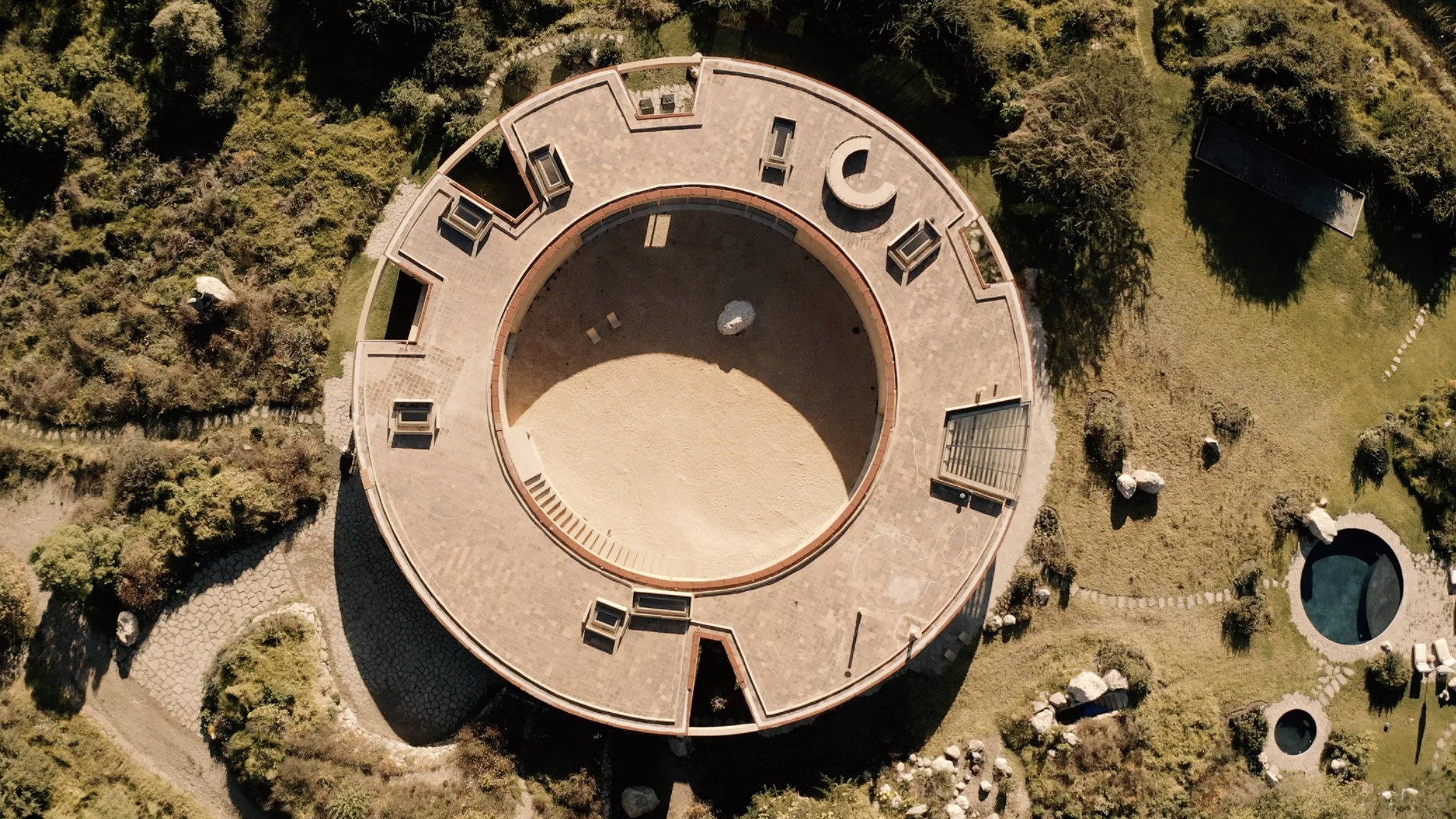 Tour the wonderful homes of ‘Casa Mexicana’, an ode to residential architecture in Mexico
‘Casa Mexicana’ is a new book celebrating the country’s residential architecture, highlighting its influence across the world


-
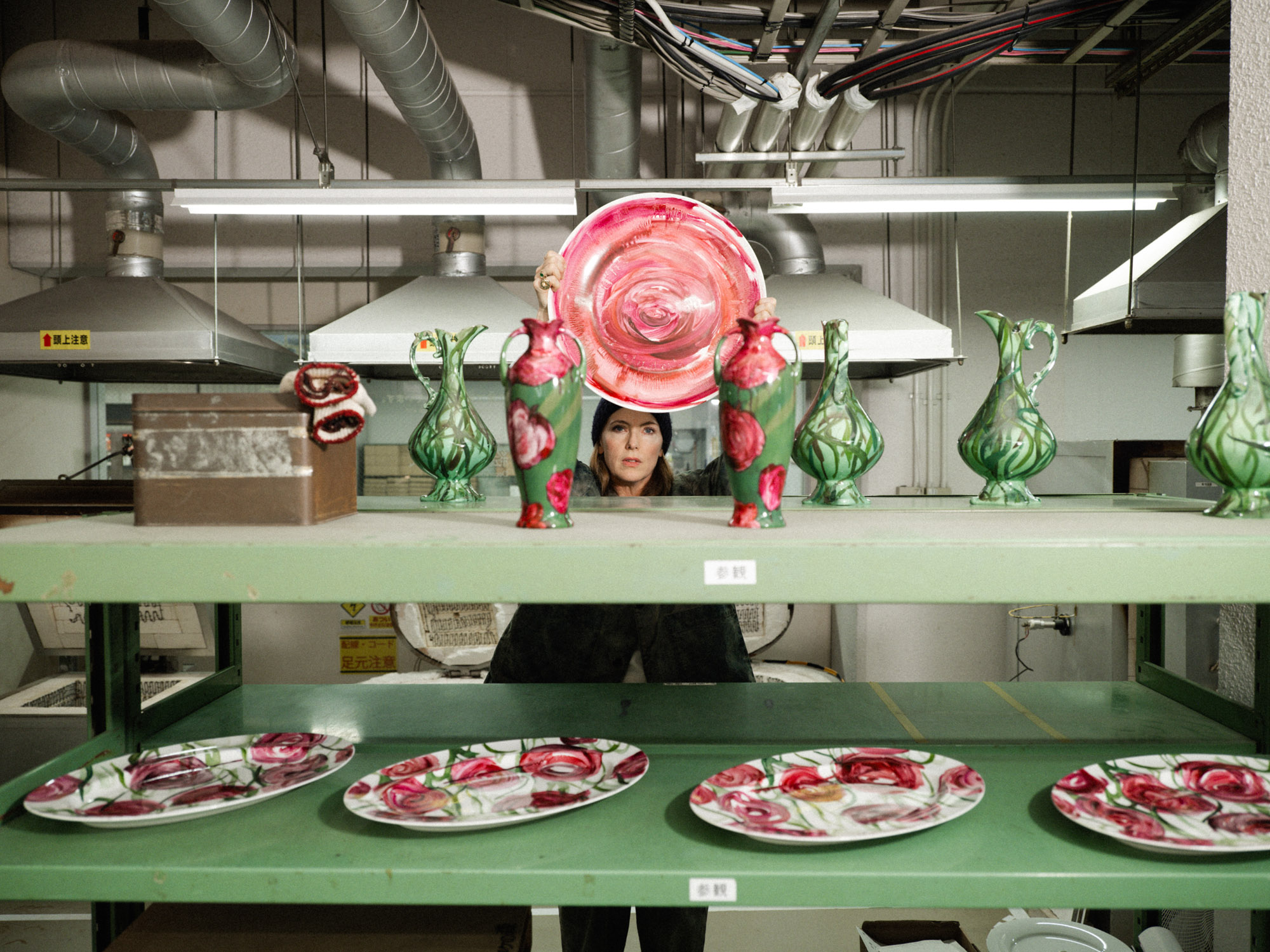 Faye Toogood comes up roses at Milan Design Week 2025
Japanese ceramics specialist Noritake’s design collection blossoms with a bold floral series by Faye Toogood
-
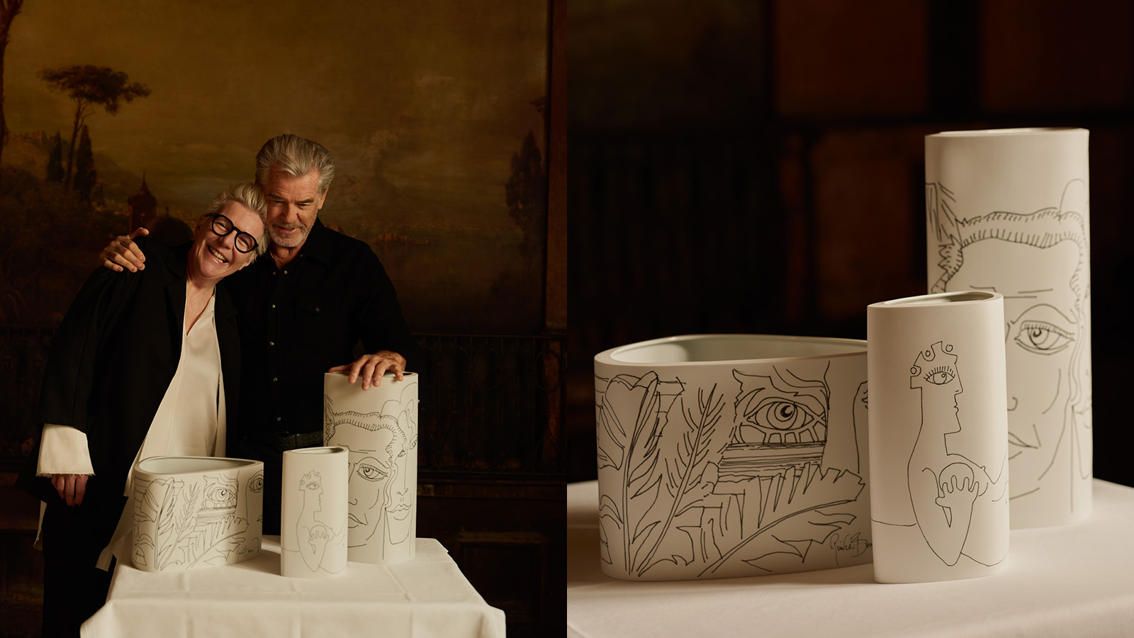 Pierce Brosnan and Hering Berlin's ceramic vases explore love, loss and renewal
Actor and artist Pierce Brosnan translates his ‘So Many Dreams’ artworks to Hering Berlin ceramic vases in a new limited edition
-
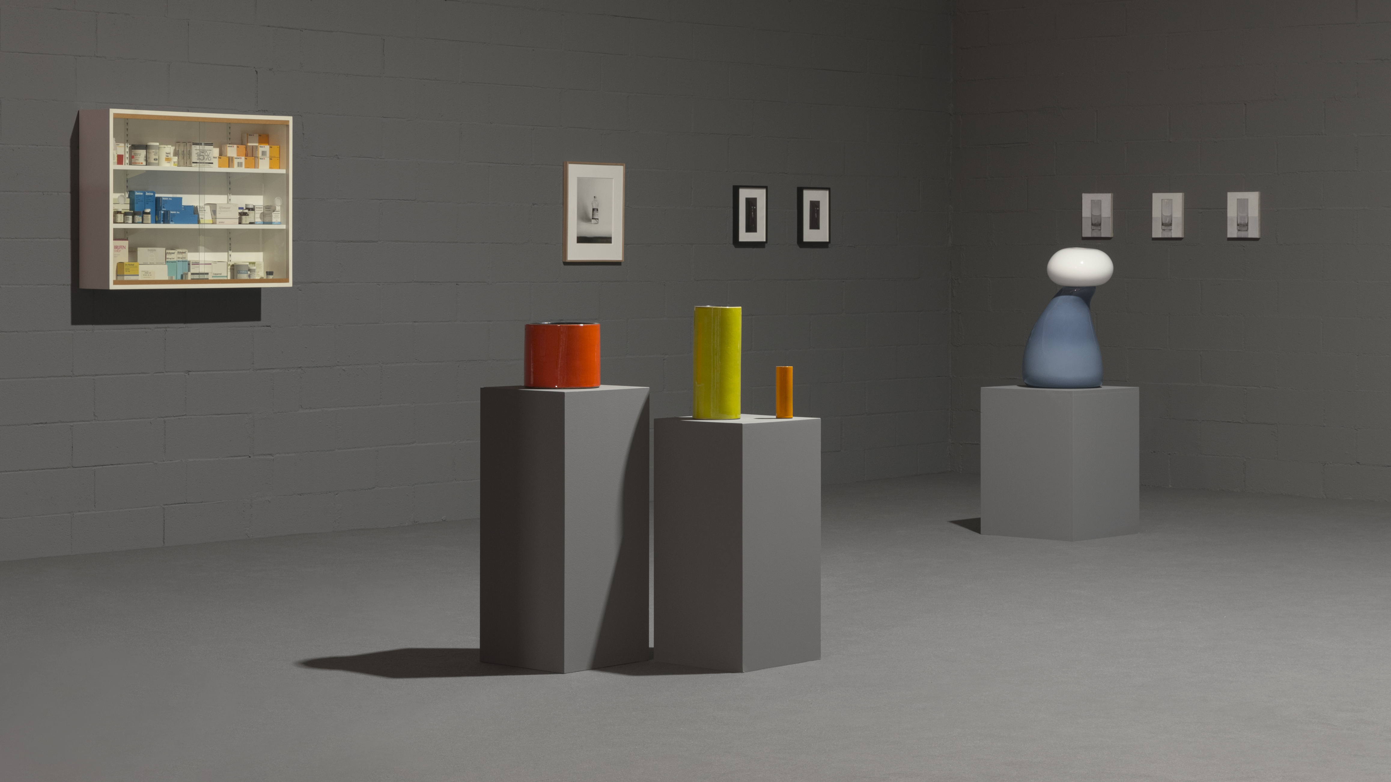 Ceramics brand Mutina stages a poetic tribute to everyday objects
Design meets art as a new Mutina exhibition in Italy reframes the beauty of domestic stillness, juxtaposing ceramics, sculpture, paintings and photography
-
 Designer Danny Kaplan’s Manhattan showroom is also his apartment: the live-work space reimagined
Danny Kaplan’s Manhattan apartment is an extension of his new showroom, itself laid out like a home; he invites us in, including a first look at his private quarters
-
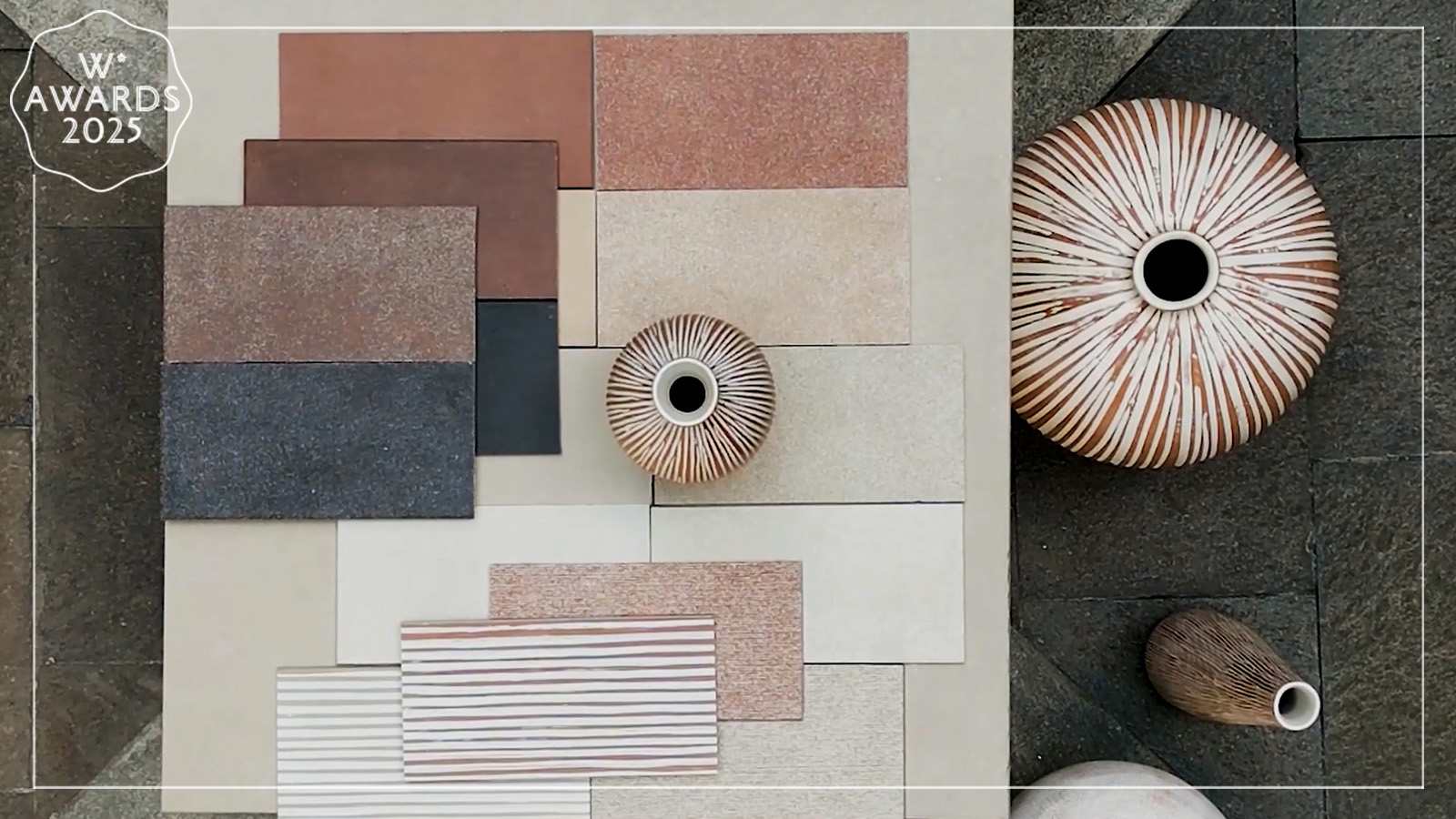 Florim’s new ceramic surface collection is an ode to tactility
A primal pleasure, Matteo Thun and Benedetto Fasciana’s SensiTerre collection of ceramic flooring and cladding surfaces for Florim is a Wallpaper* Design Award winner
-
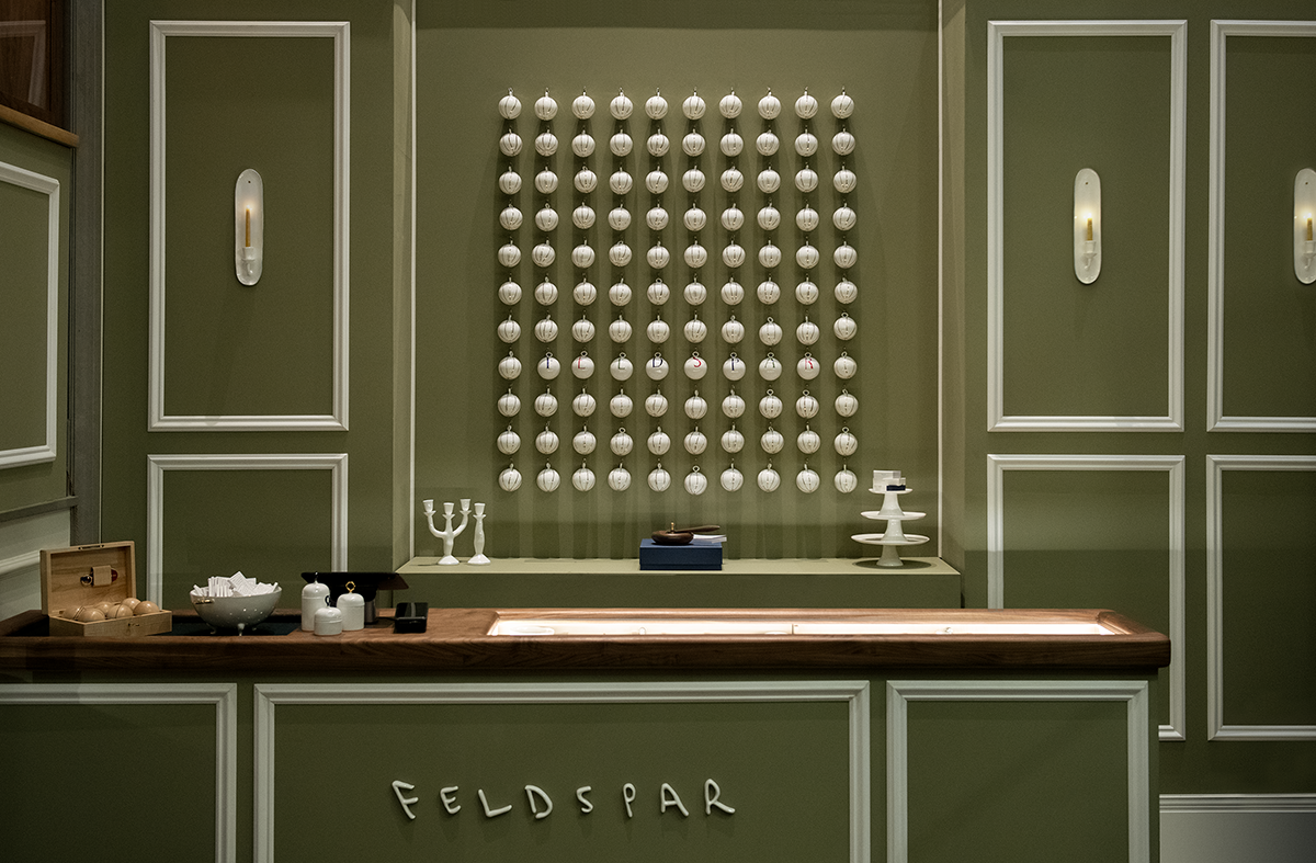 Feldspar makes its mark on Whitehall with a festive pop-up at Corinthia Hotel
Devon-based bone china brand Feldspar makes its first foray into shopkeeping with a pop-up at London’s Corinthia Hotel. Ali Morris speaks with the founders and peeks inside
-
 Hella Jongerius’ ‘Angry Animals’ take a humorous and poignant bite out of the climate crisis
At Salon 94 Design in New York, Hella Jongerius presents animal ceramics, ‘Bead Tables’ and experimental ‘Textile Studies’ – three series that challenge traditional ideas about function, craft, and narrative
-
 Arrernte artist Alfred Lowe wins 2024 Shelley Simpson Ceramic Prize with Mud Australia
Mud Australia has awarded Alfred Lowe its annual ceramics prize for his keenly political and visually unique pieces


