R & Company unveils fresh New York gallery housing archive library, exhibition space and more
Receive our daily digest of inspiration, escapism and design stories from around the world direct to your inbox.
You are now subscribed
Your newsletter sign-up was successful
Want to add more newsletters?
For the pioneering New York design gallery R & Company, heralding 20 years in the industry was a perfect opportunity to reinvigorate its mission. This week, the Tribeca institution inaugurates a new space, just a stone’s throw from its original location. Situated behind an 1869-built cast iron storefront, the gallery’s new iteration boasts 8,000 sq ft of space at its disposal, allowing it to support and pursue 20th- and 21st-century design at a grand new scale.
Designed by Kulapat Yantrasast and Andrija Stojic of the interdisciplinary design and architecture studio, Why, the new multi-level gallery not only houses exhibition spaces, but also an academic research centre with an archive and library amassed during the gallery’s 20 years, that will be available to both institutions and the public.
‘The new space will take what our existing gallery has already done for two decades and elevate it to a more iconic status. It will be a space to discover historical and contemporary design and allows us to raise the bar within the industry,’ says co-founder Zesty Meyers. ‘We wanted to expand our programming and to find a space where we could present design on various scales from the intimate works to the large-scale pieces. This new gallery gives us that opportunity with the multitude of various exhibition spaces.’
Behind its historical façade, Why has created a dramatic contemporary interior for R & Company, which includes a three-story atrium that funnels natural daylight through to the other levels via a light well. A monumental marble staircase connects the three levels.
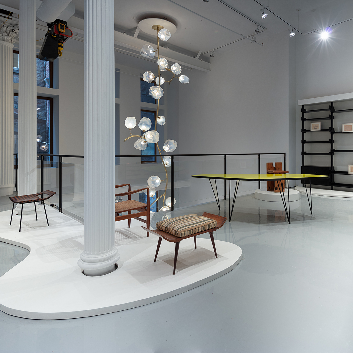
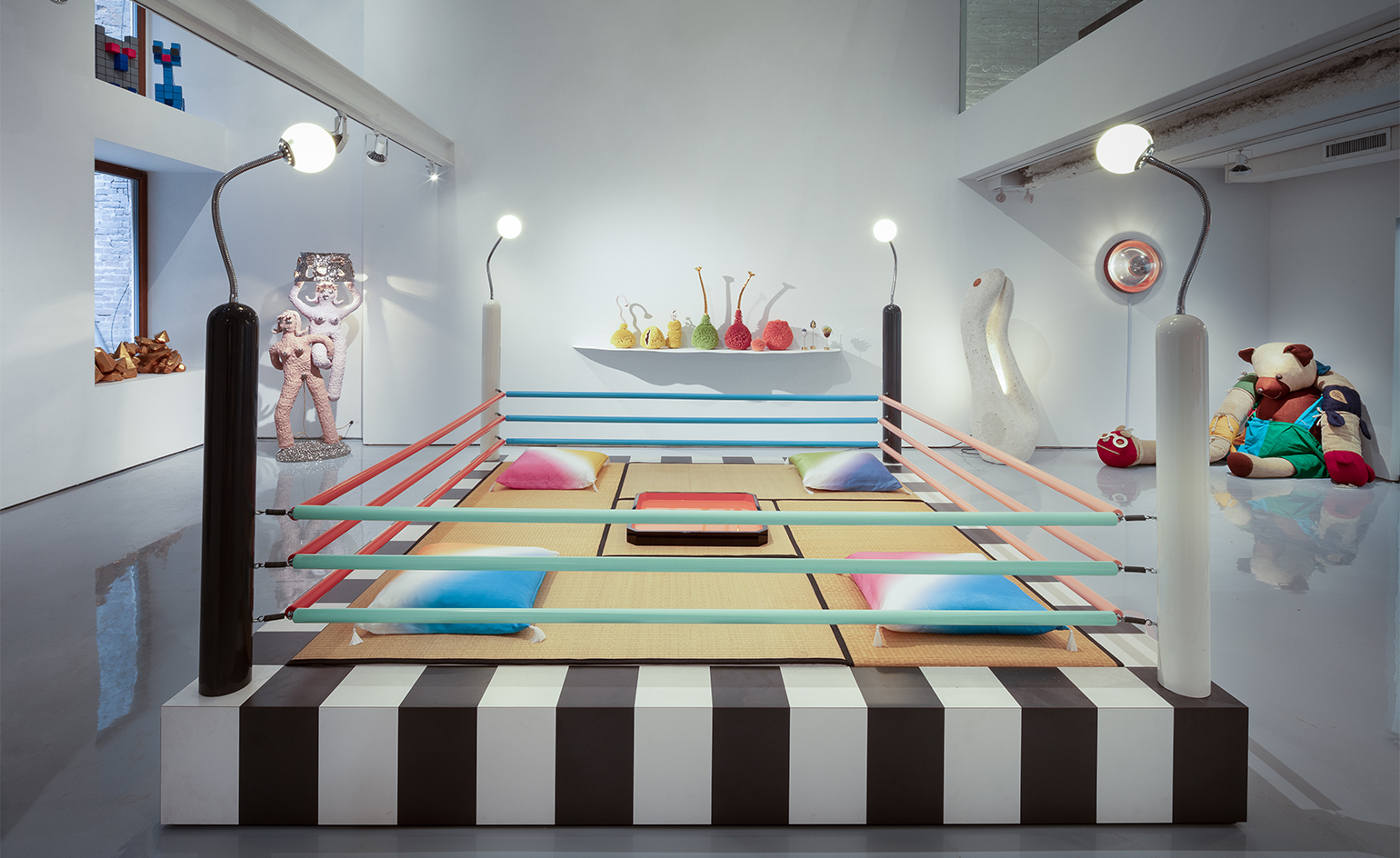
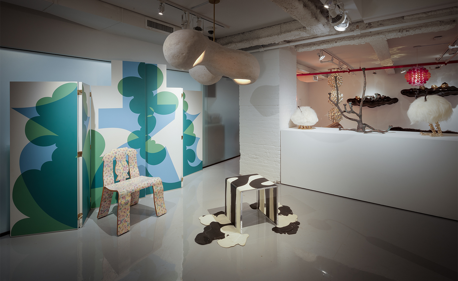
Inside R & Company’s new gallery space
‘We wanted to keep the history of the cast iron building, but still make it a contemporary space,’ says Myers. ‘The top floor is dedicated to exhibition space and offices, the middle is a library that houses archives. We plan on creating programming around the archives and inviting historians, scholars, press, and enthusiasts to learn about historical and contemporary design.’
Yantrasast adds, ‘the hardest part about the design [was] achieving unity via diversity. The space is long and deep, so we planned it with focused areas for different presentations that wouldn’t cancel each other out, like different moments in a good park. The research facility and archive are on their own floor, so we designed a different atmosphere for those areas – slowing people down so that they might look at things even closer and longer. I want it to be elusive so people will feel differently each time they return.’
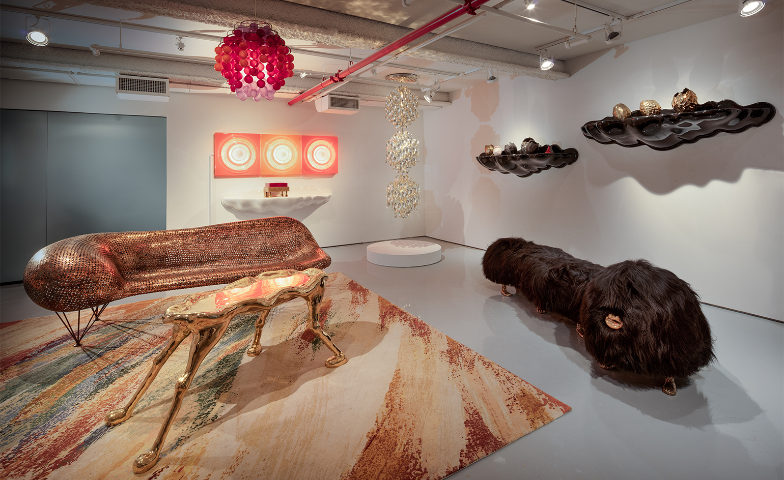
On the lower level, permanent installations devoted to Jeff Zimmerman, Rogan Gregory and Katie Stout are showcased against the exposed pillars of the building, which rest on New York City bedrock. ‘The fact that the pillars of the building rest on NYC bedrock, sticking out above the floor in the basement – it is so powerful when you can feel the anchor rock of your space,’ Yantrasat says.
Receive our daily digest of inspiration, escapism and design stories from around the world direct to your inbox.
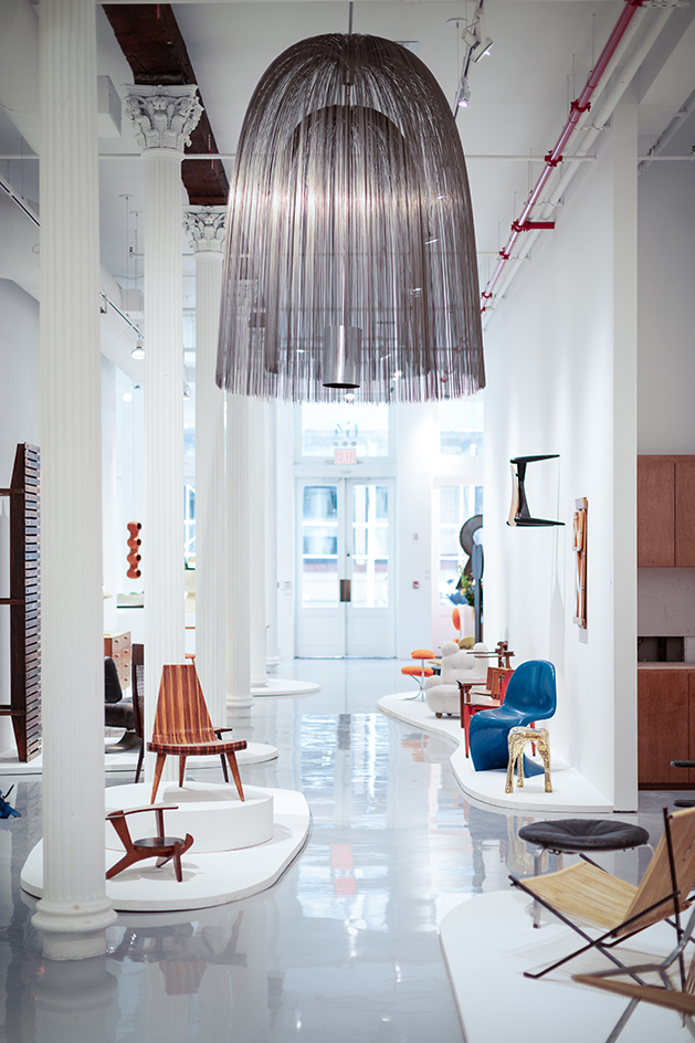
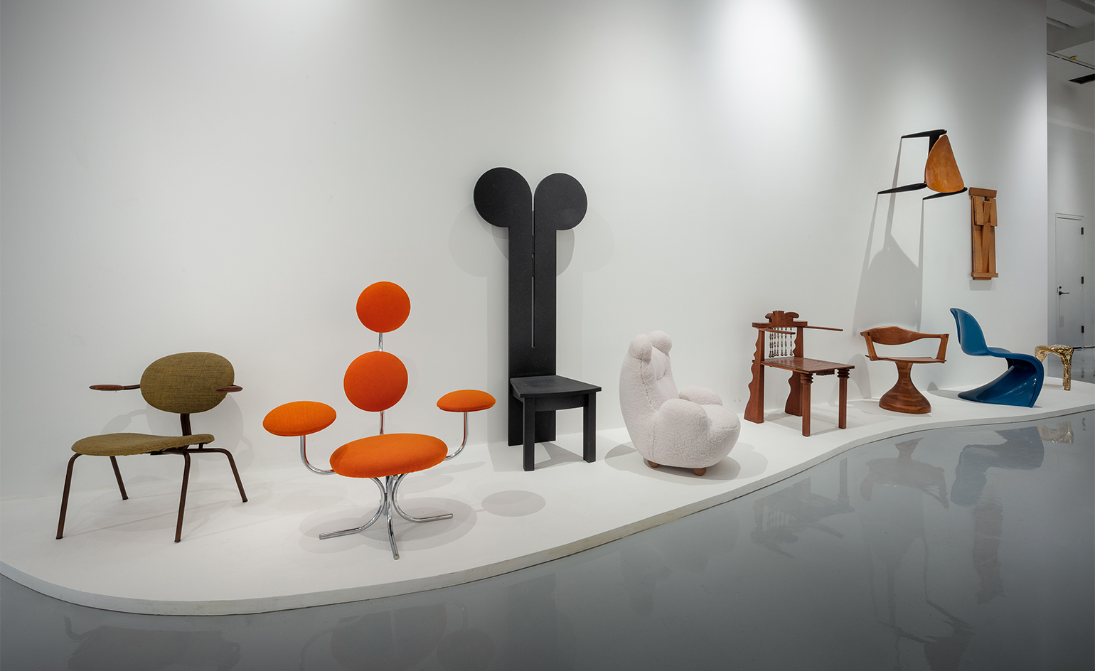
Bringing the journey full circle is the new space’s debut show, ‘20 Years of Discovery’, which highlights four areas that R & Company has been integral in developing – Brazilian Modern design, Postwar American design, Contemporary design and a group that it calls ‘Difficult’ design. With works from icons such as Ettore Sottsass, Greta Magnusson Grossman and Joaquim Tenreiro, and mavericks like Kelly Lamb, Thaddeus Wolfe and Lapo Binazzi, the show is a perfect toast to the gallery’s legacy, as well as its years to come.
INFORMATION
For more information, visit the R & Company website
ADDRESS
R & Company
64 White Street
New York
NY 10013
Pei-Ru Keh is a former US Editor at Wallpaper*. Born and raised in Singapore, she has been a New Yorker since 2013. Pei-Ru held various titles at Wallpaper* between 2007 and 2023. She reports on design, tech, art, architecture, fashion, beauty and lifestyle happenings in the United States, both in print and digitally. Pei-Ru took a key role in championing diversity and representation within Wallpaper's content pillars, actively seeking out stories that reflect a wide range of perspectives. She lives in Brooklyn with her husband and two children, and is currently learning how to drive.