Designing The Rolling Stones: the band, the branding and the Sixty tour
In this exclusive interview, creative director Mark Norton looks back on three decades of collaboration with The Rolling Stones on their visual identity, from a first lucky contribution to the Steel Wheels tour to his latest work for their Sixty tour
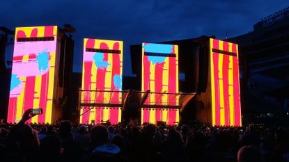
As The Rolling Stones Sixty tour is in full swing across Europe, we talk to creative director Mark Norton of London-based agency Thinkfarm. Norton has collaborated with the band for over three decades, starting with the Steel Wheels tour in 1989, and was most recently in charge of the visual identity for Sixty, the band’s 60th-anniversary tour.
As part of the anniversary celebrations, Norton and his team worked on a re-energised version of the popular Rolling Stones tongue and lips logo. Originally created in 1970 by British artist and graphic designer John Pasche (allegedly for £50), the stylised image was inspired by the iconography of the Hindu goddess Kali. In its latest iteration, the logo has been adapted for the digital age and moving image applications, with its instantly recognisable outline becoming the frame for colour and pattern.
We speak to Norton about his three decades of design with The Rolling Stones, from a first encounter with Mick Jagger and Keith Richards to creating a summer-specific stage for the Sixty tour.
Mark Norton on the design of The Rolling Stones
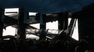
Sixty tour stage design.
Wallpaper*: How did you get started?
Mark Norton: Quite early on in my career, I got introduced to a group of set designers, led by Mark Fisher, who took us under his wing. We were young and relatively inexperienced, and he had opened the door to successfully producing some material for several shows. Mark has been very influential in transforming the essence of music entertainment projects into visual experiences. He went on to create the [2008] Beijing Olympics scheme with Ai WeiWei and was also behind the [2012] London Olympics. But then he was still a young man who worked for Pink Floyd and had designed The Wall show, and as a young architect, decided he didn't really want to make buildings, he wanted to make temporary architecture. And he found that the rock and roll shows were the perfect medium for it – as an articulate designer myself, I was fascinated by that.
W*: What were your early projects with Mark Fisher?
MN: One show we worked on was the taking over of the then completely derelict Royal Victoria Dock, in the East End of London, which had just been used for the set of Apocalypse Now to create a war scene, and we helped create the look and visual material for a Jean-Michel Jarre extravaganza.
And then a couple of weeks later, we were working on the look for a campaign for the release of Nelson Mandela. Our client was the ANC [African National Congress] and the project involved a global television broadcast. It was an integrated idea experienced by people watching at home. The graphics on TV related to the show and the posters on the streets. The idea of branding [sank in] quite fast [for] us skinny 26-year-old kids working on the project.
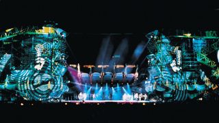
The Steel Wheels tour stage.
W*: How did that lead to the Rolling Stones?
MN: Patrick Woodroffe, who had been lighting The Stones for some time, had got Mark involved in doing his first proposals for Steel Wheels, in 1989, and Mark very generously opened the door to us and we jumped at the opportunity.
Wallpaper* Newsletter
Receive our daily digest of inspiration, escapism and design stories from around the world direct to your inbox.
We worked on a look and a logo and tried to get to the soul of what this idea might be. There were a lot of conversations with Mick [Jagger] at the time, and he has always been incredibly on it in terms of art and branding and what’s the story of The Rolling Stones; there was a conversation about stuff he’d been reading about, a William Gibson book called Mona Lisa Overdrive, about the life of an avatar character. This was 1989, a very early probe into the future. And this was the starting point for Steel Wheels, a sort of dystopian future idea, and I produced graphics, the identity elements, the branding component, helped dress the stage, [worked on] the album cover and the marketing look. The stage design that Mark was doing was a very physical evocation of a broken portable city that arrived in all these stadiums.
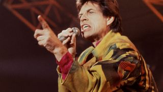
Mick Jagger performing during the Steel Wheels tour.
W*: What did you learn about designing musical events from working on the Steel Wheels tour?
MN: I had incredible good luck being invited into the first part of the tour and seeing the things being built and realised, and seeing how these things were deconstructed and put in boxes and moved around the world, and how you needed to create elements that had enormous simplicity. You’re dealing with audiences of 100,000 people; they have to respond to lighting design, on a set design level, but even on a graphics level, the people you are designing for are not necessarily design literate. We are talking about my working-class cousins, we are talking about people who have jobs as mechanics and have spent vast amounts of their savings on a special day out, and have come from Milwaukee; they are going to sit in a stadium all day and want something that's going to make them feel like they got an experience.
So you’re trying to get a balance between Mick, who is very articulate and mixes with the world’s most influential artists, is a piece of pop art in himself, and on the other hand you have Joe and Jane in Milwaukee. And somewhere you have to create a marriage between those two entities.
I learned all this with that first show 33 years ago, and ever since then, I've been ploughing the same thing effectively. Every time we come at it, I learn more, but this context never changes from what I saw then, which was going into a field and seeing Joe and Jane and Mick, and a wedding between them.
W*: How has your work for The Rolling Stones evolved in these past three decades?
MN: If you look into the economics of touring, you would find out that this show introduced a new model for the way that large-scale music event touring happened. And the reason for it is that up until that point, every time a band went on tour, they had to dig into their own pockets in order to finance the tour, which was effectively a marketing tool for an album. But on [Steel Wheels] – after a ten-year hiatus where the band hadn't been touring – a Canadian entrepreneur gave them a guarantee financially that underwrote the risk they took to go back on the road. And that put the band’s visual identity at the centre of the equation for the very first time. It became the fiscal glue between all of these components: an album, a marketing campaign, a stage show and a huge range of clothing you could buy. And these things were all part of a financial model.
From that moment, branding and identity and the role it plays in cementing [the relationship between other elements] was at the centre of everything we did.
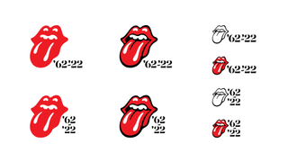
The re-energised tongue logo.
W* Tell us about the re-energised tongue logo for The Rolling Stones’ 60th anniversary. What was the process to create it?
MN: There always has been a sort of relentless drive there, never to be old, never to be retro. Every time they're creating a new project, it actually is about the reinvention of them.
So when the project for the 60th anniversary came along, it presented a massive conundrum, because of course, what is an anniversary if not looking back? But actually, just like all good design solutions, the answer is inside.
So we started playing, trying to create something that looks like the future, looking at the idea that you could create this synthetic thing, which was a bit ambiguous, it had no time. And at the same time, redraw the original tongue logo (for only the third time in its life), so that the thing that looks new also looked like it came from the 1960s. It was a very deliberate reference to what [its creator] John Pasche did originally.
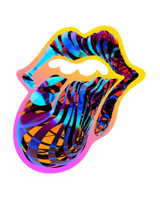
The re-energised tongue logo.
W* And what was the result?
MN: The logo had been a static thing, but here we wanted something that felt sexual, that had that wetness, that was not made up of angles or corporate drawing, but which went to the core of Stoneness in an old way [and yet] was the template for something that was vivid and colourful and modern.
And out of that came a design system that actually uses both [new and old approaches] in combinations and various ways and uses a custom-built typeface and a style guide. It was systems thinking inspired by the conundrum itself: how do you deal with new at the same time as staying old?
And then the naming was a reflection of the same conundrum, because how do you say anniversary, without sounding like granddad? You say Sixty!
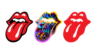
The re-energised tongue logo.
W* The logo appears on merchandise, moving images, at different scales: how does it get declined in its various iterations?
MN: I worked together with two other designers in my studio, Zoe Prosser who has been working on the digital stuff on what has been her first big-scale project, and Elke Pettitt, who is a very experienced brand designer.
We created a brand guide, a package that defines the look of the tour to the promoter, who in turn distributes it across various firms working on the tour. And then we deal with a merchandise company that then takes our material and creates ranges of things from it.
In the old days, we did it all. But these days, we create the core of the system, the set of assets that plug together, and then give them instructions about what they can and can't do with it.
I am still thinking about Jane and Joe all the time. And I know that the cousins of Jane and Joe may be in the marketing department at the Milwaukee promoter, so you have to give them rules, but you also have to accept that they're going to mash it as hard as they can.
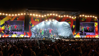
Sixty tour stage design.
W*: What are the most important elements of the stage design for the Sixty tour?
MN: When tours like this [go to] other parts of the world [other than Europe], quite early on in the performance, night has fallen and the stage becomes an opportunity for lighting designers to make something of it.
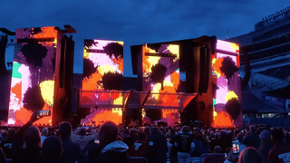
But when you’re touring in Europe in summer, in most cases it doesn't get dark until 10.30 at night, so the show needs to have a physical form that works in daylight. I don't always do material that is so viscerally central to the look of the stage, but on this occasion, I got asked whether I could contribute to the look of that daylight form, because it had to be a big static printed piece of art.
This great big piece of art has to be – excuse the rock ’n’ roll language – a bit fuck off. You want something that says you have arrived at a Rolling Stone stage. Because we're working in a world now where branding moves, whereas it didn't 33 years ago. You must consider all of the social media components; when you're designing a mark, you're also thinking about how it can be eye candy, how it can attract somebody's attention in the top corner of the screen. So it's the same idea as it was 33 years ago, but it's done using the media of the moment, for the medium of the moment.
Sixty tour stage design.
W*: Can you share a favourite anecdote from your time working with The Rolling Stones?
MN: I could go back to the very first time I met them. I was in Mark’s office, in a garage at the back of his home, in King’s Cross, with three or four limos waiting on the road outside, and Mark had a model of the Steel Wheel stage in the living room. I had a big A1 portfolio of as many sketches I could possibly have managed to make, because I really wanted that job. My knees were shaking, I was 28 years old and this was the biggest band in the world.
But something happened for me to be shown into the garage to show Mick and Ronnie [Wood] and Keith [Richards] the work. I opened this book and started flicking through all of these drawings and I had no idea what to say, because if I was frightened of Mick, I was terrified of Keith, but actually he was charm itself. And, and as I went through it, I said, ‘I'm just fishing. Just fishing for thoughts.’ And [Keith] looked at me and said, ‘Yeah, man. We're all fishing.’
What I really treasure is that of course, as a musician, that's exactly what he's doing all the time. He's fishing. That idea of jamming and finding something that works is very organic. And what he was doing was putting me at ease, including me in a process of finding something rather than being in a pitch that was binary. He was saying, let's go on a journey and find things out. And there has always been room to do that with them.
INFORMATION
rollingstones.com
thinkfarm.co.uk
Rosa Bertoli was born in Udine, Italy, and now lives in London. Since 2014, she has been the Design Editor of Wallpaper*, where she oversees design content for the print and online editions, as well as special editorial projects. Through her role at Wallpaper*, she has written extensively about all areas of design. Rosa has been speaker and moderator for various design talks and conferences including London Craft Week, Maison & Objet, The Italian Cultural Institute (London), Clippings, Zaha Hadid Design, Kartell and Frieze Art Fair. Rosa has been on judging panels for the Chart Architecture Award, the Dutch Design Awards and the DesignGuild Marks. She has written for numerous English and Italian language publications, and worked as a content and communication consultant for fashion and design brands.
-
 Tour Jacquemus’ new store, a serene Mediterranean escape in central London
Simon Porte Jacquemus has united with OMA on his latest store – a Meditteranean-inspired bolthole on London’s New Bond Street. Here, they talk Wallpaper* through the transporting space
By Jack Moss Published
-
 An intimate spa at high-design New York country hotel Inness is now open
Inness brings Manhattan-calibre wellness to the rural hamlet of Accord, New York
By Craig Kellogg Published
-
 Inside ‘De toutes beautés!’, the Louvre’s new exhibition narrating 10,000 years of beauty ideals through art
‘De toutes beautés!’ marks the beginning of a three-year partnership between the Louvre and L’Oréal Groupe. India Birgitta Jarvis reports on the show for Wallpaper*
By India Birgitta Jarvis Published