Sabine Marcelis’ seamless intervention at the Mies van der Rohe Barcelona Pavilion
Dutch designer Sabine Marcelis installs new series No Fear of Glass at the Mies van der Rohe Barcelona Pavilion, adding a new poetic dimension to the modernist structure
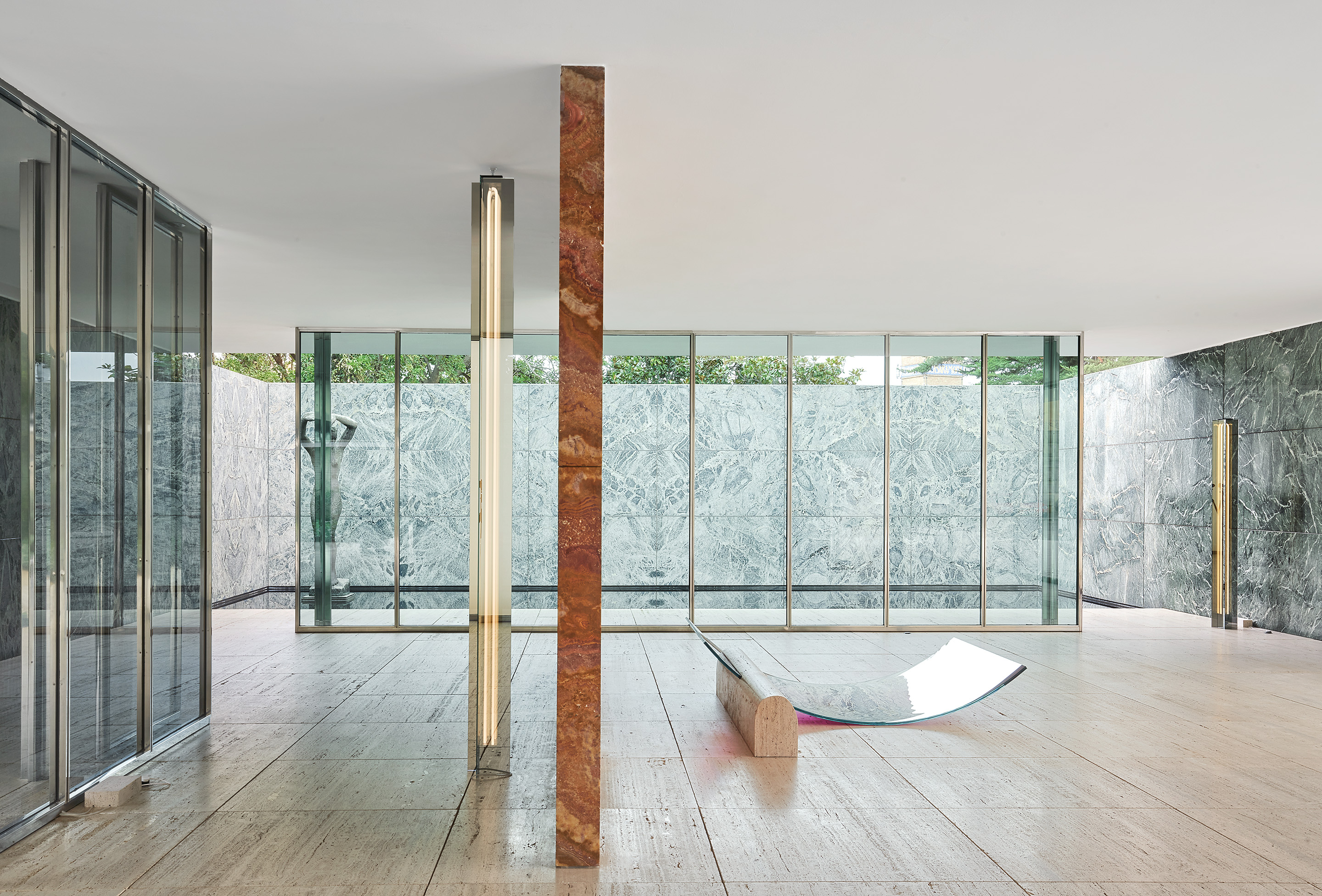
Following in the footsteps of Ai Weiwei, Enric MIralles and Ryue Nishizawa, Dutch designer Sabine Marcelis is the latest in a short line of artists with permission to temporarily alter the Mies van der Rohe Pavilion in Barcelona. Her exhibition, presented with Side Gallery and titled No Fear of Glass, includes five new works installed at the iconic architectural structure, and is a beautiful update on Mies’ intention for the space as ‘an ideal zone of tranquillity.’
The Barcelona Pavilion embodies the spirit of 20th-century modern architecture and was first built in 1929. Intended as a reception space for the Barcelona International Exhibition, it was designed to be mostly bare: architecture that was a conduit for the views beyond, a continuous space; blurring inside and outside, containing only the famous (specifically designed) Barcelona chairs and a single sculpture. Since its reconstruction in the 1980s has been a place of pilgrimage for architects from all over the globe.
An intimidating commission, perhaps, Marcelis is an apt choice to take it on. As a starting point, she takes the request made to Ludwig Mies van der Rohe to ‘not use too much glass’ in his construction, and makes the material central to her new pieces. She tests it and pushes it to its limits just as Mies van der Rohe and Lilly Reich did with the other materials in their palette nearly a century ago to test their design ideals.
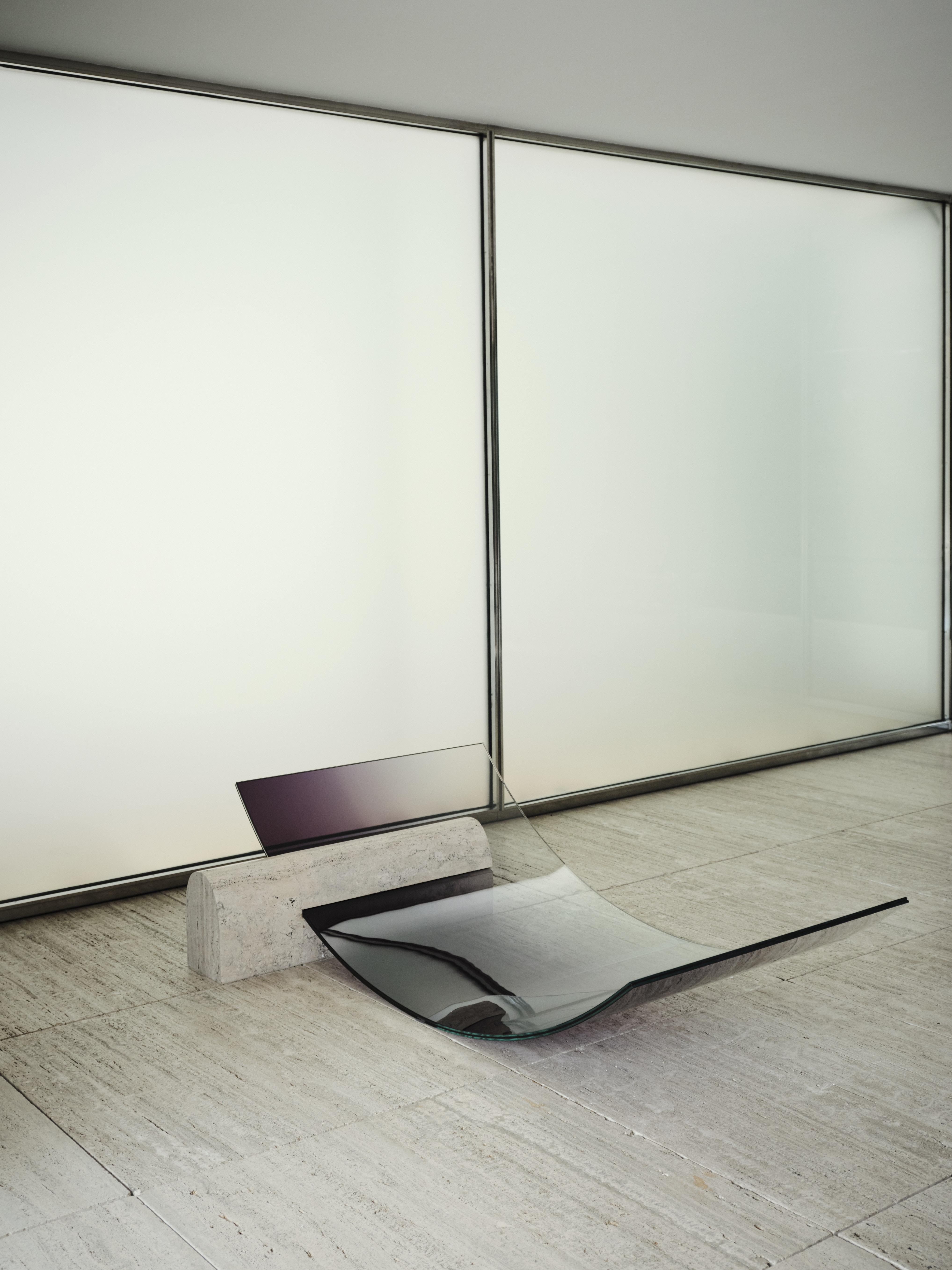
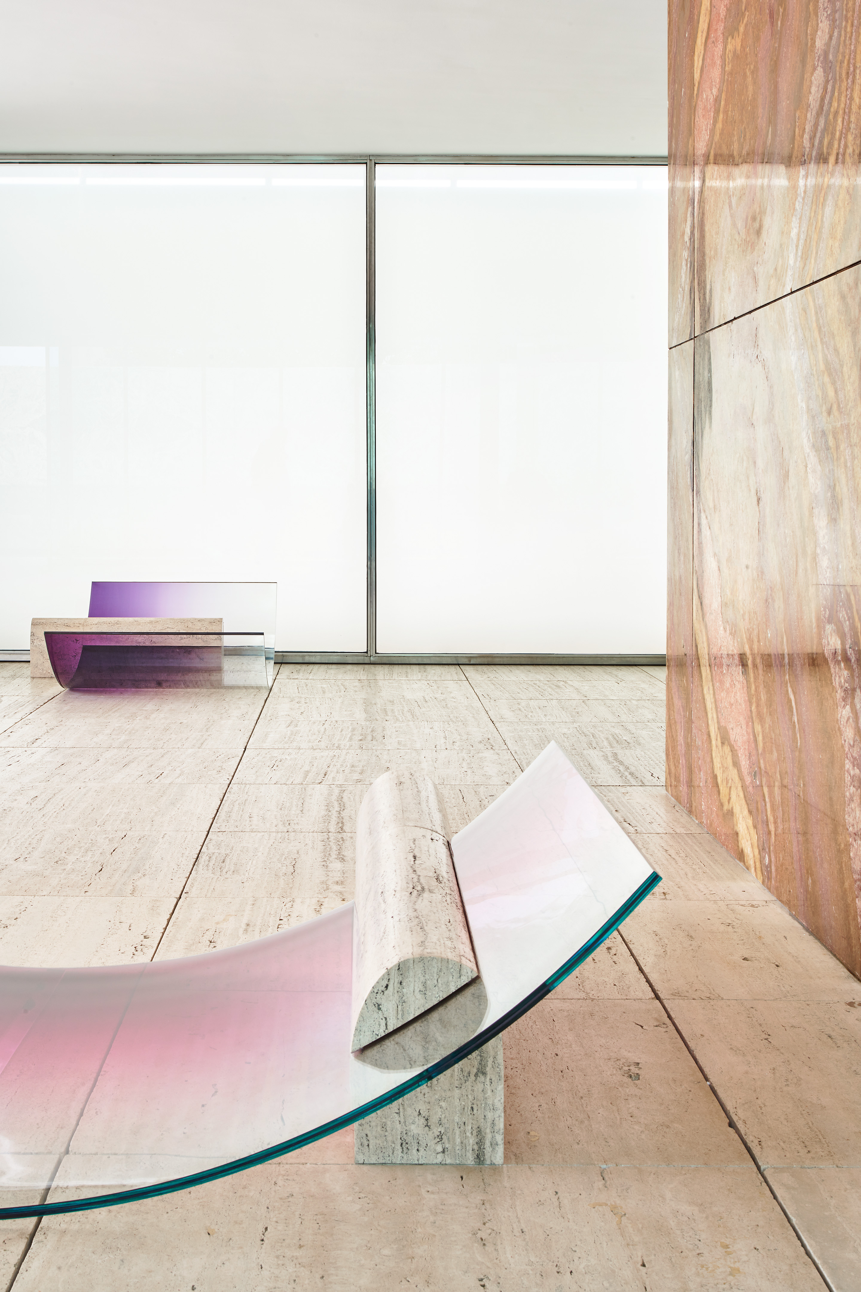
Above, Single chaise longue. Photography: Nacho Alegre. Below, Double chaise longue and Single chaise longue. Photography: José Hevia
The result is a series of pieces that seem to be grown and extruded from the structure itself; in glass, travertine and chrome. Two large chaise longues see the travertine floor extended to form a base, which is then sliced by a singular sheet of curved glass. These sculptural yet functional furniture pieces are immediately futuristic, somehow timeless, and extremely inviting.
In response to the eight chrome columns which provide the structural support for pavilion’s roof, Marcelis has also introduced a ninth. In mirrored-glass her vertical structure functions as a light and is placed in line with the existing columns, blending in seamlessly, and adding a new poetic dimension to the space.
The work of Marcelis defies fixed definitions, says Ippolito Pestellini, partner at OMA/AMO and a contributor to an upcoming book that will document the exhibition. ‘For years she has been working tirelessly to push the limits of materials, extending their qualities and performance. What at first glance looks like a purely aesthetic exercise is actually the output of a scientific and systematic research into production processes. The act of design in her practice becomes a different story, one where light, colour, reflection, strength and curvature are the driving categories of a research that is not limited to form and geometry, and that transcends the scale of objects as we know it.’
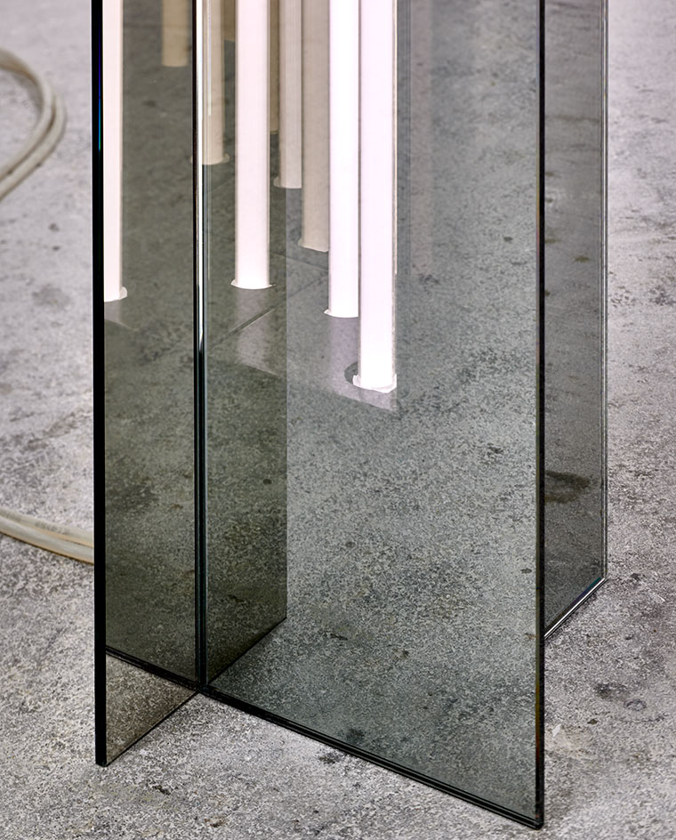
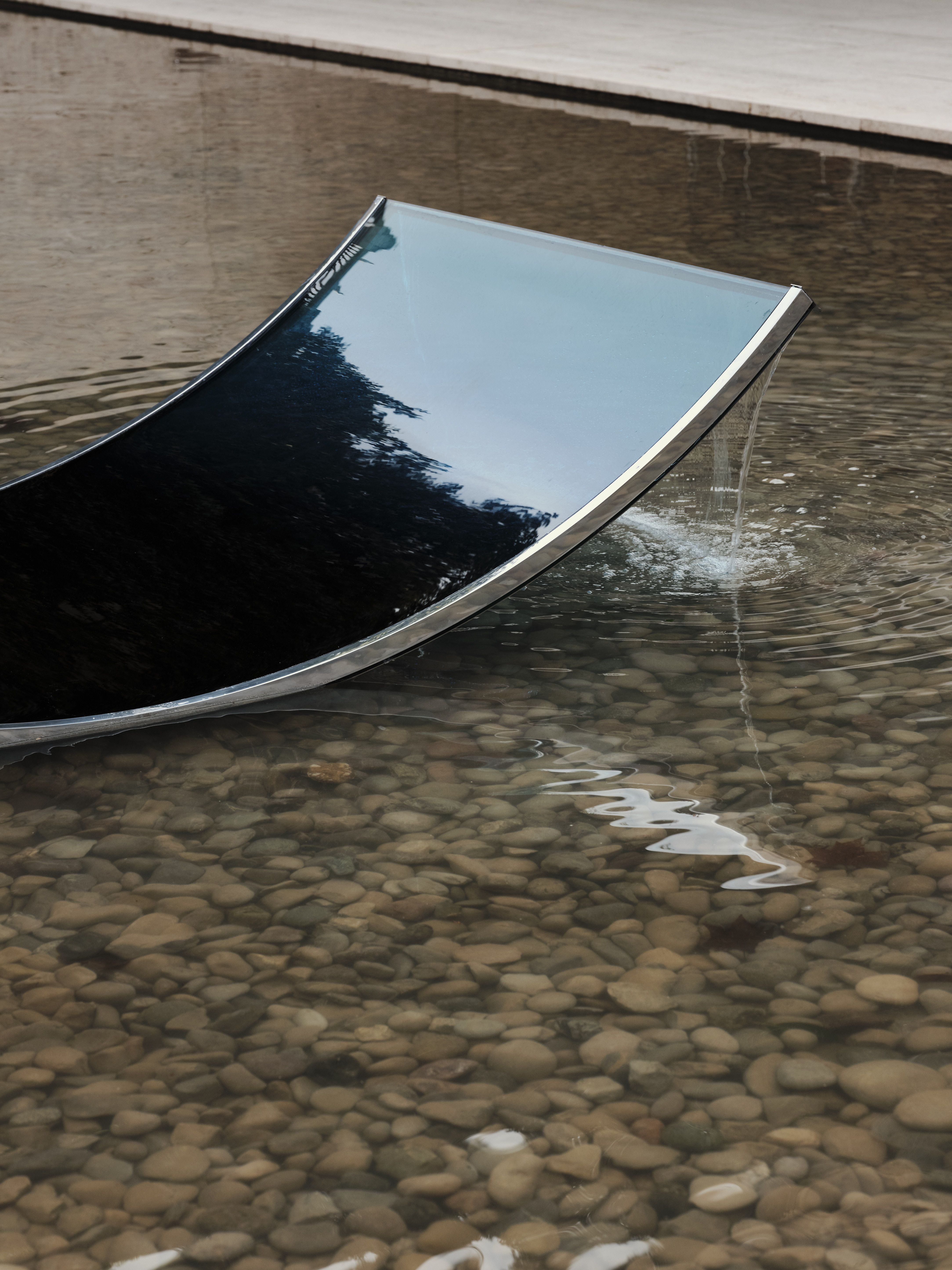
Above, detail of ‘Pillar’ lamp. Photography: Pim Top . Below, ‘Fountain’ Photography: Nacho Alegre
The final piece in the series can be found in the water pond outside: a curved glass fountain that appears to bend the water upwards from the ground, and letting it spill over and back down. Subtle, yet compelling, each of Marcelis’ interventions invite a fresh look at this seemingly untouchable space. Each, in their own way, actually improving it with a 21st century perspective on the modern way.
Wallpaper* Newsletter
Receive our daily digest of inspiration, escapism and design stories from around the world direct to your inbox.
The act of design in her practice becomes a different story
Ippolito Pestellini
Curator Maria Cristina Didero also describes Sabine Marcelis’ approach as being unique and highly recognisable: ‘Her design is sharp, severe and at the same time syrupy, honeyed - you might even want to smell or bite her pieces of furniture, which are always extraordinary.’ Consider it a warning. But if you do want to lick it, it’s surely a sign of good taste.
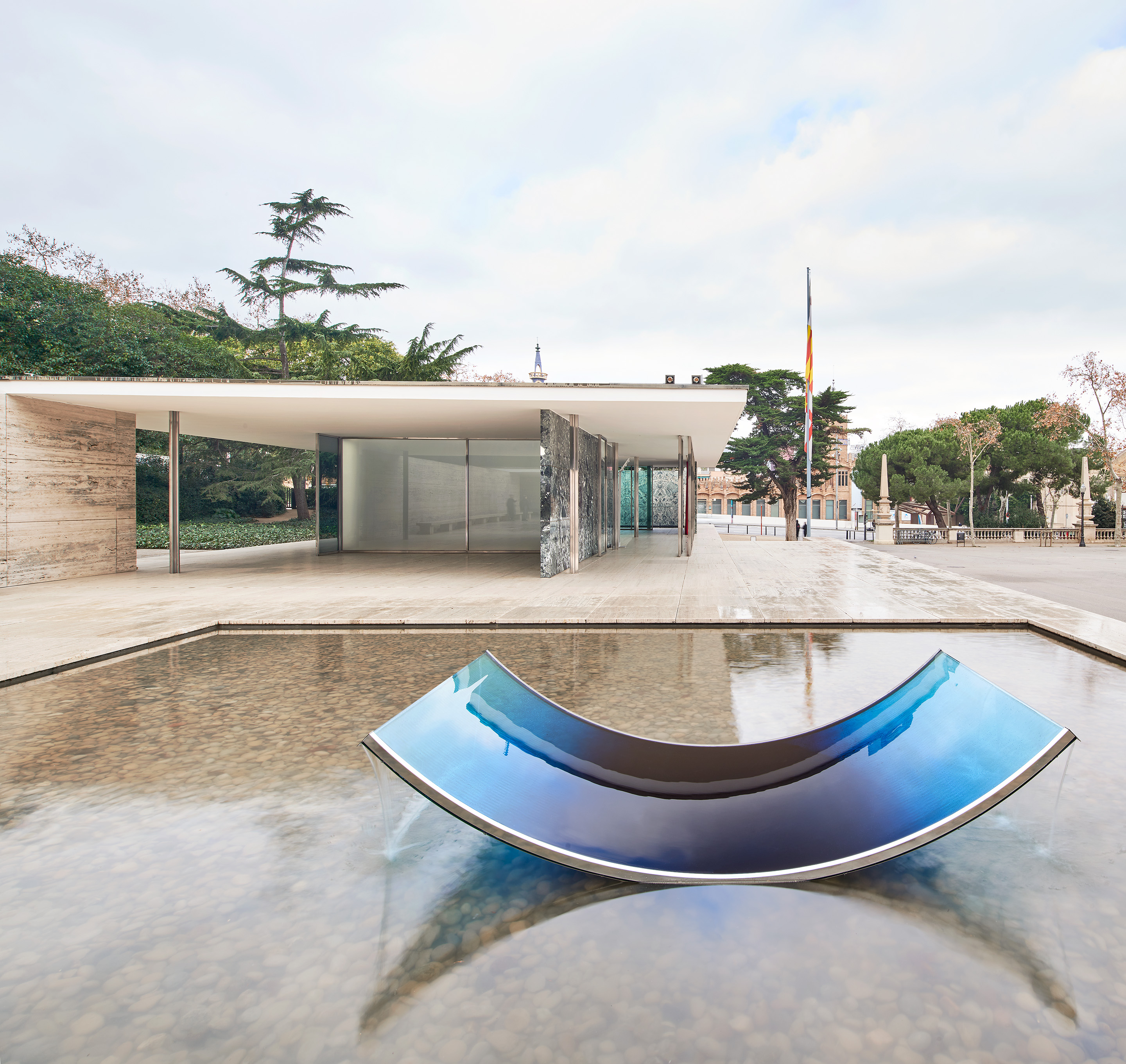
Installation view of Fountain. Photography: José Hevia
INFORMATION
Installation view of Fountain. Photography: José Hevia
ADDRESS
Av. Francesc Ferrer i Guàrdia, 7
08038
Barcelona
Henrietta Thompson is a London-based writer, curator, and consultant specialising in design, art and interiors. A longstanding contributor and editor at Wallpaper*, she has spent over 20 years exploring the transformative power of creativity and design on the way we live. She is the author of several books including The Art of Timeless Spaces, and has worked with some of the world’s leading luxury brands, as well as curating major cultural initiatives and design showcases around the world.
-
 At Linden Los Angeles, classic New York comfort food gets its due
The restaurant, inspired by a stretch of boulevard bridging Brooklyn and Queens, honors legacy, community and pleasure
By Carole Dixon Published
-
 Faye Toogood comes up roses at Milan Design Week 2025
Japanese ceramics specialist Noritake’s design collection blossoms with a bold floral series by Faye Toogood
By Danielle Demetriou Published
-
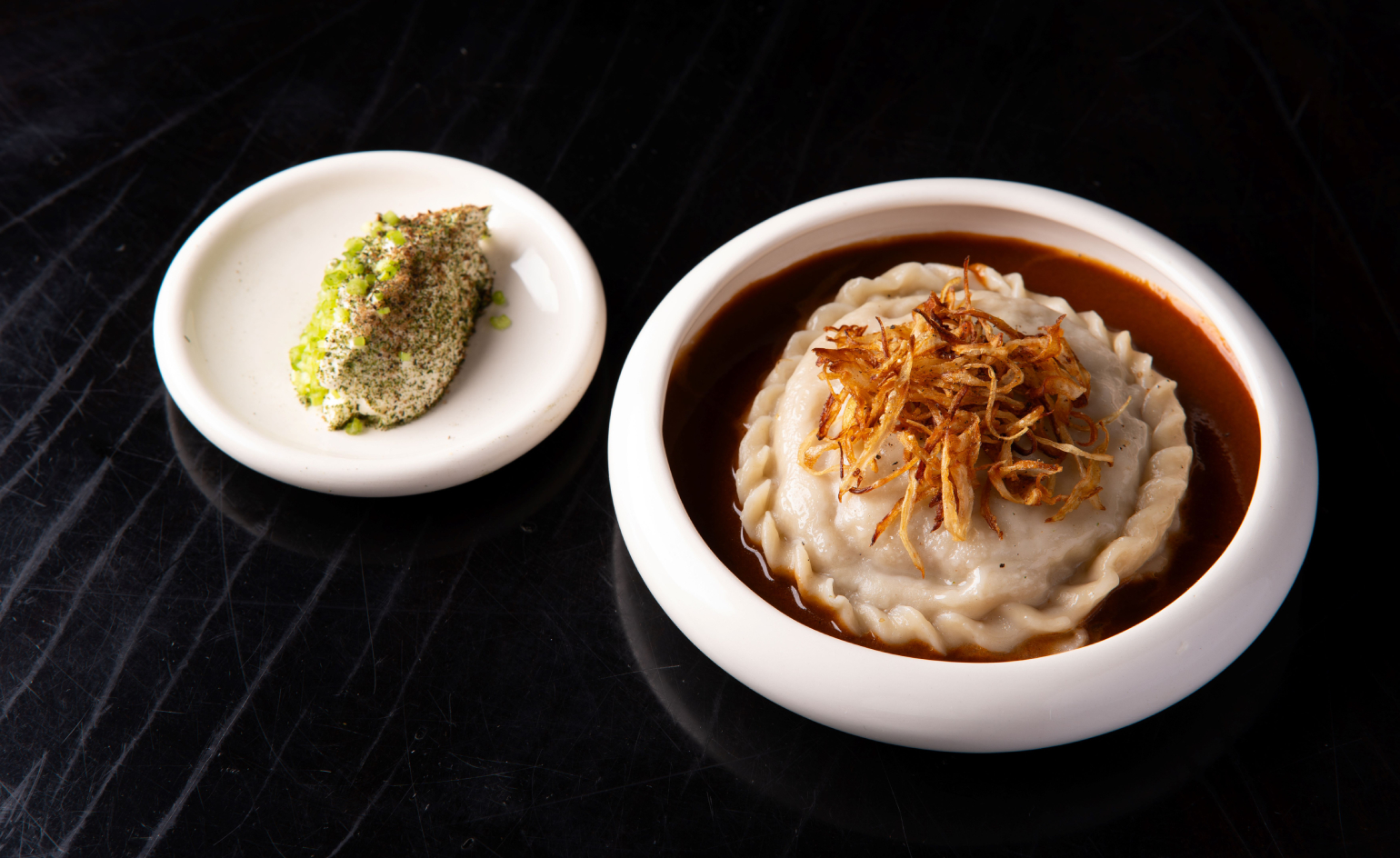 Tatar Bunar puts Ukrainian heritage front and centre
Family recipes and contemporary design merge at this new east London restaurant by Ukrainian restaurateurs Anna Andriienko and Alex Cooper
By Ben McCormack Published
-
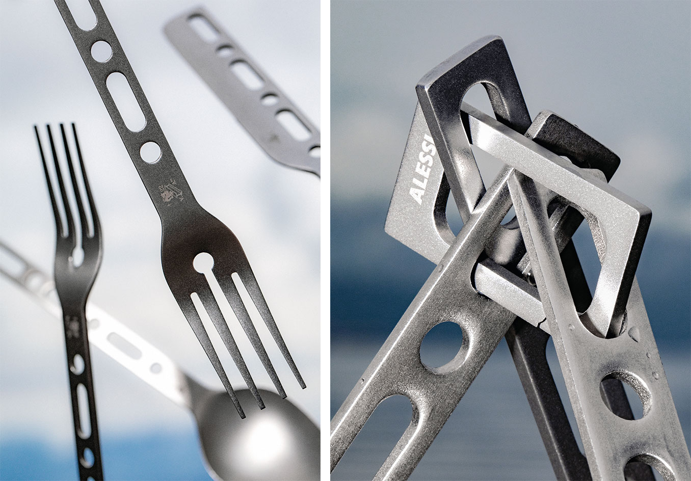 Alessi Occasional Objects: Virgil Abloh’s take on cutlery
Best Cross Pollination: Alessi's cutlery by the late designer Virgil Abloh, in collaboration with his London studio Alaska Alaska, is awarded at the Wallpaper* Design Awards 2023
By Rosa Bertoli Published
-
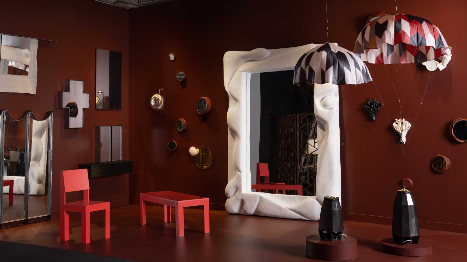 Design Miami 2022: highlights from the fair and around town
Design Miami 2022 (30 November – 4 December) aims at ‘rebooting the roots of our relationship with nature and collective structures, ecospheres, and urban contexts’
By Sujata Burman Last updated
-
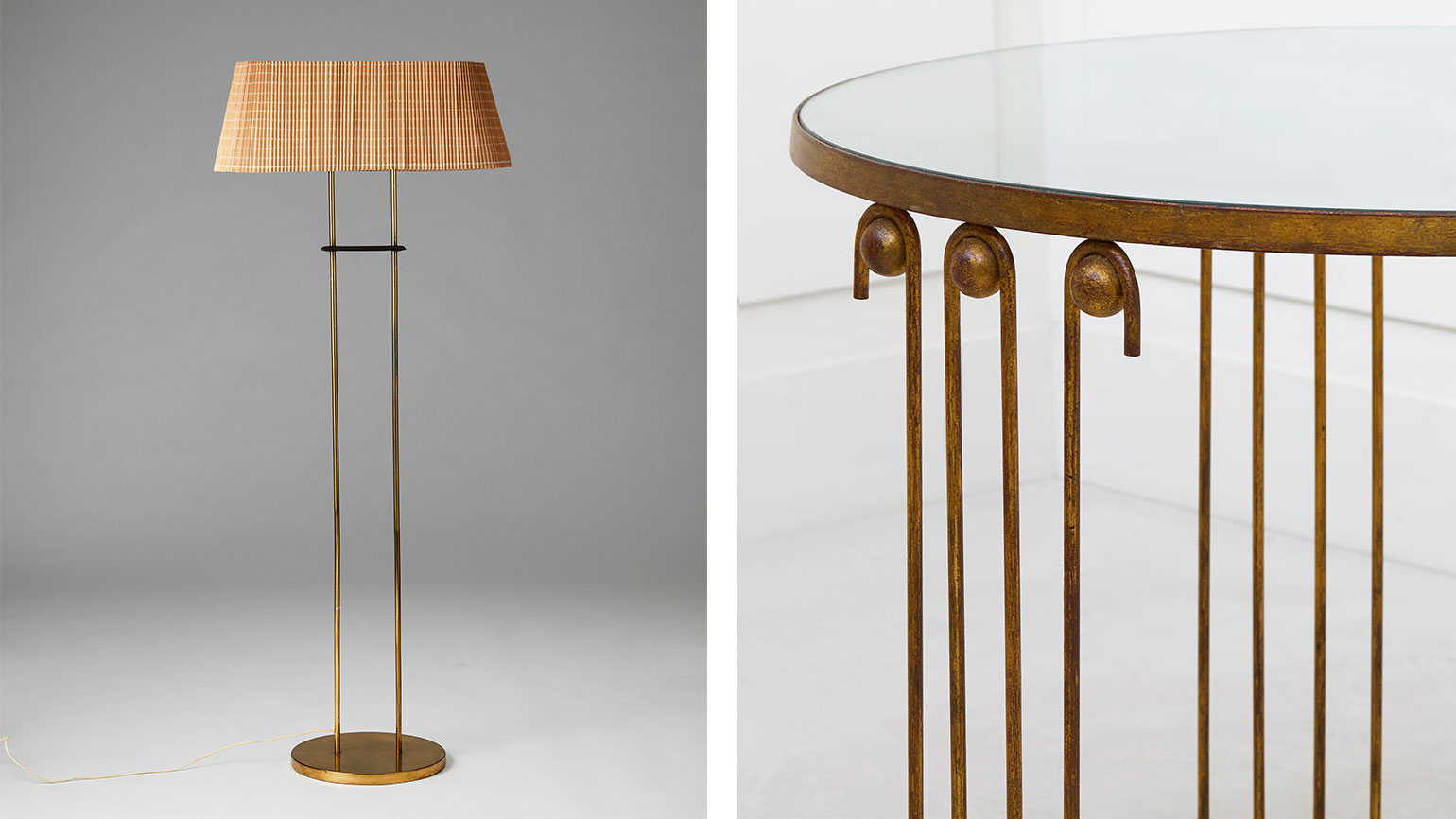 Salon Art + Design 2022: design highlights not to miss
Wallpaper* highlights from Salon Art + Design 2022, New York
By Tilly Macalister-Smith Last updated
-
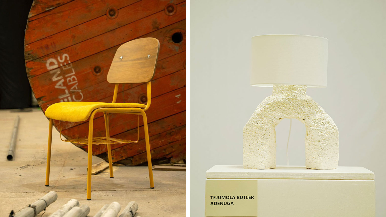 Design Week Lagos 2022 celebrates creativity and innovation in West Africa and beyond
Curated by founder Titi Ogufere, Design Week Lagos 2022 is based on a theme of ‘Beyond The Box’
By Ugonna-Ora Owoh Last updated
-
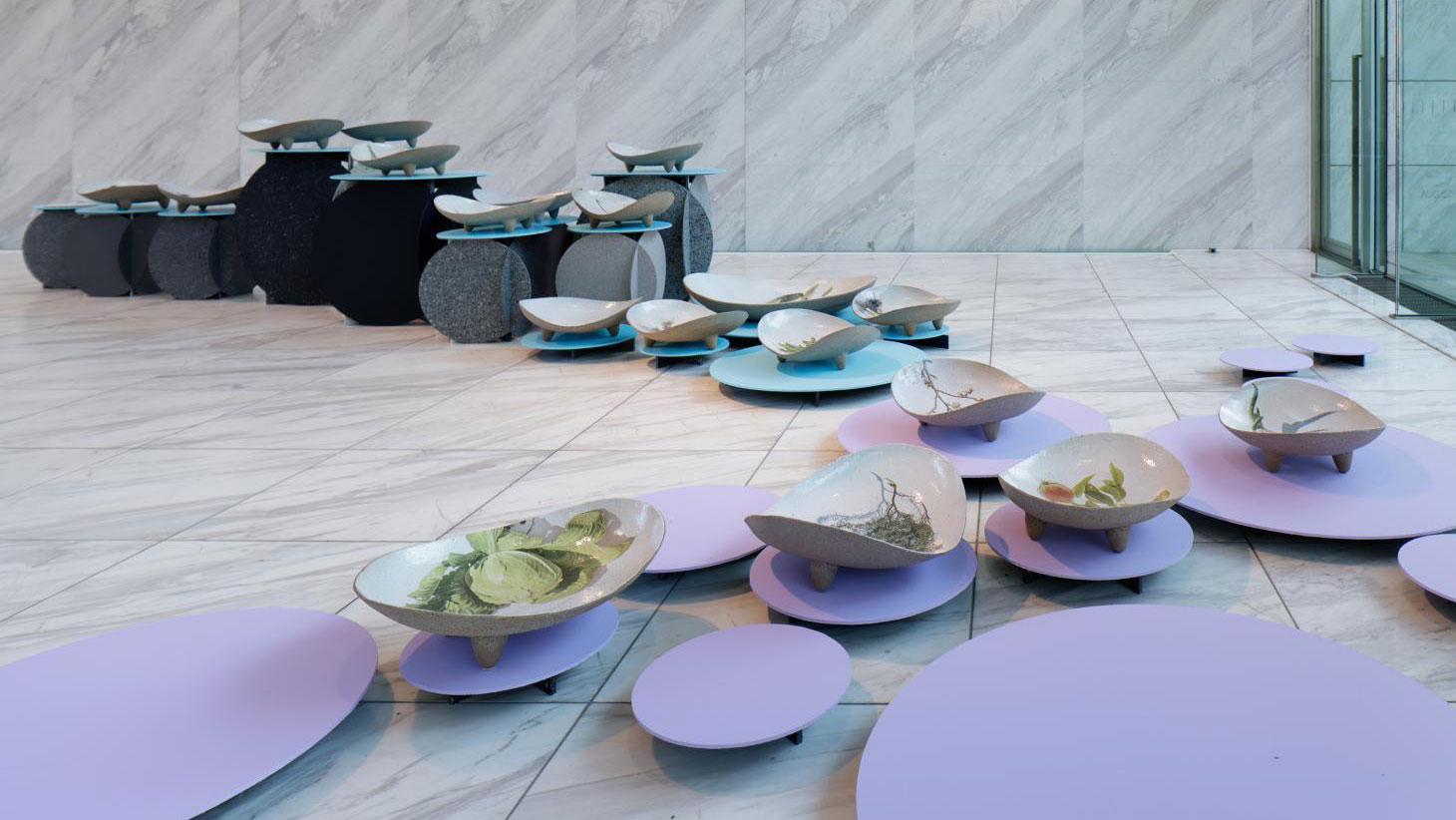 Designart Tokyo transforms the city into a museum of creativity
Designart Tokyo presents global design highlights through a series of exhibitions involving global creative talent and traditional Japanese craft
By Danielle Demetriou Last updated
-
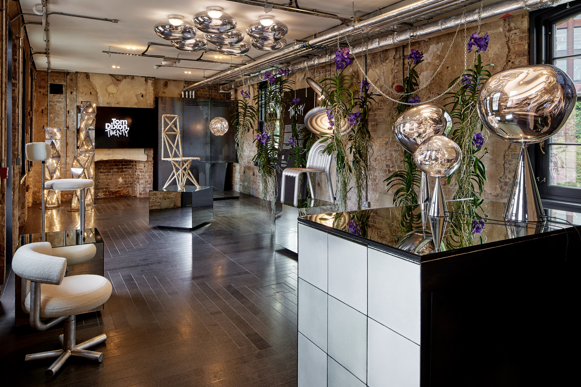 Tom Dixon marks his studio's 20 years with a show of design experiments
Mushroom, cork, steel coral and more: Tom Dixon showcases an overview of his design experiments as he celebrates his practice's 20 years
By Rosa Bertoli Last updated
-
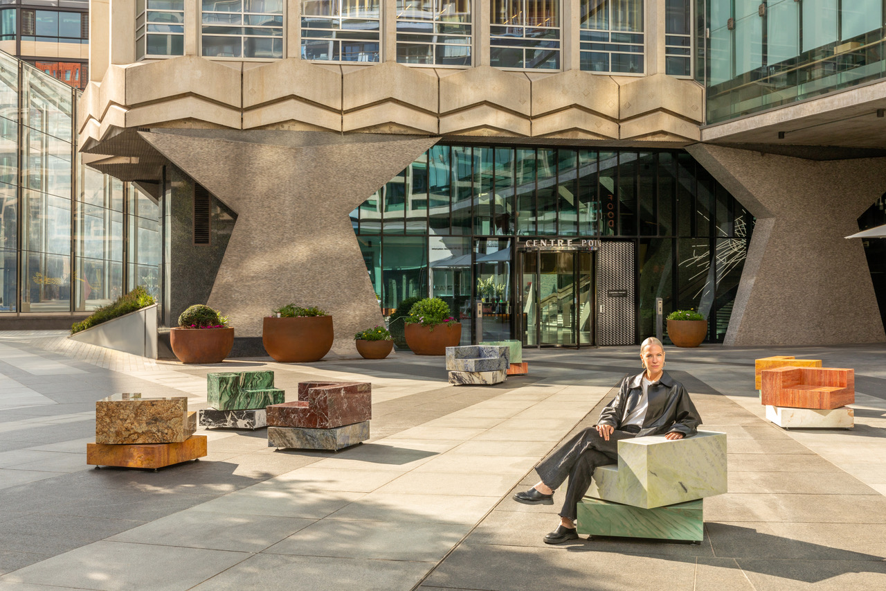 Sabine Marcelis’ swivelling marble seats bring London square to life
London Design Festival 2022: Sabine Marcelis presents Swivel (until November 2022), in partnership with Almacantar and with natural stone by SolidNature
By Rosa Bertoli Last updated
-
 Vitra unveils new London home in the Tramshed, Shoreditch
London Design Festival 2022: after a year-long renovation, Vitra opens the door to its new showroom in the heart of Shoreditch
By Rosa Bertoli Last updated