Set in stone: Sekford and Salvatori carve out a timeline of typography
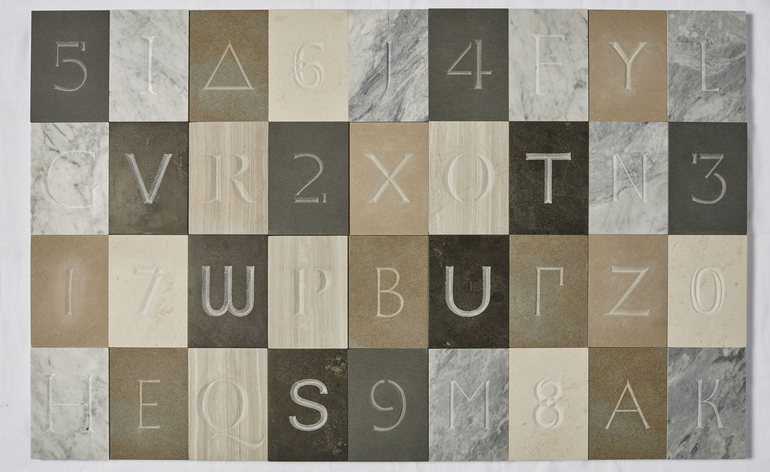
‘Typography evokes a period. Even if you don’t know anything about typography, you sort of know what period it is from,’ says Sekford creative director Kuchar Swara on the power of type. In a special new collaboration, the most prominent typographical periods in history have been engraved into Italian brand Salvatori's stone wares in celebration of typography's evolution.
In an effort to honour the art form, Sekford set out to explore lettering through a technique that inspired its dials: stonemasonry. Titled 'Cutting Through Time', the exhibition went on show during London Design Festival last month, with 26 letters and 12 numbers that delved into a typographical timeline from Ancient Greek and Imperial Roman, to Bauhaus via handsome stones and eloquent carving methods.
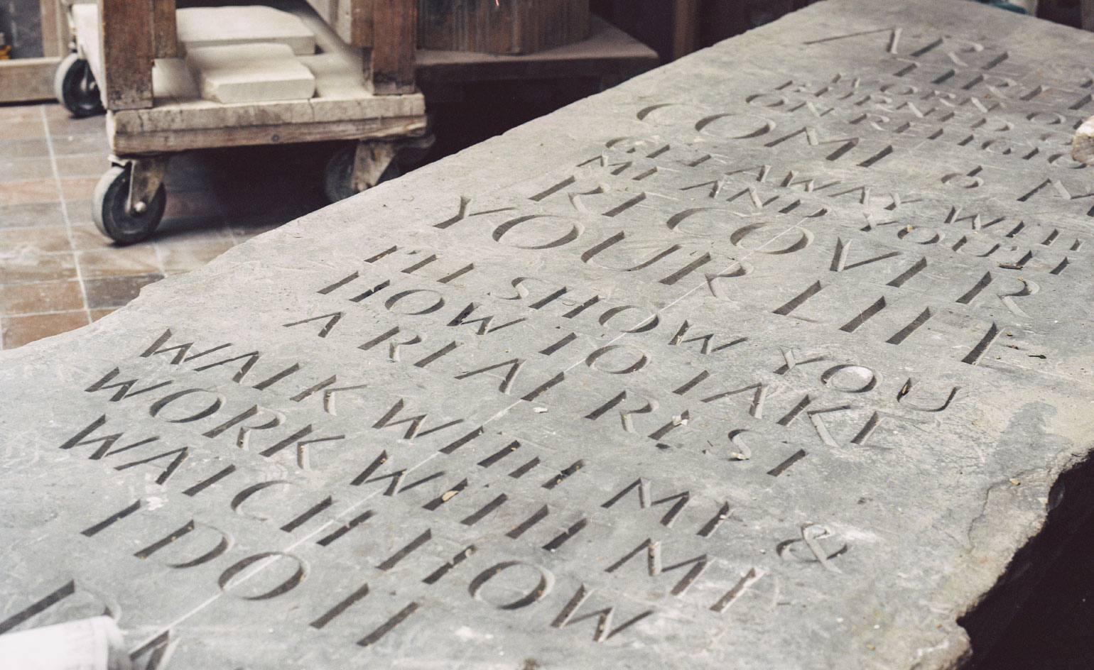
A hand-carved slate in typeface designer and sculptor Richard Kindersley's studio
Sekford approached British typeface designer and stone letter carver Richard Kindersley to rally the nation’s top cutters for the project. Together, they took on the task of working with Salvatori's impressive catalogue for the first time in this way, mastering the shapes in textured fine stones including Pietra d'Avola for Bauhaus, Silk Georgette for Scotch Roman and Avana for Gill and Johnston.
Aside from the challenge, Swara intended the exercise to be an educational one, distinguishing a visual narrative of the different styles. 'If you look at the very first one, the Ancient Greek letterings are so fine, simple and pure,’ he says. ‘There is almost a line coming back, a full circle when you look at the Bauhaus lettering. The postmodernist interpretations also have simple lines, no thick and thin stresses – it's all to do with the angles.’ To wit, the stones evoke the genesis of type, where decorative experimentation had a moment, but circled back to clean line work.
The timeline concludes on the contemporary carving, which is relatively open to interpretation. Realised in 7, 8 and 0, the designs exude surprisingly decorative shapes, yet still in a modern aesthetic, keeping in line with typography’s intimate tale of ‘going back to go forward.’
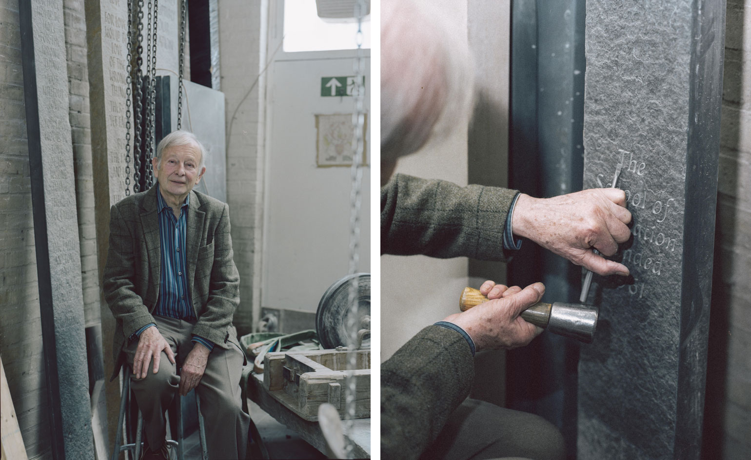
Sekford approached lettering master Richard Kindersley, pictured here in his studio, to spearhead the project
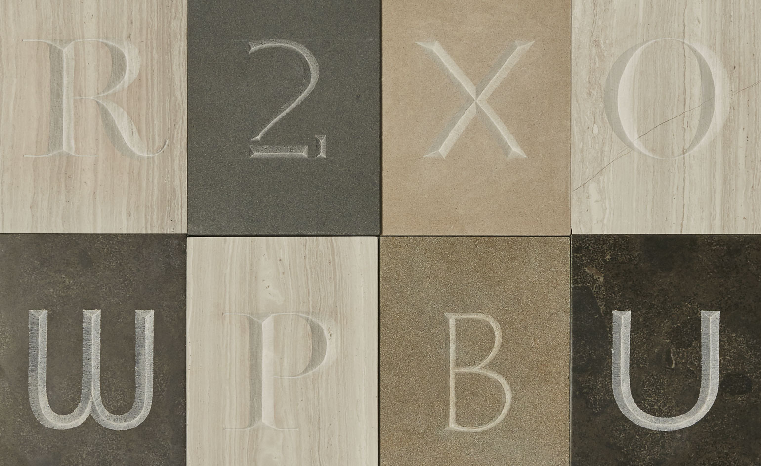
Entitled ‘Cutting Through Time,’ the exhibition proposes a typographical timeline from Ancient Greek to Bauhaus-inspired type
INFORMATION
For more information, vist the Sekford website
Wallpaper* Newsletter
Receive our daily digest of inspiration, escapism and design stories from around the world direct to your inbox.
Sujata Burman is a writer and editor based in London, specialising in design and culture. She was Digital Design Editor at Wallpaper* before moving to her current role of Head of Content at London Design Festival and London Design Biennale where she is expanding the content offering of the showcases. Over the past decade, Sujata has written for global design and culture publications, and has been a speaker, moderator and judge for institutions and brands including RIBA, D&AD, Design Museum and Design Miami/. In 2019, she co-authored her first book, An Opinionated Guide to London Architecture, published by Hoxton Mini Press, which was driven by her aim to make the fields of design and architecture accessible to wider audiences.
-
 The Subaru Forester is the definition of unpretentious automotive design
It’s not exactly king of the crossovers, but the Subaru Forester e-Boxer is reliable, practical and great for keeping a low profile
By Jonathan Bell
-
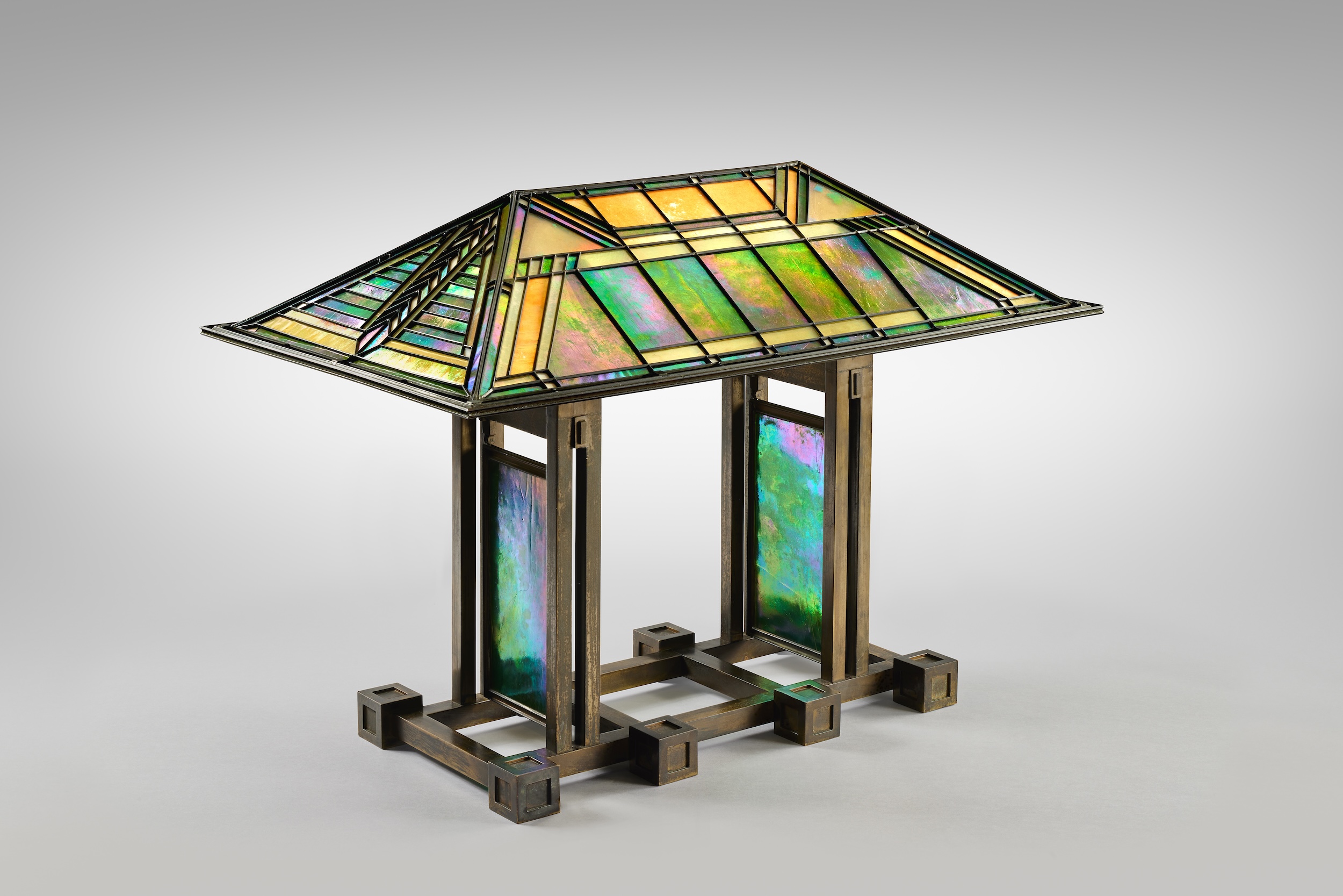 Sotheby’s is auctioning a rare Frank Lloyd Wright lamp – and it could fetch $5 million
The architect's ‘Double-Pedestal’ lamp, which was designed for the Dana House in 1903, is hitting the auction block 13 May at Sotheby's.
By Anna Solomon
-
 Naoto Fukasawa sparks children’s imaginations with play sculptures
The Japanese designer creates an intuitive series of bold play sculptures, designed to spark children’s desire to play without thinking
By Danielle Demetriou
-
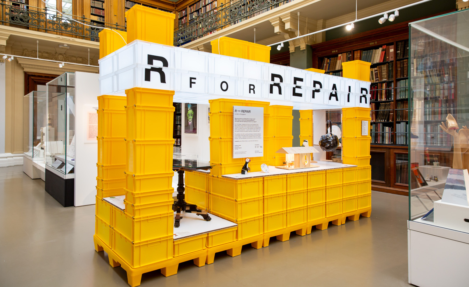 ‘R for Repair’ at London Design Festival displays broken objects, re-formed
In the second half of a two-part exhibition and as part of London Design Festival 2022, ‘R for Repair’ at the V&A displays broken objects, re-formed
By Martha Elliott
-
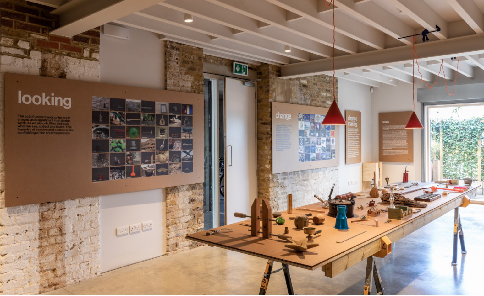 ‘Finding quality through the act of making’: Pearson Lloyd celebrates 25 years of design
Pearson Lloyd’s show ‘Change Making’ reflects on past designs from its archives, showcasing the influences on and evolution of the studio, from furniture design to the NHS
By Martha Elliott
-
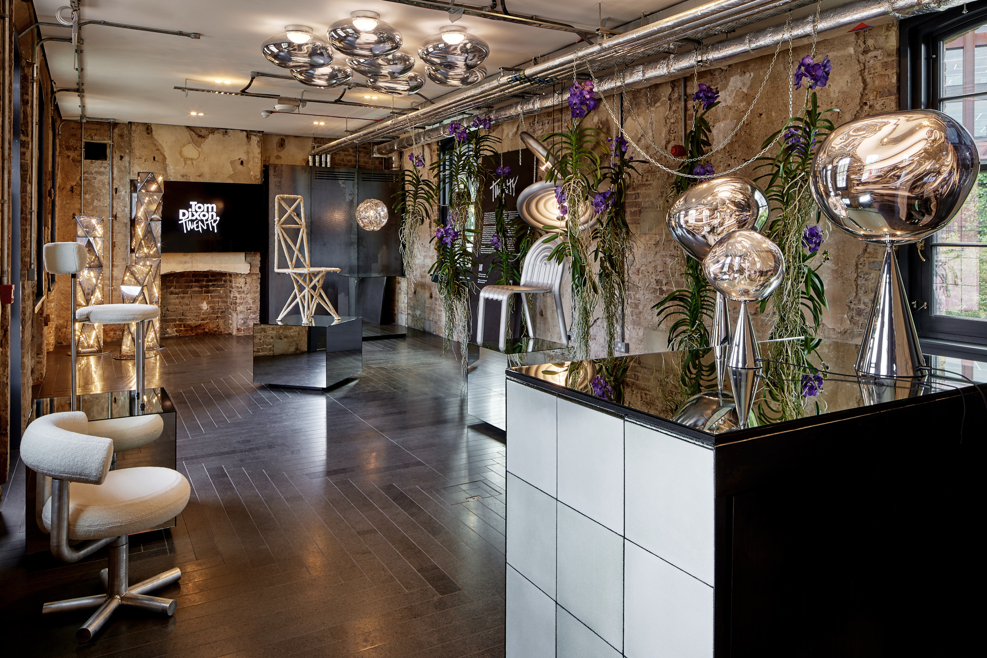 Tom Dixon marks his studio's 20 years with a show of design experiments
Mushroom, cork, steel coral and more: Tom Dixon showcases an overview of his design experiments as he celebrates his practice's 20 years
By Rosa Bertoli
-
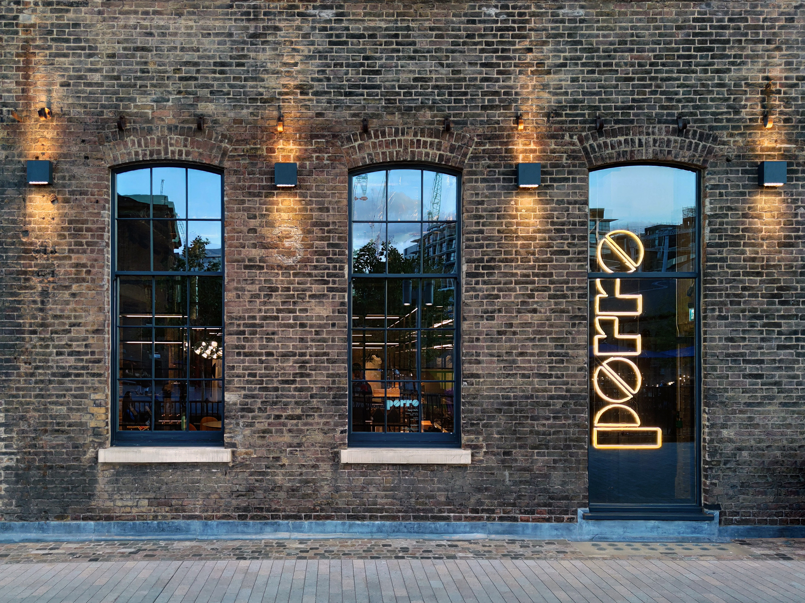 Porro unveils new London showroom at Coal Office
London Design Festival 2022: industrial architecture meets pure geometries in the new Porro showroom, taking over a space within Tom Dixon’s Coal Office to showcase the brand’s systems and furniture
By Rosa Bertoli
-
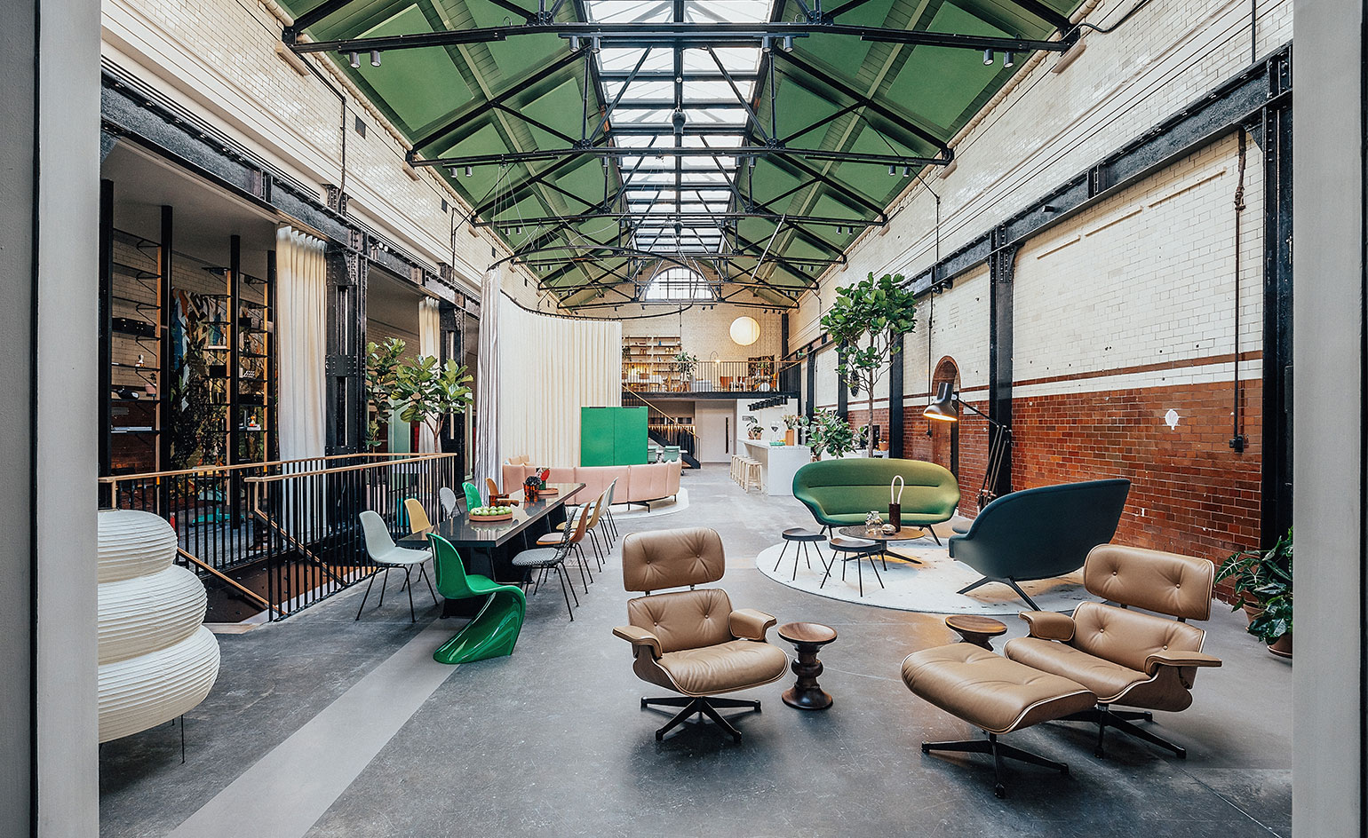 Vitra unveils new London home in the Tramshed, Shoreditch
London Design Festival 2022: after a year-long renovation, Vitra opens the door to its new showroom in the heart of Shoreditch
By Rosa Bertoli
-
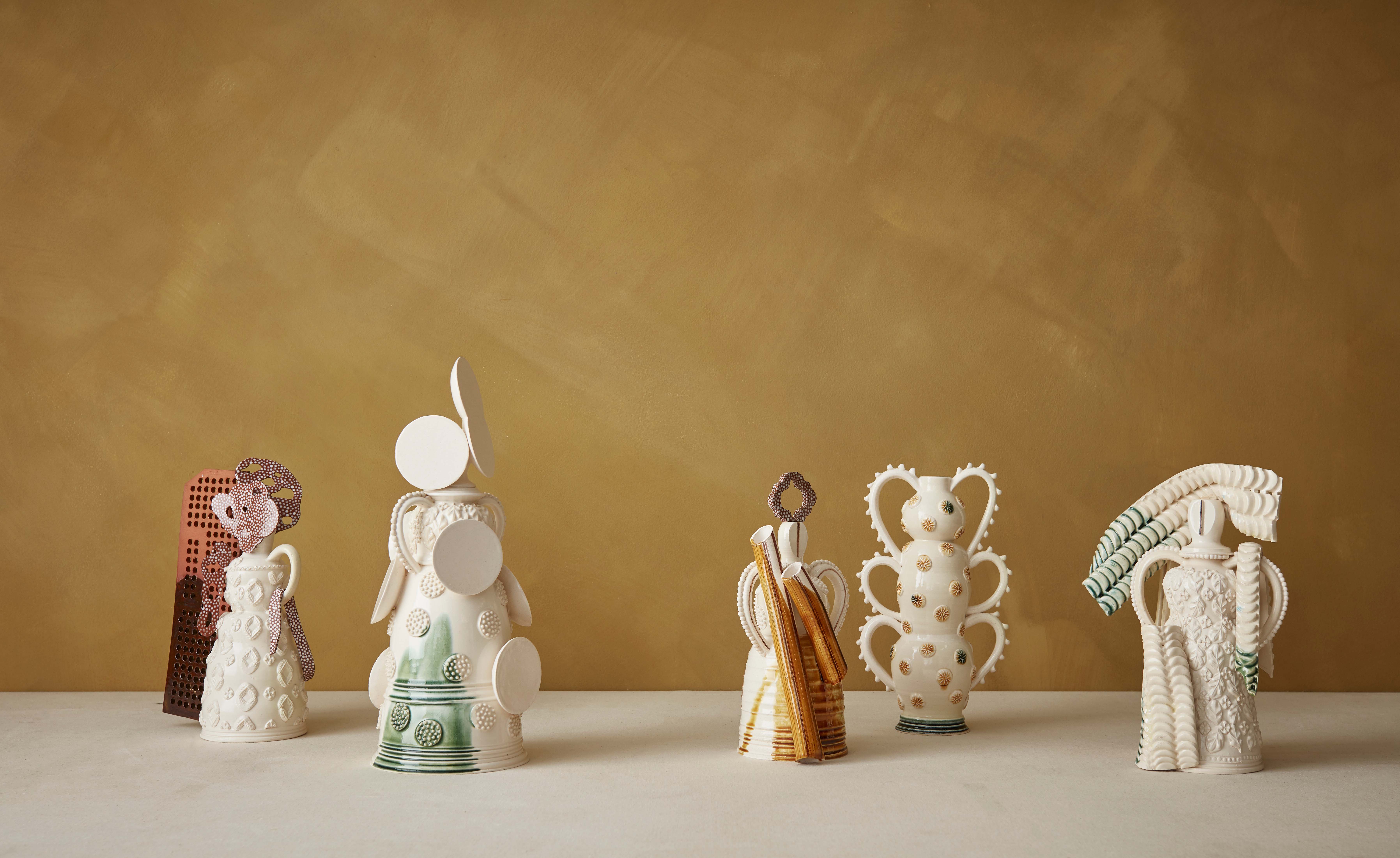 Mudlarking beside the River Thames inspires The New Craftsmen’s makers
London Design Festival 2022: The New Craftsmen’s new collection, ‘Claylarks’, features work from a group of creatives inspired by a River Thames mudlarking expedition
By Mary Cleary
-
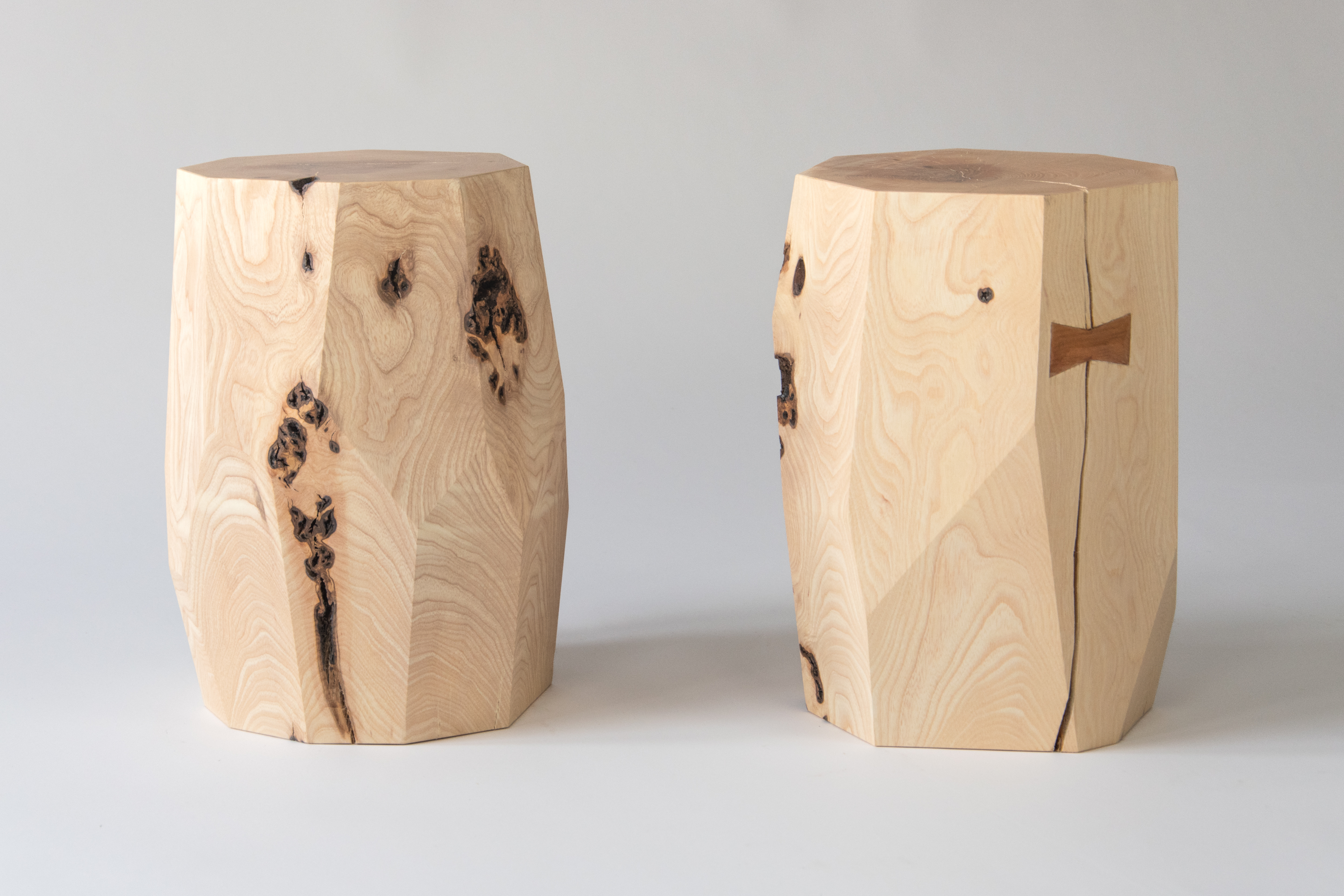 One tree, ten designers: SCP presents The One Tree Project at London Design Festival
London Design Festival 2022: SCP enlisted ten British designers to create furniture and objects from a felled ash tree from founder Sheridan Coakley's Hampshire garden
By Francesca Perry
-
 London Design Medals 2022
London Design Medals 2022 are awarded to costume designer Sandy Powell, architect Indy Johar, researcher Joycelyn Longdon and photographer Sir Don McCullin
By Rosa Bertoli