Studio Job redesigns Antwerp HQ and home with maximal impact
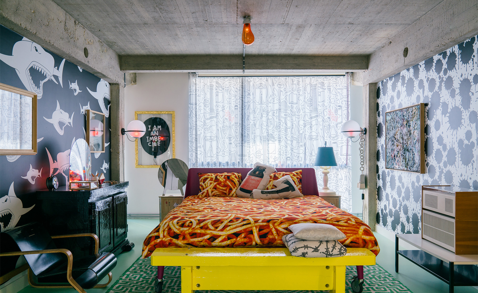
Design duo Studio Job had plenty of reasons for moving their headquarters to Antwerp back in 2003. Escaping the ‘suffocating Dutch design scene’ was one of them, according to co-founder Job Smeets, along with the creative edge that the city offered. Fifteen years on, and the contemporary art and design studio has now redesigned the space into an apartment, gallery and workspace, all in one.
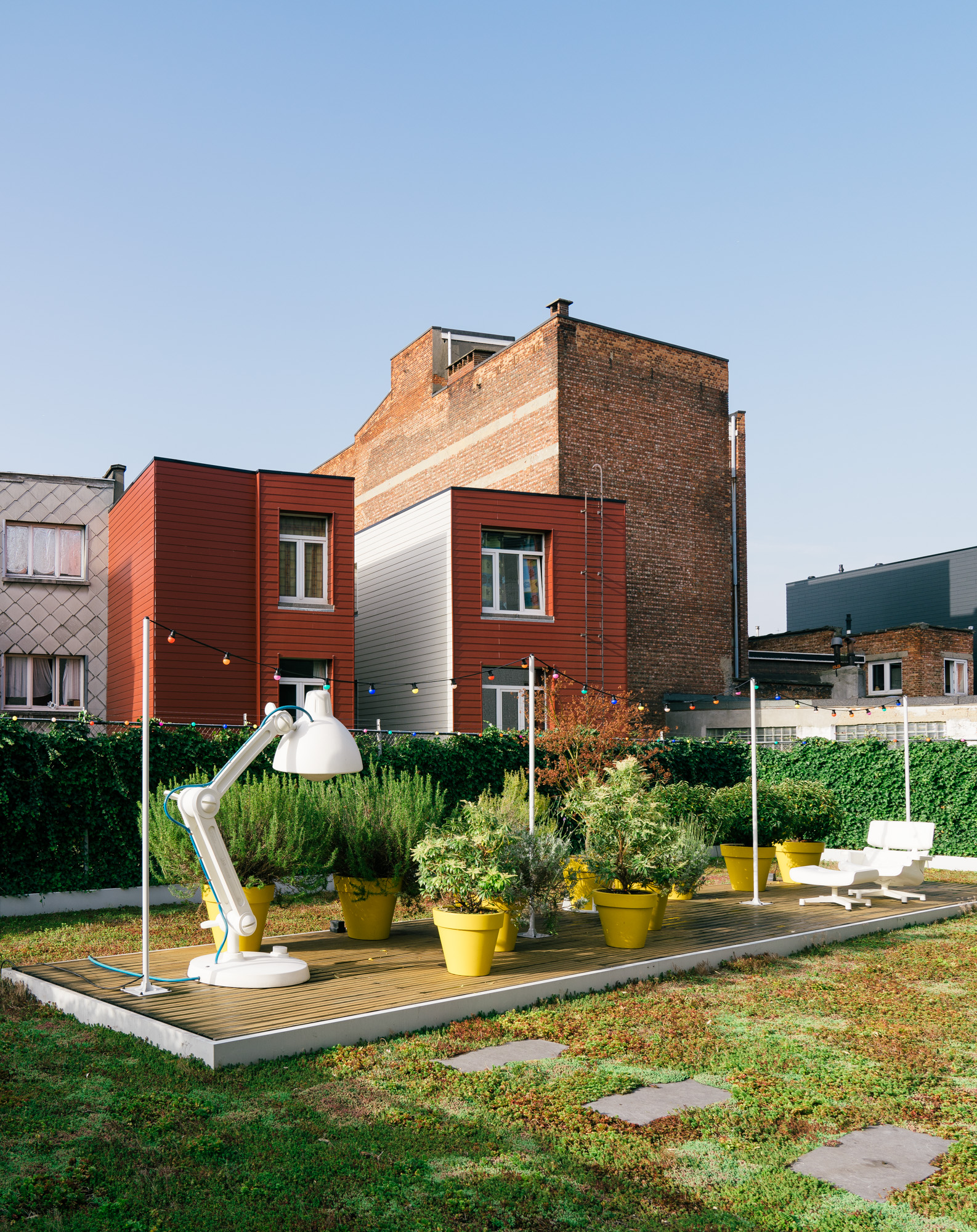
The 1950s concrete building, which was originally a Jewish school, featured a 400 sq m rooftop space (a rare find in the city) and Smeets saw huge potential this, knocking down the walls and stripping it back to unite the brand’s universe all under one roof.
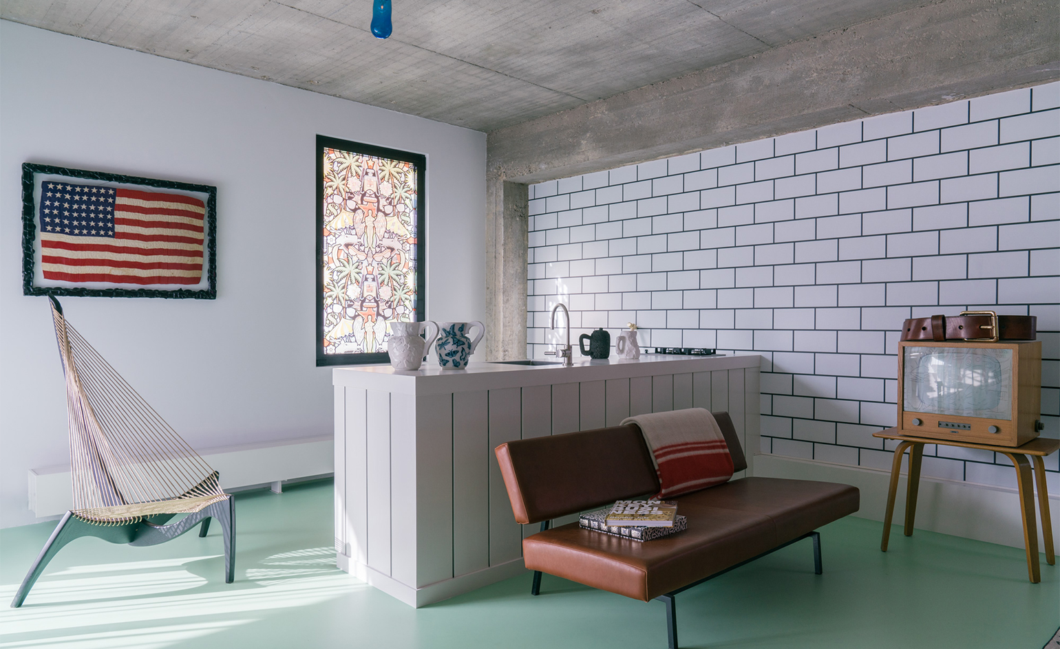
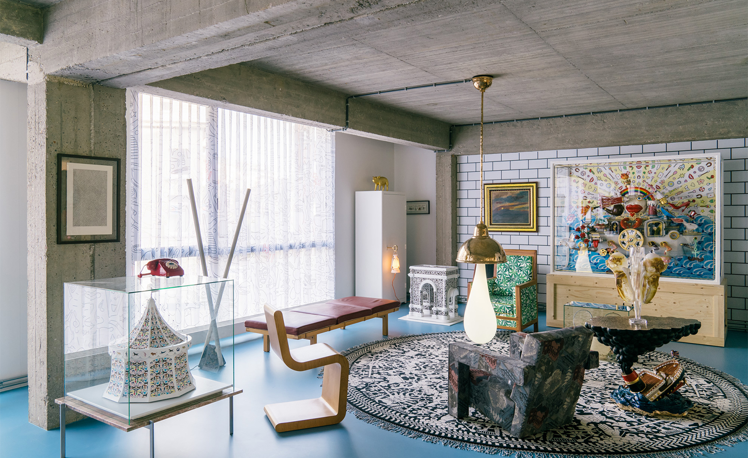
The property has all the workings of a functional apartment – bedroom, bathroom and living space – but is designed with Studio Job’s ‘serious fun’ ethos, with many of their humorous and whimsical designs populating the interiors, creating an archive of the firm’s oeuvre. ‘It is overwhelming sometimes to see pieces from over 20 years of work all together in one space, it makes me realise how much we have done over the years and how prolific we have been,’ Smeets muses.
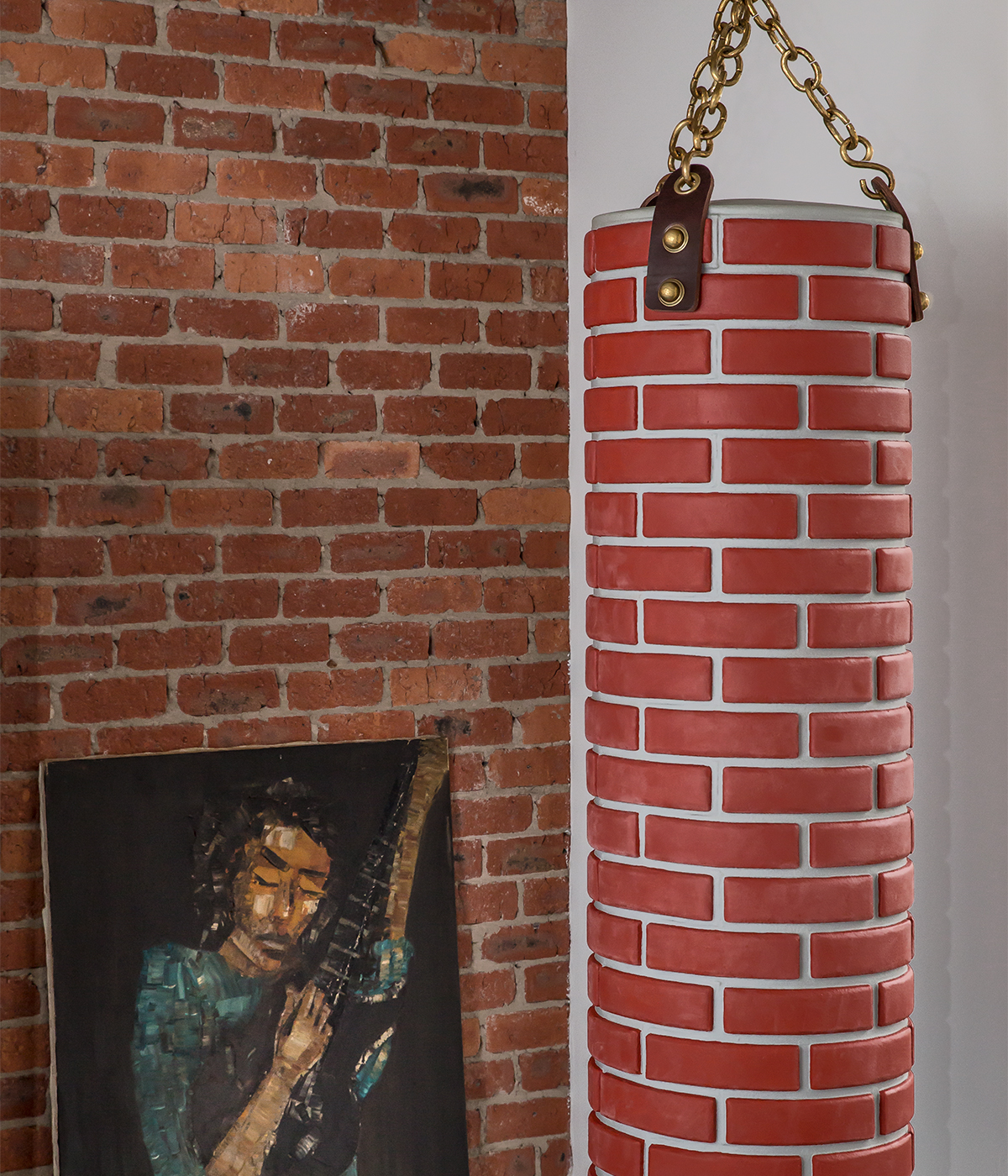
Visitors are invited to enjoy this design journey inside the headquarters. ‘The plan was to create a Studio Job world where pieces are mixed with the styles and years sitting alongside each other, on paper this shouldn’t work but in reality it’s perfectly balanced in my mind,’ he continues. This transformative vision is certainly reflected in the space which includes everything from scale models to design highlights including the ‘Punch-a-wall’ bag for Gufram and the banana sculpture the studio made for Design Pride at Salone del Mobile. These are scattered alongside products by other artists including Misha Kahn, and Smeets’ own father, Johan Smeets.
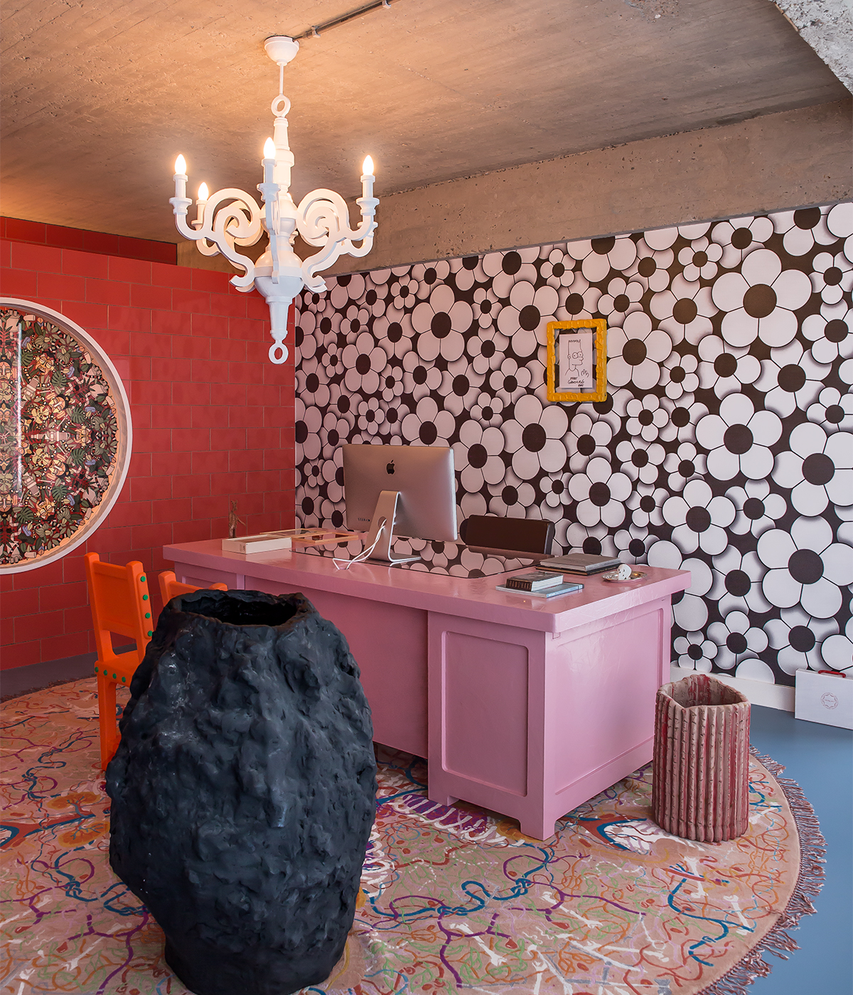
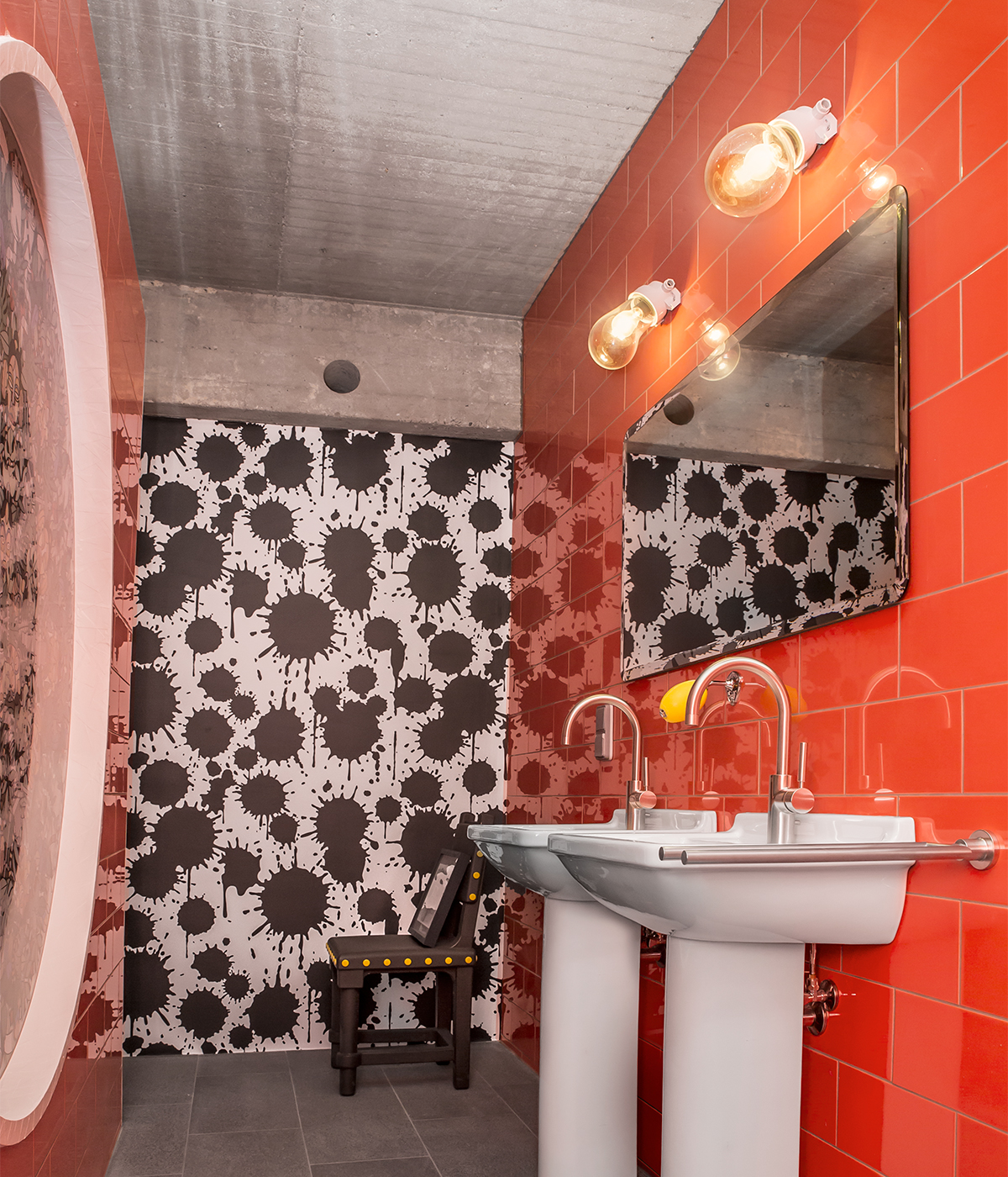
Elsewhere Smeets’ own office is inspired by the workspace of Italian design legend Alberto Alessi, while a tomato-red tiled bathroom makes an impact with its deep copper tub and gold-hued appliances. There are surprises around every corner with each room exuding its own eccentric personality.
‘With minimalism you can hide behind the aesthetic values of line and colour,’ Smeets explains, ‘with an eclectic style you need to know what you are doing otherwise you overcook it. It could be a well-executed modern interior of a 90-year old-collector’.
INFORMATION
For more information visit the
Wallpaper* Newsletter
Receive our daily digest of inspiration, escapism and design stories from around the world direct to your inbox.
Sujata Burman is a writer and editor based in London, specialising in design and culture. She was Digital Design Editor at Wallpaper* before moving to her current role of Head of Content at London Design Festival and London Design Biennale where she is expanding the content offering of the showcases. Over the past decade, Sujata has written for global design and culture publications, and has been a speaker, moderator and judge for institutions and brands including RIBA, D&AD, Design Museum and Design Miami/. In 2019, she co-authored her first book, An Opinionated Guide to London Architecture, published by Hoxton Mini Press, which was driven by her aim to make the fields of design and architecture accessible to wider audiences.
-
 All-In is the Paris-based label making full-force fashion for main character dressing
Part of our monthly Uprising series, Wallpaper* meets Benjamin Barron and Bror August Vestbø of All-In, the LVMH Prize-nominated label which bases its collections on a riotous cast of characters – real and imagined
By Orla Brennan
-
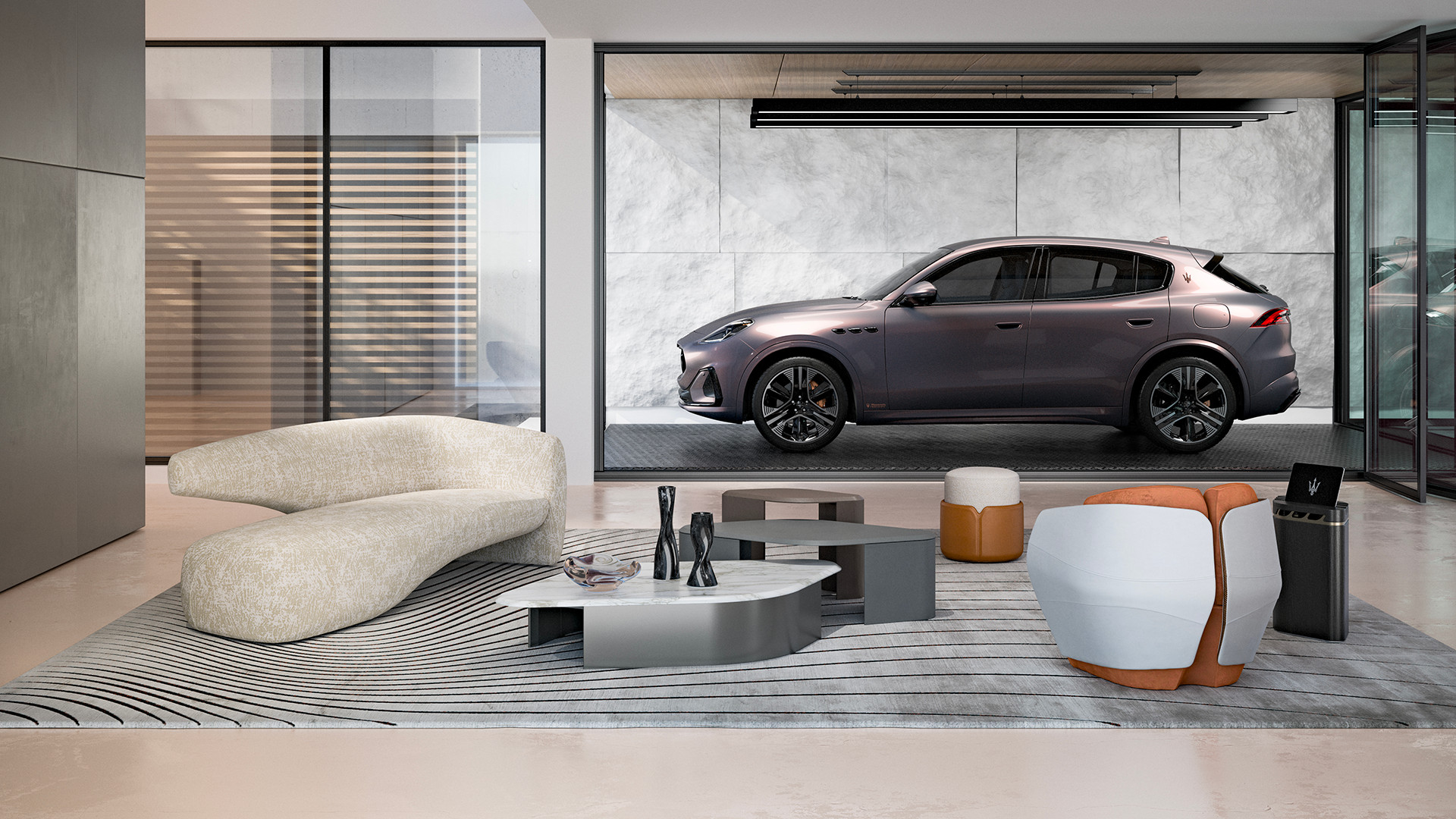 Maserati joins forces with Giorgetti for a turbo-charged relationship
Announcing their marriage during Milan Design Week, the brands unveiled a collection, a car and a long term commitment
By Hugo Macdonald
-
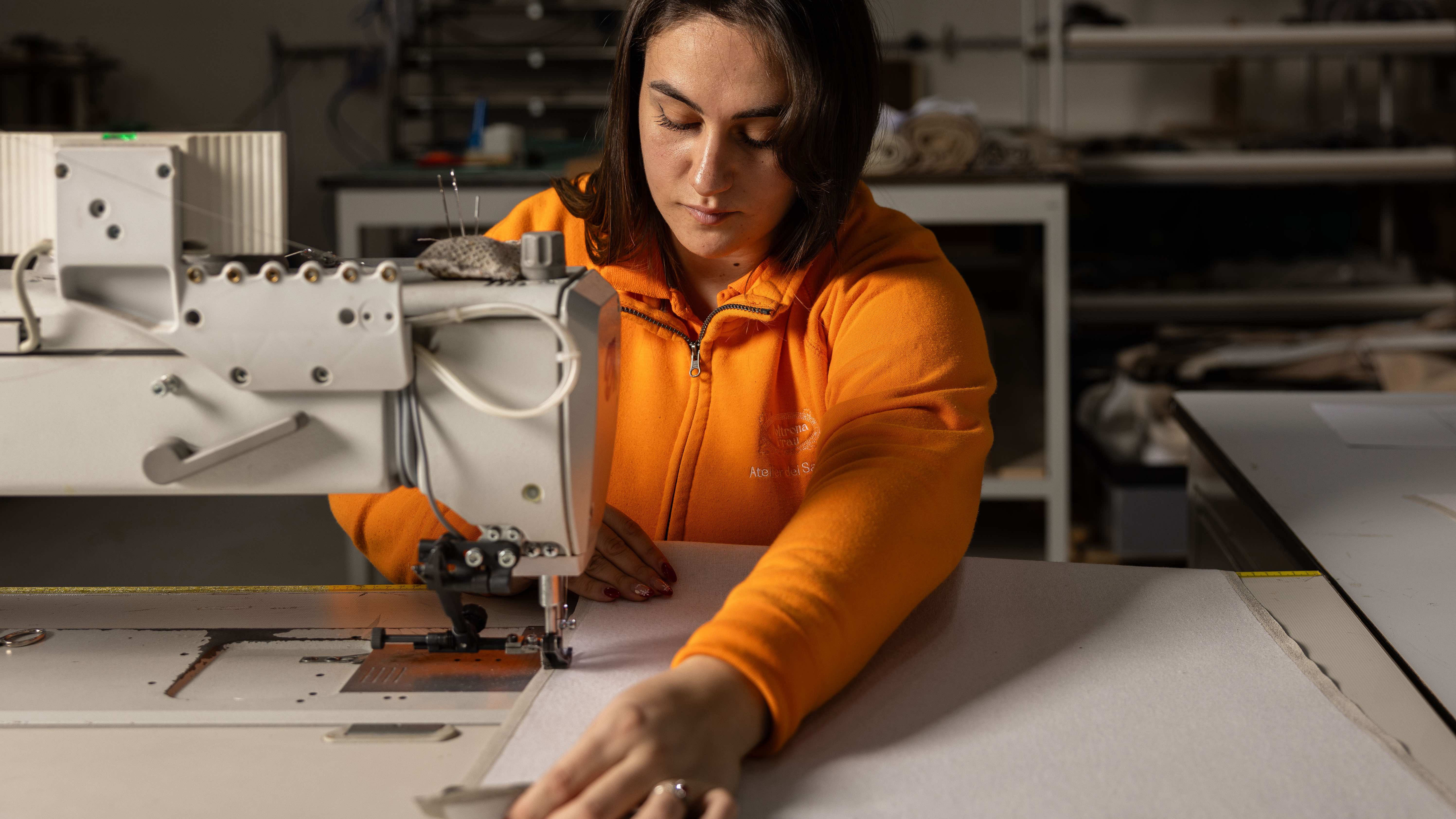 Through an innovative new training program, Poltrona Frau aims to safeguard Italian craft
The heritage furniture manufacturer is training a new generation of leather artisans
By Cristina Kiran Piotti
-
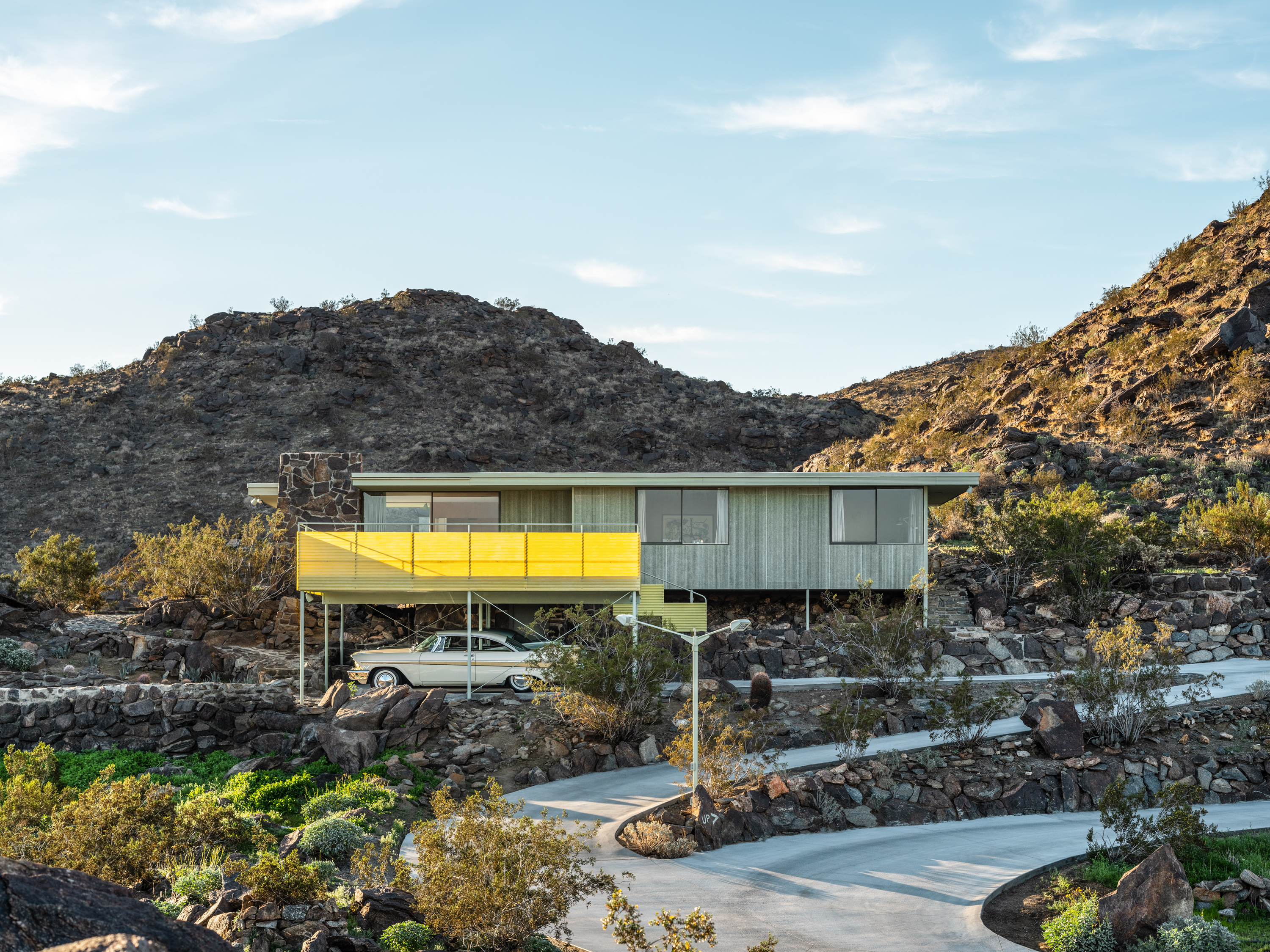 Modernist architecture: inspiration from across the globe
Modernist architecture has had a tremendous influence on today’s built environment, making these midcentury marvels some of the most closely studied 20th-century buildings; here, we explore the genre by continent
By Ellie Stathaki
-
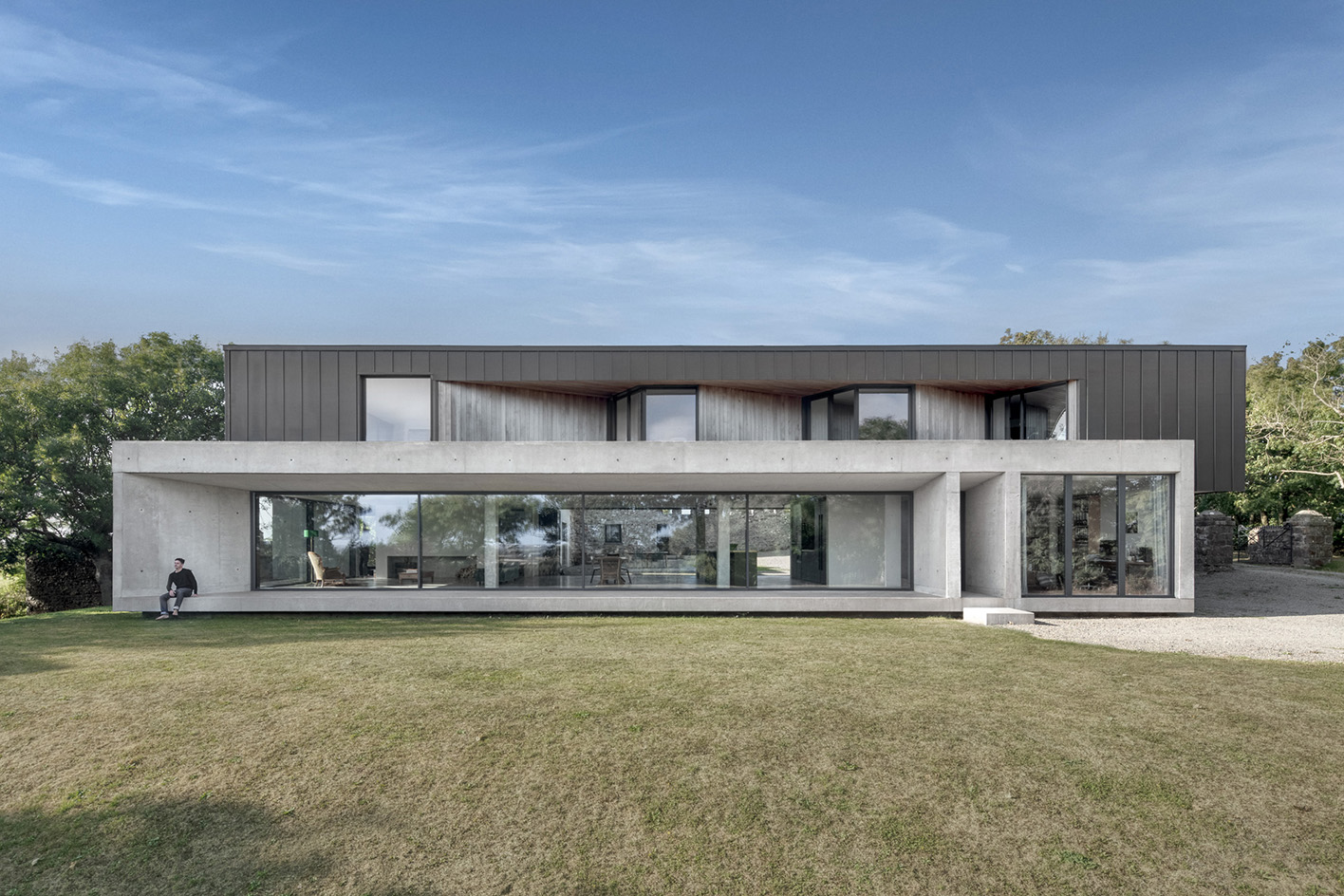 Minimalist architecture: homes that inspire calm
These examples of minimalist architecture place life in the foreground – clutter is demoted; joy promoted
By Ellie Stathaki
-
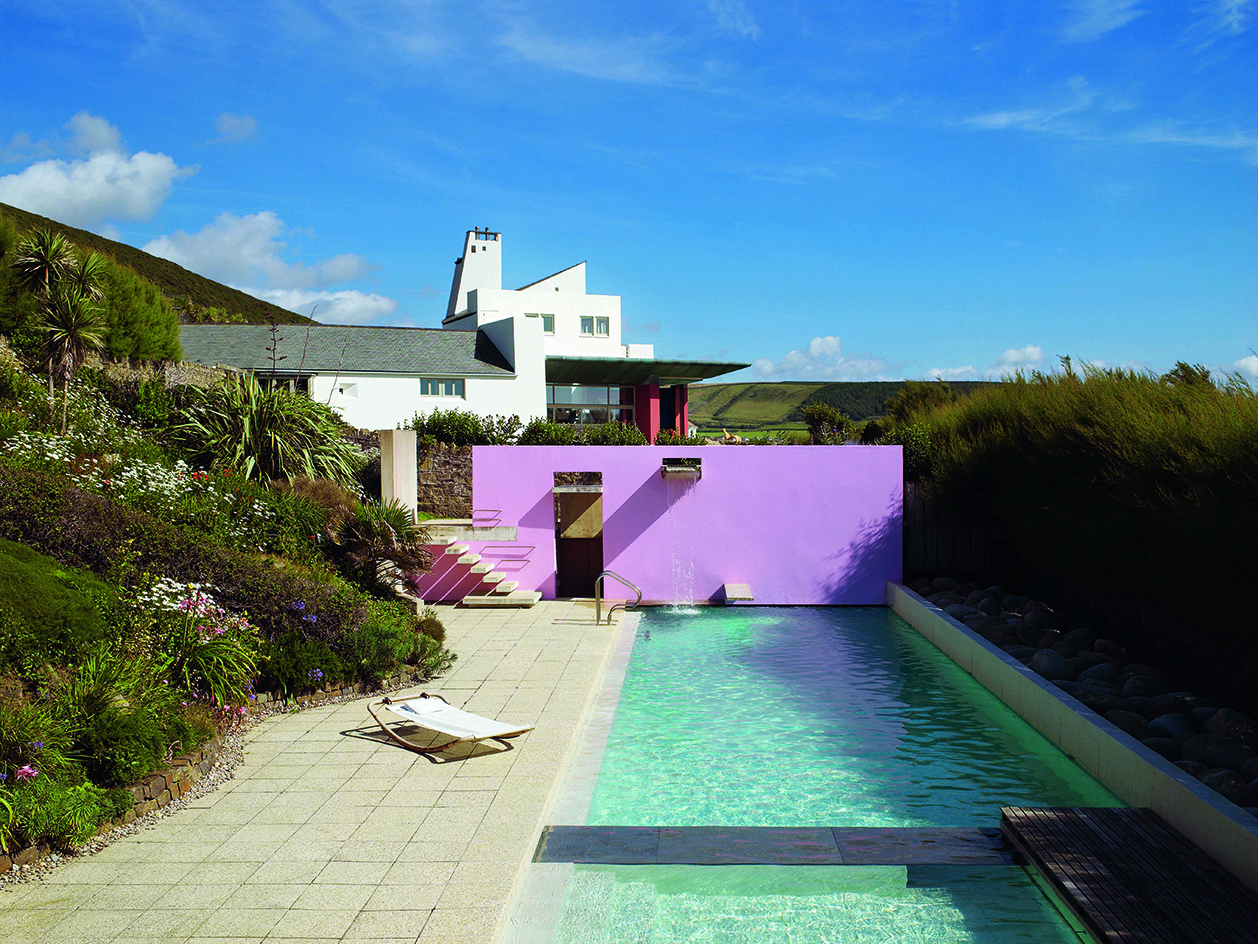 The iconic British house: key examples explored
New book ‘The Iconic British House’ by Dominic Bradbury explores the country’s best residential examples since 1900
By Ellie Stathaki
-
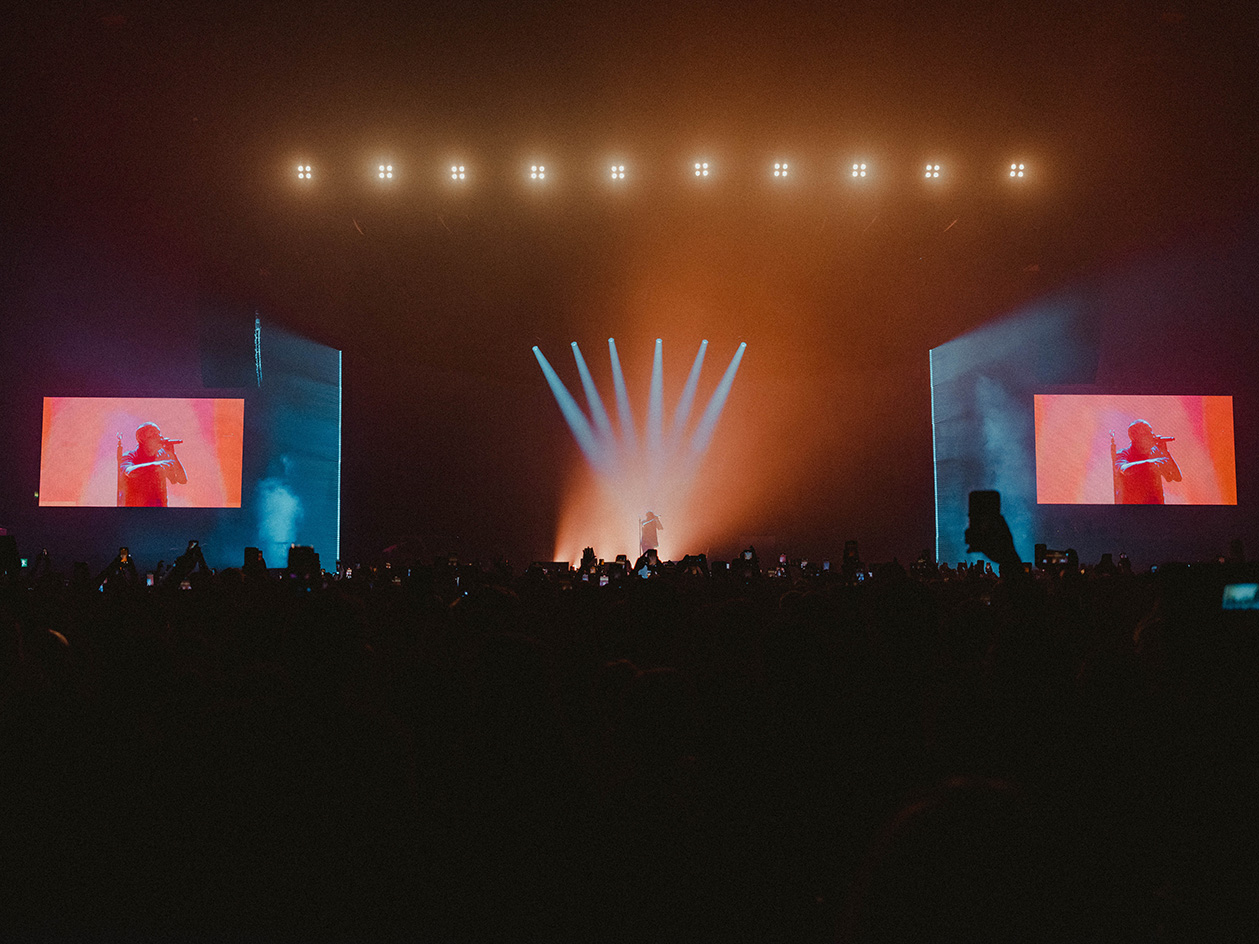 Loyle Carner’s Reading Festival 2023 stage presents spatial storytelling at its finest
We talk to Loyle Carner and The Unlimited Dreams Company (UDC) about the musical artist’s stage set design for Reading Festival 2023
By Teshome Douglas-Campbell
-
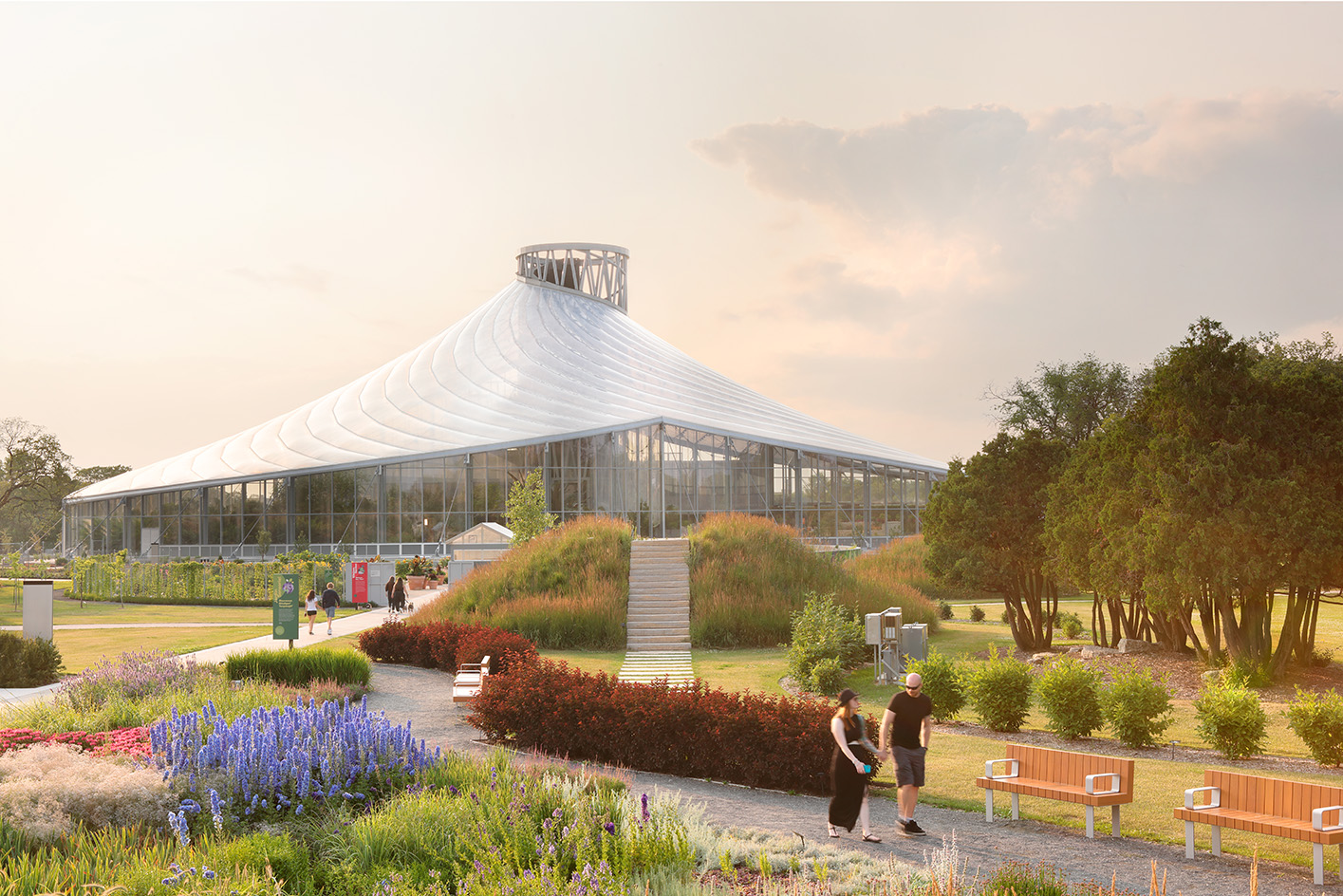 The Leaf is a feat of engineering and an ode to the Canadian Prairies
The Leaf in Winnipeg, Canada, is the first interactive horticultural attraction of its kind: a garden and greenhouse complex promoting a better understanding of how people can connect with plants
By Adrian Madlener
-
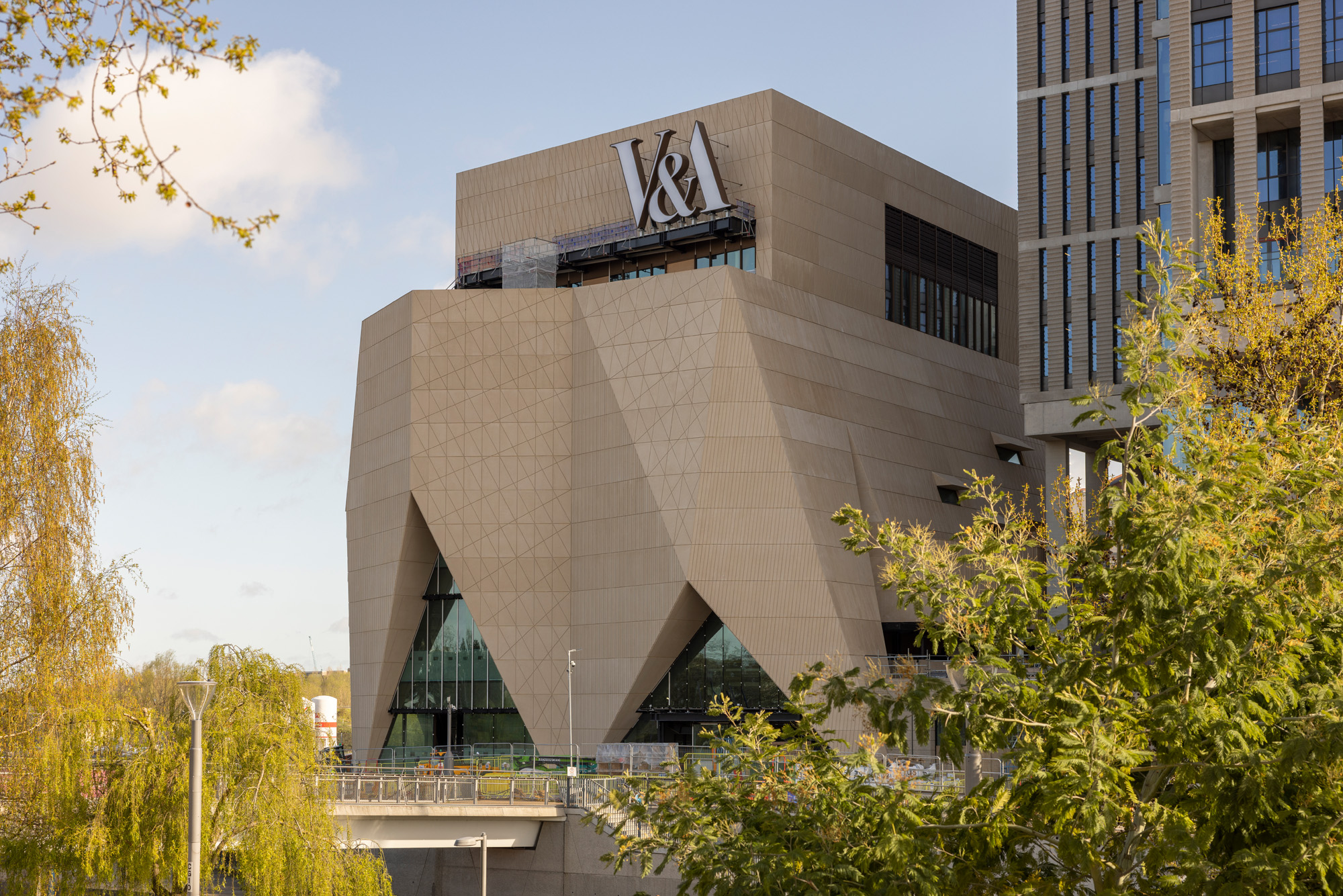 Behind the V&A East Museum’s pleated façade
Behind the new V&A East Museum’s intricate façade is a space for the imagination to unfold
By Ellie Stathaki
-
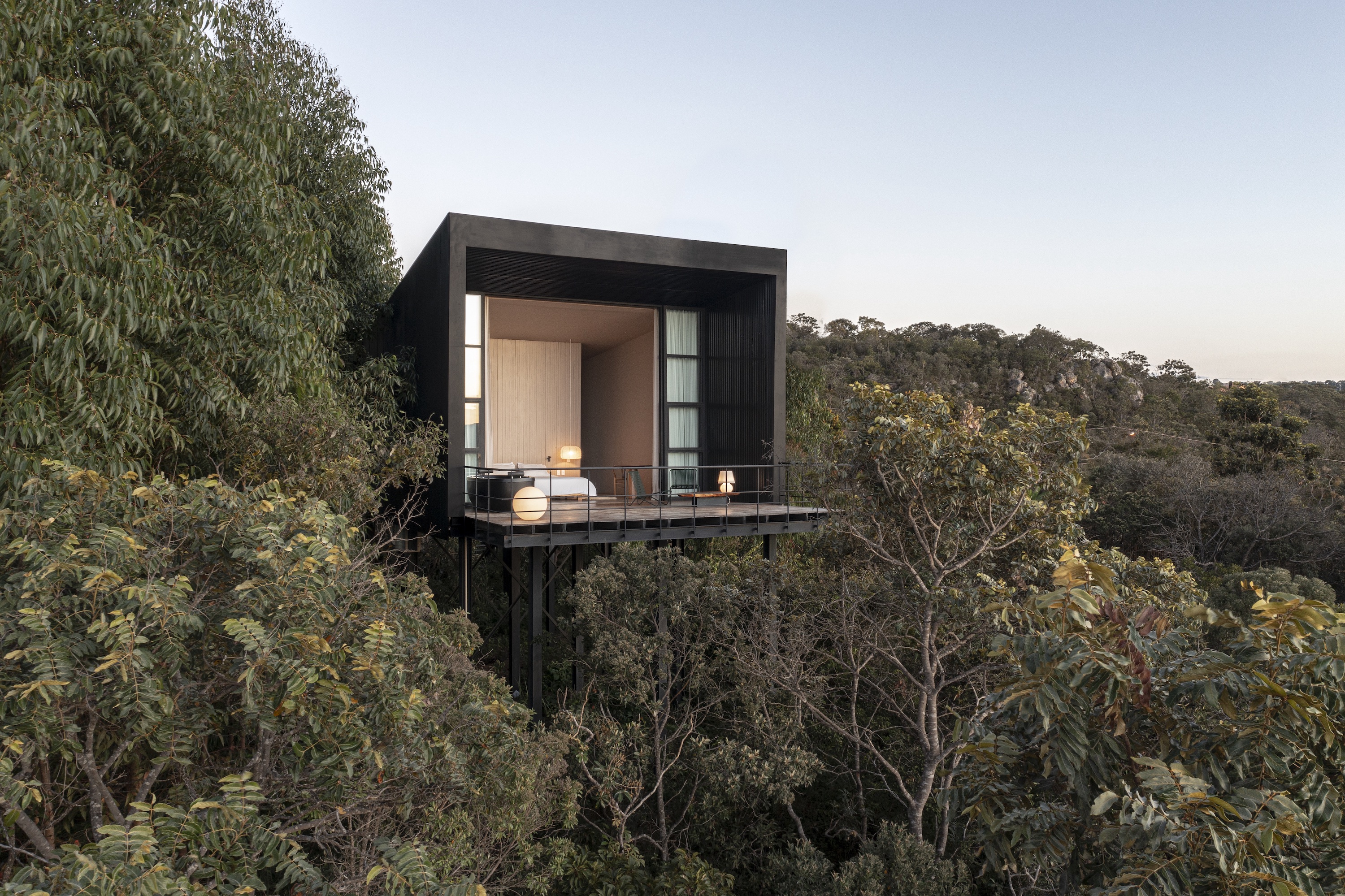 Casa Monoculo offers a take on treetop living in Brazil
Casa Monoculo by architect Alan Chu is a house raised above the treetops in Alto Paraiso City, Brazil
By Ellie Stathaki
-
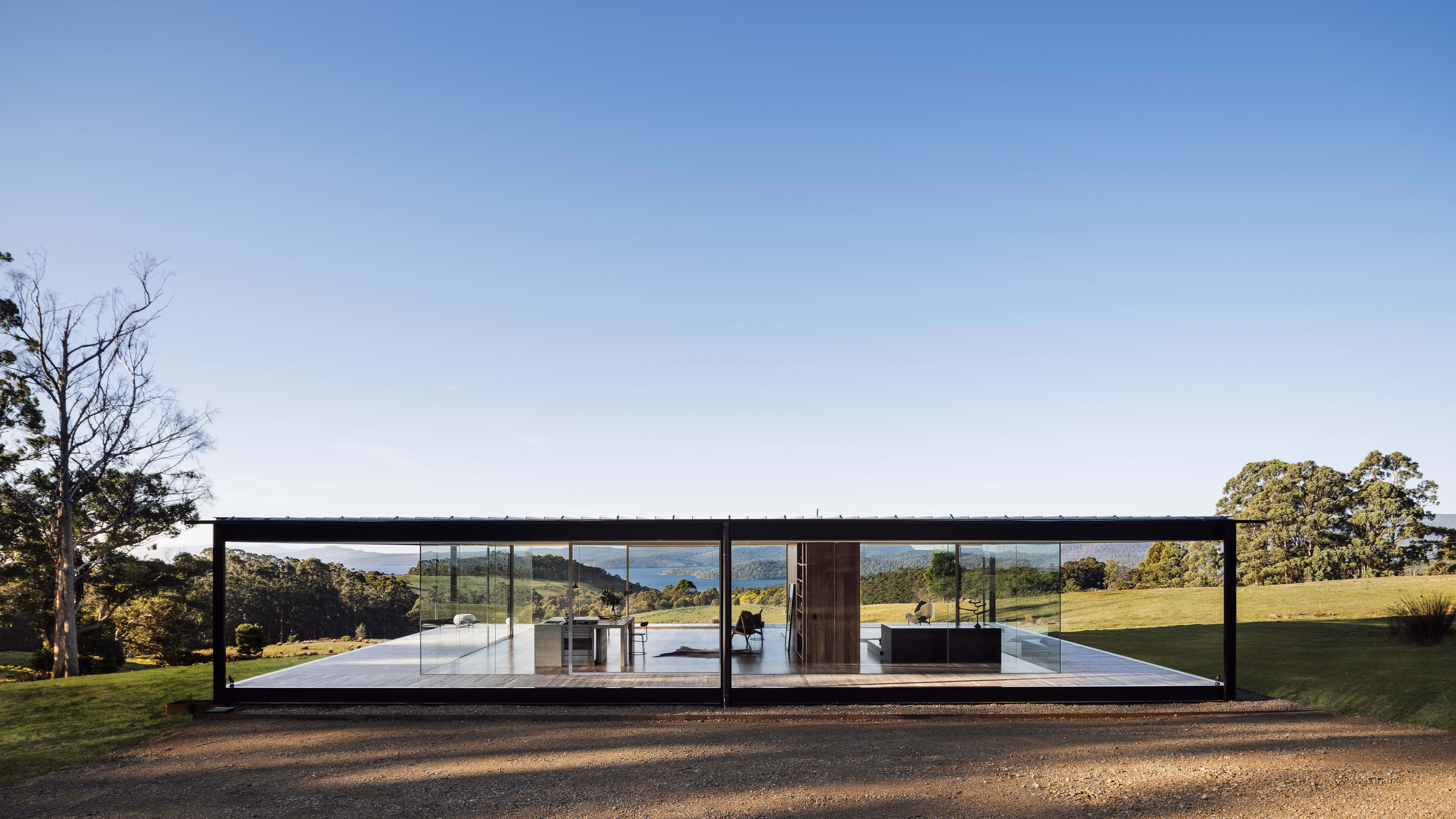 Tasmania house brings minimalist glass and concrete to rural Koonya
A Tasmania house designed in immaculate minimalist architecture by Room 11 makes the most of its idyllic Koonya location
By Stephen Crafti