Studio Mellone transforms lobby of iconic art deco building in Rockefeller Center
The elegant 50 Rockefeller Plaza lobby by Studio Mellone features furniture by Green River Project and lighting by Apparatus
Receive our daily digest of inspiration, escapism and design stories from around the world direct to your inbox.
You are now subscribed
Your newsletter sign-up was successful
Want to add more newsletters?
Midtown Manhattan may not exude the same allure today as it did in the mid-20th-century, but a quiet revamp of one of its hallmarks is set to restore some of its long-lost glamour. Famed for its art deco architecture and signature plaza, Rockefeller Center has been an enduring destination for visitors – appealing to both design buffs and tourists alike. 50 Rockefeller Plaza is one of the area’s most attractive strongholds, not only for its mammoth, Isamu Noguchi-sculpted façade, but its recently opened roof terrace, just a modest seven storeys up, which now offers a unique vantage point of the surrounding area at select times, as well as private events.
50 Rockefeller Plaza: lobby design by Studio Mellone
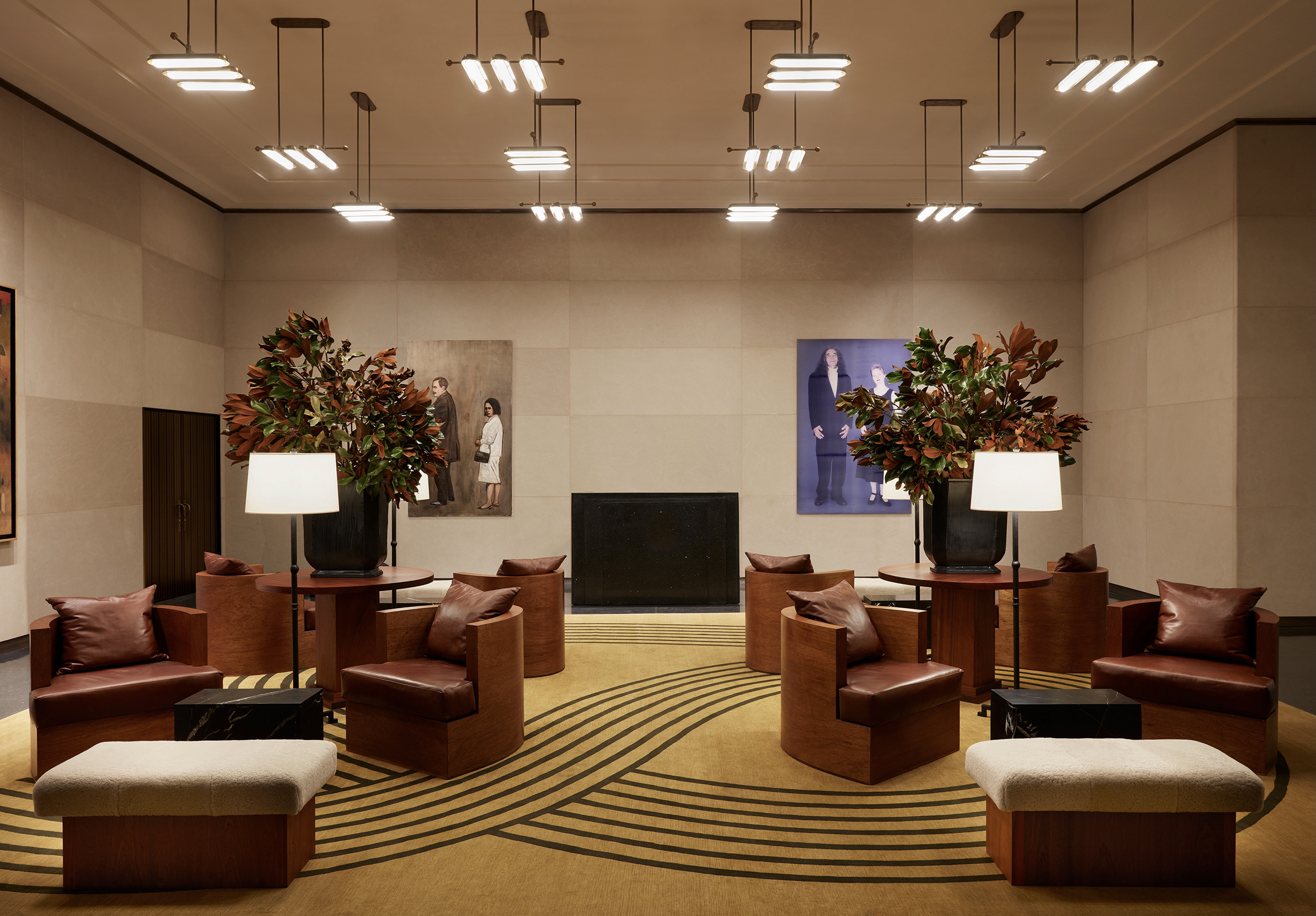
On the ground floor, the building has revealed a newly transformed lobby designed by the New York-based interior design firm Studio Mellone. Sumptuous, elegant and well-appointed, the evocative space looks more like it would belong to a hotel or luxury residence than an office building.
‘Tishman Speyer, the developer that now owns Rockefeller Center, has been making a move towards giving the buildings’ lobbies a hospitality feel and turning them into spaces that people want to be at and enjoy, not just like a mausoleum stone box where you check in and then just go upstairs,’ says Andre Mellone, the firm’s principal and founder. ‘This renovation is part of a larger project to revamp Rockefeller Center and make it more for New Yorkers, not just a tourist destination.’ With plans to elevate the retail offering and food and beverage assortment available in the vicinity – signs of which have already become evident during the last year – the area is poised for revival.
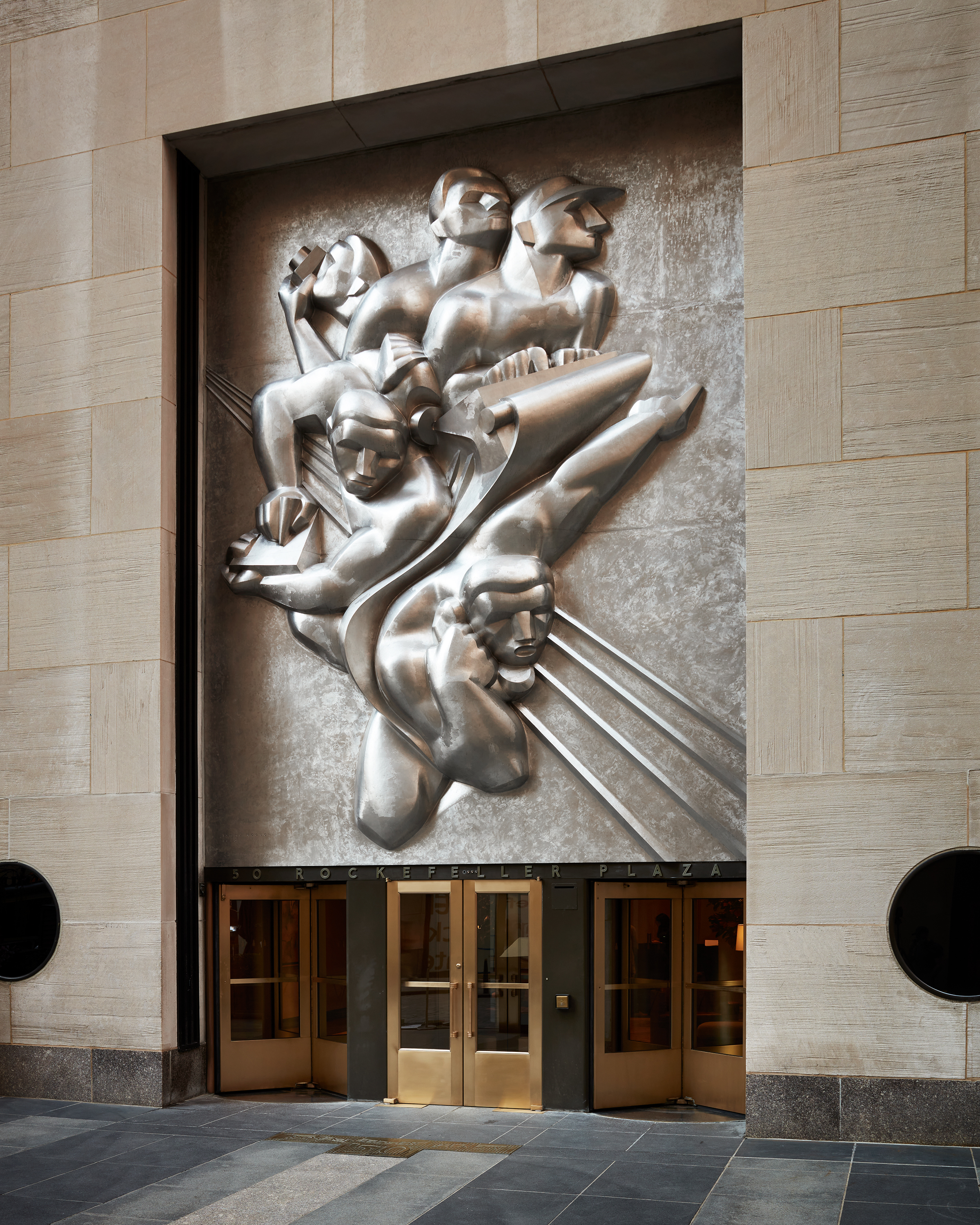
Originally built in 1938, 50 Rockefeller Plaza was once home to the Associated Press, and comes with a storied legacy of the city’s rise and fall since that time. While many other aspects of the Rockefeller Center are under historical landmark protection, this lobby was notably not, allowing Mellone to undertake a complete renovation of the space.
‘This lobby had actually been renovated before [the] landmarks [came into force], some time in the 1970s, but it was one of the few areas in the prime Rockefeller buildings that we could actually touch,’ Mellone continues. ‘We dove into the history and style of Rockefeller Center. It’s such an icon of American art deco, so the idea was very much based in that movement, in terms of organisation, furniture layout and material choice. The big architectural gestures were trying to replicate some of the materials you see throughout the building.’
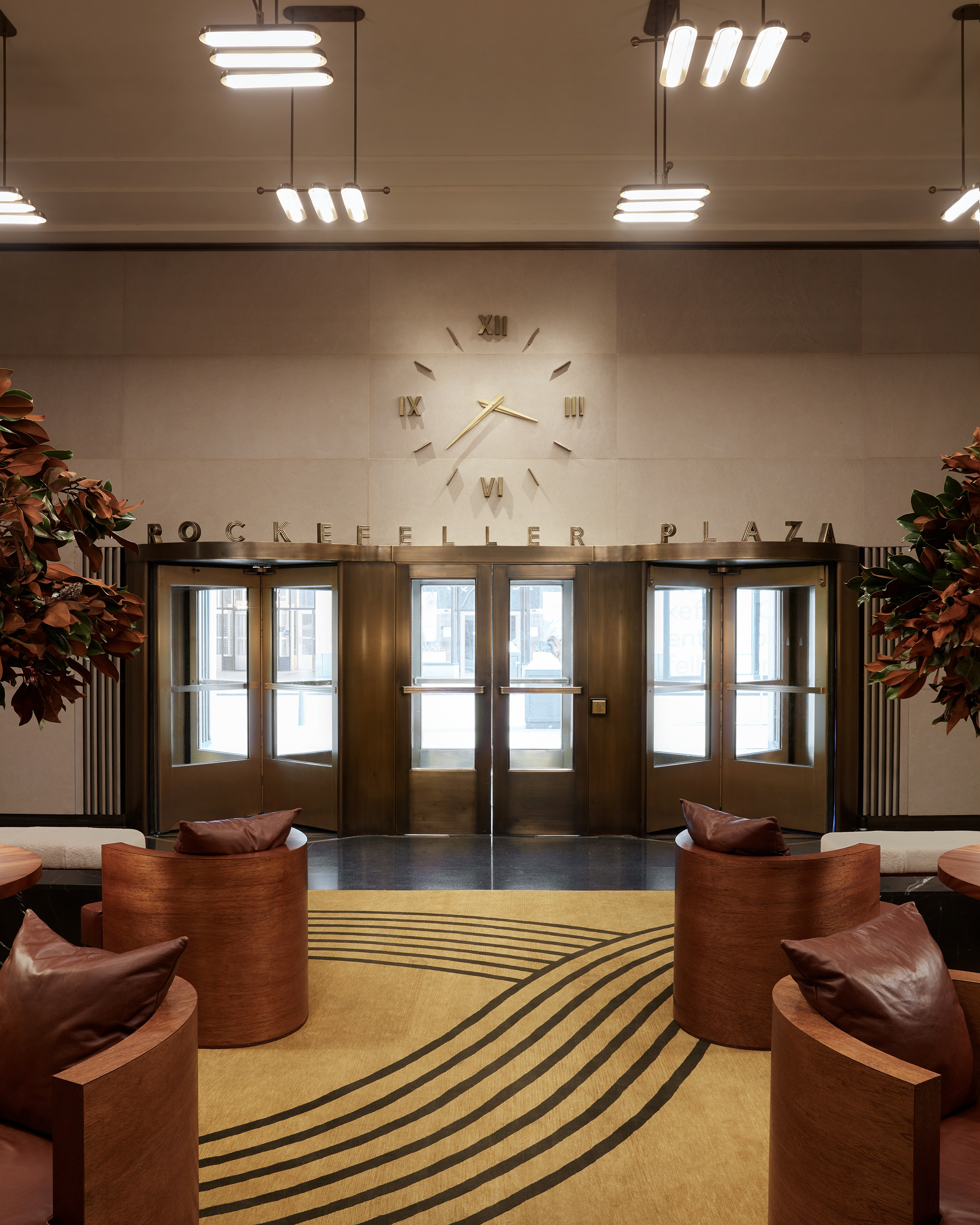
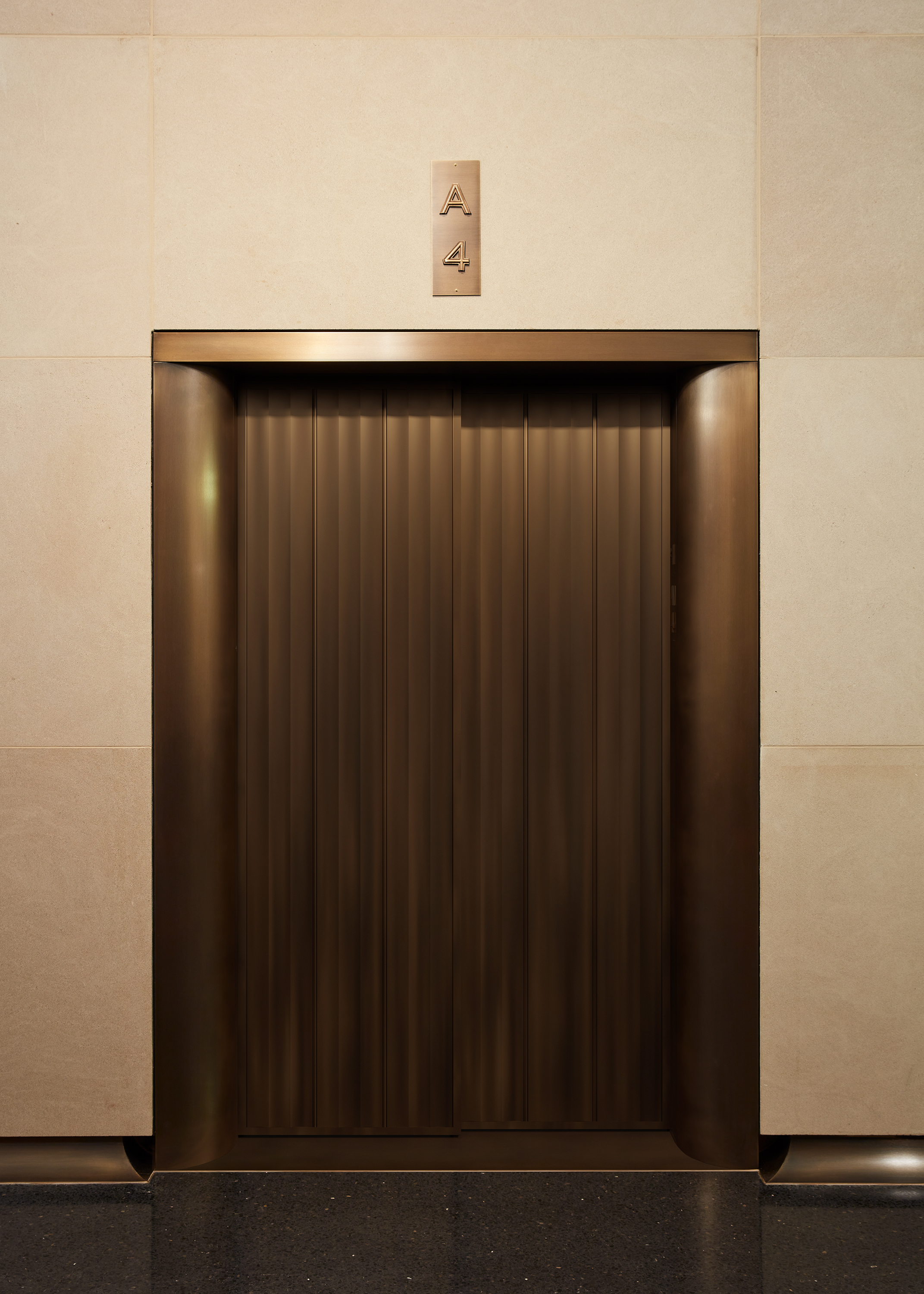
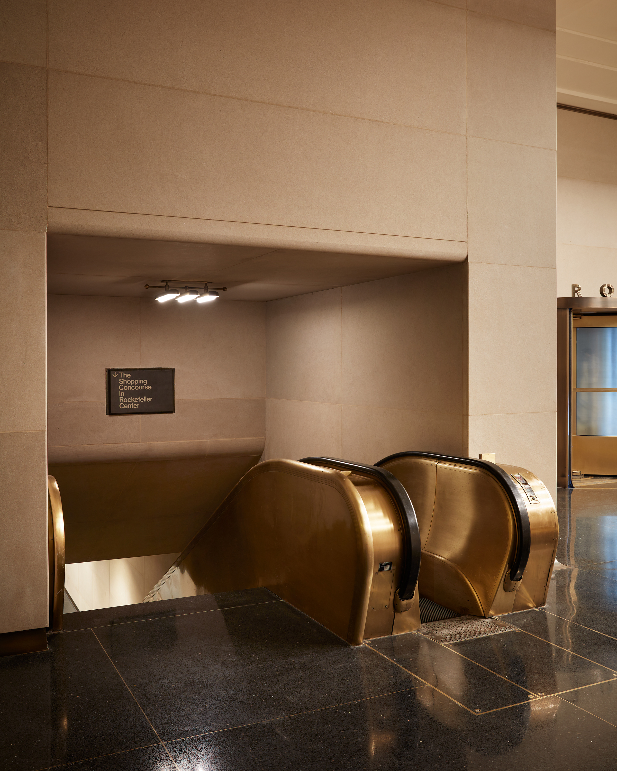
Studio Mellone completely re-envisioned the space, replacing the cove ceiling and existing chequerboard stone floor with a stark, black terrazzo criss-crossed with brass details. The walls are made from Indiana limestone – a material typically found on the exterior of these buildings – that has been finished to allow its variation to come through, exuding a parchment-like texture.
To furnish the space, Mellone turned to trusted local collaborators and partners, including Green River Project to design the furniture and Apparatus to create the lighting. The metal pieces, such as urns, floor lamps and a console, were created by Jake Szymanski, a designer and metalworker based in the Bronx. 'This was all happening during the pandemic and it became an indirect gesture of pride: New Yorkers for New York, the site being such a symbolic thing to the city,’ he explains. ‘I felt like Green River Project’s designs were a very modern-day interpretation of art deco, in terms of proportion, detailing and their contrast of materiality and roughness. Same with Apparatus, who adapted a design and made it bigger for us. It’s a contemporary design that has a deco feel. One of the biggest compliments I get is that it feels like it was always there. This was a concrete box and everything you see here is part of the renovation.’ Rugs by Erik Lindstrom complete the space's residential feel.
Receive our daily digest of inspiration, escapism and design stories from around the world direct to your inbox.
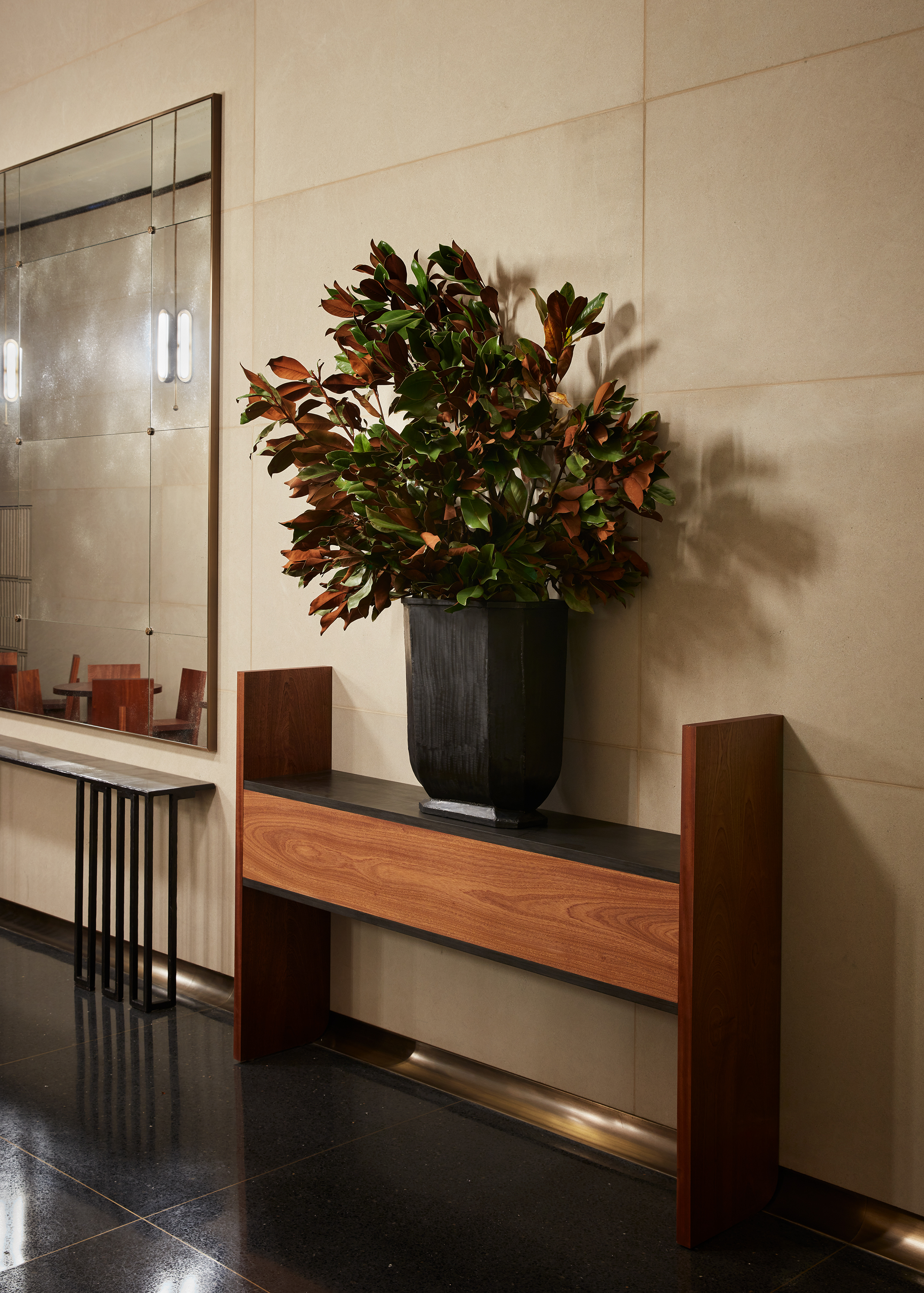
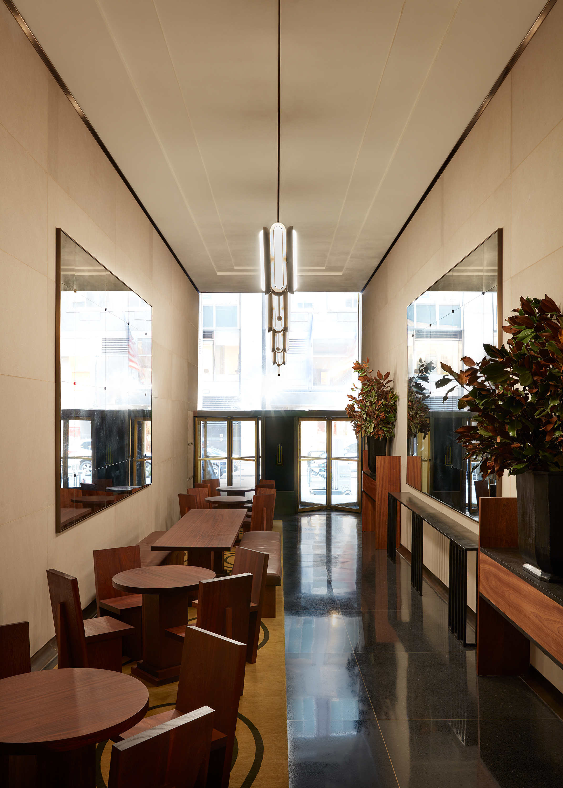
Mellone’s vision not only encompasses the main lobby-lounge area, which is open to the public, but also through to the elevator bank and an auxiliary, café-style room, which offers access from 51st Street, and an additional space where visitors can sit.
He says, ‘It’s an office building, in theory, but the lobby is public. The developer’s intentions are manifold and they want the tenants to use the space, but because the main entrance is well-trafficked, that activity spills into the lobby. The new roof terrace is also accessed through this lobby, so there are all these arteries feeding through.’
INFORMATION
Pei-Ru Keh is a former US Editor at Wallpaper*. Born and raised in Singapore, she has been a New Yorker since 2013. Pei-Ru held various titles at Wallpaper* between 2007 and 2023. She reports on design, tech, art, architecture, fashion, beauty and lifestyle happenings in the United States, both in print and digitally. Pei-Ru took a key role in championing diversity and representation within Wallpaper's content pillars, actively seeking out stories that reflect a wide range of perspectives. She lives in Brooklyn with her husband and two children, and is currently learning how to drive.