A hole in one: celebrating 21 years of life-enhancing stuff
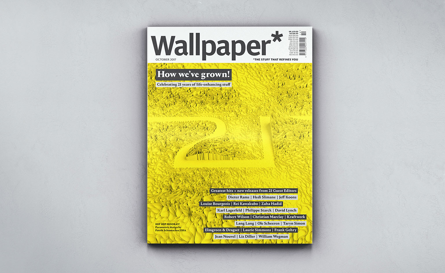
This month marks Wallpaper’s coming of age: our 21st anniversary. It’s also my tenth year as editor-in-chief, having switched from being creative director in April 2007. I must confess that my coming of age came a number of years earlier. Time flies.
One of the earliest projects I worked on in my new role was our inaugural October Guest Editors’ Issue. Now, many media outlets have given over their editorial reins to appropriate talents in order to bring a fresh perspective and generate some PR buzz. But because of Wallpaper’s multi-faceted editorial remit, we felt our spin on the concept should be equally all-encompassing – we would invite not just one, but up to three diverse creatives each year who would reflect our offering, but also push us to try new things.
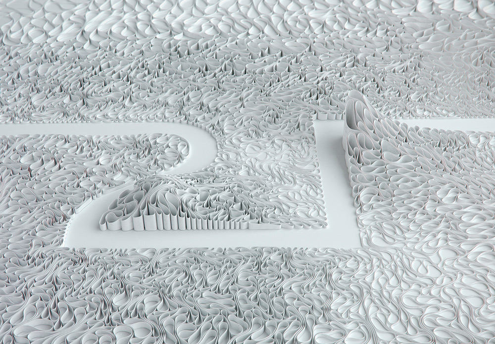
Zaha Hadid Architects’ parametric design honours our 21st birthday with a fitting salute. Back in 2008, Hadid herself was Guest Editor. See more from our 21 Guest Editors
So year one saw a purist industrial designer, Dieter Rams, an iconoclastic artist, Jeff Koons, and a much-more-than-a-fashion-designer fashion designer, Hedi Slimane. To rebalance the unintentional male bias for 2007, the next year saw Louise Bourgeois, Zaha Hadid and Rei Kawakubo bring art, architecture, and fashion girl power to our pages. Subsequent editions have seen Karl Lagerfeld, Philippe Starck, David Lynch, Robert Wilson, Kraftwerk, Christian Marclay, Lang Lang, Ole Scheeren, Taryn Simon, Laurie Simmons, Elmgreen & Dragset, Frank Gehry, Jean Nouvel, William Wegman and Liz Diller have fun at our expense. That makes 21 in total, and therefore a convenient excuse to take a retrospective look, as well as request some updates for our latest issue. (Our thickest issue yet, the spine also happens to measure a serendipitous 21mm)
In addition to a 20-plus page section within the magazine, each of our Guest Editors was also invited to design a cover. Many called for unusual paper technologies – Hedi used specialist printing inks to simulate glitter, whereas Karl invited readers to strip the Dior Homme suit off his muse by means of a peelable layer. Starck constructed a transparent front cover using three layers of tracing paper. And Kraftwerk’s Ralf Hütter tacked on a pair of 3D specs, to go with his 3D cover portrait and portfolio of exclusive images tied to key Kraftwerk compositions.
If I had to pick one favourite project it would be Zaha’s. Her cover was a gatefold construction using multiple die-cuts, while inside she produced a 16-page die-cut sculpture, which was a take on her ‘Lotus’ room installation at that year’s Venice Biennale. ‘I want to put a big hole in the magazine’, she told us. We dutifully obliged.
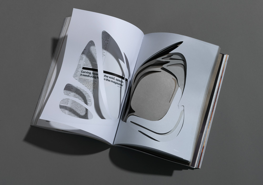
For her 2008 guest editorship, Hadid designed a front cover and 16 pages of greyscale cut-outs. Photography: Frank Hülsbömer
Zaha was profiled by art critic Matthew Collings, who visited her at her London offices and provided a pleasant distraction from discussions about cement. Collings and ‘Big Z’, as he affectionately called her, hit it off immediately. ‘Her architecture is the greatest art of the moment,’ he said.
So it’s a huge pleasure for me and I think a fitting tribute to Zaha (who tragically passed away 18 months ago) that this anniversary issue’s cover was created by Zaha Hadid Architects and its principal and torchbearer, Patrik Schumacher.
Enjoy this special issue and raise a glass to Big Z.
Tony Chambers, Editor-in-Chief
As originally featured in the October 2017 issue of Wallpaper* (W*223)
Our thickest issue yet, the spine also happens to measure a serendipitous 21mm, in keeping with our celebration of 21 years, and 21 guest editors
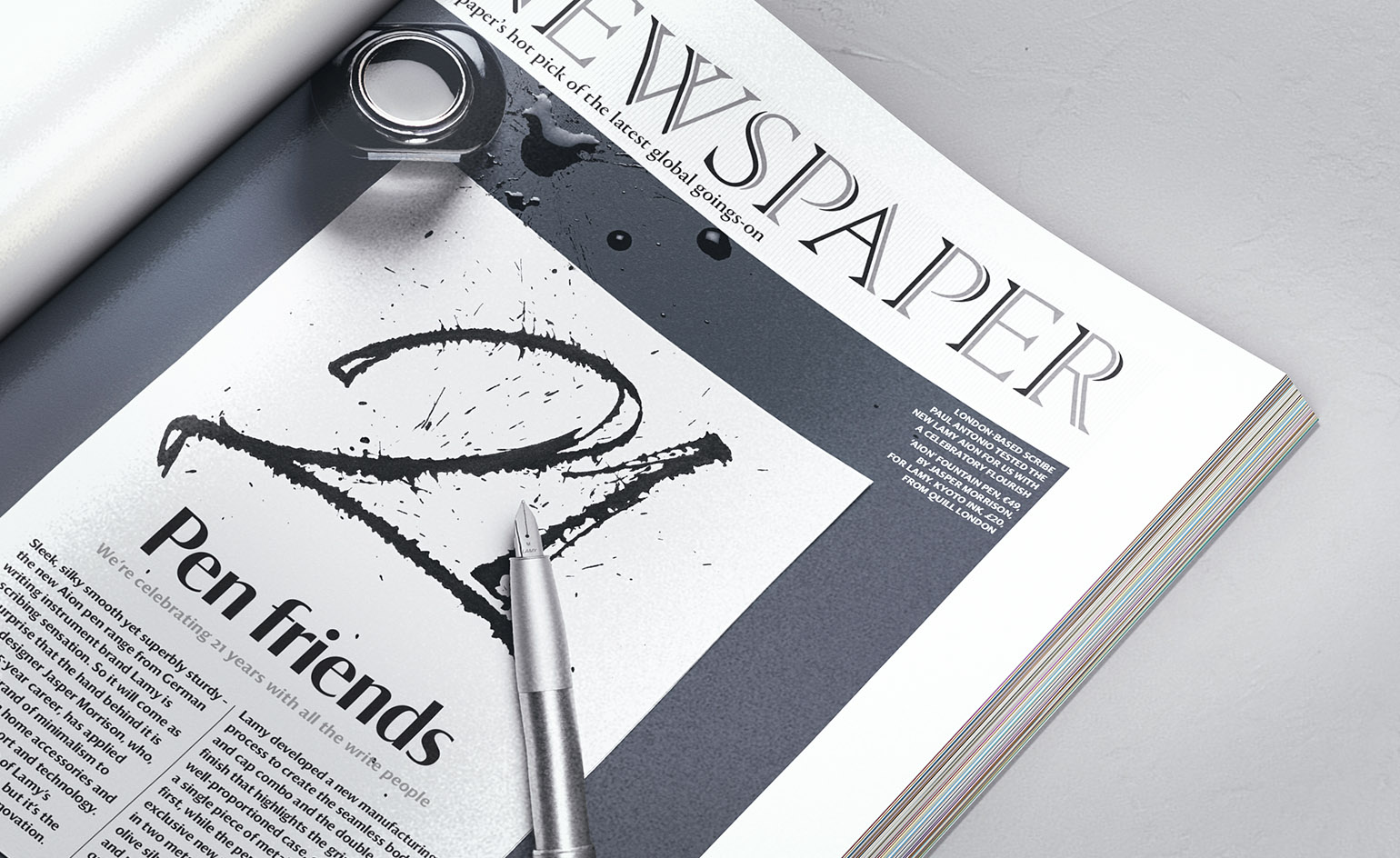
We’re celebrating 21 years with all the write people. Photography: Philippe Frangnière
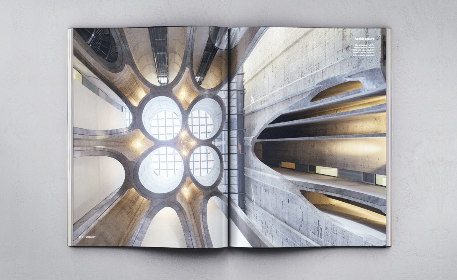
Resurrecting a disused grain silo, Heatherwick Studio creates a temple to contemporary African art and a hymn to concrete. Read more here. Photography: Iwan Baan
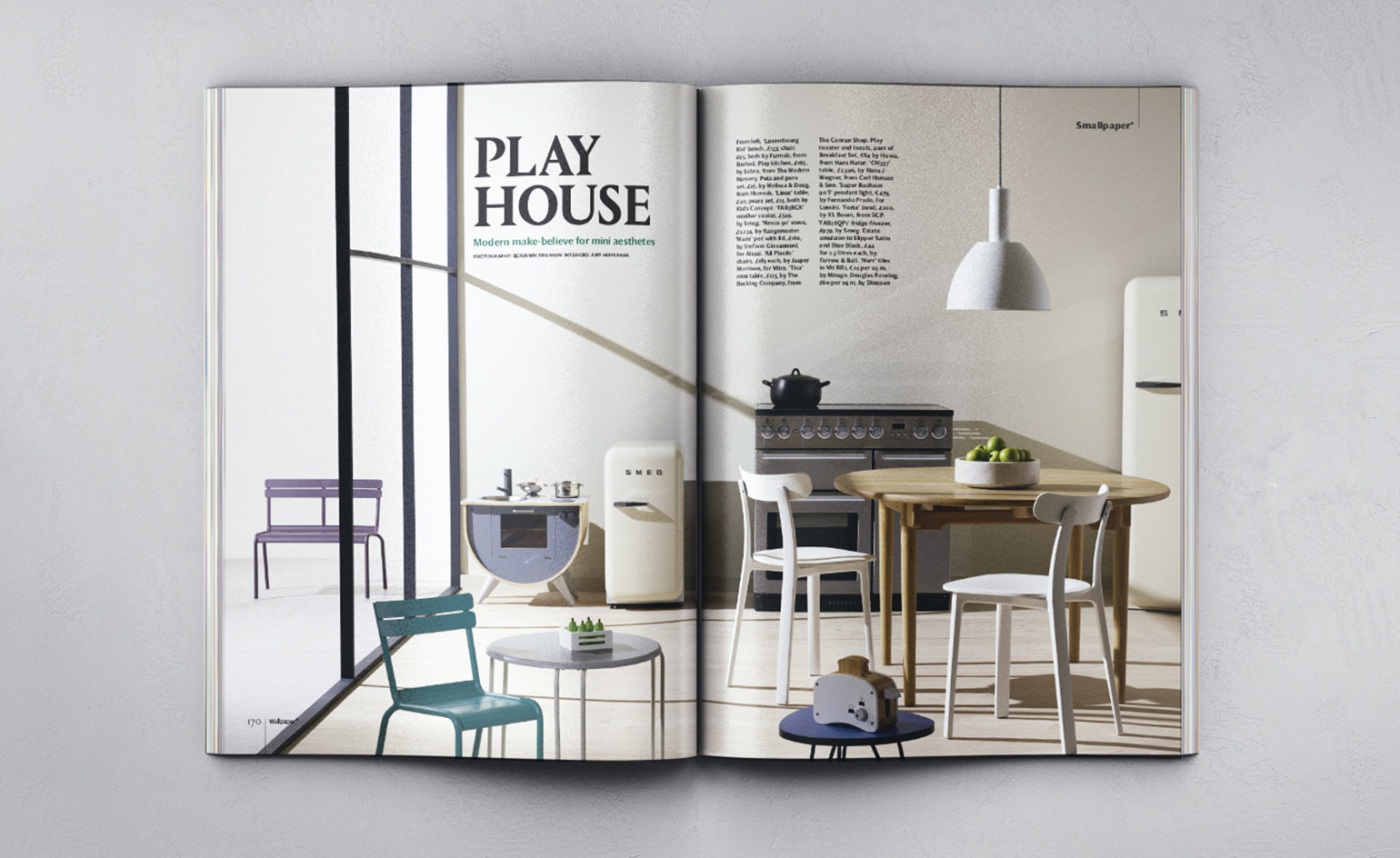
Modern make-believe for mini aesthetics. Photography: Benjamin Swanson
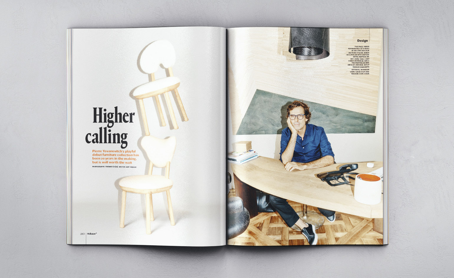
Pierre Yovanovitch’s playful debut furniture collection has been 20 years in the making, but is well worth the wait. Read more here. Photography: Thomas Chéné
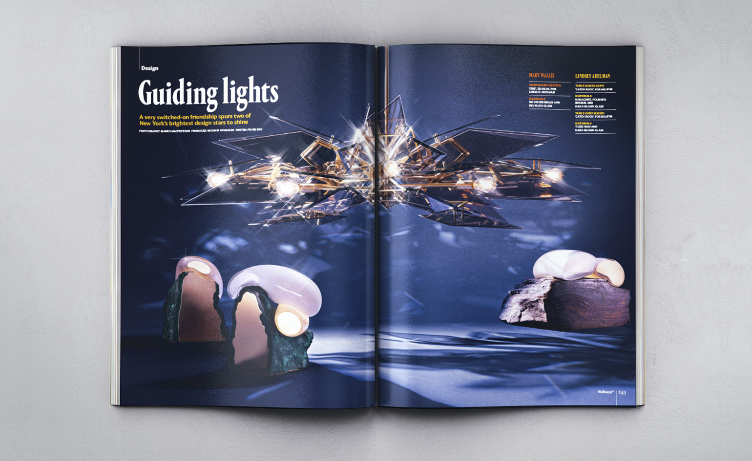
A very switched-on friendship spurs two of New York’s brightest design stars to shine. Photography: Marko Macpherson. Producer: Michael Reynolds
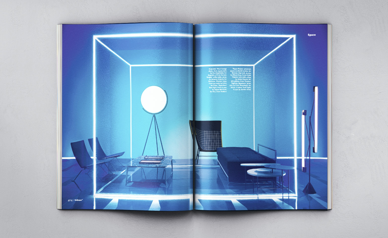
We‘re kings of neon in our interiors Space shoot. Photography: Stephen Lenthall
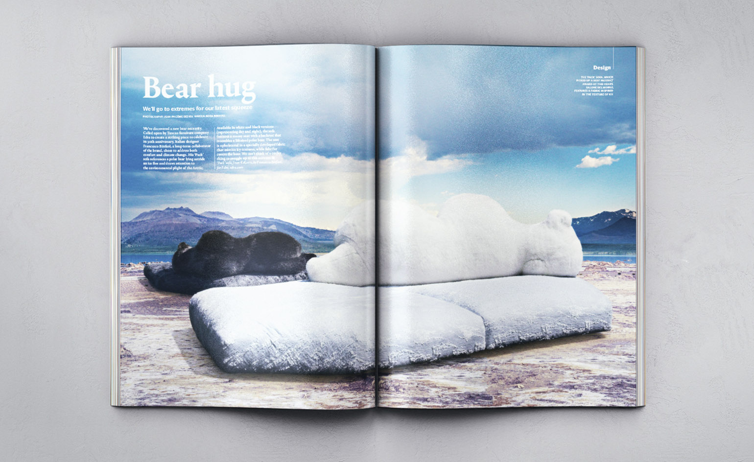
We’ll go to extremes for our latest squeeze. Photography: Jean-Pacôme Dedieu
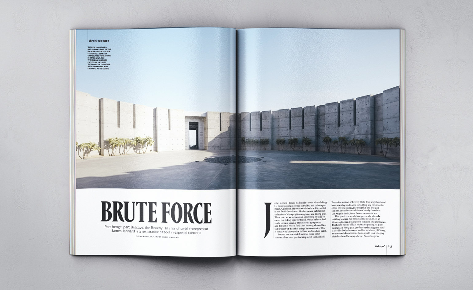
Part henge, part Batcave, the Beverly Hills lair of serial entrepreneur James Jannard is restorative citadel in exposed concrete. Photography: Joe Fletcher
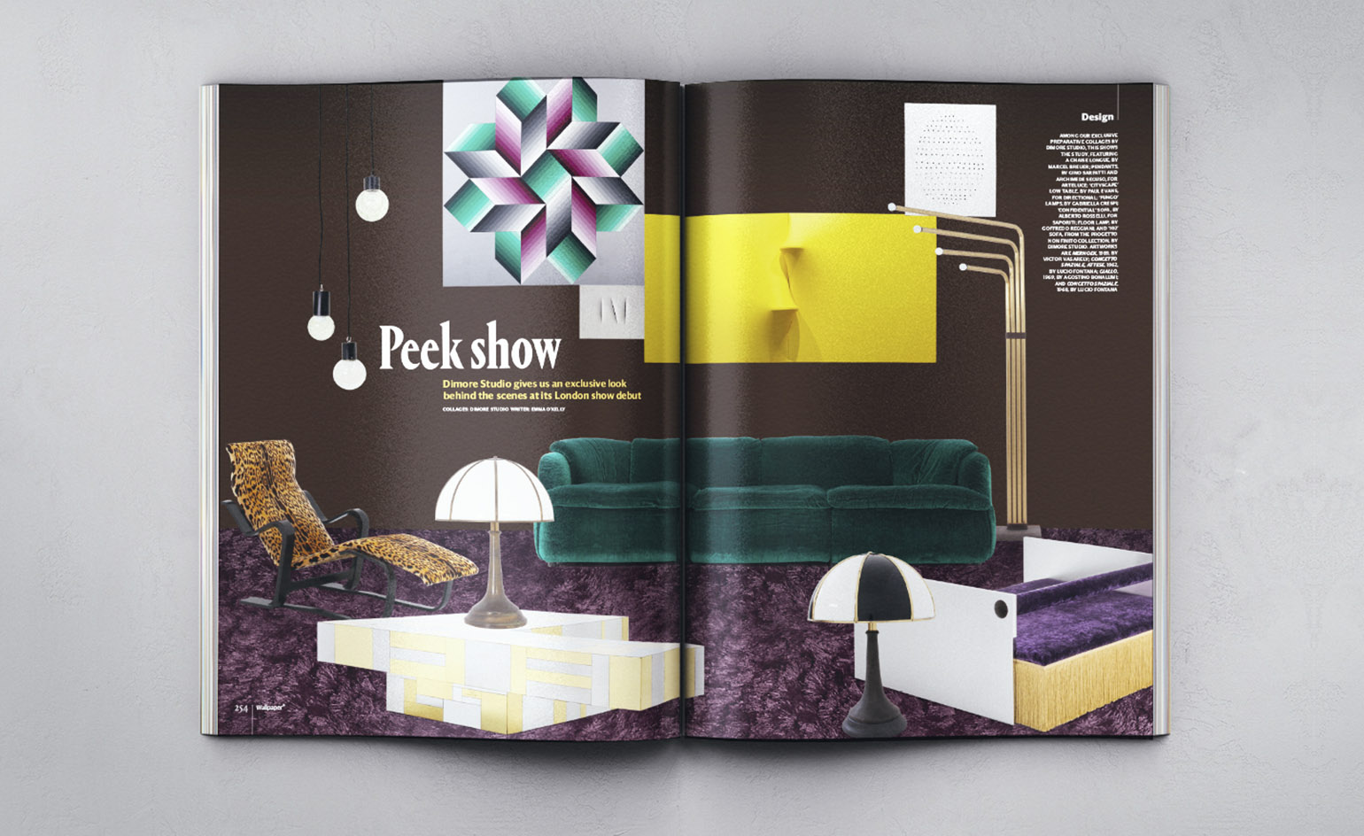
Dimore Studio give us an exclusive look behind the scenes at its London show debut. Read more here. Collage: Dimore Studio
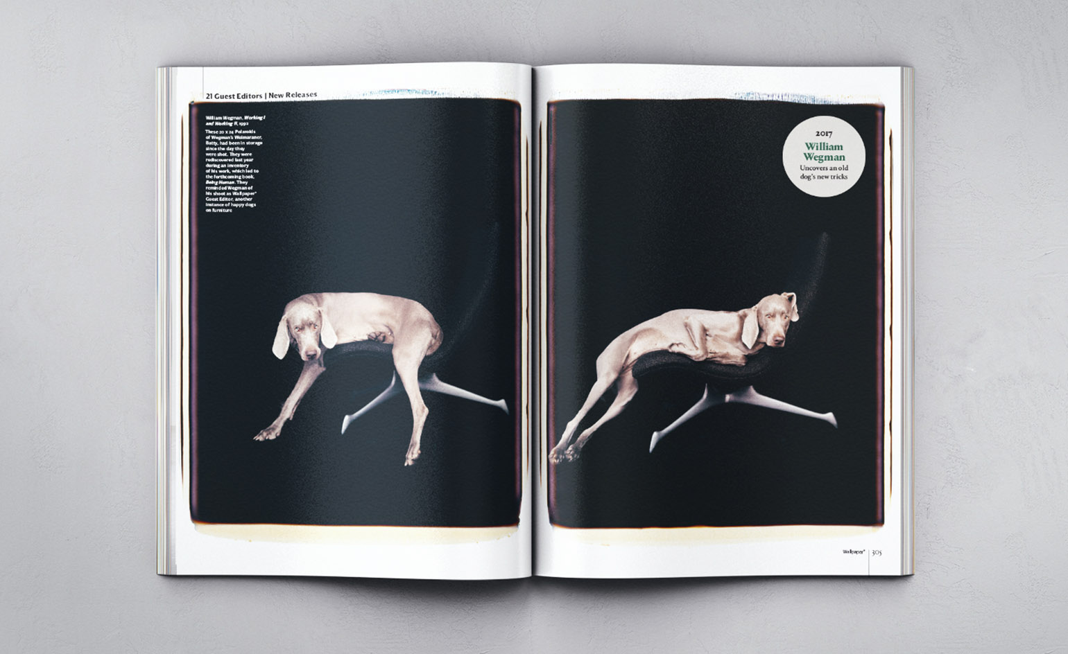
William Wegman is among our former Guest Editors who gave a new contribution to the issue. Pictured, Working I and Working II, by William Wegman, 1992
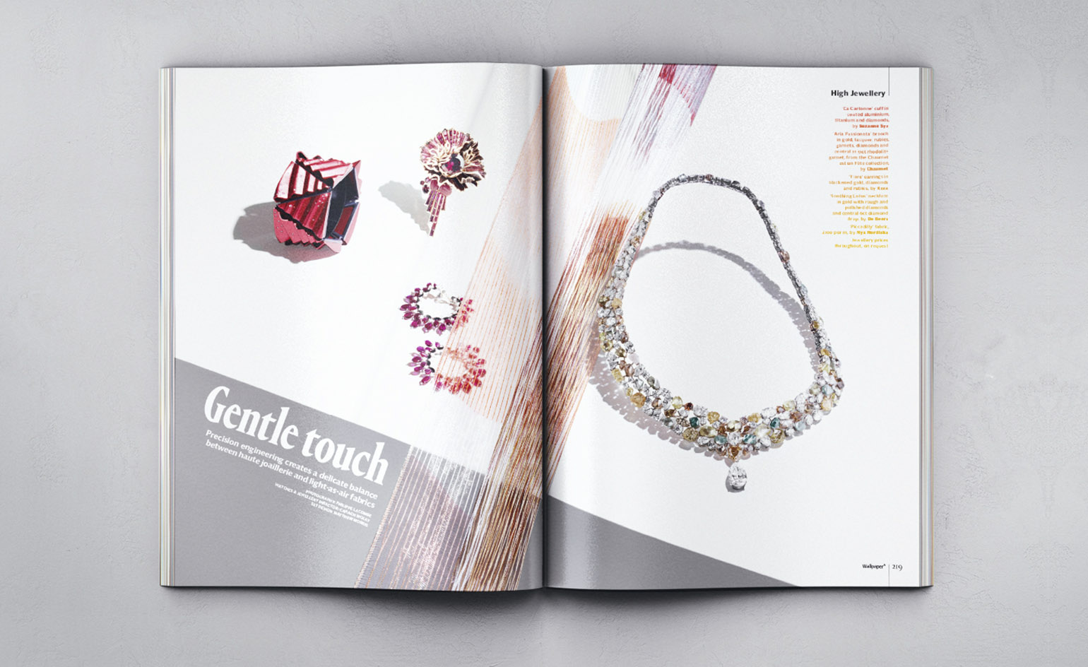
Precision engineering creates a delicate balance between haute joaillerie and light-as-air fabrics. Photography: Philippe Lacombe
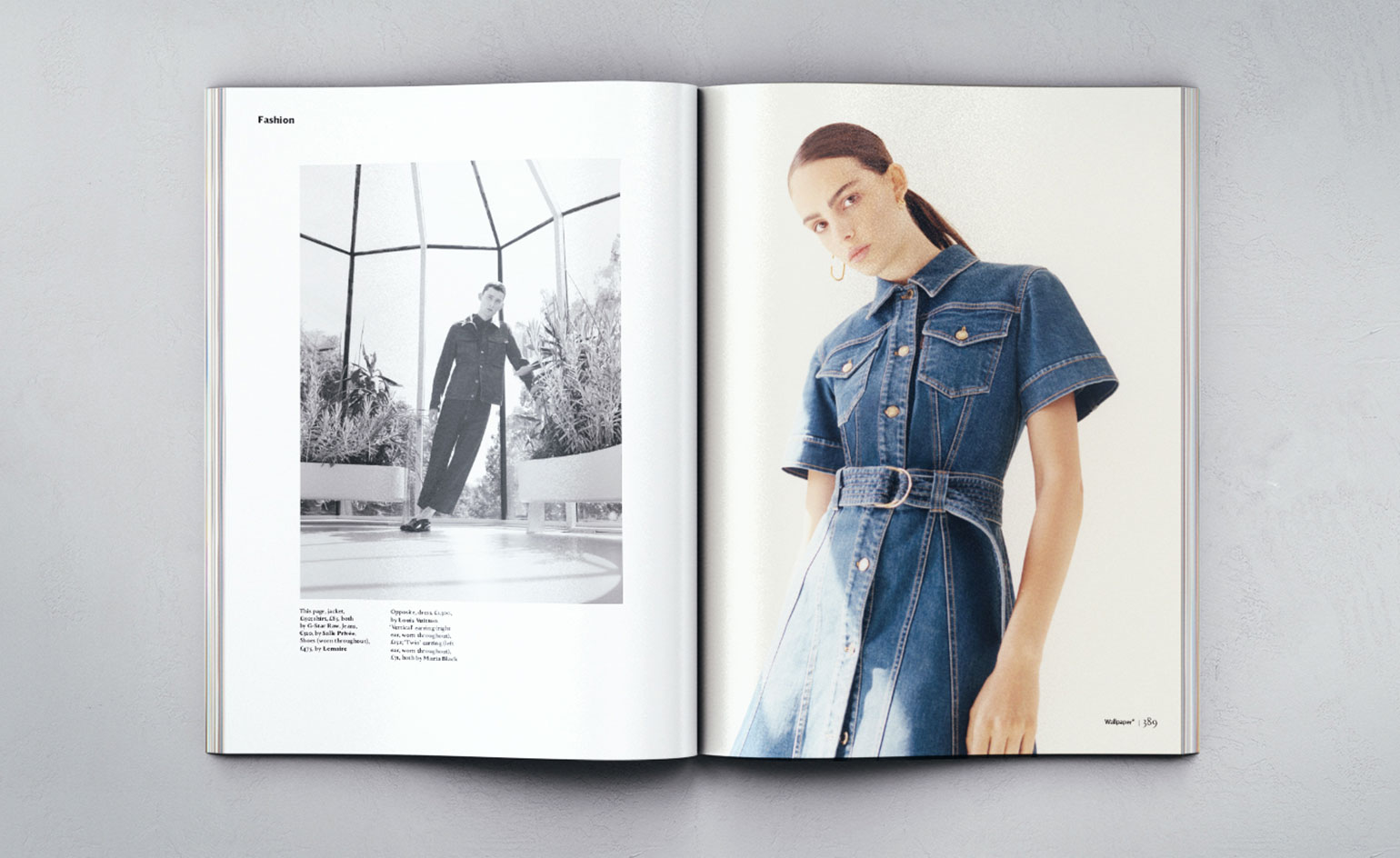
We’re daring to par with some denim-on-denim action. Photography: Ivan Ruberto
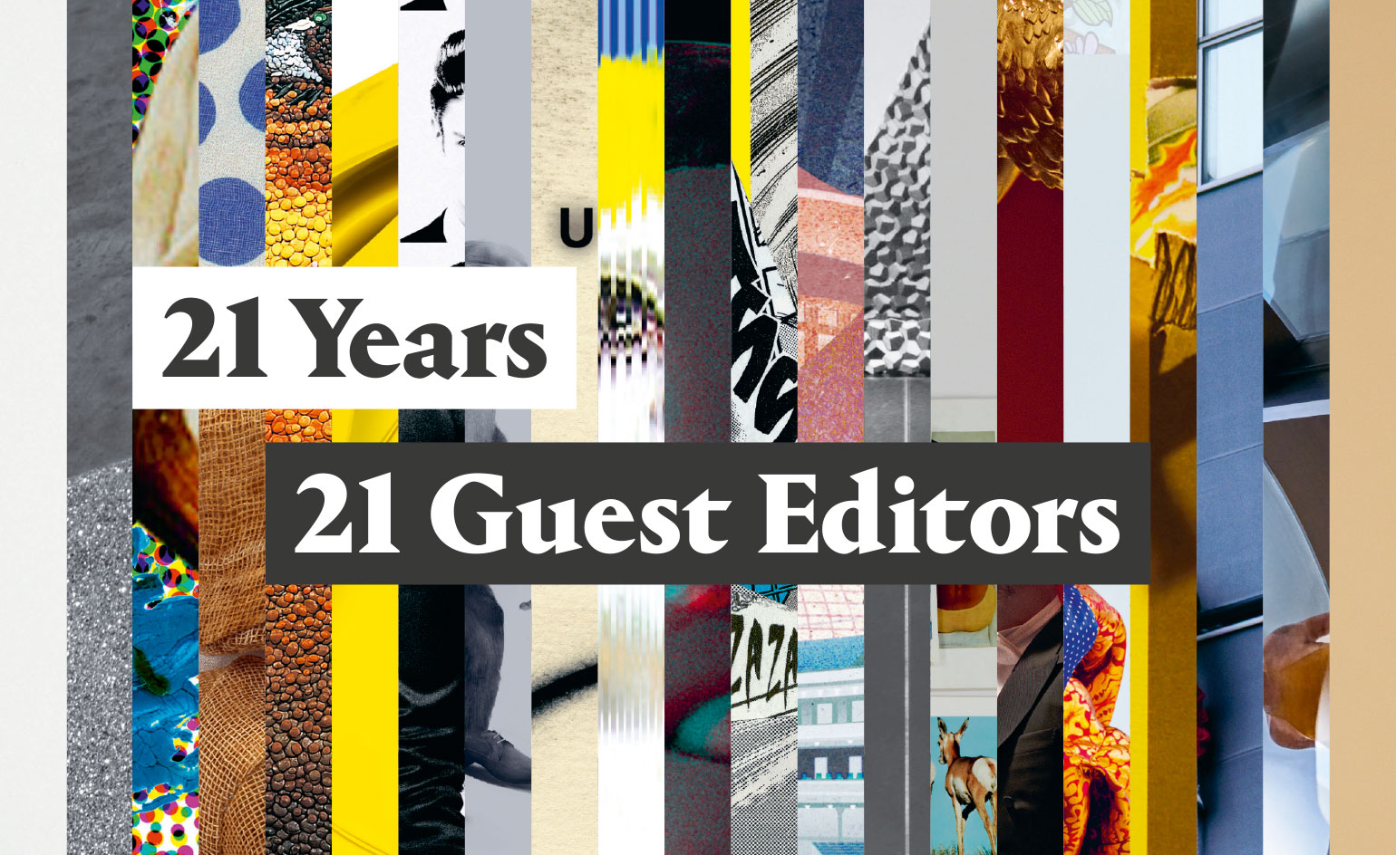
Ten years ago, in the spirit of creative collaboration, we offered space and time to a trio of guest editors. It was the start of something very special, a series of editorial experiments, pushing us to try new things and to the edges of the possible. Here, we take a retrospective look at our 21 Guest Editors to date, each one generous and demanding in all the right ways...
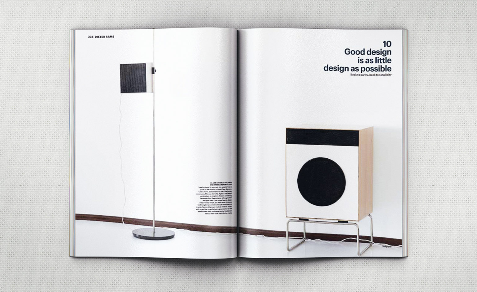
Dieter Rams, 2007: His contribution as one of our inaugural Guest Editors included a 16-page portfolio exploring Rams’ Ten Commandments of Design. Photography: Matthew Donaldson
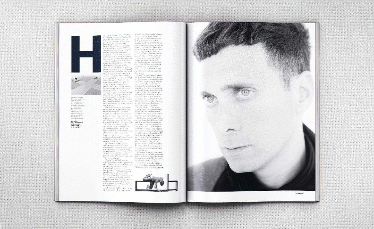
Hedi Slimane, 2007: Slimane’s contribution to the issue was a set of 20 60 x 40cm posters using his own photography and typography. Photography: Philippe Fragniere
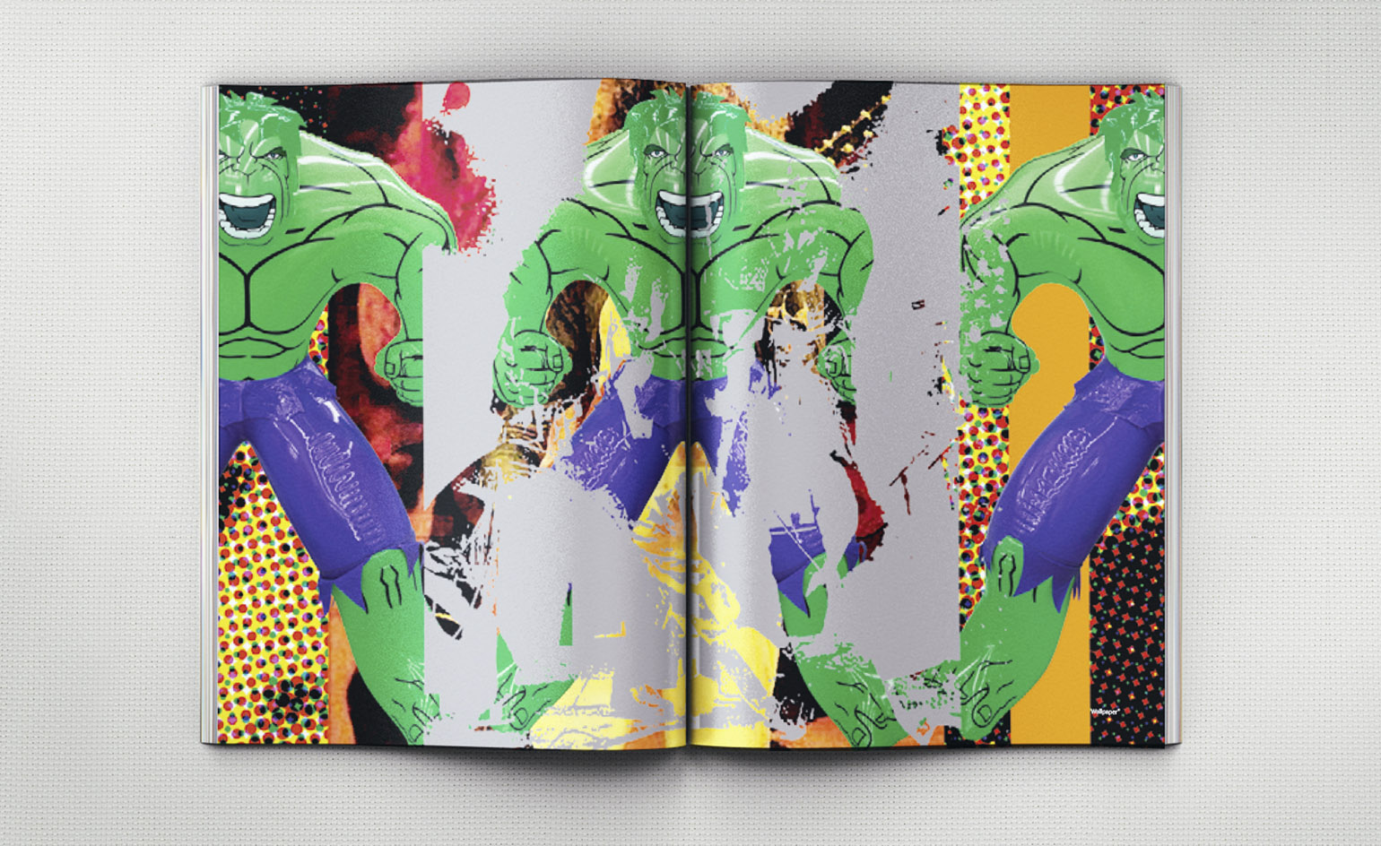
Jeff Koons, 2007: The artist provocateur produced an eye-popping homage to childhood heroes Led Zeppelin
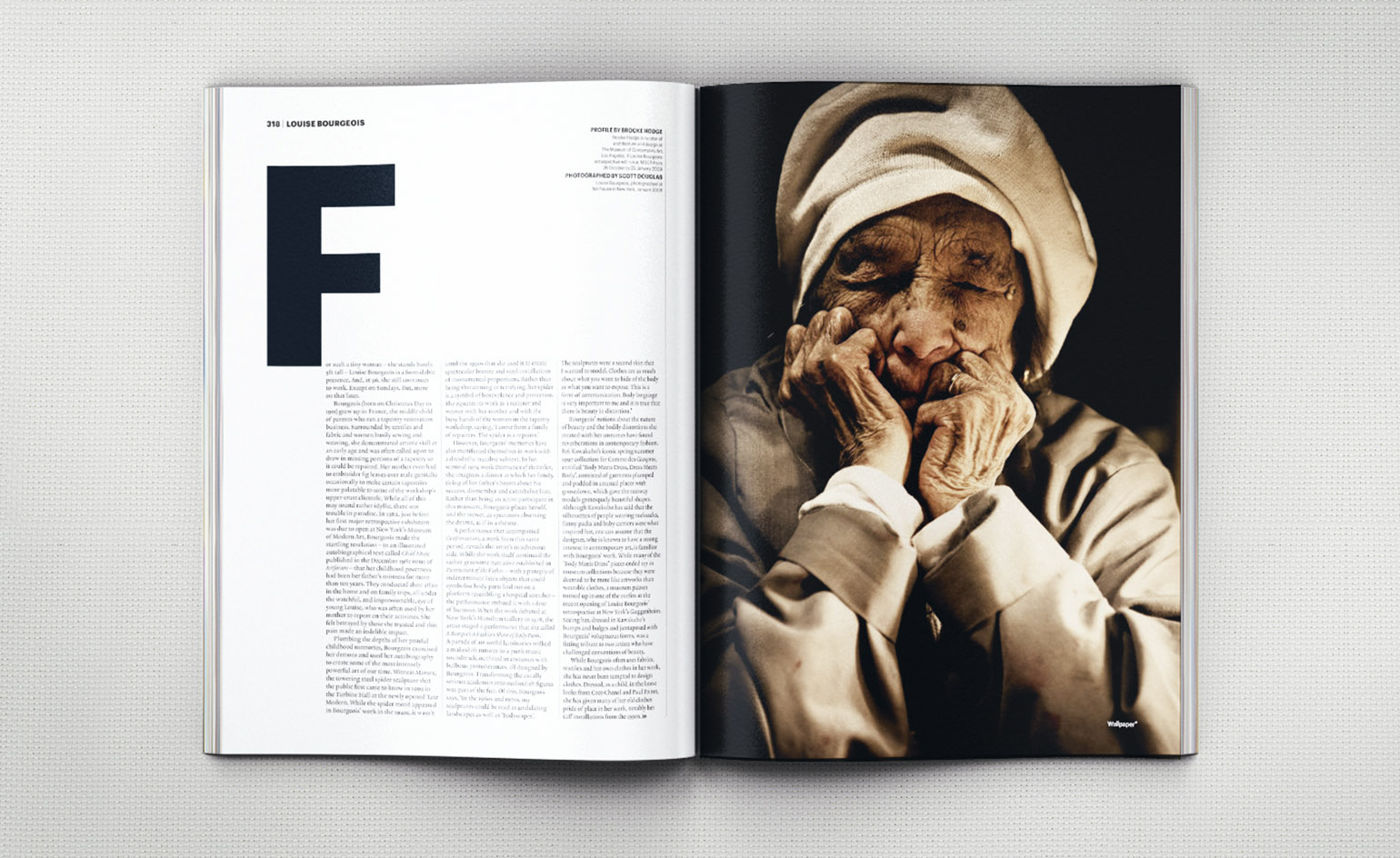
Louise Bourgeois, 2008: The art world grand dame worked with three long-time friends and collaborators – fashion designer turned artist Helmut Lang, architect Peter Zumthor and artist Roni Horn – to curate a unique edit of their work. Photography: Scott Douglas
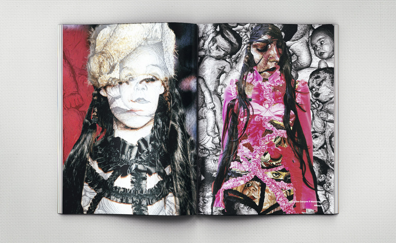
Rei Kawakubo, 2008: The fashion avant-gardiste took a typically left-field approach to her brief, assembling 20 pages that combined art, animation, photography, graphics and illustration to summon up the maverick spirit of Comme des Garçons
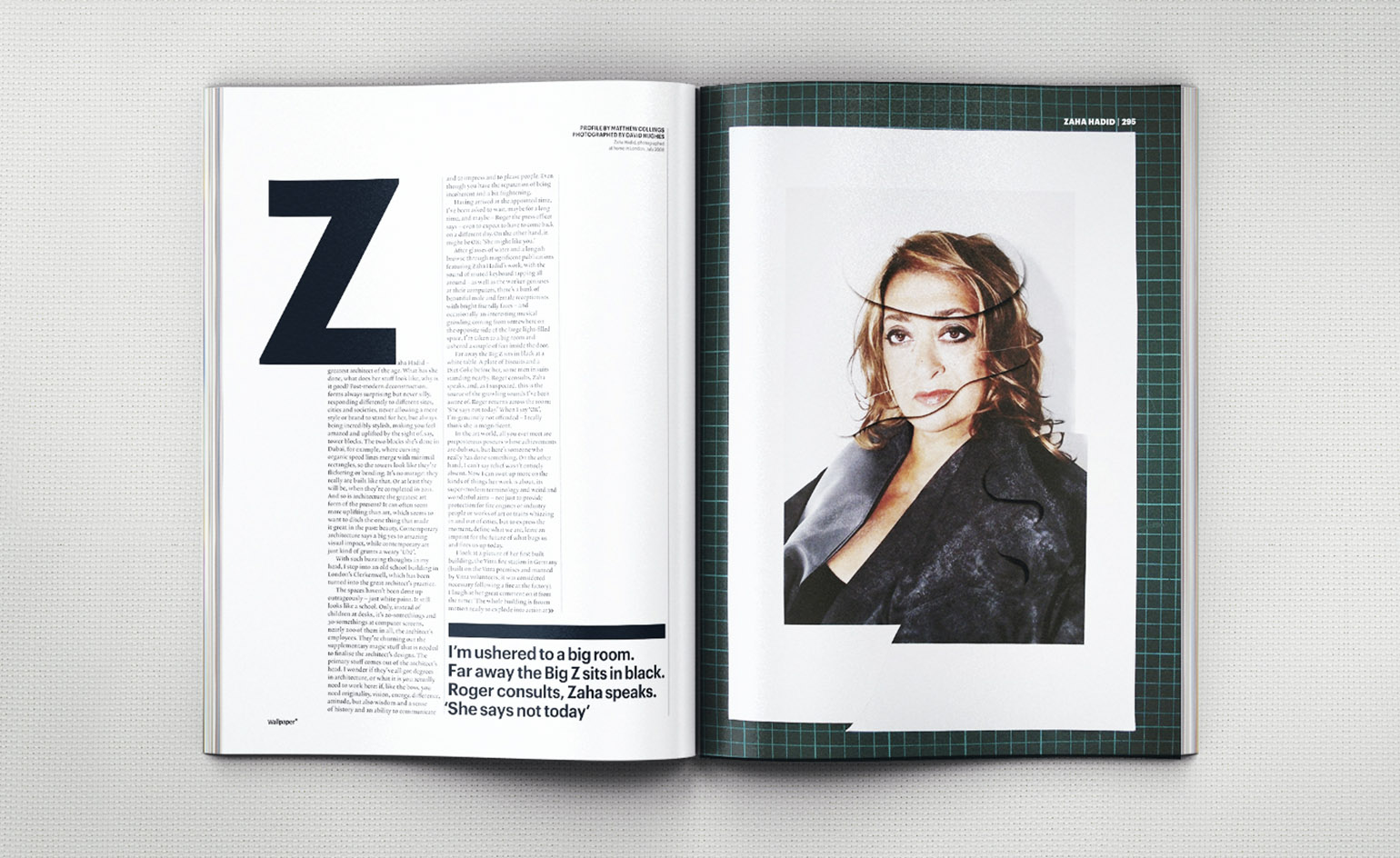
Zaha Hadid, 2008: She brought a futuristic touch into the magazine, testing the ‘powers and patience of the print production department’ (wrote Editor-in-Chief Tony Chambers) with greyscale cut-outs across 16 pages. Photography: David Hughes
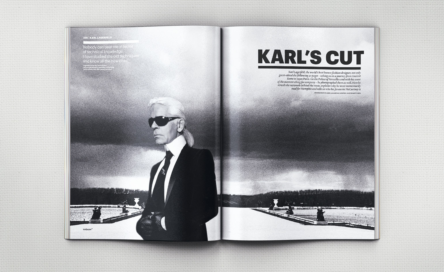
Karl Lagerfeld, 2009: For Wallpaper* he photographed Alvar Aalto’s Maison Louis Carré and the artist Claude Lévêque, as well as his muse of the moment, the French model Baptiste Giabiconi in the Queen’s Theatre at Versailles
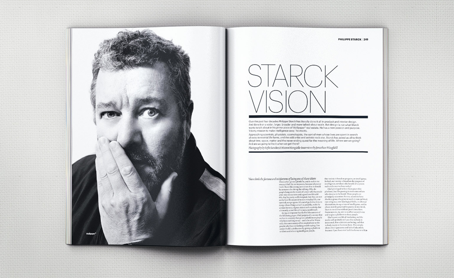
Philippe Starck, 2009: Starck asked us all to think about time, space, matter and the never-ending quest for the meaning of life with the help of seven sharp minds. Photography: Sofia Sanchez & Mauro Mongiello
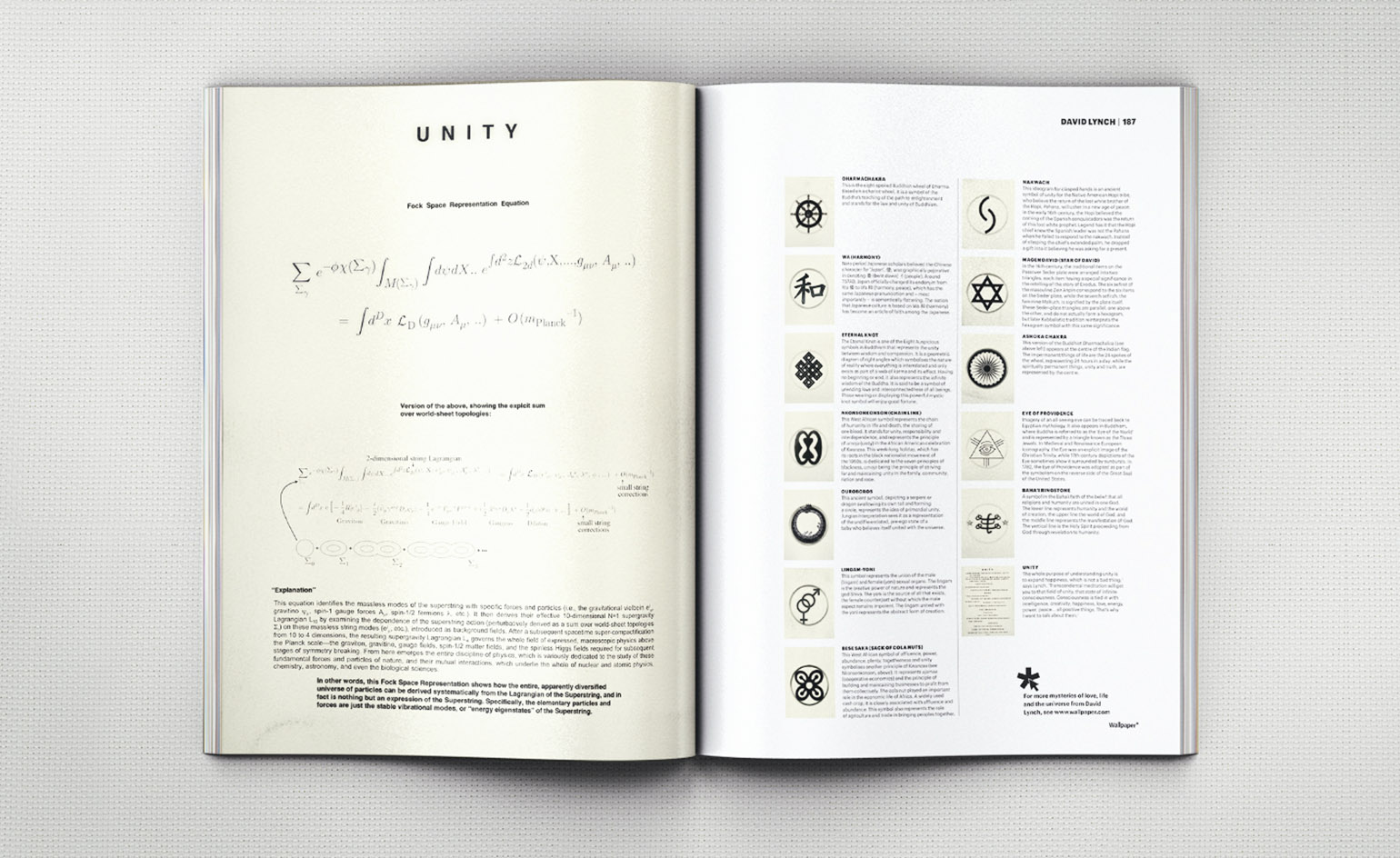
David Lynch, 2010: The maverick film director used his space to celebrate a somewhat surprising passion: transcendental meditation, which he has been practising twice a day, every day, since 1973
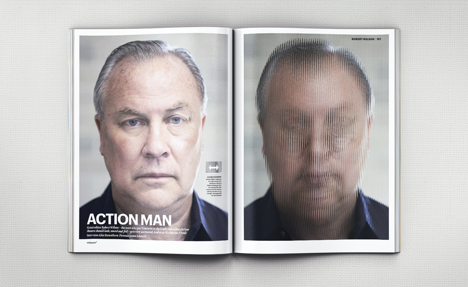
Robert Wilson, 2010: He created a 16-page portfolio of portraits and then, with creative communications agency Dentsu London, employed a pre-cinema technique called Ombro Cinema: by sliding a striped acetate sheet across the page, readers could make subjects such as Brad Pitt and a sumo world champion move. Portrait: Jason Schmidt
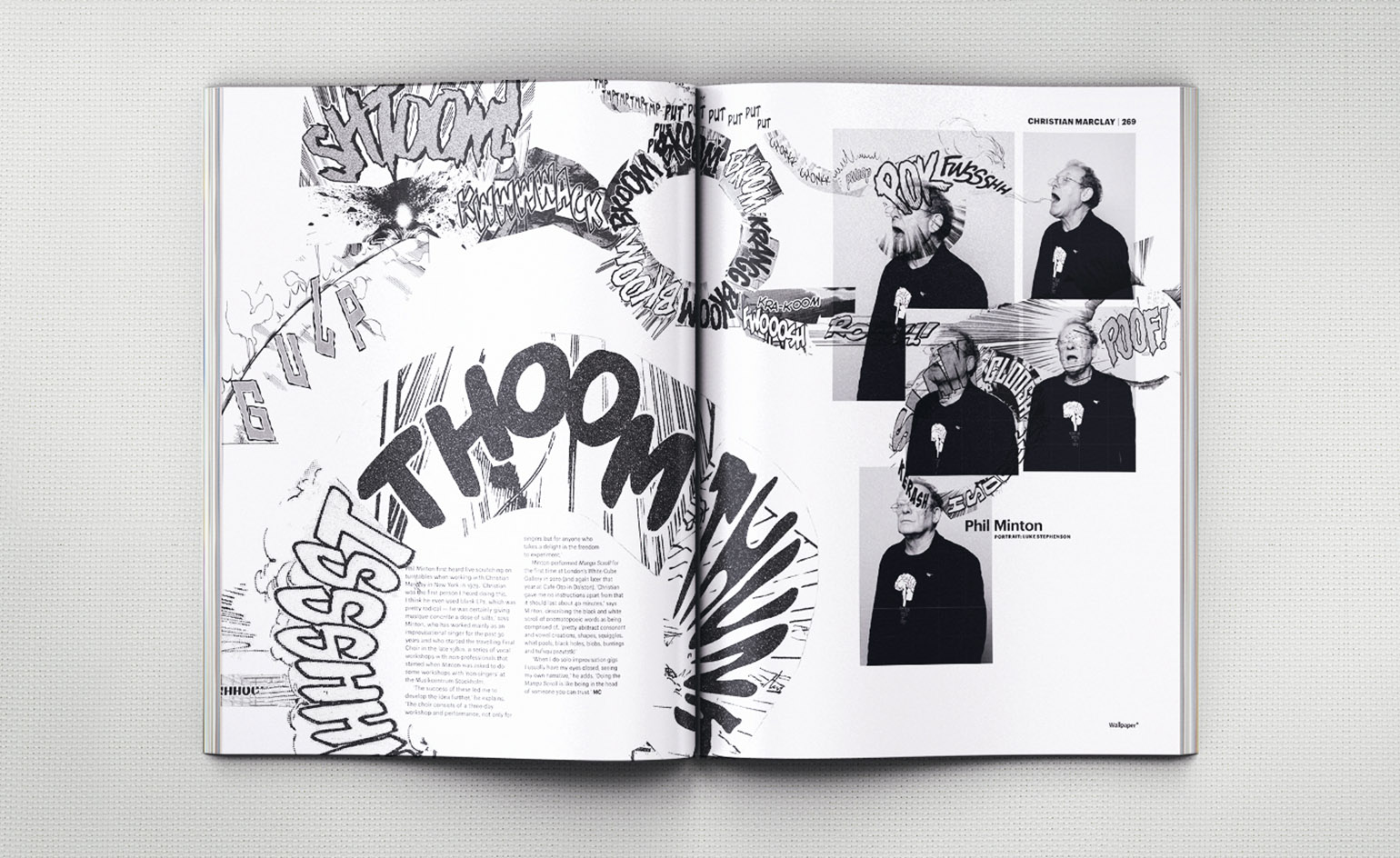
Christian Marclay, 2011: As Guest Editor, Marclay reimagined his Manga Scroll to dramatic effect. Manga Scroll images, courtesy of Graphicstudio, University of South Florida, Tampa
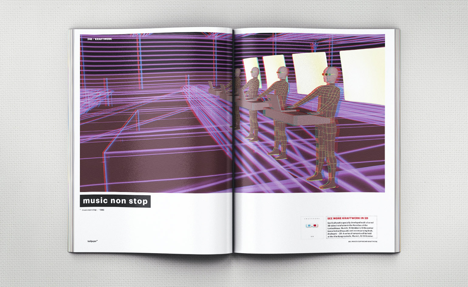
Kraftwerk, 2011: The electronic music pioneers previewed a portfolio of 3D-imagery and pulled in the likes of Peter Saville, Neville Brody, Thomas Demand and Andreas Gursky, to talk about the band’s broader impact on art and design
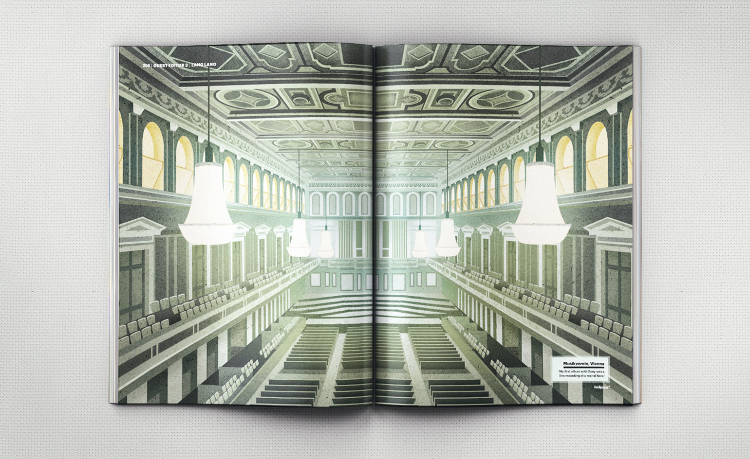
Lang Lang, 2012: The world’s most famous classical musician presented ten of the venue’s he’s performed in. Illustrator: Eoin Ryan
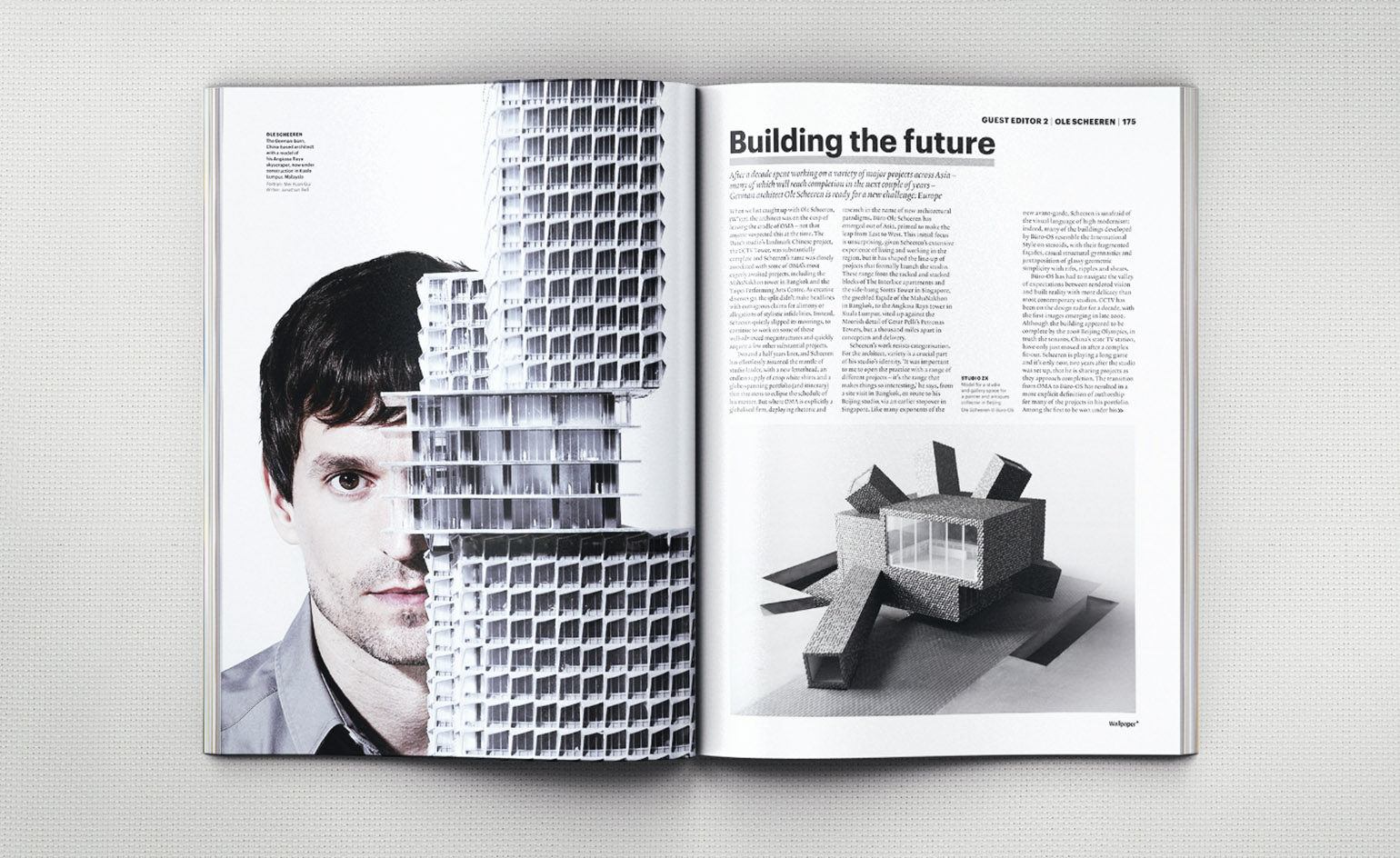
Ole Scheeren, 2012: The architect’s offering was a typically headlong rush around the fast-changing Asian landscape in the company of a clutch of artists
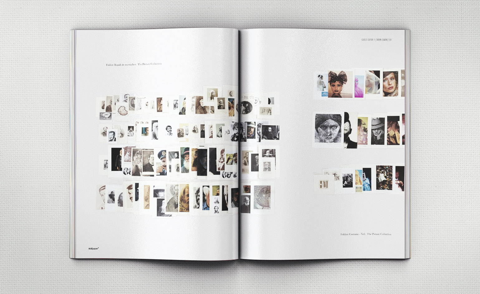
Taryn Simon, 2012: As Guest Editor, she focused on two projects – the online Image Atlas, which compares by country the image results delivery by internet search engines; and The Picture Collection (pictured), based on the New York Public Library’s image archive
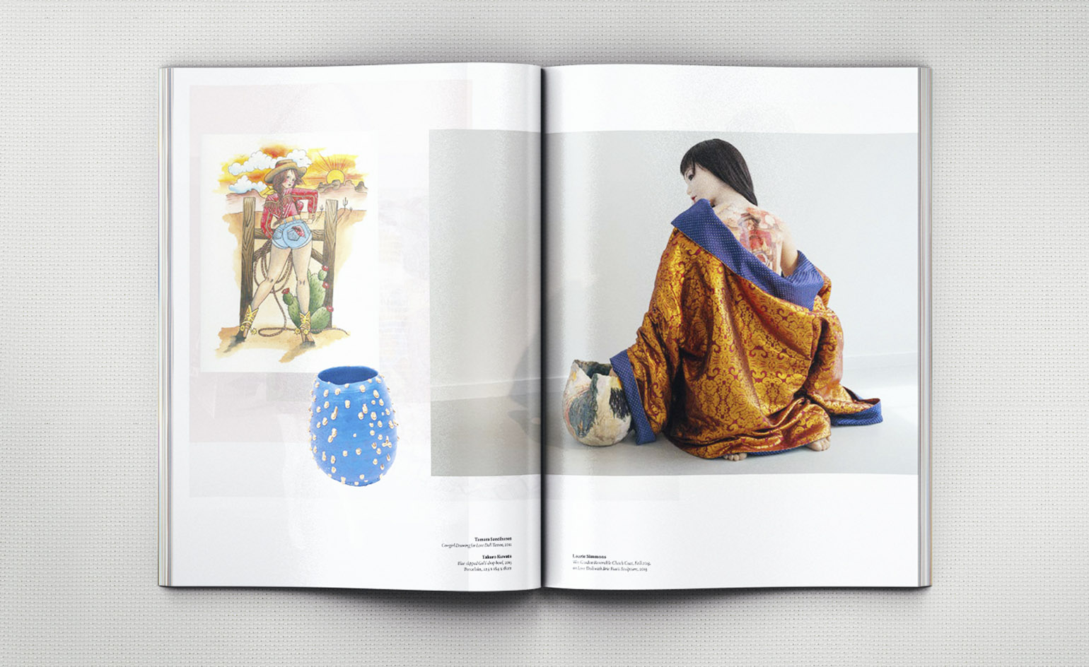
Laurie Simmons, 2013: For us, she created a 16-page extravaganza of jellybean-scattered images from her own work and by artists she admires
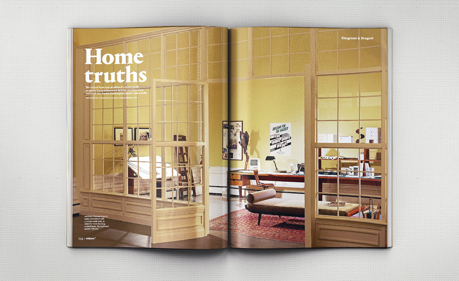
Elmgreen & Dragset, 2013: The domestic world’s a stage for our Guest Editor duo, who opened their address book to take us on an intriguing tour of fictional homes. Photography: Jonathan de Villiers
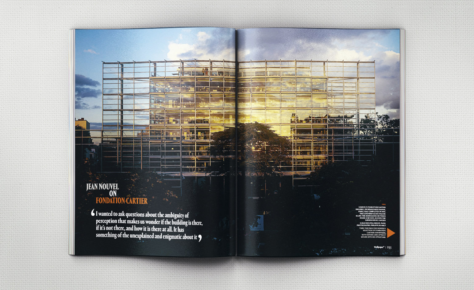
Jean Nouvel, 2014: The French architect ran us through 20 years of making monuments to better thinking. Photography: Philippe Ruault
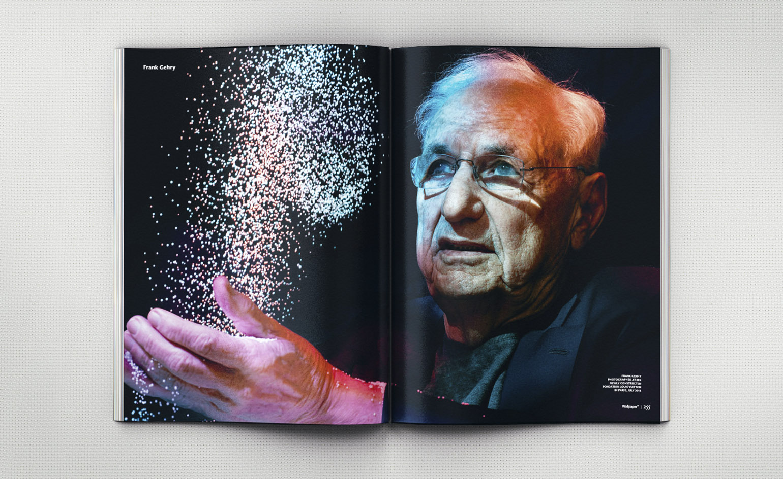
Frank Gehry, 2014: With the wind in his sails, Gehry talked and walked us through his titanic, ship-shape Fondation Louis Vuitton. Photography: Azim Haidaryan
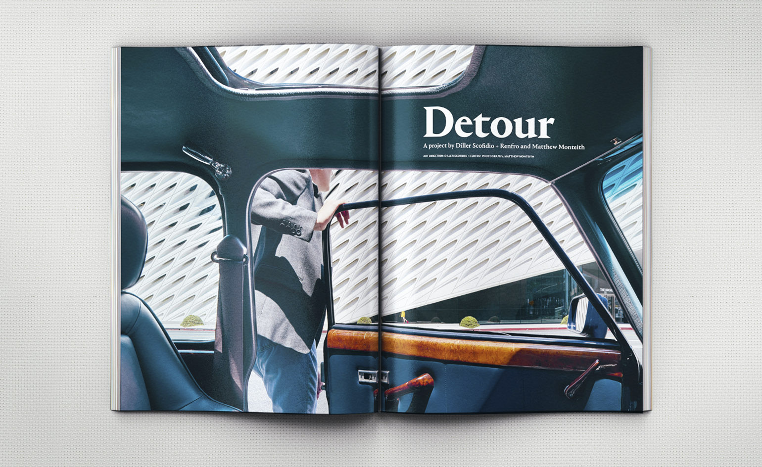
Liz Diller, 2015: The American architect gave us an exclusive photographic tour of The Broad art museum in LA. Photography: Matthew Monteith
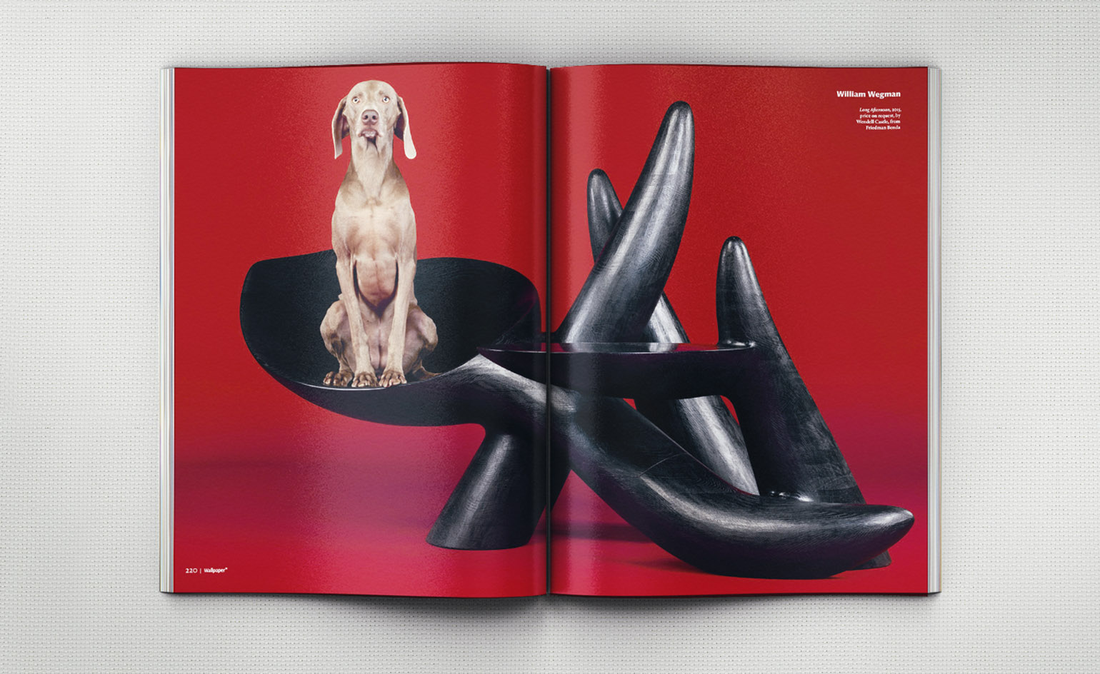
William Wegman, 2015: The king of canine conceptualism met Wallpaper* in a series of photographs featuring an artful edit of American design. Photography: William Wegman. Producer: Michael Reynolds
INFORMATION
The October 2017 issue of Wallpaper* is out now. Subscribe here
Wallpaper* Newsletter
Receive our daily digest of inspiration, escapism and design stories from around the world direct to your inbox.
-
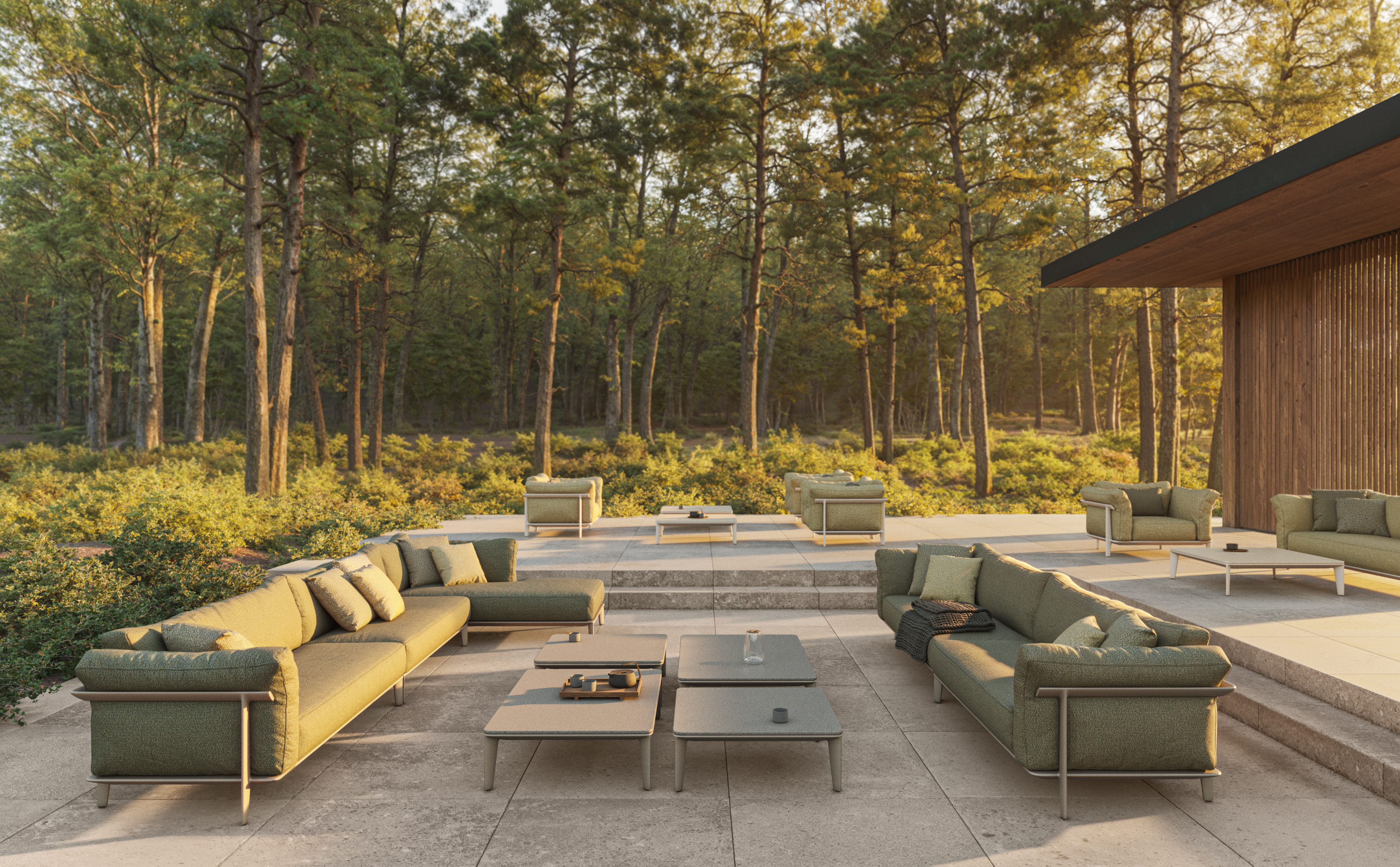 This new Vondom outdoor furniture is a breath of fresh air
Designed by architect Jean-Marie Massaud, the ‘Pasadena’ collection takes elegance and comfort outdoors
By Simon Mills
-
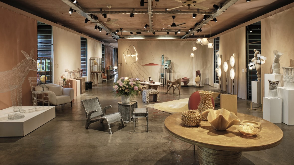 Eight designers to know from Rossana Orlandi Gallery’s Milan Design Week 2025 exhibition
Wallpaper’s highlights from the mega-exhibition at Rossana Orlandi Gallery include some of the most compelling names in design today
By Anna Solomon
-
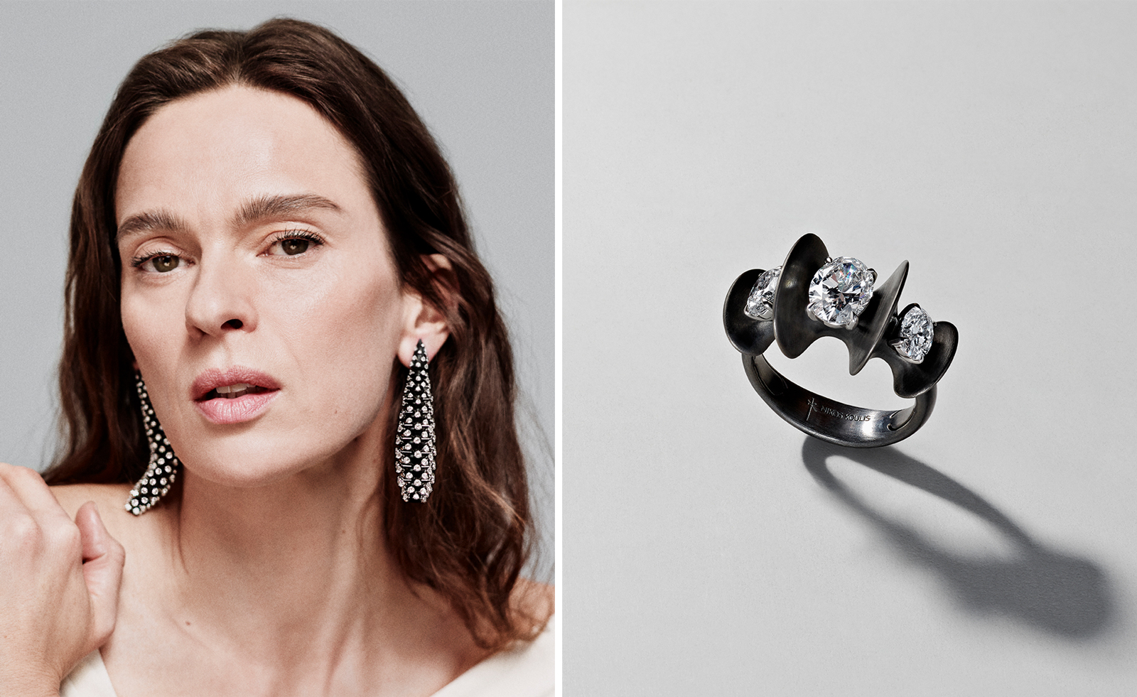 Nikos Koulis brings a cool wearability to high jewellery
Nikos Koulis experiments with unusual diamond cuts and modern materials in a new collection, ‘Wish’
By Hannah Silver
-
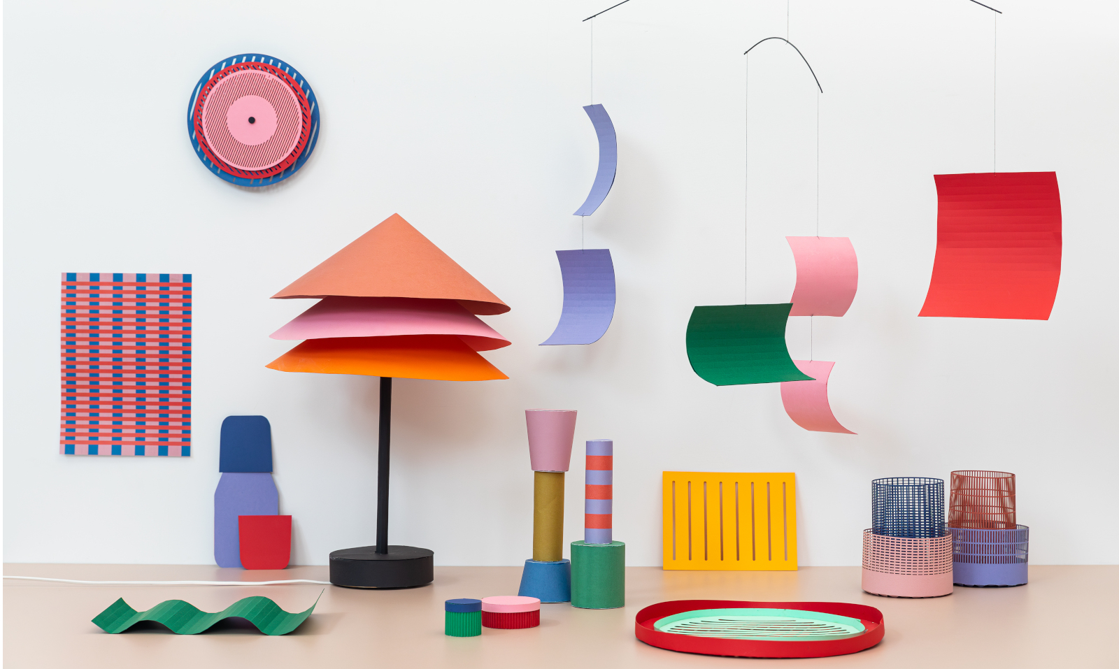 Year in review: top 10 design stories of 2024
Wallpaper* magazine's 10 most-read design stories of 2024 whisk us from fun Ikea pieces to the man who designed the Paris Olympics, and 50 years of the Rubik's Cube
By Tianna Williams
-
 Boffi and Zaha Hadid Design’s new Cove Kitchen, an Italian island dream
The newly updated Cove Kitchen is conceived as a modular hub of creation and conviviality
By Simon Mills
-
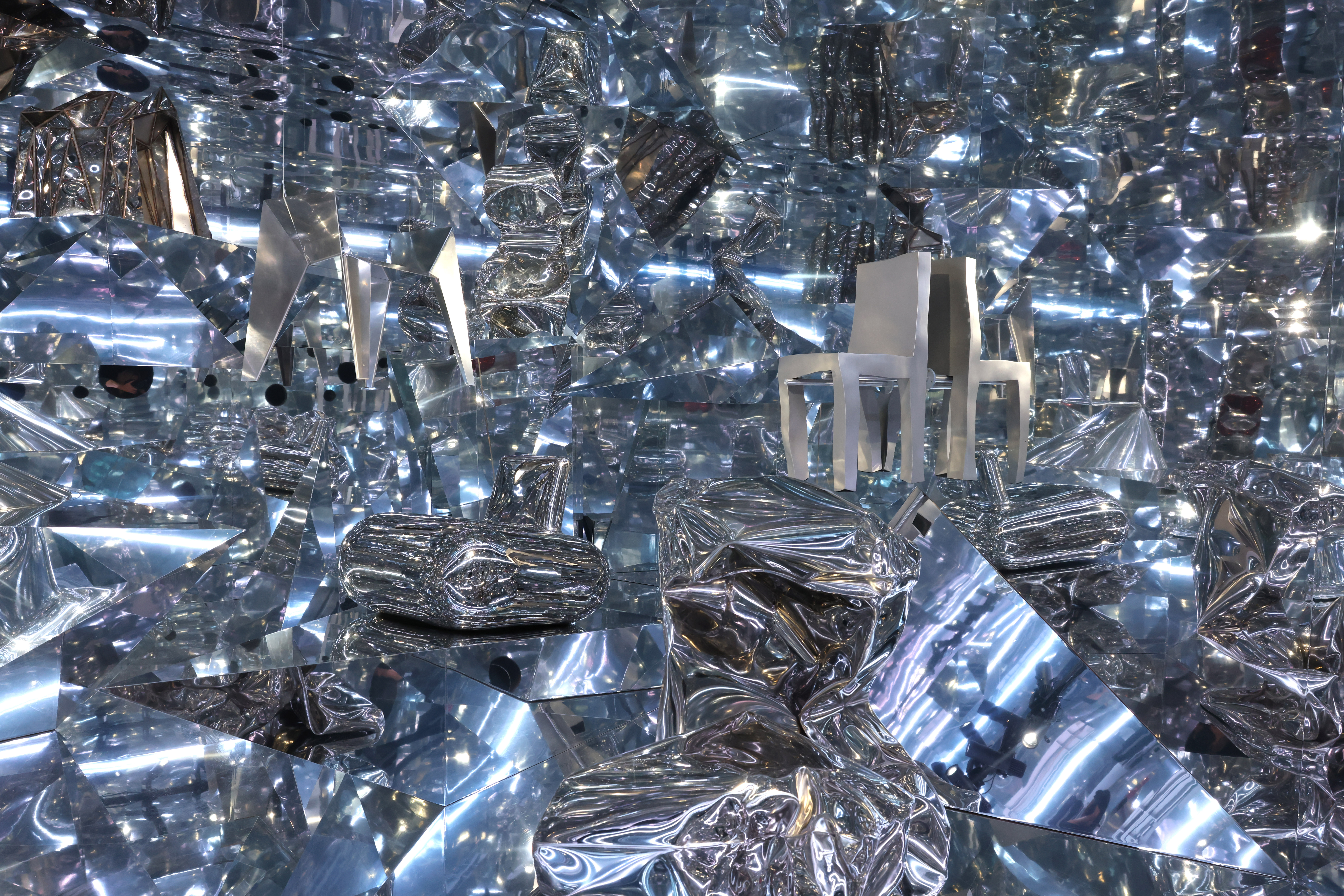 Robert Wilson creates a kaleidoscopic stage for 140 chairs in Leipzig
‘A Chair and You’ is on display at the Grassi Museum of Applied Arts in Leipzig, celebrating its 150th anniversary with the Robert Wilson-staged exhibition, until 6 October 2024
By Léa Teuscher
-
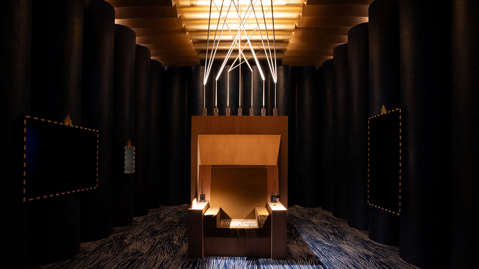 David Lynch presents 'A Thinking Room' at the Salone del Mobile
The David Lynch Salone del Mobile 2024 installation was a cinematic experience within the fair curated by Antonio Monda: watch the video
By Laura May Todd
-
 Salone del Mobile 2024: David Lynch will lead the fair’s new cultural approach
Salone del Mobile 2024 will take place from 16-21 April. The programme was just announced, with Eurocucina returning to the fair, SaloneSatellite celebrating 25 years of emerging design talent, and a new cultural programme that includes David Lynch’s Thinking Rooms
By Rosa Bertoli
-
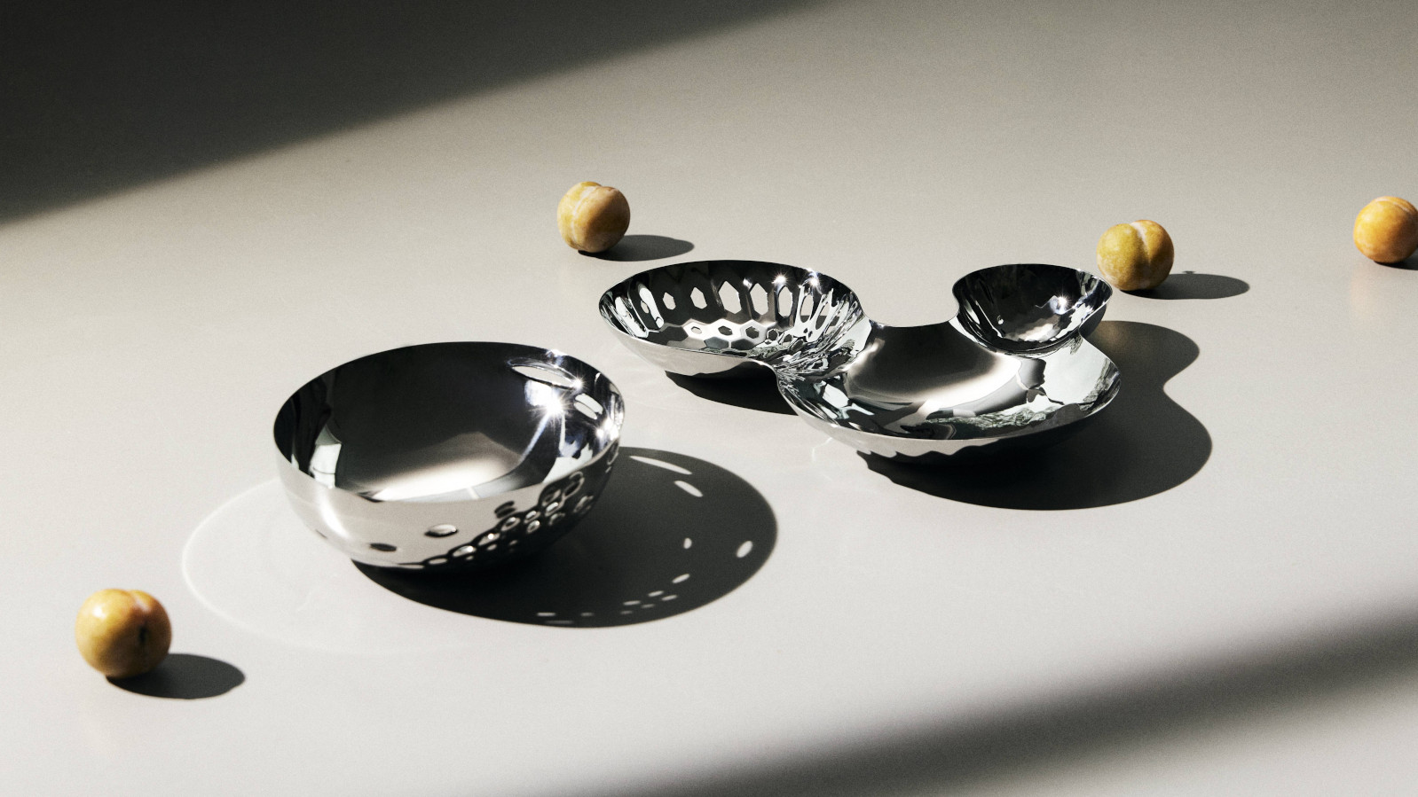 Zaha Hadid Design serves up sophisticated new tableware
Tableware takes on compelling forms as Zaha Hadid Design shows its polish with new additions to its collections
By Simon Mills
-
 Philippe Starck announced as Mortlach Whisky’s first creative director
The renowned French designer lends his expertise and holistic vision to Mortlach, the heritage Scotch distillery
By Adrian Madlener
-
 A new history of Braun charts the company’s path to ultimate modernist manufacturer
Phaidon’s monograph Braun: Designed to Keep tracks over a century of product design, including its long-standing collaboration with Dieter Rams
By Jonathan Bell