London’s iconic Tube map design grows two new stations
As the London Tube map grows to include two brand new stations, we speak to the designer safeguarding its famous design codes
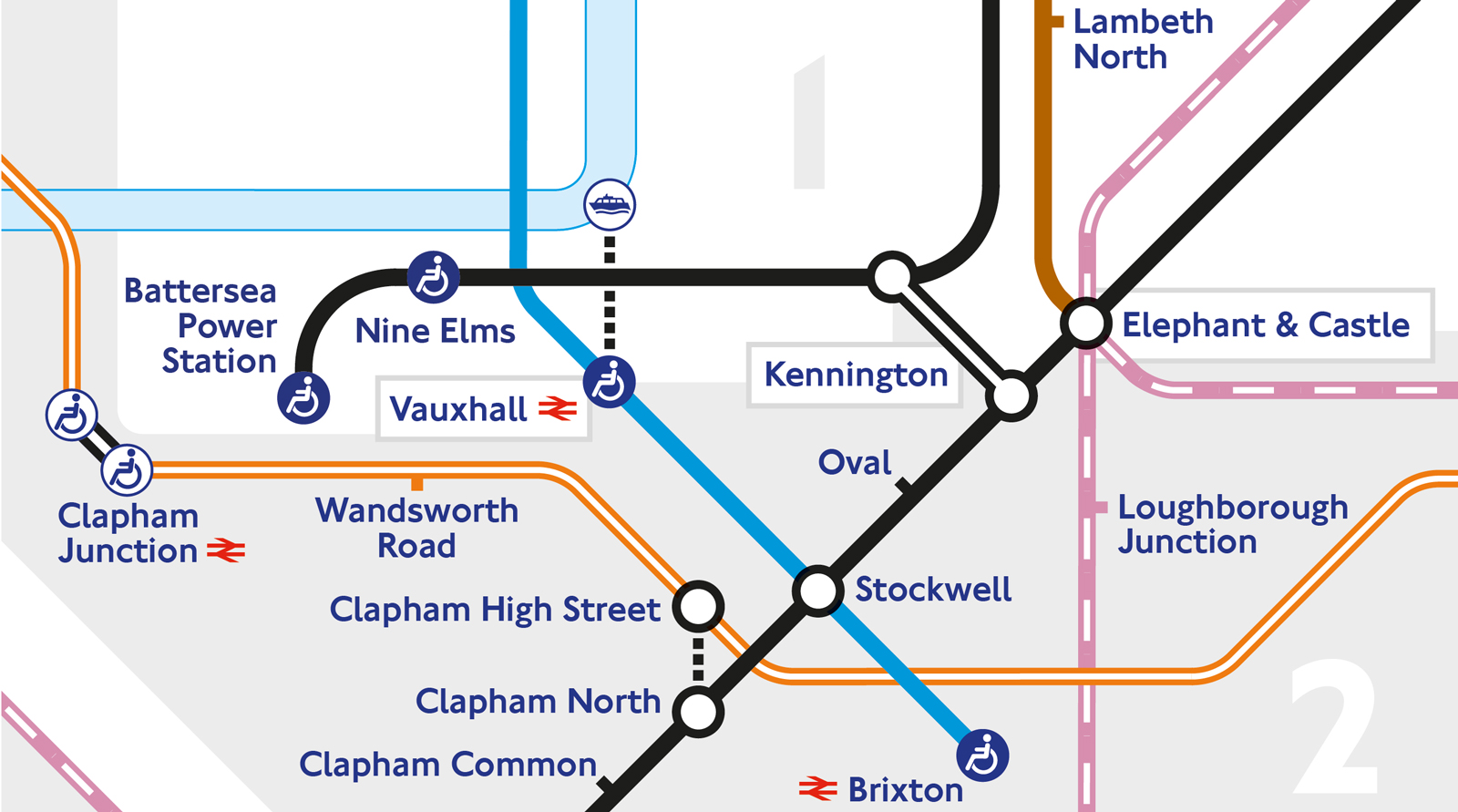
When it comes to developing the design of the London Tube map, there is no such thing as one small adjustment, says Transport for London (TfL) head of design Jon Hunter. ‘As a product, the Tube map is entirely interconnected, so even a small change can result in large sections of the map needing to be redrawn,’ he explains. ‘Is there enough space on the current map to accommodate the change and, if not, what do we need to move or change to allow it to be included?’
It was a consideration that came into play with the first major Tube extension this century, with the addition of new stations Nine Elms and Battersea Power Station in a move that puts previously neglected south London on to the Tube map.
The new stations are represented by a curving loop already seen in other parts of the map, such as between Liverpool Street and Aldgate. To ensure consistency, strict design standards specify everything from the thickness of the lines and dimensions of the angles to the spacing of the station names.
As well as conforming to these design codes, tweaks to the design must also respect physical boundaries. ‘One of the constraints that we face when adding additional content to the map is the symbiotic relationship with other elements that must appear,’ adds Hunter. ‘For example, the River Thames, other nearby lines and the fare zones, which often combine to determine the eventual design solution. The representation of the Northern Line Extension was created using the existing design elements. The design continually evolves as we consider what additional information would be useful to customers, for example including short walking interchanges between some stations.’
The resulting contemporary design, even when allowing for these changes, is still rooted in the classic and original version of the map designed by Harry Beck in 1933. ‘As a truly iconic design, we seek to evolve the Tube map to best suit the ever-growing size of the network. The recent launch of the TfLGo app provides the same design language in a digital format, but allows for personalisation by the user.’
INFORMATION
Wallpaper* Newsletter
Receive our daily digest of inspiration, escapism and design stories from around the world direct to your inbox.
Hannah Silver is the Art, Culture, Watches & Jewellery Editor of Wallpaper*. Since joining in 2019, she has overseen offbeat design trends and in-depth profiles, and written extensively across the worlds of culture and luxury. She enjoys meeting artists and designers, viewing exhibitions and conducting interviews on her frequent travels.
-
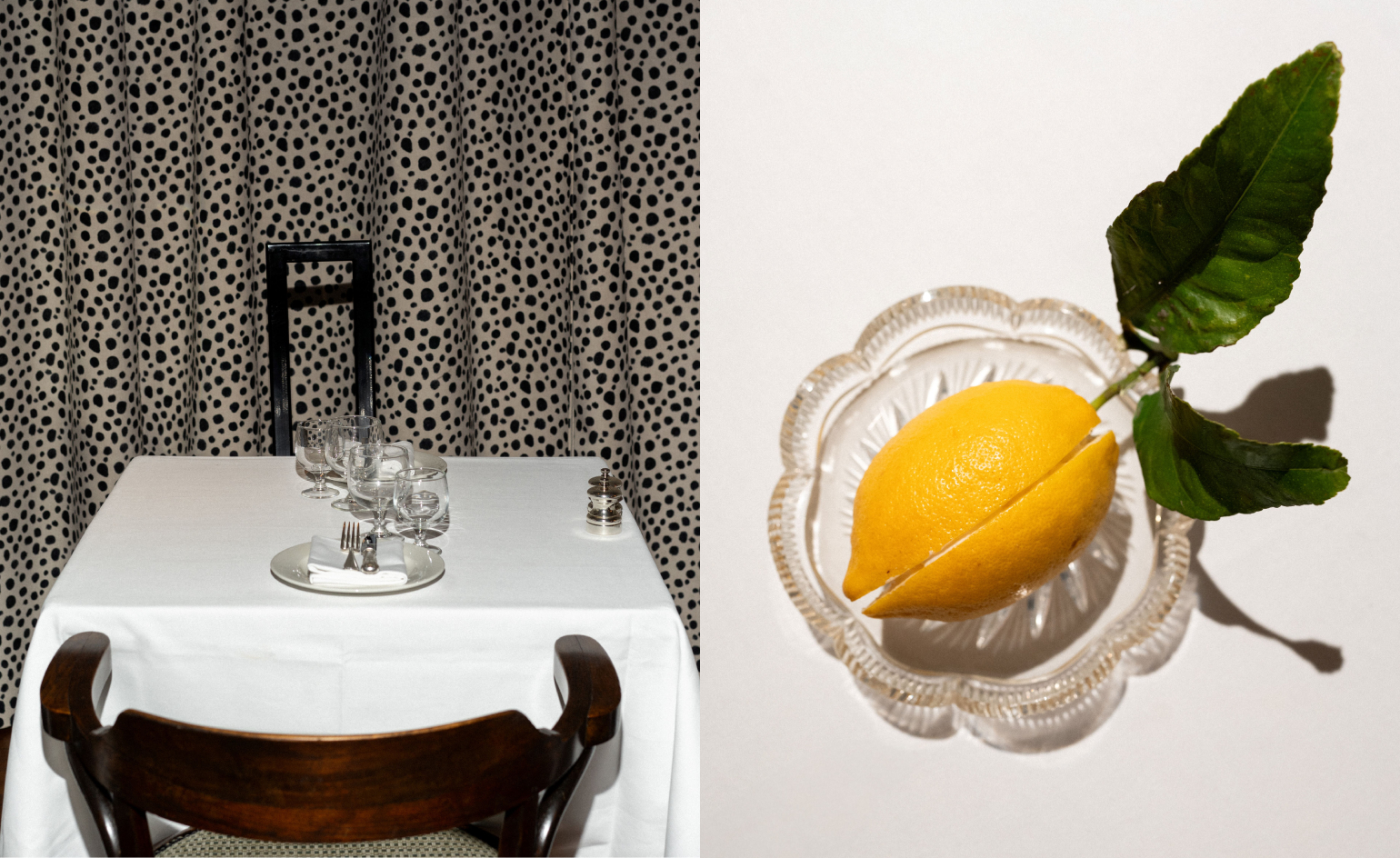 Marylebone restaurant Nina turns up the volume on Italian dining
At Nina, don’t expect a view of the Amalfi Coast. Do expect pasta, leopard print and industrial chic
By Sofia de la Cruz
-
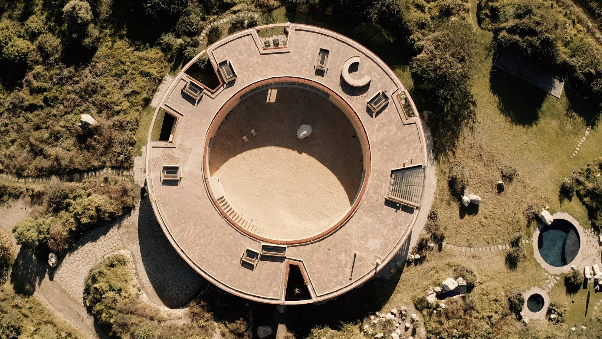 Tour the wonderful homes of ‘Casa Mexicana’, an ode to residential architecture in Mexico
‘Casa Mexicana’ is a new book celebrating the country’s residential architecture, highlighting its influence across the world
By Ellie Stathaki
-
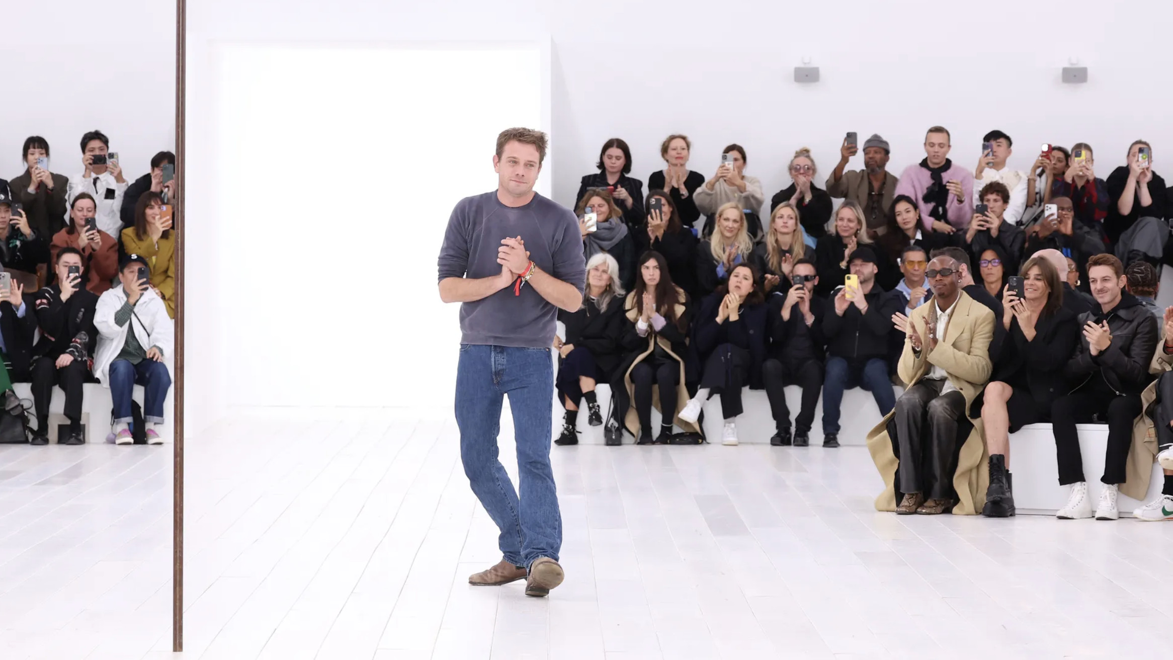 Jonathan Anderson is heading to Dior Men
After months of speculation, it has been confirmed this morning that Jonathan Anderson, who left Loewe earlier this year, is the successor to Kim Jones at Dior Men
By Jack Moss
-
 On the Isle of Man, the secret history of designer Archibald Knox is revealed
The mysterious life and works of local designer Archibald Knox is celebrated in a retrospective at Manx Museum, spanning silverware, furniture, clocks and more
By Emma O'Kelly
-
 Wedgwood’s AI tool lets the public reimagine Jasperware for its 250th anniversary
To celebrate 250 years of Jasperware, Wedgwood debuts an AI tool that opens up the design process to the public for the first time
By Ali Morris
-
 A new London show explores material magic with medieval melancholy
Inspired by deconsecrated monasteries, interior designer and curator Jermaine Gallacher takes us on a journey through time and mood in a London exhibition at The Ragged School
By Billie Muraben
-
 William Morris mania meets the design industry’s darker side in a new London show
‘Morris Mania’ at the William Morris Gallery explores the British designer’s complicated legacy in an ever-more commodified world
By Tianna Williams
-
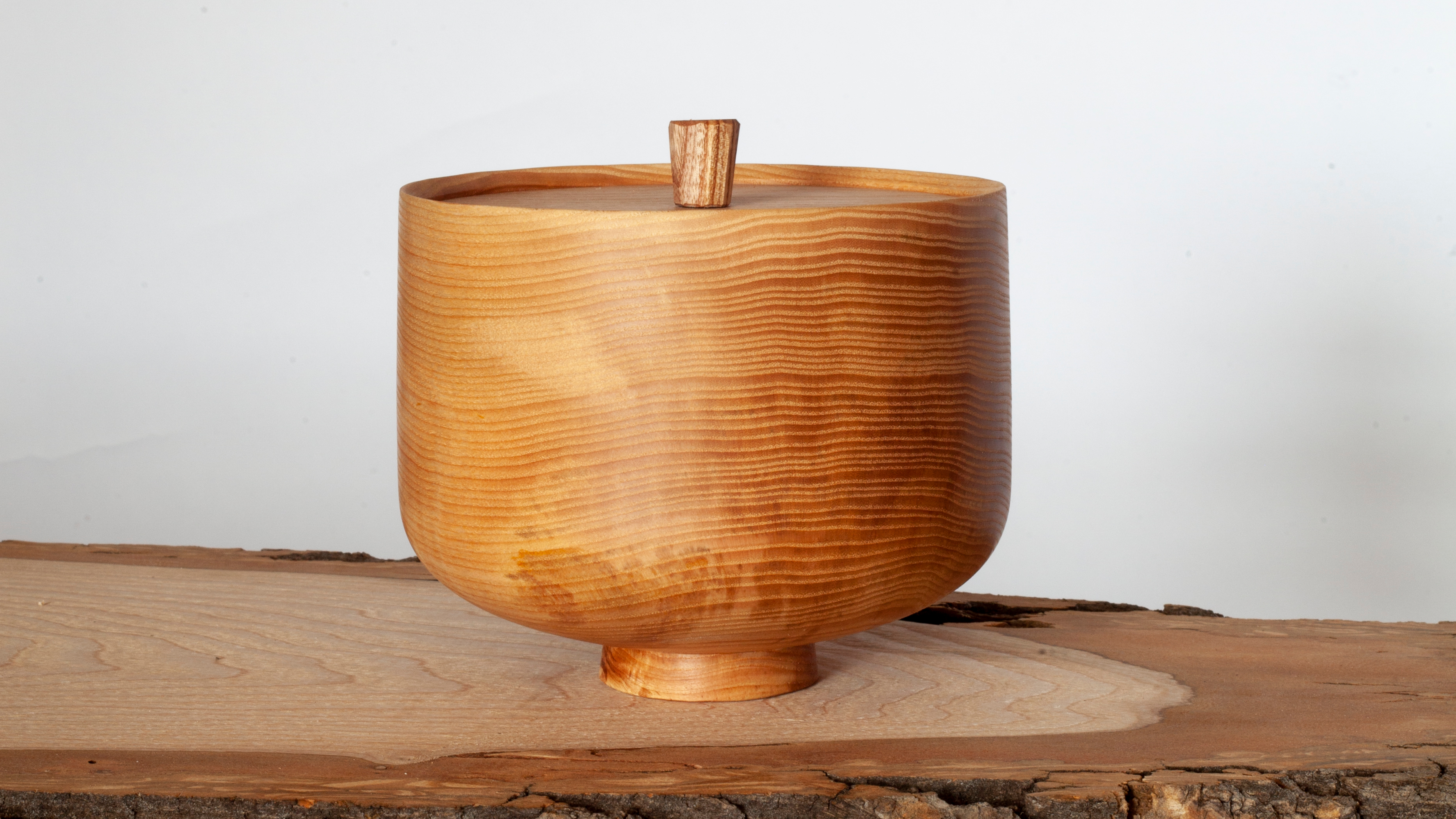 Reimagining remembrance: Urn Studios introduces artistic urns to the UK
Bridging the gap between art and memory, Urn Studios offers contemporary, handcrafted funeral urns designed to be proudly displayed
By Ali Morris
-
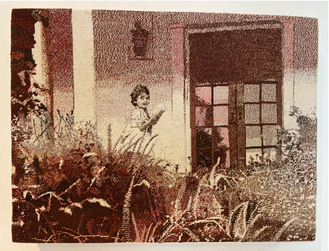 Wallpaper* takes a turn around Somerset House for Collect 2025
Our round-up of the highlights from the 21st edition of the collectible craft and design fair in London
By Malaika Byng
-
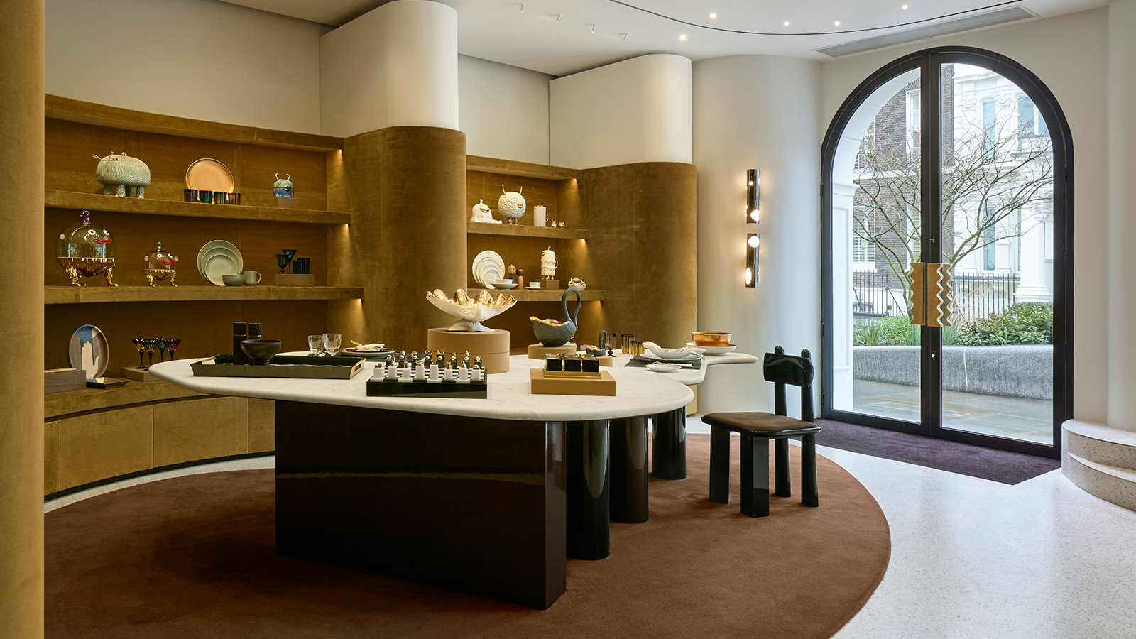 ‘It’s a museum-like jewel box’: L’Objet marks 20 years of elegant design with a new London flagship
Opening on 12 March 2025, L’Objet’s new London boutique is rich in chocolate colours and velvet detailing
By Tianna Williams
-
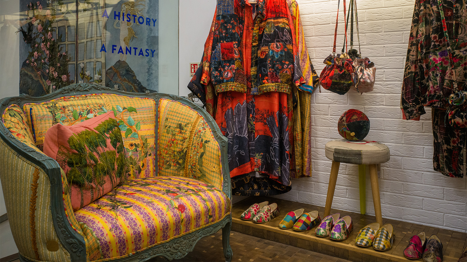 This Beirut design collective threads untold stories into upholstered antique furniture
Beirut-based Bokja opens a Notting Hill pop-up that's a temple to textiles, from upholstered furniture to embroidered cushions crafted by artisans (until 25 March 2025)
By Tianna Williams