Modular market: UXUS designs Tate Modern’s new Switch House store
Tate Modern opens its much anticipated Herzog & de Meuron extension, called Switch House, this weekend. We advise that you exit through the gift shop, captured on film here
There was a buzz around Bankside this morning as Tate Modern's Herzog & de Meuron extension opened its doors to press, en masse. At the top of the grandiose, central concrete staircase, we find the new Tate store, double height and stretching to an impressive 500 sq m. George Gottl of the Netherlands-based consumer experience agency UXUS walked Wallpaper* around.
'We've thought about every detail,' he explains. 'From the women's accessory displays, to the bespoke bookshelves to the t-shirt mannequins.' With such a broad range of items in stock, creating a fluid and unifying shop floor was essential. 'Every unit you see here is on wheels,' Gottl adds, pushing a towering display cabinet, attached to an exposed, industrial runner. 'So, as the exhibitions and needs of the museum change, the store can be continually adjusted to fit. I think of it like a marketplace, with stalls that can be completely dismantled and reconfigured, depending on the product they're selling.'
Even the lighting is 'permanently temporary' – it moves with the shelves. Discreet LED strips are embedded into the framework of the modular units, shining a spotlight on each item. 'When the strip lights are switched off, it's amazing how different the space looks,' Gottl notes. 'But when they're on, the store feels more like an extension of the gallery space, giving each object an even more premium feel – so the customer might be pleasantly surprised by the price tag.'
The store stocks similar items to the existing River shop (postcards, mugs, art supplies) but there is a heightened focus on limited edition art books and prints, which occupy a library-sized shelving unit across the back wall.
Splashes of colour come courtesy of the dedicated children's area, which benefits from padded, child-sized cubbyholes carved directly into the bookshelf – perfect resting places for kids, after a long tour of the now gargantuan museum. Elsewhere, things feel rather more grown-up, with powder-coated steel fixings, Tate-typical concrete floors and accents of darkened wood.
The excitement of the opening day is infectious, and Gottl's passion for the project is clear. 'Working closely with Tate Modern's enterprise team, we realised the importance of the store in generating income for the not-for-profit gallery,' he concludes. 'We have always admired Tate for its visionary approach – it has been an enormous honour to be part of the team that is making that vision a reality.'
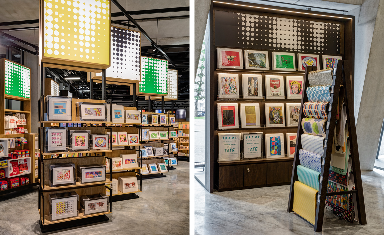
Designed by the Netherlands-based consumer experience brand UXUS, in collaboration with Tate’s in-house retail experts, the store stretches to an impressive 500 sq m
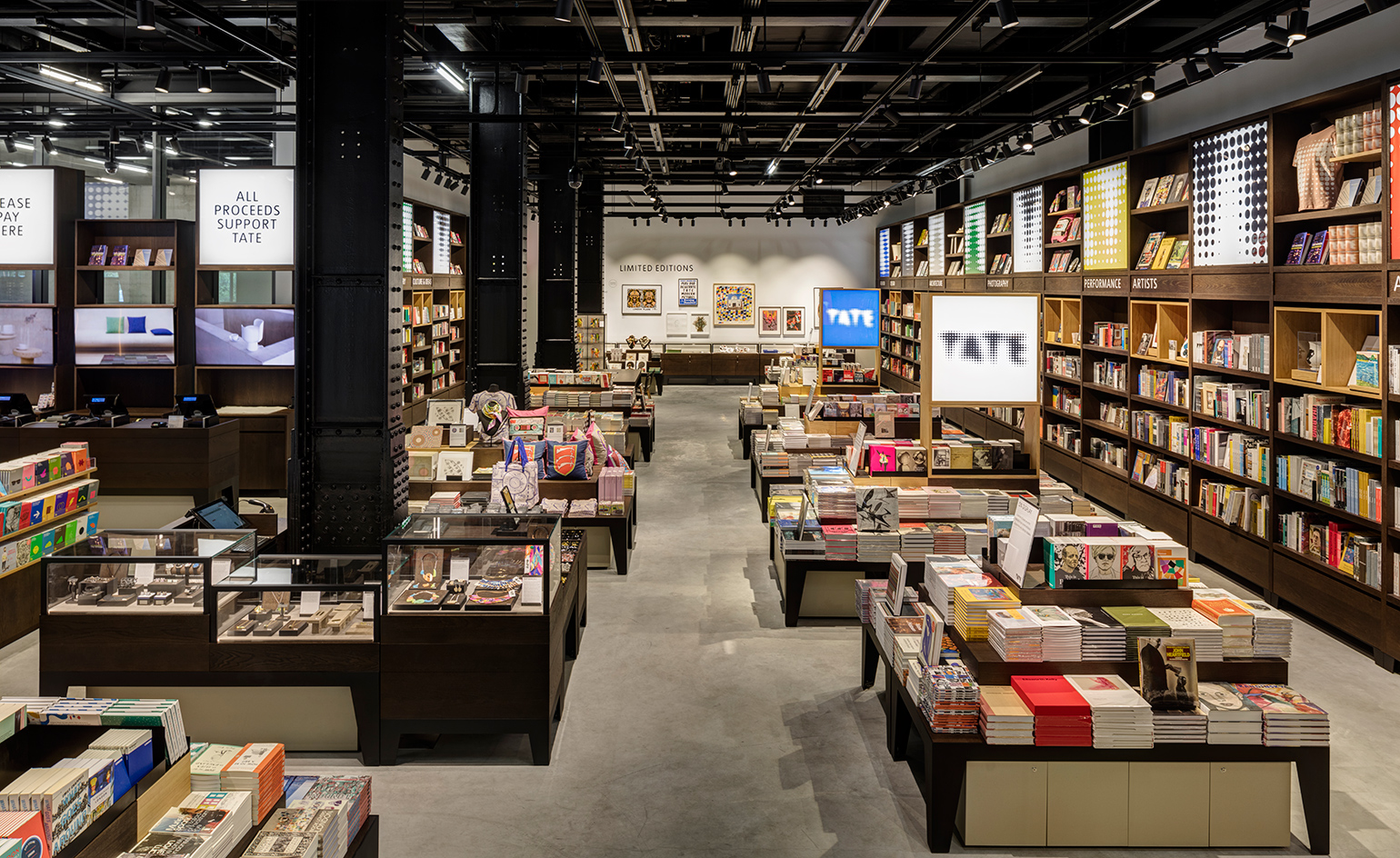
’Every unit you see here is on wheels,’ George Gottl of UXUS explains, ’so, as the needs of the museum change, the store can be continually adjusted to fit
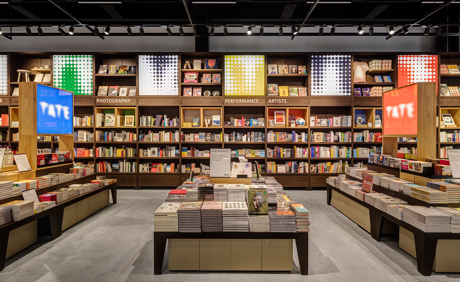
The store stocks similar items to the existing River shop (postcards, mugs, art supplies) but there is a heightened focus on limited edition art books and prints, which occupy a library-sized shelving unit across the back wall
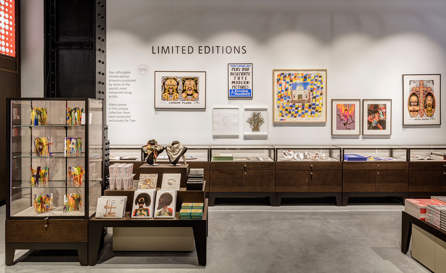
The finishes are high quality, with powder-coated steel fixings, Tate-typical concrete floors and accents of darkened wood
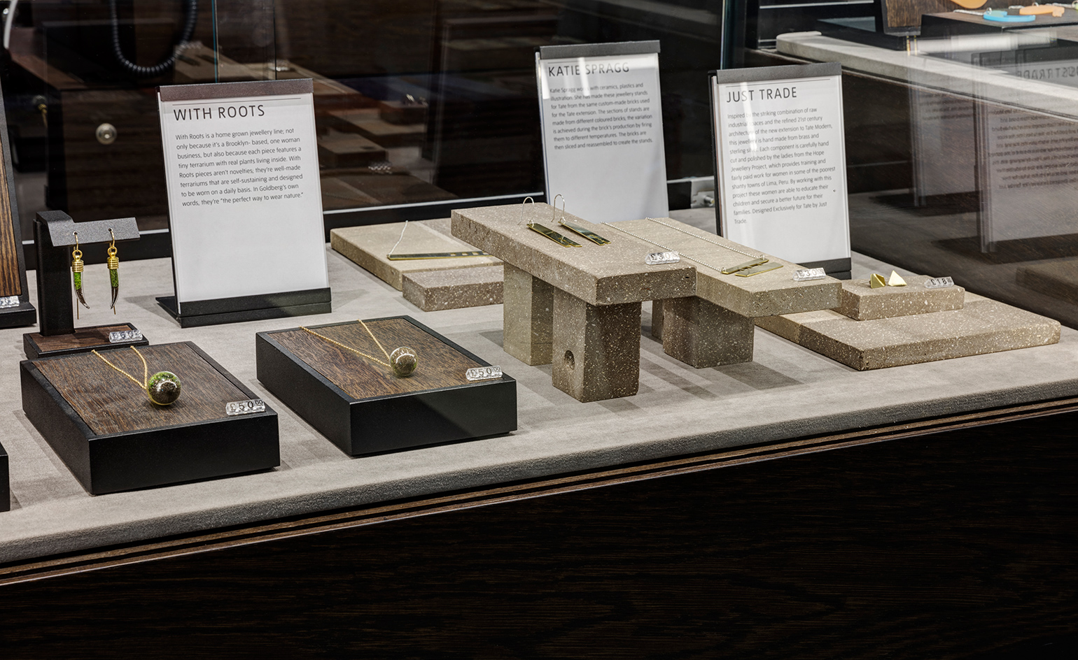
Discreet LED strips are embedded into the framework of the modular units, shining a spotlight on each item
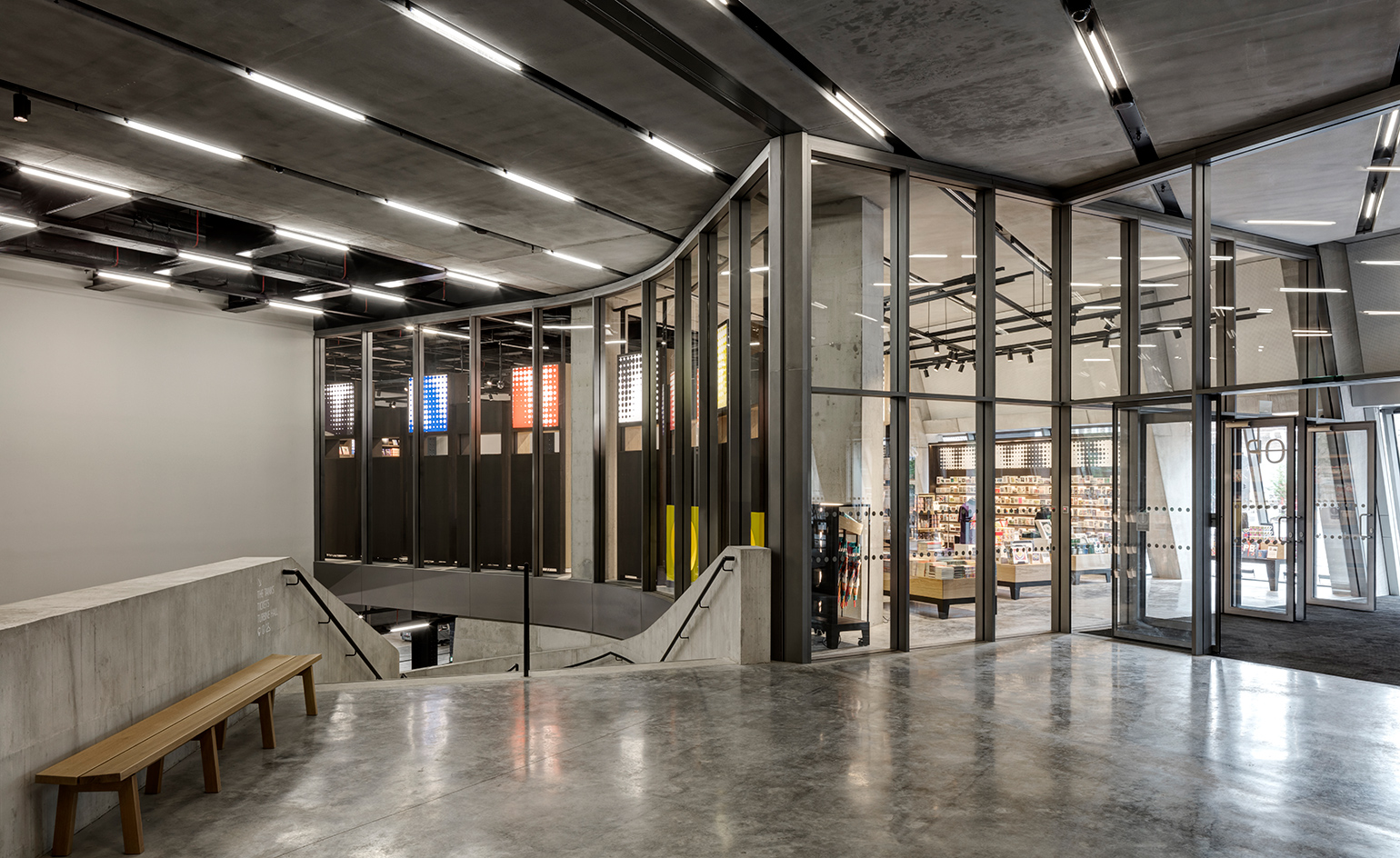
Gottl concludes, ’We have always admired Tate for its visionary approach – it has been an enormous honour to be part of the team that is making that vision a reality.’ Pictured: view at the top of the imposing, central concrete staircase
INFORMATION
For more information, visit the Tate Modern website
Photography courtesy UXUS and Tate
ADDRESS
Bankside, London SE1 9TG
Wallpaper* Newsletter
Receive our daily digest of inspiration, escapism and design stories from around the world direct to your inbox.
Elly Parsons is the Digital Editor of Wallpaper*, where she oversees Wallpaper.com and its social platforms. She has been with the brand since 2015 in various roles, spending time as digital writer – specialising in art, technology and contemporary culture – and as deputy digital editor. She was shortlisted for a PPA Award in 2017, has written extensively for many publications, and has contributed to three books. She is a guest lecturer in digital journalism at Goldsmiths University, London, where she also holds a masters degree in creative writing. Now, her main areas of expertise include content strategy, audience engagement, and social media.
-
 The Subaru Forester is the definition of unpretentious automotive design
It’s not exactly king of the crossovers, but the Subaru Forester e-Boxer is reliable, practical and great for keeping a low profile
By Jonathan Bell
-
 Sotheby’s is auctioning a rare Frank Lloyd Wright lamp – and it could fetch $5 million
The architect's ‘Double-Pedestal’ lamp, which was designed for the Dana House in 1903, is hitting the auction block 13 May at Sotheby's.
By Anna Solomon
-
 Naoto Fukasawa sparks children’s imaginations with play sculptures
The Japanese designer creates an intuitive series of bold play sculptures, designed to spark children’s desire to play without thinking
By Danielle Demetriou
