Very Good and Proper
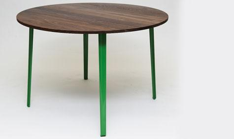

Set up by a third of the Canteen founding trio, Patrick Clayton-Malone, together with design duo Ed Carpenter and Andre Klauser, design and production company Very Good and Proper espouses much the same philosophy for their products as Canteen does for food: simple and honest. We grabbed a few minutes with Patrick and Ed in their Hackney studio space to hear more…
Why did you feel the need to set-up a design and manufacturing company to furnish your restaurant?
Patrick: Restaurants have different concerns to the home when it comes to design. Things get used a lot, by lots of people. If we’re doing 10,000 covers a week, that’s the same tables, hooks, cutlery being used by an enormous amount of people in a very short space of time. We had a problem with table design in our restaurants and hence we approached Ed and Andre to provide a practical solution.
Ed: From the design and production side we’ve helped Patrick get it up and running, operating along similar lines to Canteen. We find the factories, source the materials and oversee the whole project.
What is the company’s ethos?
Patrick: Inquisitiveness of how we can get best get things done, to the best possible value without sacrificing quality.
Ed: Andre and I have the same ethos that Canteen has with food; we want our designs to be well made, simple and as pleasurable to the user as possible.
Wallpaper* Newsletter
Receive our daily digest of inspiration, escapism and design stories from around the world direct to your inbox.
How does this translate from food to design?
Patrick: Just as we go direct to the producers to source our food, so Ed and Andre go directly to Berlin, to have the table legs cast. In hindsight with the euro we should maybe have gone to Southampton…
What inspired the designs beyond practicality and production?
Patrick: Utilitarian design from the 1940s and 1950s when a lot of furniture was being made by Second World War machinery, like Ernest Race’s B.A. Chair.
Ed: The B.A. chair was a starting point but it’s almost too 1950s for my taste, maybe too kitsch. Andre and I have taken this 1950s ideal and tweaked it according to today’s aspirations. Designing for me is not about trying to do something new all the time, it’s about trying to do something better.
Why is the table particularly suited to a restaurant?
Ed: It’s all about the single piece leg that just screws into the table surface. If it gets broken you just put a new one on and you can change the shape or size of the surface at the drop of a hat. We originally got the idea from the brackets in old Victorian urinals, where the casting was so beautiful. We wanted to bring this attention to detail back to a relatively mundane object.
And the hook
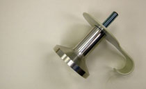
Ed: The important thing for the hook was to have a big surface area so it doesn’t damage clothes. We also added a plate that stops people marking the wall behind when repeated greasy thumbs rub against the wall when they go to hang their coats up, which also hides the mess you make in the wall when you screw it in. It’s designed to gently reference an oversized screw.
Are the designs for sale in the restaurant?
Patrick: At the moment all sales are through the shop TwentyTwentyOne. We’ll advertise in the restaurant saying they’re available to buy at TwentyTwentyOne and any enquiries that come directly to us we’ll forward on to them. From a resource point of view we don’t have the time to set up a distribution network. One step at a time.
What’s next?
Patrick: We may take it to Milan or potentially a gallery where we can show people what we’re doing outside the restaurant.
Ed: We’d hopefully work on a few new prototypes that fit into the range as well.
Do you plan to work with other designers?
Patrick: Ed and Andre are keen to get other young designers involved in the future.
Ed: The main thing is to keep the processes as simple as possible so we don’t lose control over the cost or the quality.
Is that why it’s called Very Good & Proper – Measure Twice, Cut Once?
Ed: Measure Twice, Cut Once is what all the old technicians used to say to me at college.
Patrick: We have another business called ‘Bodge it and Scarper’ whose motto is measure once, cut twice. They’re our nemesis. The name’s intended to be direct and tongue in cheek. I think there’s a lack of humour in too many things these days – everything’s very serious and it’s nice to have some fun.
ADDRESS
TwentyTwentyOne
274 Upper Street
London N1 2UA

Hugo is a design critic, curator and the co-founder of Bard, a gallery in Edinburgh dedicated to Scottish design and craft. A long-serving member of the Wallpaper* family, he has also been the design editor at Monocle and the brand director at Studioilse, Ilse Crawford's multi-faceted design studio. Today, Hugo wields his pen and opinions for a broad swathe of publications and panels. He has twice curated both the Object section of MIART (the Milan Contemporary Art Fair) and the Harewood House Biennial. He consults as a strategist and writer for clients ranging from Airbnb to Vitra, Ikea to Instagram, Erdem to The Goldsmith's Company. Hugo has this year returned to the Wallpaper* fold to cover the parental leave of Rosa Bertoli as Global Design Director.
-
 All-In is the Paris-based label making full-force fashion for main character dressing
Part of our monthly Uprising series, Wallpaper* meets Benjamin Barron and Bror August Vestbø of All-In, the LVMH Prize-nominated label which bases its collections on a riotous cast of characters – real and imagined
By Orla Brennan
-
 Maserati joins forces with Giorgetti for a turbo-charged relationship
Announcing their marriage during Milan Design Week, the brands unveiled a collection, a car and a long term commitment
By Hugo Macdonald
-
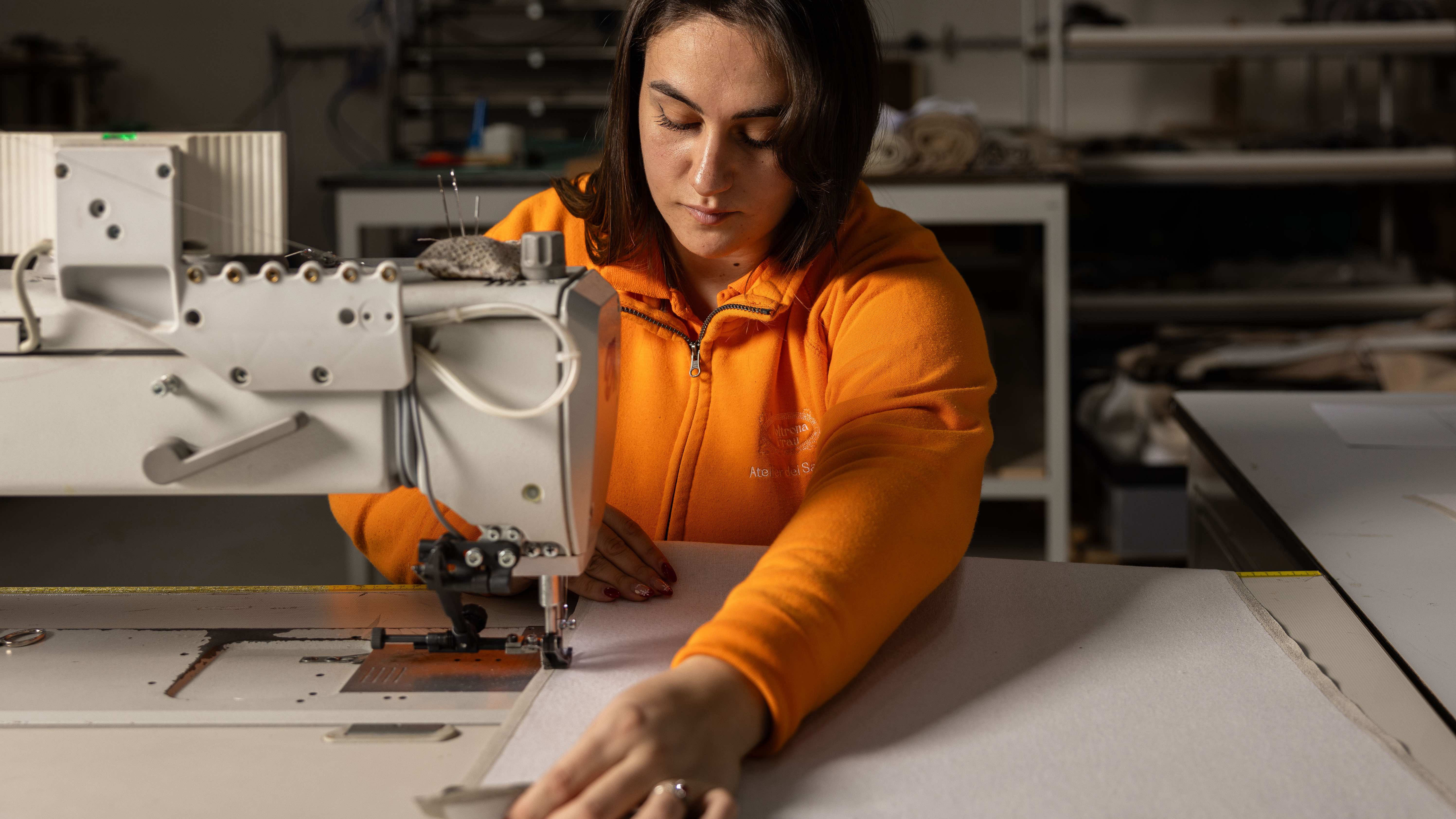 Through an innovative new training program, Poltrona Frau aims to safeguard Italian craft
The heritage furniture manufacturer is training a new generation of leather artisans
By Cristina Kiran Piotti