Design Awards 2018: best of the rest
Each year, we celebrate an explosion of glittering creative talents for the Wallpaper* Design Awards. What follows is a visual feast of the hottest design, architecture and fashion high-fliers for 2018, from see-through seating to wellness labs and chocolate faucets.
As originally featured in the February 2018 issue of Wallpaper* (W*227)
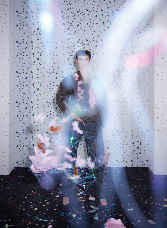
Best pop stars
Best pop stars
Designers have been bursting with good ideas this year
This season, fashion maverick Hussein Chalayan was inspired by party poppers for his collection, which took the form of patterned bibs that could be ripped open to eject glitter, confetti and tinsel. Meanwhile, British designer Garth Roberts’ rug series for CC-Tapis was inspired by a confetti-covered floor after a birthday celebration. And the dotted motif also appeared on wallcoverings by Ferm Living and upholstery textiles by Dedar.
Pictured: jacket, price on request; trousers, £689, both by Chalayan. Shoes, £135, by COS. ‘After party’ rug, €6,486, by Garth Roberts, for CC-Tapis. ‘Terrazzo’ wallpaper, £65 per 10m roll, by Ferm Living. ‘Podium QB’ fabric, £210 per m, by Dedar
Photography: Sofie Middernacht & Maarten Alexander. Fashion: Jason Hughes. Interiors: Maria Sobrino. Writer: Rosa Bertoli
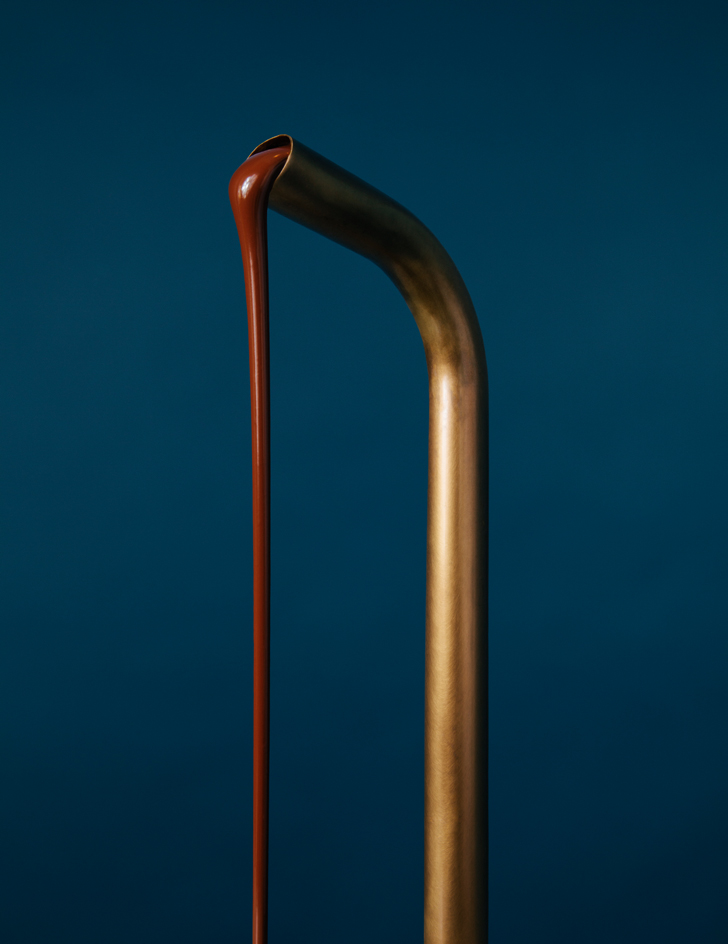
Best plumbing
Best plumbing
Chocolate tap, by Kelly Wearstler, for Compartés
It’s the tap we would all like plumbed into our Carrara countertop. Created by interior designer Kelly Wearstler for the flagship store of chocolatier Compartés in Los Angeles, this is one of a pair of gold taps that flows 24 hours with either dark or milk chocolate. The chocolate is oozed into cups of hot chocolate or used as an indulgent coating on the brand’s dipped confections, all available at the store’s take-out window.
Photography: Jonnie Chambers. Writer: Emma Moore
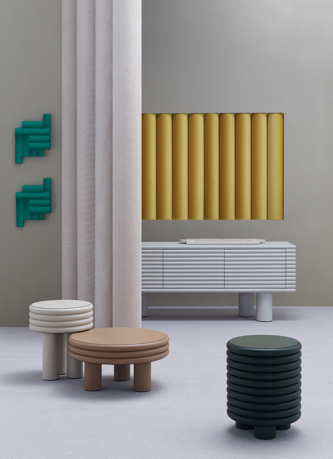
Best ribbing
Best ribbing
We’re tickled by adorable undulation
Among the year’s most curvaceous products were Stéphane Parmentier’s ‘Scala’ tables and sideboard, which used leather and lacquered wood to create a ribbed effect with more than a touch of the Michelin Man about it, and Venetian studio Zaven’s 3D tiles, with convex and concave ribs inspired by legendary Italian ceramicist Nino Caruso. Not to be out-ribbed, textile maker Nya Nordiska has reinvented classic corduroy in a range of cool contemporary colours.
Pictured: ‘Scala’ high coffee table, €1,670; low coffee table, €1,860; stool, €1,975; sideboard, €9,590; ‘Palazzo’ tray, £1,455, all by Stéphane Parmentier, for Giobagnara. ‘PPP Model #2’ tiles, from £250, by Zaven, for Stylnove. ‘Cord 2.0’ fabric in cream and mustard, £86 per m, by Nya Nordiska. ‘Bell Twist’ carpet in portland, £40 per sq m, by Brintons. Paint in bungee no.30, by Caparol Icons
Photography: Benjamin Swanson. Interiors: Maria Sobrino. Writer: Christopher Stocks
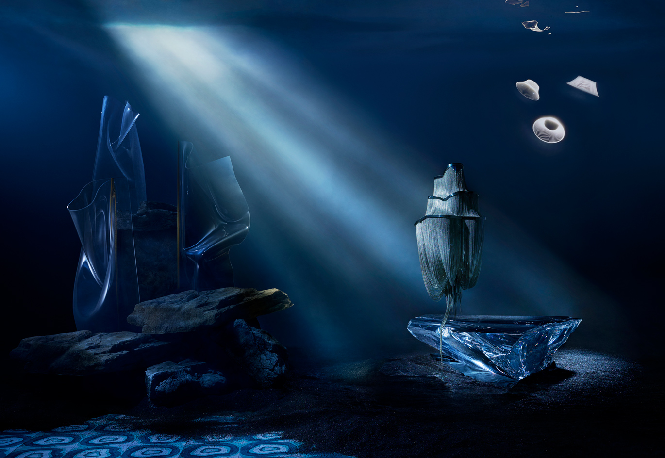
Best deep seascape
Best deep seascape
Our interior inspiration comes in waves
Some deep thinking has been going on in the design world. Lights produced by Terzani, Parachilna and Martinelli Luce appear to float effortlessly, looking more like sinuous sea creatures than industrially developed objects. Meanwhile, Fredrikson Stallard’s acrylic ‘Antarctica’ coffee table is seemingly carved from a block of ice. Smoothing out our seabed is the latest addition to Bisazza’s Cementiles collection. Designed by Brazilian brothers Fernando and Humberto Campana, the small cement tiles were inspired by the spiral patterns of local agate.
‘Gweilo Han Gr’ floor lamp, €1,695; ‘Gweilo Qin Gr’ floor lamp, €1,695; ‘Gweilo Song’ floor lamp, €550, all by Partisans, for Parachilna. ‘Atlantis’ lamp, from £11,000, by Barlas Baylar, for Terzani. ‘Antarctica’ coffee table, £60,000, by Fredrikson Stallard, for David Gill Gallery. ‘Plisse’ lights, €370 each, by Emiliana Martinelli, for Martinelli Luce. ‘Brazilian Agata Verde’ tiles, £154 per sq m, by Fernando and Humberto Campana, for Bisazza
Photography: Ryan Hopkinson. Interiors: Matthew Morris. Writer: Rosa Bertoli
Best metal gurus
Best metal gurus
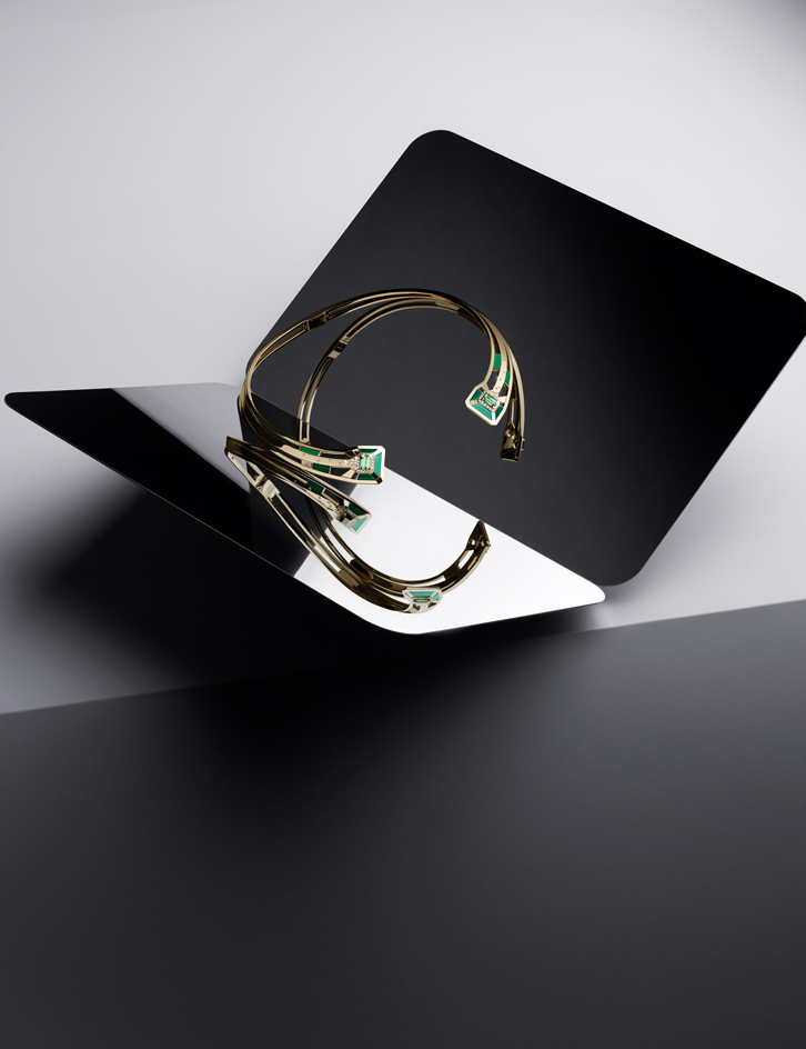
Gallery Collection, by Chanel Fine Jewellery
Obscured by its rose-hued counterpart in recent years, yellow gold, that 1970s casual-chic favourite, is once again finding its way into fine watch and jewellery design. Chanel got the memo and used the yellow chain of its ‘2.55’ handbag as a starting point for a new 12-piece fine jewellery capsule collection, the Gallery, which includes this necklace, shown against the backdrop of Artek’s striking angular mirror. Because it allows for bold colour combinations, yellow gold offers designers a chance to use densely-hued semi-precious hardstones alongside traditional light-filled gems, such as emeralds and diamonds. By framing these in graphic, architectural forms, Chanel imbues traditional fine jewellery materials with a contemporary sensibility.
Pictured: ‘My Green’ necklace, part of the Gallery collection, in yellow gold, with tourmalines, malachite and diamonds, £39,000, by Chanel Fine Jewellery, chanel.com. ‘124°’ Mirror, £156, by Daniel Rybakken, for Artek
Photography: Philippe Lacombe. Interiors: Matthew Morris. Writer: Caragh McKay
Best updates
Best updates
Some iconic designs seen in a new light
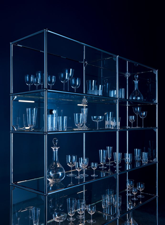
USM’s modular Haller shelving system now comes with integrated lighting. Called ‘Haller E’, it’s a triumph of sophisticated simplicity, rather like Lobmeyr’s ‘Drinking Set No.4’, originally designed by Ludwig Lobmeyr in 1856. Look closely at this set and you’ll notice hand-engraved ‘cracks’ in the glass, a witty embellishment dreamed up by legendary New York design gallerist Murray Moss as part of an initiative by Storefront for Art and Architecture in New York.
Pictured: ‘Haller E’ glass display shelf, £6,787, by USM. ‘Drinking Set No.4 (1856) with crack’, from €150, by Murray Moss, for Lobmeyr, available at Storefront for Art and Architecture
Photography: Ryan Hopkinson. Interiors: Matthew Morris. Writer: Christopher Stocks
Best debut
Best debut
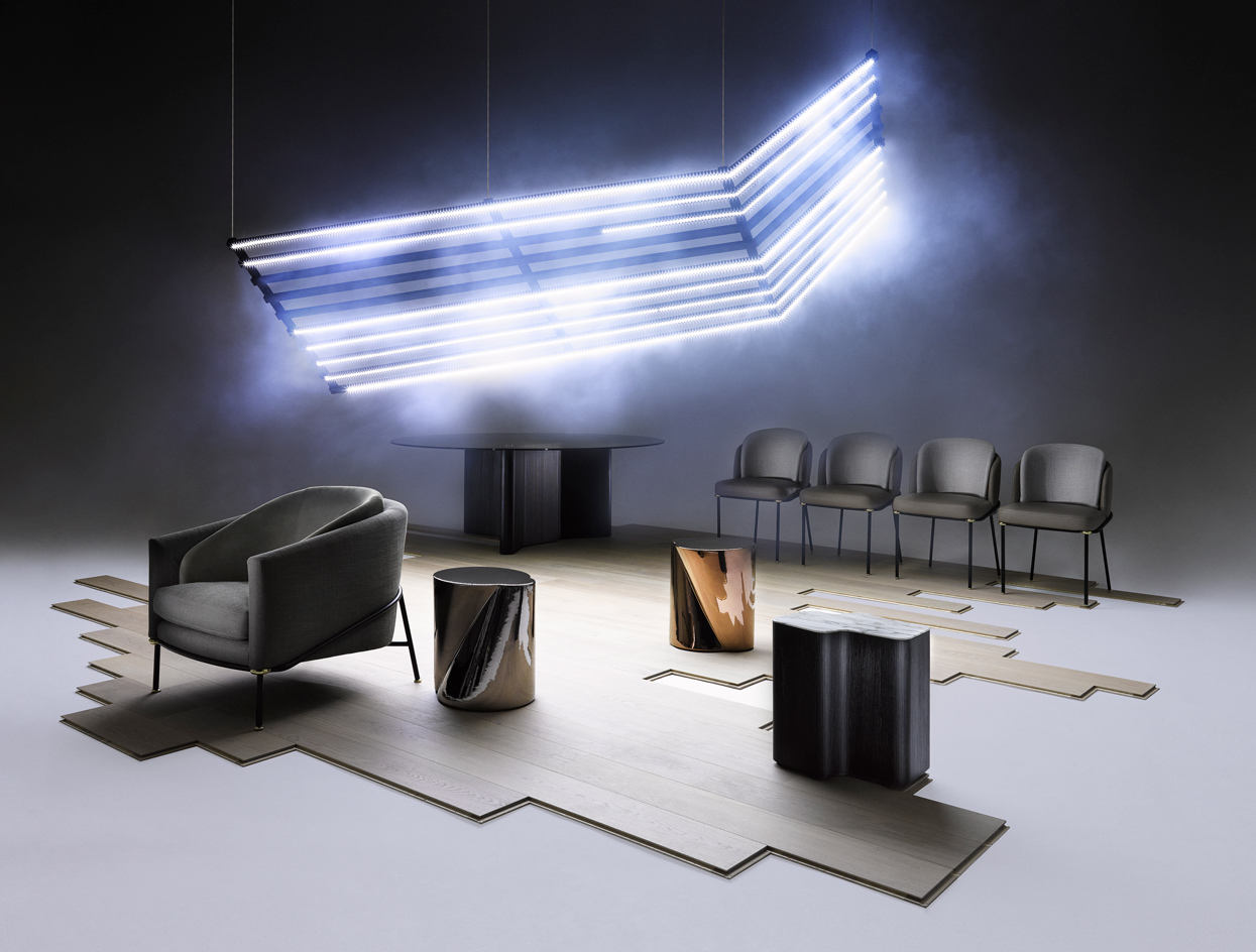
Furniture, by Christophe Delcourt, for Minotti
Minotti’s relationship with the architect and designer Rodolfo Dordoni stretches back 20 years. And as artistic director, Dordoni has long overseen the brand’s output. In 2017, though, he decided to add extra hands and called on Christophe Delcourt. The French designer’s pieces feature sculptural shapes and subtle detailing, and he brings a sophisticated design sensibility that’s a perfect fit with Dordoni’s perfectly engineered elegance.
‘Fil Noir’ armchair, From £10,200; ‘Lou’ dining table, From £11,955; ‘Noor’ side tables, From £2,640 each; ‘Lou’ coffee table, from £2,325; ‘Fil Noir’ dining chairs, From £3,410 each, all by Christophe Delcourt, For Minotti. ‘Palazzo’ wood flooring in dune white oak oiled, £85 per sq m, by Quick-Step
Photography: Luke Kirwan. Interiors: Matthew Morris. Writer: Rosa Bertoli
Best squaring up
Best squaring up
How to work the right angles
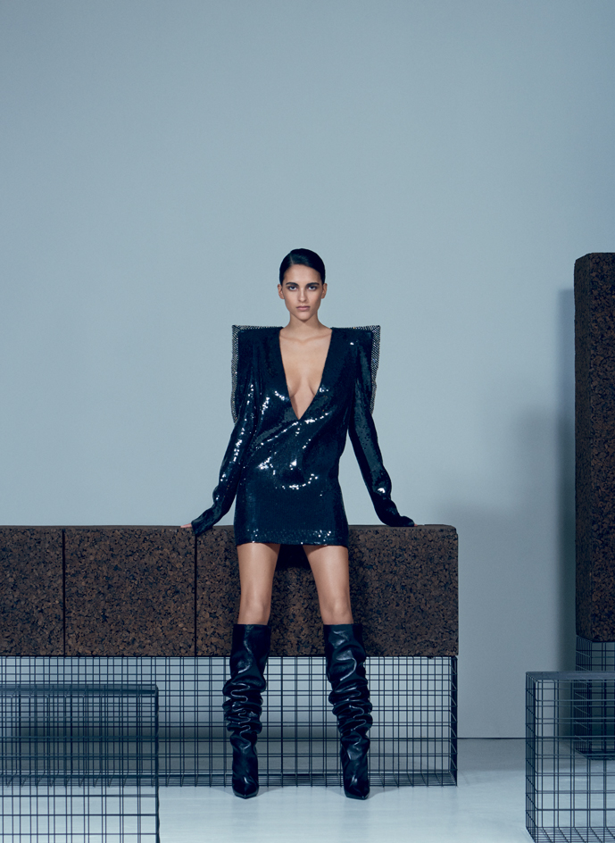
Saint Laurent reinvented the power shoulder for A/W17, as seen in this plunging sequined mini-dress, complete with crystal-embellished epaulets. The square-shouldered details make clear creative director Anthony Vaccarello’s obsession with all things 1980s, while pointing a way forward for the modern metropolitan wardrobe. Milan-based designer Gustavo Martini’s ‘The Grove’ furniture collection also works the right angle. Crafted from grids of electro-welded steel and cork, the pieces represent the desire for both nature and rigour within well-functioning cities.
Pictured: dress, £7,275; boots, £1,200, both by Saint Laurent by Anthony Vaccarello. ‘The Grove’ collection, €5,210 for console, cabinet, cube table, rectangle table, by Gustavo Martini, produced with Carlo Citterio and Creative-Cork
Photography: Sean Alexander Geraghty. Fashion: Jason Hughes. Interiors: Matthew Morris. Writer: Laura Hawkins
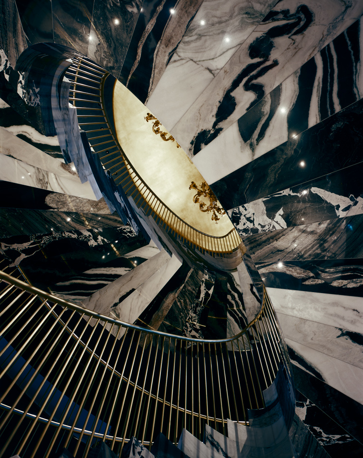
Best ascent
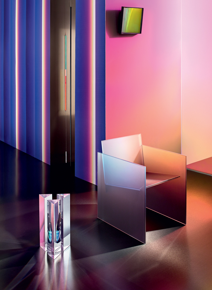
Best in glass
Best ascent
Marble staircases, by Gwenael Nicolas, for Dolce & Gabbana
When it comes to staircase construction, Dolce & Gabbana is seriously ahead of the curve. So much so, that we’ve awarded the brand the Best Ascent award. Two superior spiral designs connect the six floors of the Italian label’s recently renovated 2,350 sq m Old Bond Street boutique in London. The first enclosing design is crafted using an artisan inlay technique, which sees Spanish Nero Marquina and Chinese Bianco Laser marble slotted together with millimetre precision, like a monochrome jigsaw puzzle. ‘We were really trying to go one step further with the material,’ says the French Tokyo-based interior designer Gwenaël Nicolas. Read more here.
Photography: Hélène Binet. Writer: Laura Hawkins
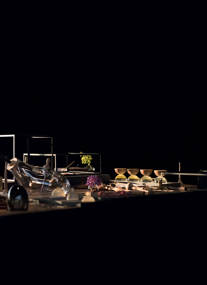
Best sensory overload
Best sensory overload
Alchemy is at work in the output of new Mexican perfume brand Xinú
Fragrance retail has come a long way since the terrors of the department store spritz squad. For the curious scent customer who seeks a more leisurely experiential purchase, there are adventures to be had. Take, for example, the beautifully conceived Mexican fragrance brand Xinú. The creation of designer Héctor Esrawe and brand studio Cadena, Xinú is designed to represent the rich botanical landscape of the Americas, both visually and olfactively. Two gardens flank the Xinú store in Polanco, Mexico City, while inside, a table acts as a cabinet of curiosities, the haul of an imaginary naturalist. It features glass objects, stones, woods, resins and metal; a landscape designed to tell the story of ‘handcrafted processes, artistic expression, natural species, aromas, textures, light and shadows’. The scents were created by classically trained Mexican nose Rodrigo Flores-Roux, who has brought French refinement to creative medleys of indigenous botanicals that have not traditionally been scent-making material.
Botanicals: There are four scents in the collection, which are based around indigenous botanicals such as agave, Mexican orange blossom, queen of the night, mesquite and datura.
Scent bottles: Inspired by abstract precolonial sculpture and sacred geometry, Esrawe designed the non-disposable scent bottle, which is made from blown glass and handcrafted, certified-wood lids.
Repurposeable container: Once the scent is finished, the container can be reused in multiple ways: as an incense burner or a decorative object, or the wood and glass pieces can be flipped to create a vase.
Photography: Luis Gallardo. Writer: Emma Moore
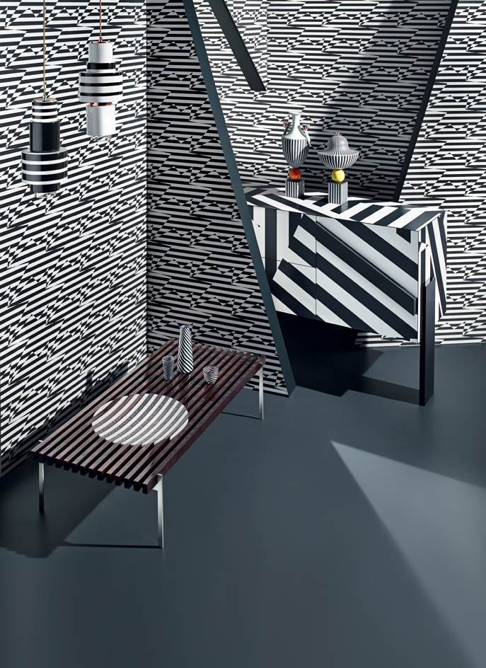
Best stripes
Best stripes
It’s all here in black and white
Op art seems to be the disorder of the day, with Alessandro La Spada’s wood-and-marble coffee table for Visionnaire and Eley Kishimoto’s monochrome ‘Zig Zag Birds’ wallcovering for Kirkby Design. The ‘Ziqqurat’ cabinet proves that Driade is on dazzling form, sporting an unusually striking pattern for a big Italian brand. Clashing nicely are Eric Willemart’s Memphis-inspired pendant lights for Casalto, which can be assembled in different iterations. Lee Broom’s vases for Wedgwood continue the zebra theme, with Laurence Brabant Editions’ tableware giving the look a final twist.
Pictured: ‘Kinta no.1’ light, €420; ‘Kiona no.3’ light, €430, both by Eric Willemart, for Casalto. ‘Tea-Party’ coffee table, €10,167, by Alessandro la Spada, for Visionnaire. Tumbler, €110, carafe, €425; bowl, €185, all by Laurence Brabant Editions. ‘Ziqqurat’ cabinet, €6,150, by Driade. Vases, from £7,500, by Lee Broom, for Wedgwood, from Harrods. ‘Zig Zag Birds’ wallcovering, £135 per roll, by Kirkby Design x Eley Kishimoto. Vinyl flooring in slate grey, £29 per sq m, by The Colour Flooring Company
Photography: Joel Stans. Interiors: Maria Sobrino. Writer: Christopher Stocks
Best twist action
Best twist action
Designs taking a turn for the better
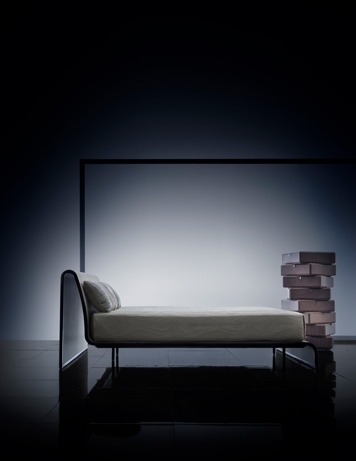
Call us warped, but we’ve always liked designs that give the material world a bit of a twist, such as Armani/Casa’s ‘Morfeo’ bed, which integrates headboard, base and footboard in a continuous form that appears to float. Upholstered in synthetic chinchilla by the Massachusetts-based faux leather manufacturer Majilite, it’s framed in a dark oak veneer. An equally twisted imagination is at work over at Molteni & C, where Israeli designer Ron Gilad’s faceted ‘Teorema’ chest of drawers, made from American walnut, can be stacked in a linear or spiralling configuration.
Pictured: ‘Morfeo’ bed, £26,550; ‘Cyprus’ bedcover in manila; ‘Mystic’ and ‘Monsoon’ cushions, prices on request, all by Armani/Casa. ‘Teorema’ drawer unit, price on request, By Ron Gilad, for Molteni & C. ‘Dreaming’ tiles in grey stone, €77 per sq m, by Lea Ceramiche
Photography: Beppe Brancato. Interiors: Dimitra Louana Marlanti. Writer: Christopher Stocks
Best ring cycle
Best ring cycle
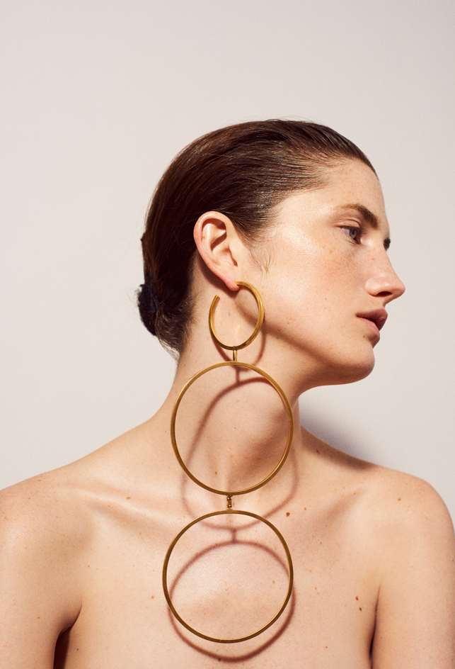
‘Nexus’ shoulder earring, by Jenny Sweetnam
London-based jeweller Jenny Sweetnam takes failsafe jewellery classics and skews them into showstopping forms. Her exploration of traditional skills adds intrigue: ‘Experimenting with articulation allows me to keep intact the graphic silhouette I envision and play with how the jewels are worn,’ she says of her most dynamic design yet.
Pictured: ‘Nexus’ shoulder earring in yellow gold-plated brass and silver, £620, by Jenny Sweetnam
Photography: Lee Whittaker. Writer: Caragh McKay
Best blushers
Best blushers
We’re tickled (millennial) pink by the latest colour trend
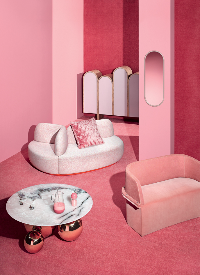
This year’s fancy millennial pink has been infectious. Raf Simons added a shade of candy pink mohair to his textile collection for Kvadrat, while Studio MVW used pink jade in its jewel-like coffee tables. The shade has also perked up furniture by the likes of Sancal, Emmemobili and Moroso, while Italian designer Cristina Celestino employed the colour in various projects this year, including a playful clear and pink glass set for Paola C.
Pictured: ‘Jinshi’ coffee table, €42,000, by Studio MVW, from Galerie BSL. Jug, €371; glass, €117, both part of the Dolce Vita Collection, by Cristina Celestino, for Paola C. ‘La Isla’ sofa, price on request, by Note Design Studio, for Sancal. ‘Argo 2’ cushion, from £236, by Kvadrat/Raf Simons. ‘Portico’ cupboard, from €9,100, by Ferruccio Laviani, for Emmemobili. ‘Angui’ mirror, £135, by AYTM. ‘Assembly’ sofa, from £2,440, by Diesel, for Moroso. ‘Silky Seal 1202’ carpet, price on request, by Object Carpet. Absolute matt emulsion in carmine, £42 for 2.5 litres, by Little Greene
Photography: Joel Stans. Interiors: Maria Sobrino. Writer: Rosa Bertoli
Best descent
Best descent
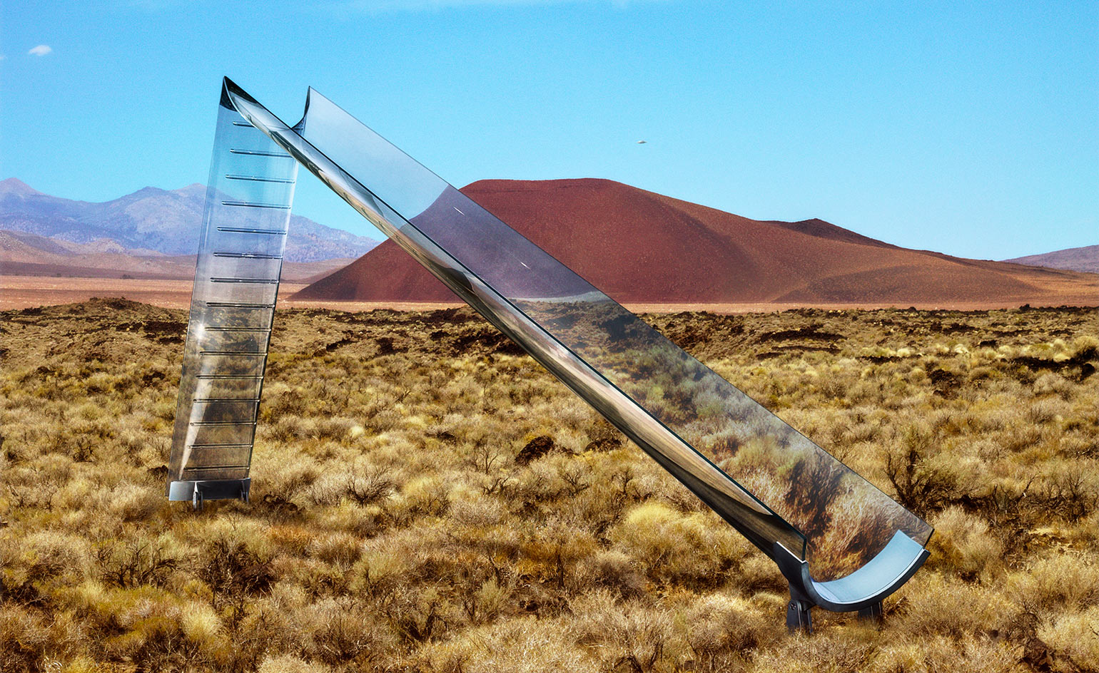
‘Vidre’ slide, by Eckersley O’Callaghan and Cricursa
This striking glass slide pushes the boundaries of playground aesthetics. Created by James O’Callaghan and Lisa Rammig of London-based engineering firm Eckersley O’Callaghan and Spanish curved glass specialist Cricursa, the one-off features a 4m stairway seamlessly connected to a 9m-long glass half-tube, supported at the base by a steel structure and kept in place by adhesive bonds, with no need for mechanical fixings. Called ‘Vidre’ (Catalan for glass), the slide offers a playful insight into the collaborative approach of engineers and fabricators, testing the practical application of emerging glass technologies to create the structures of tomorrow.
Pictured: the ‘Vidre’ slide consists of two long glass elements, propped against each other and held together at their base by a steel structure. The glass treads are bonded to the curved glass surface using transparent structural silicone adhesive
Photography: Jean-Pacôme Dedieu. Interiors: Maria Sobrino. Writer: Rosa Bertoli
Best personal space
Best personal space
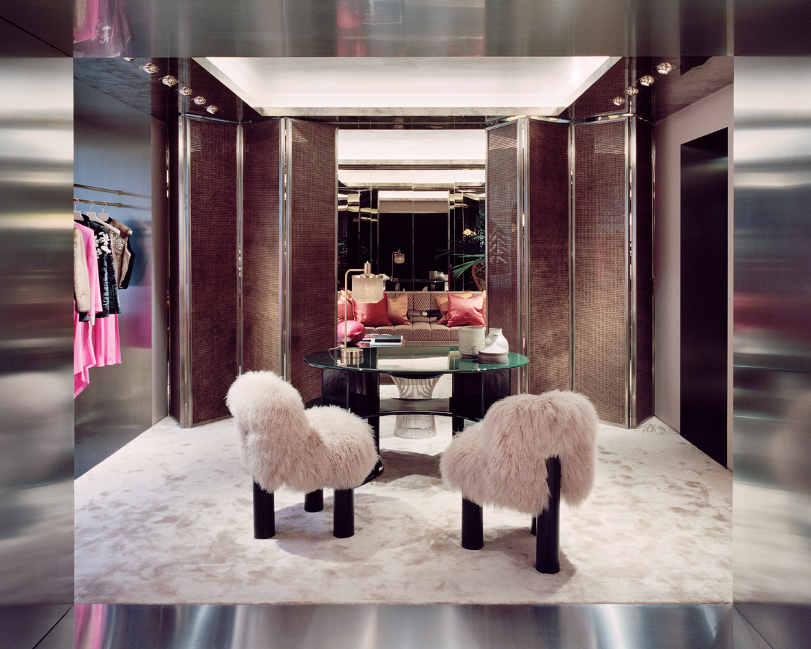
Fendi VIP room, London, by Dimore Studio
Dimore Studio’s refurbishment of Fendi’s Sloane Street store in London, unveiled in December, appears more like a salon than a retail space. The design, which marks the Milan-based studio’s first retail concept for the Roman label, builds on the opulent late midcentury aesthetic that it perfected at the Fendi apartment in Rome, but this time with a dash of exotic glamour added in. ‘Our vision was to create a chic and luxurious space injected with a sophisticated contemporaneity,’ says Dimore Studio’s Britt Moran. ‘There are elements inspired by the late 1960s and 1970s and the designs of Paul Evans, Pierre Paulin and Gae Aulenti.’ An intimate VIP room on the first floor is the store’s crowning glory. Here, hidden behind a set of Vienna-straw screens, visitors are enveloped in a warm golden glow created by skilfully layered patterns and shimmering textures. A deep amber silk carpet, bronze-mirrored wall panels and an oxidised steel ceiling form a rich backdrop for statement-making furniture and art. ‘It is truly distinctive, sophisticated and with a whispered luxury and intimate feel,’ says Fendi CEO Pietro Beccari, who plans to eventually roll the concept out internationally.
Pictured: a set of Alpaca ‘Botolo’ chairs by Cini Boeri for Arflex sits at the entrance to Fendi’s VIP room, which features a made-to-order bag and fur service and private changing rooms
Photography: Rory Gardiner. Writer: Ali Morris
Best waves
Best waves
Mindbending lines make for a totally swell look
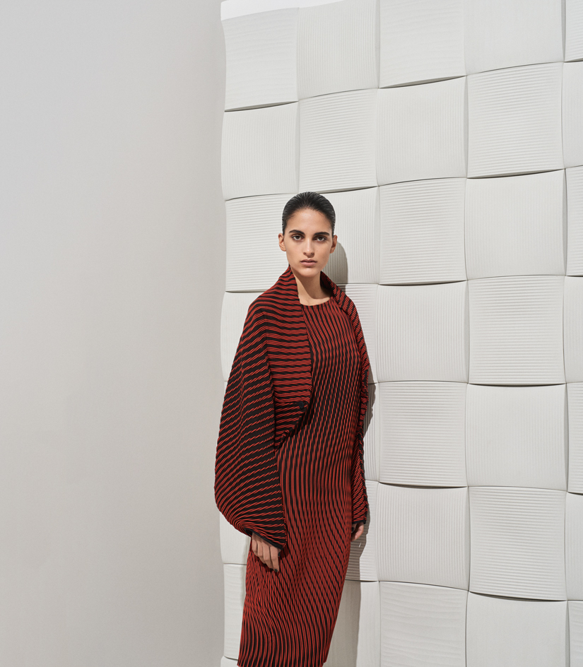
Inspired by auroras, Issey Miyake’s A/W17 collection featured a series of colour-shifting numbers, including this wonderful undulating dress. Part of the ‘Plasma x Baked Stretch’ series, it is made from a glue-printed fabric, with pleats that dance open as the wearer moves. To complement this pulsating piece, we set it against a backdrop of concrete ‘Weave’ tiles by Stockholm’s Note Design Studio. Inspired by the rhythmic contours of wind-sculpted sand dunes, the three different designs slot together to create waves across the wall.
Pictured: jacket, £1,215; dress, £1,240, both by Issey Miyake. ‘Weave’ tiles, £419 per sq m, by Note Design Studio, for Kaza Concrete. Estate Emulsion in strong white, £40 per 2.5 litres, by Farrow & Ball
Photography: Sean Alexander Geraghty. Fashion: Jason Hughes. Interiors: Matthew Morris. Writer: Elly Parsons
Best façade
Best façade
V&A Museum of Design, Dundee, by Kengo Kuma & Associates
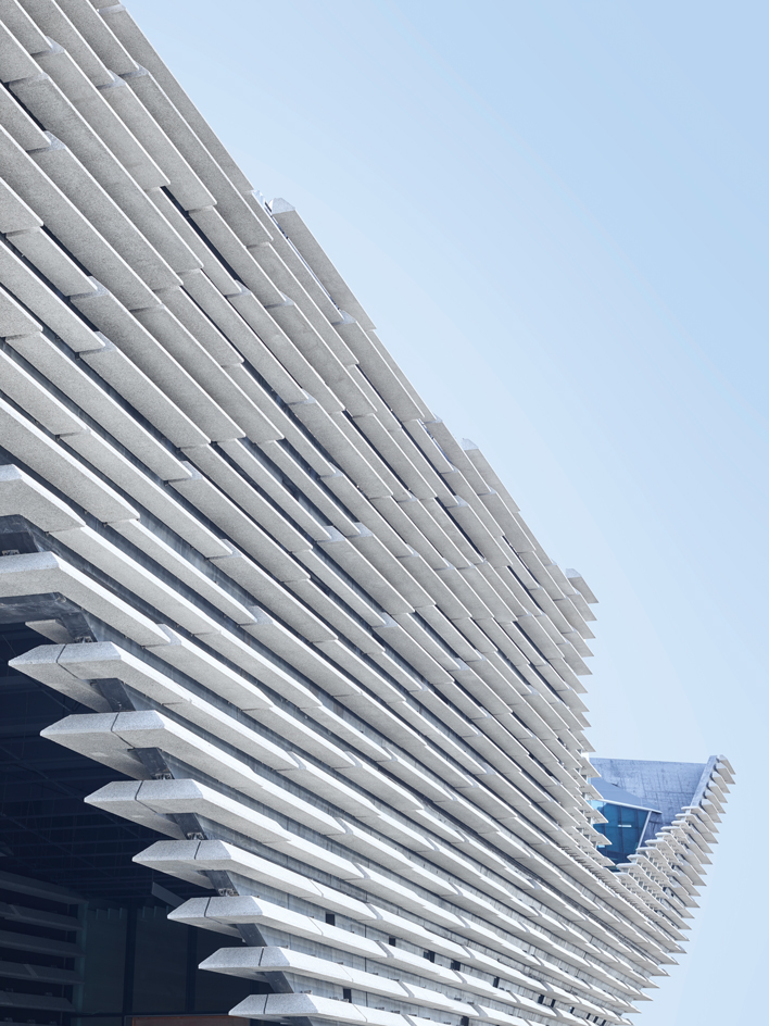
Kengo Kuma’s new V&A Museum of Design recently reached a defining moment in what are the final stages of its construction on Dundee’s waterfront. The removal of the temporary cofferdam, which enabled the building to be anchored into the bedrock of the River Tay, has finally revealed the full drama of the landmark project, which sports a striking façade inspired by the craggy cliff formations of Scotland’s east coast.
Due to open in 2018, the £80m V&A Dundee will be Scotland’s first dedicated design museum, and the only V&A museum outside London. The project will also be the first building in the UK designed by the Japanese architect Kengo Kuma, who this year has otherwise been busy working on Tokyo’s National Stadium, the centerpiece of the 2020 Olympics.
In a bravura feat of engineering, structural experts Arup and construction firm BAM had to dig 30 200m-deep bore holes to form part of the museum’s geothermal heating system, before building a complex structure in which every single exterior wall is curved. They then covered it with over 2,400 pre-cast panels to create a striated façade that projects out towards the sea.
Speaking exclusively to Wallpaper*, Kuma, whose design was chosen in 2010 following an international competition, describes the key concept behind the recently revealed superstructure: ‘The pre-cast concrete gives a monumentality to the façade design. We also wanted to create a real roughness, so we exposed the aggregate in the concrete. This matches the roughness and strength of the sea and surrounding topography. Between the concrete panels, strong shadows create changing patterns, forming a new relationship between the river and the building. It fits with the beauty of the coast.’
For all its scale, the V&A Dundee is not conceived simply as a standalone statement building. Central to the architect’s vision was to root the building in the city itself. Indeed, it is a key element of Dundee’s 30-year waterfront masterplan; the museum will sit alongside a new public park and the historic ship RRS Discovery, which took Scott to the Antarctic.
The V&A building is described by Kuma as ‘a bridge connecting the city to the river’. In fact, the axis of Union Street, the city’s main thoroughfare, passes directly under the museum, via a public plaza and walkway cut through the middle of the building.
The three-storey, 8,000 sq m museum includes a main hall, learning centre, lecture theatre, temporary exhibition space, and a permanent gallery dedicated to Scotland’s outstanding design heritage. Its star exhibit will be Charles Rennie Mackintosh’s Oak Room, a two-storey masterpiece being rebuilt after spending over four decades in storage.
The building consists of two structures at ground level, intersected by the public walkway and housing separate staff quarters and public areas. They join to form an upper level supported by huge steel beams and offering large, uninterrupted gallery spaces, with the main public hall and restaurant featuring in the building’s ‘prow’.
Internally, Kuma’s aim was to create a homely, rather than impersonal, environment. ‘Despite the building’s monolithic form, the interior space is a combination of natural light and warm materials, such as oak timber finishes,’ explains the architect. ‘The aim is that when people go into the building after coming in from the elements, it will feel like their living room.’ Landscaping, by Edinburgh-based multidisciplinary studio Open, will include large-scale water features as well as plaza spaces for performance and exhibitions. The result, according to Kuma, will be ‘a new landmark at one with nature’.
Pictured: the striated façade is made of over 2,400 pre-cast concrete fins, each weighing up to three tones
Photography: Benedict Redgrove. Writer: Caroline Ednie
Best beauty lab
Best beauty lab
How to magic your own potions and lotions
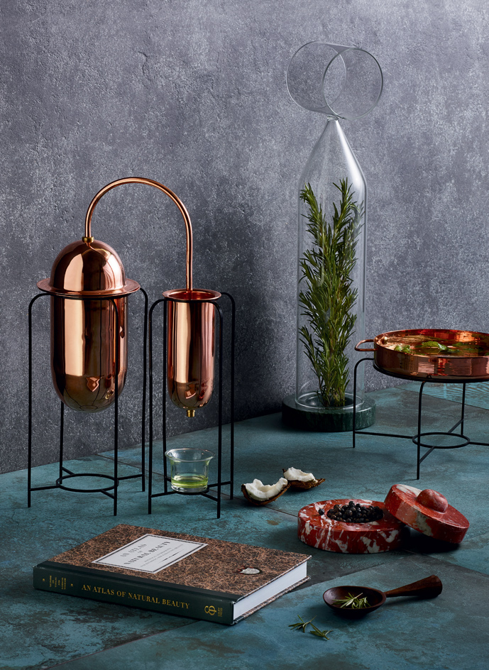
Just as the culinary arts have ditched processed foods, so wellness devotees are eschewing preservative-primed, ready-made skincare and mixing their own. Buly 1803 has come up with An Atlas of Natural Beauty, a bible for the modern alchemist. Also equipping our lab is the essential oil distillery by Tiffany Lai, Mark Braun’s pestle and mortar, Davide Aquini’s bell jars to keep botanicals looking beautiful, and Hope in the Woods’ exquisite scoops for precise prepping.
Pictured: ‘Hers and Herbs’ essential oil distiller, $1,800, by Tiffany Lai. An Atlas of Natural Beauty, €20, by l’Officine Universelle Buly (Ebury Press). ‘Muse’ bell jar, €270, by Davide Aquini. Table mortar, €139, by Mark Braun, for Hem. Scoop, £110, by Hope in the Woods. ‘Urban Style’ tiles, price on request, by Florim. ‘Aqua’ porcelain tiles, £106 per sq m, by Lapicida
Photography: Paul Zak. Interiors: Olly Mason. Writer: Emma Moore
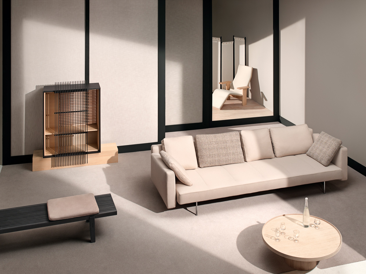
Best uchi
Best uchi
Inspired by the latest mania for modern Japanese interiors, we’re settling down with superior sake
Bench: Jean-Marie Massaud’s ‘Home Hotel’ bench, part of a collection he developed for Poliform, is designed to blend seamlessly into both domestic and commercial interiors.
Cabinet: Staffan Holm used quintessentially Japanese materials, such as hinoki wood and sumi-dyed ash, to create his cabinet for Ariake, which pays tribute to traditional kumiko screens.
Sake: Architect Tsuyoshi Tane’s sake bottle for the Akita brewing alliance Next5 has rice grains attached, creating a tactile surface. We’re serving the sake in a set of glasses by Nendo.
Room divider: Inspired by a coat hanger, Luis Arrivillaga’s ‘Ceiba’ screen for Living Divani features a white linen canvas adorning an elegant wooden frame.
Chaise longue: The ‘Quindici’ chaise longue marks the third collaboration between Mattiazzi and the Bouroullecs. This version in natural ash is combined with fabric by Kvadrat/Raf Simons.
Sofa: Piero Lissoni’s ‘Sakè’ sofa is, according to the designer, ‘a platform on which to float in peace’. His inaugural design for B&B Italia, punctuated by modern stitching, appears to be magically suspended in the air, like a flying carpet.
Pictured: ‘Home Hotel’ bench, £4,196, by Jean-Marie Massaud, for Poliform. ‘Kumiko’ cabinet, $6,000, by Staffan Holm, for Ariake. ‘Sakè’ sofa, from £6,709, by Piero Lissoni, for B&B Italia. ‘Rodan’ coffee table, from £1,055, by Pinch. ‘Siki’ glass set, price on request, by Nendo, for Miyakanbai. ‘Harvest 2017’ sake bottle, ¥8,200 ($72), by Atelier Tsuyoshi Tane for Next5. ‘Ceiba’ screen, €2,654, by Luis Arrivillaga, for Living Divani. ‘Quindici’ chaise longue, €1,990, by Ronan and Erwan Bouroullec, for Mattiazzi. ‘Apley’ fabric in shell, £52 per m, by Zoffany. ‘Douglas’ flooring, from £60 per sq m, by Dinesen. ‘Bell Twist’ carpet in portland, £40 per sq m, by Brintons. Absolute matt emulsion in lamp black and mortar, £42 for 2.5 litres, by Little Greene
Photography: Joel Stans. Interiors: Maria Sobrino. Writer: Rosa Bertoli
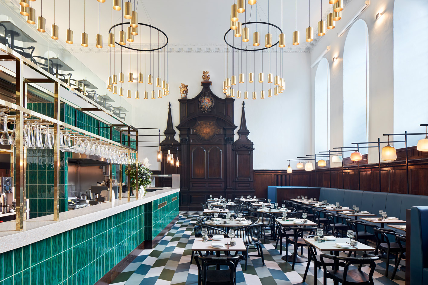
Best holy orders
Best holy orders
Duddell’s, London, by Michaelis Boyd
A firm favourite among Hong Kong’s art-world elite, Duddell’s has finally landed in London. And owners Alan Lo, Yenn Wong and Paulo Pong could not have picked a more dramatic spot for their first international outpost, located in the historic St Thomas’ Church, just a few steps away from the looming Shard. Its high stained-glass windows, dark timber wall panelling and ecclesiastical altar form a grand backdrop to local firm Michaelis Boyd’s contemporary decor, inspired by 1960s Hong Kong tea houses. Set over two levels, the restaurant is decked in greens and blue-greys, a bold palette that appears on the leather banquettes, geometric rubber flooring and tiled central bar. Here, guests can sip on Duddell’s signature cocktail, the Hybrid Jia Tea, a concoction of gin and jasmine tea cordial, while chef Daren Liew dishes out the same elevated Cantonese fare that won the restaurant its legion of Hong Kong fans and its two Michelin stars. Expect exquisite handcrafted dim sum, crisp Peking duck, plus an array of perfectly executed small bites, from wagyu beef baskets to spicy soft shell crab. 9a St Thomas Street, tel: 44.20 3957 9932
Pictured: Duddell’s is located in a grade II-listed, Queen Anne-style church, originally part of St Thomas’ Hospital. Like its Hong Kong counterpart, the restaurant offers year-round art events and exhibitions
Photography: Ed Reeve. Writer: Lauren Ho
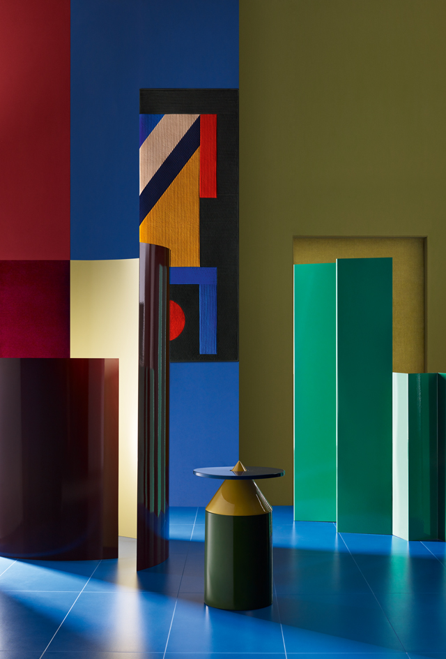
Best chroma zone
Best chroma zone
Interiors get a colour injection
We’re fans of colour blocking, so when we came across go-to German paint specialist Caparol Icons’ library of 120 super-saturated emulsions, we couldn’t resist a hotly hued rethink of our walls. The paints are a bold backdrop to Hermès’ cashmere blanket, or ‘plaid’, featuring the graphic abstractions of French-Korean artist Seulgi Lee and stitched using a Korean quilting technique. Belgian design duo Muller Van Severen’s ‘Fireworks’ screens in enamel-painted steel offer an intense chromatic hit, while colour animates Beirutbased Karen Chekerdjian’s reconfigurable ‘Totem’ table, which recently became part of the permanent collection at Paris’ Musée des Arts Décoratifs.
Pictured: ‘Beloved Paint’ in No 120 Burlesque; No 55 Denim; No 79 Green Trick, €85 per 2.5 litres, all by Caparol Icons. Cashmere Plaid (hanging), price on request, By Seulgi Lee, for Hermès. ‘Fireworks’ screens, from €12,000 each, by Muller Van Severen. ‘Keepers Red’ rug (centre left); ‘Melrose Yellow’ rug (back right), from £750 each, both by The Rug Company. ‘Totem’, $4,000, By Karen Chekerdjian. ‘Signature’ flooring, from £70 per sq m, by Amtico
Photography: Benjamin Swanson. Interiors: Maria Sobrino. Writer: Christopher Stocks
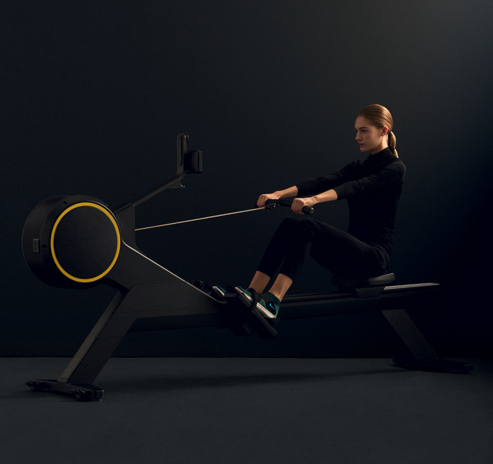
Best strokes
Best stroke
We’re feeling the pull of a high-resistance, high-style anaerobic workout
Perfect for increasing your pulling power, Technogym’s new SkillRow is a stroke of genius. It’s the first indoor rowing machine equipped to improve anaerobic oomph and neuromuscular abilities. Aquafeel technology creates an incredibly realistic rowing sensation, and the machine can be used with an app offering training programmes and a real-time overview of your performance. We’ve complemented it with gear by Aeance, the German brand that blends the finest materials with cutting-edge technology to create gym gear with superior functionality.
Pictured: SkillRow rowing machine, £3,490, by Technogym. Estate emulsion in railings, £40 per 2.5 litres, by Farrow & Ball. Vinyl flooring in slate grey, £29 per sq m, by The Colour Flooring Company. Top, £188; trousers, £335, both by Aeance. Trainers, £87, by Nike
Photography: Sean Alexander Geraghty. Fashion: Lune Kuipers. Writer: Rosa Bertoli
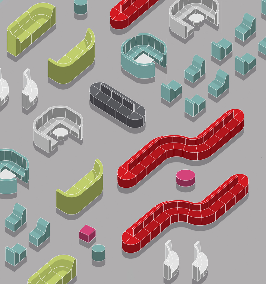
Best break-out
Best break-out
‘Neighborhood’ by Joe Gebbia, for Bernhardt Design
If you were going to commission someone to design a break-out space, Airbnb co-founder Joe Gebbia might not be the first person you’d call on. But before he became a bed-and-breakfast billionaire, Gebbia was an industrial-design grad from the Rhode Island School of Design, and when Jerry Helling, president and creative director of Bernhardt Design, suggested they work on a furniture line together, Gebbia jumped at the chance. The result, called ‘Neighborhood’, is a set of 38 modules that can be combined to form endlessly flexible break-out areas for offices and public spaces. With integrated USB and power sockets and soundabsorbent materials, ‘Neighborhood’ is designed to evolve with the company around it.
Pictured: the ‘Neighborhood’ Collection ranges from ottomans to privacy modules and work tables. From $600 per piece
Illustrator: Oscar Francis. Writer: Christopher Stocks
Best rocks
Best rocks
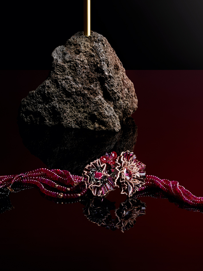
‘Aria Passionate’ necklace, by Chaumet
Citing Milan’s La Scala opera house as inspiration, Chaumet’s jewelers have skillfully translated the interior details of architect Giuseppe Piermarini’s baroque masterpiece into an audaciously abstract jewel, the ‘Aria Passionata’ necklace. A modular pink gold and lacquer piece, the design can also be transformed to adorn the back, but it’s the cacophony of expert stone cuts – three oval-cut rhodolite garnets, three East African cabochon-cut rubies, baguette-cut rubies, brilliant-cut diamonds and ruby and onyx beads – that ultimately makes this high-jewellery masterpiece sing.
Pictured: ‘Aria Passionata’ necklace, in pink gold and lacquer with rhodolite garnets, rubies, diamonds, and ruby and onyx beads, price on request, by Chaumet. ‘Kryptal’ lamp, €1,800, by Ctrlzak, for JCP
Photography: Philippe Lacombe. Interiors: Matthew Morris. Writer: Caragh McKay
Best stretch
Best stretch
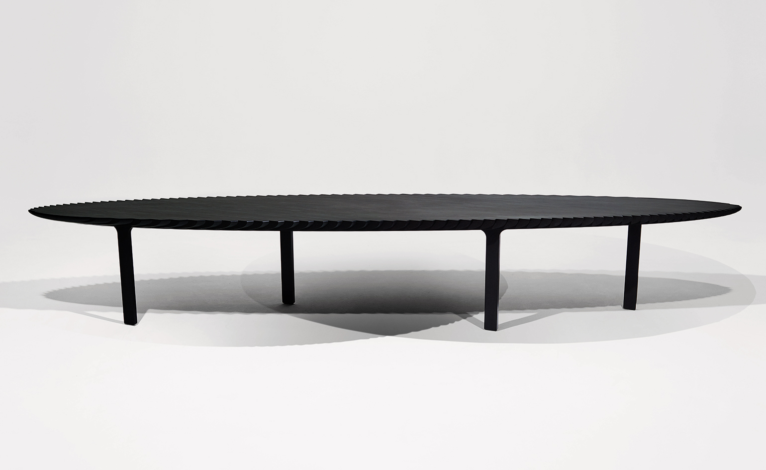
‘Friction Table’, by Heatherwick Studio
About a year ago, the prototype of this ‘Friction Table’ informed Thomas Heatherwick’s articulated cover for Wallpaper’s 20th anniversary issue. Now, in final form, this ostensibly simple circular design, 1.8m in diameter, conceals a pivot mechanism that can stretch it into an ellipse, over 4m long. Crafted from resin-infused paper – a mid-20th century industrial material that lends itself to precise engineering while retaining warmth and tactility – the table comprises 61 slats, held together by nine ribs of anodized aluminium and 212 articulated joints, accurate to within 0.02mm, allowing it to expand and contract in one fluid movement. The gently grained surface has a mottled grey colour that will lighten over time, adding to the piece’s organic charm.
Pictured: fully extended, thanks to its 212 articulated joints, the table measure more than 4m in length, and ensures hosting dinner is never a stretch. Price on request
Photography: Ryan Hopkinson. Interiors: Matthew Morris. Writer: TF Chan
Best pile-up
Best pile-up
We’re rugging up this winter with the perfect floor show
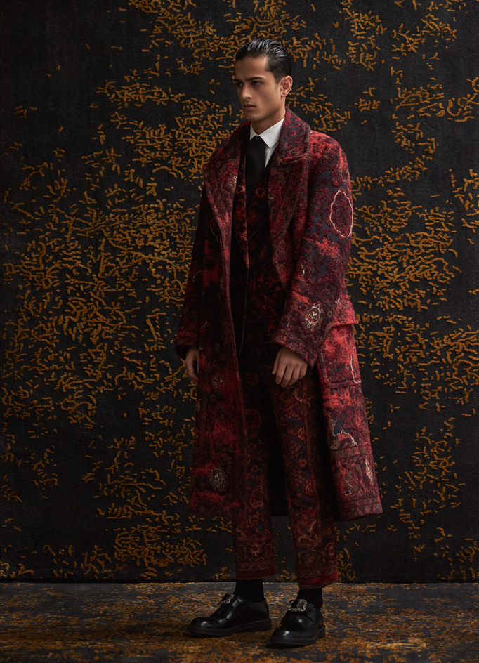
For A/W17, Alexander McQueen’s creative director Sarah Burton gave men’s outerwear the red carpet treatment. It took three weeks to weave this bouclé jacquard overcoat, which is crafted from 12m of fabric and, thanks to engineered printing, boasts an entirely unbroken pattern. The collection takes inspiration from Oscar Wilde and the predilection of dandies towards antique furnishings. Also weaving a bit of magic into our everyday lives is this ‘Blossom/ rug from Stepevi, which makes for the perfect heirloom. The Turkish carpet company has crafted a rug with soft petal details that evoke the breaking of a golden dawn. The design has a tactile pile, created by applying an embossing technique during the tufting process. We’ll be smug as a bug this winter.
Pictured: ‘Blossom’ rug in titanium grey and dark gold, £1,950, by Stepevi. Coat; jacket; shirt; trousers; tie; shoes, prices on request, all by Alexander McQueen. Socks, £13.50, by Pantherella
Best green space
Best green space
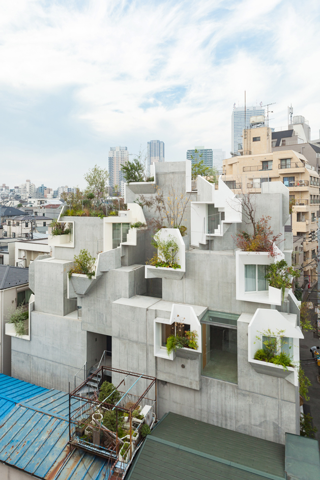
Tree-ness House, Tokyo, by Akihisa Hirata
Redefining the term ‘house and garden’, Tree-ness House is a mountain of concrete boxes dotted with pockets of greenery – 17 in all. Located squarely in the middle of Tokyo, the building was created by architect Akihisa Hirata for a gallerist and his family. In addition to passions for photography and contemporary art, the owner has a penchant for the great outdoors. Now he doesn’t even need to leave home for his nature fix.
The start of the project may be traced back to a chair – Hirata’s first realisation of his ‘pleats’ concept. Rooted in fractal geometry, the ball-shaped seat consisted of a single, continuously folded surface resembling cluster coral. Eager to translate this model into architecture, Hirata brought the chair to his first meeting with the gallerist, who was planning a new exhibition space in Ginza. After that project faltered, the client asked Hirata to replace his existing hom with a combined house and gallery. Shortly before the start of construction in 2011, the Great East Japan Earthquake jolted the country and once again Hirata’s project came to a standstill. This pause caused the client to rethink the brief and Hirata to redesign accordingly. The upshot was Tree-ness House.
Filling a narrow site along a busy, two-lane thoroughfare, the property stands rather taller than the neighbouring two- and three-storey dwellings. Fitting neatly within the volume permitted by the city’s sunshine laws, it is designed as a compilation of boxes piled in a stepped formation. ‘I thought it would be better to articulate the volume instead of making one big one,’ explains the architect.
Hirata allocated one function per box. In-between, he inserted sheets of museum-grade glass, creating less enclosed areas for the living, dining and other communal spaces. Spread out over nine levels, the maze-like interior practically requires a compass to navigate. But there is logic and hierarchy to Hirata’s thinking. Linked by stairs, lift and a hollow core extending from street to rooftop, the space transitions from the public gallery at the building’s base to an independent studio flat above that and, finally, the client’s private triplex at the summit.
Contrasting with the gallery, a six square-metre cube of windowless space, the airy and light-filled home seems to float above the city. In keeping with convention, it begins with a foyer where outdoor shoes are exchanged for indoor slippers, and flows into the kitchen and dining area. From there, a few steps ascend to the living room which opens onto a wood-clad mini-study and a leather-lined lounge, each housed in its own box, plus a terrace at the back. More stairs lead up to the three bedrooms, followed by a bathroom and the outdoor spaces that crown the building. While the terrace is for air-drying clothes (as is the preference in Japan), the roof garden is for relaxation. When one is surrounded by the small trees and potted plants, Tokyo’s hustle and bustle simply melts away.
To open up the boxy rooms and soften their rigid geometry, Hirata cut holes in the concrete and surrounded them with exterior metal frames. Informed by his ‘pleats’ concept, each frame is a continuous, albeit contorted, steel surface that was mortared into place – the building’s greatest construction challenge. Like giant window boxes, the frames incorporate planters for flowering and fruit-bearing plants, resulting in dots of greenery across the exterior. ‘I envisioned groups of small plants among the rocky outcrops on a mountainside,’ says Hirata. The building’s various levels and aspects create conditions that will support everything from cacti to conifers.
By contrast, most surfaces inside the home are blank. There’s barely even any art. While glass and concrete walls limit display options, the paucity of paintings is down to the client’s wish to distinguish his home and work place. Finishes and fittings, such as drapery by textile designer Yoko Ando and lighting fixtures by Michael Anastassiades, add comfort to the raw space.
With its concrete trunk, metal branches and real leaves, Tree-ness House perfectly fuses the organic and the manmade.
Pictured: located in Toshima, in the heart of Tokyo, Tree-ness House is comprised of multiple concrete cubes, punctuated by 17 folded steel window boxes
Photography: Vincent Hecht. Writer: Naomi Pollock
Best foot forward
Best foot forward
How to brush up on your presentation skills
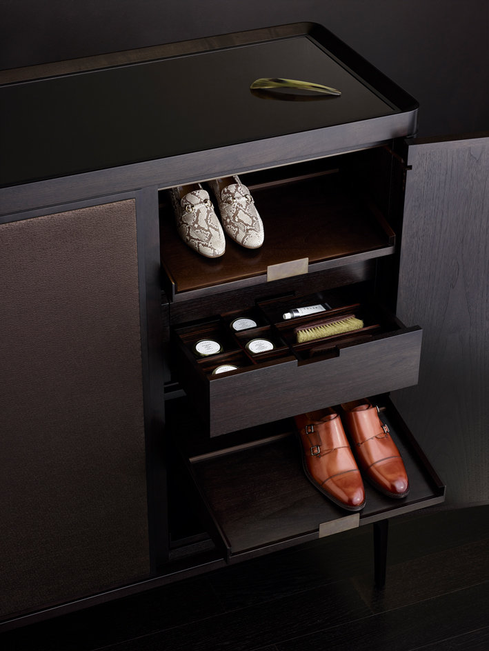
We’ve fallen head over heels for Roberto Lazzeroni’s ‘Full’ cabinet, an American walnut beauty: the tidy exterior, the bounty of compartments, and, last but not least, the integrated mini-bar and cigar box – it’s simply perfect. To fill it, we picked two pairs of Geox’s S/S18 models, featuring the Italian brand’s signature breathable sole. Designed to keep feet dry, whatever the weather, the high-tech waterproof membrane is disguised inside supple, classical Italian leather.
Pictured: ‘Full’ cabinet, €16,000, by Roberto Lazzeroni, for Ceccotti Collezioni. ‘Marlyna’ moccasins, £110; ‘Hampstead’ shoes, £140, both by Geox. ‘TGC051’ shoe horn, €33; shoe polish and brushes, part of the seven-piece ‘TGC038’ large shoe care set, €110; ‘TGC206’ tulip hand cream, €20, all by Tangent GC. ‘Oak Castle’ flooring, £42 per sq m, by Emanuel Lidberg, for Kährs
Photography: Paul Zak. Interiors: Olly Mason. Writer: Elly Parsons
Best Instagram fodder
Best Instagram fodder
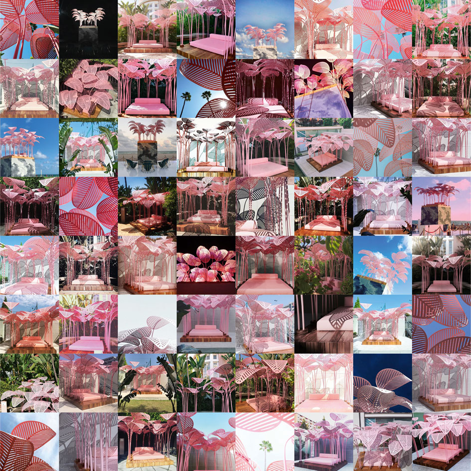
‘Le Refuge’ daybed, by Marc Ange, for The Invisible Collection
Visitors to Wallpaper’s Holy Handmade exhibition at last year’s Salone del Mobile in Milan were taken by a millennial pink storm when they discovered Marc Ange’s ‘Le Refuge’. This large pink daybed, shaded by pink metal palm fronds, fast became the fair’s most Instagrammed piece, adding pure fun to a week dedicated to serious furniture and design. The piece then travelled to the US, where it was displayed first at LA’s Beverly Hills Hotel and then at the Faena Hotel in Miami Beach, again in collaboration with Wallpaper*, but this time for Design Miami. Perched on a plinth clad in tiles evoking a cloudy sky, with the sea as a dramatic backdrop, it offered a different perspective on Ange’s daybed. Here it was out of reach and surrounded by the designer’s latest creation, a series of arachnid-inspired chairs that counterbalanced the playful mood of the pink centrepiece. Instagram became the medium of choice for anyone who came into contact with the installation, and the plethora of images that appeared on the photo-sharing site offered all manner of angles and takes on its unmistakably pop aesthetic.
Pictured: just a tiny selection of the thousands of pictures posted on Instagram of Marc Ange’s ‘Le Refuge’ daybed
Best big chill
Best big chill
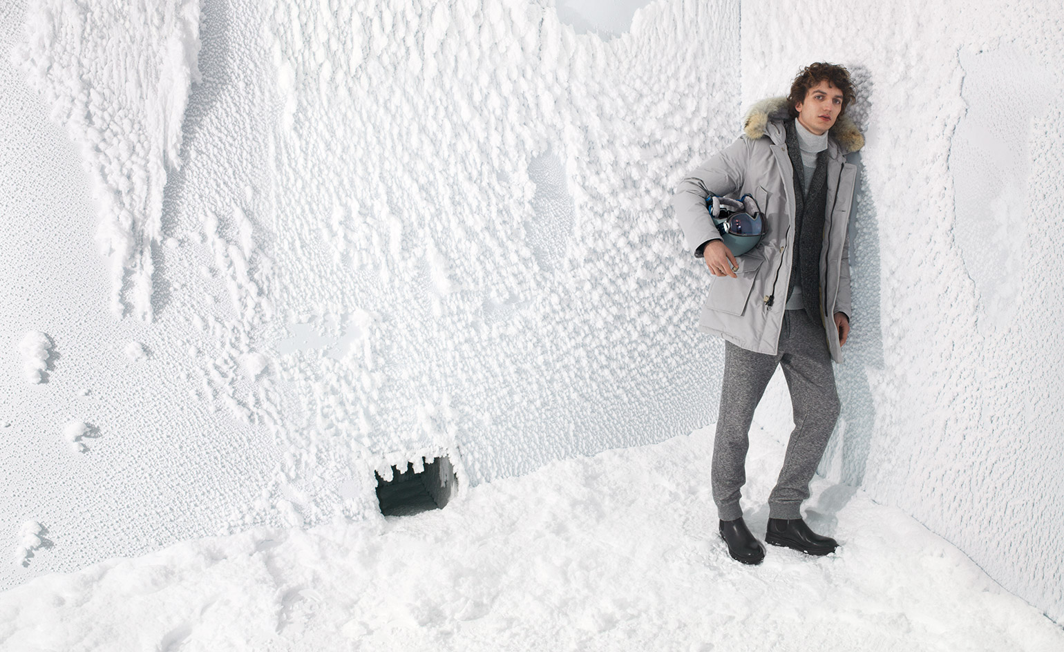
Extreme Weather Experience Room, Milan, by Woolrich
We’ve awarded Woolrich the Best Big Chill award in this year’s Wallpaper* Design Awards (W*227). The American outerwear brand’s new 700 sq m flagship store on Milan’s Corso Venezia features an immersive Extreme Weather Experience Room, where customers can try out parkas in temperatures as glacial as minus 20°C. ‘We wanted to create a sensory experience that helps convey the Woolrich story,’ says the label’s creative director Andrea Canè. In 1972, the brand invented the Arctic Parka to protect Alaskan pipeline workers from sub-zero weather. The 14 sq m ‘freezer’, designed with Japanese studio Wonderwall, features walls made from temperature-maintaining four-fold glass. Each night, an internal cooling cycle produces a fresh layer of artificial snow. This frosty feature is enhanced with 360-degree film footage of chilly climes, such as Alaska’s Colony Glacier and Flattop Mountain. Nice ice, baby.
Pictured: Parka, £650; blazer, £250; roll-neck, £300; trousers, £130; helmet, £110; goggles, £185; boots, £240, all by Woolrich.
Photography: Alessandro Furchino Capria. Fashion: Jason Hughes. Writer: Laura Hawkins
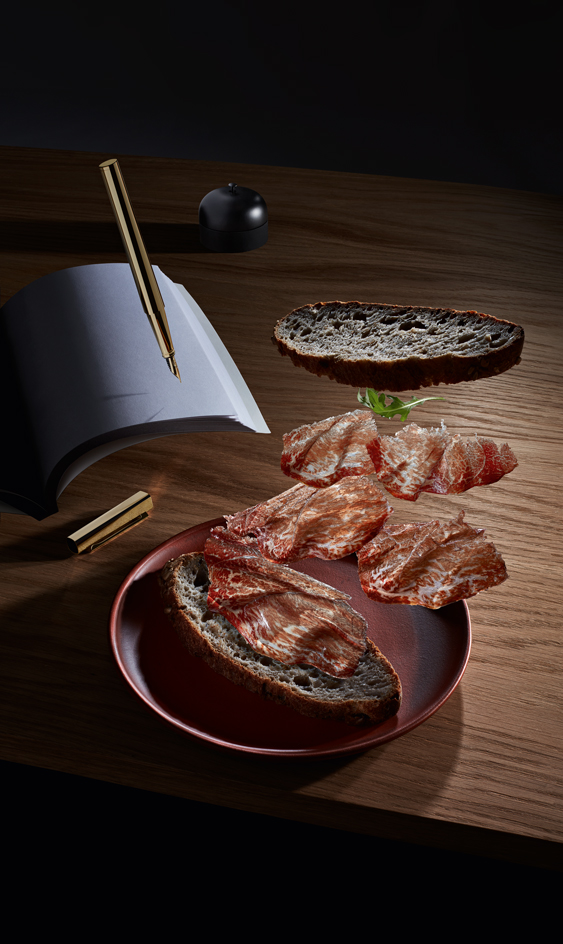
Best working lunch
Best working lunch
We like to keep things light
Writing instrument: Six years in the making, the Sculpture pen, by Swiss stationer Hieronymus, impresses with its exceptional workmanship. Chiselled from a solid piece of brass (clip included), then plated with gold, it has a streamlined, geometric form that feels substantial in the hand, and a writing nib of 18-carat gold to guarantee a smooth stroke. Committing ideas to paper has never been a higher pleasure.
Beef sandwich: Jamon de Buey, by Monaco meat specialist Giraudi, is a Kobe beef from 900-day-old Japanese Black cows, fed on grass, rice straws, soybean and corn, then smoked with various woods, salted and cured over 12 months in Spain. The nutty, marbled flesh dissolves on the tongue. We paired it with buckwheat sunflower loaf, one of the latest offerings from Maison Kayser’s New York bakeries.
Pictured: Sculpture pen in gold-plated brass, CHF2,600 (€2,233), by Hieronymus. Jamon de Buey, €980 per kg, by Giraudi. Buckwheat sunflower loaf, $5, by Maison Kayser. ‘PK52 Professor’ desk, £3,165, by Poul Kjærholm, for Carl Hansen & Søn. Plate, £50, by Christopher Jenner, for Yixing Ceramics. Table bell, ¥3,000 ($27), by Gen Suzuki Studio, for Timbre
Photography: John Short. Food: Peta O'Brien. Writers: TF Chan, Emma Moore
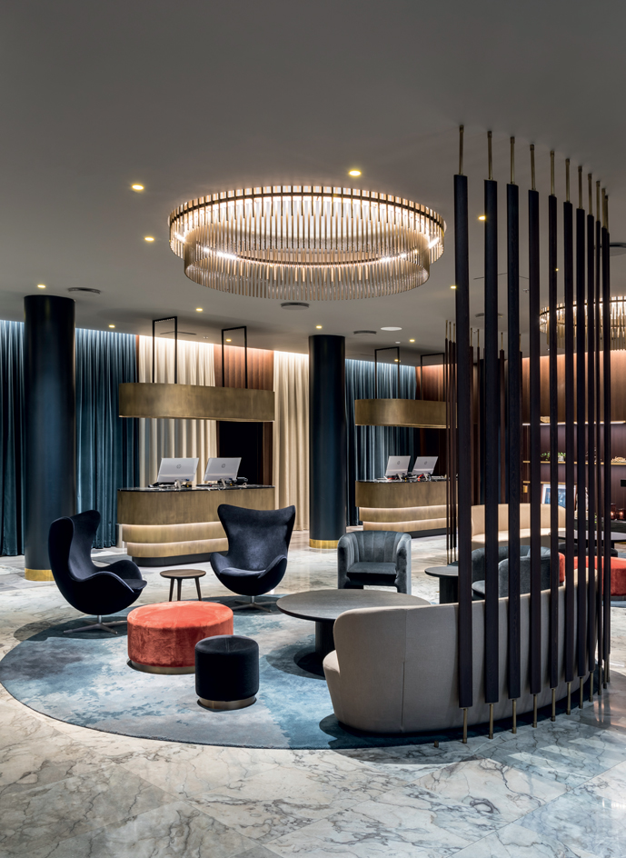
Best restoration
Best restoration
We think the revival of a landmark Copenhagen hotel has staying power
When it opened in 1960, Copenhagen’s SAS Royal Hotel was the talk of the town. It was the city’s first skyscraper and boasted top-to-toe design by Danish architect Arne Jacobsen, who had a hand in everything from the façade to the furnishings and cutlery. In recent years, a series of mishandled updates had left the hotel looking bland, with many of its original treasures lost or put in storage. But the 260-room property, now called the Radisson Blu Royal, has recently unveiled the final stages of a complete overhaul that has put it back in fine fettle. Many of Jacobsen’s original designs, such as his iconic ‘Swan’ and ‘Egg’ chairs and the lobby’s spiral staircase, have been reinstated or reconditioned, with local studio Space Copenhagen adding custom lighting and furnishings in an urban charcoal colour palette with flecks of brass. The result is a modern take on what the designers think Jacobsen would have done if commissioned today, while still respecting the architect’s legacy and honouring the property’s status as the world’s first design hotel.
Pictured: curved details, such as the chandelier and sofa (a version of space Copenhagen’s ‘stay’ sofa for Gubi) are a nod to Arne Jacobsen’s original interiors. A lobby chair (next To The ‘Egg’ chair) was designed for the hotel by Space Copenhagen and produced by &Tradition.
Photography: Alistair Philip Wiper. Writer: Lauren Ho
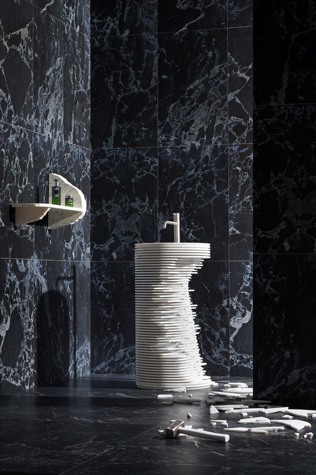
Best clean strike
Best clean strike
It’s smash and grab in our bathroom with a DIY sink and a mean, green regime
Wash Basin: Elevating the humble sink to euphonious heights is Antoniolupi’s ‘Introverso’ basin. Designed by sculptor Paolo Ulian, it is chiselled from a single block of Carrara marble and features a series of plates that can be left intact or smashed away as desired. More pleasing still is the sound produced when you slide your finger along the plates.
Skincare: New skincare brand Orveda occupies a category of its own making, somewhere between luxury and niche. Founded by the former president of Lancôme, Sue Nabi, it contains effective quantities of active ingredients; its products are clean, green, vegan and gender-neutral, and are specially fomulated to promote glow from within.
Pictured: ‘Introverso’ sink, price on request, by Paolo Ulian, for Antoniolupi. ‘Duo’ shelf, price on request, by Ilaria Bianchi. Marble wallpaper, €199 per roll, by Piet Hein Eek, for NLXL. ‘Evolutionmarble’ tiles in bronzo amani lux, price on request, by Marazzi. Cleansing bamboo and enzymatic water, £80; deep-clearing mud masque, £89, both by Ordeva, from Harvey Nichols
Photography: Beppe Brancato. Interiors: Dimitra Louana Marlanti. Writers: Anne Soward, Emma Moore
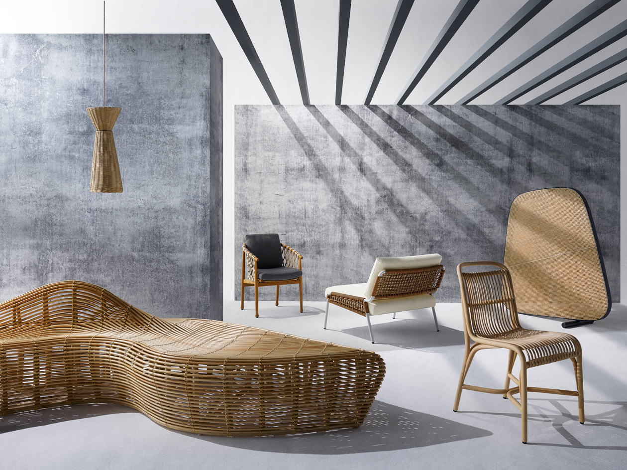
Best weaves
Best weaves
Wicker is slicker for the ins and outs of modern furnishings
Bench: Constructed entirely of sustainable rattan from the forests of Kalimantan, Sulawesi and Sumatra, the ‘Linger’ bench by Indonesian designer Alvin Tjitrowirjo comes in three sizes.
Pendant: Maurizio Bernabei’s wicker lampshades for Bottega Inteccio are handwoven in its Mogliano workshops, supporting traditional craftsmen in Italy’s Marche region.
Armchair: Designed by Antonio Citterio for B&B Italia, the ‘Ginestra’ chair has a solid teak frame with woven interlacing, which looks equally good inside or out.
Chair (left): The ‘Zoe’ chair, designed by Andrea Parisio for Meridiani, comes in both indoor and all-weather versions, woven either from natural saddle leather or rope.
Chair (right): Expormim’s sinuous ‘Gata’ chair, by father-and-son team Miguel and Gonzalo Milá, uses natural peeled rattan for its structure and its struts.
Screen: Part of Pearson Lloyd’s freeform seating system for Tacchini, this sculptural screen is made from woven cane and works equally well in a solo context.
Pictured, ‘Linger’ Bench, €5,460, by Alvin Tjitrowirjo, for Yamakawa Rattan. Pendant, price on request, by Maurizio Bernabei, for Bottega Intreccio. ‘Ginestra’ chair, from £1,111, by Antonio Cittero, for B&B Italia. ‘Zoe’ chair, price on request, by Andrea Parisio, for Meridiani. ‘Gata’ chair, €656, by Miguel and Gonzalo Milá, for Expormim. ‘Ischhia’ screen, £2,324, by Pearson Lloyd, for Tacchini. ‘Concrete Wall’ wallpaper, £30 per sq m, by Mr Perswall. Estate emulsion in down pipe, £40 for 2.5 litres, by Farrow & Ball
Photography: Luke Kirwan, Interiors: Olly Mason. Writer: Christopher Stocks
Best drawing room
Best drawing room
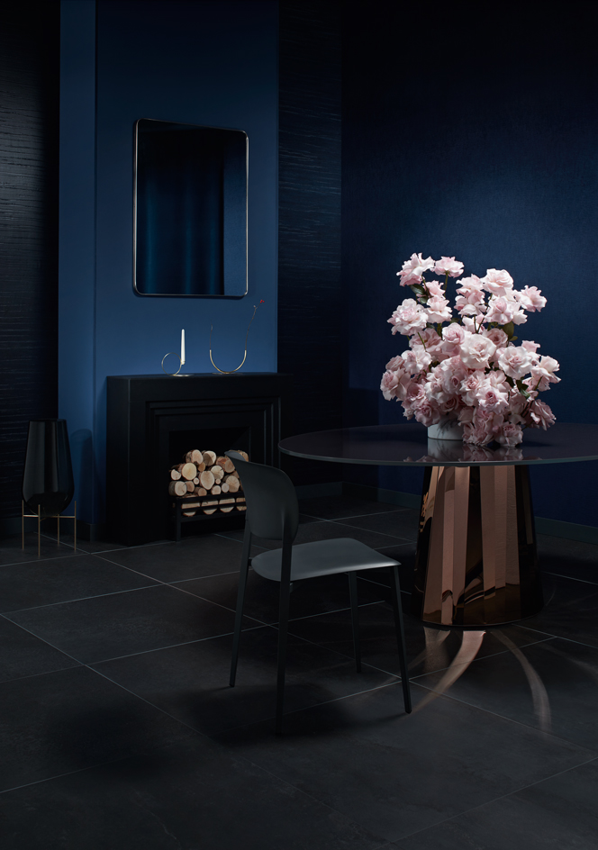
How to be a blooming marvellous host
Setting: We’ve taken a shine to French Designer Victoria Wilmotte’s ‘Pli’ tablefor ClassiCon, with its faceted mirrored steel base, and RH Modern’s simple ‘Lucent’ mirror. Two new offerings from Dedar elevate our walls: embossed velvet ‘Proust’, and ‘Lacca’, which reproduces wood grain in vinyl with a tactile beeswax finish.
Centrepiece: Since relocating from Sydney to London three years ago, Simone Gooch’s floristry business Fjura (‘flower’ in Maltese) has gained an A-list following. We’re smitten by Gooch’s bold floral gestures, a kind of unique free-flowing ikebana style, made up of fresh blooms chosen early each morning from New Covent Garden Market.
Pictured (from left): ‘Échasse’ vase, £400, by Theresa Arns, for Menu. ‘Lucent’ mirror, $596, by RH Modern. ‘Bugia’ candleholder, $195, by Formafantasma, for Roll & Hill. ‘Glass Half Full’ vase, A$270 (£155), by Anna Varendorff, for ACV Studio. ‘Soho’ freestanding fire basket, £395, by Chesneys. ‘Ply’ chair, €265, by Pocci + Dondoli, for Desalto. ‘Pli’ table, €5,959, by Victoria Wilmotte, for ClassiCon. Flowers, by Fjura. ‘Triangoli’ marble vase, from €366, by David Nicolas, for Editions Milano, from Silvera. ‘Lacca’ wallcovering in Col. 7 Notte (on left wall), £208 per roll; ‘Proust’ fabric in Col. 16 Blue Marine (on right wall), £96 per m, both by Dedar. ‘Streamline’ fabric in Royal Blue (seen in mirror), £96 per m, by Mark Alexander. Estate emulsion in Drawing Room Blue (on wall) and Railings (on skirting), £40 per 2.5 litres, both by Farrow & Ball. ‘Flowtech’ porcelain tiles, price on request, by Florim
Photography: John Short. Interiors: Olly Mason. Writers: Christopher Stocks, Nick Vinson
Best retreat
Best retreat
Jan Michalski Foundation for Writing and Literature, Switzerland
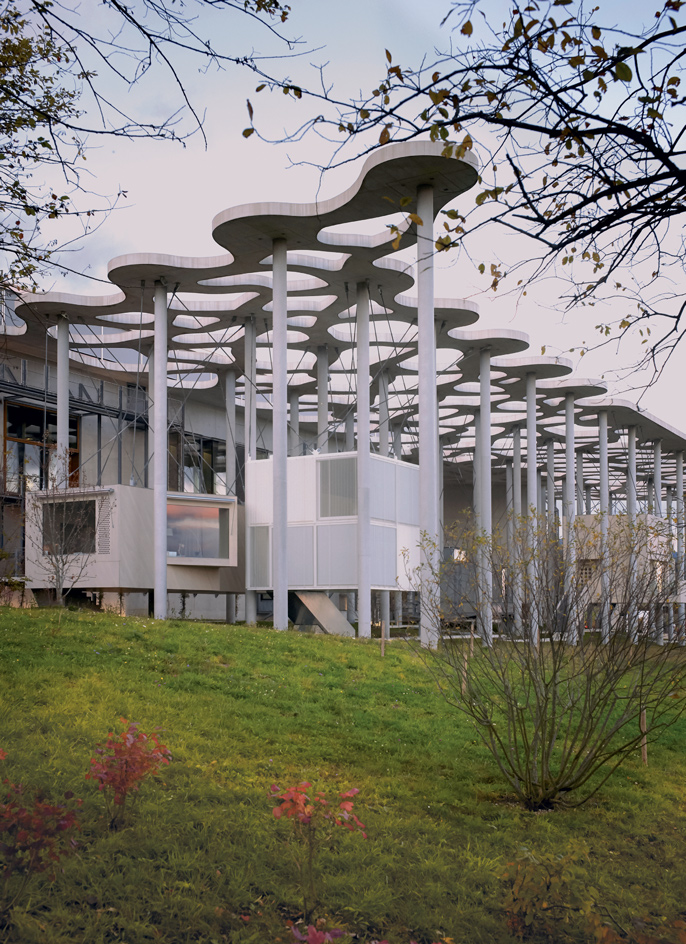
The Jan Michalski Foundation for Writing and Literature is set on a remote hillside at the foot of the Jura Mountains, nestled in the stillness of the Swiss town of Montricher. It’s a true haven for readers and writers, made all the more appealing by an architecturally astute new complex.
The foundation was set up by Vera Michalski-Hoffman in 2004, in memory of her husband and business partner. The pair’s publishing house, Les Éditions Noir sur Blanc, was founded in Montricher in 1987, specialising in novels and personal accounts from Eastern Europe. It slowly became a cultural bridge between Eastern and Western Europe and a landmark on the literary landscape. ‘The narrative behind the foundation is to foster literary creation and encourage the practice of reading,’ explains Michalski-Hoffman. ‘Later on came the idea to bring writers and the public together, in the same place.’
The complex’s masterplan, designed by Nyon-based architects Mangeat-Wahlen on the site of a former children’s summer camp, consists of two main concrete volumes: a library, and an auditorium with an exhibition hall. These are surrounded by 11 small ‘cabins’, designed by various architects and seemingly suspended mid-air, and everything is united beneath a grand sculptural canopy.
Four of the cabins – including metal-clad offerings by Mangeat-Wahlen, a wooden cabin by Kengo Kuma and a glass structure by Chilean architect Alejandro Aravena – house administrative and communal space. The other seven are writers’ retreats, where emerging and established talents can apply for residence. These are by Switzerland’s Jean-Gilles Décosterd, Atelier Bonnet, AFGH and Schaub Zwicky, Brazil’s Studio MK27, and Norway’s Rintala Eggertsson, as well as Mangeat-Wahlen. Most are located at the back of the complex, facing the Alps and Lake Geneva, and each comprises a kitchen, workspace, bedroom and bathroom.
The timber-clad library accommodates literary works in ten languages. Some levels offer private seating areas, which protrude from the volume like birds’ nests, almost mirroring the elevated cabins outside. A spacious underground auditorium sits next to the library, with a flexible exhibition space on top. Its cleverly designed entrance features plenty of openings that flood the auditorium with natural light.
Mangeat-Wahlen has carefully orchestrated a confluence of past and present, natural context and the foundation’s vision, weaving together all the architectural contributors’ works to create a masterpiece in placemaking.
Pictured: the canopy rests on pillars up to 18m high and plays a key role in the weight distribution between cabins. Seen here are writers retreats by Schaub Zwicky (left), Atelier Bonney (centre) and AFGH (far right)
Photography: Julien Lanoo. Writer: Joana Lazarova
Best reissues
Best reissues
Updated design classics that make us sit up and take notice
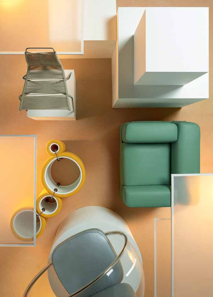
We were thrilled to see the return this year of Eero Aarnio’s ‘Bubble’ chair, 50 years after it first launched. Now made to order by Aarnio Originals, it’s the ultimate escape pod. Cappellini has also reimagined the iconic ‘Tube’ lounger, designed by Joe Colombo in 1969, in a new edition using a variety of materials and vibrant colours. Cassina offers a new take on Mario Bellini’s 1960s ‘MB1 Quartet’ belted armchair, revising its proportions and upholstery, while Poul Kjærholm’s ‘PK1’ woven dining chair, designed in 1955 and reissued by Carl Hansen & Søn, has had its proportions tweaked to cater for today’s taller body frames.
Pictured: clockwise from top left, ‘PK1’ chair, £418, by Poul Kjærholm, for Carl Hansen & Søn. ‘MB1 Quartet’ armchair, £4,428, by Mario Bellini, for Cassina. ‘Bubble’ chair, €2,823, by Aarnio Originals. ‘Tube’ chair, €2,235, by Joe Colombo, for Cappellini
Photography: Ryan Hopkinson. Interiors: Matthew Morris. Writer: Anne Soward
Wallpaper* Newsletter
Receive our daily digest of inspiration, escapism and design stories from around the world direct to your inbox.
Rosa Bertoli was born in Udine, Italy, and now lives in London. Since 2014, she has been the Design Editor of Wallpaper*, where she oversees design content for the print and online editions, as well as special editorial projects. Through her role at Wallpaper*, she has written extensively about all areas of design. Rosa has been speaker and moderator for various design talks and conferences including London Craft Week, Maison & Objet, The Italian Cultural Institute (London), Clippings, Zaha Hadid Design, Kartell and Frieze Art Fair. Rosa has been on judging panels for the Chart Architecture Award, the Dutch Design Awards and the DesignGuild Marks. She has written for numerous English and Italian language publications, and worked as a content and communication consultant for fashion and design brands.
-
 Put these emerging artists on your radar
This crop of six new talents is poised to shake up the art world. Get to know them now
By Tianna Williams
-
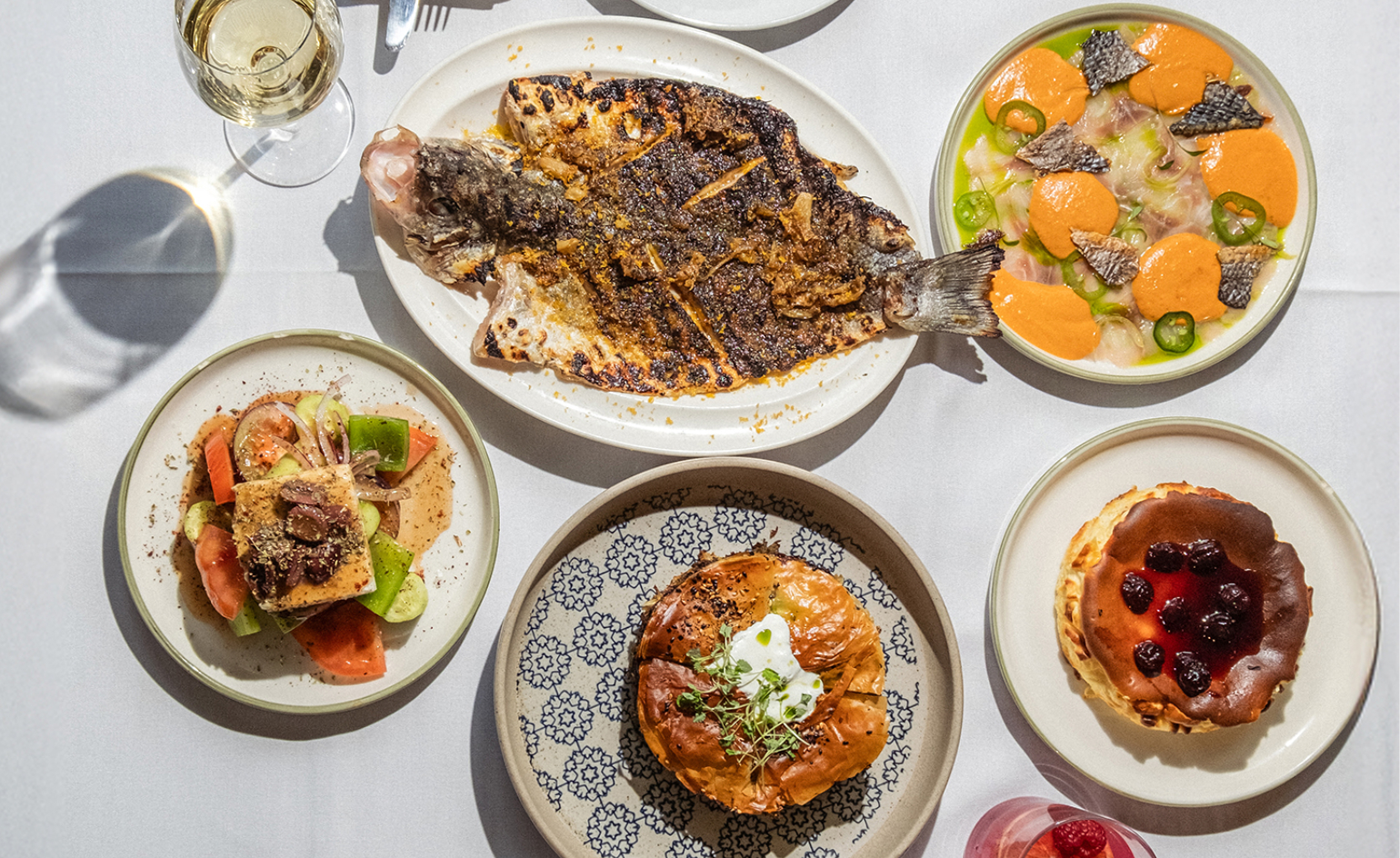 Dining at Pyrá feels like a Mediterranean kiss on both cheeks
Designed by House of Dré, this Lonsdale Road addition dishes up an enticing fusion of Greek and Spanish cooking
By Sofia de la Cruz
-
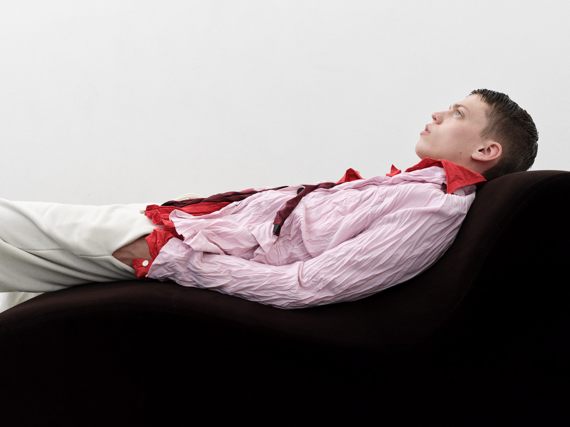 Creased, crumpled: S/S 2025 menswear is about clothes that have ‘lived a life’
The S/S 2025 menswear collections see designers embrace the creased and the crumpled, conjuring a mood of laidback languor that ran through the season – captured here by photographer Steve Harnacke and stylist Nicola Neri for Wallpaper*
By Jack Moss