Match maker: Yorgo & Co’s newest endeavour is a happy marriage of digital and print
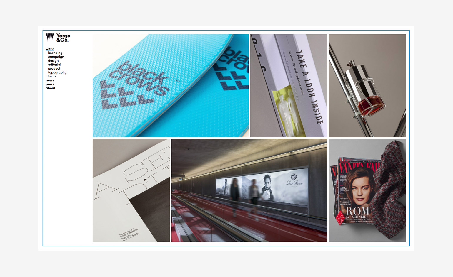
In the 20 years since starting his studio, art director and designer Yorgo Tloupas has never had a website to showcase his work. It's an admission that come as a shock to today’s increasingly digitally devoted creative community, but the explanation behind Tloupas’ lack of online presence was simple. ‘I basically couldn't find the time in all those years, as projects kept on coming,’ the designer explains, also adding how, business-wise, he didn’t think it was necessary to have a digital display of his work.
‘I've always had my design work visible through the magazines I've art directed [GQ France, Libération, Vanity Fair France], or the ones I started [car magazine Intersection].’ Things are set to change this month at Yorgo & Co, with the launch of a new website showcasing the studio’s many creative highs. He says, ‘The website serves as a comprehensive archive, from my early work to all the interviews I've given, via countless small projects, hidden in the clients section.’
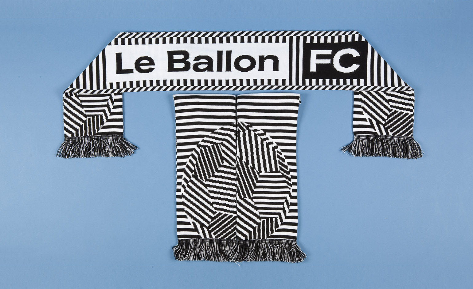
Yorgo & Co created the visual identity for Le Ballon, a pop-up bar launched during the 2014 FIFA World Cup
These include Tloupas’ Wallpaper* Handmade project – a flask designed in collaboration with Martell (he’s also responsible for the French cognac brand’s visual identity) – as well as the branding for ski label Black Crows, and collateral projects for Parisian concept store Colette. Throughout his two decades in business, Tloupas has collaborated with the creative industry's most notable names, from Ramdane Touhami to Noé Duchaufour-Lawrance, and worked across fashion, design and hospitality.
Tloupas isn’t completely abandoning his preference for analogue, however, as the Yorgo.co domain will be accompanied by a publication that replicates the website’s imprint. ‘It could be said that all of this was just a pretext to launch another magazine, titled Publication,’ he quips. Publication will also explore new printing techniques, with a perforated plastic cover, playing with the codes of the Op Art movement, a recurring visual reference in the studio’s work. ‘Ironically, as I've always avoided web-only projects,’ concludes Tloupas: ‘I couldn't help but to print something to celebrate this digital achievement!’
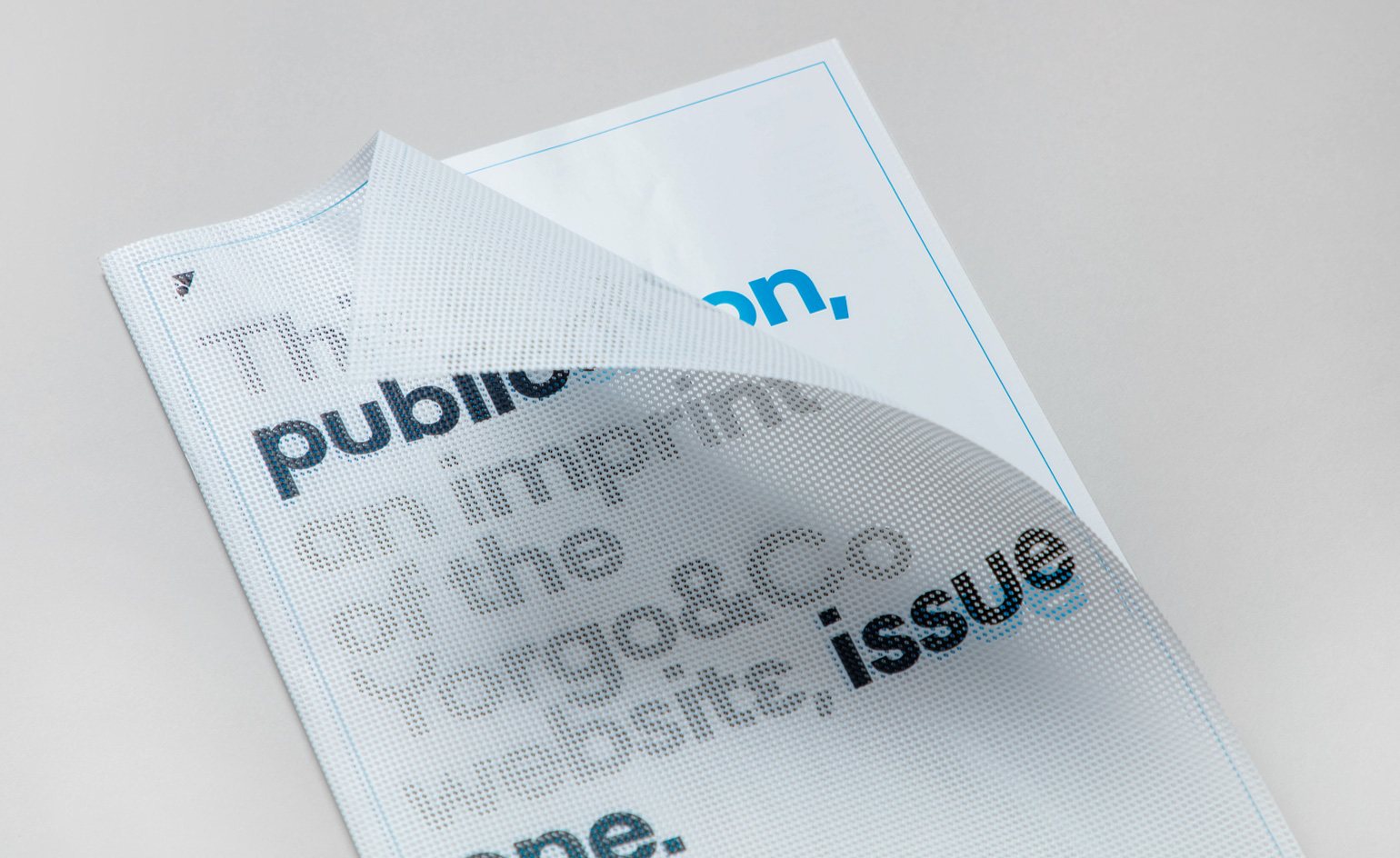
The website is accompanied by a publication that explores new printing techniques, complete with a perforated plastic cover.
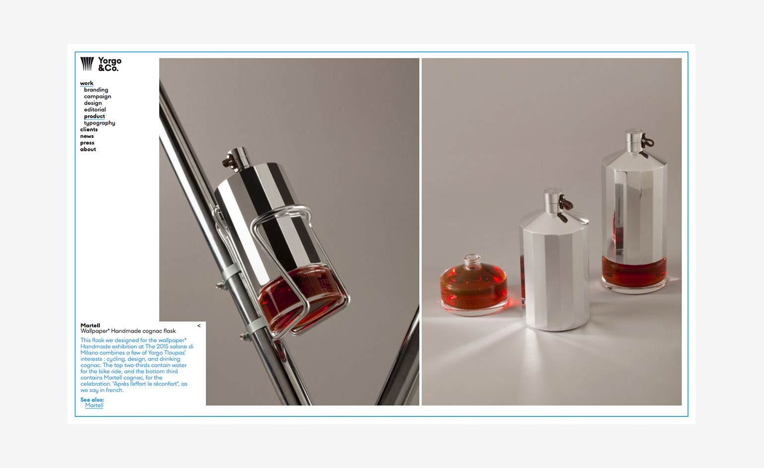
Among the projects showcased on the new online portal is a bike flask created in collaboration with Martel for Wallpaper* Handmade in 2015

In 2016, the studio worked on Loro Piano’s first advertising campaign in 10 years.
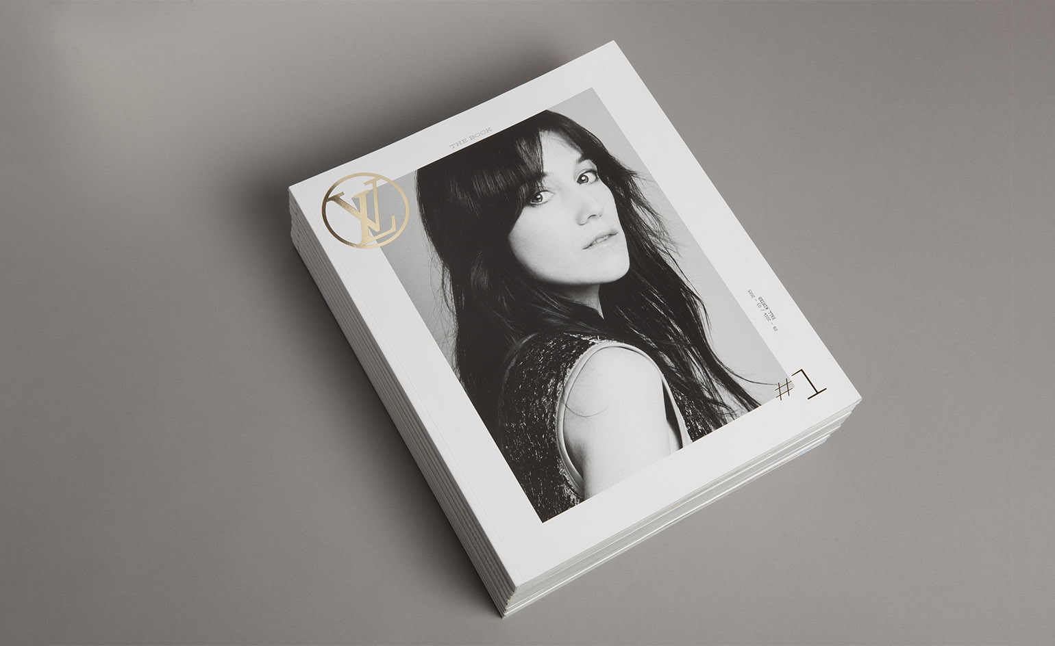
The team also worked on the visual identity for the biannual Louis Vuitton magazine...
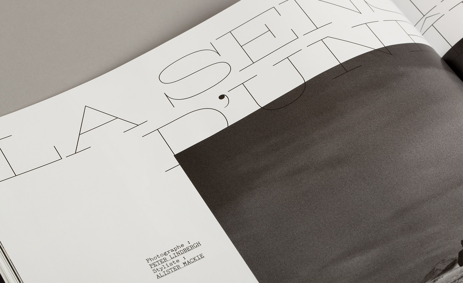
...creating two families of typefaces in collaboration with Production Type.
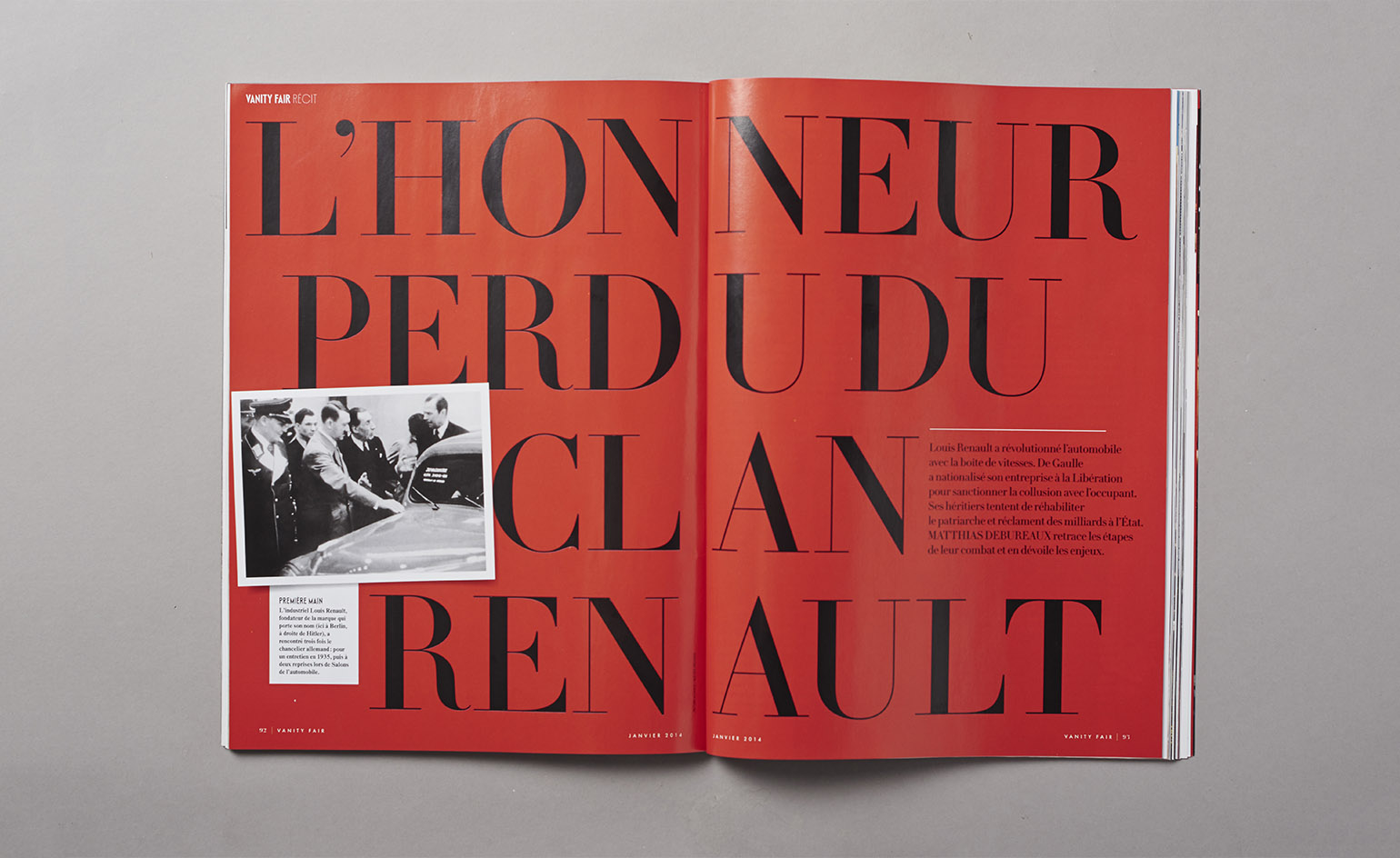
Yorgo & Co’s clients include Vanity Fair France.
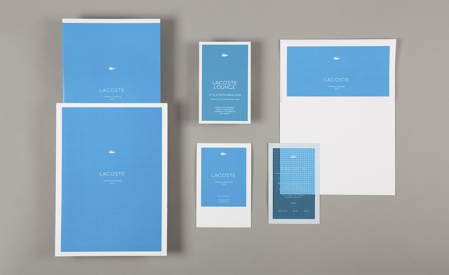
The studio devised the swimming pool-inspired invitations for Lacoste’s S/S 2010 show.
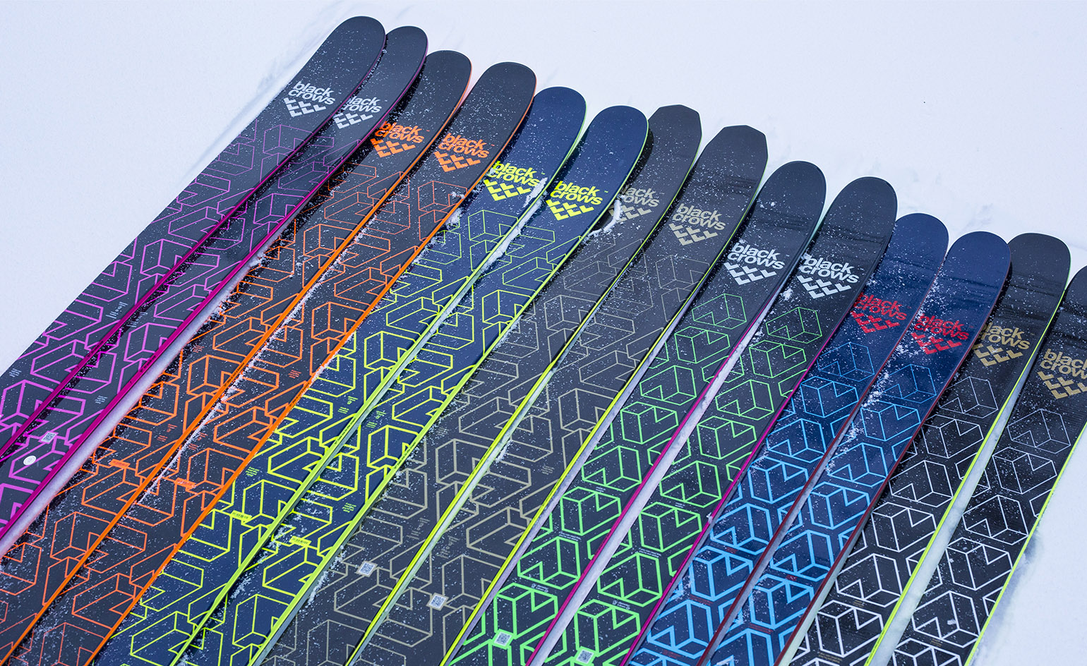
Since 2007, the studio has been working on the branding for ski label Black Crows, with a logo based on a bird-like shape.
INFORMATION
For more information, visit the Yorgo & Co website
Wallpaper* Newsletter
Receive our daily digest of inspiration, escapism and design stories from around the world direct to your inbox.
Rosa Bertoli was born in Udine, Italy, and now lives in London. Since 2014, she has been the Design Editor of Wallpaper*, where she oversees design content for the print and online editions, as well as special editorial projects. Through her role at Wallpaper*, she has written extensively about all areas of design. Rosa has been speaker and moderator for various design talks and conferences including London Craft Week, Maison & Objet, The Italian Cultural Institute (London), Clippings, Zaha Hadid Design, Kartell and Frieze Art Fair. Rosa has been on judging panels for the Chart Architecture Award, the Dutch Design Awards and the DesignGuild Marks. She has written for numerous English and Italian language publications, and worked as a content and communication consultant for fashion and design brands.
-
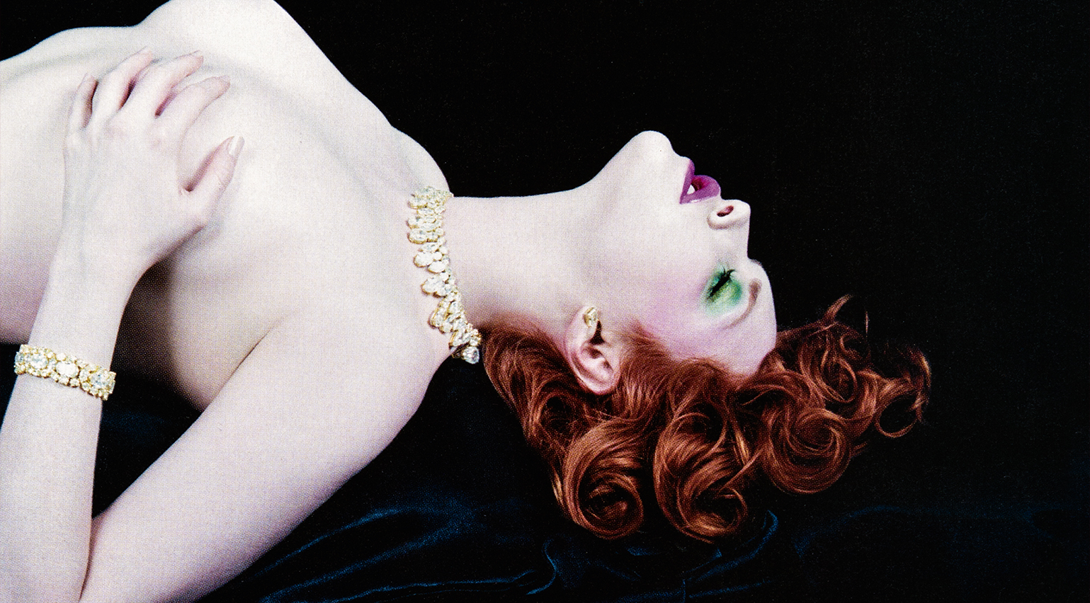 Sex, scent and celebrity: what perfume ads of the 2000s reveal about consumer culture today
In All-American Ads of the 2000s, the latest instalment of Taschen’s book series chronicling print advertising across ten decades, a section on perfume is a striking precursor for consumerism in the age of social media
-
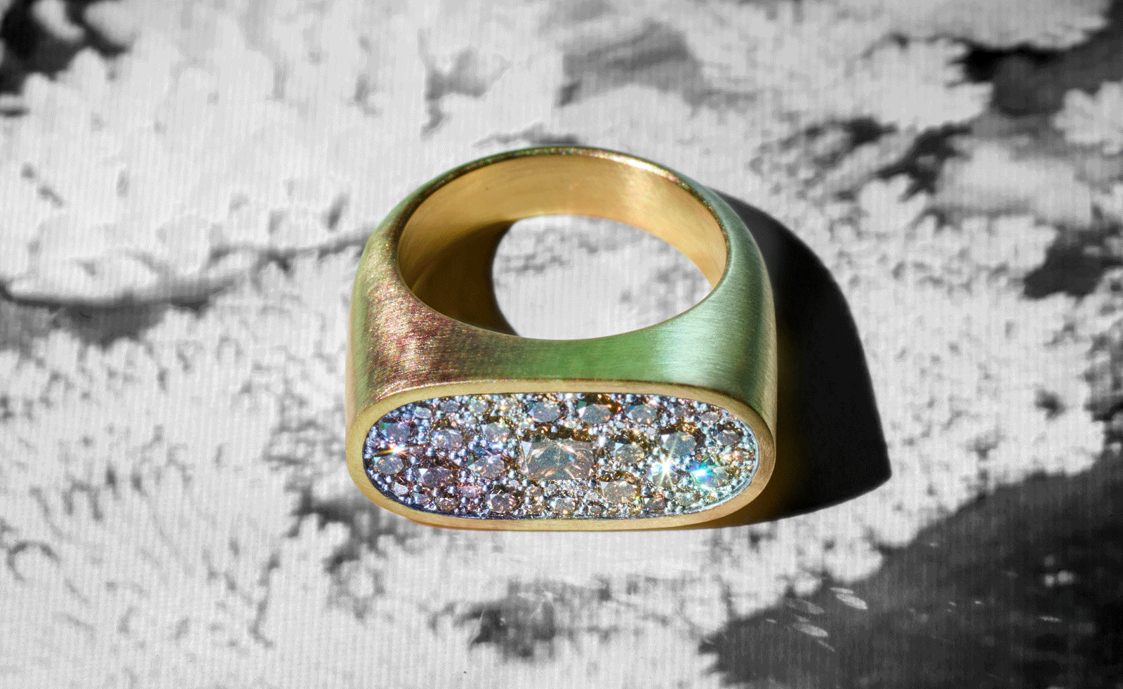 Shola Branson draws from the antique and modern for his must-have jewellery pieces
Shola Branson's jewellery in SMO gold combines a range of eclectic influences
-
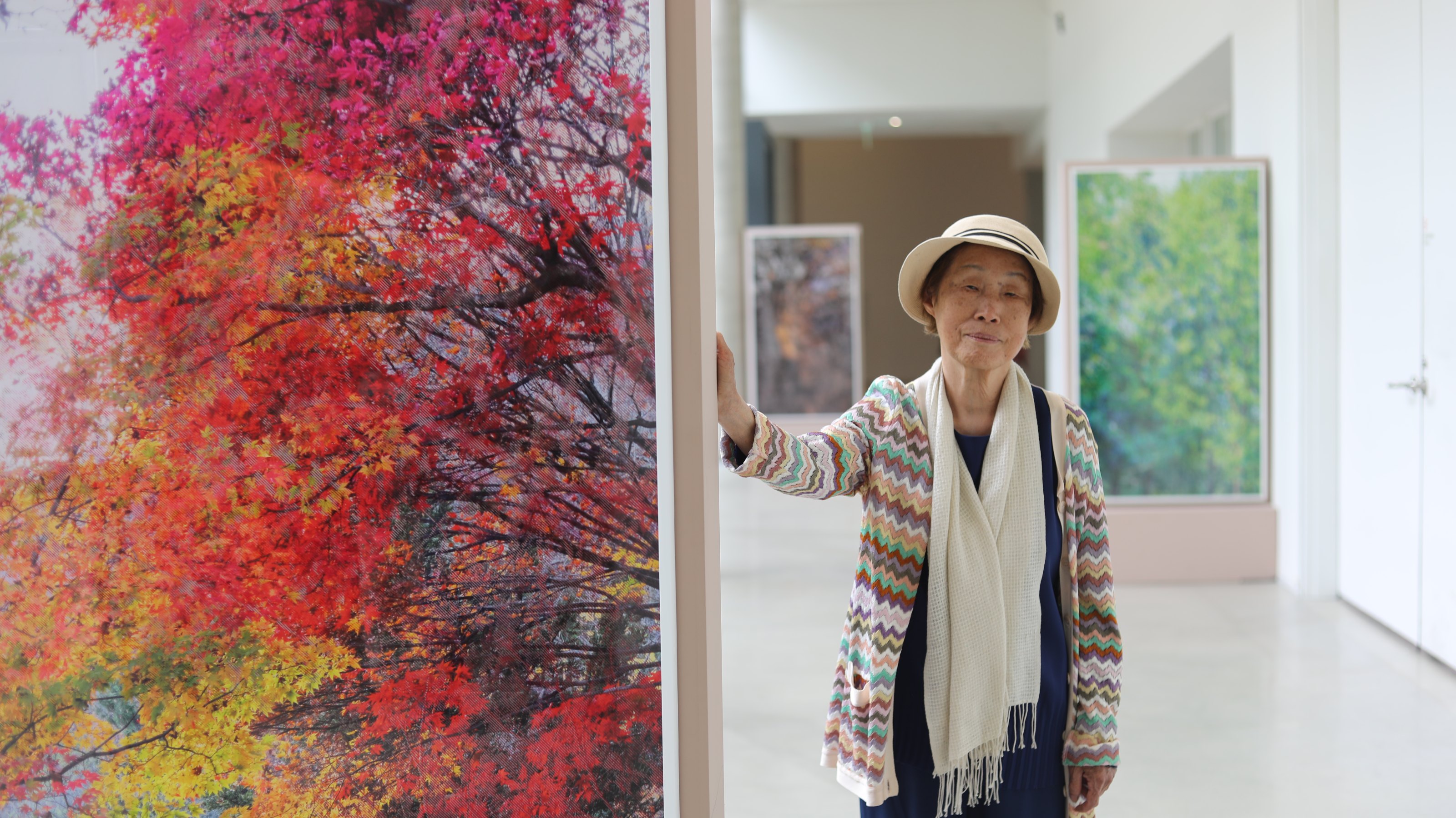 The exquisite landscape architecture of Jung Youngsun is celebrated at SMAC in Venice
Timed to coincide with the Venice Biennale, the new San Marco Art Centre opened with a show on the work of South Korean landscape architect Jung Youngsun
-
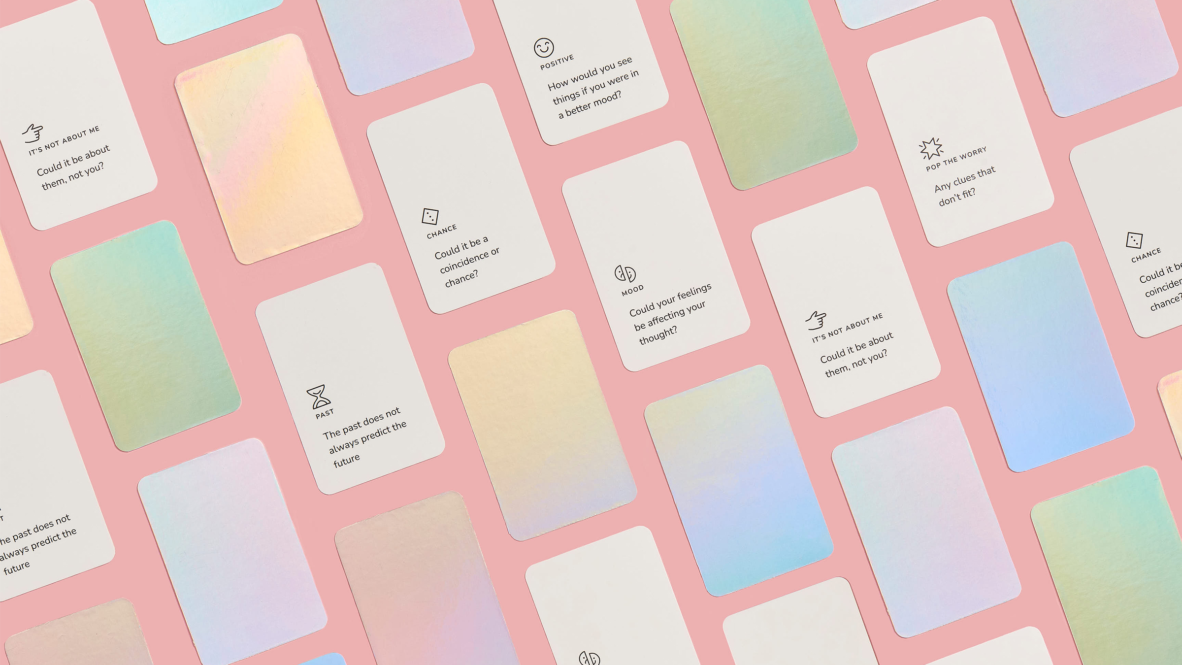 SlowMo eases digital mental health therapy into daily life
SlowMo is a new mental health support app developed by design studio Special Projects and King’s College London that uses visual prompts to combat unhelpful thoughts
-
 Mark Dalton on helping people navigate a pandemic through design
Design Emergency began as an Instagram Live series during the Covid-19 pandemic and is now becoming a wake-up call to the world, and compelling evidence of the power of design to effect radical and far-reaching change. Co-founders Paola Antonelli and Alice Rawsthorn took over the October 2020 issue of Wallpaper* – available to download free here – to present stories of design’s new purpose and promise. Here, Alice Rawsthorn talks to creative director Mark Dalton
-
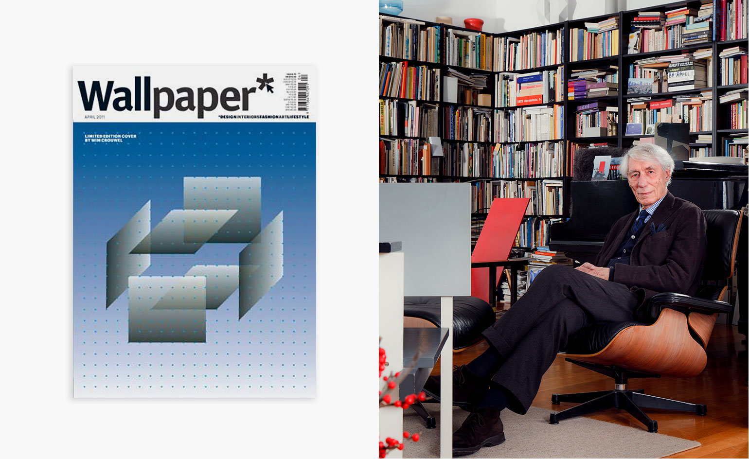 In memoriam: Wim Crouwel (1928-2019)
 -
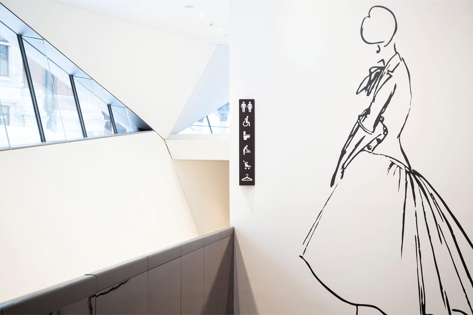 V&A Museum’s new map navigates seven miles of gallery space
Anyone who has ever found themselves waylaid in the V&A will welcome the addition of a new map, and nearly 400 signs, comprising 60 totems, 130 hanging signs as well as an entirely new signage at gallery thresholds
-
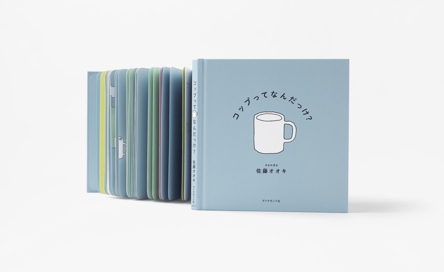 Nendo’s first graphic picture book depicts how design ideas are born
 -
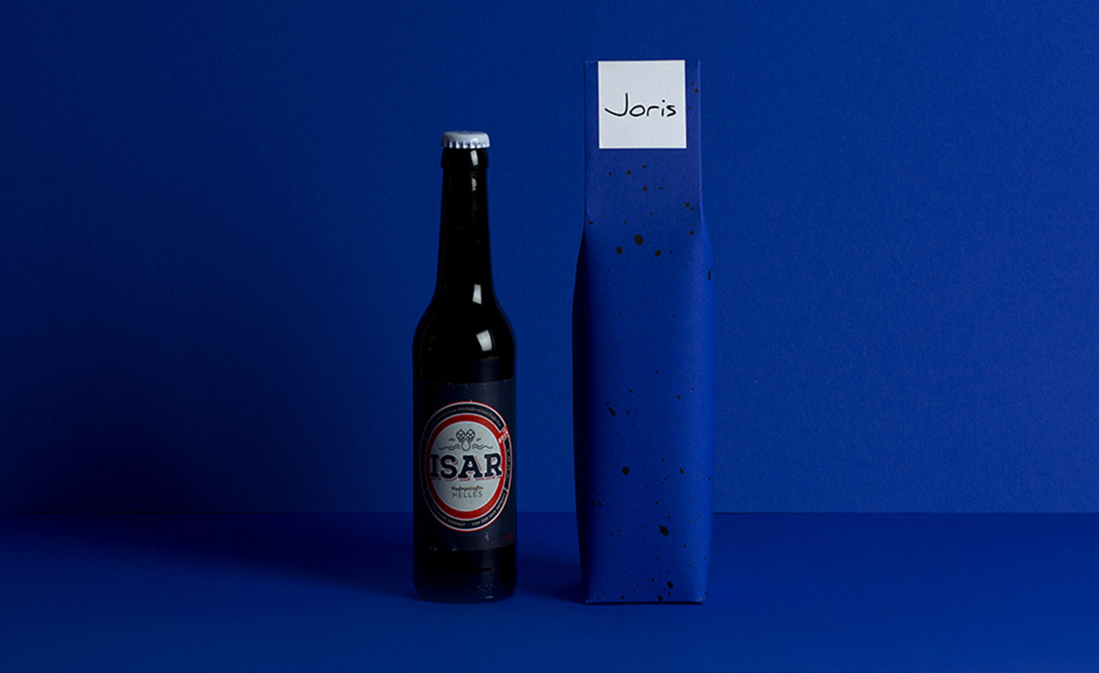 Making paper: traditional Japanese gift wrapping gets a modern German twist
 -
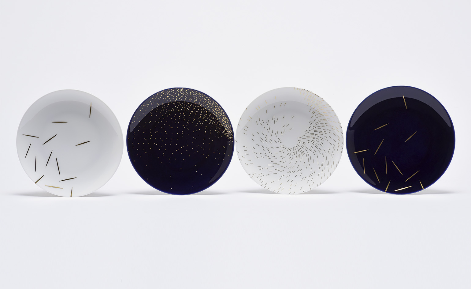 Frozen motion: Philippe Apeloig makes his mark on porcelain
 -
Man of letters: Anthony Burrill’s guide to creative inspiration packs a punch
