Space out: a history of NASA’s graphic design
‘The Worm’ is a showcase of NASA's iconic logos – from the original 1974 manual, all the way to up to its eventual banishment in the early 1990s
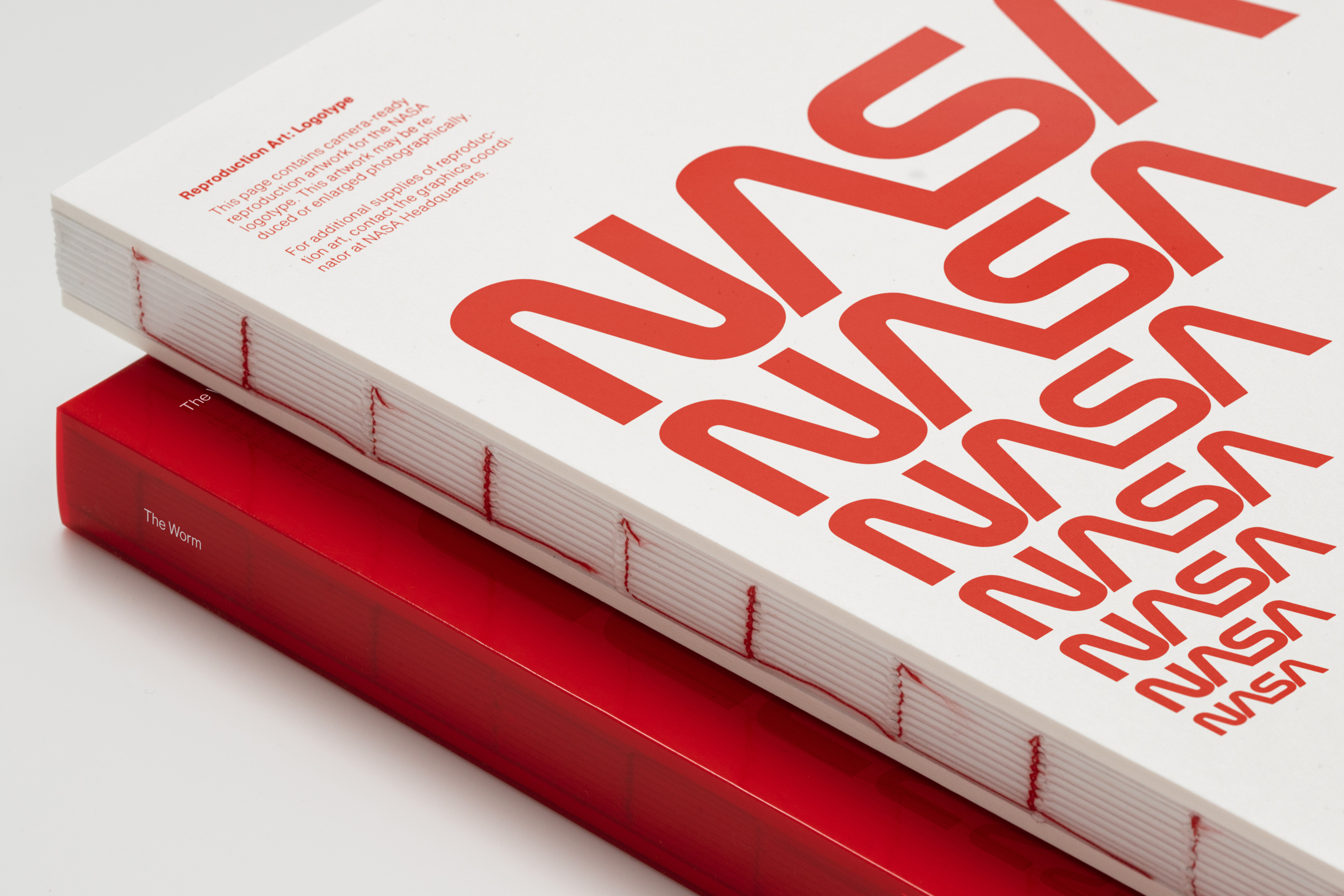
Back in April 2020, NASA announced that it was bringing back ‘The Worm’, the fabled 1970s-era logo that graced some of the most significant space expeditions of the decade.
In those days, the agency’s serious grip on detail didn’t necessarily extend to branding. When designers Richard Danne and Bruce Blackburn created the new logo in 1974 and its accompanying ‘NASA Graphics Standards Manual’, they found the engineering-driven organisation wasn’t especially bothered about how to present themselves.
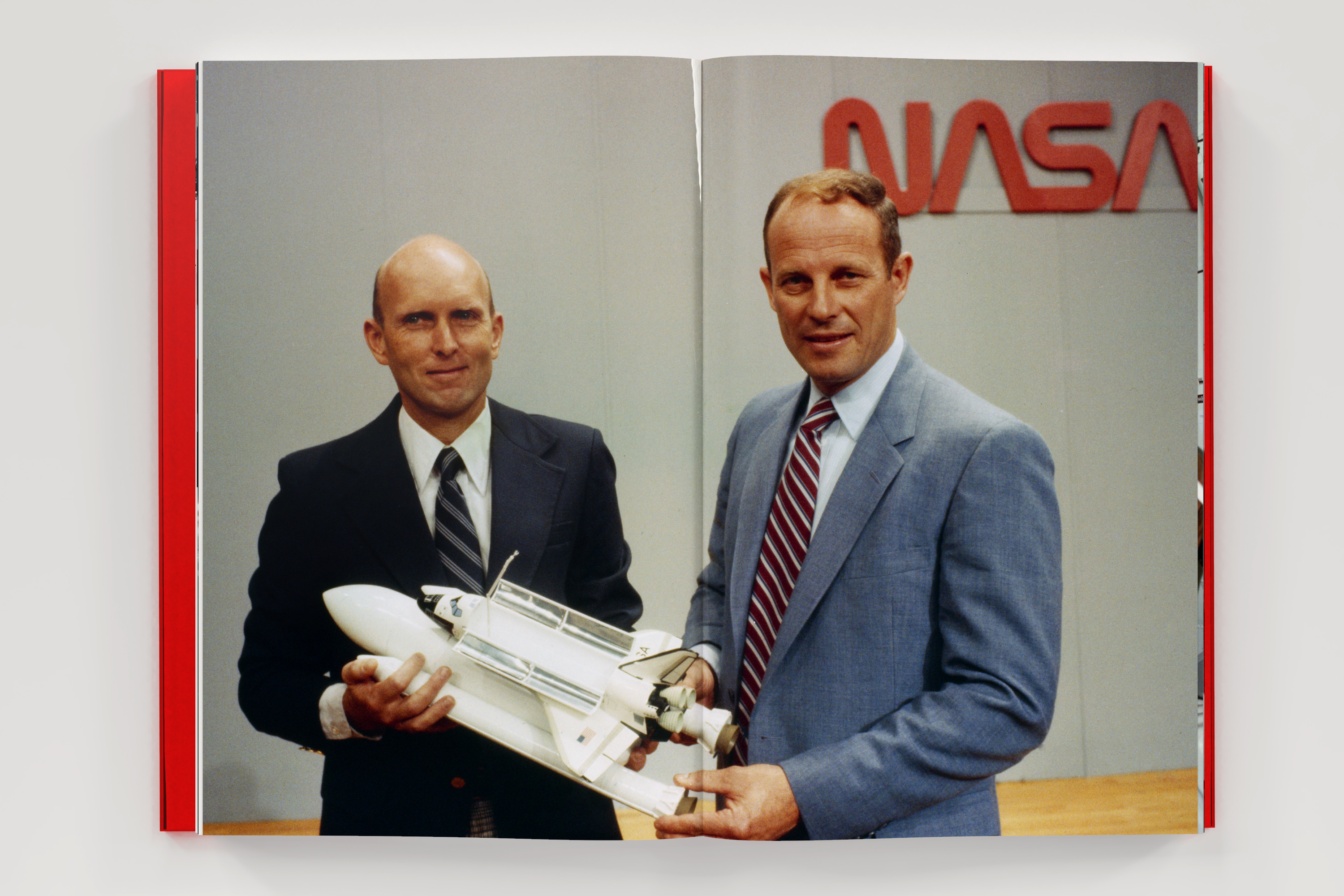
Danne and Blackburn’s meticulous guide to how the logo, typography and graphic sensibility should be applied across everything from confidential memos to minibuses and, of course, spaceships, wasn’t enthusiastically followed. The design industry still loved it though and in 2015 the GSM was given a lavish reprint back in 2015 by Standards Manual, a publishing house set up by Jesse Reed and Hamish Smyth from New York design agency Order. Reed and Smyth were long-time admirers of the golden age of graphic design standards manuals, back when these were the corporate equivalents of holy tablets, and NASA’s was one of the best.
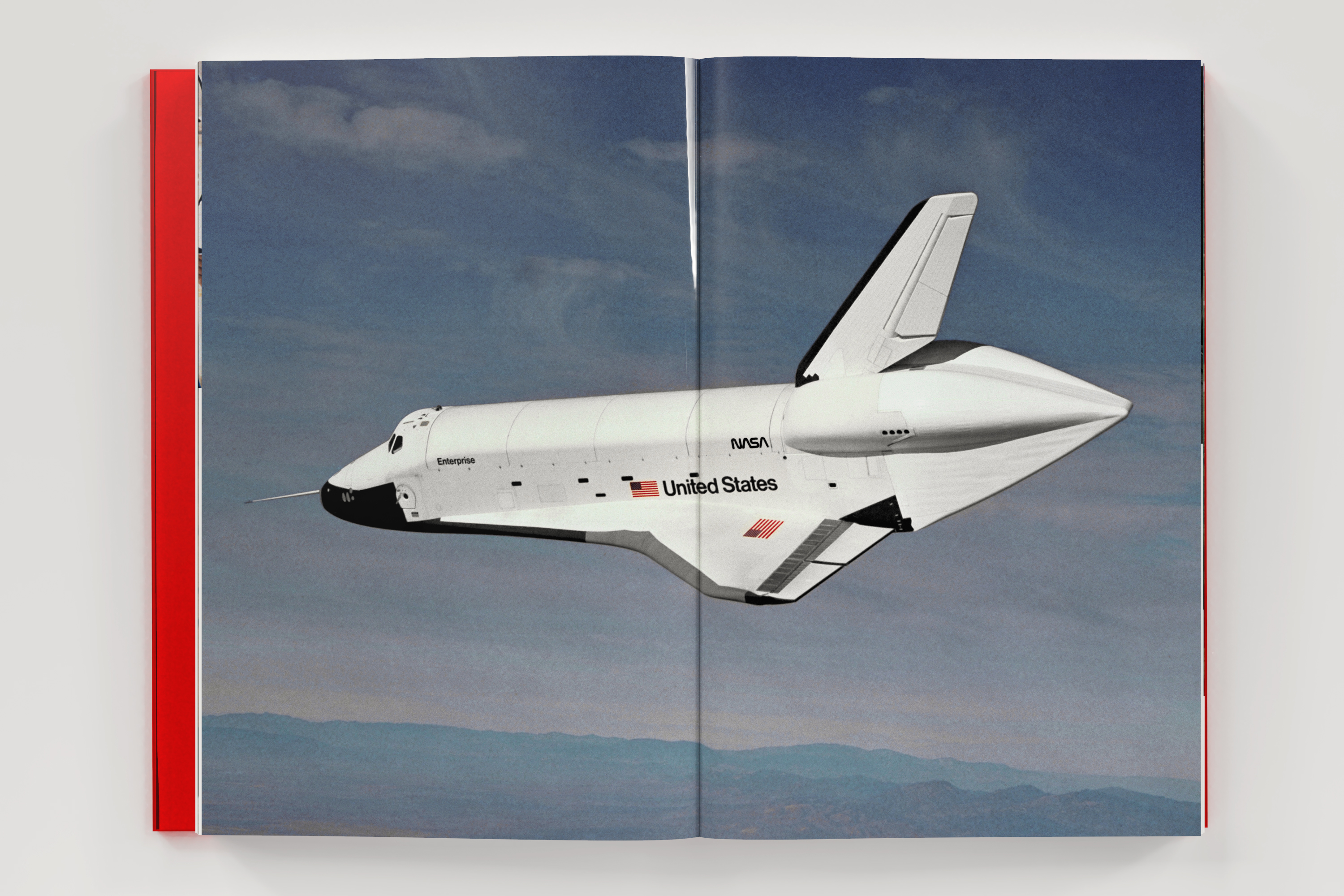
Now as a follow-up to the reprint, Standards Manual are creating another showcase trawl through the NASA archive. ‘The Worm’ traces the application of the snaking logo that was the subject of the original 1974 manual, all the way up to its eventual banishment in the early 90s. A simple, timeless graphic, the Worm conjured up both far futurism and the all-embracing sophistication of a huge, benevolent corporate identity. And there’s a happy ending, as the logo made a triumphant return on the side of the SpaceX Crew Dragon launched at the end of May, as well as on the spacesuits of astronauts Robert Behnken and Douglas Hurley.
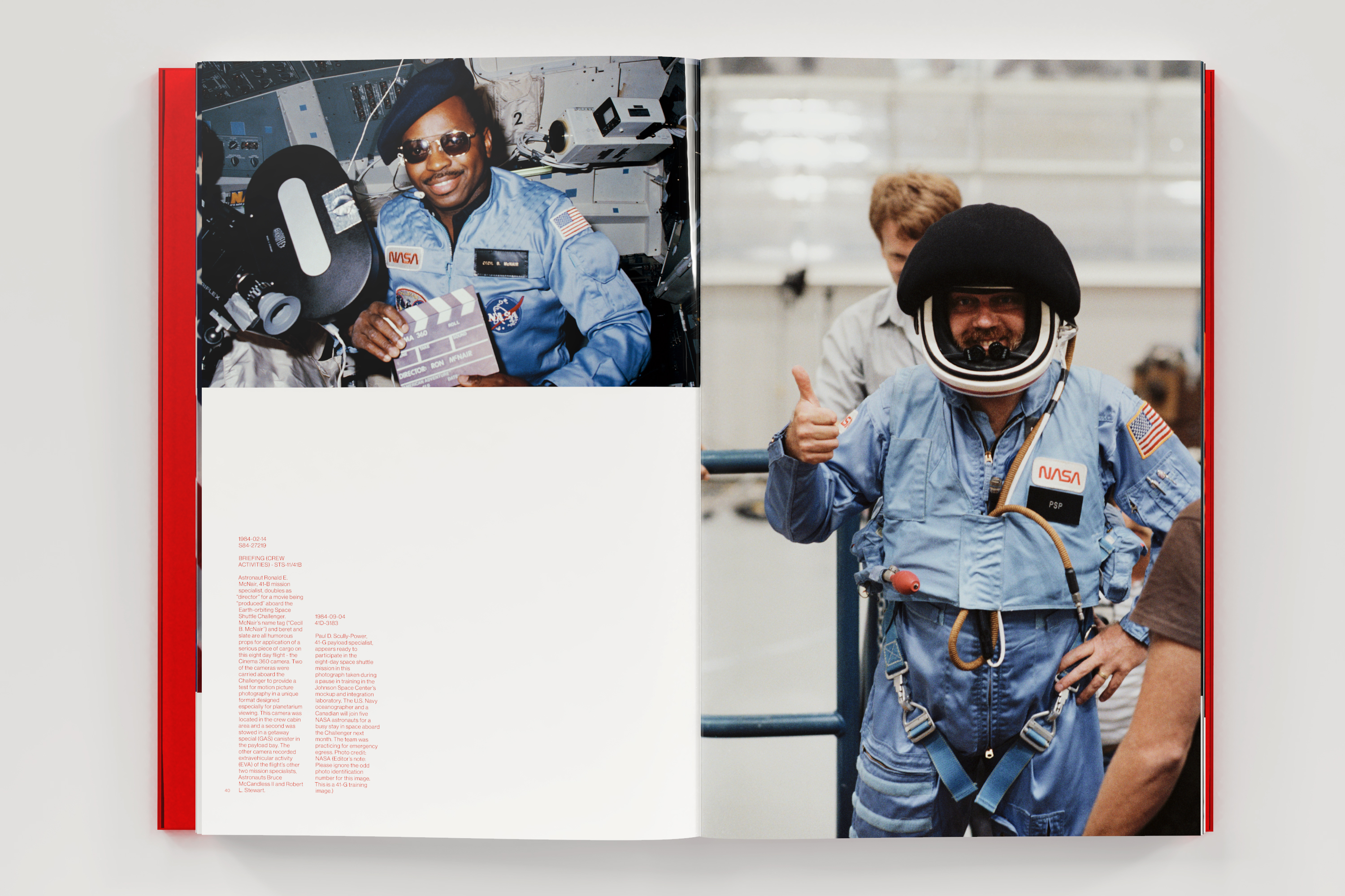
Space is more politicised and commercialised than ever before. The number of countries capable of launching their satellites are now competing with private companies looking to monetise the everyday ways in which we use satellite-based communications and location services. NASA is still committed to pushing ever further into the solar system, only this time it helps to have a distinct identity that stands out from the crowd. With over 300 pictures of the Worm in action, on the ground as well as in space, the monograph is a fine reminder of how to do corporate branding on a truly interstellar scale.
INFORMATION
The Worm is available to pre-order through Counter-Print, £52
www.counter-print.co.uk
order.design
standardsmanual.com
Wallpaper* Newsletter
Receive our daily digest of inspiration, escapism and design stories from around the world direct to your inbox.
Jonathan Bell has written for Wallpaper* magazine since 1999, covering everything from architecture and transport design to books, tech and graphic design. He is now the magazine’s Transport and Technology Editor. Jonathan has written and edited 15 books, including Concept Car Design, 21st Century House, and The New Modern House. He is also the host of Wallpaper’s first podcast.
-
 Meet Lisbeth Sachs, the lesser known Swiss modernist architect
Pioneering Lisbeth Sachs is the Swiss architect behind the inspiration for creative collective Annexe’s reimagining of the Swiss pavilion for the Venice Architecture Biennale 2025
By Adam Štěch
-
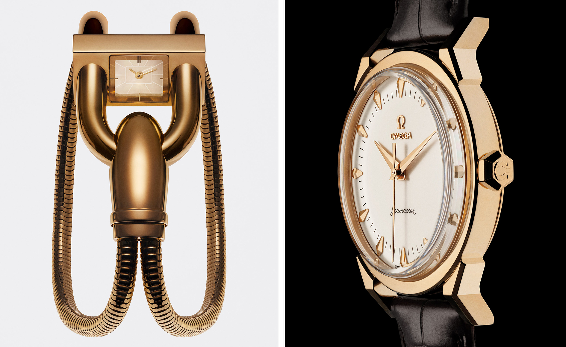 A stripped-back elegance defines these timeless watch designs
Watches from Cartier, Van Cleef & Arpels, Rolex and more speak to universal design codes
By Hannah Silver
-
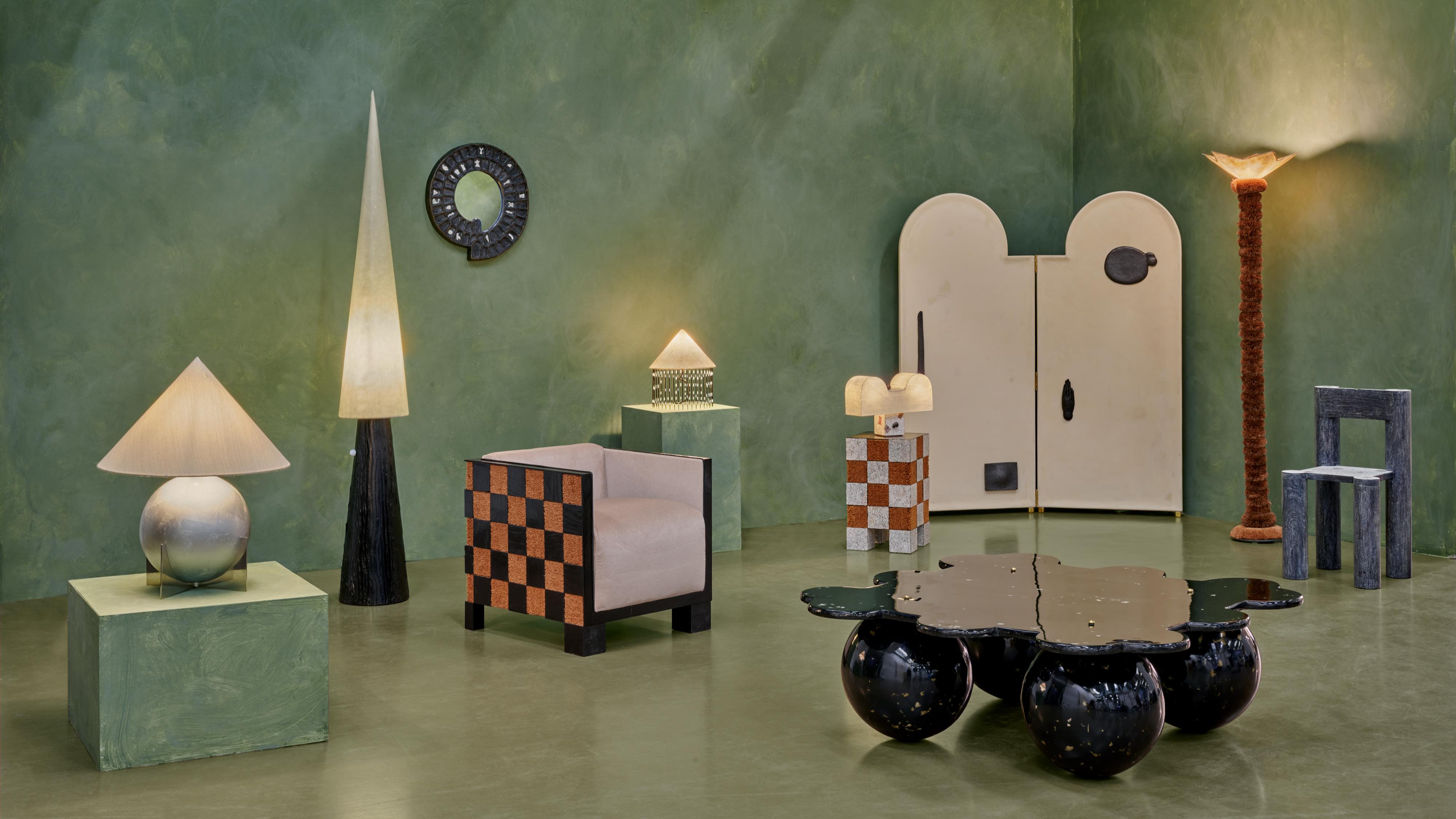 Postcard from Brussels: a maverick design scene has taken root in the Belgian capital
Brussels has emerged as one of the best places for creatives to live, operate and even sell. Wallpaper* paid a visit during the annual Collectible fair to see how it's coming into its own
By Adrian Madlener
-
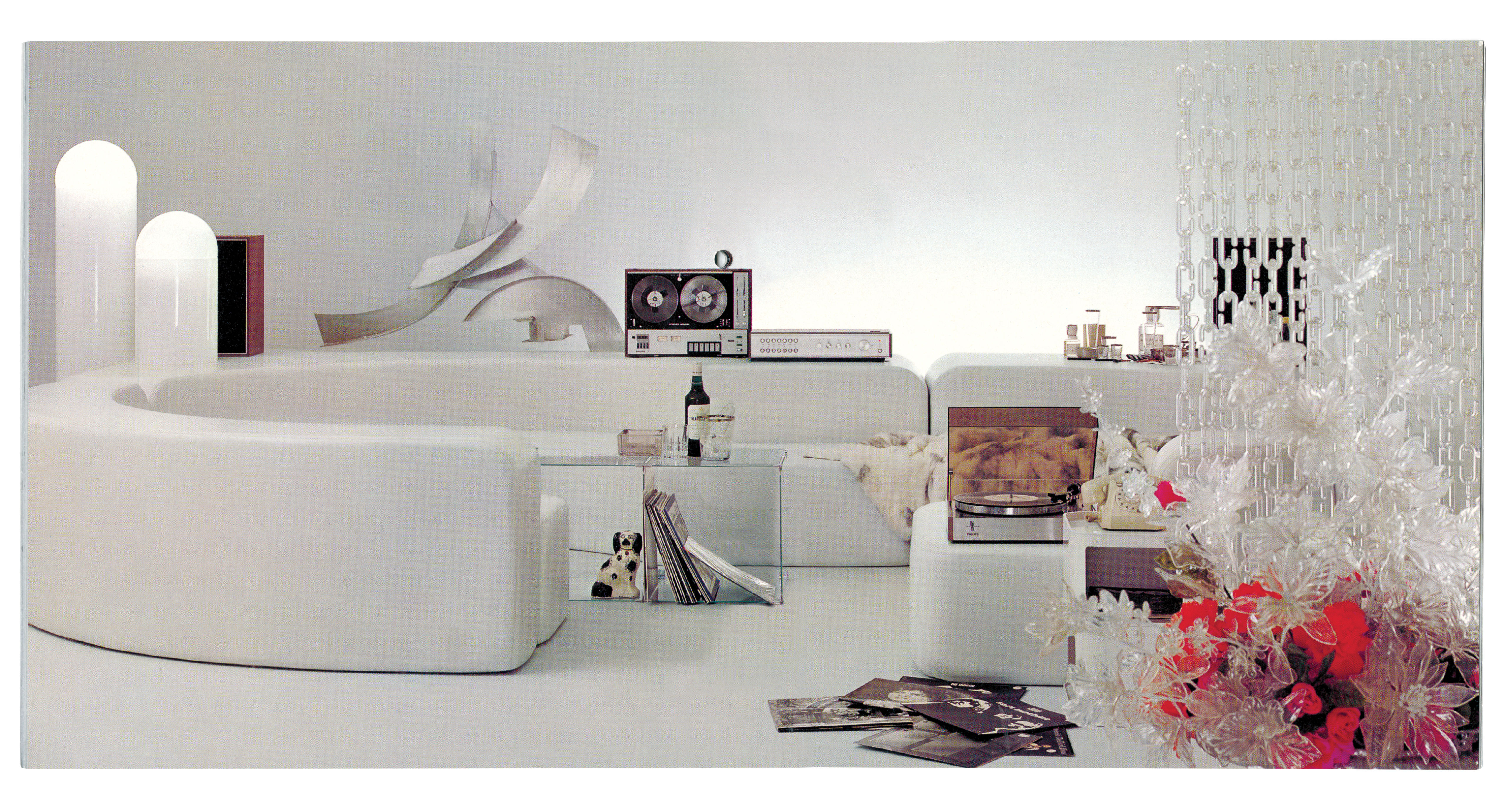 ‘Audio Erotica’ charts home audio through promotional graphics and imagery
‘Audio Erotica: Hi-Fi Brochures 1950s-1980s’ is a playful survey of three decades’ worth of design for listening
By Jonathan Bell
-
 Deyan Sudjic’s new book explores the appeal of analogue technology
‘Analogue: A Field Guide’ by Deyan Sudjic delves into the design history of hundreds of iconic pieces of personal tech
By Jonathan Bell
-
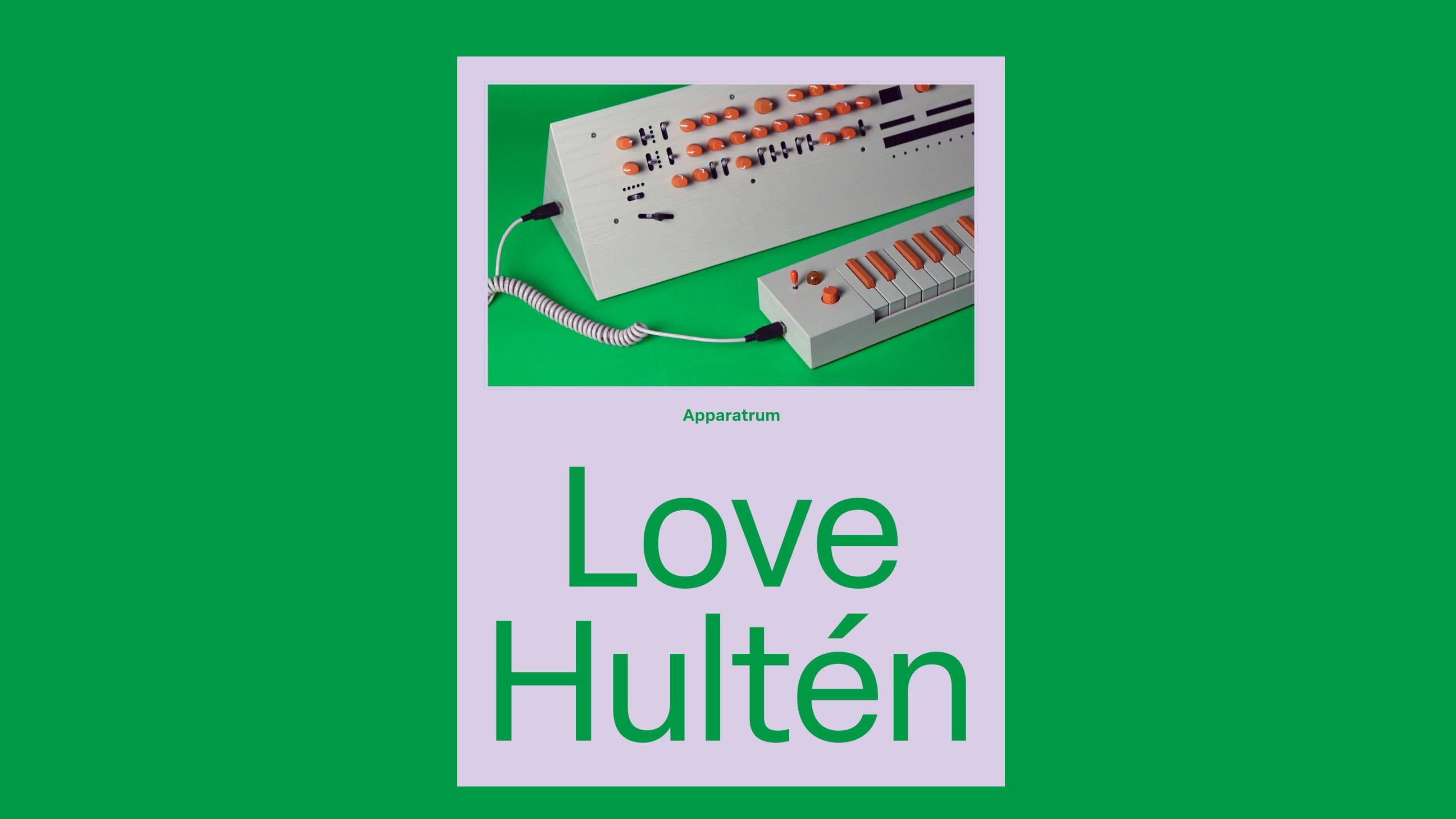 ‘Apparatrum’ is a book exploring the craft of synthesist and inventor Love Hultén
‘Apparatrum’ charts the life and work of Swedish craftsman Love Hultén – you’ll have to move fast to secure the limited-edition version
By Jonathan Bell
-
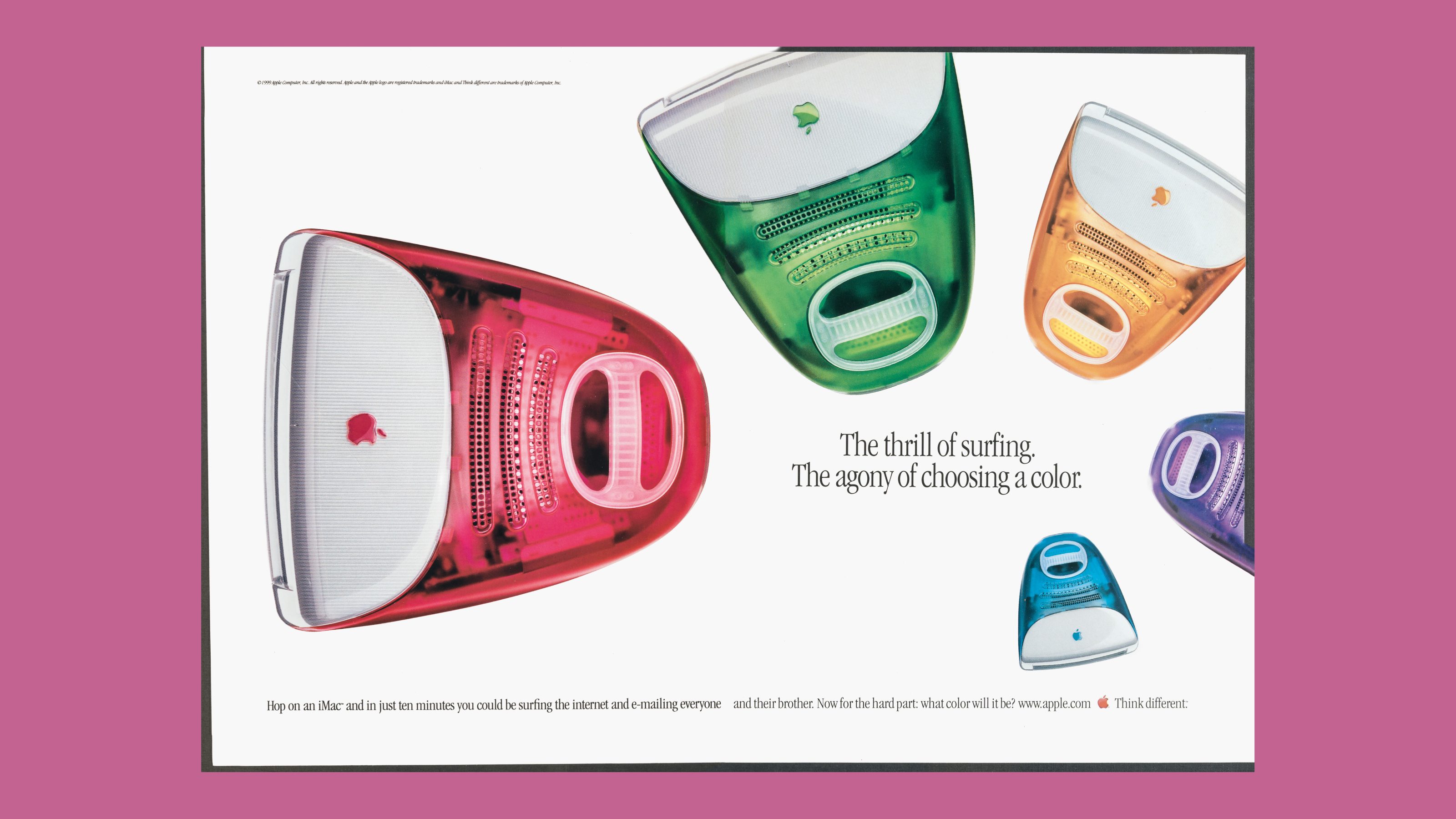 New Taschen book ‘The Computer’ is a monumental survey
‘The Computer’ from Taschen is a richly illustrated history of society’s ever-evolving relationship with the silicon chip
By Jonathan Bell
-
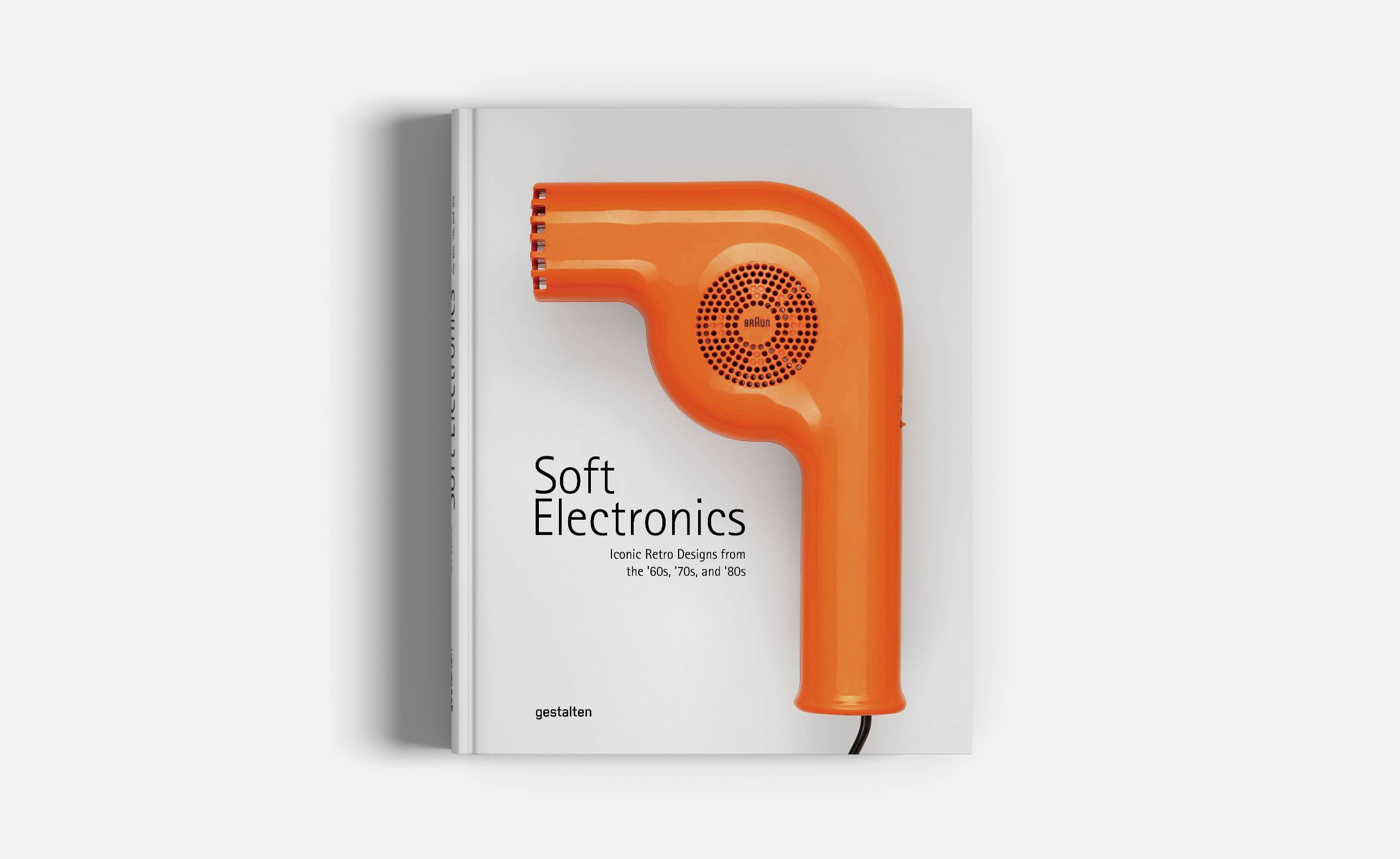 ‘Soft Electronics’: this polychromatic old consumer tech will blow you away
Vintage electronics and obsolete appliances are explored in all their curvy, colourful and quirky glory in a new book, Soft Electronics, by Dutch designer Jaro Gielens
By Jonathan Bell
-
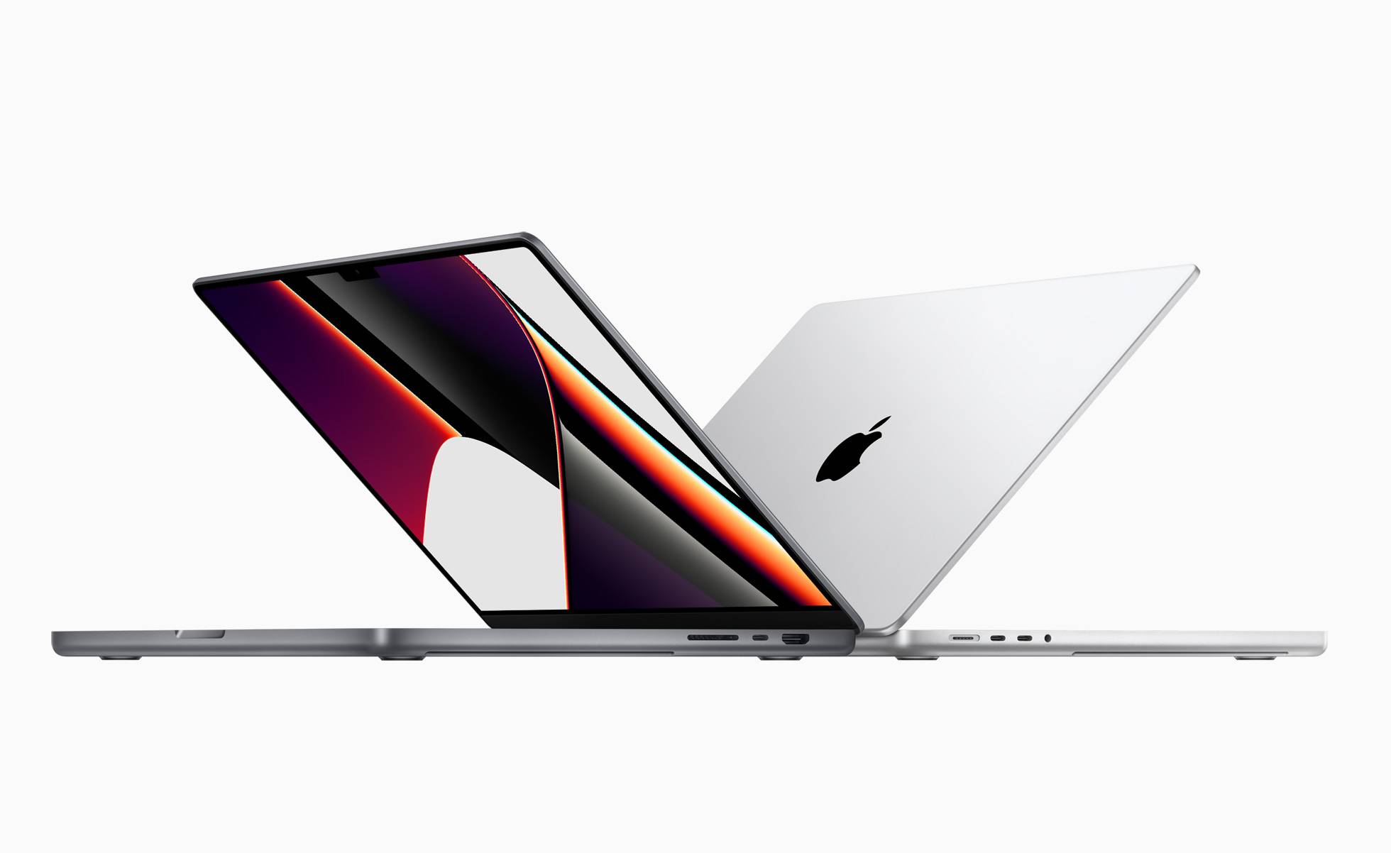 Key design innovations in the new Apple Watch, iPhone, and MacBook Pro
Apple’s latest round of innovations delivers a wealth of fingertip functionality – here’s what to expect from the Apple Watch 7, iPhone 13 Pro, and MacBook Pro
By Nick Compton
-
 New books: how designers see the world
Our round-up of new books spans James Dyson on his hits and misses, Stephen Bayley on the combustion age, an exploration of vintage synthesisers, and an axe lover’s handbook
By Jonathan Bell
-
 Supercharge your productivity with Microsoft Surface Book 3
Microsoft's laptop-tablet hybrid combines the full power of a laptop with the detachable portability of a tablet
By Jonathan Bell