Aesop’s ethereal stores: explore the brand’s design philosophy in a short film
Perfectly integrated into the local urban fabric, Aesop’s three new stores showcase the brand’s powerful yet pared-back design philosophy
Receive our daily digest of inspiration, escapism and design stories from around the world direct to your inbox.
You are now subscribed
Your newsletter sign-up was successful
Want to add more newsletters?
From Madrid to Makati, a modest amber bottle with a vanilla-toned label, filled with a woody, aromatic elixir, has become an emblem of good taste. At the heart of Australian skincare company Aesop is an exacting design ethos that gives form to something that is, in its essence, ethereal.
When Marianne Lardilleux, director of global retail design, joined the company in 2016 as store design manager for the Americas, she had spent six years working for luxury behemoth LVMH. Aesop helped reactivate her focus on a more sustainable, conscious way of doing things. ‘I had a lot of Aesopian things in my home already, but I realised that it is mostly about an attitude; how you welcome people, adding lemon to a jug of water, or sourcing local flowers,’ she says. ‘It sounds simple, but this is the philosophy we are in.’
Watch our film: Marianne Lardilleux on Aesop stores
Beyond skincare, Aesop promotes a sense of wellbeing, and its stores, for which Lardilleux and her team of 43 are responsible, offer a haven of peace in a chaotic world. When the first Aesop signature store opened in the Melbourne suburb of St Kilda in 2003, much had been learned from Emeis, the hair salon opened by Aesop’s founder Dennis Paphitis in Armadale, Victoria, in 1987. There, in a space with matte alabaster walls bathed in natural light, Paphitis blended essential oils into hair products and set about establishing other subtle aesthetic codes to ensure an intimate, sensual ambience. Aesop’s 200-plus standalone stores and 80 counters owe their shape to these principles.
Three new locations open this year: a glimmering space on Rome’s Via del Corso (its launch recently celebrated with a Wallpaper* event), a futuristic store on Broadway, New York, and a serene box in Seochon, northern Seoul, each a candid, expressive and contemporary riff on Aesop’s founding philosophies.
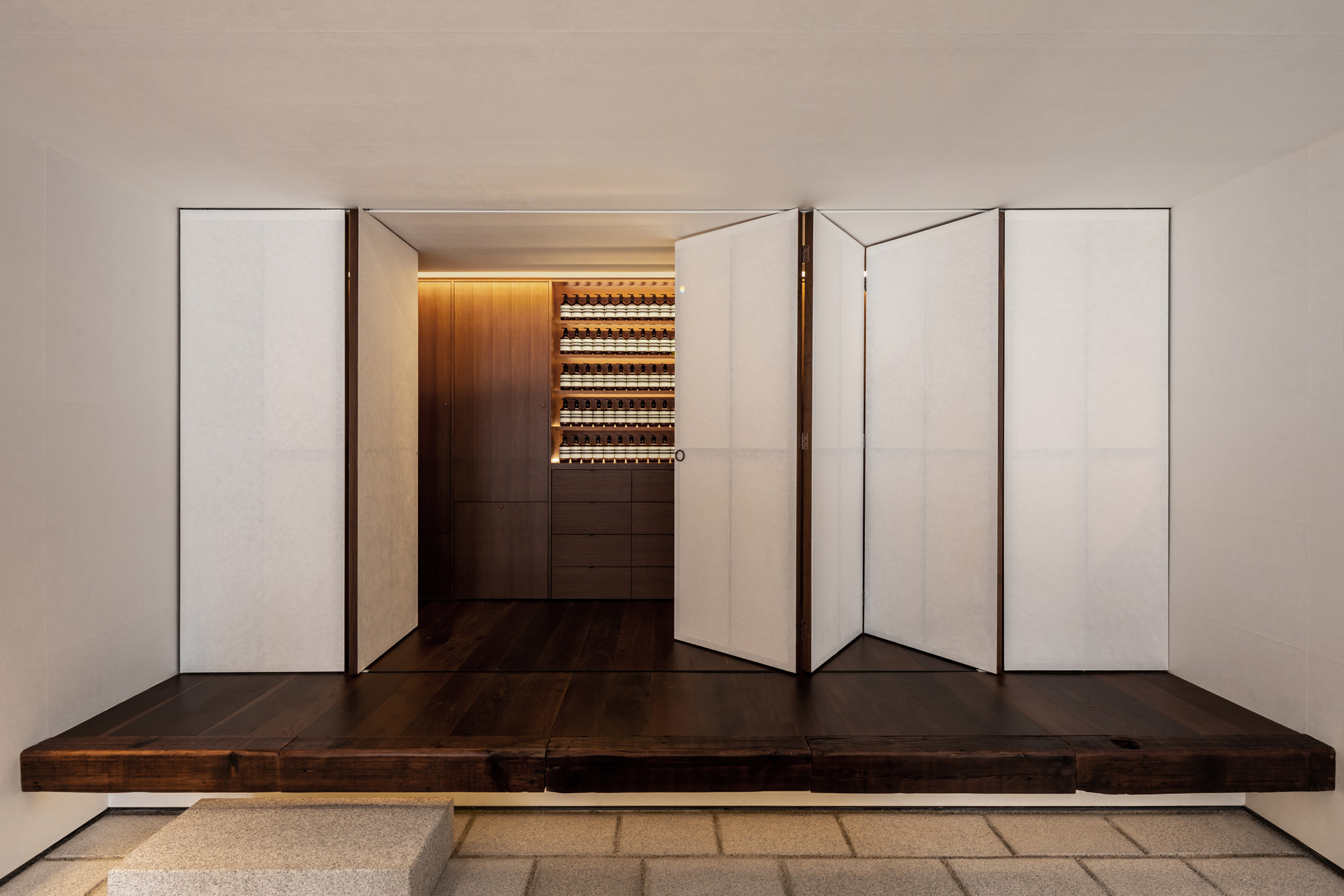
The Seoul store is based on traditional open-sided pavilions and features a series of folding doors and shutters
Recently at a dinner with Lardilleux, Paphitis shared his thoughts about ‘how you should welcome people, how you should place things for people to feel comfortable. The way you treat your employees, the design continuity of what happens behind the scenes as well as on the floor,’ she recalls. For example, what are the right chairs? What is the correct distance between the top and the border of the sink, so it is a comfortable distance to put your hand under it? These have taken decades to get right and are carefully recorded at the brand’s HQ in London and offices around the world, including Paris and Melbourne. If Paphitis is the original composer of Aesop’s graceful retail opera, then Lardilleux is now its maestro conductor.
‘An Aesop environment does not scream out to passers-by; instead, it humbly nestles itself within the block and respectfully presents itself among the cityscape,’ say Cyril Marsollier and Wallo Villacorta, the designers behind the New York NoMad store. The pair met while working in-house for the company in 2016 before leaving to establish their own practice in 2020. ‘Not one aspect of the brand is without intention – everything from carefully designed internal documents to the design of the office environment matters.’ Their own approach is archaeological. ‘First, we try to learn from the buildings and spaces to find a respectful and considered response. We then carefully peel back layers that may have been added over time to reveal the original structure.’ At 1165 Broadway, the duo uncovered century-old iron columns that have become a key feature of their design.
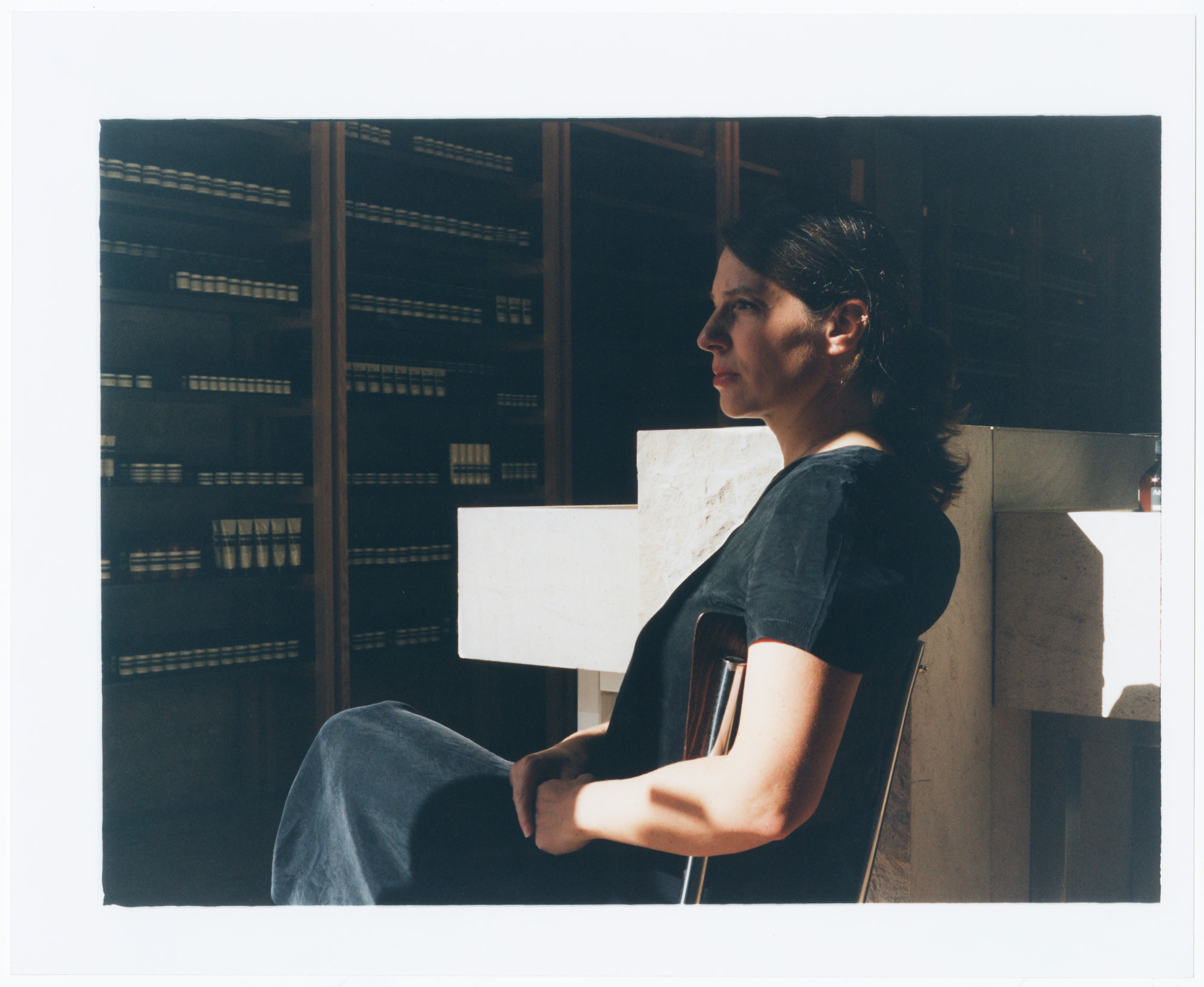
Marianne Lardilleux, Aesop’s director of global retail design, in the brand’s flagship Sentier boutique in Paris, designed by Hugo Haas Studio
Before any architectural projects begin, collaborators are each sent copies of Peter Zumthor’s Atmospheres, Gaston Bachelard’s The Poetics of Space and Jun’ichirō Tanizaki’s In Praise of Shadows. Moreover, the brand’s packaging, teacups and email signature are peppered with philosophical quotations. ‘The briefs I receive are usually loose, with a few functional requirements, but other than that, it’s more or less carte blanche – and full of trust,’ the Swiss architect Jakob Sprenger says. His Rome boutique, opened this summer, is an ode to ancient Roman architectural principles. Each element, from the polished lacquer surfaces to the traditional lime plaster, is in dialogue with the other.
Receive our daily digest of inspiration, escapism and design stories from around the world direct to your inbox.
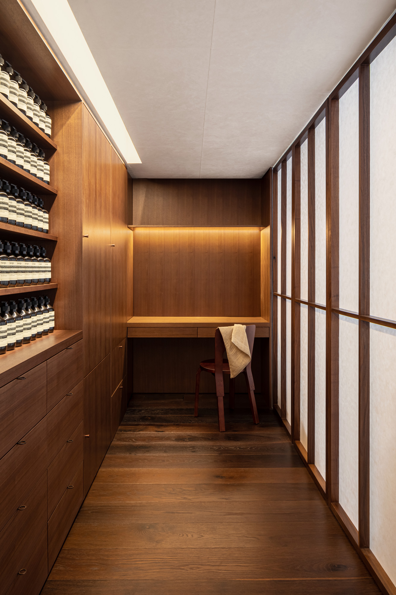
But the Aesopian design principle is more than a soothing colour palette, a brass tap or stone tile. It is an intellectual balance between the material and the mind. Lardilleux says, ‘I think our customer loves to come into our stores because they feel like they are entering their own home, or a space that speaks to something within them. The way we approach retail is to provide a moment for our customer that is outside of their busy life. To offer some intimacy is very important.’ First-time collaborator Samuso Hyojadong was tasked with designing a store for his own neighbourhood, located to the north of Seoul. The space, which opened earlier this year, was inspired by the jeongja, a Korean open-sided pavilion where people come to be surrounded by nature. ‘I wanted the space to immerse people in a meditation, to become unaware of the passage of time,’ Hyojadong says.
The brand’s new Rome store, by Swiss architect Jakob Sprenger, is inspired by ancient Roman architectural principles
Yet among this emphasis on simplicity, there’s always room for a little largesse. Aesop’s stores offer both sanctuary and stimulation: the Seoul shop’s metal shutters fold back to create an entirely open façade, an 18th-century painting takes centre stage in Rome, and striking shelving adds drama in New York. Lardilleux says, ‘When I first visited our stores, I was so impressed with the detailed presentation, and how the products are composed around the sink. Each store is the result of 30 years of research.’
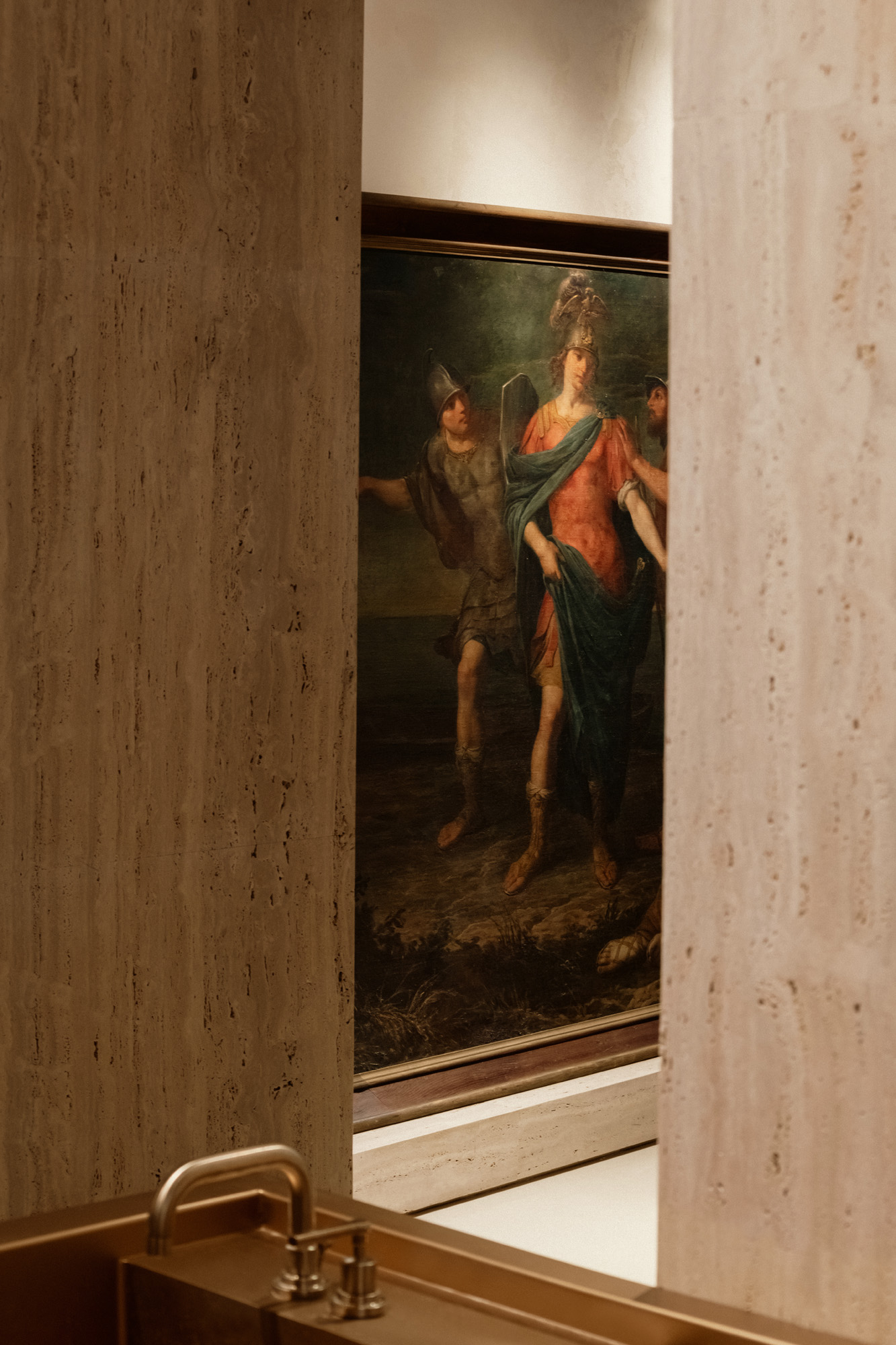
Felice Torelli’s 18th-century painting Theseus Abandoning Ariadne on display at Aesop’s new store on Rome’s Via del Corso
A version of this article appears in October 2023 Wallpaper*, on sale now available in print, on the Wallpaper* app on Apple iOS, and to subscribers of Apple News +. Subscribe to Wallpaper* today
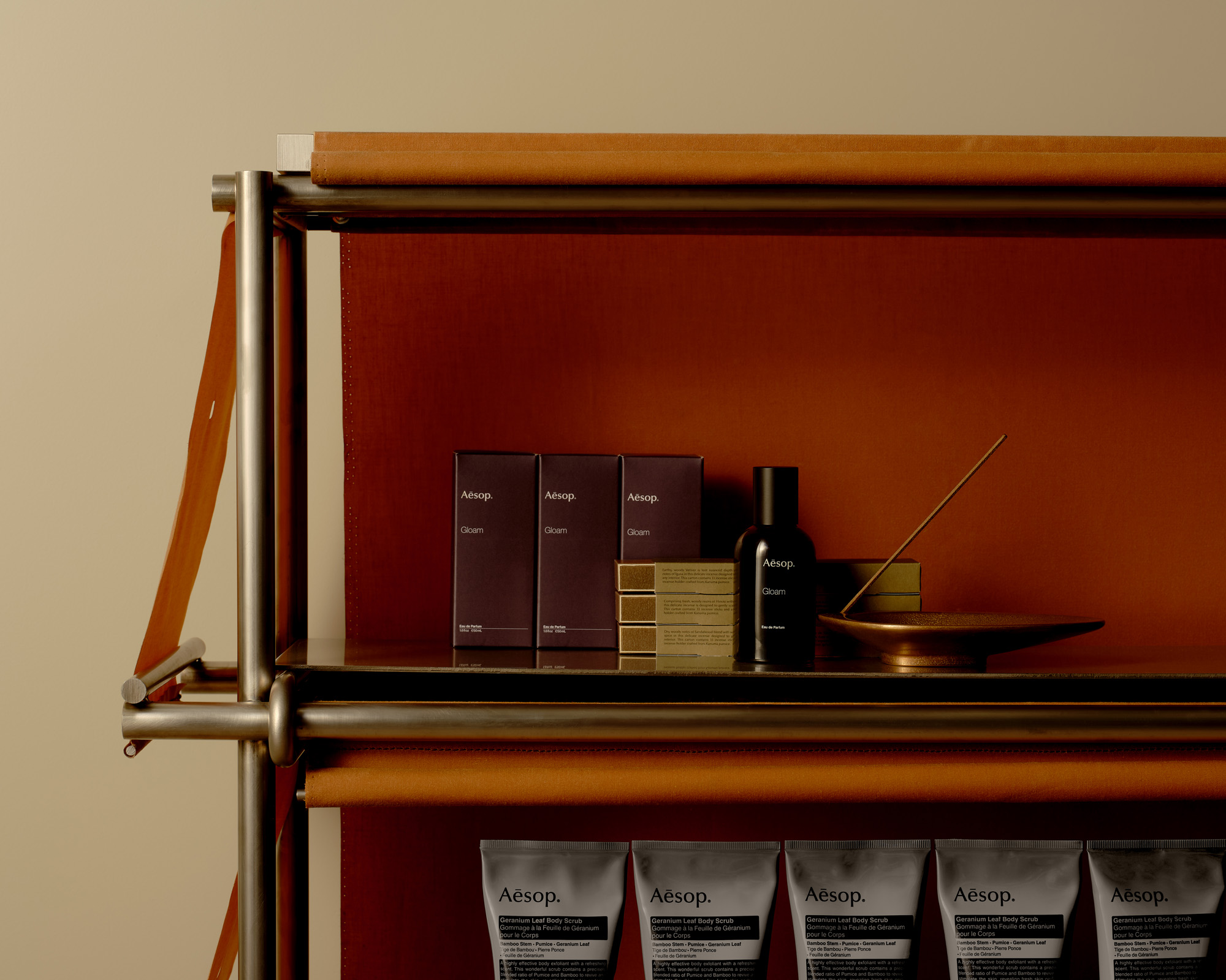
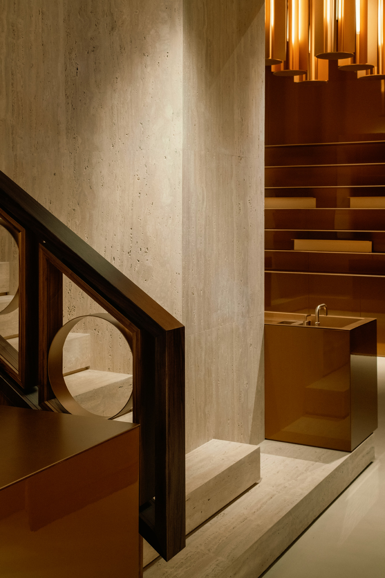
The New York NoMad store’s design, by Marsollier Villacorta, is inspired by its Broadway location. Above, steel frames covered with burnt orange canvas panels evoke the area’s historic street awnings
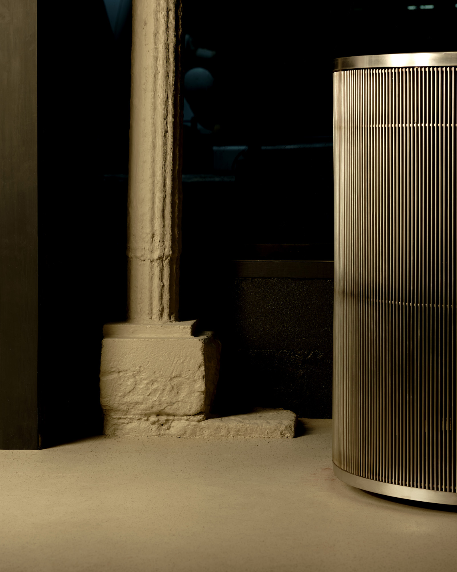
The common wire shelving once found in the surrounding wholesale shops is bent into futuristic sinks
London based writer Dal Chodha is editor-in-chief of Archivist Addendum — a publishing project that explores the gap between fashion editorial and academe. He writes for various international titles and journals on fashion, art and culture and is a contributing editor at Wallpaper*. Chodha has been working in academic institutions for more than a decade and is Stage 1 Leader of the BA Fashion Communication and Promotion course at Central Saint Martins. In 2020 he published his first book SHOW NOTES, an original hybrid of journalism, poetry and provocation.