Kyoto exhibition collates Veronica Ditting’s influential printed matter for the world’s biggest brands
Creative director and designer Veronica Ditting has created printed matter for The Row, Hermès and Maison Margiela. Now, a new exhibition in Kyoto, ‘Folio Folio Folio: Print by Veronica Ditting’ celebrates her influential career so far
Receive our daily digest of inspiration, escapism and design stories from around the world direct to your inbox.
You are now subscribed
Your newsletter sign-up was successful
Want to add more newsletters?
You will likely have encountered Veronica Ditting’s work, even if you do not know her name. The highly influential creative director and designer – who comes with a string of awards to her name – conceived the distinctive original design for The Gentlewoman (she worked at the magazine for 12 years, from when it was founded, leaving in 2021) and has worked on a slew of projects for brands including Maison Margiela, The Row, Louis Vuitton, Tiffany & Co and Hermès. For the last, she guest art-directed Le Monde d'Hermès magazine, one of the industry’s highest accolades.
A new exhibition in Kyoto, Japan celebrates Ditting’s career so far, particularly her work in printed matter, the medium for which she is best known. Titled ‘Folio Folio Folio: Print by Veronica Ditting’ (until 28 July 2024) and taking place at the city’s ‘ddd gallery’, the exhibition – curated by London-based design historian Emily King – spans two decades of print projects including books, magazines, exhibition design and other ‘printed delights’. These include The Gentlewoman – memorable covers shown as the exhibition include those featuring author Zadie Smith and gymnast Simone Biles – as well as a series of printed ephemera created for the launch of Hermès’ beauty line.
‘Folio Folio Folio: Print by Veronica Ditting’ at Kyoto ddd gallery
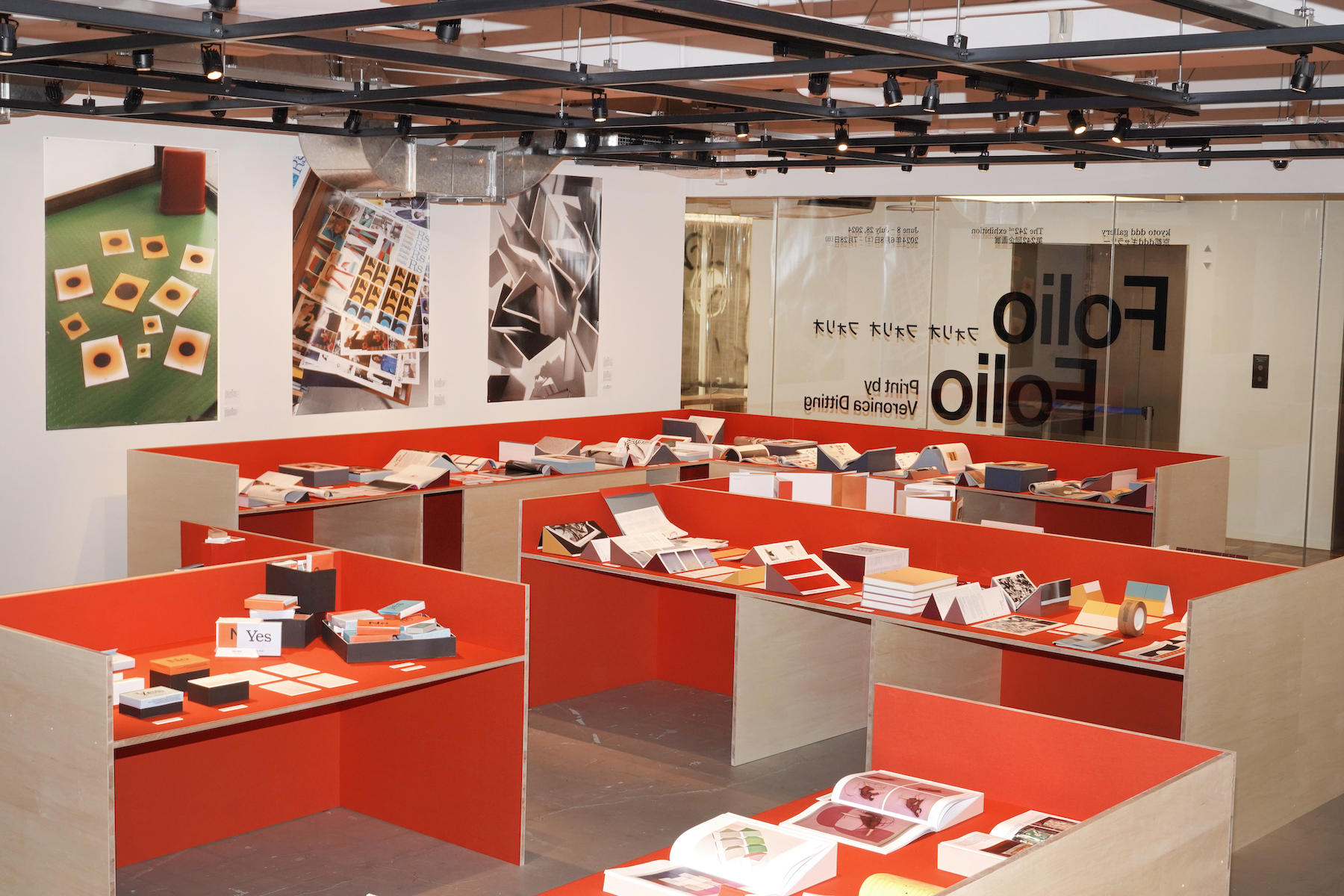
Installation view Folio Folio Folio at Kyoto ddd gallery
For the latter, process images of the ‘colour chapters’ show how Ditting achieved the ’intense and beautiful’ combinations of colour by manipulating physical pages to see how she could replicate it on-screen. Meanwhile, a slim, narrow book echoes Pierre Hardy’s design for the Hermès lipstick. These works – among several others – are displayed in the exhibition on custom stands created by the Veronica Ditting Studio, while a series of vivid large-scale images by Beijing-born photographer Qiu Yang capture models, dummies and proofs in graphic style. The process images were photographed at Ditting’s home in the Barbican, London.
Here, as the exhibition continues in Kyoto, Wallpaper* catches up with Ditting about the career-spanning project.
Wallpaper*: How did this exhibition come about? Do you have a link with Kyoto?
Veronica Ditting: ‘ddd gallery’ in Kyoto is one of the few galleries in the world dedicated to graphic design, alongside its sister gallery ’ggg’ in Tokyo. While their online presence is sparse, I have been aware of some of the shows at the gallery over the years. Then in autumn last year, London-based design historian Emily King asked me if I’d consider a solo exhibition at ddd. Emily had curated a show about British graphic designer Alan Fletcher [a Wallpaper* cover artist] at ggg back in 2008 and she’s kept in touch with the team ever since.
Without being fully aware what I was actually committing to, I pretty immediately said yes. The chance to work with Emily in an in-depth manner and to finally visit Japan – my first time – in such an engaging manner seemed too good to be true.
Receive our daily digest of inspiration, escapism and design stories from around the world direct to your inbox.
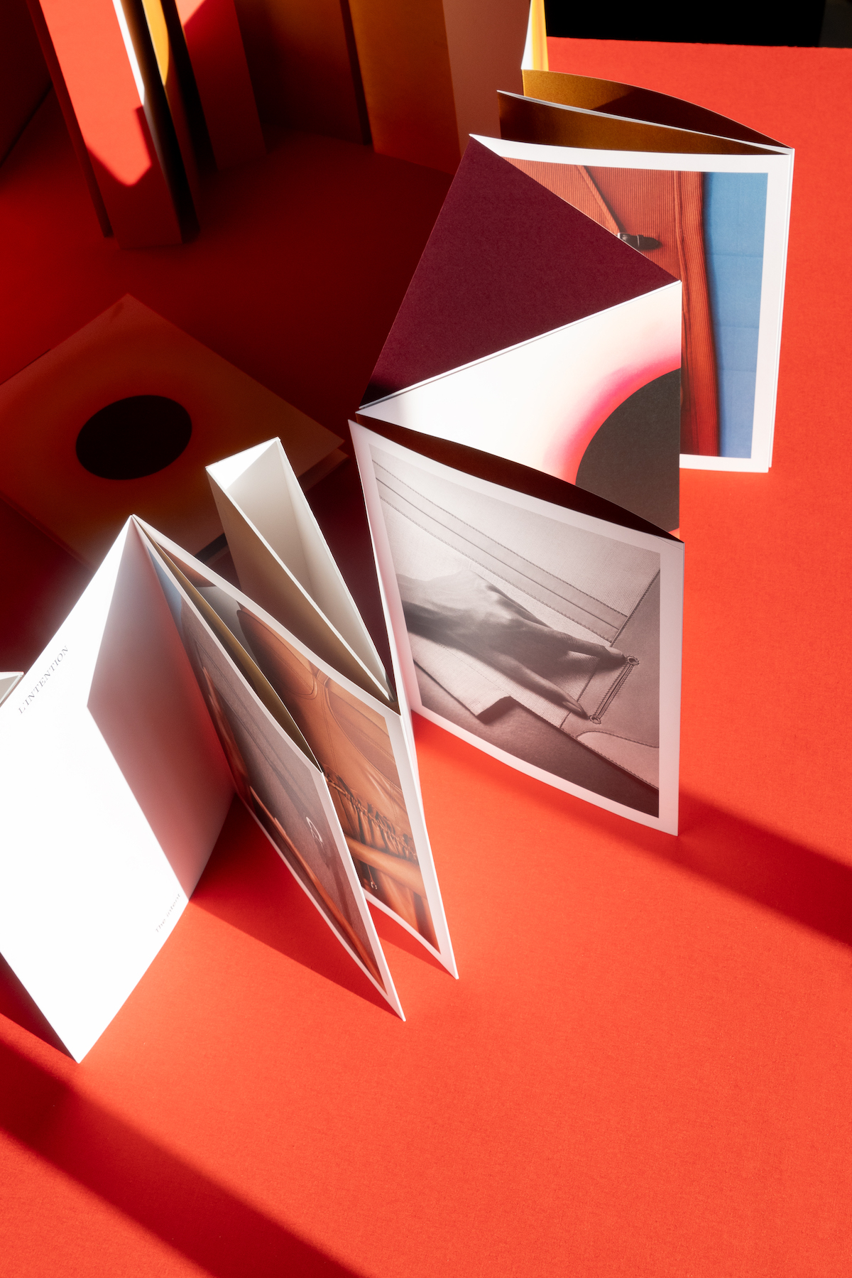
This more than 6m leporello that was a printed press tool for the Hermès S/S 2021 women’s ready-to-wear runway show
W*: How has it been to see your work collated in this way? Do you enjoy looking back on past projects?
VD: These days, I mainly work in fashion and it seems like we never pause and reflect. Everything is always about moving forward. Taking the time to go back into my archive and look back on projects has for the most part been quite joyful, and at times also confronting.
For months, Emily and I would meet at my Barbican office, deep-diving into my archive, working on the selection and phrasing the approach to ‘Folio Folio Folio’. As a creative director, my work covers many different aspects – from image-making to graphic design. Therefore a show could take many shapes depending on the approach.
Given the context, we decided to primarily focus on graphic design and particularly on printed matter. You could say the exhibition is a celebration of printed matter and everything it entails. Maybe in a different space it would be a significantly different exhibition.
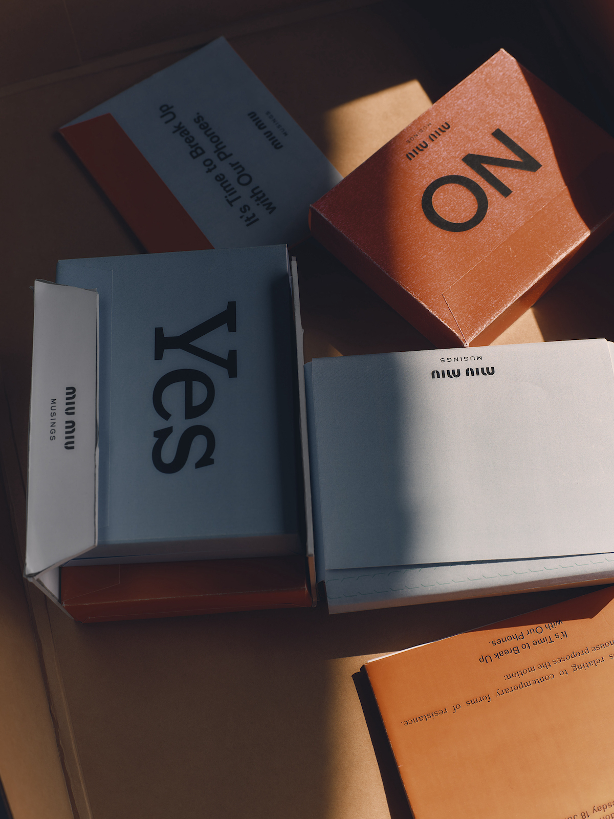
Place settings for a Miu Miu lunchtime debate
W*: When it comes to print design, why is it a medium you have gravitated towards? What is it about the physicality of print that is appealing?
VD: Working closely with printers and bookbinders is something I treasure deeply. Print is the aspect that is most closely related to craft within our practice. At the start of my career, I would even press-pass business cards [‘press pass’ refers to the process of travelling to the printing press to run final checks while your project is being printed]. Obviously I don’t have that type of time commitment any longer, but realising how much you can influence at the press has fine-tuned my eye.
When Emily and I started discussing what the approach at ddd could be, we fairly quickly decided to focus on the physicality of my works; a lot of them have a specific construction or folding technique applied to them.
Over the course of many months, my team built display stands by hand, each specifically designed for the pieces on show. 155 in total! Standing at various heights and angles, these stands allow several vantage points on the pieces. The display emphasises the materiality and three-dimensionality of the works, essentially creating a topography that visually underlines the fundamental characteristics and sensibility of the pieces.
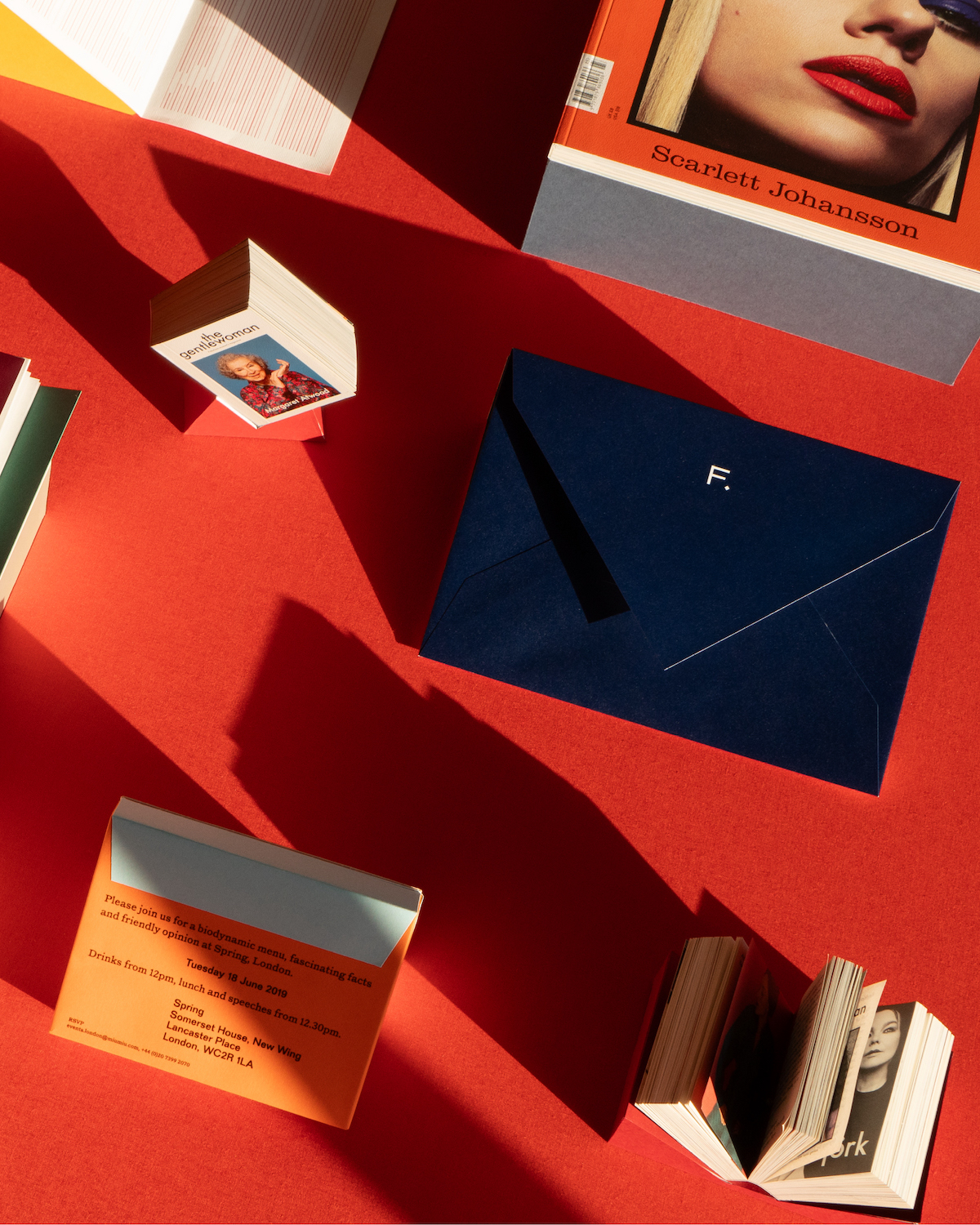
Exhibition booklet for Looiersgracht 60 Amsterdam, The Gentlewoman issue number 23 S/S 2023, photographed by Inez & Vinoodh, envelope for Frenesy by Luca Guadagnino, Miu Miu Musings invitation, The Gentlewoman Mini magazine, photographed by Alasdair McLellan
W*: What are some of your personal highlights from the exhibition?
VD: It’s hard to pick favourites, but I would say one of the highlights which works really well in the space and the display method is the Hermès Beauty chapter. I’ve been working with Hermès since 2015 on different projects and with the Beauty métier since 2019. In the exhibition, all press publications and invitations created since are shown. The specific ratios and the publications chapter pages are revealed in a significant manner. The communication for the women’s ready-to-wear department of Hermès also stands out as all of the pieces relate to the aspect of construction and folding.
Then two early projects come to mind. In 2008 I designed ‘Andy’, a newspaper to accompany the Andy Warhol exhibition at the Stedelijk Museum in Amsterdam. Working to an extremely tight deadline and budget, I decided to concentrate on Warhol’s appearance in popular media such as advertising campaigns and editorials. The newspaper shows Andy modelling and acting on TV shows. Footnote images and fun facts are scattered throughout the publication, in the middle of the publication is an index of all people mentioned in its pages. It was an expansion of my graduation project, and these visual devices anticipated the information layering that became a central feature of The Gentlewoman magazine.
Another highlight is the publication A Study on Colour by Dutch artist Katja Mater, published in 2009. It shows Katja’s photographic series ‘The Human Colour Wheel’, an experimental work partly inspired by Isaac Newton’s colour theory and partly by Katja’s own formulations. Designed in close collaboration with Katja, the publication was one of my first projects touching upon art direction and commissioning. It’s a humble publication, but still meaningful to me.
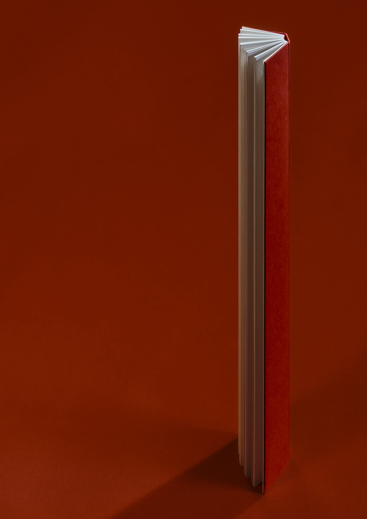
W*: Tell me about the photographic project by Qiu Yang, and how that came about?
VD: Twelve large-scale posters photographed by Qiu Yang show work-in-progress material from my archive. Models, dummies, proofs and design sketches are included and each image relates to a specific focus of my practice. All [of them] are photographed at my office and home in the Barbican. Qiu and I studied together at the Gerrit Rietveld Academy in Amsterdam and have been collaborating ever since on different types of projects. He documented some of my projects last year and the way he lights and frames my projects feels appropriate. Significantly, the posters speak to the commissioning of images, which is a pivotal aspect of my work as a creative director.
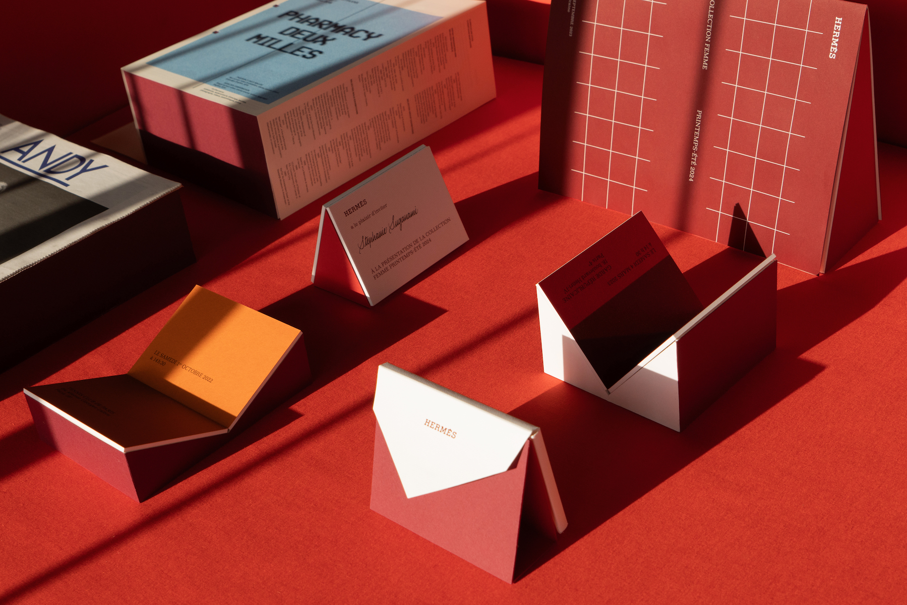
One poster shows a vast amount of dummies created for the Hermès women’s ready-to-wear runway shows. When asked to create a new classic invitation for the shows, I considered both the moment the card would be received and when the invitee would be rushing from show to show. Significantly, the design is small enough to fit into a bag or pocket and rigid enough not to bend in transit. During the design process, we eventually arrived at an innovative construction involving two small rigid cards held together with a sheet of paper. Flipping the invitation open reveals a colour or texture related to the design direction of the particular season. In the exhibition space, the super-large posters are installed on the walls, giving a sense of the process behind the designs on display in this exhibition and also of their tactility.
’Folio Folio Folio: Print by Veronica Ditting’ runs at Kyoto’s ’ddd gallery’ until 28 July 2024.

Dummy invites created for the Hermès women’s ready-to-wear runway shows
Jack Moss is the Fashion & Beauty Features Director at Wallpaper*, having joined the team in 2022 as Fashion Features Editor. Previously the digital features editor at AnOther and digital editor at 10 Magazine, he has also contributed to numerous international publications and featured in ‘Dazed: 32 Years Confused: The Covers’, published by Rizzoli. He is particularly interested in the moments when fashion intersects with other creative disciplines – notably art and design – as well as championing a new generation of international talent and reporting from international fashion weeks. Across his career, he has interviewed the fashion industry’s leading figures, including Rick Owens, Pieter Mulier, Jonathan Anderson, Grace Wales Bonner, Christian Lacroix, Kate Moss and Manolo Blahnik.