Glossier debuts a design-conscious New York flagship store
The new Glossier store in New York is a sophisticated upgrade for the beauty brand, with a tempered palette and a subway-inspired layout
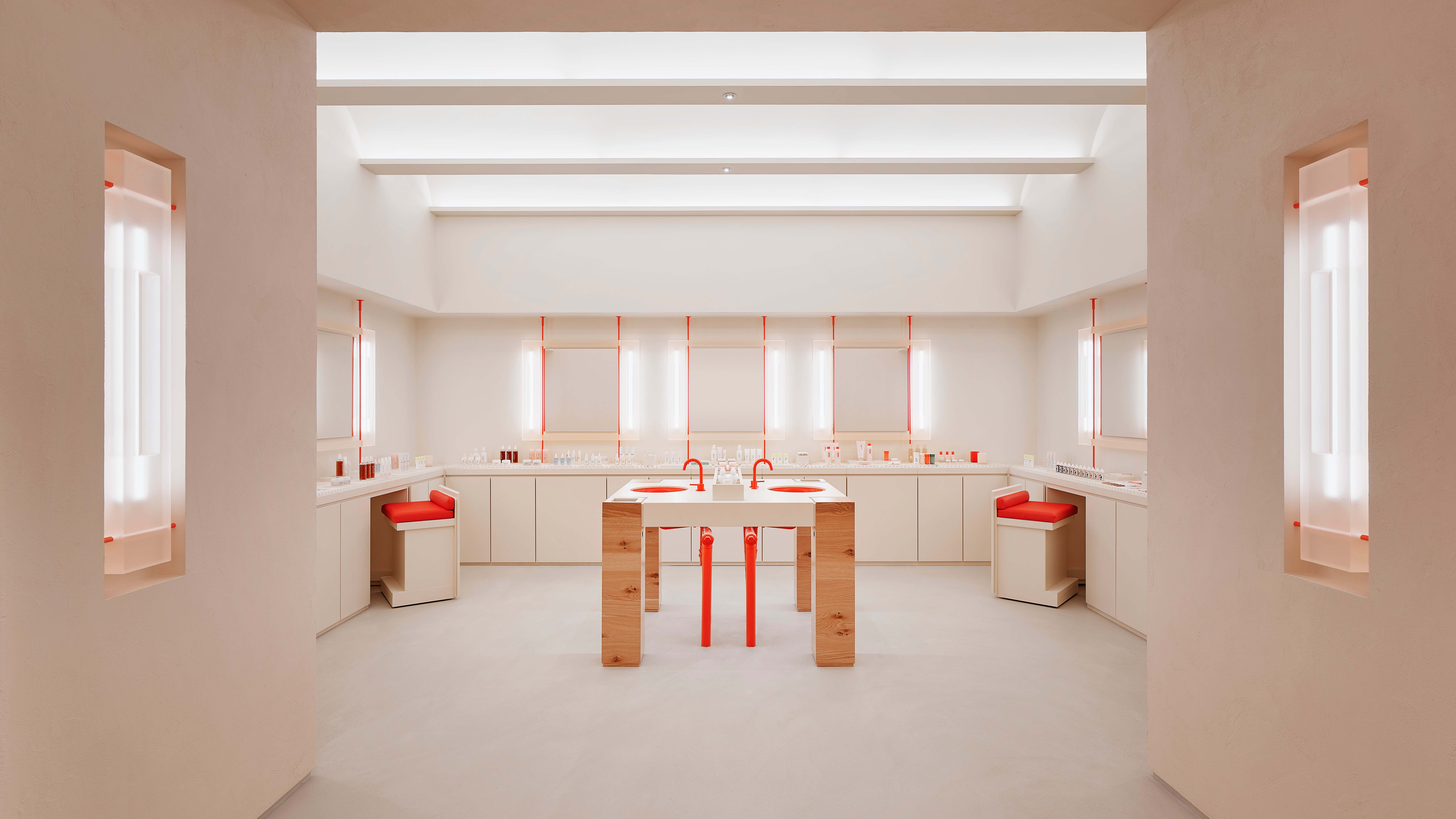
The zeitgeisty beauty brand Glossier has returned to its home turf of New York City with a new flagship store, not far from where it first put down IRL roots with its debut permanent store in 2018. Although that space quietly closed in 2020 – a casualty of the global pandemic – its new and improved iteration is bigger, and arguably better than before. Designed by the in-house retail team, the new Glossier store in SoHo brings together the brand’s recognisable design aesthetic together with heartfelt nods to New York City.
New York Glossier store opens
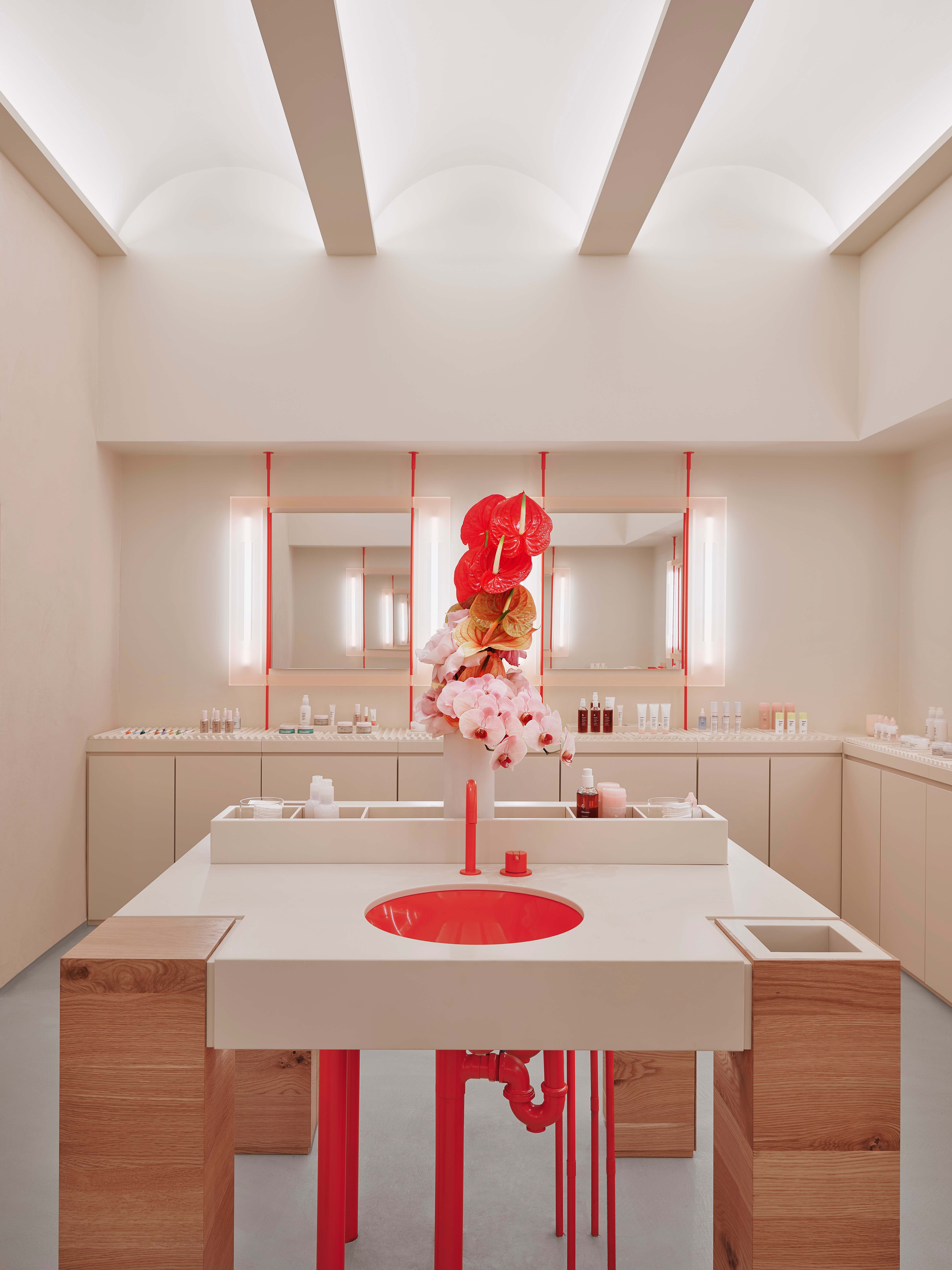
Laid out across a single floor, the new Glossier store is a vibrant 3,200 sq ft space that has placed the visitor’s experience at its heart. Conceived to mimic the New York City subways, the space has been carved into myriad experiential areas that are unified by barrel-vaulted ceilings and archways, which bring a latent dynamism to the space. Also noticeable is the brand’s subtle move away from the millennial pink shade it was strongly associated with, towards an embrace of shades like nude and blush instead.

‘If Glossier had a house, this would be our home. It’s a blend of brand history, inspiration from our city, scaling up details from our products, and using materials that make our spaces uniquely Glossier on a fresh and sophisticated level,’ says Julia Muntean, the retail design manager who oversaw the store’s design. ‘The materiality of the store references the elegant, raw, utilitarian, and unfinished elements of a SoHo loft, complemented by refined details and elevated materiality. These resins, plasters, and red accents often show up in core Glossier design, but for our new home in SoHo they were reinvented into exclusive new features.’
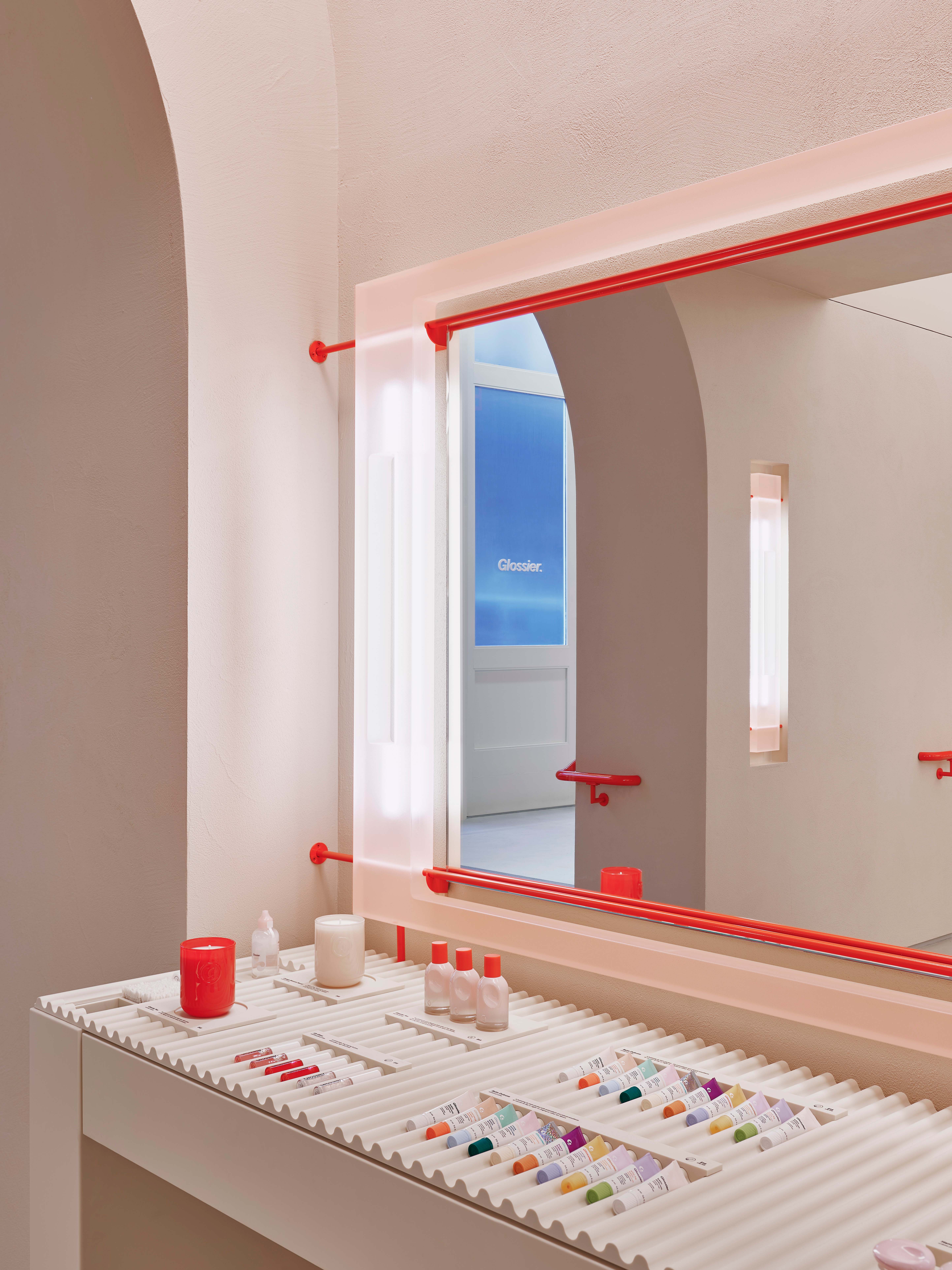
Running through the length of the main room, a pair of 15ft-long dining-inspired tables, decked out with the brand’s patented wave-shaped product trays, both visually and physically invite visitors to try and feel the products on offer. The eye-catching assortment of covetable lip balms, skincare, make-up and bodycare collections, are on full display, intuitively interspersed by mirrors, so both fanatics and newbies to the brand can feel comfortable in the communal setting.
Stemming off the central space, a special wet room on one side, flanked by individual mirrors and built-in stools, allows visitors to test and experience everything from the brand’s face masks to its body washes, and then conveniently rinse them off too. The other auxiliary space, a more intimate corridor anchored by a generous mirror and great lighting, provides a comparatively more private try-on area, where complexion and make-up can be put to the test.
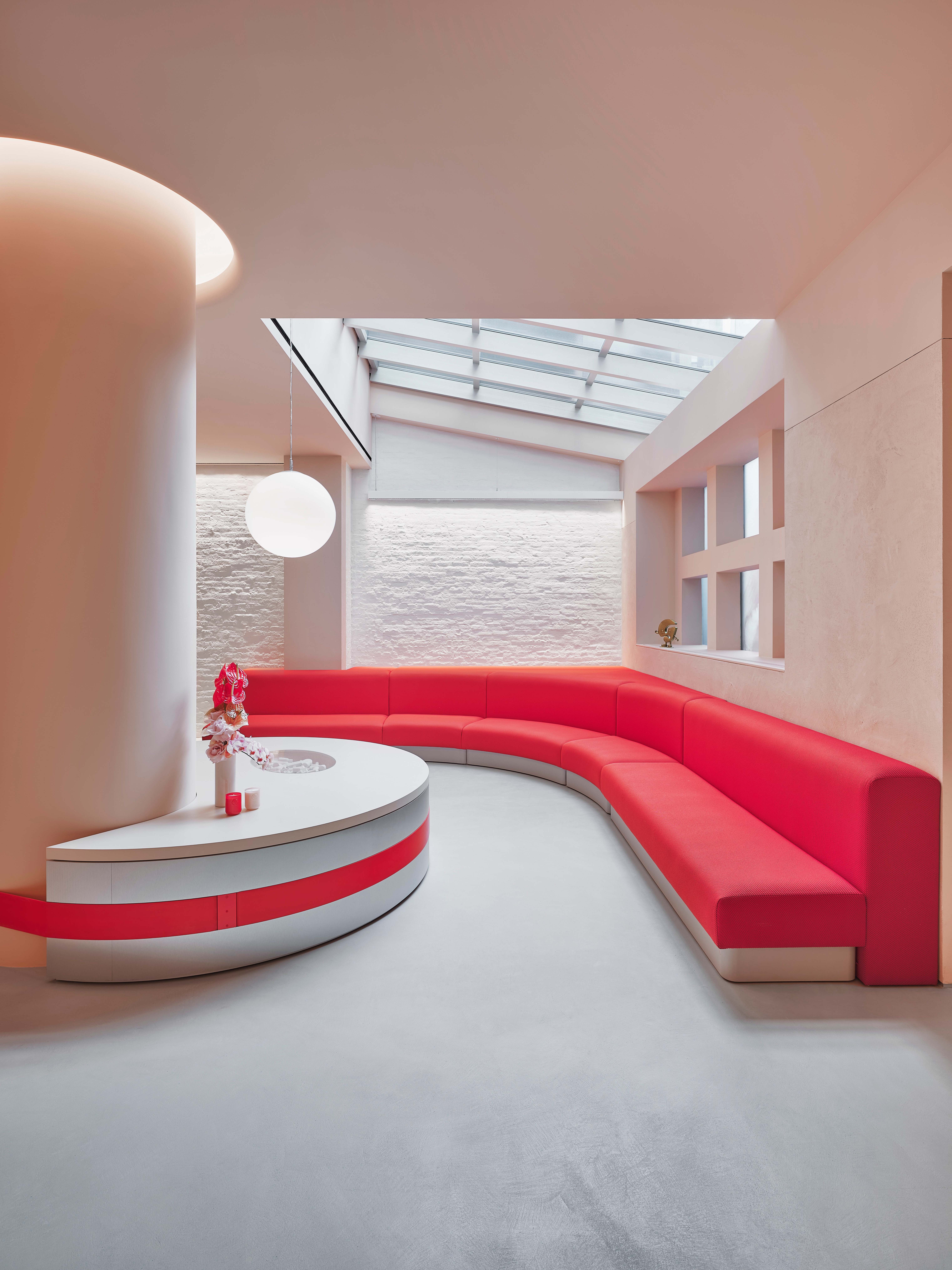
In addition to a spacious lounge area, where the infamous ‘boyfriends of Glossier’ and other non-patrons can relax while waiting for their companions, the store would not be complete without the perfect selfie moment. Tucked behind a corner of the store is a full, mosaic-tile mural depicting Glossier’s florals in larger-than-life scale, complete with a wooden subway-style bench where people can photograph their visit.
‘We’re thrilled to return to our downtown roots with the opening of Glossier NYC, right in SoHo, the neighbourhood where it all began,’ says Kyle Leahy, the company’s CEO. ‘This new flagship is an incredible representation of our brand in real life.’
Wallpaper* Newsletter
Receive our daily digest of inspiration, escapism and design stories from around the world direct to your inbox.
72 Spring St, New York, NY 10012, glossier.com
Pei-Ru Keh is a former US Editor at Wallpaper*. Born and raised in Singapore, she has been a New Yorker since 2013. Pei-Ru held various titles at Wallpaper* between 2007 and 2023. She reports on design, tech, art, architecture, fashion, beauty and lifestyle happenings in the United States, both in print and digitally. Pei-Ru took a key role in championing diversity and representation within Wallpaper's content pillars, actively seeking out stories that reflect a wide range of perspectives. She lives in Brooklyn with her husband and two children, and is currently learning how to drive.
-
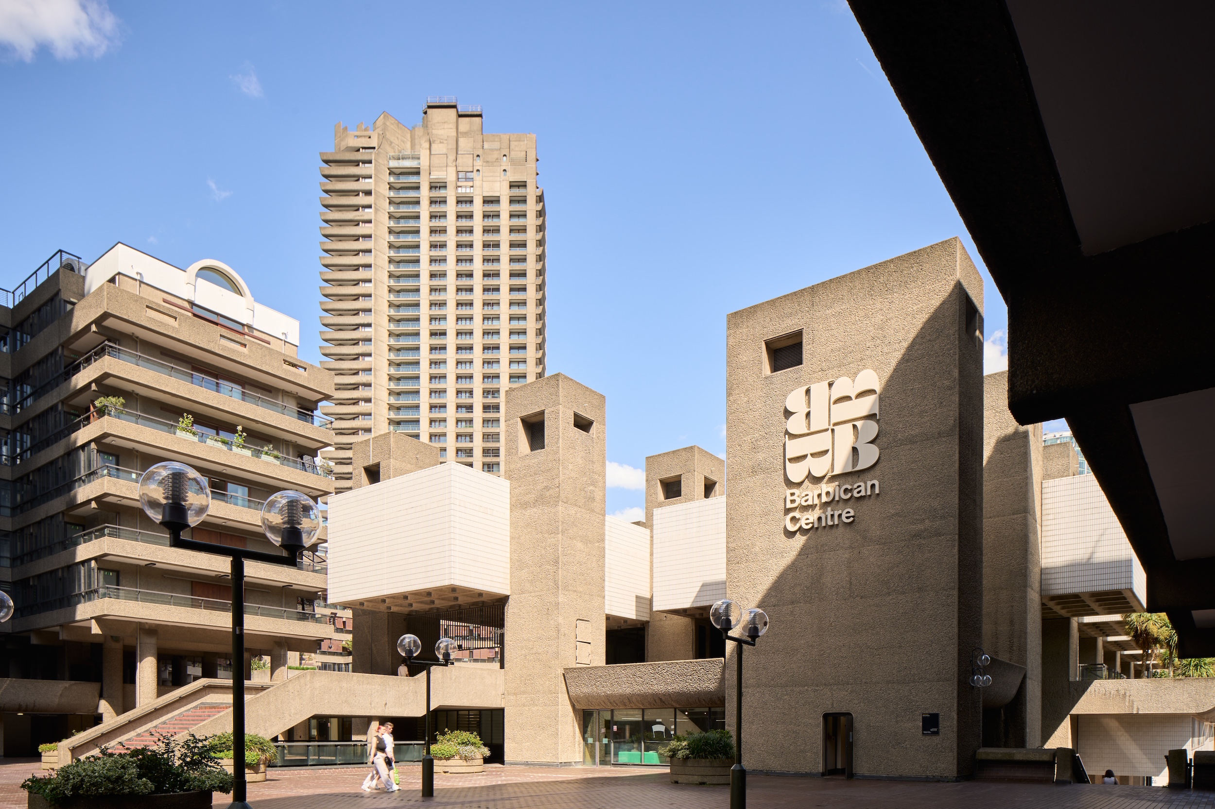 Warp Records announces its first event in over a decade at the Barbican
‘A Warp Happening,' landing 14 June, is guaranteed to be an epic day out
By Tianna Williams
-
 Cure your ‘beauty burnout’ with Kindred Black’s artisanal glassware
Does a cure for ‘beauty burnout’ lie in bespoke design? The founders of Kindred Black think so. Here, they talk Wallpaper* through the brand’s latest made-to-order venture
By India Birgitta Jarvis
-
 The UK AIDS Memorial Quilt will be shown at Tate Modern
The 42-panel quilt, which commemorates those affected by HIV and AIDS, will be displayed in Tate Modern’s Turbine Hall in June 2025
By Anna Solomon