Paul Smith’s iconic pink Los Angeles store has had a makeover
Paul Smith’s Melrose Avenue address, known for its bright pink façade, has had a ‘facelift’ by Standard Architecture in collaboration with the designer
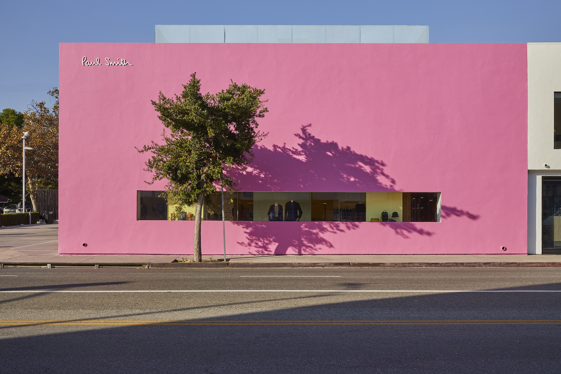
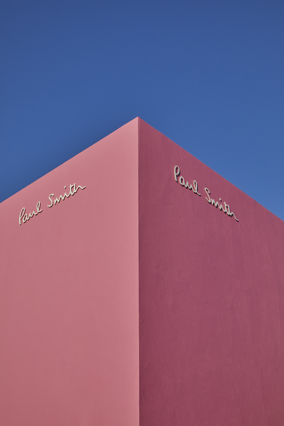
Inspired by the liberated colour palette of Luis Barragán, Paul Smith’s Los Angeles address is known for its monolithic pink façade which – against the near-perennial blue skies of California – has become one of the city’s most photographed spots (such is its ubiquity as an Instagram backdrop, its comes with its own #pinkwall hashtag).
The store first opened its doors in 2005, and nearly two decades on, the designer has drafted Standard Architecture to give the unique location a ‘facelift’. Reimagining the interior with a carefully curated selection of objects and furniture, the re-do also involves the addition of a new VIP lounge with its own dedicated entranceway. As for what stays the same, fear not, the pink exterior remains.
Colour theory: Paul Smith reopens pink Melrose store
‘Our inspiration for this redesign came from the experimental architecture that shaped the LA landscape around the middle of the 20th century,’ says Smith. ‘The new shop layout features a comprehensive redesign with multi-purpose, adaptable spaces, sculptural shelving, and a blend of custom and vintage furniture.’
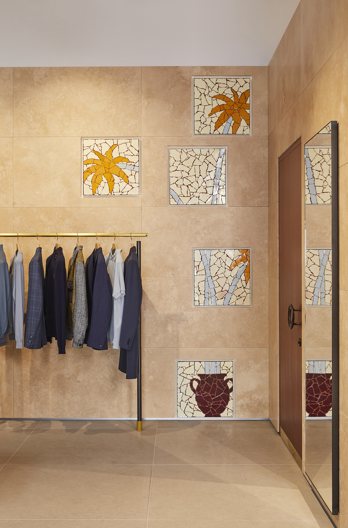
Standard Architecture, meanwhile, said it wanted to make the interior a more ‘cohesive’ experience for customers, one that moves seamlessly between menswear, womenswear and the brand’s homeware offerings. Partition walls, in warm stone-coloured tones, gently divide the space, while amphitheatre-style tiered displays show off the brand’s accessories offering.
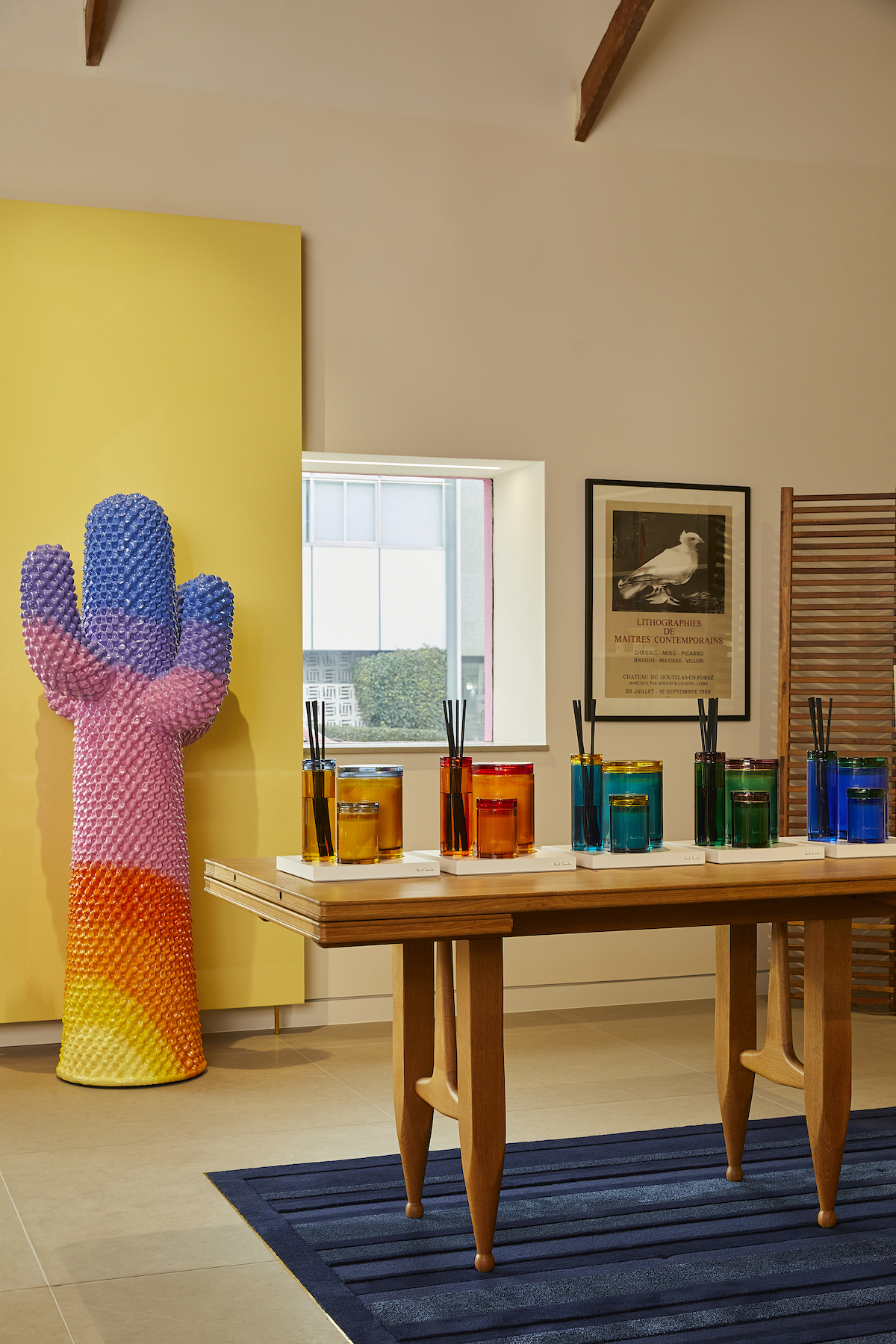
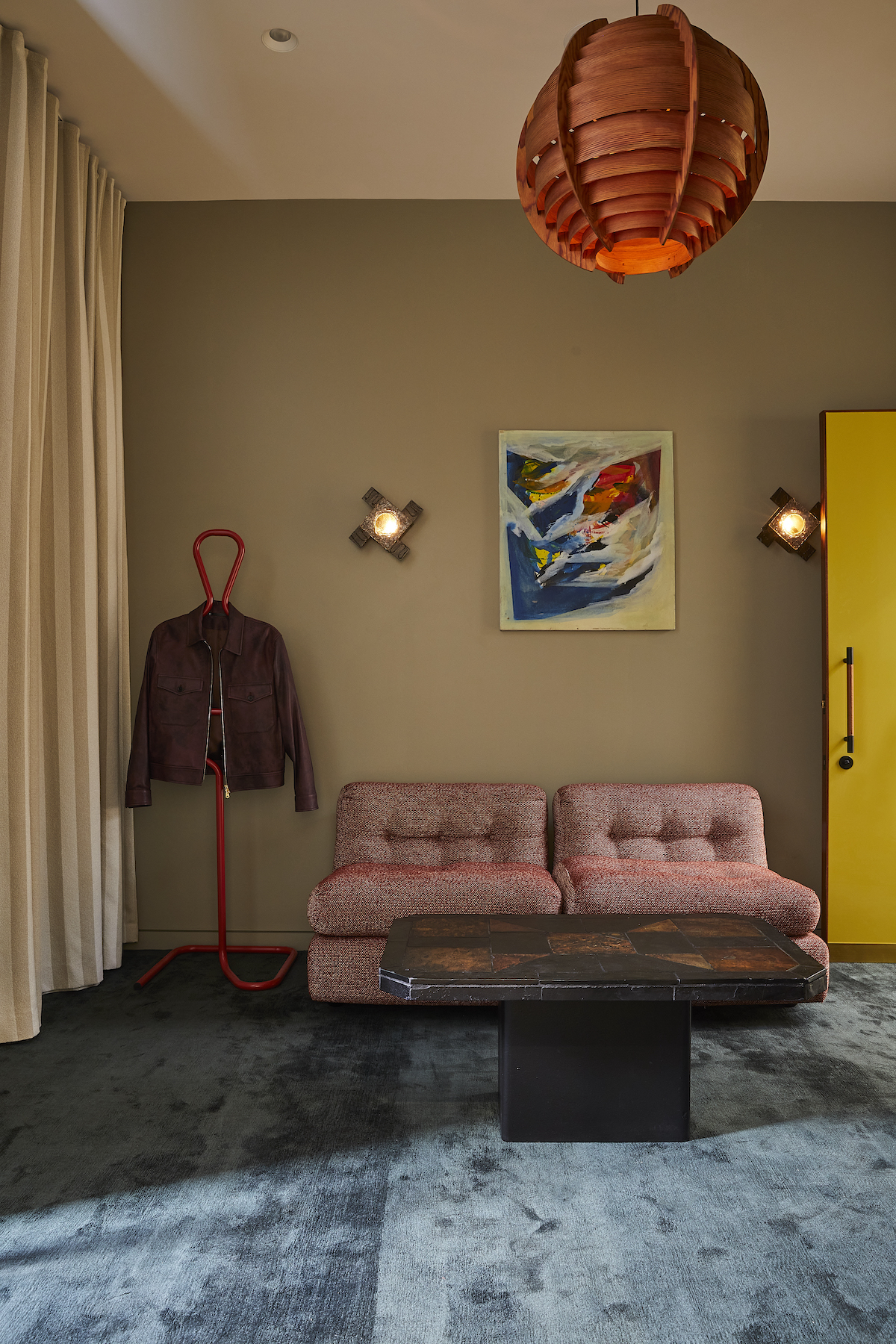
As in all of Smith’s spaces, the designer’s eclectic eye – which often includes icons of design and furniture – defines the objects that populate the interior, here spanning both vintage objects and artworks, as well as custom-made creations. A new ‘sunrise’ version of the Gufram Cactus – an icon of 1970s design – also appears. Smith collaborated with Standard Architecture on all elements of the space.
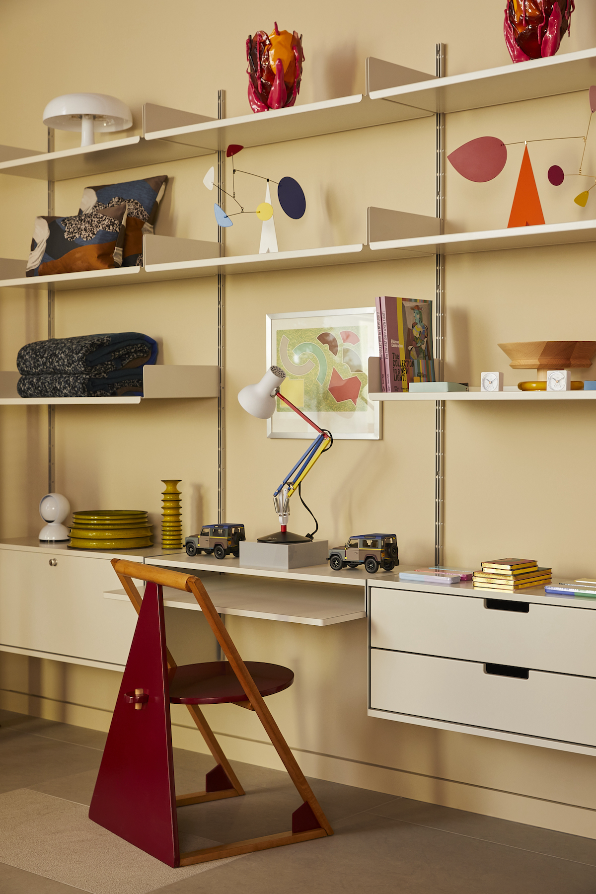
A vivid use of colour also runs throughout, in typical Paul Smith style – from mosaic artworks to modular shelving stacked high with brightly hued model cars, mobiles and lamps. Together, it is a reinvigorated vision for one of the world’s most memorable stores.
The reinvigorated Paul Smith at 8221 Melrose Avenue, Los Angeles is open now.
Wallpaper* Newsletter
Receive our daily digest of inspiration, escapism and design stories from around the world direct to your inbox.
Jack Moss is the Fashion Features Editor at Wallpaper*, joining the team in 2022. Having previously been the digital features editor at AnOther and digital editor at 10 and 10 Men magazines, he has also contributed to titles including i-D, Dazed, 10 Magazine, Mr Porter’s The Journal and more, while also featuring in Dazed: 32 Years Confused: The Covers, published by Rizzoli. He is particularly interested in the moments when fashion intersects with other creative disciplines – notably art and design – as well as championing a new generation of international talent and reporting from international fashion weeks. Across his career, he has interviewed the fashion industry’s leading figures, including Rick Owens, Pieter Mulier, Jonathan Anderson, Grace Wales Bonner, Christian Lacroix, Kate Moss and Manolo Blahnik.
-
 Put these emerging artists on your radar
This crop of six new talents is poised to shake up the art world. Get to know them now
By Tianna Williams
-
 Dining at Pyrá feels like a Mediterranean kiss on both cheeks
Designed by House of Dré, this Lonsdale Road addition dishes up an enticing fusion of Greek and Spanish cooking
By Sofia de la Cruz
-
 Creased, crumpled: S/S 2025 menswear is about clothes that have ‘lived a life’
The S/S 2025 menswear collections see designers embrace the creased and the crumpled, conjuring a mood of laidback languor that ran through the season – captured here by photographer Steve Harnacke and stylist Nicola Neri for Wallpaper*
By Jack Moss
-
 Paul Smith’s Claridge’s Christmas tree is a playful slice of ‘countryside in the centre of London’
Sir Paul Smith is the latest in a long line of fashion designers to curate the iconic Claridge’s Christmas tree. Here, he talks to Wallpaper* about the inspiration behind the tree, which features bird boxes and wooden animals
By Jack Moss
-
 Pitti Uomo 106: what we learnt from the Florence menswear fair
While this season’s Pitti Uomo guest designers embraced Florence’s uniquely cinematic setting, at the fair itself, brands presented comprehensive offerings that crossed seasons and celebrated Italian craft
By Jack Moss
-
 Paul Smith opens up ‘Bar Paul’ for his return to Pitti Uomo after 31 years
Paul Smith’s S/S 2025 menswear collection, shown yesterday evening as part of Florence menswear fair Pitti Uomo, was inspired by the Italian coffee bars of London’s Soho and their artistic patrons
By Jack Moss
-
 Men’s Fashion Week S/S 2025: what to expect
Beginning this weekend, everything we know about Men‘s Fashion Week S/S 2025 so far, from Dries Van Noten’s final show in Paris to an intimate Craig Green presentation in London
By Jack Moss
-
 Best in shows: Wallpaper* picks S/S 2024’s standout looks
As part of Wallpaper’s Design Awards 2024 issue, we select the winning S/S 2024 runway collections – and their defining looks – at the start of a new season in style
By Jack Moss
-
 Why the men’s tie is no longer a relic of the past
In the hands of these designers, the men’s tie is being reinvented in colourful, imaginative new fabrications – making it 2024’s most desirable accessory
By Jack Moss
-
 Paul Smith unites with NYC label Commission for a collection inspired by family
For the ongoing &PaulSmith project, the British designer has united with Jin Kay and Dylan Cao’s Commission for a collection exploring generational style
By Jack Moss
-
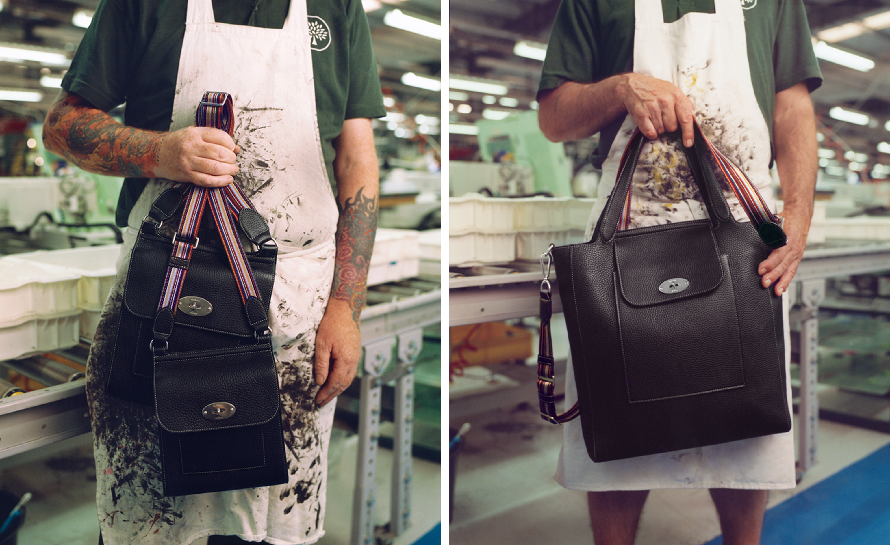 First look at Paul Smith and Mulberry’s colour-soaked bag collaboration
British stalwarts Paul Smith and Mulberry have united on colourful new bags that riff on the latter’s classic ’Antony‘ messenger style
By Jack Moss