10 Corso Como arrives in Shanghai
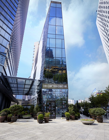
When she launched her curated boutique on Milan's 10 Corso Como back in 1990, Carla Sozzani couldn't have imagined her vision would eventually infiltrate the Champs Elysees of China. Still, last week she cut the ribbon on her fourth and latest concept shop, in a four-storey glass missile on Shanghai's flashiest shopping street, the Nanjing West Road.
The 2,500 sq m building is more akin to Sozzani's glass-and-steel Seoul location than the original Milanese villa. In a quintessential East Asian circumstance, its neighbour is the 58-storey Wheelock Square, Shanghai's fifth-tallest tower, though its polished glass façade reflects the image of Jing'an Temple, a Buddhist sanctuary that has inhabited the opposite corner for nearly 2,000 years.
Sozzani stripped back the interior to its raw, industrial core and bare white walls, adding a polished-concrete floor and leaving the rest to her longtime collaborator, the artist Kris Ruhs. The Corso Como monochrome palette was his starting point, and the hand-drawn circles that have become a motif across the brand now swathe Shanghai's café walls, terrace floor and even Seussian faux-flower arrangements on circular tables.
Elsewhere Ruhs has taken his trademark scrap-metal sculpture to new heights. He has rounded thick concrete pillars in moiré patterns of paper-thin steel and installed perforated metal skins on the acute-angled windows. And he has designed some display tables with precision-cut circles and others by interlocking sheets of metal in architectural patterns. Meanwhile, the freestanding clothing rails and mirrors take on anthropomorphic qualities under his outlandish hand.
The collection in store is light on Asian design. Comme des Garçons always has a presence in the Corso Como sphere, yet it appears Chinese designer's haven't quite hit the right note for Sozzani. European brands like Margiela, Celine and now J.W. Anderson cloak the Ruhs-designed mannequins here, amid vitrines of Courrèges sunglasses, tableaux of iconic seating and a paint-spattered men's oxford designed by Andy Warhol for Ferragamo in the 1960s.
The third-floor gallery is only slightly more sober. Ruhs constructed bulbous viewing benches and generous concrete plinths for art books (his own feature prominently, to be sure) but kept the rest fuss-free to keep the focus on dozens of framed photographic works. The view from the bar and restaurant on the fourth level - called the fifth here, to appease Chinese superstitions - is face to face with the temple, now dwarfed by a city of skyscrapers whose top-floor bars would overlook it completely.
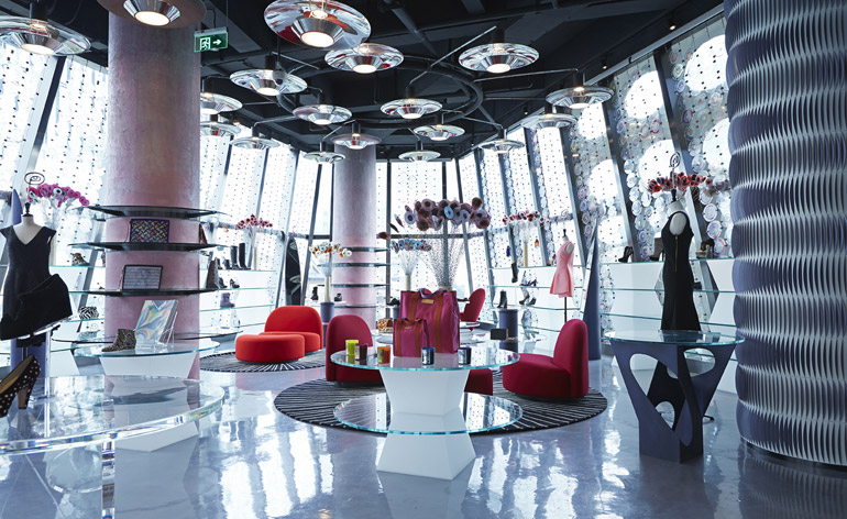
Artist Kris Ruhs designed the interiors, carring Corso Como's signature circle motif throughout the space, from the lighting and the Seussian faux flowers to the glass window treatments and the tiered tables. His sliced-steel wall treatment creates a moiré effect
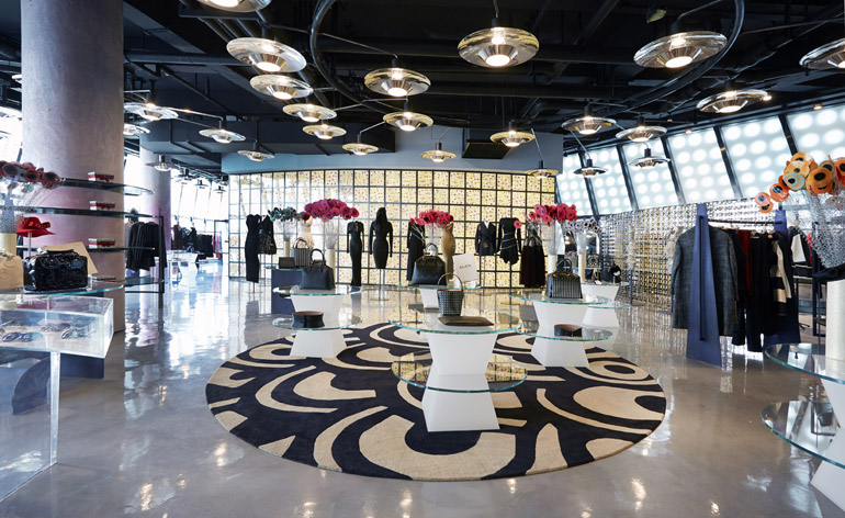
Ruhs designed his fixtures and fittings with dynamism in mind. The circular motion is almost dizzying
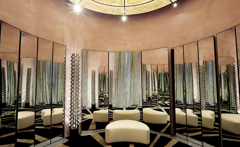
The women's su misura lounge takes a different tack from the other areas, with a feminine, Art Deco look reminiscent of Shanghai's 1920s heyday
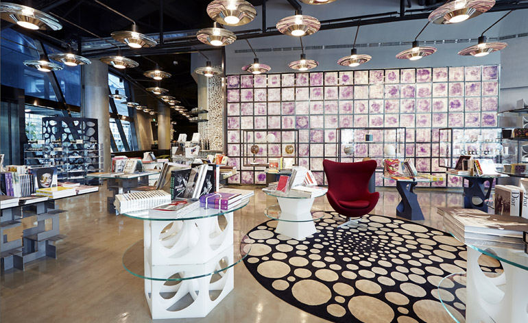
The book shop on the first floor
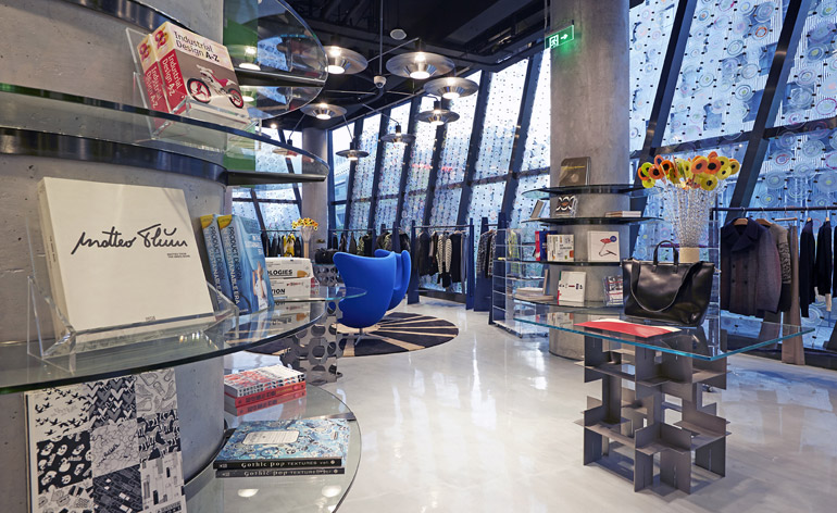
Ruhs designed some display tables with precision-cut circles and others by interlocking sheets of metal in architectural patterns. The freestanding clothing rails and mirrors - seen here on the menswear floor - take on anthropomorphic qualities under his outlandish hand
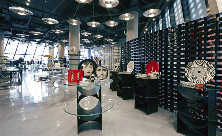
Fornasetti always figures prominently at Corso Como. The monochrome theme is echoed in the steel tables and feature wall
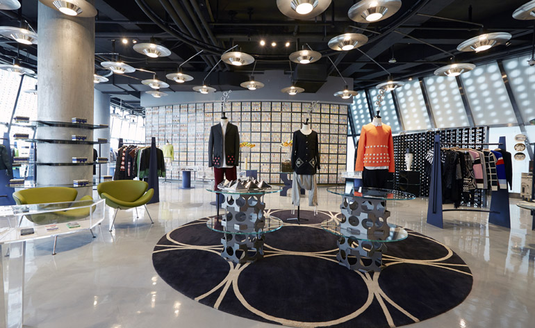
The coloured-glass wall at the back of the menswear floor is the shoe boutique, where there are paint-spattered Ferragamo oxfords designed by Warhol on sale for eye-watering prices
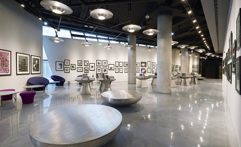
The third-floor gallery is slightly more sober than the fashion rooms. Ruhs constructed bulbous viewing benches and generous concrete plinths for art books but kept the rest fuss-free to keep the focus on dozens of framed photographic works
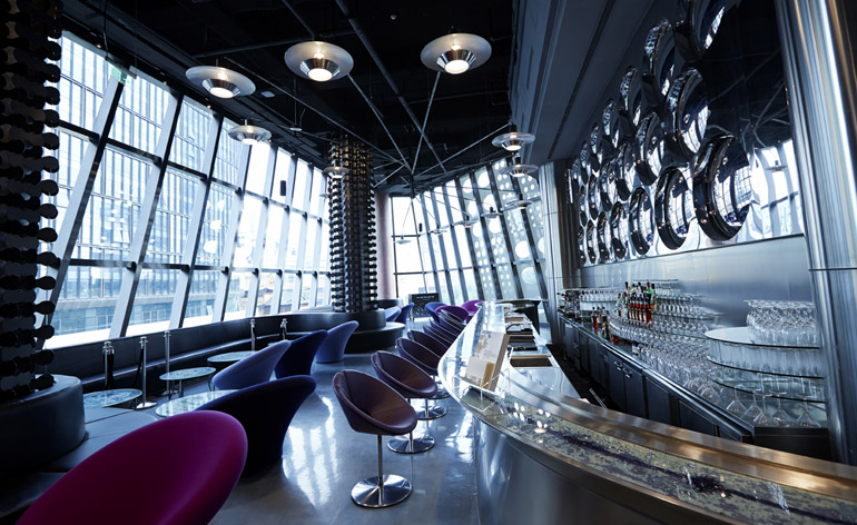
The top-floor lounge brings home that circle motif, but the real dazzler is the view, face to face with the Buddhist Jing'an Temple
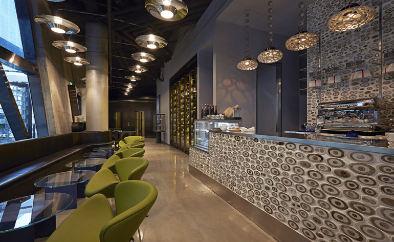
The cafe, open day and night, is quintessential Corso Como, serving Italian wines, coffee and bijoux chocolates wrapped in circle-motif paper
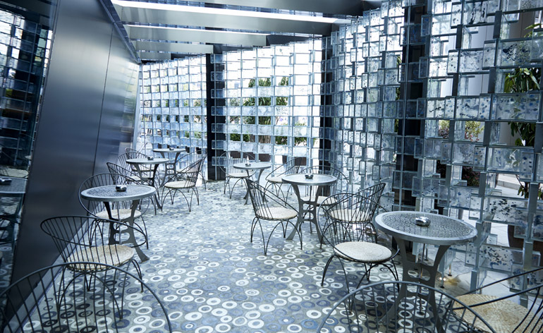
A glassed-in terrace brings a little Italy to central Shanghai. Sozzani had greenery installed behind Ruhs' glass screen
ADDRESS
10 Corso Como
1717 Nanjing West Road
Shanghai
Wallpaper* Newsletter
Receive our daily digest of inspiration, escapism and design stories from around the world direct to your inbox.
Based in London, Ellen Himelfarb travels widely for her reports on architecture and design. Her words appear in The Times, The Telegraph, The World of Interiors, and The Globe and Mail in her native Canada. She has worked with Wallpaper* since 2006.
-
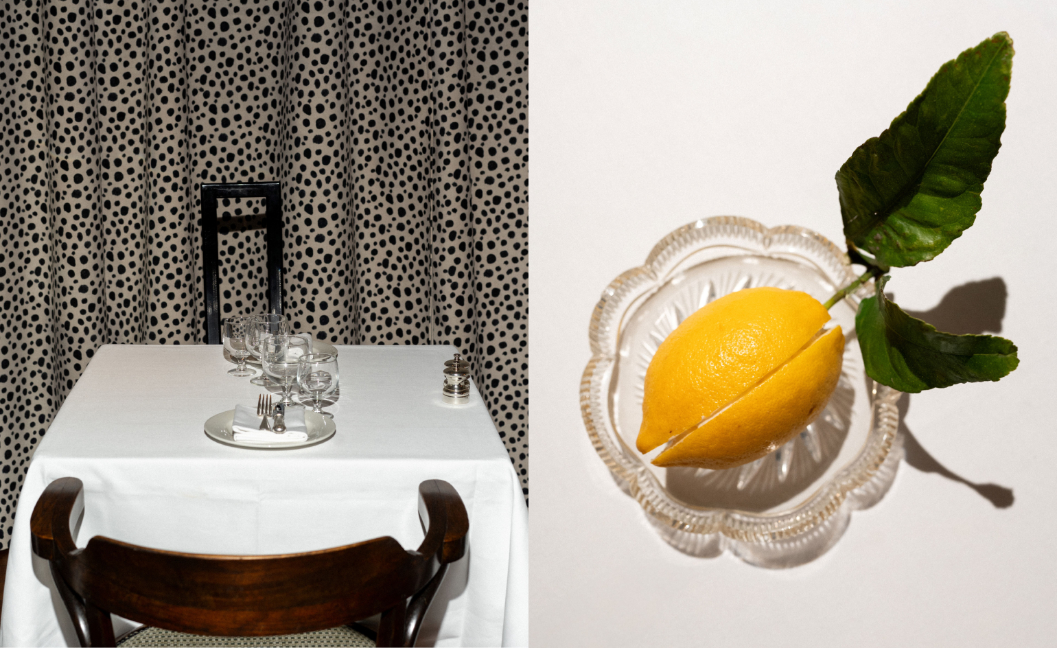 Marylebone restaurant Nina turns up the volume on Italian dining
At Nina, don’t expect a view of the Amalfi Coast. Do expect pasta, leopard print and industrial chic
By Sofia de la Cruz
-
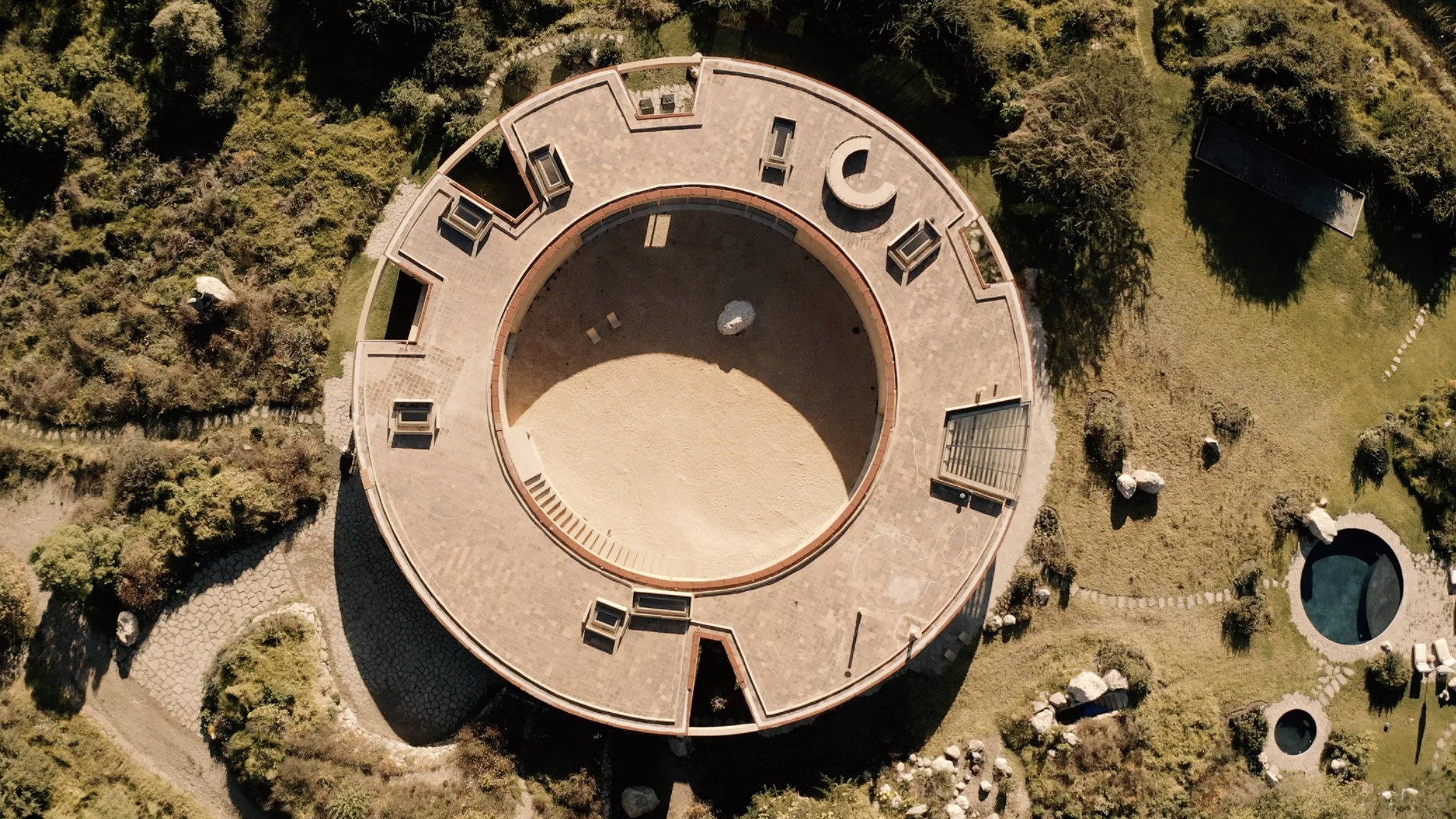 Tour the wonderful homes of ‘Casa Mexicana’, an ode to residential architecture in Mexico
‘Casa Mexicana’ is a new book celebrating the country’s residential architecture, highlighting its influence across the world
By Ellie Stathaki
-
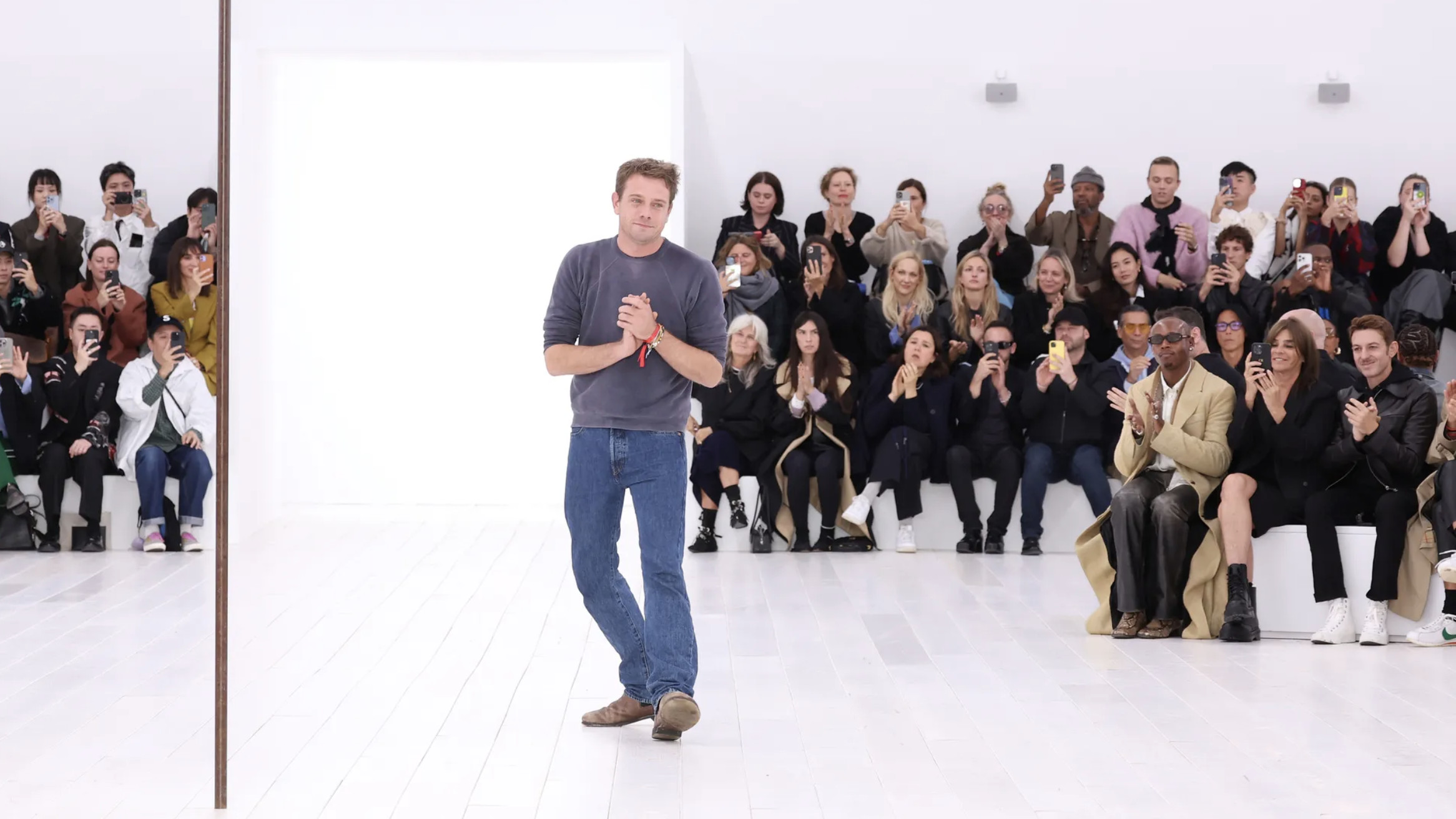 Jonathan Anderson is heading to Dior Men
After months of speculation, it has been confirmed this morning that Jonathan Anderson, who left Loewe earlier this year, is the successor to Kim Jones at Dior Men
By Jack Moss
-
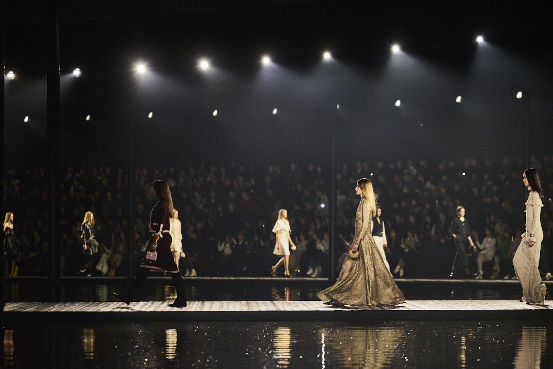 Chanel heads to Hangzhou, China for a poetic Métiers d’Art 2025 show
This evening in China (3 December 2024), Chanel travelled to Hangzhou’s much-mythologised West Lake, a Unesco World Heritage site, for a show that highlighted the extraordinary craft of the house’s artisans
By Jack Moss
-
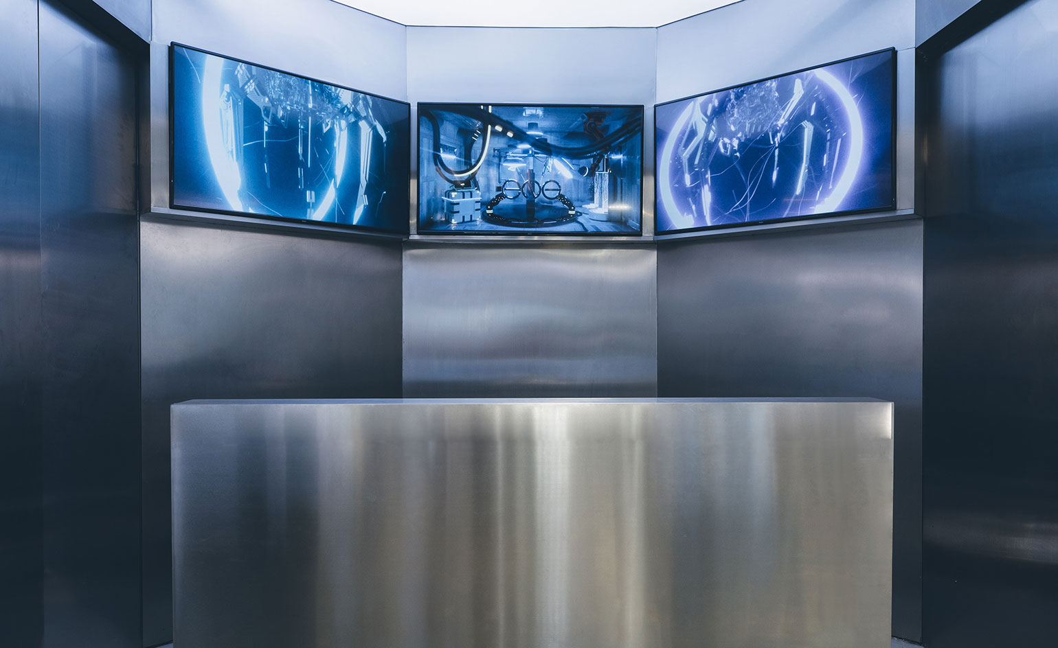 ENG Shanghai: Minority Report-inspired retail for the Gen Z mind
ENG Shanghai opens its second luxury fashion concept store aimed at Gen Z customers, inside the city’s TX Mall, featuring artworks by Carlos Saez, robotic arms and cyborg-like mannequins
By Laura Hawkins
-
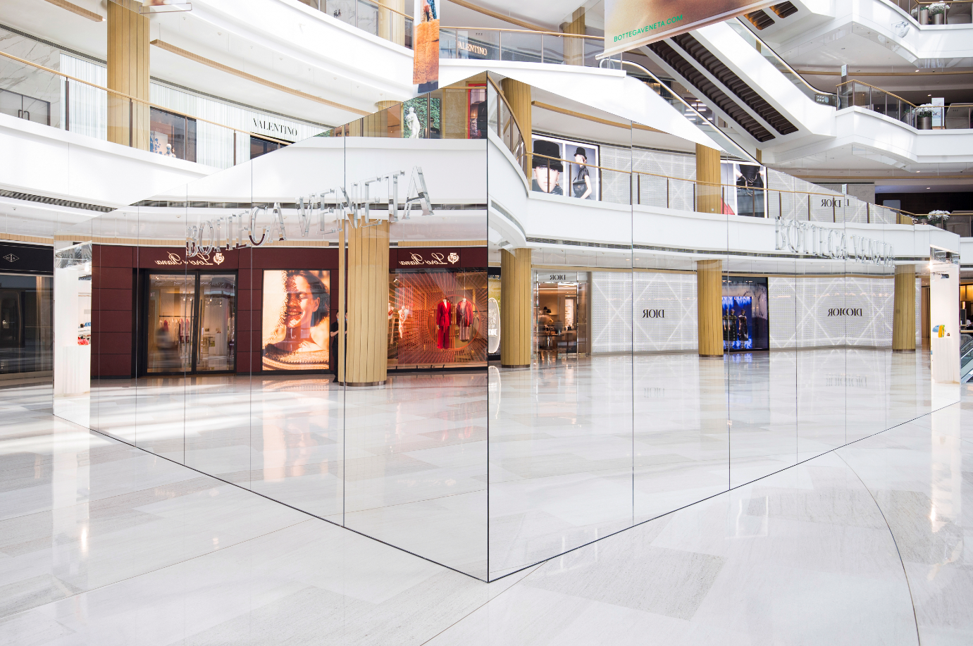 Bottega Veneta constructs ‘invisible' pop-up in Shanghai
Conceived by creative director Daniel Lee, the three metre-high, 100 sq m mirrored cuboid continues Bottega Veneta’s subversive denouncement of self-promotion
By Daven Wu
-
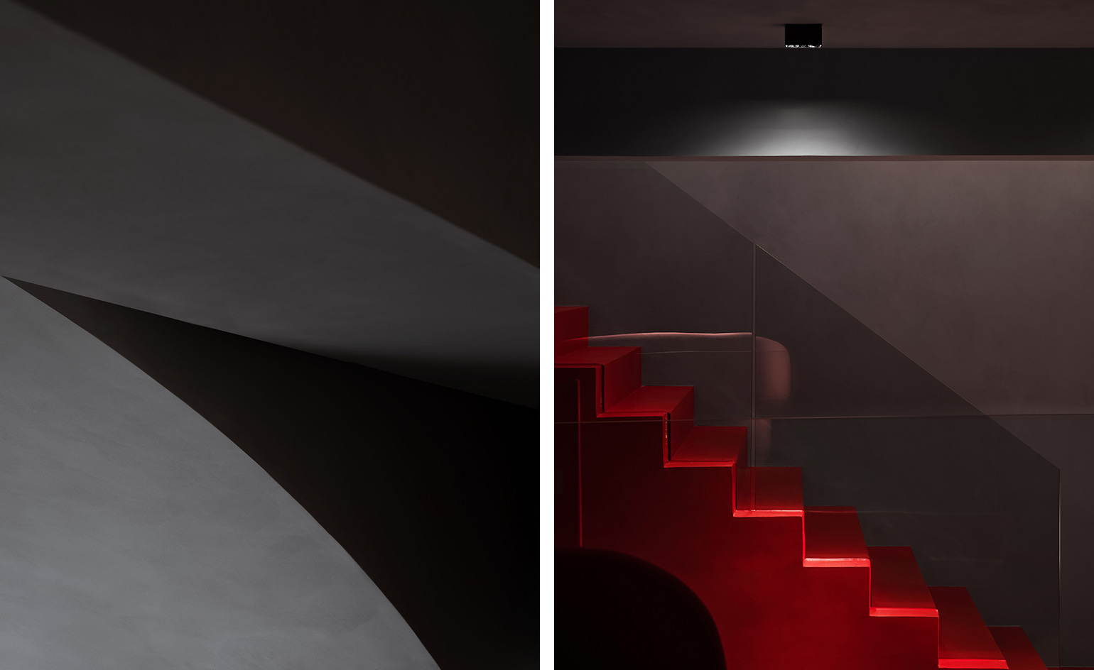 Ripple effect: Trongyee’s undulating Shantou boutique
Shenzen-based firm AD Architecture has conceived a rippling, pared-back retail design for Shantou, China-located luxury womenswear boutique Trongyee
By Laura Hawkins
-
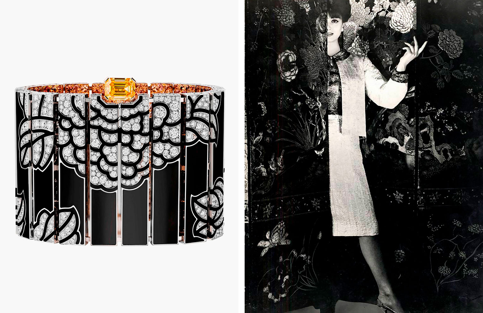 The China List: Chanel, Fashion
Wallpaper* and China’s Cultural Heritage and Sustainable Development Fund (CHSDF) present China By Design—a celebration of Chinese cultural heritage and the many global creatives who have been inspired by it. Explore the full list here.
By Laura Hawkins
-
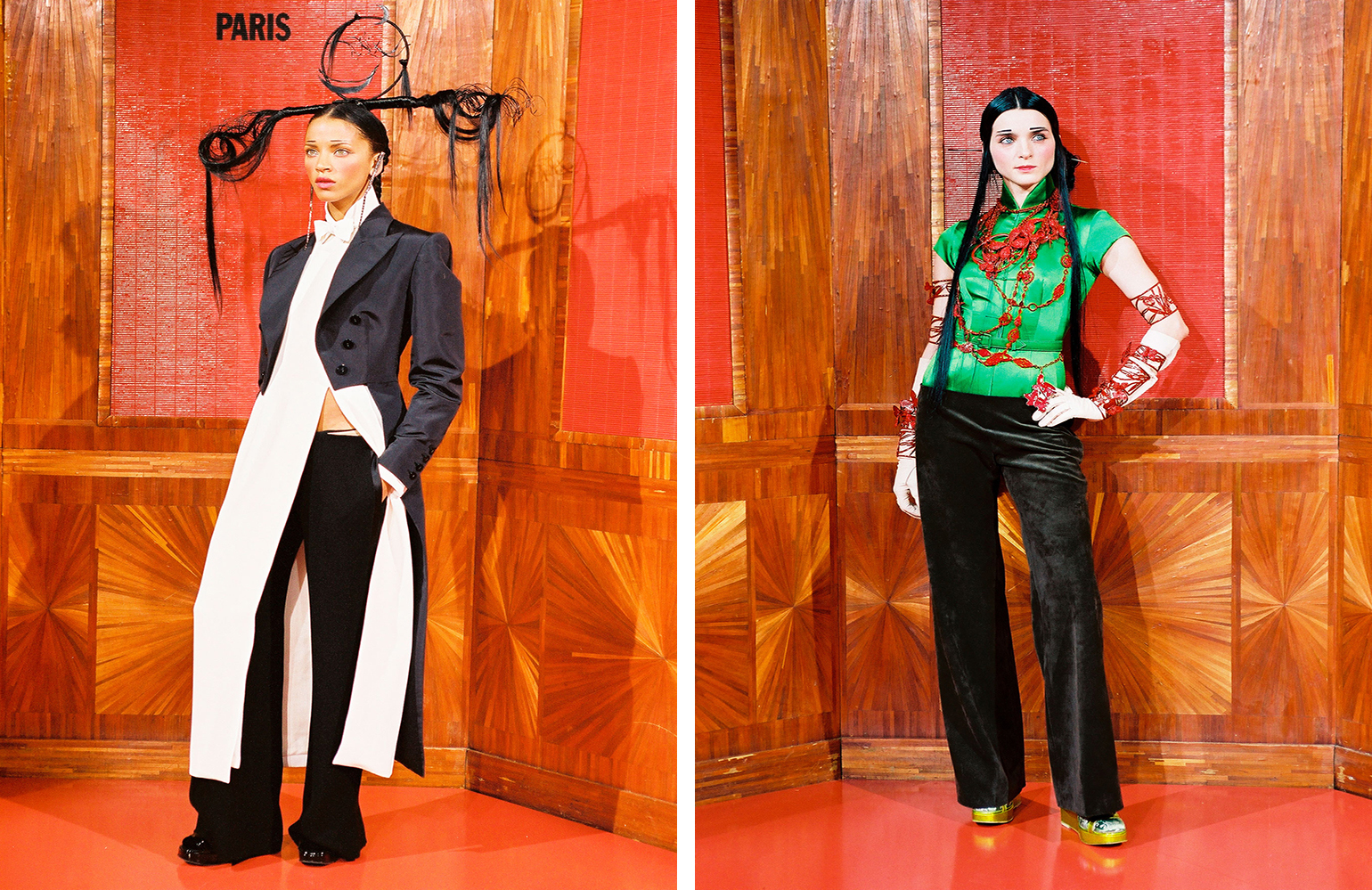 The China List: Jean Paul Gaultier, Fashion
Wallpaper* and China’s Cultural Heritage and Sustainable Development Fund (CHSDF) present China By Design—a celebration of Chinese cultural heritage and the many global creatives who have been inspired by it.
By Laura Hawkins
-
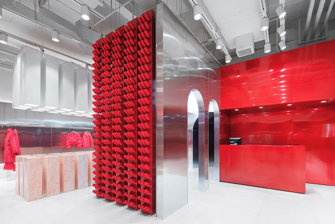 Playing it spool inside Annakiki’s thread-stacked boutique
By Laura Hawkins
-
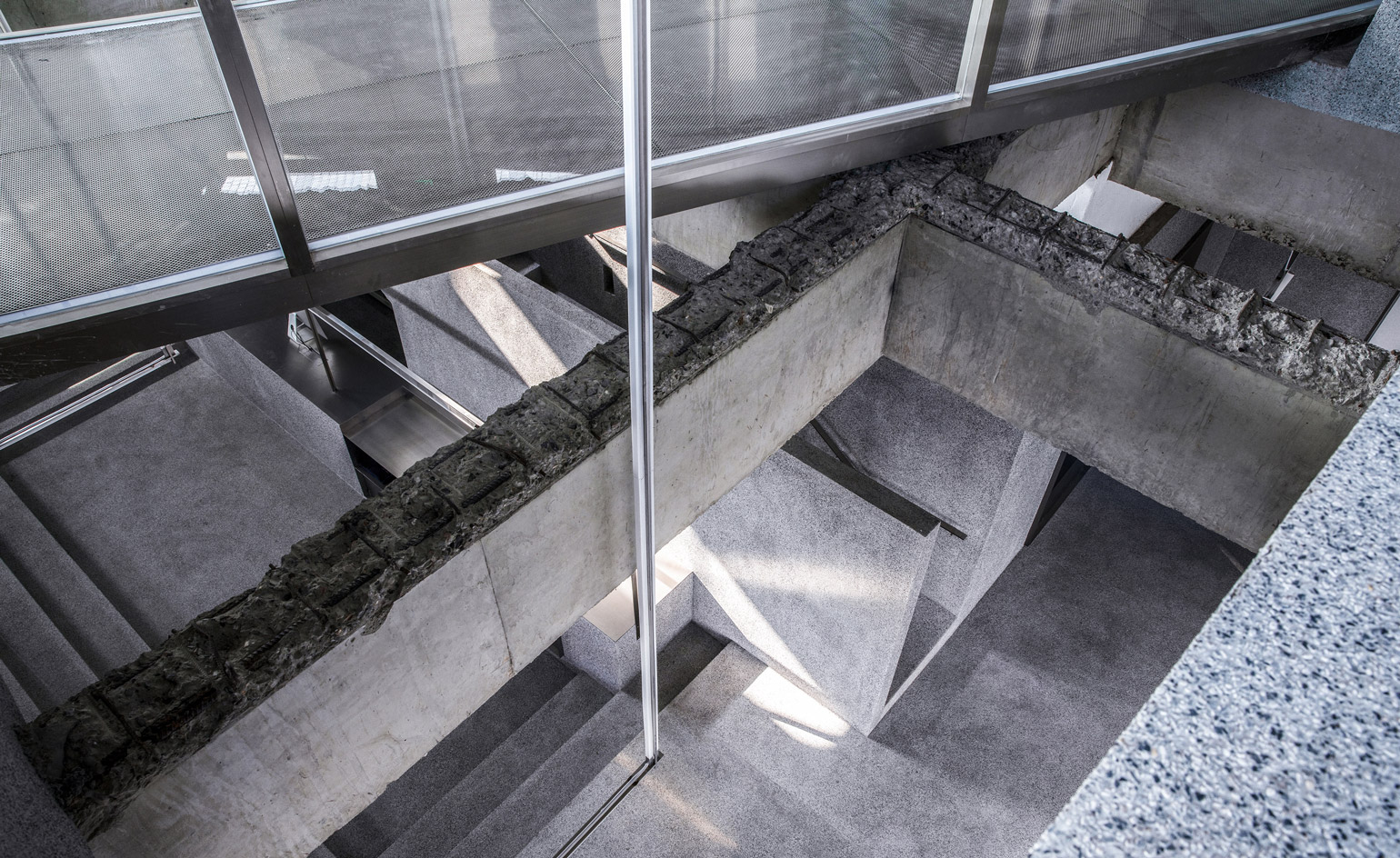 Atelier Tao+c designs monochrome multi-brand boutique in Zhengzhou
By Cat Nelson