A tour of Louis Vuitton’s New Bond Street maison
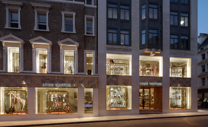
To create the vast new maison, Peter Marino entirely reworked the original store - also designed by him - and fused it with what was Donna Karan, next door. ’I had to destroy my own baby,’ he says. The two spaces are united by white Portland stone, double height windows and Louis Vuitton’s signature golden mesh cladding. Says Marino: ’I could barely touch the historic facade, so I knocked everything inside down instead...’
Louis Vuitton's epic new London 'maison' has just opened its doors on New Bond Street. Entered via a bridge over a 'moat', its four outrageously luxurious floors include a VIP apartment, a 'librairie' of limited edition art and art books, revolving handbag installations and artworks by all the big guns, from Damien Hirst to Gilbert & George. You name it, this store's got it. Here, the architect behind this temple to luxury - Peter Marino - takes us on a tour.
'I spent five years pouring my heart into making the Champs-Élysées store have all the bells and whistles, only to be told that the London maison had to be even better,' says Marino.
This new, 1,500 sq m palace certainly gives the flagship maison a run for its money, pioneering a number of firsts for Louis Vuitton, including the VIP apartment. It's also London's largest single-brand store.
Here, the brand is even commissioning and selling limited-edition artworks by the likes of Anish Kapoor and Gary Hume. But more of that in Wallpaper's July issue...
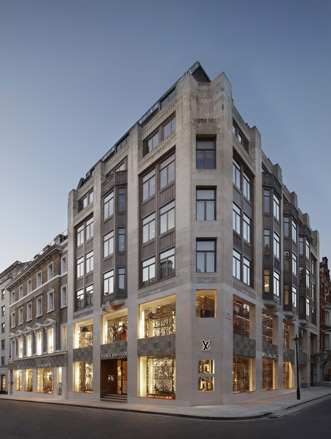
The facade
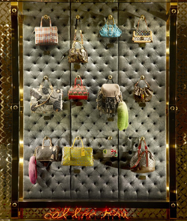
The windows
To enter the store, visitors step across a bridge, which separates the inner building from the facade. Below it is a glass staircase, illuminated by LEDs that will show constantly changing film and artistic animations. 'I've created a kind of "moat"', says the American designer. 'But it's a virtual one, not the kind that apparently costs vast sums to clean, like your MPs''. Asked if he sees a 'moat' as something quintessentially English, Marino replies, 'Didn't you all live in castles when you were kids?'
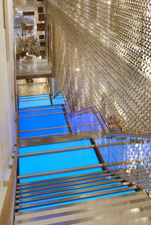
The entrance
Cross over the bridge and you come to an installation of vintage trunks suspended in the air. This is backed by a bronze mesh, whose pattern is based on the flowers of the monogram handbag, which wraps the entire store. 'It involved very difficult workmanship,' explains Marino. 'The Nottingham-based company that made it had to make thousands of samples to get it right, because it's about 30ft high and heavy as hell. The first one was like chainmail but in the end it came out light and scintillating. It filters the light and moves like a curtain'.
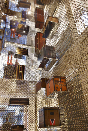
The Trunk installation
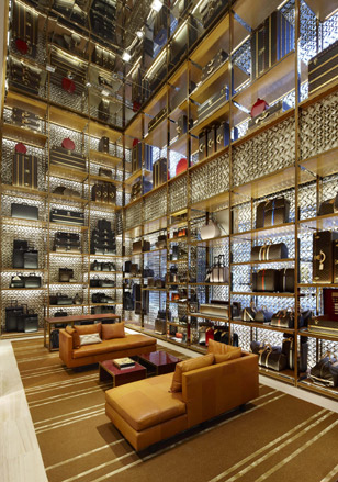
The trunk wall
Beside the trunk installation, pieces from the new collection are displayed on a series of towering shelves
One of the many firsts that this store pioneers for the Louis Vuitton network is the placing of the most expensive pieces bang opposite the entrance. This store isn't scared of scaring customers away with its price tags. 'It's a bit experimental and risk-taking. But this is New Bond Street,' Marino exclaims. 'The theory is that the customer here is somewhat immune to the vagaries of the market.'
The fine jewellery, watches and best bags are displayed in an intimate area, with lacquered wall panelling and partitions clad in dark woven copper, linen and wool. 'This was my way of responding architecturally to the gorgeous materials of the bags.'
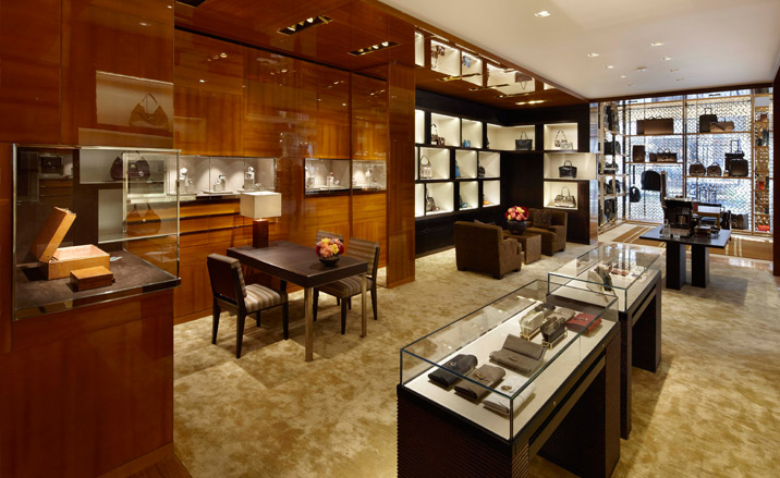
The high end area
'I call this the "girls just want to have fun" part of the store, because everything is moving. It's really hilarious,' says Marino. The costume jewellery zone, to the far left of the store, marks the entrance to a room filled with moving bags and scarves. Two LV-branded planets orbit around ceiling inspired by Saturn's rings. On a plinth stands Kiki - a sculpture by long-time Vuitton collaborator, Takashi Murakami.
Wallpaper* Newsletter
Receive our daily digest of inspiration, escapism and design stories from around the world direct to your inbox.
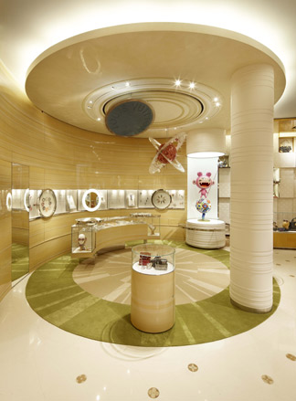
The costume jewellery area
Here, customers can sit on stools and pick their bags like they would a cocktail, from a back-lit, rotating display. 'When I was parading round all the other shops that are heavy on handbags I felt this lethal lack of energy,' explains the architect. 'I couldn't give the bags any artificial stimulation so I thought, let's get them moving.'
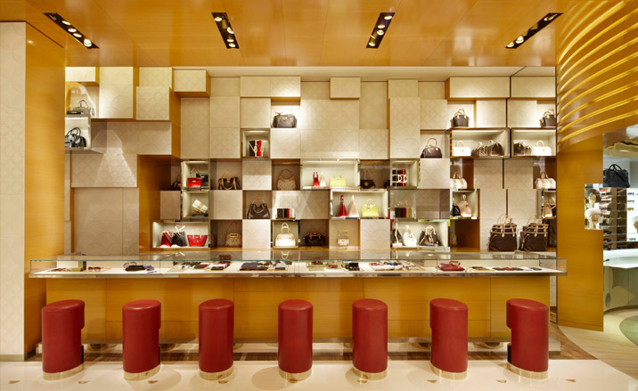
The bag bar
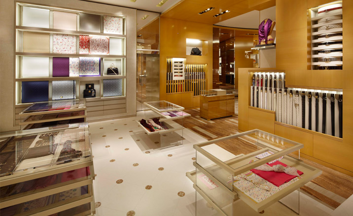
The scarves area
Scarves are framed like works of art in a gallery - as part of a moving wall display or arranged flat in drawers like precious art prints.
Even the sun-like light that shines through the central oculus of the sunglasses area moves up and down. 'Dichroic glass constantly changes the light that hits your eyes, ergo, creating the need to put sunglasses on,' says Marino. 'Pedro likes to get paid, you know...'
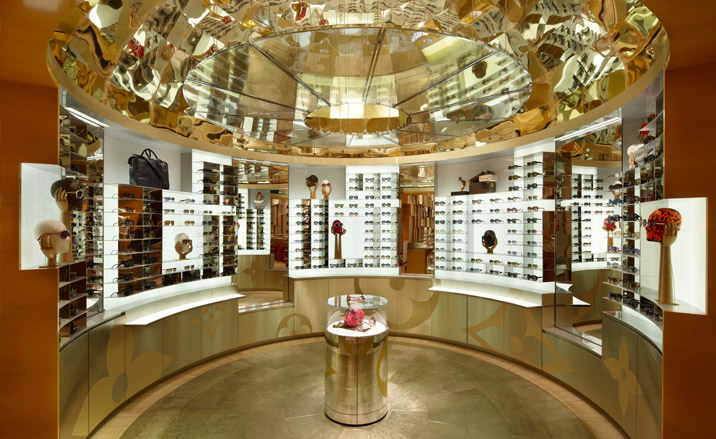
The sunglasses area
The first floor is home to the latest womenswear collections. The three ready-to-wear zones have different moods to draw out different aspects of the collections, decorated in varying tones of French embossed leather and light French lacquer. This floor is also home to the librairie, sculptures by the likes of Damien Hirst and an area for temporary exhibitions.
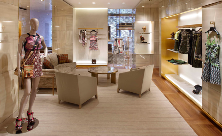
The women's Universe
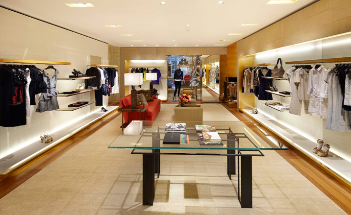
The women's Universe
If you're lucky enough to get the nod, a security-controlled lift will whisk you up to the invitation-only inner sanctum of the store - the VIP 'apartment'. The open plan space can be sectioned off into suites, and features artworks, including this piece titled 'The Bible cowboys' by Richard Prince, and others by the likes of Jeff Koons, Jean-Michel Basquiat, Hans Hartung, and Bertrand Lavier. 'I designed it like a Peter Marino apartment,' says the architect, putting his feet up on the table. When we venture that we could happily live here, he replies: 'I'd like to have sex here.'
There are fireplaces, rare antiques, lacquered doors and all the carpets are one off mixtures of silk and wool, designed by Marino himself. Says the architect: 'I call it VIP on steroids. But I also wanted it to feel like a space where you can hang.'
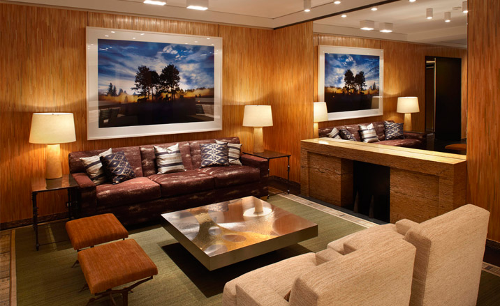
The apartment
The plan for a VIP space was hatched only 14 months ago - a response to a growing trend in luxury stores in China. "The feedback from the brands who created them in China was a revelation. They make as much profit from these areas as they do out of all the selling floors,' Marino explains. So he put the idea to Louis Vuitton. 'They said, "Okay Peter, go ballistic. We're going to try this." Quite frankly speaking, it's an experiment. I've never done this for a brand in the West before.'
Here, custom-made furniture by Marino sits alongside a chair by French sculptor Philippe Hiquily.
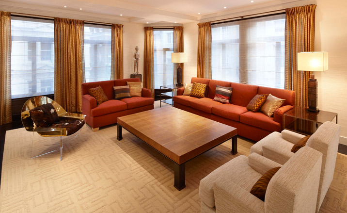
The apartment
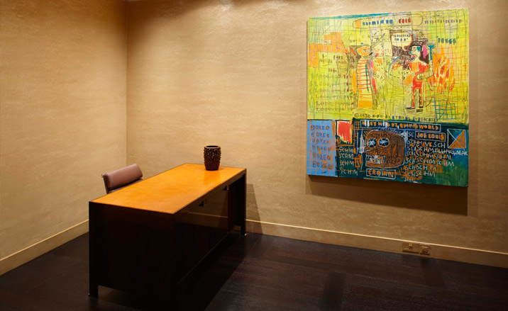
The apartment
In the entrance to the apartment is 'Napoleonic Stereotype circa '44' by Jean-Michel Basquiat
The apartment
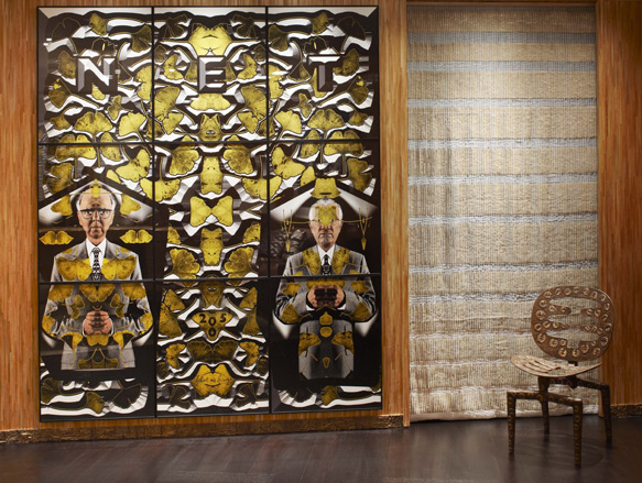
On the wall of the main room is a work titled 'NET' by Gilbert & George
The apartment
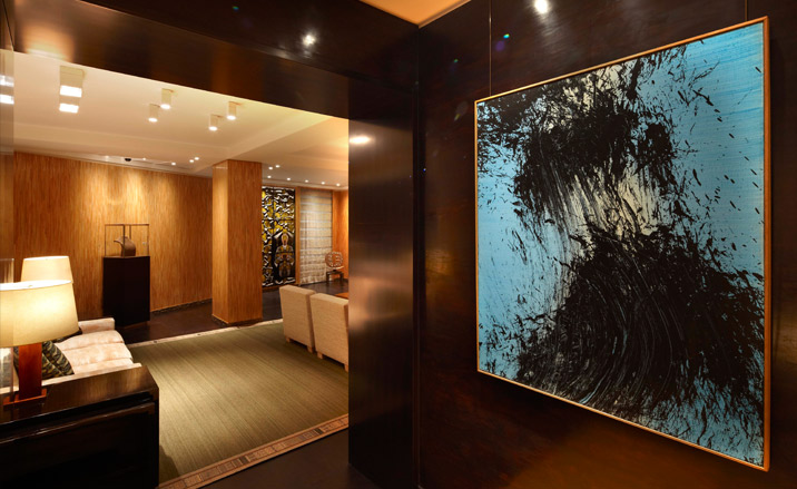
'TI985 H12' by Hans Hartung hangs on a lacquered wall
The apartment
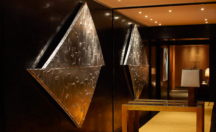
'Atomium detail N10' by Bertrand Lavier
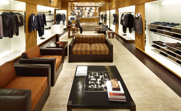
Descend the LED-lit staircase to the lower-ground floor and you'll find the men's universe, comprising various areas, such as the leather goods zone, the shoes area and the men's club. Darker finishes give it an aptly masculine feel and walls are clad in wood veneer.
The men's universe
Dominated by a giant 2005 artwork by Gilbert & George, the space is filled with relaxing sofas and low tables, once again like a private apartment. 'Because I began my career creating high end luxury residences - for the likes of Yves St Laurent, the Rothschilds - before I became a retail architect, I'm able to bring to the stores a high end sense of how the customer lives,' he explains. Throughout the new maison you'll find unusual furniture from auctions and dealers, including tables by Roland Mellan and John Ashpool.

The men's club
ADDRESS
17 - 20 New Bond Street
London W1
Malaika Byng is an editor, writer and consultant covering everything from architecture, design and ecology to art and craft. She was online editor for Wallpaper* magazine for three years and more recently editor of Crafts magazine, until she decided to go freelance in 2022. Based in London, she now writes for the Financial Times, Metropolis, Kinfolk and The Plant, among others.
-
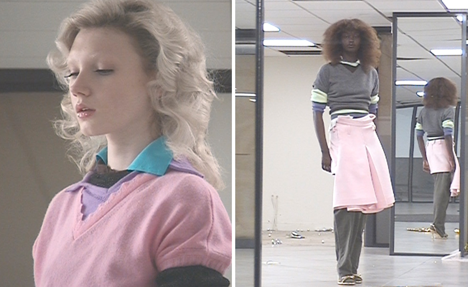 All-In is the Paris-based label making full-force fashion for main character dressing
Part of our monthly Uprising series, Wallpaper* meets Benjamin Barron and Bror August Vestbø of All-In, the LVMH Prize-nominated label which bases its collections on a riotous cast of characters – real and imagined
By Orla Brennan
-
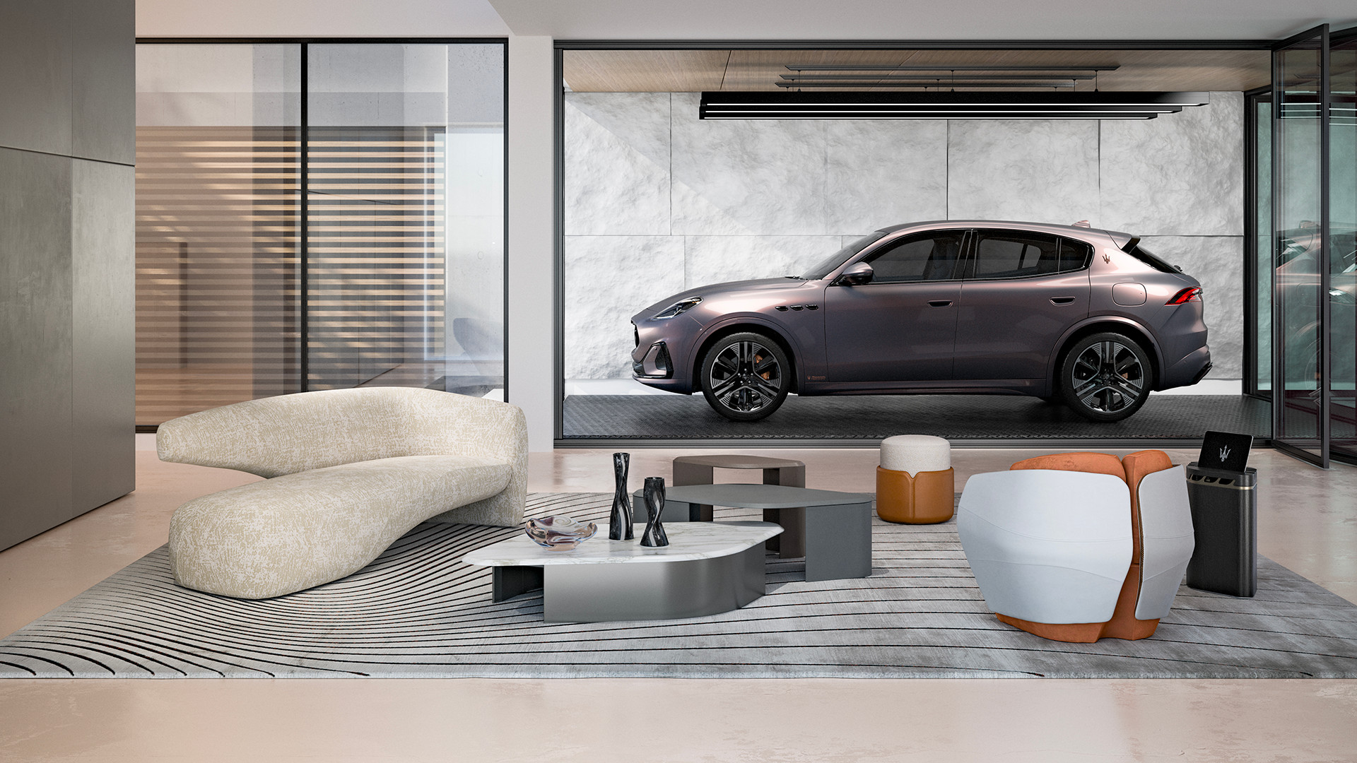 Maserati joins forces with Giorgetti for a turbo-charged relationship
Announcing their marriage during Milan Design Week, the brands unveiled a collection, a car and a long term commitment
By Hugo Macdonald
-
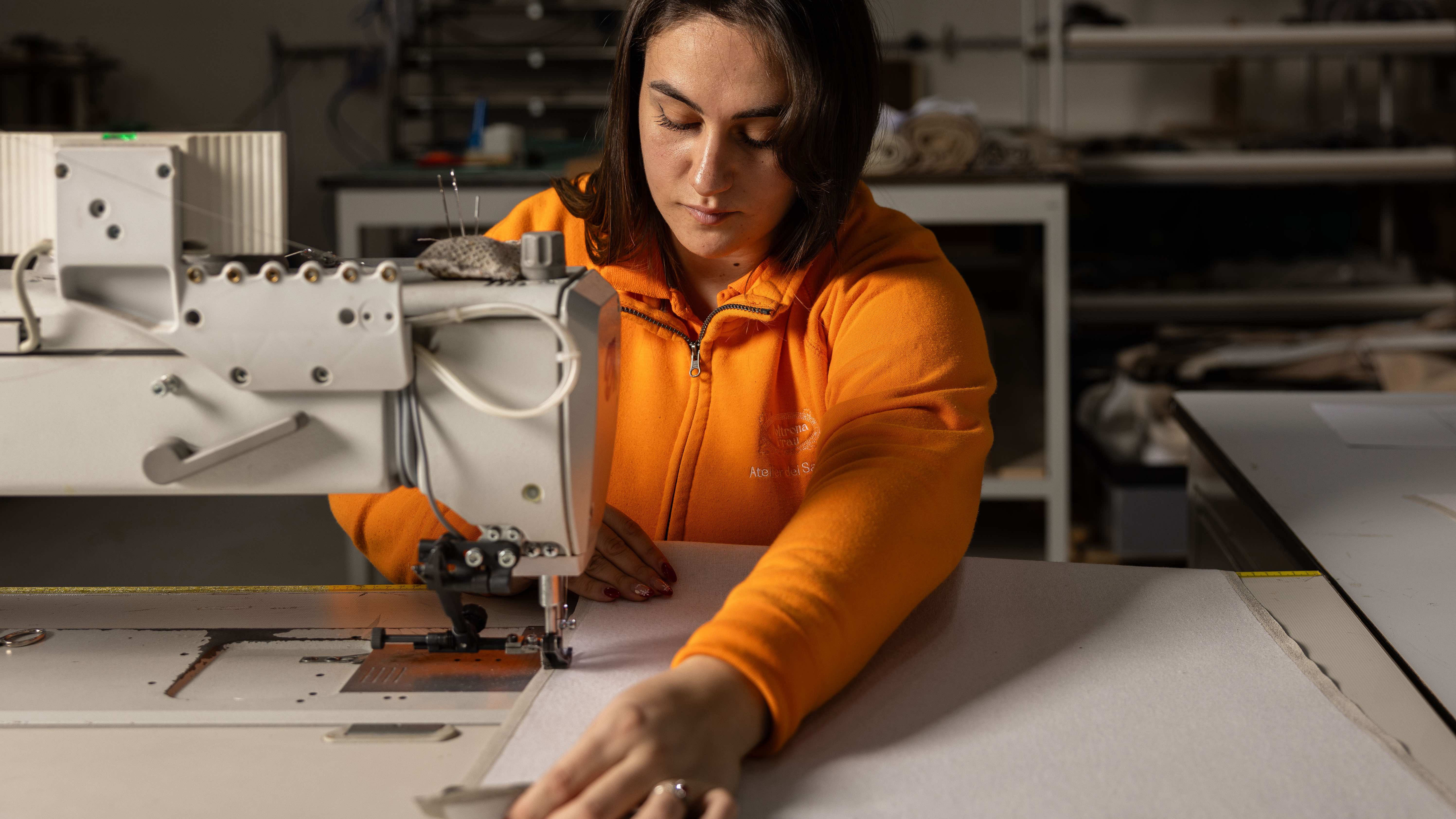 Through an innovative new training program, Poltrona Frau aims to safeguard Italian craft
The heritage furniture manufacturer is training a new generation of leather artisans
By Cristina Kiran Piotti
-
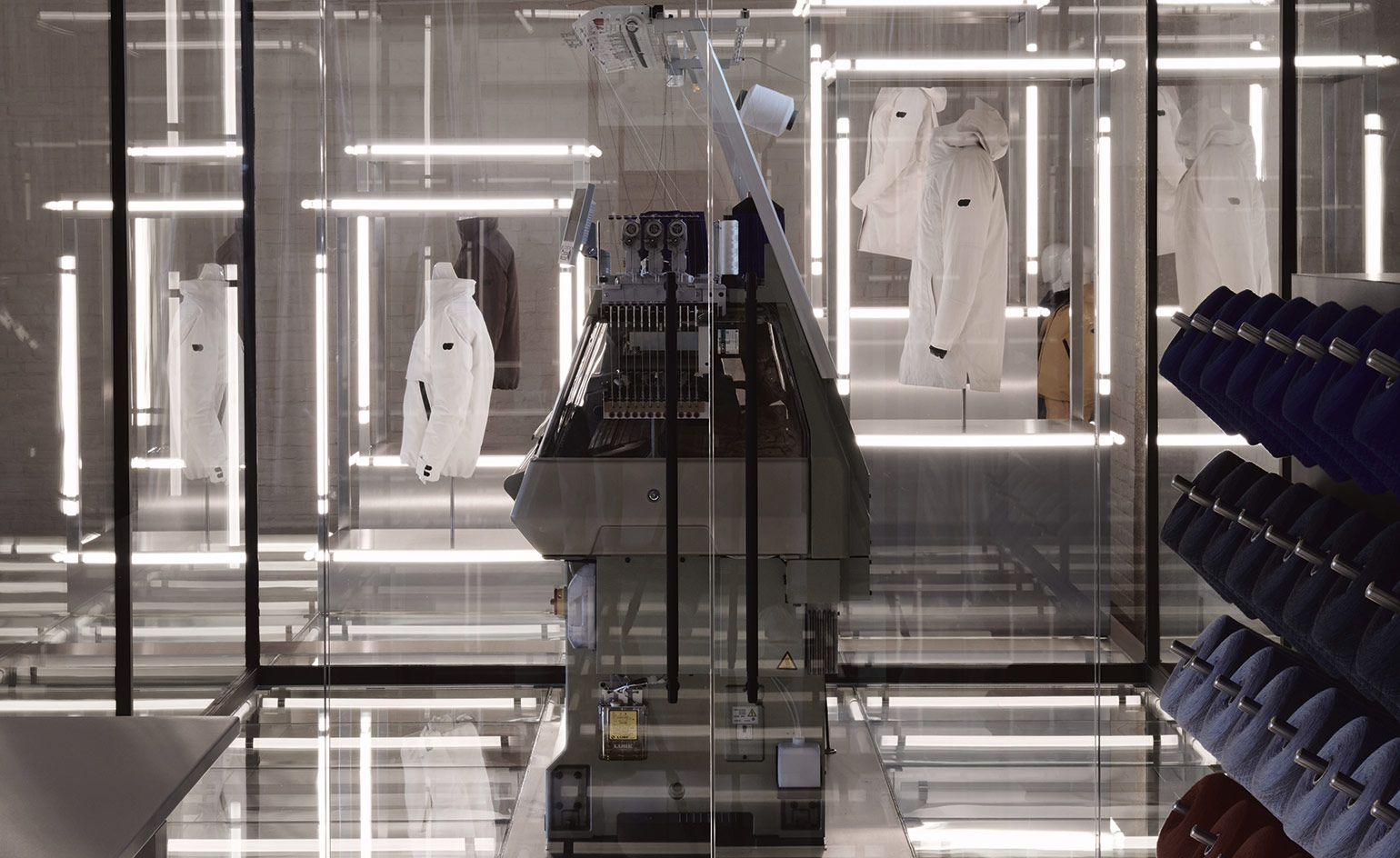 AlphaTauri’s Salzburg HQ is a science fiction fantasy
Browse in-store, buy online: the future-focused mentality of AlphaTauri
By Simon Mills
-
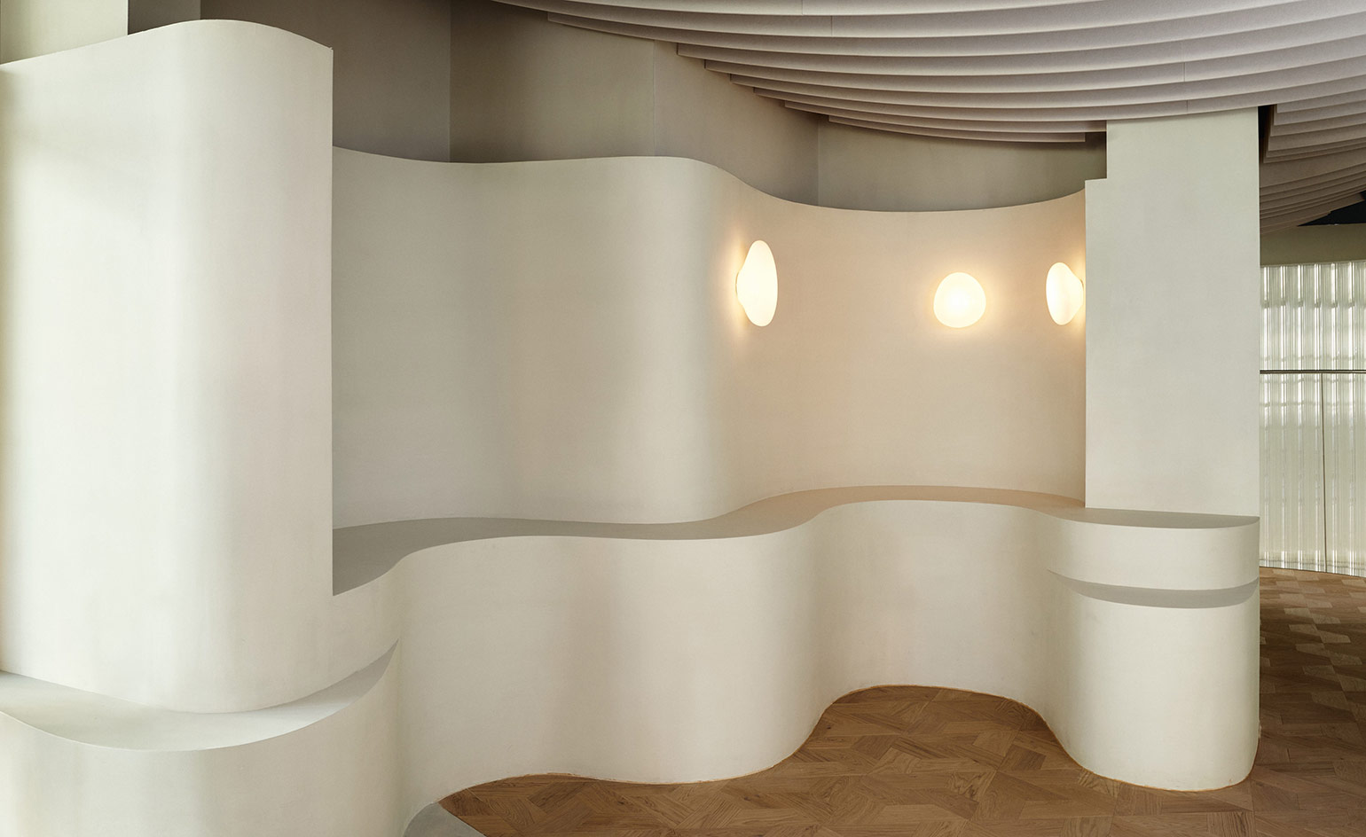 Water inspires Holzweiler’s Snøhetta-designed Oslo flagship
Holzweiler Platz, the new retail destination of fashion brand Holzweiler in Oslo, is designed by architects Snøhetta as a naturalistic space that unites fashion, art and food
By Laura Hawkins
-
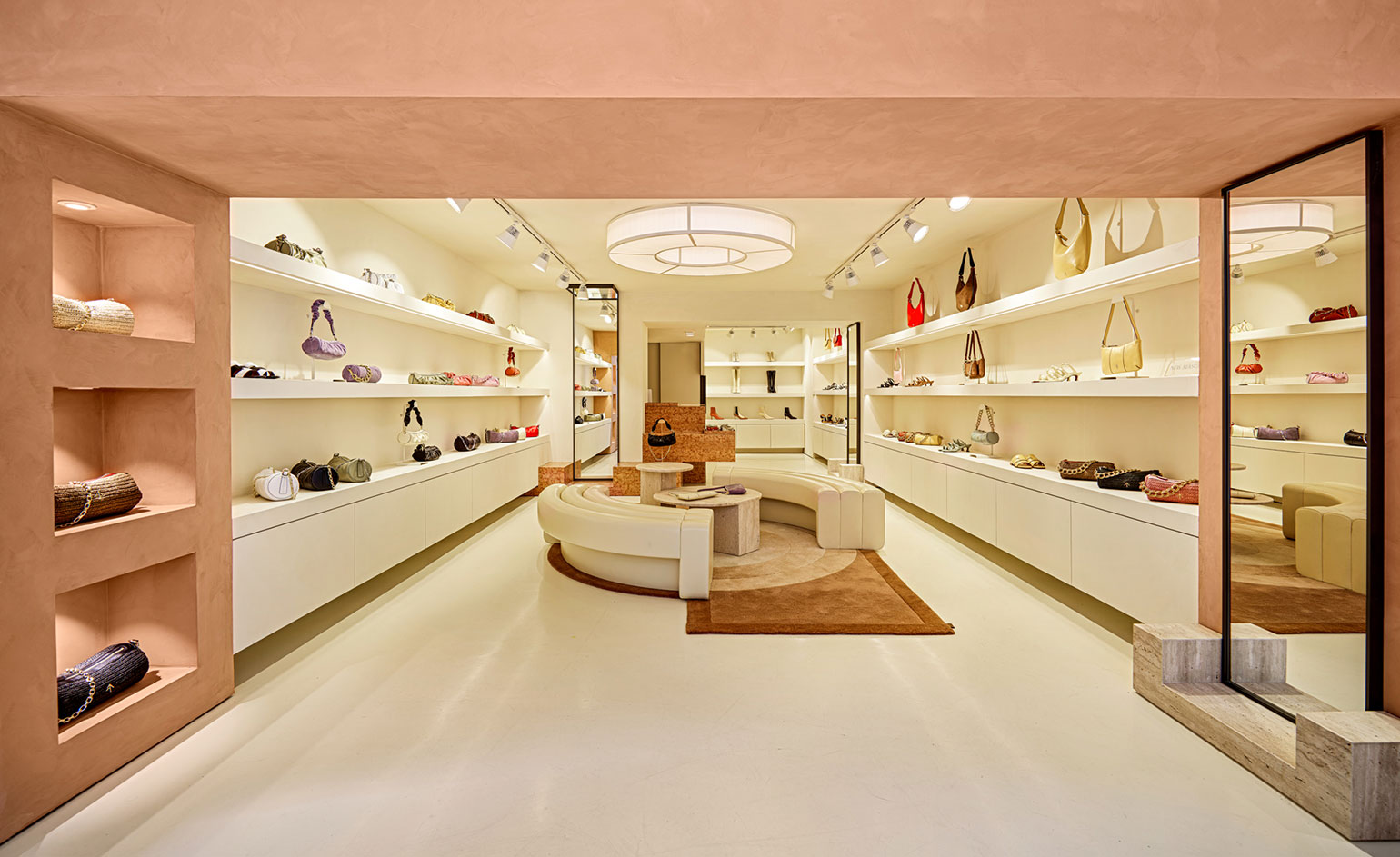 Manu Atelier's first boutique nods to Le Corbusier in Istanbul
The cult Istanbul-based label introduces bold, sculptural expressionism into this first bricks and mortar store
By Laura Hawkins
-
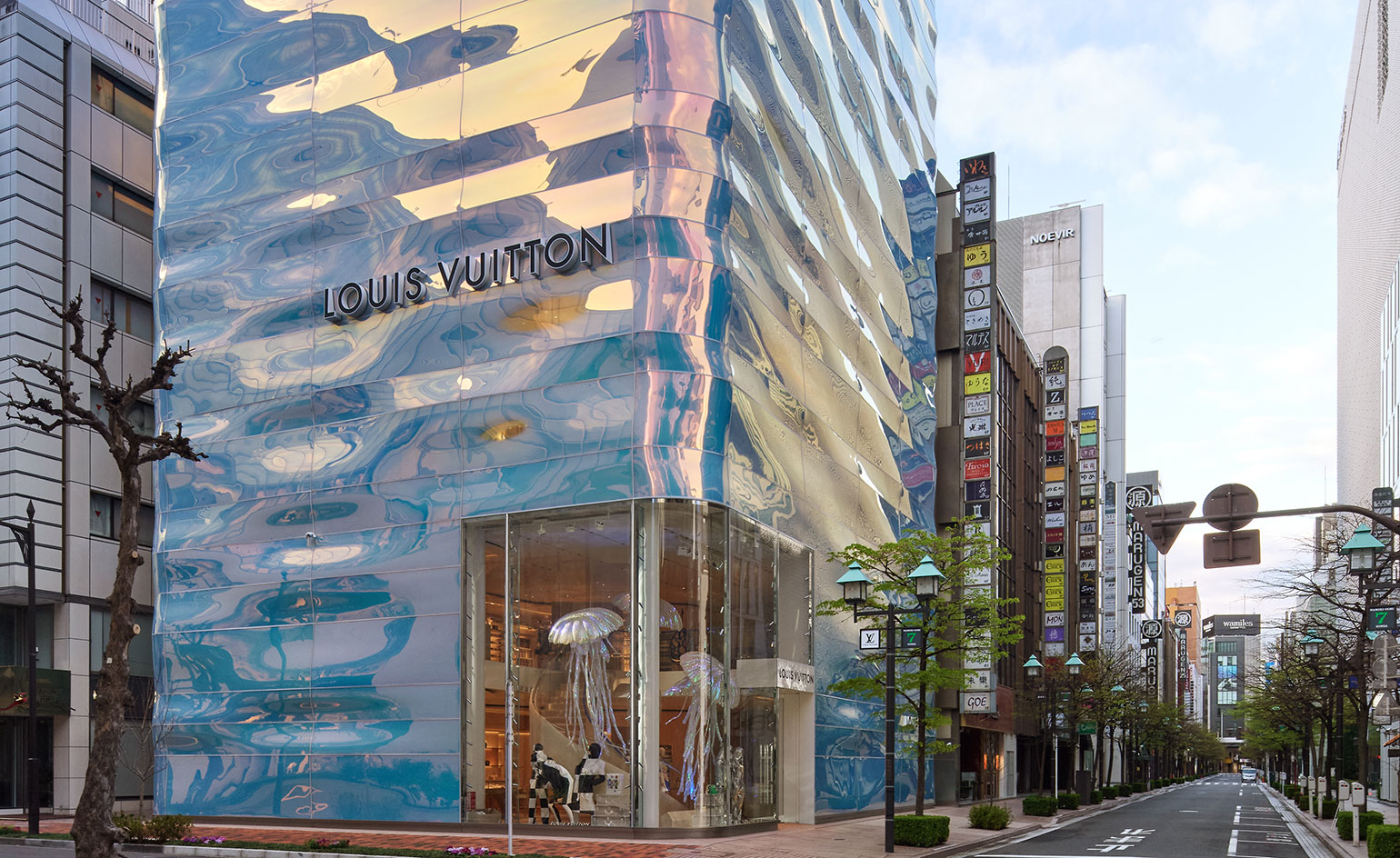 Louis Vuitton's Ginza Namiki flagship evokes a rippling pillar of water
Japanese architect Jun Aoki creates a water-like facade for Louis Vuitton's Ginza Namiki Tokyo flagship
By Danielle Demetriou
-
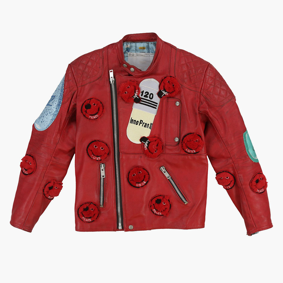 Virgil Abloh auctions upcycled clothing customised by Damien Hirst
Abloh’s online platform Canary Yellow auctions pieces from ‘Beverly Hirst Recycler’, a clothing collection customised by Damien Hirst and LA-based recycled clothing mastermind Tetsuzo Okubo
By Laura Hawkins
-
 Alternative retail websites for fashionable festive gifting
Look to luxury etailers Rêve En Vert, APOC Store and Doda the Store, Aspect and Zero-Living for feel-good gifting options that support emerging creatives and artists, and have a sustainability-focused mindset
By Laura Hawkins
-
 Aspesi’s upcycled shirt is a winter wardrobe staple
The Italian brand's Shirt-Jacket 13 silhouette is well padded with eco-credentials
By Laura Hawkins
-
 David Chipperfield designs Furla's new flagship in Milan's historic Piazza Duomo
Gio Ponti, Vico Magistretti and Achille Castiglione inspire the brand's newest Milan boutique
By Laura Hawkins