Shape shifter: Ace & Tate gives its Munich store a whole new perspective
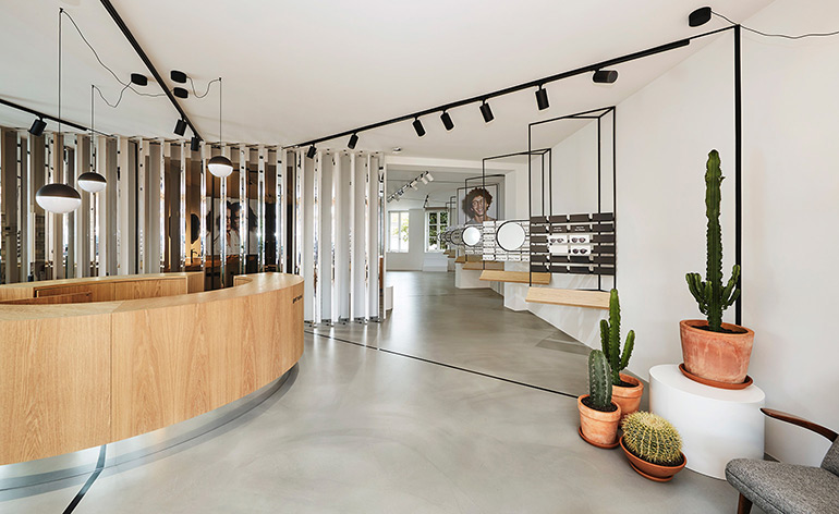
Hot on the heels of Ace & Tate’s Berlin store opening, the Amsterdam-based eyewear brand drives its German expansion forward with a new outpost in Munich. For its sixth store, Ace & Tate called in design duo Tina Bunyaprasit and Birgit Kohlhaas – otherwise known as Weiss-heiten – to bring the brand's retail concept to life, which has unique iterations across its growing number of European locations.
The multi-disciplinary designers oscillate between interior design, architecture and visual communication, and for this space they integrated elements of illusion and perception – interestingly, under the musical spell of Guns N’ Roses album Use your illusion.
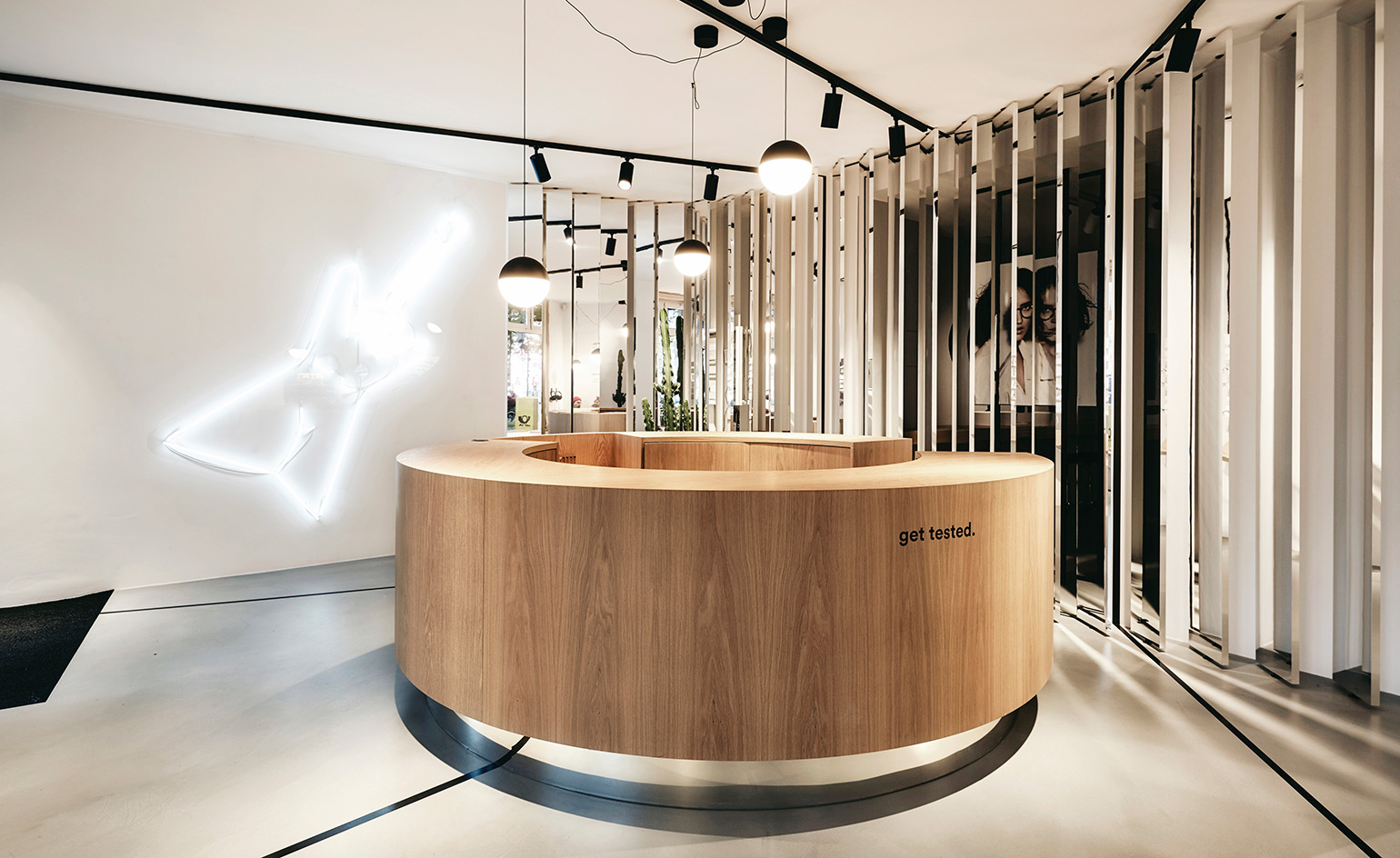
Local graphic artist Gabe's neon installation lights up the customer counter
Playing with our sense of perspective, black frames are placed at different angles within the extremities of the space, dividing the shop floor into optic partitions, while a vanishing point guides the gaze. Behind a curved wooden customer desk, mirrored panes provide fragmented glimpses into an adjacent room. In that mirrored corner, the furrowed and ridged edges of spiked succulents are reflected fragmentarily.
The store has an almost surrealist feel as a result of these interventions, which sit in contrast with the untouched exterior of the heritage building and the laid-back entrance area, which is reserved for relaxation.
But Ace & Tate also keeps things familiar. The shelving that carries the eyewear is designed by New Tendency – the firm behind the eyewear brand’s Berlin store – and, what’s recognisable for locals, the Munich-based graphic artist Gabe has put his stamp on the store with a neon light installation that can be interpreted as either a guitar or an abstracted female form. It all depends what view you take.
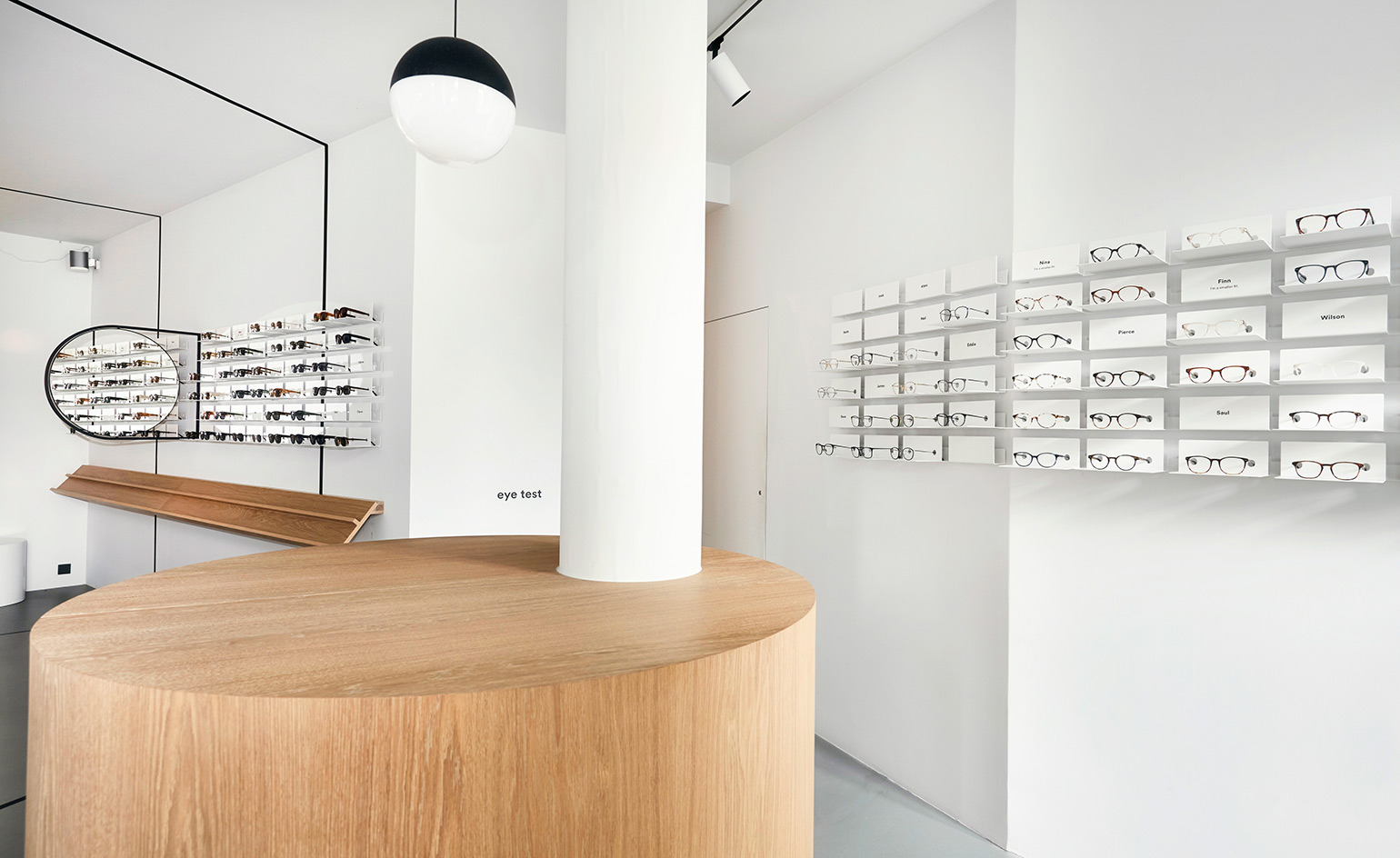
the store integrates elements of illusion and perception
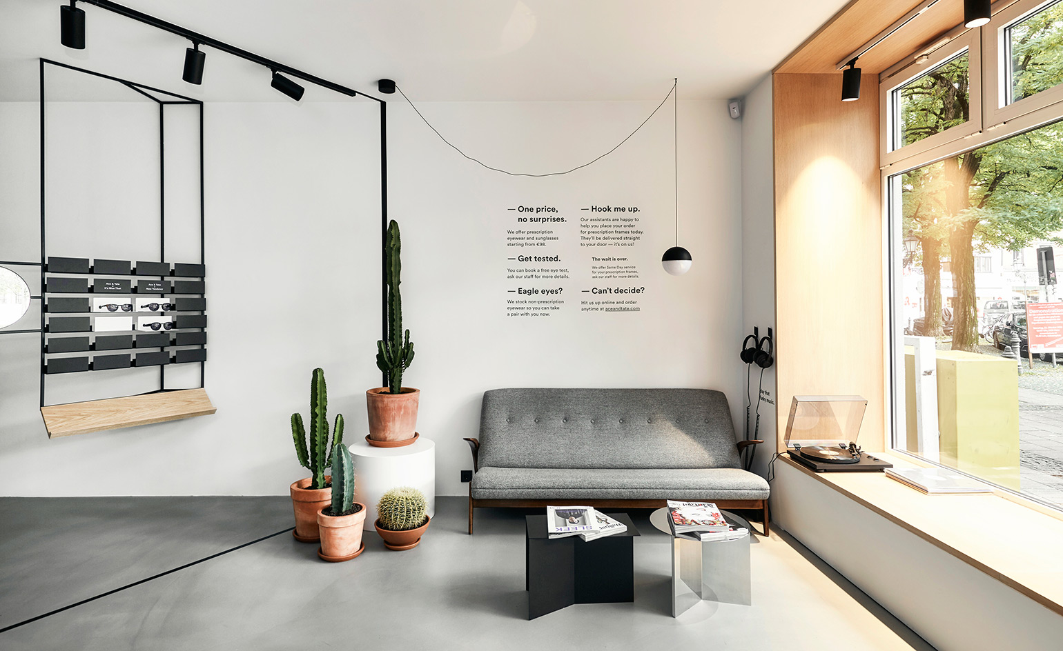
A small area at the entrance is reserved for relaxation
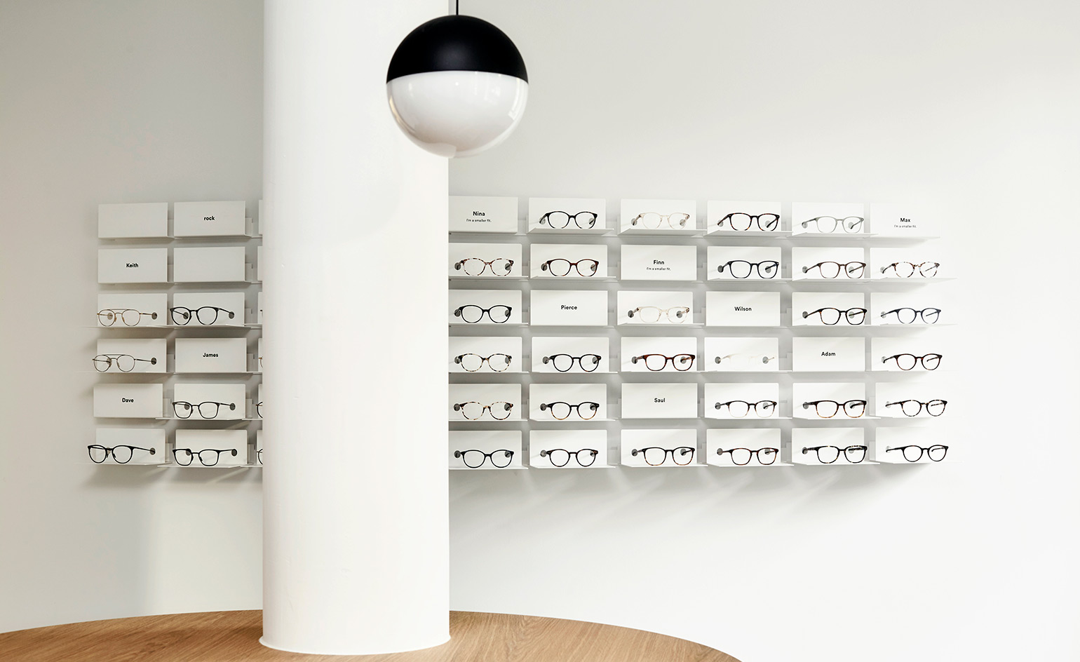
The designers have kept the store's palette minimal and clean
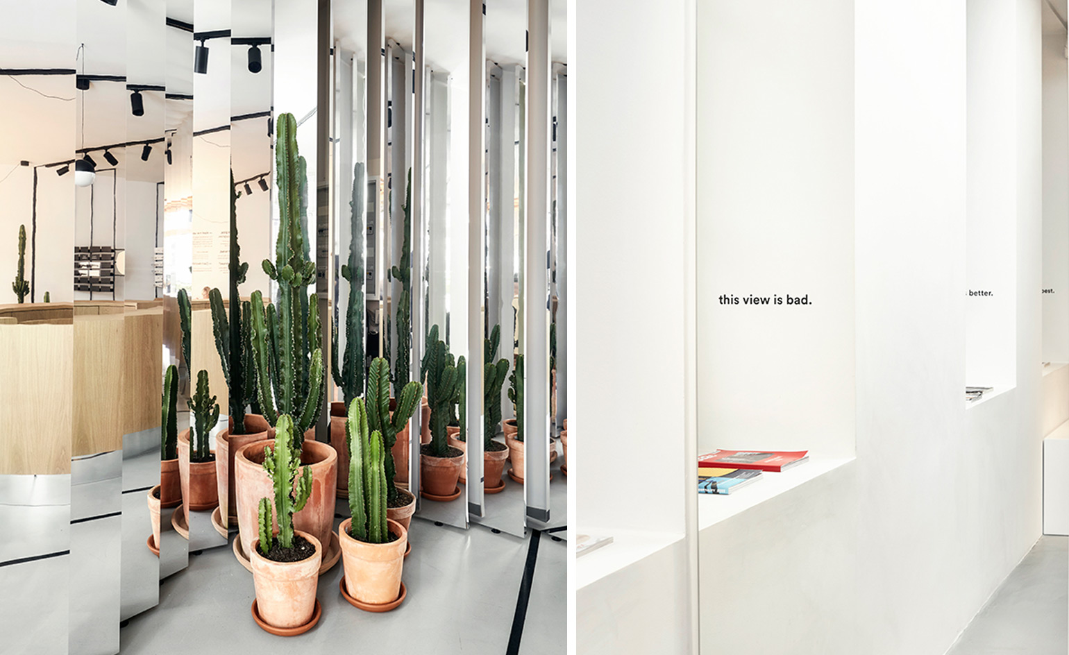
Left: mirrored panes provide fragmented reflections of spiky succulents. Right: tongue-in-cheek text graphics inject a sense of humour into the space
INFORMATION
For more information, visit the Ace & Tate website
ADDRESS
Gärtnerplatz 1
80469 Munich
Wallpaper* Newsletter
Receive our daily digest of inspiration, escapism and design stories from around the world direct to your inbox.
Siska Lyssens has contributed to Wallpaper* since 2014, covering design in all its forms – from interiors to architecture and fashion. Now living in the U.S. after spending almost a decade in London, the Belgian journalist puts her creative branding cap on for various clients when not contributing to Wallpaper* or T Magazine.
-
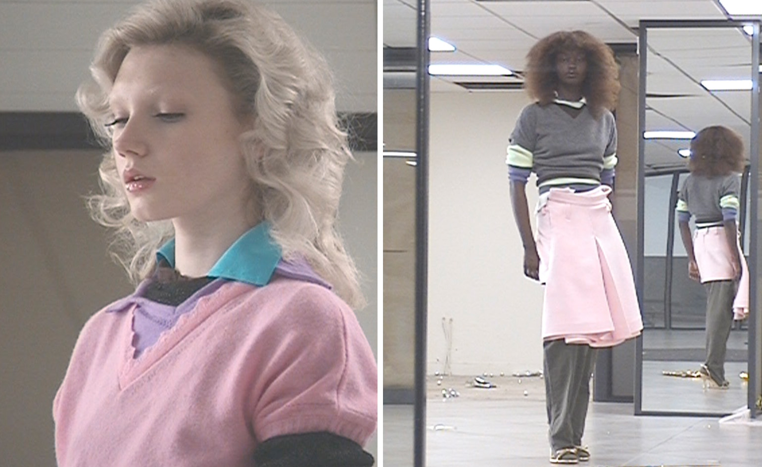 All-In is the Paris-based label making full-force fashion for main character dressing
Part of our monthly Uprising series, Wallpaper* meets Benjamin Barron and Bror August Vestbø of All-In, the LVMH Prize-nominated label which bases its collections on a riotous cast of characters – real and imagined
By Orla Brennan
-
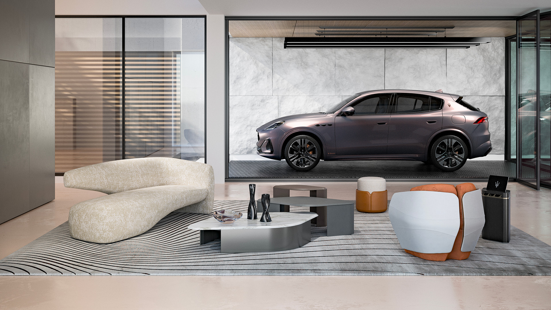 Maserati joins forces with Giorgetti for a turbo-charged relationship
Announcing their marriage during Milan Design Week, the brands unveiled a collection, a car and a long term commitment
By Hugo Macdonald
-
 Through an innovative new training program, Poltrona Frau aims to safeguard Italian craft
The heritage furniture manufacturer is training a new generation of leather artisans
By Cristina Kiran Piotti
-
 Celine New Bond Street: a carnival of materials, furniture and art
The French maison opens Celine New Bond Street, an art-filled flagship store in central London. Commissioned artworks by Nika Neelova and Leilah Babirye and a distinctively contemporary material palette contrast with the listed Edwardian building, reflecting artistic director Hedi Slimane’s vision of exacting opulence
By Dal Chodha
-
 Palazzo Avino’s fashion boutique in Ravello is pretty in pink
At luxury hotel Palazzo Avino, a serene and sumptuous spot on the Amalfi Coast, The Pink Closet boutique offers guests an insight into Italian fashion, in an intimate space designed by Cristina Celestino
By Laura Hawkins
-
 AlphaTauri’s Salzburg HQ is a science fiction fantasy
Browse in-store, buy online: the future-focused mentality of AlphaTauri
By Simon Mills
-
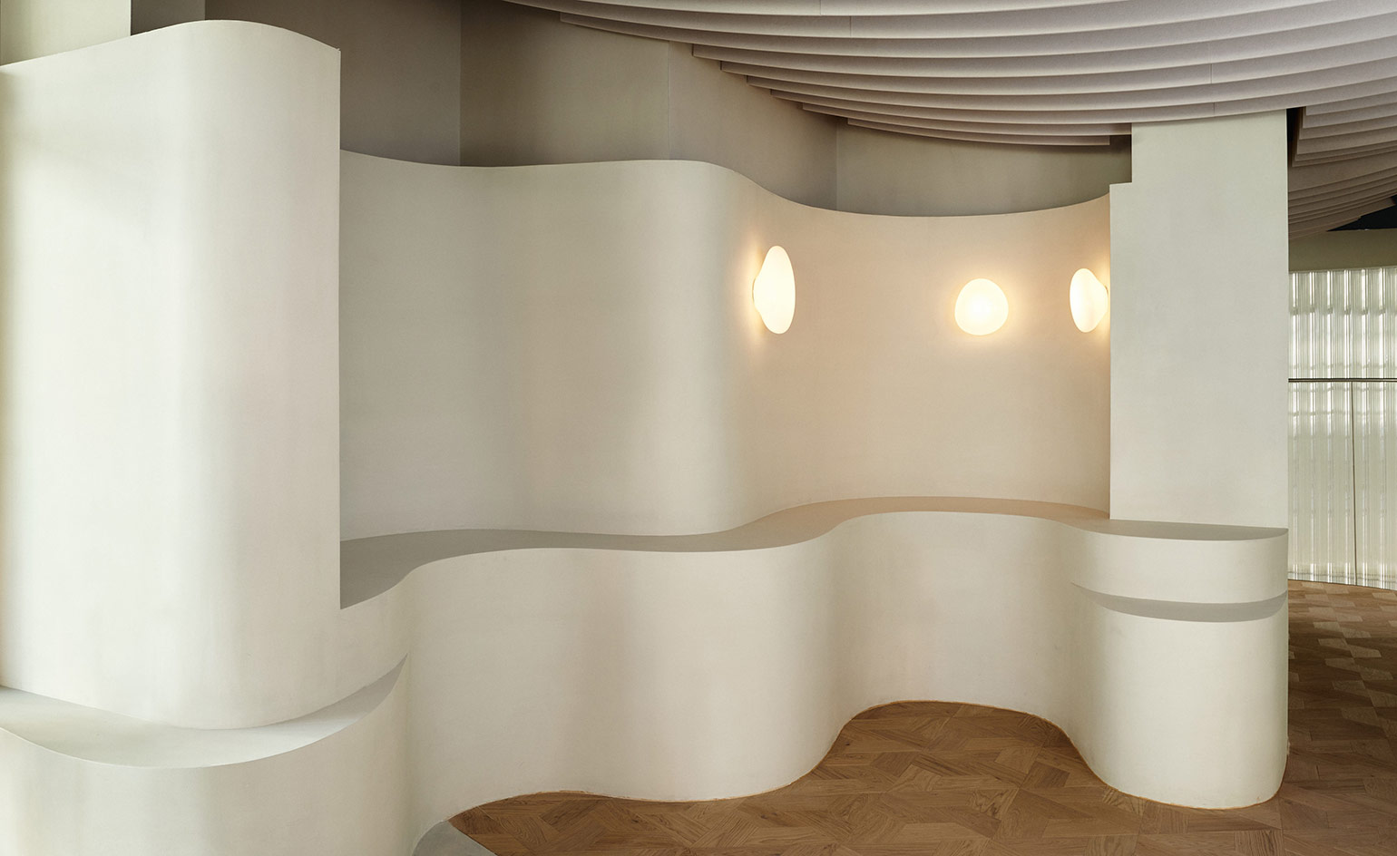 Water inspires Holzweiler’s Snøhetta-designed Oslo flagship
Holzweiler Platz, the new retail destination of fashion brand Holzweiler in Oslo, is designed by architects Snøhetta as a naturalistic space that unites fashion, art and food
By Laura Hawkins
-
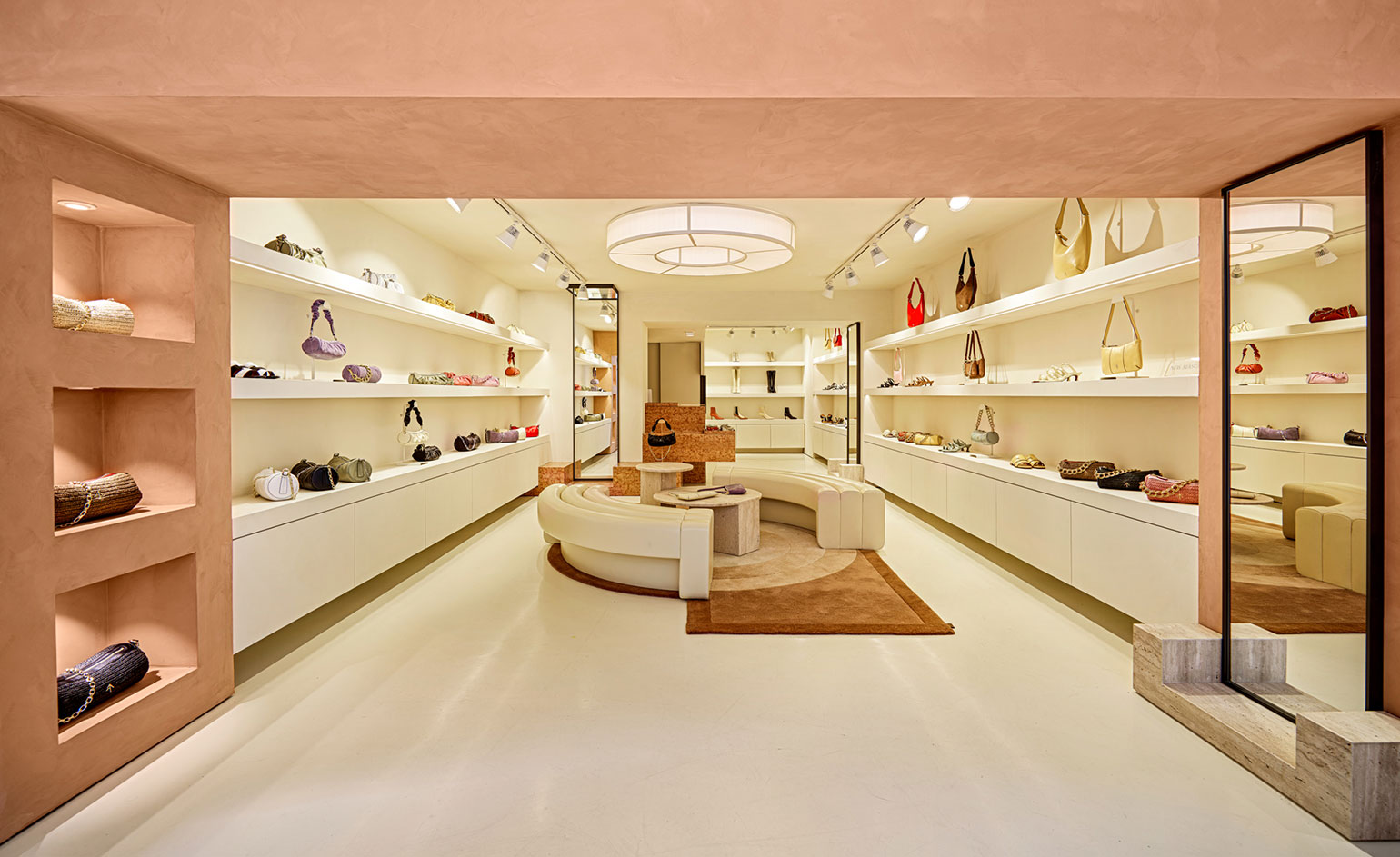 Manu Atelier's first boutique nods to Le Corbusier in Istanbul
The cult Istanbul-based label introduces bold, sculptural expressionism into this first bricks and mortar store
By Laura Hawkins
-
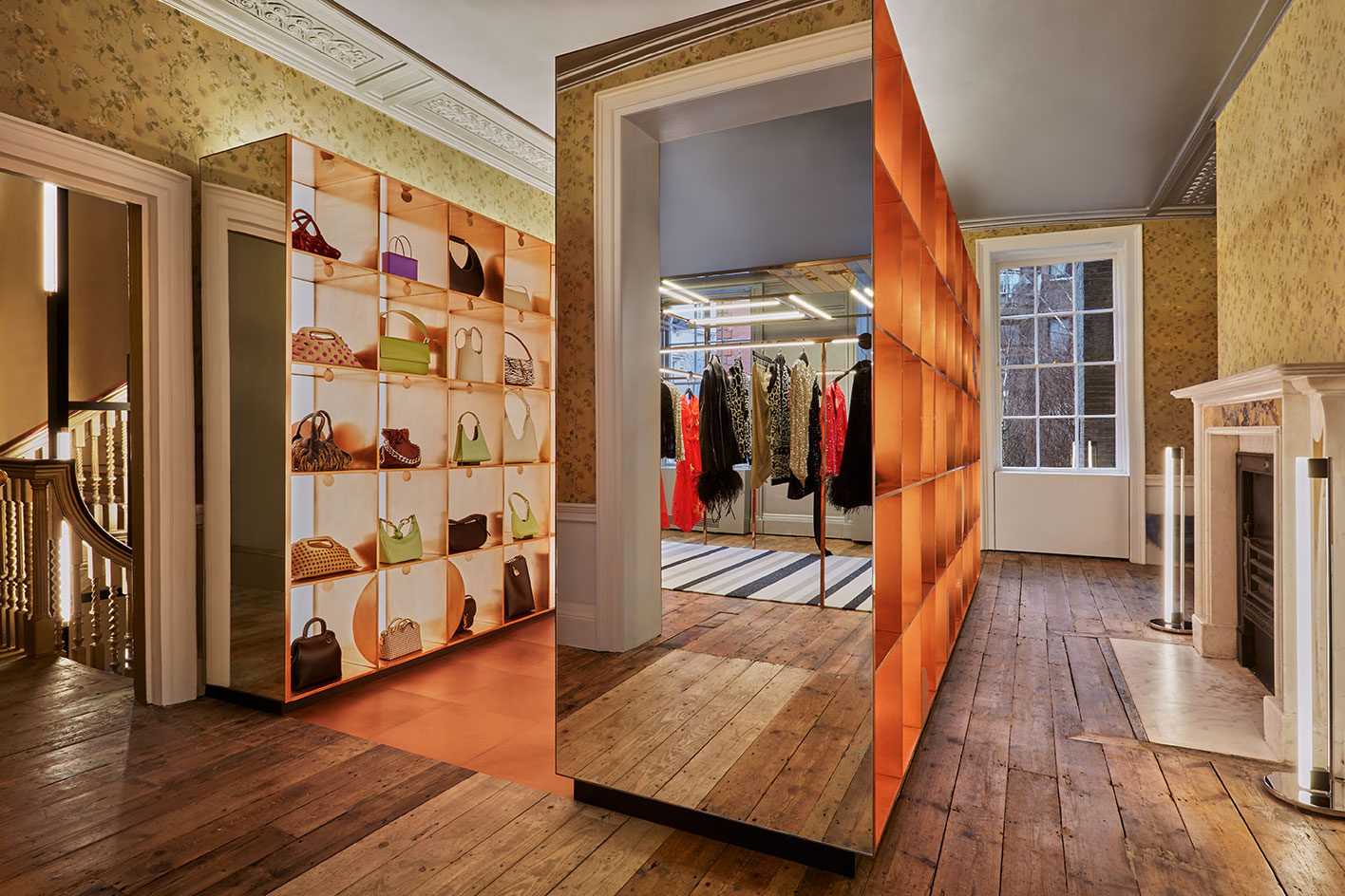 Browns Brook Street looks to the future of retail in Grade II*-listed London building
Browns Brook Street opens its doors in London's Mayfair in a historic, 18th-century location
By Laura Hawkins
-
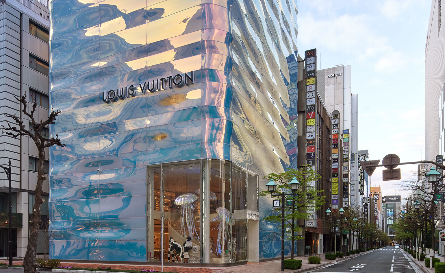 Louis Vuitton's Ginza Namiki flagship evokes a rippling pillar of water
Japanese architect Jun Aoki creates a water-like facade for Louis Vuitton's Ginza Namiki Tokyo flagship
By Danielle Demetriou
-
 Alternative retail websites for fashionable festive gifting
Look to luxury etailers Rêve En Vert, APOC Store and Doda the Store, Aspect and Zero-Living for feel-good gifting options that support emerging creatives and artists, and have a sustainability-focused mindset
By Laura Hawkins